Many people talk about urban growth in Australian cities being car-dependent low-density suburban sprawl. But how true is that in more recent times? Are new greenfield density targets making a difference? Are cities growing around their rapid public transport networks? And how do growth areas compare to established areas at a similar distance out from city centres?
This post takes a look at what census data can tell us about outer urban growth areas in terms of population density, motor vehicle ownership, distance from train/busway stations, and journey to work mode shares.
How much of city population growth is in outer areas?
Firstly a recap, here is the percentage of annual population growth in each city that has occurred in “outer” areas (defined by groupings of SA3s around the edges of cities – refer my previous post for maps showing outer areas) for Greater Capital City Statistical Areas.

Sydney has had less than a third of its population growth in outer areas since around 2003, while Perth has mostly had the highest outer growth percentage (since 1996), and more recently pretty much all population growth in Perth has been on the fringe. You can see how the other cities sit in between.
However, not all of this “outer” population growth was in urban growth on the fringe. For that we need to distinguish between urban growth and infill development, even in “outer” areas. So we really need a better definition of outer growth areas.
How to define outer urban growth areas
I have built groupings of SA1s (Statistical Area Level 1) that try to represent outer urban greenfield residential development. SA1s are the smallest census geographic areas (average population 400) for which all census data variables are available.
I’ve selected 2016 SA1s that meet all of the following criteria:
- Brand new SA1 or significant population growth: The 2016 SA1 is new and cannot be matched to a 2011 SA1 (by location/size and/or ABS correspondences), or if it can be matched, the population at least doubled between 2011 and 2016. Brand new SA1s are very common in urban growth areas as new SA1s are created to avoid oversized SA1s on last census boundaries (except this doesn’t always happen – more on that shortly).
- In an SA2 with significant population growth: The SA2 (Statistical Area Level 2 – roughly suburb sized with typically 3,000 to 25,000 residents) that contains the SA1 had population growth of at least 1000 people between 2011 and 2016 (based on 2016 boundaries). That is, the general area is seeing population growth, not just one or two SA1s.
- Are on – or close to – the urban fringe. I’ve filtered out particular SA2s that I’ve judged to be contain all or mostly in-fill development rather than greenfield development, or that are largely surrounded by existing urban areas and are not close to the urban fringe. I’ll be the first to admit that some of the inclusions/exclusions are a little arbitrary.
The criteria aren’t perfect, but it seems to work pretty well when I inspect the data. I’m calling these “Growth SA1s” or outer urban growth in this post.
For urban centres, I’m using Significant Urban Area 2016 boundaries (rather than Greater Capital City boundaries), and I’ve bundled Yanchep with Perth, Melton with Melbourne, and the Sunshine Coast and Gold Coast with Brisbane to form South East Queensland (SEQ).
Where are these outer urban growth areas?
What follows are maps for each city with the density of these growth SA1s shown by colour.
Melbourne’s northern and western growth areas:
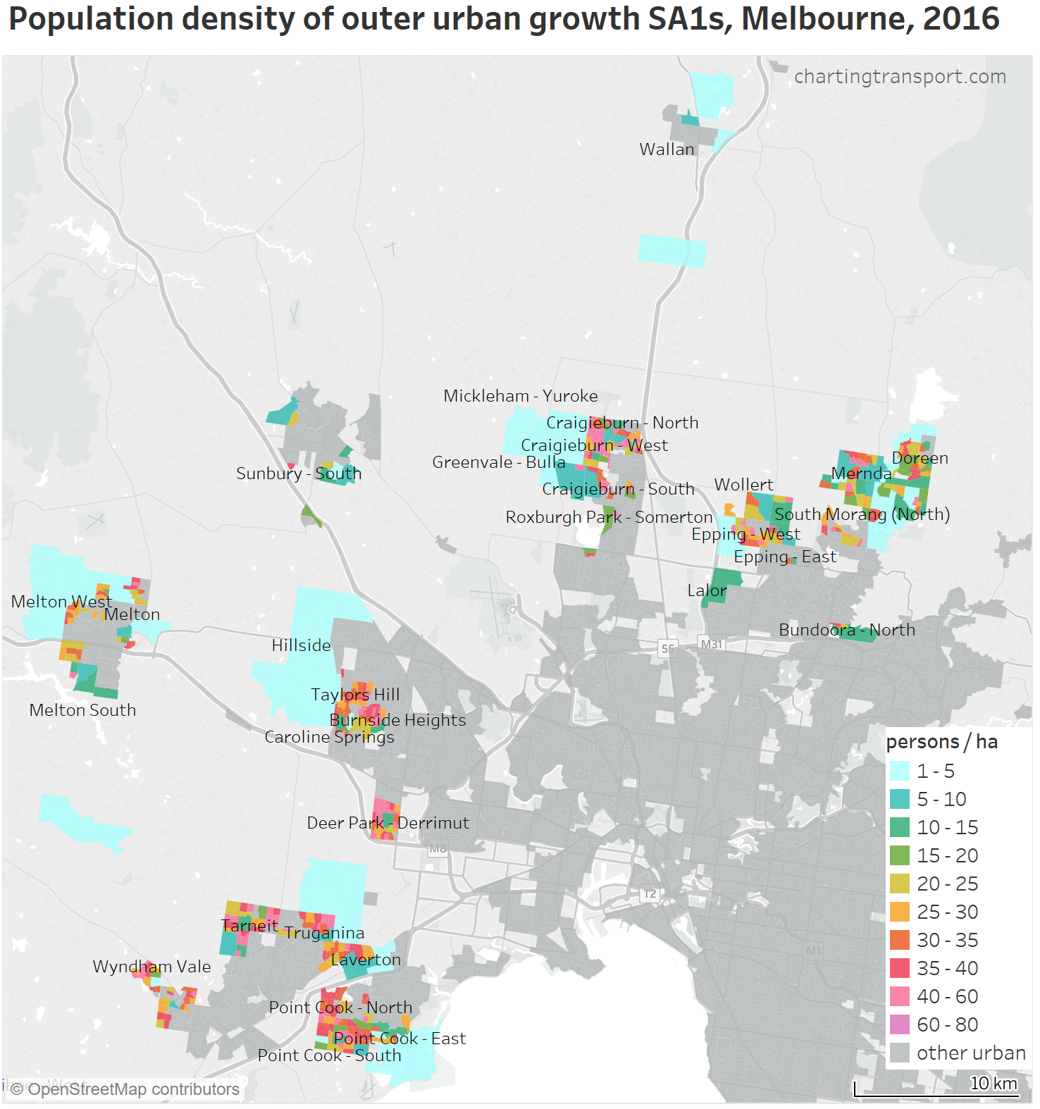
Technical note: The maps do not show non-growth SA1s with fewer than 5 people per hectare, or “growth SA1s” with fewer than 1/hectare, although these SA1s are including in later analysis.
And the south of Melbourne:

Note: not shown on these Melbourne maps are isolated tiny growth SA1s in Rosebud and Mooroolbark.
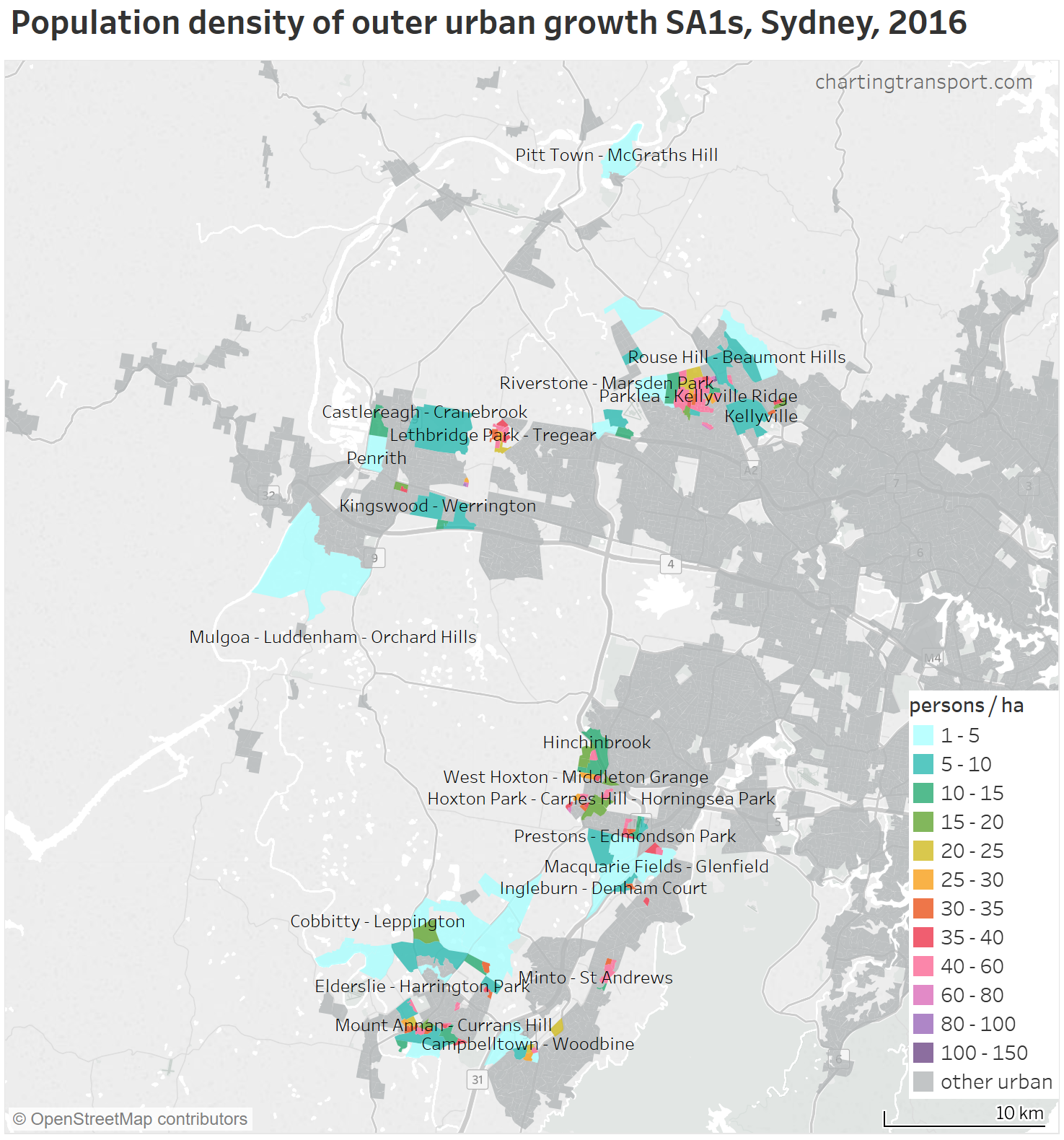
Here are Sydney’s growth SA1s – all in the western suburbs:
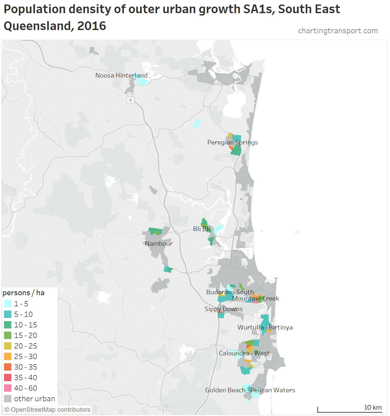
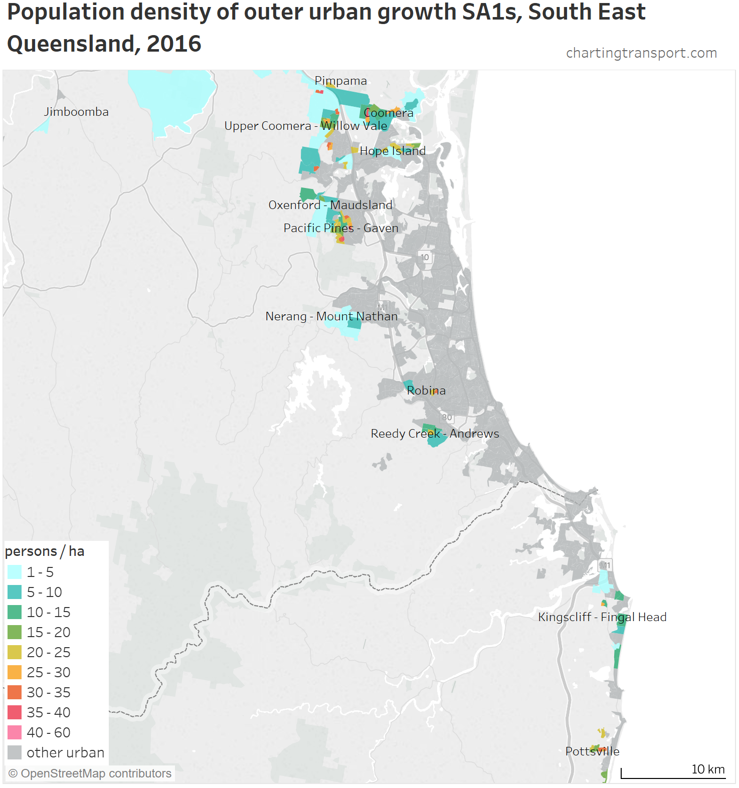
Next up South East Queensland, starting in the north with the Sunshine Coast:
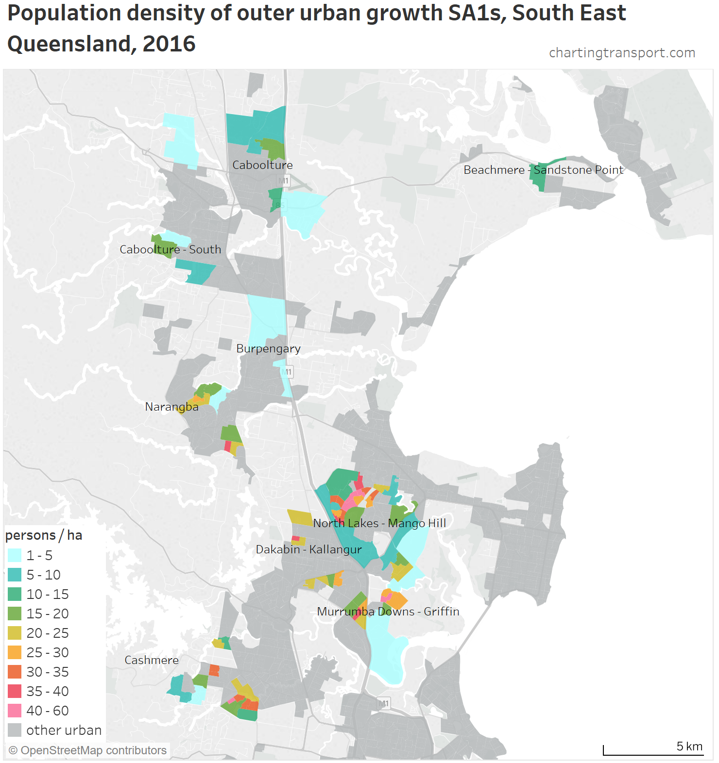
Northern Brisbane:
Outer urban growth is scattered in southern Brisbane and northern Gold Coast:

Gold Coast – Tweed Heads:
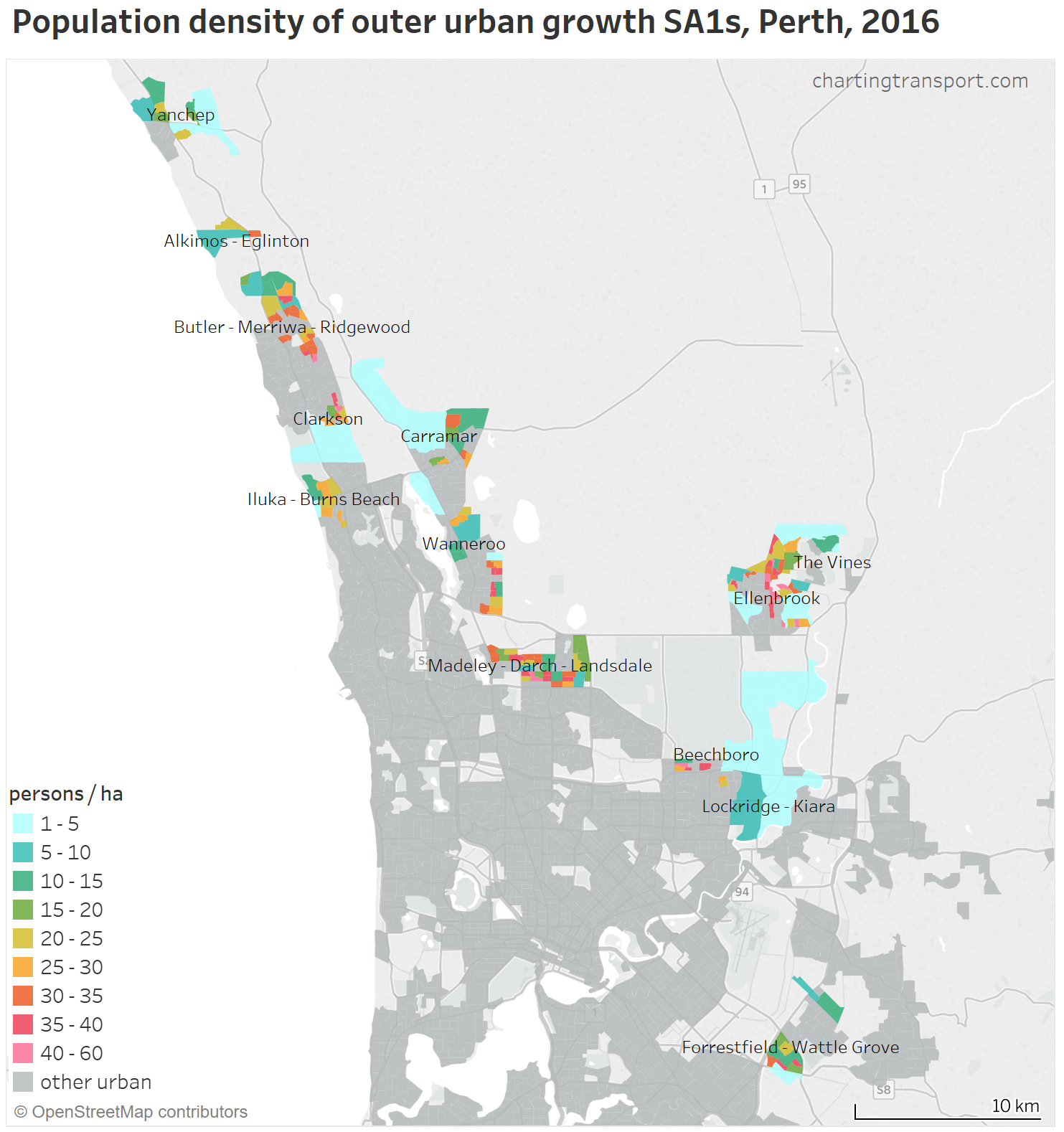
Perth’s northern and eastern growth areas:
Perth’s southern growth areas:
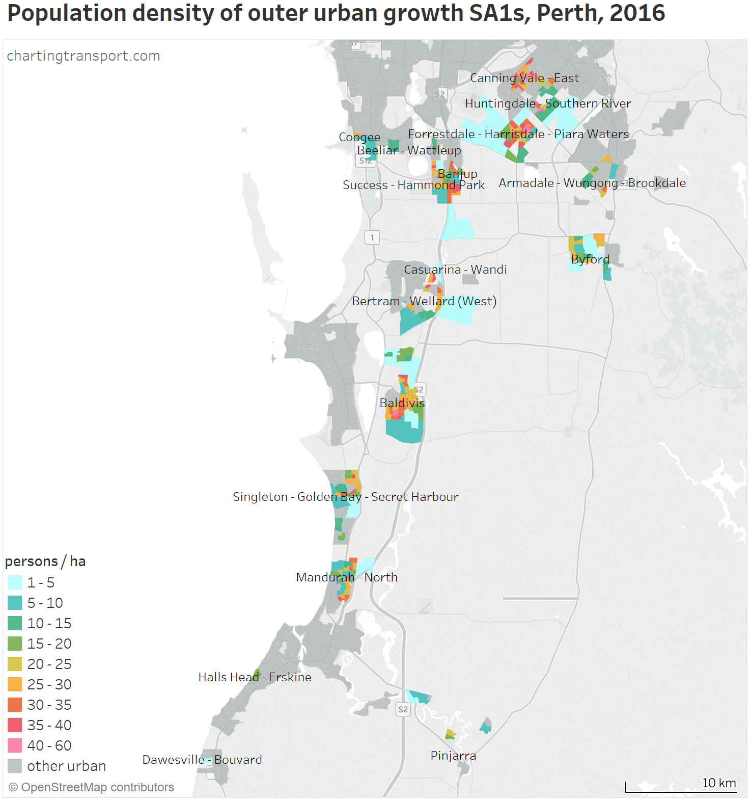
Note: Canning Vale East is an inclusion you could debate – the previous land use of the growth SA1s appear to have been rural based on satellite imagery.
Northern Adelaide:

Southern Adelaide:

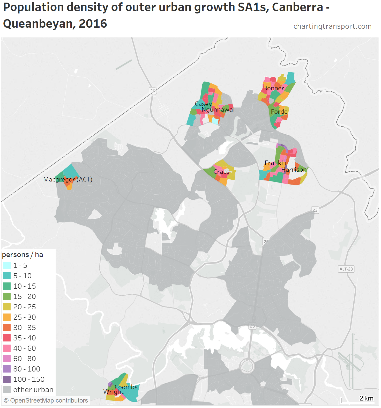
And finally Canberra:
So how much of each cities’ population growth has been in outer growth areas?
Here’s a breakdown of the population growth for my six urban areas:
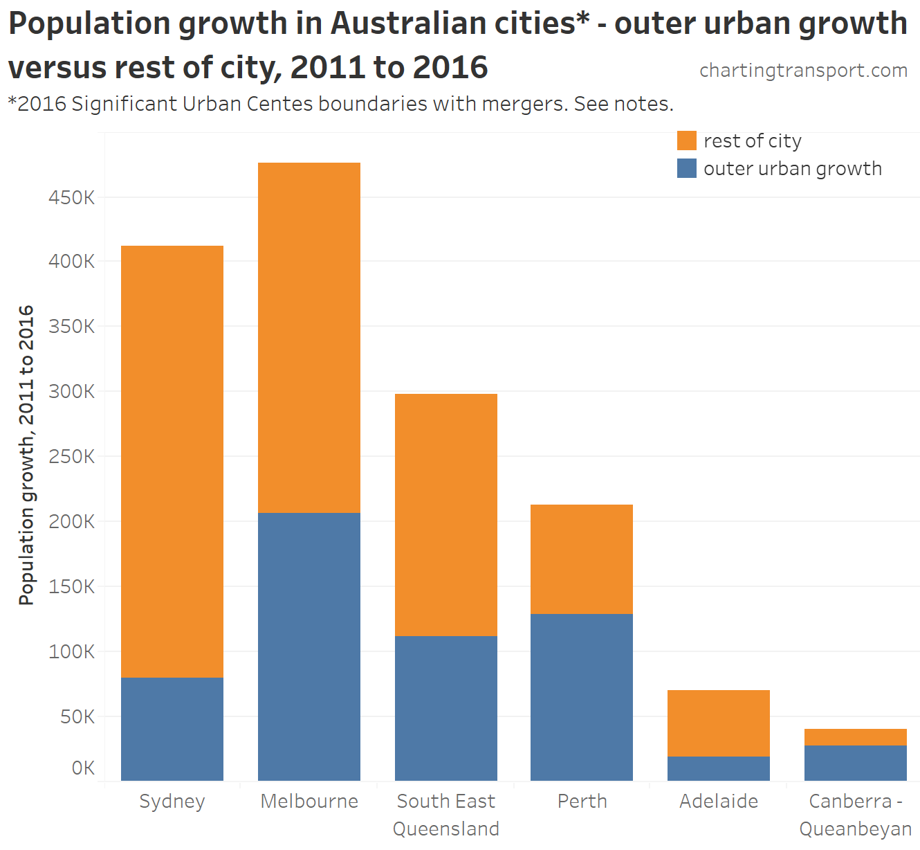
Over the five-year period, outer urban growth areas accounted for 19% of Sydney’s population growth, 43% of Melbourne’s, 37% of SEQ’s, 60% of Perth’s, 27% of Adelaide’s and 69% of Canberra’s.
Technical note: These “outer urban growth” figures are different to the chart at the top of this post which had a coarser definition of “outer” and used Greater Capital City boundaries. Some of my “outer urban growth” areas actually don’t quality as “outer” in the coarser definition, and I’ve also excluded several “outer” SA2s from “outer urban growth” where I’ve deemed the growth to be mostly infill. Hence the differences.
In case you are wondering, it’s not easy to create a longer-term time-series analysis about the proportion of population growth in “outer urban growth” areas because the classification of SA2s would have to change on a year-by-year basis which would be messy and somewhat arbitrary.
A challenge for density analysis: some SA1s are over-sized
You might have noticed some SA1s in the maps above are very large and show a low average density of 1-5 persons per hectare (I’ve coloured them in a light cyan). Many of these SA1s had thousands of residents in 2016, which is way more than the ABS guideline of 200 to 800 residents. Unfortunately what seems to have happened for 2011 and 2016 in some cities is that the ABS did not create enough SA1s to account for new urban areas. Some Melbourne SA1s had a population over 4000 in 2016. Many of these SA1s contain a combination or urban and rural land use, so their calculated density is rather misleading.
I’m designating any SA1s with more than 1000 residents and larger than 100 hectares as “oversized”, and I’ve exclude these from some density analysis below. Here’s a chart showing the proportion of outer growth area populations that are in oversized SA1s:
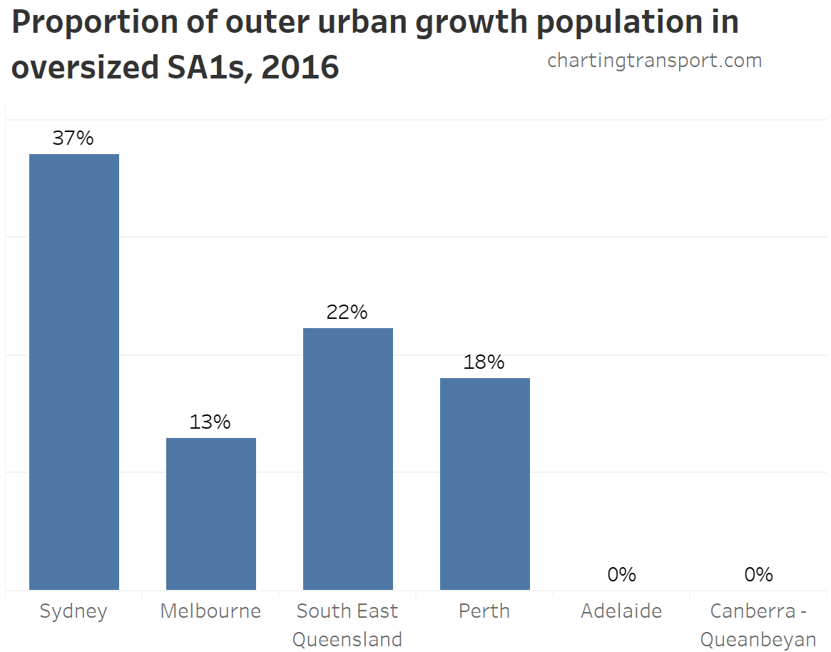
You can see it is a substantial problem in Sydney, Melbourne, Perth and South East Queensland, but miraculously not a problem at all in Adelaide or Canberra (I’m sure someone in ABS could explain why this is so!).
If you are interested, in 2011 it was a bigger problem in Melbourne, and only Canberra was fully clean.
So how dense are outer urban growth areas?
Firstly, I am excluding over-sized SA1s from this analysis for the reasons just mentioned.
Secondly, all cities will also have growth areas that were partially developed at the time of the census (ie some lots with occupied houses and other lots empty) so the densities measured here may be understated of the likely fully built-out density of these SA1s. That said, those areas perhaps are more likely to be in over-sized SA1s, but it’s hard to be sure. So keep this in mind when looking at growth area densities.
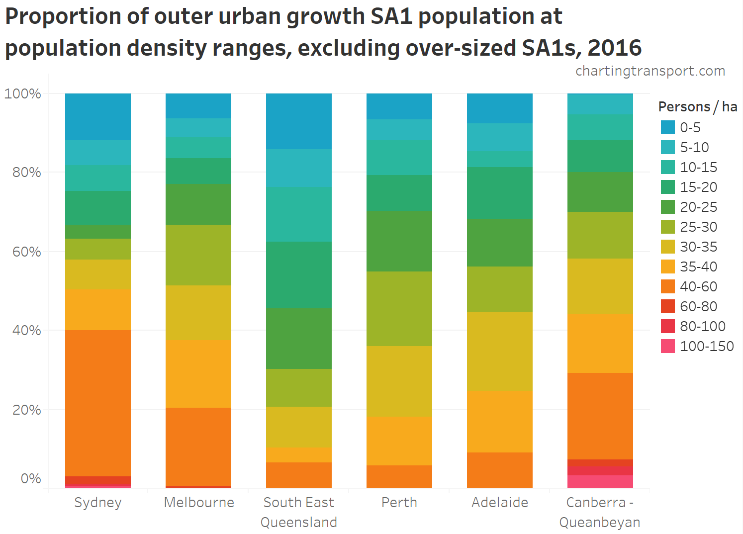
You can see dramatic differences, with Sydney, Canberra, and Melbourne showing higher densities, and South East Queensland with much lower densities. As we saw on the maps above, South East Queensland’s outer growth areas are very dispersed, so perhaps more of them are growing slowly and more of them are partially built-out? It’s hard to be sure.
But perhaps what is most remarkable is that Canberra had the highest densities in outer urban growth areas of any city – nothing like what you might consider suburban sprawl. Here’s what was 144.5 people per hectare in 2016 in Wright on Canberra’s new western growth front looks like:
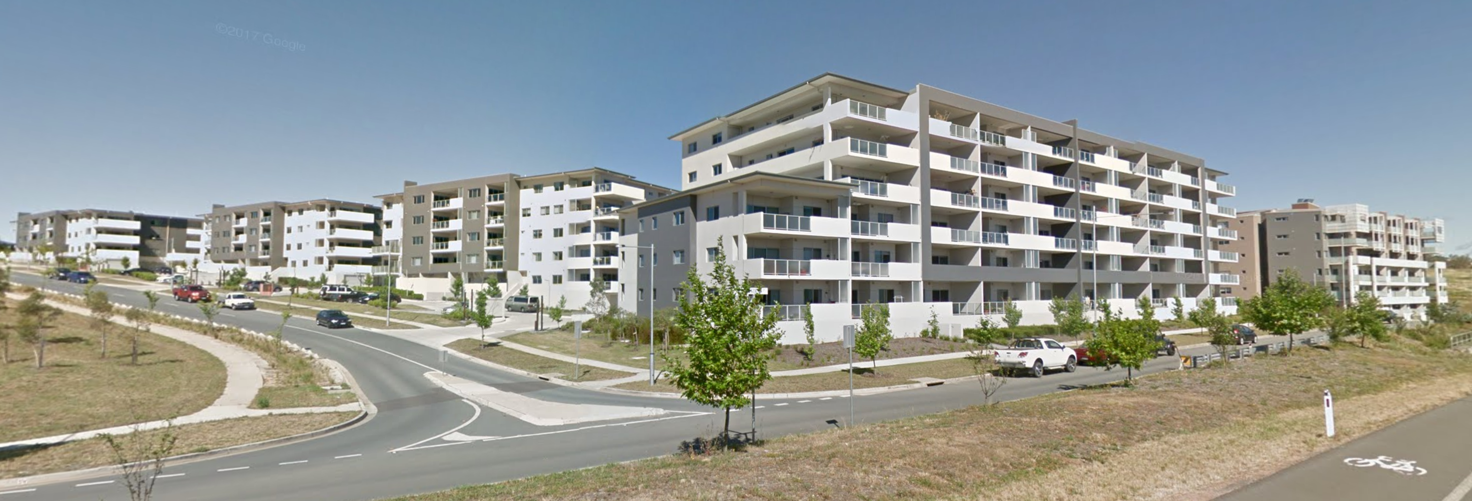
(pic from Google Streetview, dated December 2016)
The densest SA1 in Sydney’s growth areas was 101 persons/ha. Nothing like this was seen in other cities.
Canberra’s outer growth areas are actually, on average, denser than the rest of Canberra (on a population weighted density measure):

The same was also true by a slim margin in both Perth and Adelaide, but they have relatively “suburban” densities for both growth and established areas. The growth areas of Sydney and Melbourne are more dense than Perth and Adelaide, but not compared to the rest of these cities as a whole. That’s probably got to do a lot with the large cities having dense inner suburbs.
So perhaps it is better to compare the urban growth areas with established areas a similar distance from city centres, which the following chart does (I’ve filtered out 5 km distance intervals without growth areas of at least 2000 population, and apologies for rather squashed Canberra label):

Technical note: for South East Queensland I’ve measured distances from the Brisbane CBD.
Outer growth areas were much more dense than the rest of each city at most distances from the city centre, except in Sydney.
One issue with the above chart is that different distance intervals have different populations – for example only 2,815 people were in growth SA1s at a distance of 45-50 km from the Perth CBD (just above my threshold of 2000), so the low population density of that interval is not hugely significant.
To get around that issue, I’ve calculated the overall population weighted density of non-growth SA1s that are within these 5 km distance intervals from the CBD (including all of SEQ beyond 15 km from the CBD). The following chart compares those calculations with the population weighted density of the growth areas overall:

This shows that urban growth areas are on average more dense than other parts of the city at similar distance from the CBD, except in South East Queensland. And remember, many of the growth SA1s will be partially built out, so their expected density is understated.
Are outer urban growth areas near rapid public transport?
The next chart shows the proportion of growth SA1 population by distance from the nearest train or busway station:
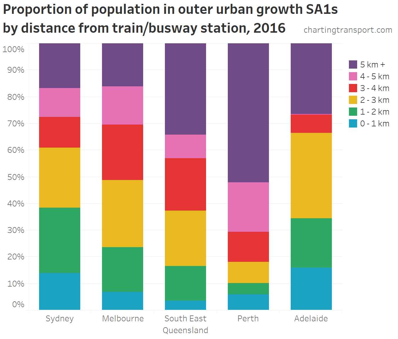
Technical notes: Distances are measured from the centroid of each SA1 to a point location defined for each station (sourced from August 2016 GTFS feeds). For oversized SA1s these distances might be a little longer than reality for the average resident. I haven’t excluded oversized SA1s because I want to see the population alignment of growth areas overall. Canberra excluded due to lack of separated rapid transit.
What sticks out clearly is that just over half the of the population in Perth’s outer growth areas was more than 5 km from a station in 2016. That is to say Perth has had the least alignment of outer urban growth areas and rapid public transport networks of all five cities. I’m not sure many urban planners would recommend such a strategy.
However, Perth’s MetroNet program appears to be trying to rectify this with new lines and stations proposed near urban growth areas such as Yanchep, Canning Vale East, Ellenbrook, Byford, and Karnup (Golden Bay). It will however take some time to get to them all built and open.
South East Queensland was second to Perth in terms of urban growth remote from stations, with a lot of the growth scattered rather than concentrated around rail corridors. I haven’t included the Gold Coast light rail in my proximity calculation – it runs at an average speed of 27 km/h (which is slower than most train networks) and doesn’t serve outer urban growth areas.
Sydney and Adelaide had the highest proximity of growth areas to stations.
Around half of Melbourne’s growth SA1s that were more than 5km from a train station were in Mernda and Doreen, a corridor in which a rail extension opened in 2018. Many of the rest are not in the current designated growth corridors, or are where future train stations are planned. Melbourne’s current designated urban growth corridors are fairly well aligned to its train network. From a transport perspective this is arguably a better kind of sprawl than what Perth has been experiencing.
Adelaide’s outer growth areas more than 5 km from a station were in Mount Barker (satellite town to the east) and Aldinga (on the far south coast of Adelaide).
Are the outer urban growth areas better aligned to rapid public transport stations than non-growth areas at the same distance from city centres? Here’s the chart as above but with an extra column for non-growth areas within the same distance intervals from the CBD (as before).
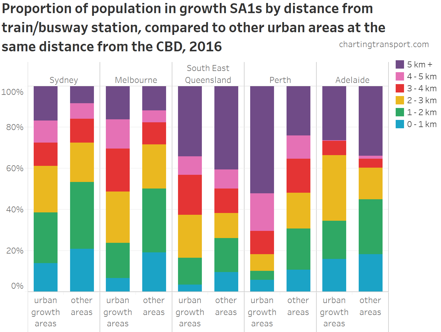
The populations of urban growth areas are less likely to be within a couple of kilometres of a station (most of that land probably has long-established urban development), but curiously in Adelaide and South East Queensland the urban growth areas are more likely to be within 5 kilometres of a station than the non-growth areas, suggesting better rapid public transport alignment than older urban growth areas. Older urban areas in other cities are more closely aligned to stations, particularly in Perth.
As an interesting aside, here’s a breakdown over the last three censuses of population by distance from train/busway stations (operational in 2016 – so it overstates 2006 and 2011 slightly):

You can really see how Perth has had much population growth remote from its rapid public transport network, which probably goes some way to explaining the overall 1.2% journey to work mode shift towards private transport between 2011 and 2016.
So how did people in these outer growth areas get to work?
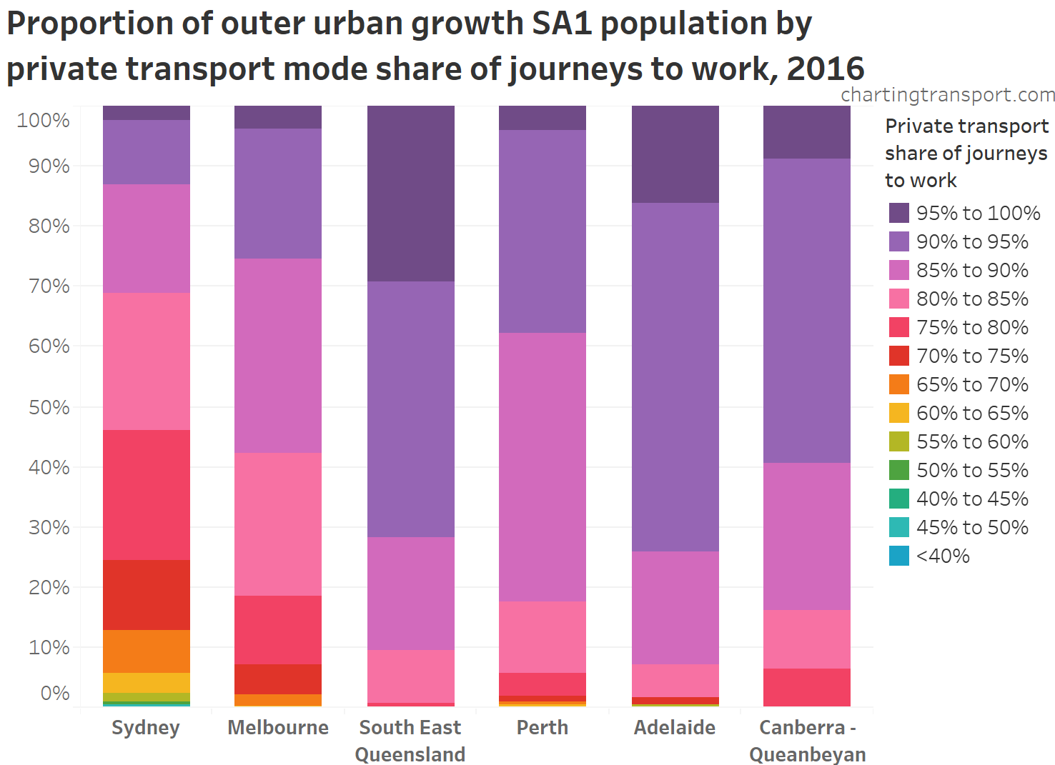
Technical note: The figures here for “private transport” are for journeys involving only private transport modes – i.e. they exclude journeys involving both private and public transport (eg car+train).
While private transport (mostly car driver only journeys) dominated journeys to work from almost all growth areas, Melbourne and Sydney were the only cities to see significant numbers of residents in outer growth areas with private transport mode shares below 80%.
South East Queensland’s outer urban growth areas were the most reliant on private transport to get to work, with an overall private transport mode share of 93%, followed by Adelaide on 92%, Canberra on 91%, Perth on 90%, Melbourne on 86%, and Sydney on 81%.
Here’s how the growth area mode shares compare to other areas a similar distance from city centres (note: the Y-axis is not zero-based):

Significantly, the growth areas of Sydney and Melbourne had lower private transport mode shares of journeys to work than other parts of the city a similar distance out – even though they are generally further away from train or busway stations (as we saw above)! That’s not to say they didn’t drive themselves to a train station to get to work.
Similar to population density, here is a summary of growth areas compared to other areas in the same distance interval from the CBD:
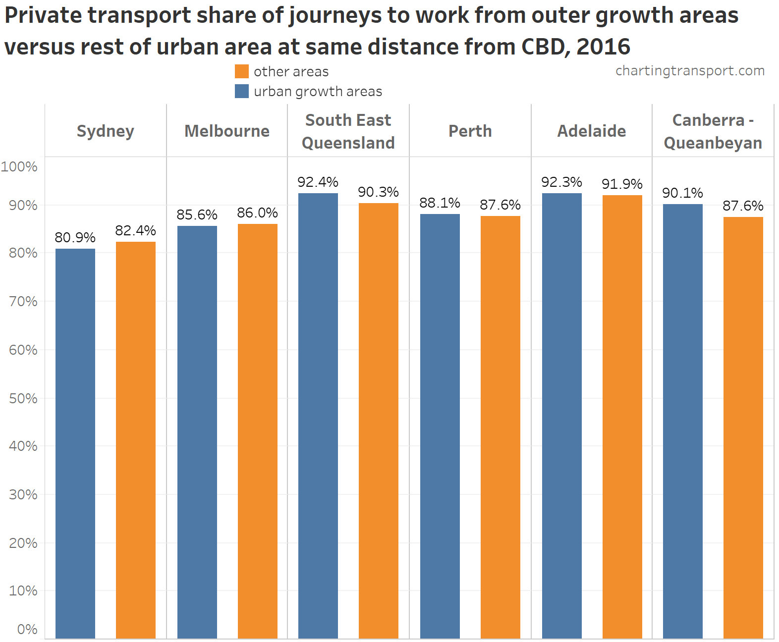
There’s really not a huge amount of difference within cities. Sydney’s growth areas had a mode share 1.5% lower than non-growth areas, while Canberra’s growth areas had a mode share 2.5% higher.
What are motor vehicle ownership rates like in the outer growth areas?
My preferred measure is household motor vehicles per persons aged 18-84 (roughly people of driving age).
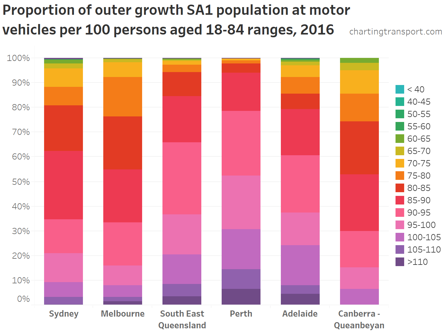
Motor vehicle ownership rates are generally very high across the growth areas – with the notable exceptions of Melbourne and Canberra where around a quarter of the growth area population had a motor vehicle ownership rate of less than 80 (although that is still pretty high!). (I explored this in more detail in an earlier post on Melbourne)
South East Queensland, Perth, and Adelaide outer urban growth areas had the highest motor vehicle ownership rates. Perth’s urban growth areas overall averaged 96.7 motor vehicles per persons aged 18-84 – pretty close to saturation.
How does motor vehicle ownership compare to established areas a similar distance from the city centre? The following chart compares motor vehicle ownership between urban growth and other areas at the same distance from the CBD (note: the Y-axis is not zero-based):

Motor vehicle ownership tends to increase with distance from the CBD, and in Sydney and South East Queensland the growth areas have higher ownership compared to non-growth areas. But the opposite is true in Melbourne, Perth and Canberra.
The population at each distance interval varies considerably, so here is a summary of the data across all distance intervals that have growth SA1s for each city:
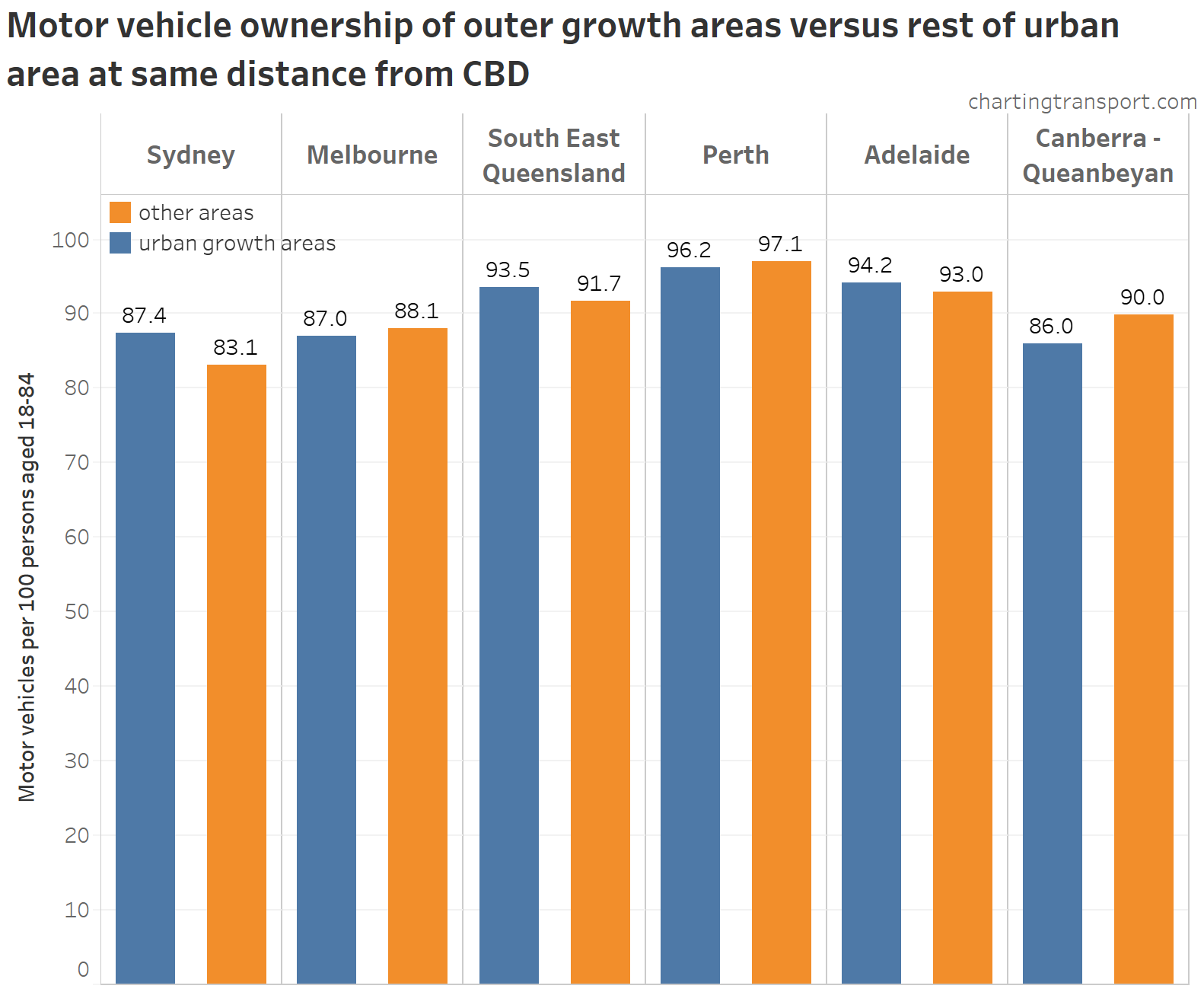
The growth areas of Melbourne, Perth and Canberra had slightly lower motor vehicle ownership than other areas a similar distance from the city, while the opposite was true in other cities. That said, motor vehicle ownership rates are very high across all cities.
Finally, I’ll look at the relationships between these measures for growth areas (see another post for analysis for whole cities).
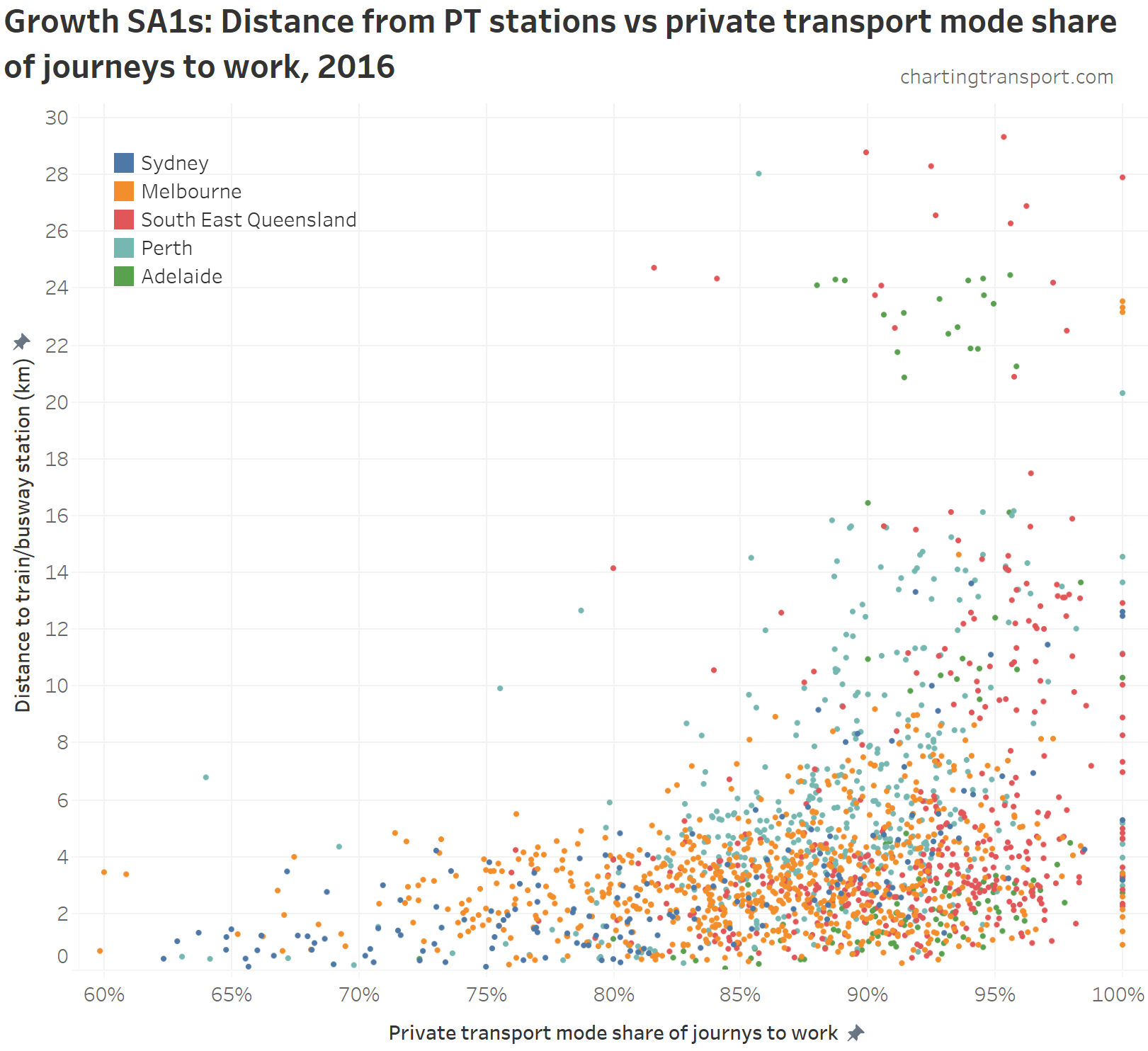
How does motor vehicle ownership relate to distance from stations?

Technical note: for scatter plots I’ve filtered out SA1s with less than 50 population as they are more likely to have outlier results (one person can change a measure by 2% or more).
Lower rates of motor vehicle ownership are generally only found close to train/busway stations (and are dominated by Melbourne examples), but close proximity to a station does not guarantee lower rates of motor vehicle ownership. Quite a few Adelaide SA1s are found the top middle part of the chart – these are all in Mount Barker which has frequent peak period express buses to the Adelaide CBD operating along the South East Freeway – which is similar to rapid transit although without a dedicated right of way.
How do journey to work mode shares relate to distance from stations?
Here’s a scatter plot of private transport mode shares of journeys to work and distance from train/busway station:
This shows that lower private transport mode shares are only generally seen within proximity of train or busway stations, and areas remote from stations are very likely to have high private transport mode shares. But also that proximity to a station does not guarantee lower private transport mode shares of journeys to work (particularly in SEQ).
Technical aside: You might have noticed that almost no SA1s report 99% private mode share. How can that be? The ABS make random adjustments to small figures to avoid identification of individuals which means you never see counts of 1 and 2 in their data. To get a mode share of 99% you’d need at least 300 journeys to work with “3” being non-private (or a similar but larger ratio). Very few SA1s have 300+ journeys to work, and even for over-sized SA1s, they are very unlikely to have only 3 or 4 non-private journeys to work. A mode share of 100% is much easier because you can get that no matter the total number of journeys.
How does population density relate to distances from train/busway stations?

Densities above 45 persons/ha were mostly only found within 5 km of stations, and almost entirely in Sydney and Melbourne. The highest densities were very close to train stations in Sydney. In the middle area of the chart you can see quite a few Perth SA1s that are around 30-40 persons/ha but remote from stations. These are all in the Ellenbrook area of Perth’s north-east, generating a lot of car traffic.
How does motor vehicle ownership relate to private transport mode shares of journeys work to work?
For interest, here is the relationship as a scatter plot:
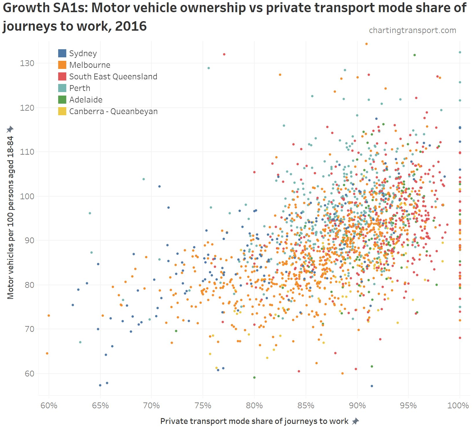
There is certainly a relationship, but it’s not strong (r-squared = 0.22). Other factors are at play.
Conclusions
- Perth and Canberra are seeing most of their population growth on the fringe, with Sydney, Adelaide, Melbourne, and South East Queensland seeing most of their population growth in established areas.
- Growth areas in Sydney, Melbourne, and Canberra have higher than traditional urban densities, indeed Sydney and Canberra have a few very high density greenfield developments. Perth, Adelaide, and particularly South East Queensland have urban growth at relatively low densities. In fact, SEQ is the only major urban centre where growth areas are measured as less dense than non-growth areas at similar distances from the CBD.
- Perth’s urban growth areas are largely remote from rapid transit stations, and this is likely contributing directly to very high and increasing rates of motor vehicle ownership and private transport mode shares. Melbourne’s current urban growth corridors are closely aligned to train stations (thanks to the opening of the Mernda line), and this is also largely true of Sydney and Adelaide.
- Almost all outer urban growth areas had high rates of motor vehicle ownership. Overall, Melbourne, Perth, and Canberra’s outer urban growth areas had slightly lower rates of motor vehicle ownership compared to other areas at the same distance from the CBD. Only Sydney, Melbourne and Canberra have some growth areas with lower motor vehicle ownership and/or lower private transport mode shares of journeys to work – and these were all close to train or busway stations.
I hope you’ve found this at least half as interesting as I have.
For a similar and more detailed analysis around these topics, see this excellent 2013 BITRE research report on changes between 2001 and 2006.


Hi Chris,
Thank you for sharing a great analysis of ABS data, I enjoyed reading the post. I’m happy to take the opportunity to get in touch about ASGS SA1 design. As you point out there were some high population SA1s in the 2016 edition of the ASGS. There are a number of reasons why that was the case.
Every five years the ABS updates the ASGS. Primarily this is to identify, and better represent areas of population growth. Each ASGS is a snapshot in time and is not able to always capture areas undergoing change. There is often a time lag in obtaining the required information to identify and accurately bound these new areas – though this has improved considerably recently. There is also a further timing issue, where we have to complete the ASGS boundaries in time for inclusion into the Census collection process. So SA1 boundaries are finalised before we have the most accurate population counts.
As you are aware, we aim to design our SA1 boundaries to contain a range of between 200-800 people. In addition to this we have further design criteria that we also need to take into account when creating these regions. These other design considerations include keeping like areas and/or populations together, examples include high-rise buildings; retirement villages or gated communities; defence establishments; resorts and caravan parks.
All of these factors can result in SA1s exceeding their optimum population range, but we do try to limit these occurrences.
We will be reviewing our SA1 boundary design in the near future, and have specifically flagged the existing high population SA1 for review in this process.
We will also be asking for feedback on the ASGS in the coming months, in preparation for the 2021 edition. Please keep an eye out on the ABS website for this as we would welcome any comments that you or your readers have.
Regards
Martin Brady
Director – Geospatial Solutions
Australian Bureau of Statistics
LikeLike