[Last updated 25 July 2020, not all charts]
For the most recently analysis of road traffic volumes – see my twitter feed.
Roads in Victoria were noticeably quieter during the depth of the pandemic shutdown, but just how much did traffic reduced? Has it varied by day of the week, time of day, and/or distance from the city centre? How have volumes increased as restrictions have been eased? What has been the impact naming identifying hot spots and postcode lock downs?
To answer these questions I’ve downloaded traffic signal loop vehicle count data from data.vic.gov.au. The data includes vehicle detection loops at 3,760 signalised intersections across Victoria (87% of which are in Greater Melbourne).
I should state that it is not a perfect measure of traffic volume:
- It may under-count motorway-based and rural travel which may cross fewer loop detectors.
- There are occasional faults with loops, and I’m only able to filter out some of the faulty data (supplied with negative count values), so there is a little noise but I will attempt to wash that out by using median counts rather than sums or averages (although charts of averages show very similar patterns to charts of medians).
- Some vehicles moving through an intersection might get counted at multiple loops, but I would hope this has minimal impact on overall traffic volume trends.
How have traffic volumes reduced during the pandemic?
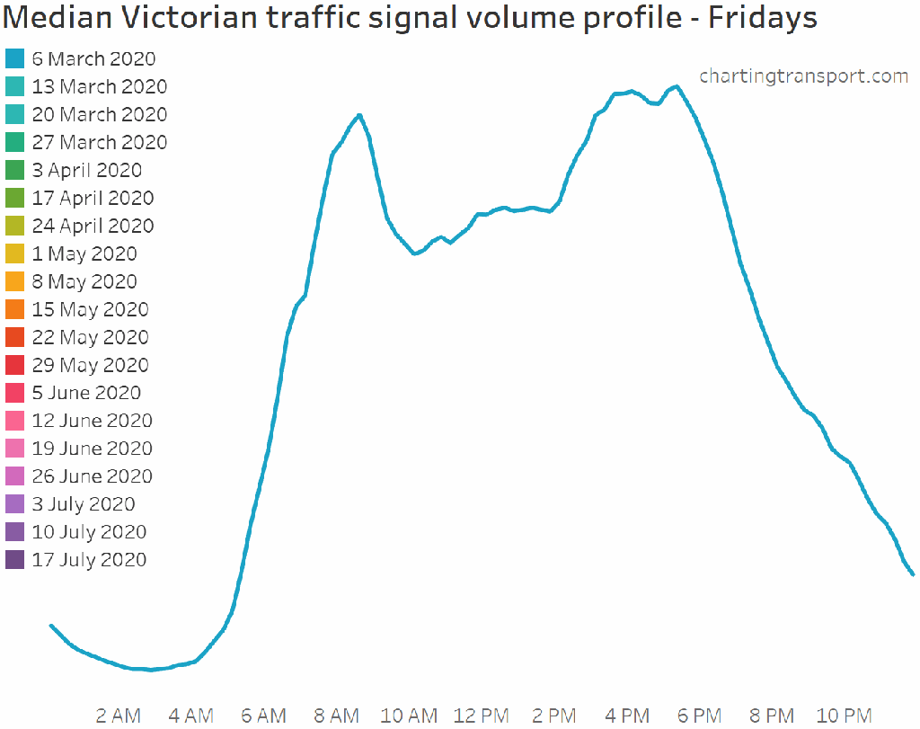
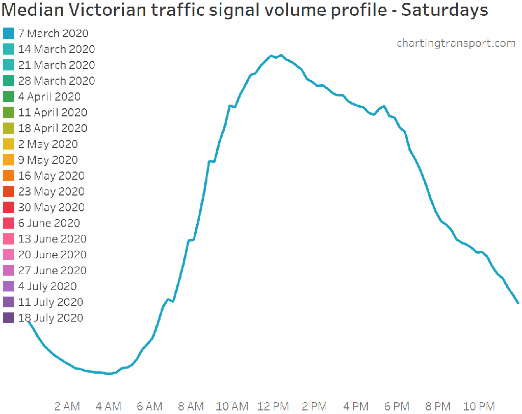
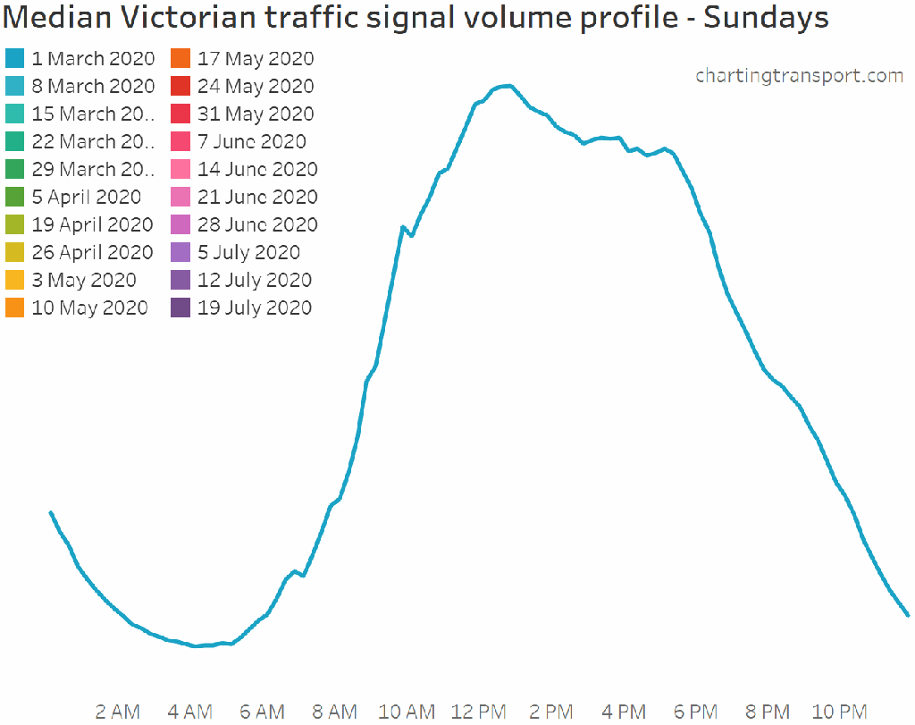
Firstly, median 24-hour loop volumes for each day:
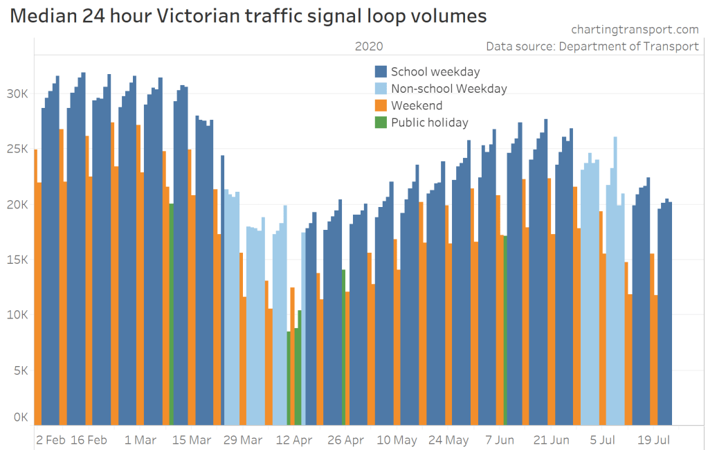
Note: the actual numbers aren’t very meaningful, it is the relative numbers that matter.
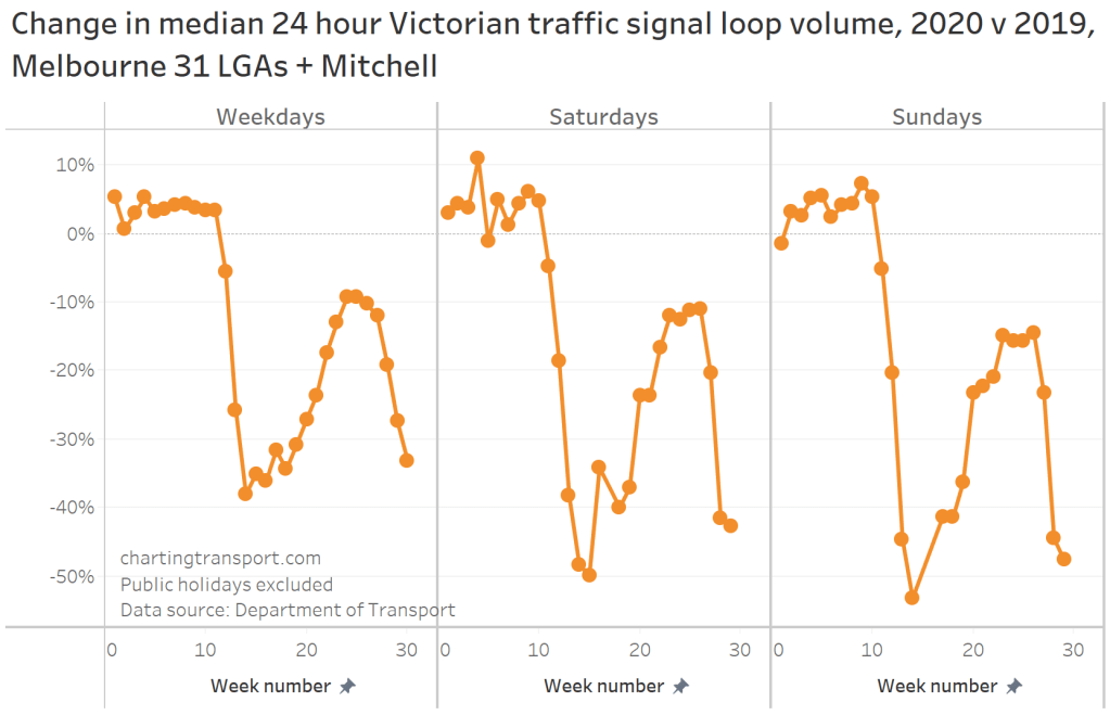
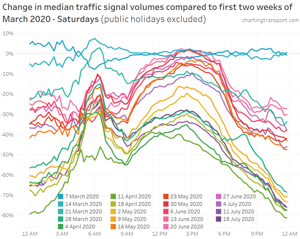
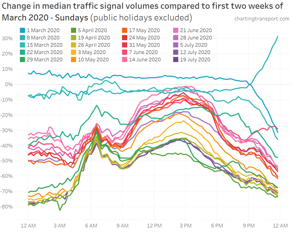
There are regular variances by day type (eg Fridays generally having the most traffic), so here is a chart looking changes by day of the week, relative to the first two weeks of March 2020. I’ve annotated various significant announcements and changes in rules.
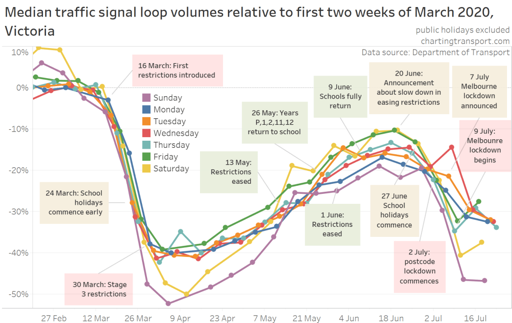
At their lowest, weekday volumes went down around 40%, while weekend volumes went down more like 50%.
In late-June volumes were down only 10-20%, with significant growth on Saturdays. However volumes declined again as a second wave of infections hit, and more restrictions were reintroduced. The key turning point was Saturday 20 June when the first warnings were raised about outbreaks, increasing cases, and a slow down in easing of restrictions.
In the early part of the second lock down, volumes were similar to April, the bottom of the first lock down, but then they settled at higher levels (more on that shortly).
Some curious outliers:
- Thursday 9 April – the day before Good Friday: there may have been some travel to holiday homes, and/or other travel that happens normally on the last workday of the week.
- Wednesday 8 July – the day before Melbourne and Mitchell Shire re-entered stage 3 restrictions (lock down), suggesting many people brought forward travel activity that was about to no longer be allowed.
- Saturday 16 May & Sunday 17 May: there was a surge in traffic volumes on the first weekend after restrictions where eased.
Have traffic trends been different in different parts of the state?
There have been many more COVID-19 cases in Melbourne than regional Victoria. Here’s a chart showing daily volume changes in Greater Melbourne:
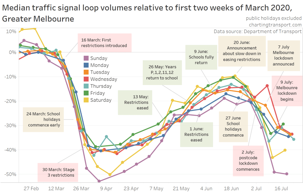
There is very little difference compared to the whole of Victoria chart, as most signals are located within Greater Melbourne.
Here is a chart of only signals outside Greater Melbourne, showing much less decline in late June / early July.
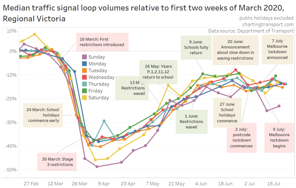
A notable exception here is Sundays where there has been a decline in July – perhaps Sundays normally involve a lot of travel to/from Melbourne.
How has traffic changed during the second wave?
From late June, there were increasing warnings about outbreaks in LGAs, suburbs, specific postcodes entered lock down before all of Melbourne plus the Shire of Mitchell also went into lock down. This section looks at the impact of some of the responses to what has become a second wave.
On 25 June, 10 suburbs were announced as outbreak concerns, with door-to-door testing campaigns to be conducted. These suburbs were within 6 LGAs identified on 20 June, so this may have refined people’s concern.
It is possible to filter to signal sites in the listed hot spot suburbs, although there are only around 100 signalised such sites (and none at all fall into the small suburb of Albanvale) which makes for some noisy data. Also, I would dare say that a lot of traffic in these suburbs is through traffic rather than local traffic.
To overcome daily noise, I’ve calculated the rolling 7 day average volume – excluding public holidays with with some normalisation (see below chart explanation). That does mean that sudden daily changes in traffic are smoothed out over the following 7 days.
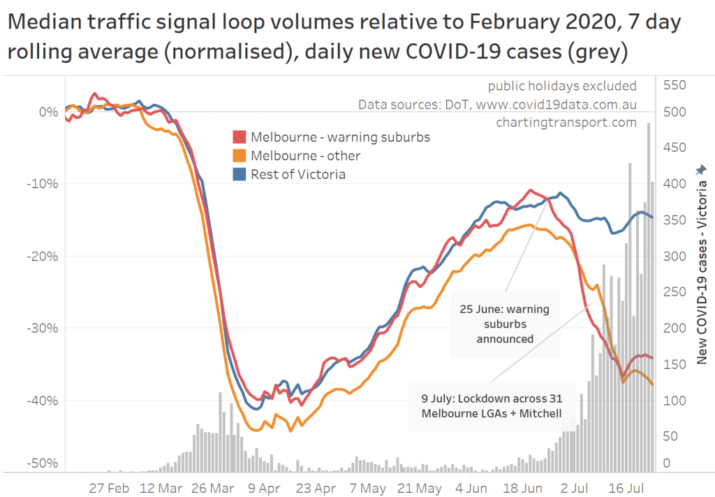
Boring but necessary technical notes: Many traffic signals are on roads that are LGA boundaries – and which LGA an intersection falls into is almost random – it depends on the coordinates of the intersection point. To normalise volumes, I have calculated the ratio of the average volume for each day of the week in February to the overall February average, and then adjusted daily volumes using these ratios to produce a relatively smooth daily time series. The rolling 7 day average then omits any public holidays. It’s not perfect, as you can see around Easter, but it was necessary to avoid having large gaps or blips in the above chart. For this analysis I used February as the baseline, as there was a public holiday in the first two weeks of March, complicating the normalisation.
Volumes immediately dropped more quickly in these suburbs compared to the rest of Melbourne, although they later settled at higher levels than the rest of Melbourne.
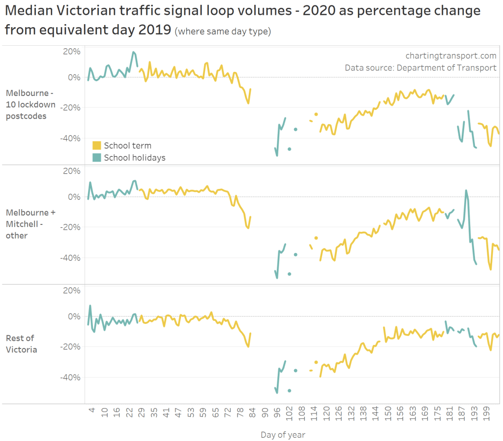
On 30 June there was an announcement that 10 postcodes would return to “lock down” (only four essential travel purposes allowed) from 2 July. Those postcodes mostly – but not entirely – lined up with the 10 warning suburbs. Here’s a similar chart that separates out those postcodes, from the rest of Melbourne (plus Mitchell Shire) that went into lock down on 9 July:
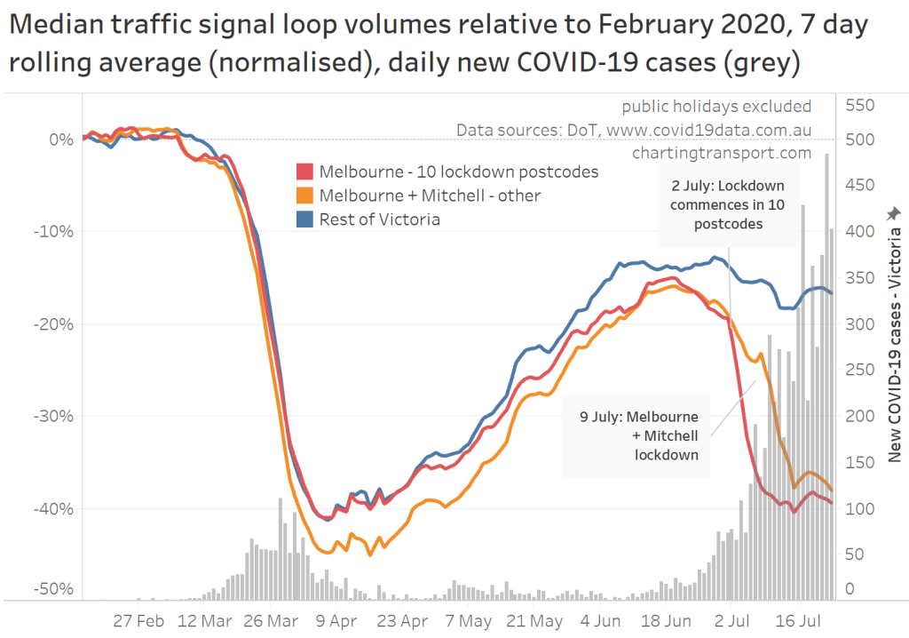
There was a step change from 2 July as the restrictions took hold (on top of a reduction from the school holidays), and the rest of Melbourne followed after 9 July.
During the first lock down, these 10 postcodes saw a slightly smaller traffic reduction compared to the rest of Melbourne, but in the second lock down other parts of Melbourne have not seen the same traffic reductions.
The 7 day averaging process hides a little of the behaviour change, so here is a daily volume chart for those 10 postcodes:
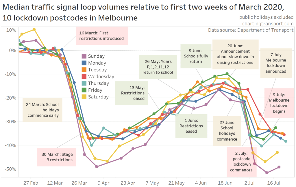
While volumes in these postcodes started declining from the first warning announcement on 20 June, if you look carefully you’ll see that on Wednesday 1 July there was little change in volume compared to the previous Wednesday. This was the last day before the lock down, and presumably some people made some extra travel that was about to become against the rules. Once the lock down had commenced, volumes were very similar to those experienced during the “stage 3” restrictions of early April. This is similar to the surge in traffic seen in Melbourne the day before the second lock down.
A more detailed look at Melbourne
The following animated map shows the change in weekday volume relative to the first two weeks of March, for each site, each week since the beginning of March. Note that there are anomalous sites for various reasons (eg faults, roadworks) – I’ve tried to filter out some sites with unusual data, but it’s difficult to get all of them.
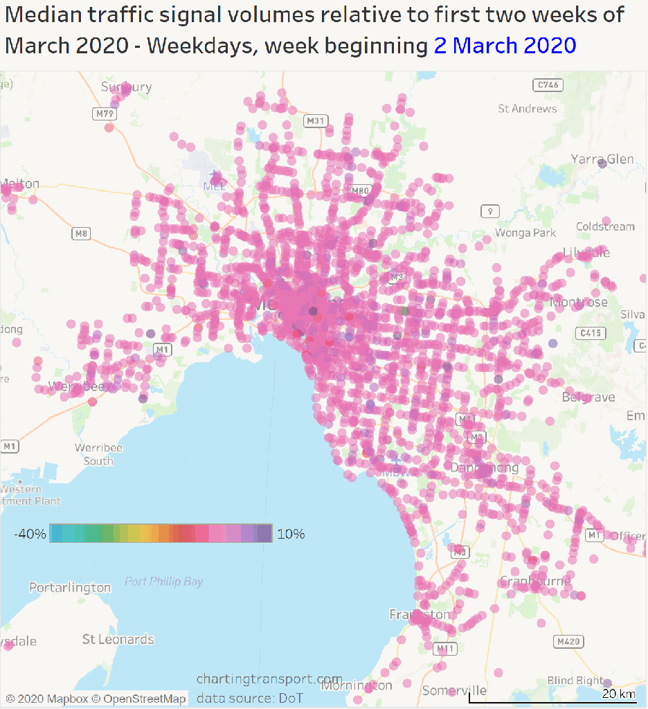
If you ignore individual sites that look like outliers you can see some clear patterns:
- Volumes haven’t reduced as much in industrial areas during lock downs, as freight and logistics largely keep operating, and factory workers continued to go to work.
- Volumes didn’t recover in the central city as they have in the suburbs, which makes sense with so many office workers have continued to work from home.
- Melbourne Airport volumes have been significantly below normal throughout, obviously due to national and international travel restrictions.
- Volumes were slower to recover in the Clayton area – probably related to working from home, and Monash University not having on-campus teaching.
- Volumes reduced from the week of 29 June, a mix of the school holiday impact, an increase in travel restrictions, and probably general fear about a second wave of infections.
I must apologise to the those with colour-blindness, it’s much more difficult to show the changes with only two-three colours.
This map doesn’t however explain the slightly smaller traffic reduction in Melbourne outside the initial 10 lock down postcodes.
The following map compares traffic volumes on Wednesday 22 July with those in the first two weeks of April (I’ve chosen a Wednesday to be clear of the Easter long weekend that happened in the second week of April). Note that the flip between orange and blue occurs at 110% (you might intuitively expect it to be at 100%).
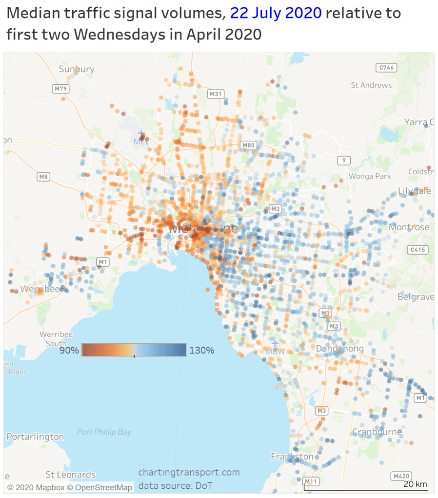
This map pretty clearly shows that second lock down volumes were higher in the eastern and south-western suburbs, but much closer to April in the north-eastern suburbs. There have been fewer COVID-19 cases in the south-eastern suburbs, and this might reflect people’s self-regulation based on perceived local risk.
Indeed, here is a chart comparing active cases as at 19 July to traffic on 20 July relative to the first lock down:
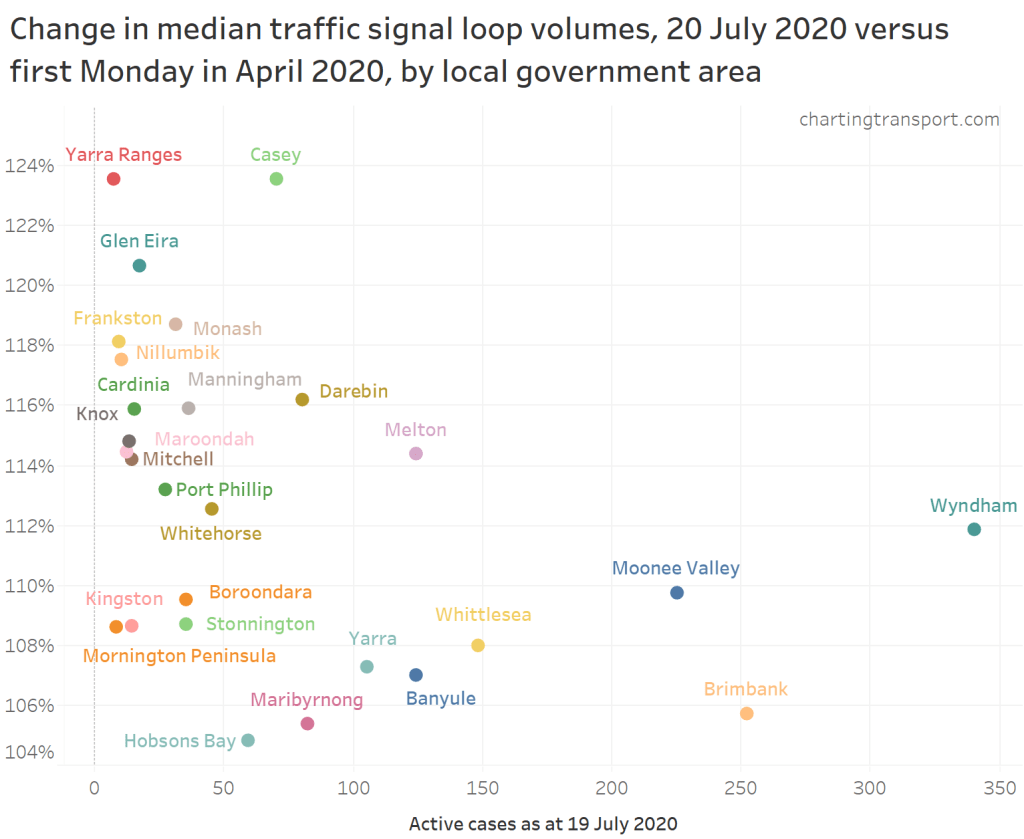
Local government areas (LGAs) with higher numbers of active cases tend to have traffic levels closer to those in early April, while LGAs with fewer cases have seen higher traffic volumes in April. I might try to explore this relationship over time in future.
How does 2020 compare to 2019?
The above analysis hasn’t differentiated school days and school holidays, and any general seasonality across the year. Here is a chart comparing 2020 with 2019 for weekdays, Saturdays and Sundays (excluding public holidays):
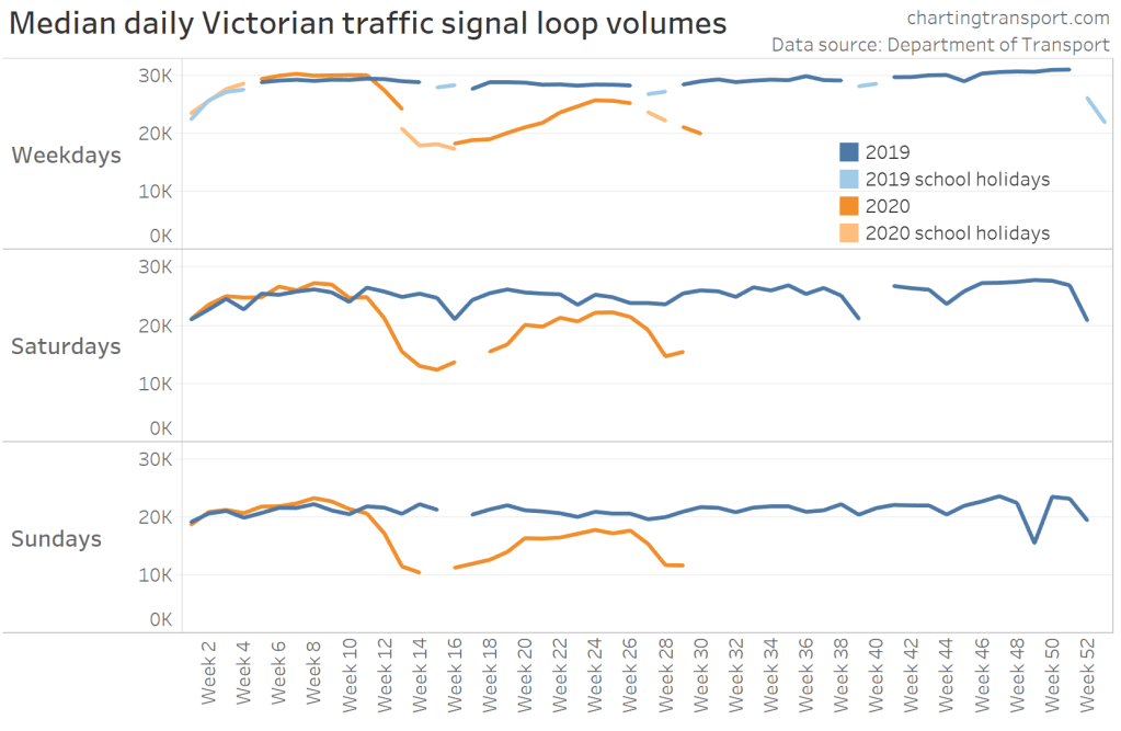
I will emphasise that there will be week-to-week variations, particularly on weekends, due to short term factors such as weather and special events. Also, while school returned in week 16 of 2020, most students were not attending schools in person (ditto week 29).
The winter school holidays began in week 27, and traffic volumes in 2020 appeared to drop in proportion to the traffic reduction in the same week in 2019.
The following chart compares 2020 to 2019 on a daily basis (with 2019 days offset by -1 to align days of the week):
We can also look at the percentage difference between the years, but only for days that have the same day type in terms of school term or holidays, and public holidays where they fall on the equivalent day of the year. So there are some gaps in the following chart, plus some noise due to daily fluctuations:
This chart shows January to late July. There are gaps around the autumn school holidays and Easter as they didn’t perfect match days of the year perfectly.
You need to not get too excited about daily variations (the Tuesday in the second week of 2019 school holidays had unusually low volume in Melbourne for some reason, which shows up as a spike for 2020).
This chart gives a feel for variations from expected patterns. Traffic in the Melbourne was down a similar percentage in the first week of the winter school holidays compared to the previous week of school.
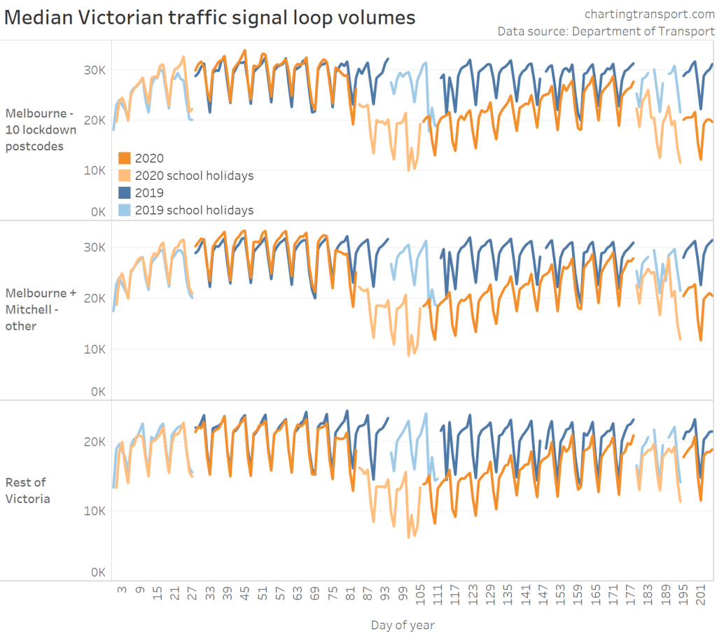
Melbourne traffic volumes began falling in the second week of winter school holidays with the rise in cases and commencement of some postcode lock downs, and then fell further with the Melbourne + Mitchell lock down from 9 July.
However in regional Victoria volumes were relatively higher in the winter school holidays – perhaps as Melbourne people were more likely to travel intrastate for holidays (interstate travel being heavily restricted, and travel not having been an option in the previous autumn school holidays). Regional Victoria travel volumes have been tracking around 10% below 2019 since early June.
The next chart compares each 2020 week with the same week 2019 for Melbourne LGAs plus Mitchell. However it is important to note that there was quite a bit of week to week variation in 2019, and the autumn school holidays started a couple of weeks earlier in 2020.
On this measure, weekdays bottomed out around 38% below 2019, but recovered to be ~10% down in week 24 (on weekdays and Saturdays). Weekends were down around 50%, but recovered to around 10-15% down before the second wave. However pre-pandemic volumes were around 5% higher than 2019, so you could perhaps add another 5% to the reduction figures.
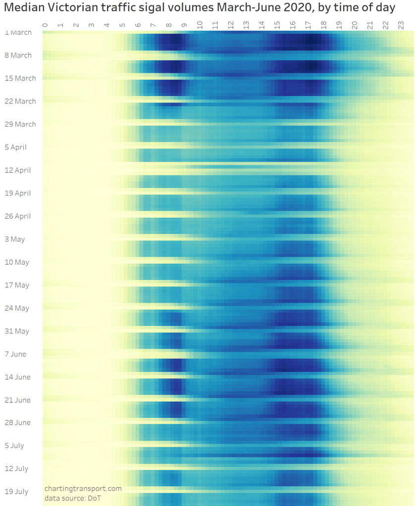
How has traffic reduced by time of day?
The traffic signal data is available in 15 minute intervals, so it is possible to examine patterns in more detail.
Here’s a look at the traffic volumes by time of day for Wednesdays:
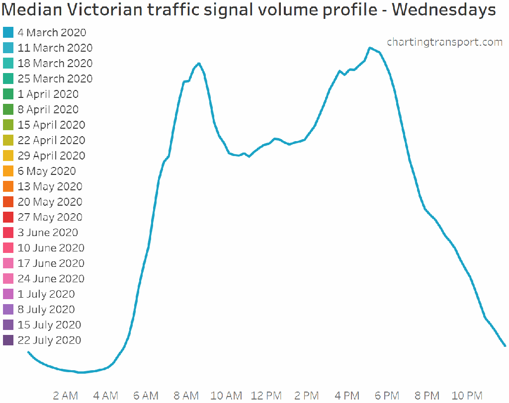
You can see a significant flattening of the traditional peaks from late March, although curiously the PM peak still commences around 3 pm, even during the school holidays. From late May there was a significant jump in peak period traffic, coinciding with the return to school of grades Prep, 1, 2, 11 and 12.
1 July was the first week of the winter school holidays and you can see substantial traffic reductions at school times, most notably in the AM peak. Meanwhile the PM commuter peak (around 5 pm) was very similar to late June.
There was a spike in traffic on 8 July – the last day before the second Melbourne full lock down.
Evening traffic was down considerably but it’s a little hard to gauge this reduction the chart. So here is a chart showing traffic volume changes relative to the first two weeks of March (with apologies to anyone with colour-blindness):
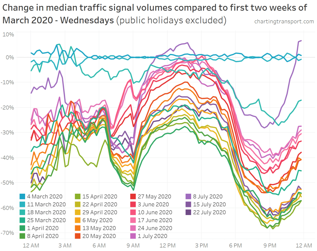
Volumes went down the most in the evenings (particularly around 9 pm) which might reflect the closure of hospitality venues, cessation of sports and reduced social activity. The AM and PM peak periods were down around 50% at the bottom, while the inter-peak period has held up the most – being only down around 30%.
Volumes recovered considerably over May and June, with volumes around 3pm back near pre-COVID levels (prior to the winter school holidays). The AM peak is interesting – at 7am, traffic on 17 June was still down around 28%, but at 8:45am is was only around 9% down – possibly reflecting the school peak, and/or a narrowing of the commuter peak (as lower congestion provides less incentive for peak spreading). As at mid-June, evening traffic was still down around 40%.
Again 8 July is an outlier – evening traffic was a lot busier, in fact traffic leading up to midnight was busier than early March, suggesting people cramming in travel activity that was about to become restricted.
I should point out that this analysis compares to a baseline of a two days in early March, and there may be some associated noise (eg weather or event impacts on particular days).
Here is the same for Fridays (excluding the Good Friday public holiday):
Late evening traffic was down even more than for Wednesdays, which probably reflects higher volumes of hospitality-related travel on Friday nights. Friday evening traffic jumped on 15 May when small social gatherings were allowed, and again on 5 June when restaurants and cafes were allowed to have dine-in patrons.
Here is Saturdays (excluding Anzac Day):
The Saturday profile shape hasn’t changed as much as weekdays, but the evenings were down most significantly.
Curiously there are several spikes in the curve in the morning – and they are the 15 minute intervals leading up to the hours of 7am, 8am, 9am, and 10am. Initially I wondered if it was a data quality issue, but I suspect it reflects a surge in travel just before work shifts and other activities that start on the hour.
For some reason traffic volumes were relatively low around 6 am on Saturday 7 March, which has resulted in other days showing less reduction.
Saturday night travel was down considerably – by over 70% by midnight at the depths of the shutdown, but jumped with restrictions easing, similar to Friday evenings. As of mid-June it was down around 25-30%.
You can also see early Saturday morning (Friday night) travel down around 60-70% at worst (discounting 11 April which was the Saturday morning following Good Friday).
Here is Sundays:
Sunday 8 March was on the Labour Day long weekend (including the Moomba festival), which probably explains the much busier traffic that Sunday night (not being a “school night”). You can more clearly see that on the following chart:
Another anomaly here is Sunday 7 June – which was another public holiday eve.
Here’s the profile by day of the week for each week since February (public holidays excluded):
This data suggests a roughly a one hour lag on Sunday mornings compared to Saturday mornings – ie travel volumes hold up an hour later on Saturday nights and ramp up an hour later on Sunday mornings. This pattern holds up for other weeks. It also shows the middle of the day on Saturdays to mostly be busier than the same time on weekdays.
Here’s another look at relative time of day traffic volumes for March through to July:
If you look closely (no, your eyes are not losing focus!) you can see:
- Significant volume reductions after schools finished on 23 March
- A surge in traffic on 9 April – the Thursday before Good Friday
- Extremely quiet traffic on Good Friday (10 April)
- Higher traffic volumes on 8 July (the day before the second lock down), particularly into the evening.
- Generally higher traffic on the last weekday of the week, particularly in the afternoon and evening (including during the shut down period)
Have traffic impacts been different by distance from the CBD?
Here’s a chart showing year-on-year reduction in median traffic volumes at intersections by distance from the Melbourne CBD for weeks 14 and 15 (the lowest two weeks of the lock-down):
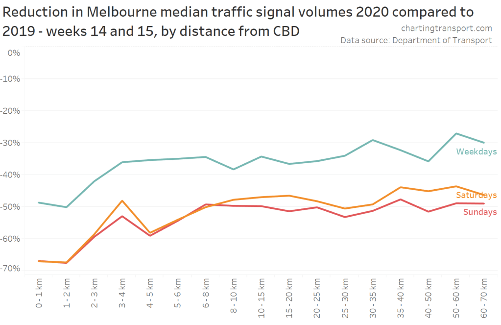
What is clear is that the central city experienced much larger traffic volume reductions than other parts of Melbourne, which makes sense as office workers stayed home, universities, cafes, restaurants and night-life closed, and (non-essential) retail activity slowed considerably.
There is some noise in the variations by distance from the CBD but I suggest not too much should be read into that as there will be various local factors at play.
The following animated chart shows median weekday volumes per week, by distance from the CBD, since the start of March 2020:
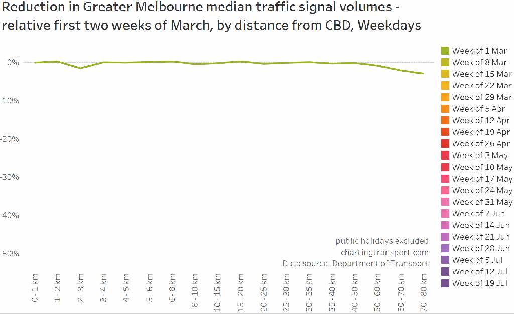
You can see the traffic decline has remained the largest in the central city. The reduction in traffic in the week of 28 June was mostly in the suburbs more than 3 km from the CBD.
Traffic signal data comes out daily, and so I will try to update this analysis at least once a week during the recovery period. There may be more frequent updates on Twitter.


Thanks Chris – its fascinating how around a 40% drop in traffic -ie 60% of the traffic is still there – leads to a sense of the roads being almost empty. Bike trips have been an absolute breeze
LikeLike
Below is a link to an alternative visualisation I made earlier (Moonee Valley City Council loops only). It covers 5am to 10:30pm (it’s a bit boring outside those hours, though it does show every night is now a “school night”). It runs from one week before “shutdown” to April 30. Easter is the quadruple green line near the middle. The persistent PM peak you see from week 3 spans 3:00-5:30pm.
(Ignore the unreadable numbers, just look at the colours. Apologies to any red-green colourblind people.)
This April was down 37.1% on last year’s April (the number and location of loops is not much changed over that period).
LikeLike
Ooh, nice calendar heatmap @DJR 🙂
LikeLike
Thanks Chris – I was hoping someone would tackle this question.
Now the question becomes, to what extent will people keep working from home when the restrictions are lifted? Surely there’ll be some smart people who decide they don’t enjoy driving in traffic and would like to work from home at least a couple of days a week. Or some smart companies that decide they can save on expensive office space by encouraging flexible working arrangements. That can only be good for the city!
LikeLike
Hi Chris, In a previous post you noted that there was a discernible difference in the decrease in traffic volumes for the CBD versus other areas. Just wondering is this still the case? Cheers
LikeLike
Great question! As of this week the answer is yes.

LikeLike
The traffic volume by time of day is intriguing. I thought it would go down a lot more between peak hours, but the data suggests otherwise. I’ve just produced similar data for selected locations in Melbourne’s west and am getting a similar shaped curve to you, ie with higher volumes in the afternoon. How do you explain the relatively high volumes over the course of the day, and higher peaks in the late afternoon? Higher levels of mobility? Higher levels of car ownership?
LikeLike
[…] was likely due to the significant decrease in motor vehicle traffic across Melbourne and Victoria throughout most of 2020 due to lockdown […]
LikeLike