[This post has been fully revised in December 2011, including removal of Brisbane periodical paper tickets, the introduction of smartcard ticketing to Canberra, and the addition of Newcastle, Auckland, Wellington and Christchurch]
With smartcard public transport ticketing coming to more cities, and the recent adoption of the MyZone fare system in Sydney, I thought it might be worthwhile to compare the current fare systems, assess them against “desirable” design criteria, and then look at the complexity of implementing each fare system in a smartcard ticketing solution.
The analysis offers some potential explanations as to why some cities are probably doing better than others with smartcards, and I’ve made some suggestions how fare systems might be tweaked in some cities.
This post has come out longer than I intended, so get yourself a cuppa and get comfortable.
Fare products in Australasian Cities
Firstly, what types of fare products are available in each city? This table is a rough summary of the main ticket types available, depending on the ticketing systems in each major city:
| City | System | single | return | all day | 10 trip | week | month/ 28 day |
quarter | year |
| Melbourne | Metcard | Yes | Yes | Yes | Yes | Yes | |||
| Myki | Yes | Yes** | Yes | Yes | Yes | ||||
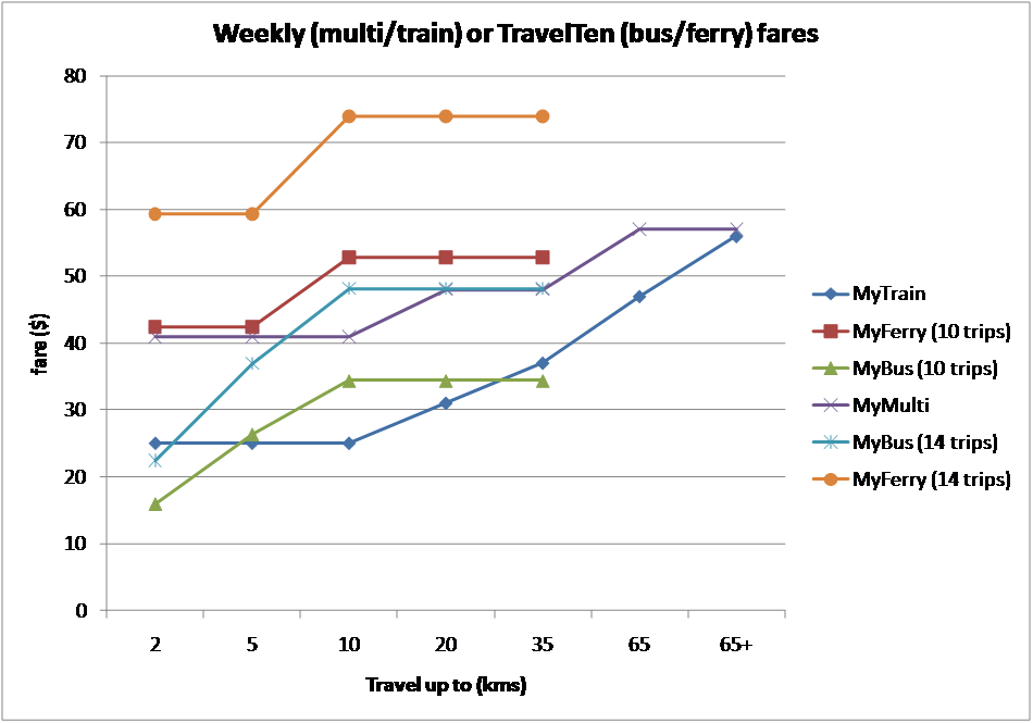
| Sydney | MyTrain | Yes | Yes* | (Yes) | Yes | (Yes) | Yes | Yes | |
| MyBus | Yes | Yes | |||||||
| MyFerry | Yes | Yes | |||||||
| MyMulti | (Yes) | Yes | Yes | Yes | |||||
| Perth | Paper | Yes | Yes* | ||||||
| SmartRider | Yes | ||||||||
| Adelaide | paper | Yes | Yes | Yes | |||||
| Brisbane | paper | Yes | |||||||
| go card | Yes | ||||||||
| Canberra | cash | Yes | Yes | ||||||
| MyWay | Yes | Yes** | Yes** | ||||||
| Hobart | Paper | Yes | Yes* | ||||||
| Greencard | Yes | Yes** | |||||||
| Newcastle | Bus | Yes | Yes | Yes | Yes | Yes | Yes | ||
| Auckland | Bus – paper | Yes | Yes# | Yes# | Yes# | Yes# | Yes# | ||
| Bus – HOP | Yes | ||||||||
| Train | Yes | Yes* | Yes | ||||||
| Wellington | Bus – paper | Yes | Yes#* | Yes# | |||||
| Bus – Snapper | Yes | Yes | |||||||
| Train | Yes | Yes* | Yes | Yes | |||||
| Train+bus | Yes#* | Yes# | |||||||
| Ferry | Yes | Yes# | Yes# | Yes# | |||||
| Christchurch | paper | Yes | |||||||
| metrocard | Yes | Yes** | Yes** |
Yes* = the product is not useable in peak periods and is only of value for certain numbers of trips/zones.
Yes** = a cap applies
(Yes) = available but no discount ahead of smaller tickets for peak travel.
Yes# = only available for some operators/services
A few things to note:
- All cities have bulk ticket products and/or smart card systems that in effect provide for bulk purchase discounts.
- At the time of writing Melbourne was in transition from metcard to myki, with both metcard and myki fare systems active.
- I’ve only really looked at products available to regular full fare passengers in the above (eg it does not include things like all day Seniors tickets).
- Translink in Brisbane has removed most paper ticket options other than single fares.
- I’ve not included Auckland ferries as different operators have different tickets, although most have 10-trip and monthly tickets (some have week and 40 trip tickets)
For the following analysis I have used fares current as at November 2011 for each system, and compared the costs of full fare travel of about 9-10 km. There may be some variations for different distances, so this analysis isn’t going to be perfect.
Why bulk purchase discounts?
Encouraging bulk purchasing has a couple of major benefits for transport authorities:
- Fewer ticketing machines and staffed ticketing windows are needed as fewer tickets are purchased for the same amount of travel.
- In the case of disposable paper tickets, fewer physical tickets are required.
- On buses, minimising ticket purchases from drivers can reduce a sometimes significant cause of delays, particularly as patronage increases.
Financial incentives for bulk purchase are often provided, but there is always a convenience incentive to buy fewer tickets (up to the limits of people’s available cash flow).
Bulk purchase discounts for the weekday peak commuter
I have taken the case of a straight forward weekday commuter, who makes a trip in the morning and afternoon peaks on weekdays only. Thus they don’t qualify for any off-peak discounts. Not all cities allow for free transfers on single and return tickets (see table further below), and I’ve assumed a transfer-less journey for the purposes of this analysis.
This first charts show the maximum discount possible given the purchasing frequency for people with this travel pattern. Because Sydney is so complicated I’ve put it on a separate chart.


A note on Sydney’s MyMulti: There is no “single” MyMulti ticket in Sydney. As a substitute I’ve used a 5km train trip ($3.20) followed by a 5 section bus trip ($3.30) = $6.50, which is relatively expensive compared to single mode 10km journeys. This is in line with the 10km base I am using as bus sections in Sydney seem to be roughly 1km apart, but you’ll see the implied bulk discounts are very high. Also, I have used MyMulti1 fares where they are better value for bus and ferry users.
The lines show whether more discounts are available when purchasing less frequently. The last point where the line increments is the maximum purchasing frequency that gives you the most discount.
Observations:
- Most smartcard systems have a discount price for single trips, but most don’t appear on the chart above because the price of a single trips is less than the minimum top-up amount of $5 or $10. Melbourne is the exception where the minimum top up amount is $1 – less than the price of almost any fare.
- Discounts kick in at the daily level for Adelaide and Canberra mostly because they have a daily or return ticket that is less than the price of two singles.
- Melbourne, Sydney and Newcastle are the only cities where discounts continue until a yearly purchasing frequency.
- Most cities have a 20-35% discount at a weekly purchasing interval. They outliers are:
- Canberra which has a very strong incentive for Smartcard based travel over cash fares
- Wellington trains that have a high value monthly ticket
- Most Auckland buses have a monthly ticket, however the zones available vary between operators. In the above chart, the “all zones” monthly pass for NZ Bus operators was used – $200, which is not better value for simple weekday commuters travelling 3 stages. Other operators have monthly tickets priced as low as $97. The complexity of the ticket offerings makes it difficult to accurate represent available discounts to Auckland bus travellers.
Oddities (skip these if you don’t care about the detail)
- Canberra :
- There is a higher discount for weekly travel because the additional 5% discount for auto-load means the price of two trips (on one day) is less than the minimum top up ($5).
- There is a monthly discount because travel is free after 36 trips.
- I’m not sure whether the $5 minimum top-up applies if topping up with BPay.
- Sydney:
- For 6+ section bus travel, a quarterly MyMulti1 is cheaper than using MyBus TravelTen tickets
- For <9km ferry travel, a weekly or longer MyMulti1 is cheaper than using MyFerry TravelTen tickets.
- Yearly train tickets offer no discount over quarterly train tickets
- Newcastle:
- The quarterly ticket (Orange TravelPass) is more expensive than travelling with weekly tickets if you are just making two trips per weekday.
- Wellington bus
- Wellington does have three monthly bus passes, with cheaper passes limited to fewer operators. Only the Go Wellington 30 day pass is of value to 5 day a week commuters, and this ticket is limited to one operator (GO Wellington, with a 36% saving over single cash fares). For the charts, the all-operator Platinum Pass ($210) has been used.
I’ll look at the discounts for lower purchase frequencies later in this post.
Bulk purchase discounts for the everyday traveller
Many systems have weekly or monthly caps, or offer discounts after a certain number of trips in a week or month. This provides an incentive for a regular weekday travellers to also travel on weekends. The discounts over single tickets can be quite high!


As you might expect, the discounts are greatest for those cities with periodical tickets. Those systems without periodical tickets (Perth, Hobart, Wellington bus, Adelaide and Brisbane) have the least discount for everyday travellers.
Bulk purchase incentives for the irregular traveller
All cities (except Sydney trains and multi-modal) have either a 10 trip ticket, or discounts over cash prices when using stored value on a smartcard:

Canberra and Brisbane offer strong incentives for people to use smartcards, while Adelaide provides a high discount for ten-trip travel (but has no higher value tickets such as periodicals). Bulk purchase discounts for irregular travel are lowest in Auckland (around 10%).
Why is Hobart Greencard and Melbourne myki money showing a 0% discount? For myki the minimum top up is $1, it is possible to pay for a single trip and get the same 21% discount over a metcard 2-hour (single) ticket that you get when you load value for 10 trips worth. There is no financial incentive for irregular travellers to top up less often than every trip. In Hobart, smartcard fares are the same as cash fares, but there is a 25% bonus value when topping up an amount of $20 or more (which equates to a 20% discount).
Sydney’s MyTrain and MyMulti do not offer 10 trip tickets. It would seem there might be much advantage in introducing these products (or a stored value smartcard equivalent) for irregular travellers to be rewarded and reduce congestion at ticket machines and windows.
Incentives for off-peak travel
From a policy perspective, there are benefits in getting peak period PT commuters to also use PT in off-peak periods (such as reducing emissions and off-peak traffic congestion). Usually there is ample spare capacity in off-peak times, so the costs of carrying extra people at these times are minimal and the resulting benefit/cost ratio is very high.
That said, Melbourne has to provide extra lunchtime peak trams in the CBD to meet demand, but arguably this adds to the liveability and productivity of the Melbourne CBD so is worthwhile anyway.
In cities with daily tickets, daily/weekly/monthly caps or weekly, monthly, quarterly and/or yearly periodicals, additional off-peak trips are have a zero marginal cost. That’s a 100% discount!
In cities with weekly tickets (and Brisbane through the frequent user scheme), regular weekday commuters often pay a lot less – or nothing at all – to also travel on weekends.
The table further below will show these discounts.
So what might an ideal fare system look like?
The following list builds on the above, and adds a few other criteria I think are worthwhile for a PT fare system:
- There are several points where the bulk purchase discount increases. Ideally a system would at least have discounts applying at the weekly and monthly purchasing frequencies. I’d argue the monthly discount is particularly important as it reduces the number of purchase transactions by a factor of 4 compared to weekly tickets (from 52 to 12 per year). Quarterly and yearly tickets are probably still worthwhile, but only for people with enough cash flow available to make a larger up-front purchase.
- For Smartcard systems, the minimum top-up amount is at least $10 (usually covering three trips), to reduce transaction costs.
- For Smartcard systems, there is an incentive to make larger top-ups, to reduce the number top-up transactions (and associated overhead costs).
- There is an incentive for people to set up automatic top-up of smartcards (via a linked bank account). This avoids any physical interaction with the ticketing system, reducing congestion, staffing and maintenance costs at ticket machines and windows. It also reduces the risk of inadvertent fare evasion when a customer forgets to top-up. Ad hoc online top ups also reduce load on ticketing machines and windows, but can require complex distribution of the top up transaction to every device on the network (such that the smartcard will be topped up when it next touches any piece of ticketing equipment). This can be problematic and delays in top-ups coming through are not unknown. The Hopper card in Auckland and Wellington only allows top ups online if the user has a device that can interact with the smartcard, or if the user has a smartcard that has a USB attachment built-in.
- There are strong incentives for regular weekday commuters to also use PT in off-peak periods/weekends. Ideally no marginal cost of additional off-peak trips.
- Passengers who have to transfer between services do not have to pay more to travel the same distance just because there is no single service connecting their origin and destination. Already, the need to transfer introduces inconvenience, usually a travel time penalty, a wait time penalty and missed connection risk into the journey, so why add a cost penalty on top? A desire for passengers to avoid transfers can put pressure on bus networks to connect many origins and destinations directly, at lower average frequencies. Also, incentives for train users to get to the station by bus – at no extra cost to the train fare – reduces the pressure on station car parks. Many train stations are in “activity centres” – where inactive land uses such as all day commuter parking are not desirable. Sydney, Auckland, Hobart and Wellington currently have financial penalties for most transfers (unless using periodicals).
- Fares are simple to understand in terms of which ticket type is best value depending on your purchasing frequency. A customer should not have to do complex calculations to determine the best fare product (a problem when offering both multi-modal and mode-specific fare options).
- Reduce production of physical materials to cut environmental impacts through waste and litter. Long life smartcards are obviously one solution to this issue, but so are periodical paper tickets.
Note: I’m not going to enter the debate about zonal v distance based fares in this post.
How do Australasian cities’ fare systems measure up?
The following table summarises how Australasian cities’ fare systems measure up to the above criteria, with colour coding giving a rough compliance rating (you will probably need to click on this and then zoom in to read it – sorry about that – nice formatted tables are difficult with wordpress).

Note: I have used the best value fare for each purchasing frequency for a roughly 10km trip to the CBD (for Sydney buses and ferries, a MyMulti ticket is sometimes better value than a single mode ticket). That took a lot of deduction which I haven’t documented here.
How do the fare systems compare?
Compared to the above criteria:
- No fare system is perfect.
- Melbourne (myki and Metcard) meets most criteria, except for financial incentives for automatic top-up, and higher minimum top-up amount.
- Sydney buses and ferries and Wellington buses meet the fewest criteria.
- Sydney MyMulti meets most criteria, but lacks a strong incentive to use a daily MyMulti ticket, and has the overlaying complexity where customers need to do complex calculations to establish whether or not MyMulti is good value.
- Brisbane go card does not provide significant bulk purchase discount incentives, and additional off peak trips are not free (although they are around half price or less).
- Adelaide lacks any periodical tickets, and hence any weekend travel incentives (indeed discounts applicable to inter-peak weekday travel do not apply on weekends!). This probably reflects the older ticketing technology in that city.
- Perth fails to provide off-peak travel incentives for regular commuters. But it is the only city with an automatic top-up discount, which offsets the impact of the smaller bulk purchase incentive.
Reducing ticket waste
Since the first edition of this post, more cities now have either a SmartCard ticketing system, or have strong discounts for quarterly or yearly tickets.
This means to get the best discount, you’ll only buy one physical ticket (or less) per year. The notable exceptions are:
- Adelaide – you need to buy a ticket every 10 trips (until their smartcard system comes online)
- Auckland and Wellington trains – the best value option may be to buy monthly tickets.
- Auckland buses – depending on your travel patterns and operator, you might be best off buying monthly paper tickets.
Is a good fare system easy to implement with smartcards?
There is obviously a link between the complexity of the fare system and the cost of a smartcard ticketing system. The Sydney T-Card project was abandoned (many blamed the complexity of the fare system), and Victoria’s myki system is costing considerably more than other cities (I have tried to get comparable system cost data but this isn’t easy).
The following table attempts to compare the network and fare complexity between cities (or states for systems that extend beyond the main metro area). Green denotes simple, and red denotes complex.

Note that many of the positive attributes of fare systems introduce complexity into smartcard systems. There’s clearly a trade-off involved!
Observations:
- Victoria’s myki system has the most complexity on all but two dimensions in the table. Perhaps this partly explains the implementation issues?
- Perth, Hobart, Brisbane and Christchurch smartcard systems have much less complexity, but meet fewer of the desirable fare system features above (particularly discounts for purchasing less frequently than weekly).
- Adelaide looks set to follow these cities with a simple stored value smartcard system.
- Canberra has a relatively simple system, although daily and monthly caps, and large top-up incentives have been implemented. The monthly cap is a simple maximum paid trips per calendar month, which probably simplifies implementation.
- Auckland and Wellington have very similar systems, but neither has been fully extended onto rail which involves monthly tickets. Wellington has implemented monthly bus passes on Snapper, but none of these are zone-based. Auckland’s HOP system uses the same technology and Wellington’s Snapper.
- Sydney has the periodical challenge made more complex by having both zonal mode-specific and multi-modal tickets.
- Adelaide probably has the easiest fare system to translate onto smartcards.
So there seems to be a clear choice in smartcard ticketing:
- Include the complexity of zonal periodical fare products to create incentives for larger bulk purchasing and off-peak PT use,
OR - Have a simpler trip-based system without periodicals, but maybe daily/weekly/monthly caps and/or incentives for larger top ups.
Victoria and Sydney have adopted the first option, whilst most other cities have gone the second option (Wellington trains may prove an issue when people use Snapper and over-run their monthly zones).
The use of daily, weekly or monthly caps combined with incentives for larger top-ups, can offset the downside of the second approach. Ideally this would involve caps that reward people for making more than two trips in a day, and more than 10 trips in a week. Canberra’s MyWay has managed to introduce relatively simple caps (although this is assisted by having only one fare zone).
Ideas for improving fare systems in each city
How might you try to improve the fare systems for the current smartcard systems to meet the criteria above? I’m not pretending I know how complex or expensive these would be, but here are some ideas:
- Perth SmartRider
- introduce a daily cap to encourage off-peak use by peak commuters (probably different for each number of zones).
- potentially introduce weekend discounts or a weekly cap as a reward for travelling Monday-Friday.
- Victoria myki
- increase the minimum top up amount to $5 or $10.
- Consider introducing an incentive for larger and/or automatic top ups.
- Tasmania Greencard
- introduce an incentive for automatic top ups.
- Brisbane gocard:
- introduce an incentive for larger and/or automatic top ups.
- Consider introducing a daily and/or monthly cap.
- Adelaide:
- Consider introducing daily, and weekly or monthly caps based on number of trips (similar to Canberra MyWay, given the single fare zone).
- Include an incentive for larger and/or automatic top ups.
- Auckland and Sydney:
- Adopt a fare system that removes financial penalties for passengers who have to transfer (ie time-based rather than single-boarding tickets)
- Introduce consistent fares and fare bands for all modes and operators
- Consider introducing daily and weekly or monthly caps (unless periodicals are retained)
- (note that monthly MyMulti tickets have been introduced since the first edition of this post)
- Wellington:
- Adopt a fare system that removes financial penalties for passengers who have to transfer (ie time-based rather than single-boarding tickets)
- introduce an incentive for larger and/or automatic top ups.
- Reduce complexity by eliminating special fare products where possible.
- Consider introducing daily and weekly or monthly caps
I must stress here that suggestions in this blog are my personal ideas only. I’m sure there are good reasons why many of these things haven’t happened. Apart from anything, there would need to be an assessment as to whether the benefits would offset the implementation cost and any loss in fare revenue.


 Posted by chrisloader


