Over one million private dwellings in Australia were unoccupied on census night in 2016 – 11.2% of all private dwellings – up from 10.2% in 2011.
This raises many questions. Where are these unoccupied dwellings and where are they now more prevalent? What type of dwellings are more likely to be unoccupied? How long have these dwellings been unoccupied? Do we know why these dwellings are unoccupied?
This post will focus on dwelling occupancy by geography, dwelling types and trends over time. In a future post I hope look into those last two questions in more detail.
I’ve prepared data for sixteen Australian cities, with various maps in Tableau (you will need to zoom and pan to your city of interest).
Why am I blogging about dwelling occupancy on a transport blog? Well partly because I’m interested in urban issues, but also because land use is very relevant to transport. If dwelling occupancy rates in the inner and middle suburbs were higher, there would be more people living closer to jobs and activities who might be less reliant on private motorised transport for their daily travel.
If you’d like to read more around the associated policy issues, Professor Hal Pawson from UNSW has a good piece in The Conversation highlighting the increasing number of empty properties and spare bedrooms, and advocates replacing stamp duty with a broad-based land tax to improve housing mobility. Also read Eryk Bagshaw in the Fairfax press, Jonathan Jackson in Finfeed, and a piece in Business Insider where the Commonwealth Bank state that 17% of recently built dwellings are left unoccupied (not sure how that was calculated).
What are the dwelling occupancy rates in Australian cities?
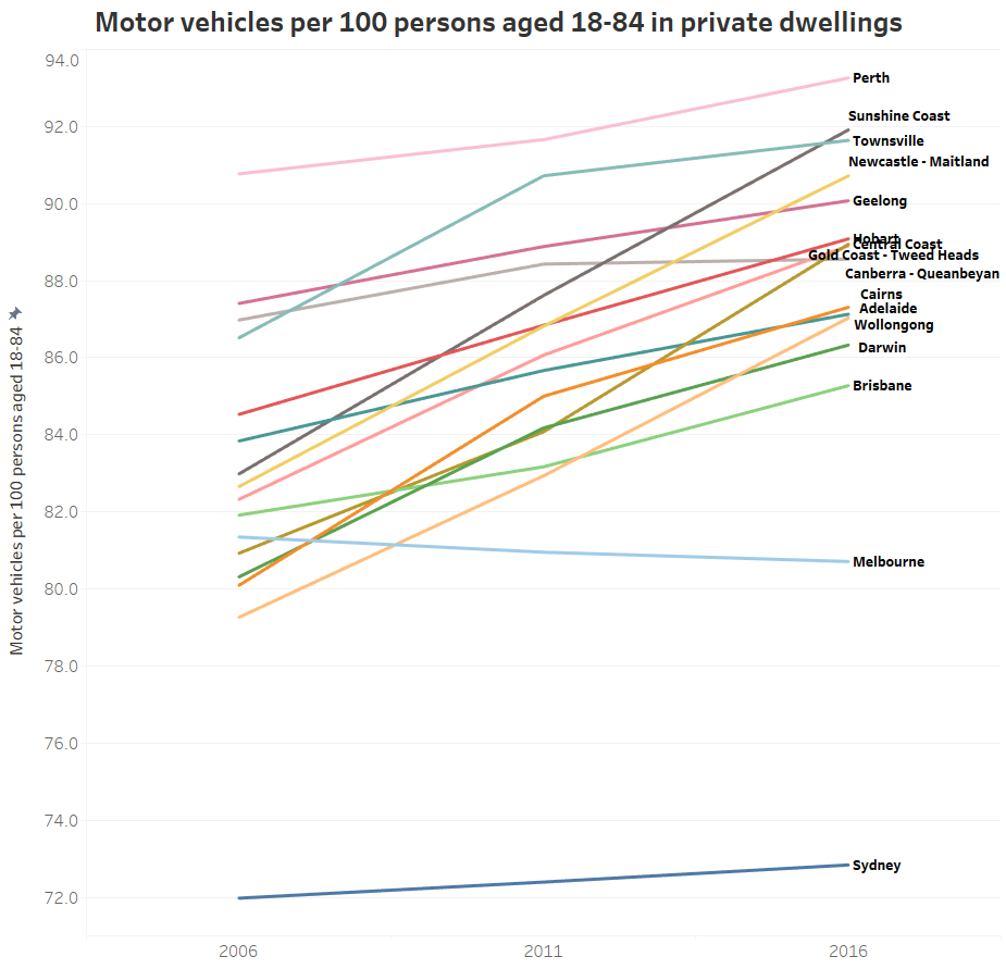
Here’s a chart showing private dwelling occupancy rates for sixteen Australian cities (using 2011 Significant Urban Area boundaries) from the last three censuses:
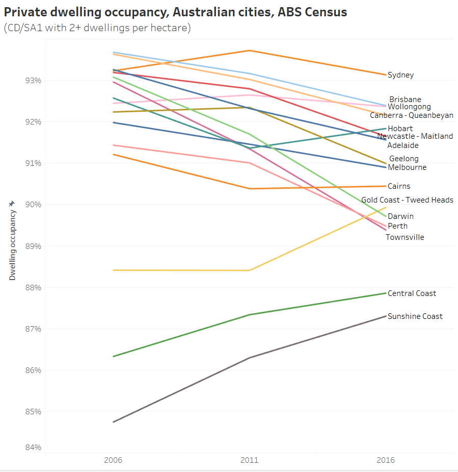
Note the y-axis only runs from 84% to 94%, so the changes are not massive. However a small change in dwelling occupancy can still have a large impact on housing prices (rental and sales).
The Sunshine and Central Coasts have the lowest occupancy, almost certainly explained by many holiday homes in those regions, although all three have been trending upwards. Curiously, the Gold Coast – Tweed Heads had a significant increase in occupancy between 2011 and 2016 to take it above Perth, Townsville, and Darwin.
Hobart and Cairns also had increased occupancy between 2011 and 2016, but all large cities declined between 2011 and 2016. Perth, Darwin and Townsville had big slides – quite possibly related to the downturn in the mining industry and slowing population growth (all three have seen slowing population growth in recent years after a boom period). Then again, if there are more fly-in-fly-out workers in a city you might expect dwelling occupancy on census night to go down as a portion of them will be away for work on census night.
How does dwelling occupancy in capital cities compare to the rest of the country?
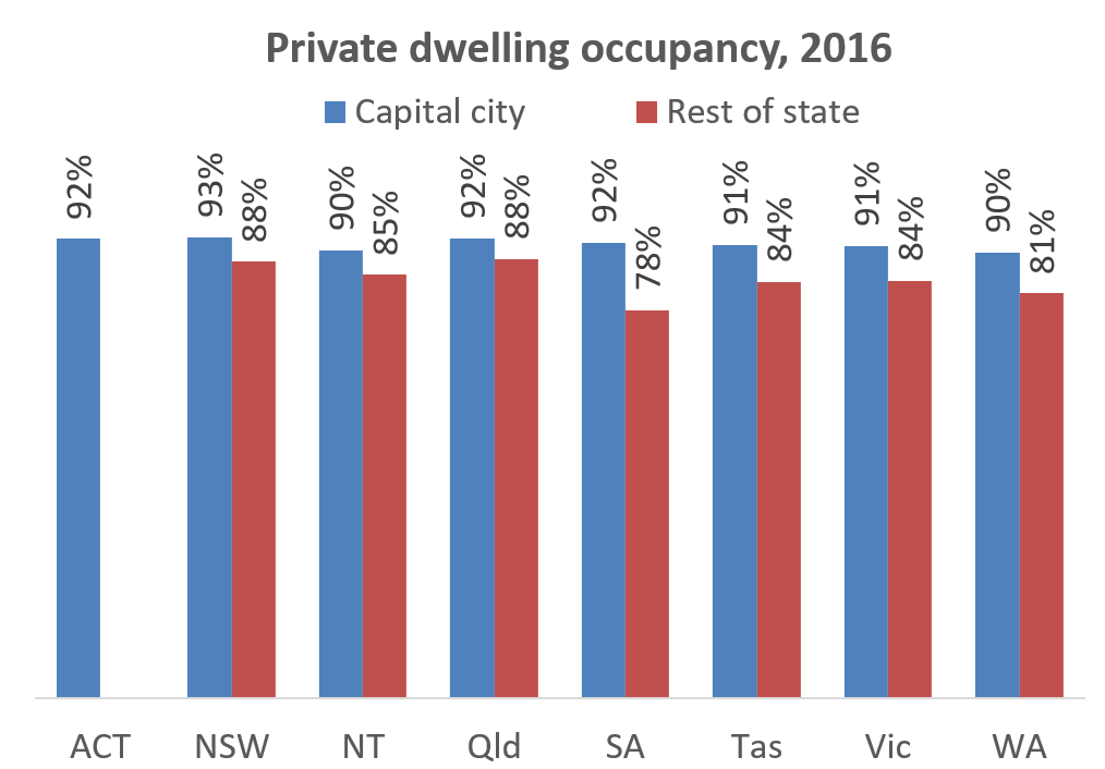
Private dwelling occupancy is significantly lower outside the capital city areas. While the capital city areas contain 63% of all private dwellings, they only contain 51% of unoccupied private dwellings.
How does dwelling occupancy vary by dwelling type?
Here’s a chart of 2016 dwelling occupancy by Greater Capital City Statistical Areas and the most common dwelling types:
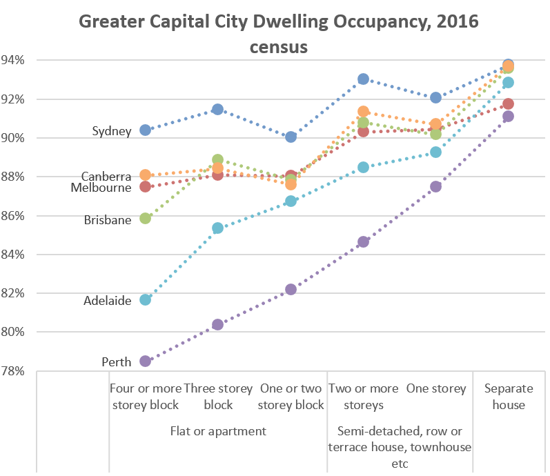
In many cities there is a strong correlation between housing type and occupancy, with separate houses having the highest occupancy rates, and multi-storey flats/apartments having the lowest. The pattern is strongest in Perth – perhaps reflecting reduced demand for apartment living following the end of the mining boom(?).
The data suggests higher density apartments are more likely to not be occupied on census night, but it doesn’t tell us why. Of course different dwelling types have different spatial distributions, so is it the dwelling type that drives the occupancy rates? I’ll come back to that shortly.
Where are the unoccupied dwellings?
Quite simply, here is a map showing the density (at SA2 geography) of unoccupied dwellings in Melbourne over time (you might need to click to enlarge to read more clearly):
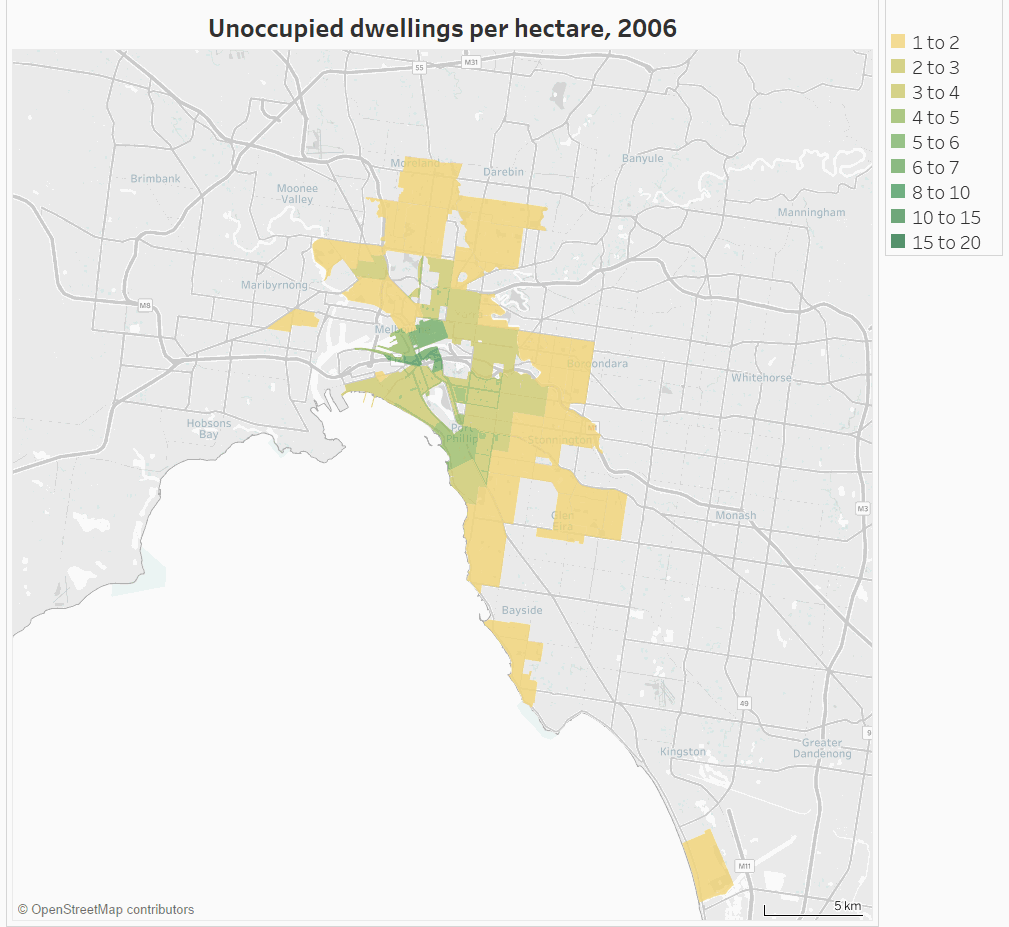
(I’ve not shaded SA2s with less than 1 unoccupied dwelling per hectare. You can look at other cities in Tableau by zooming out and then in on another city).
You can see a fairly significant increase in the number of unoccupied dwellings in the inner and middle suburbs (at least at densities above 1 per hectare).
From a transport perspective – this isn’t great. If people lived in those dwellings rather than dwellings on the fringe of Melbourne, the transport task would be easier as there would be many more people living closer to jobs and other destinations with non-car modes being more competitive.
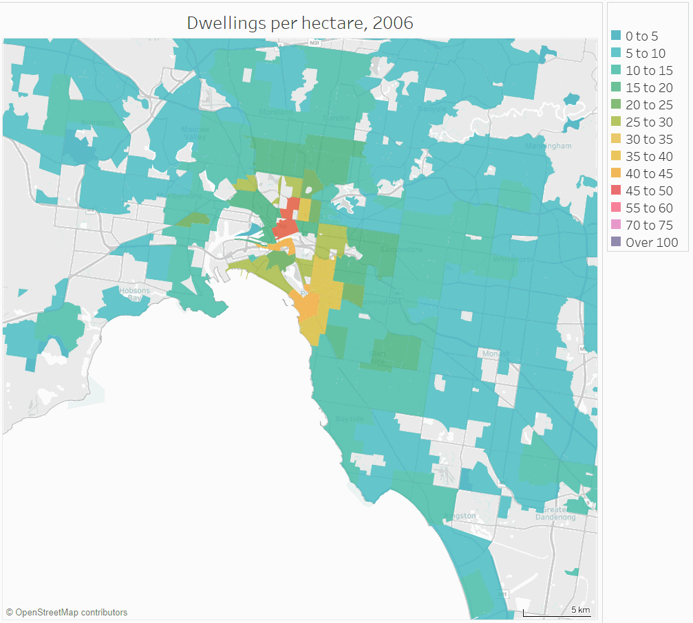
But these areas with a relatively high density of unoccupied dwellings are also areas with a high density of dwellings in general. The density of unoccupied dwellings has risen in the same places where total dwelling density has risen:
(see in Tableau – you may need to change the geography type)
Given you would expect a small percentage of dwellings to be unoccupied for good reasons (eg resident temporarily absent, or property on the market), it makes sense that the density of unoccupied dwellings has gone up with total dwelling density.
But a decrease in the dwelling occupancy rate requires the number of unoccupied dwellings to be growing at a faster rate than the total number of dwellings. We already know that is happening at the city level through declining occupancy rates, so how does that look inside cities?
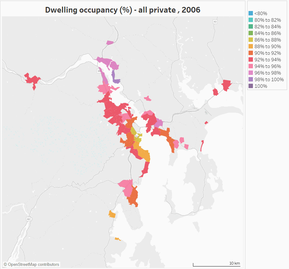
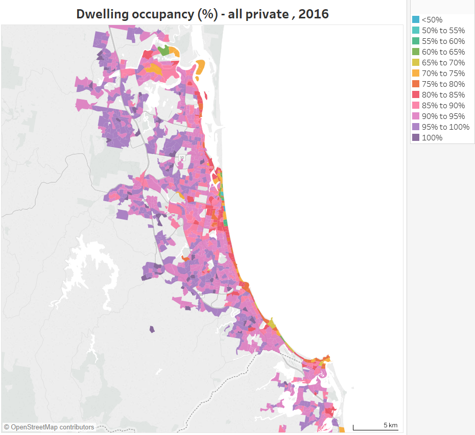
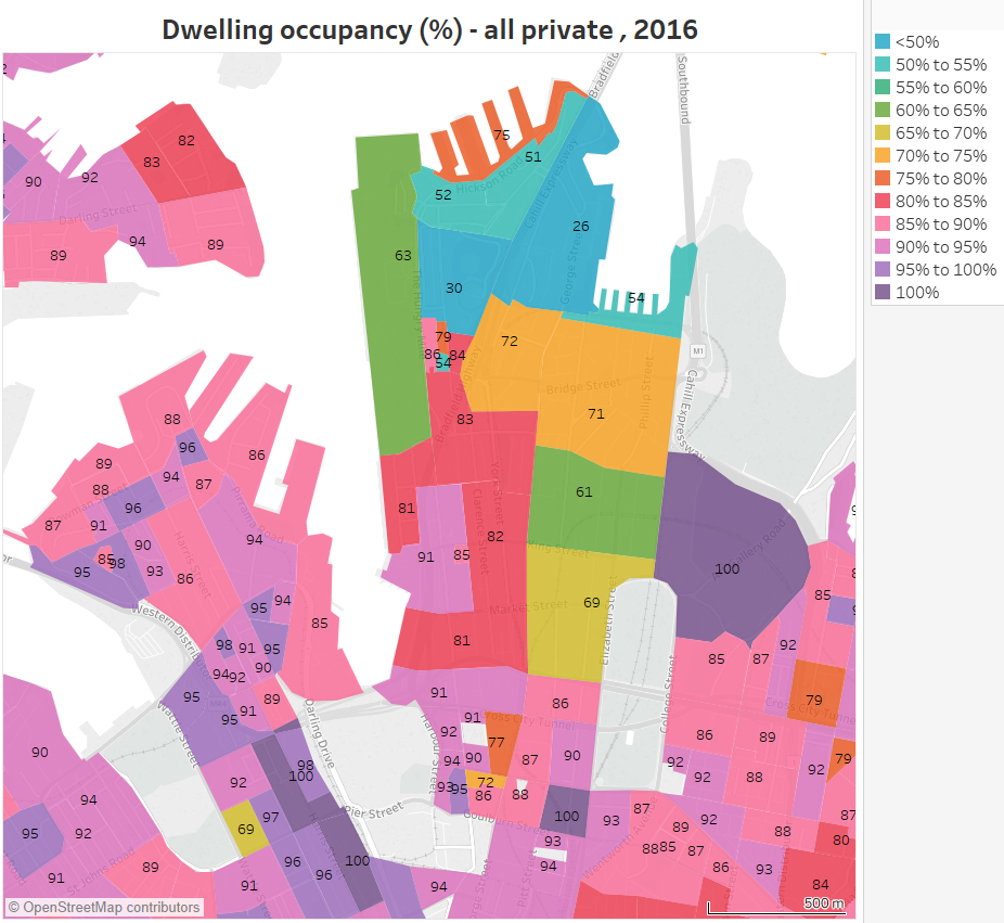
How does dwelling occupancy vary across Melbourne?
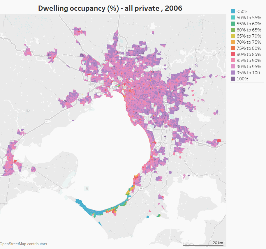
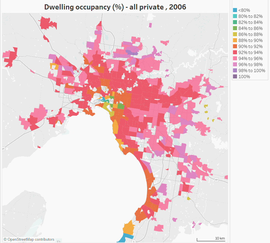
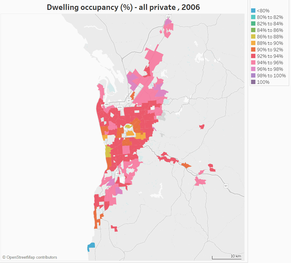
Here’s a map of dwelling occupancy in Melbourne and Geelong at CD/SA1 level geography:
(see also in Tableau)
You can see very clearly that occupancy is lowest on Mornington Peninsula beaches to the south – which almost certainly reflects empty holiday homes on census night (a Tuesday night in winter).
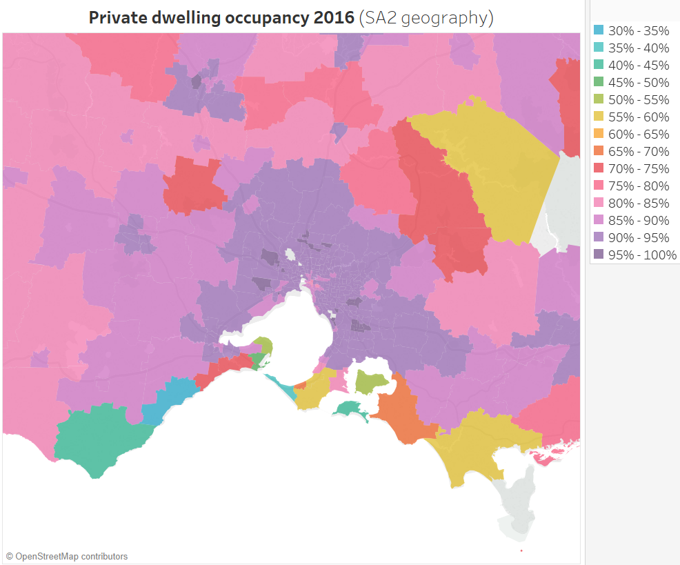
In fact, I’ve created a map of dwelling occupancy at SA2 level for all of Australia, and you can see many coastal holiday areas around Melbourne (and other cities) with low occupancy (with Lorne – Anglesea at 32% and Phillip Island at 40%):
The previous Melbourne map at CD/SA1 level is very detailed and so it’s not easy to see the overall trends. Also, apart from the Mornington Peninsula, occupancy rates are almost all above 80%.
So here is a zoomed-in map with a different (narrower) colour scale, with data aggregated at SA2 level (also in Tableau):
Things become much clearer.
The highest dwelling occupancy is generally on the fringe of Melbourne.
Apart from holiday home areas, the lowest occupancy in 2016 was concentrated in wealthier inner suburbs, including Toorak at 83% and South Yarra west at 84%. This was closely followed by the CBD, Docklands, East Melbourne, Southbank, and Albert Park between 84% and 86%. These areas have all had declining occupancy since 2011.
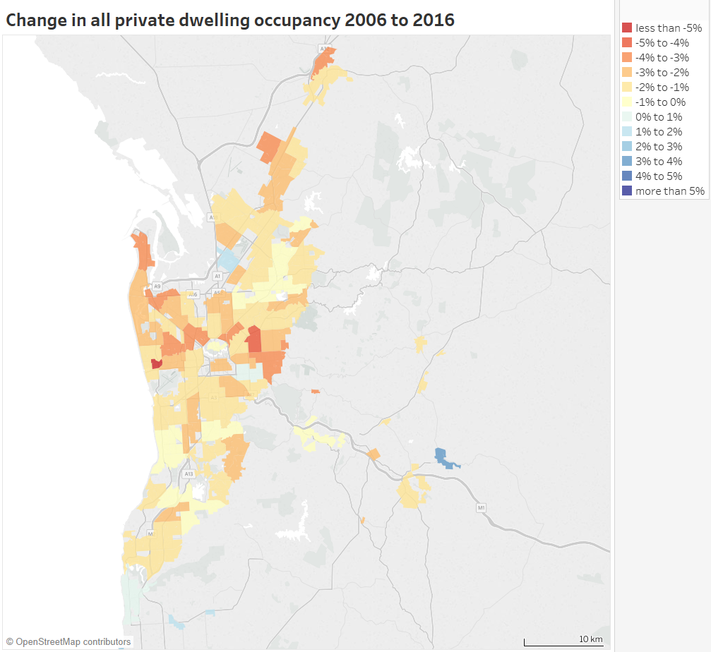
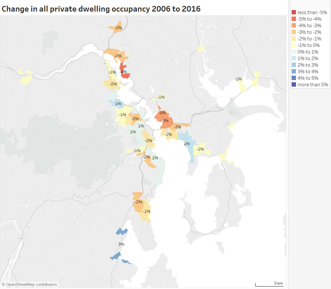
It can be a little difficult to see the changes in occupancy rates, so here is a non-animated map the change in dwelling occupancy rates between 2006 and 2016 (also in Tableau):
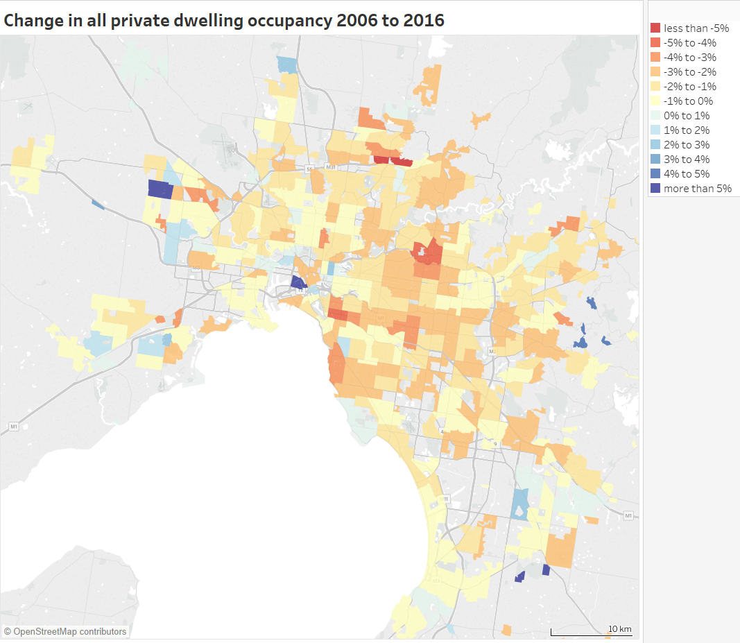
There are at least small declines in most parts of Melbourne. The biggest decline was 7% in Bundoora North (with lowest 2016 occupancy of 79% in these new units in University Hill ), followed by 5% in Doncaster (lowest around Doncaster Hill where there are new apartments, perhaps too new to be occupied on census night?), 4% in South Yarra East (lowest in the new apartments around South Yarra Station, again possibly because some are very new) and Prahran – Windsor.
Curiously, Docklands dwelling occupancy increased by 9% from 75% to 85% (rounding means that those numbers don’t perfectly add). Perhaps there were many new yet-to-be-occupied dwellings in 2006? For reference, Dockland’s 2011 occupancy was 84%, only slightly below the 2016 level.
The outer growth areas are a mixed bag of increases and decreases. This possibly depends again on how many brand new but not yet occupied dwellings there were in 2006 and 2016.
What are the dwelling occupancy patterns in other cities?
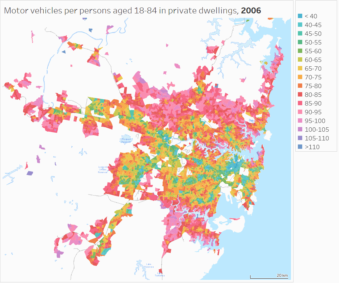
Sydney
You can see lower occupancy around the CBD, North Sydney, Manly, and the northern beaches, and higher occupancy in the western suburbs.
The largest declines are evident in the city centre and North Ryde – East Ryde:
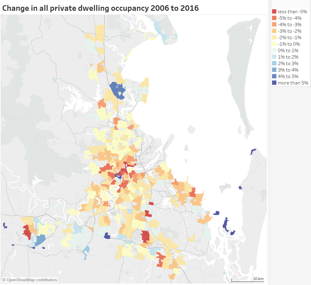
Brisbane
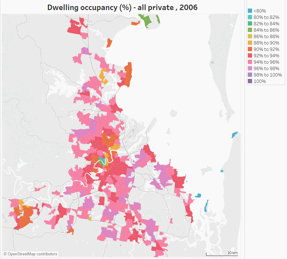
Brisbane has some big declines to the north-east of the city centre, Rochedale – Burbank, Woodridge, Logan, and Leichhardt – One Mile. The Redland Islands in the east are presumably a popular place for holiday homes.
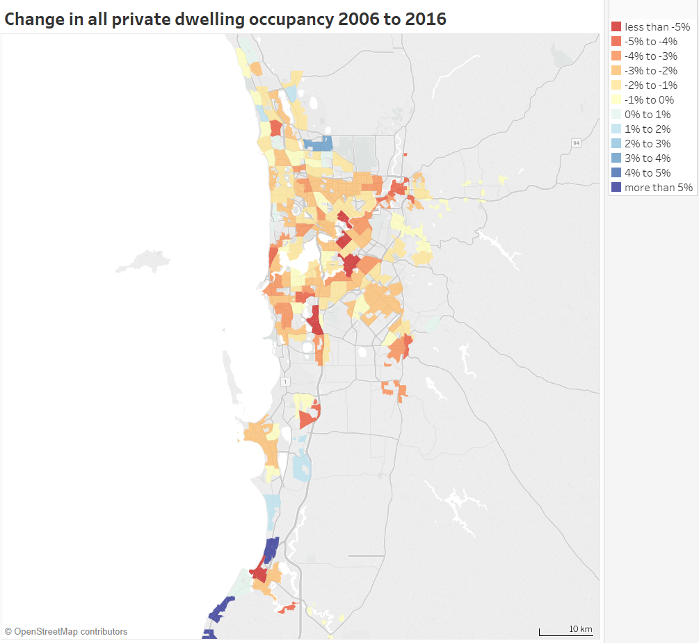
Perth
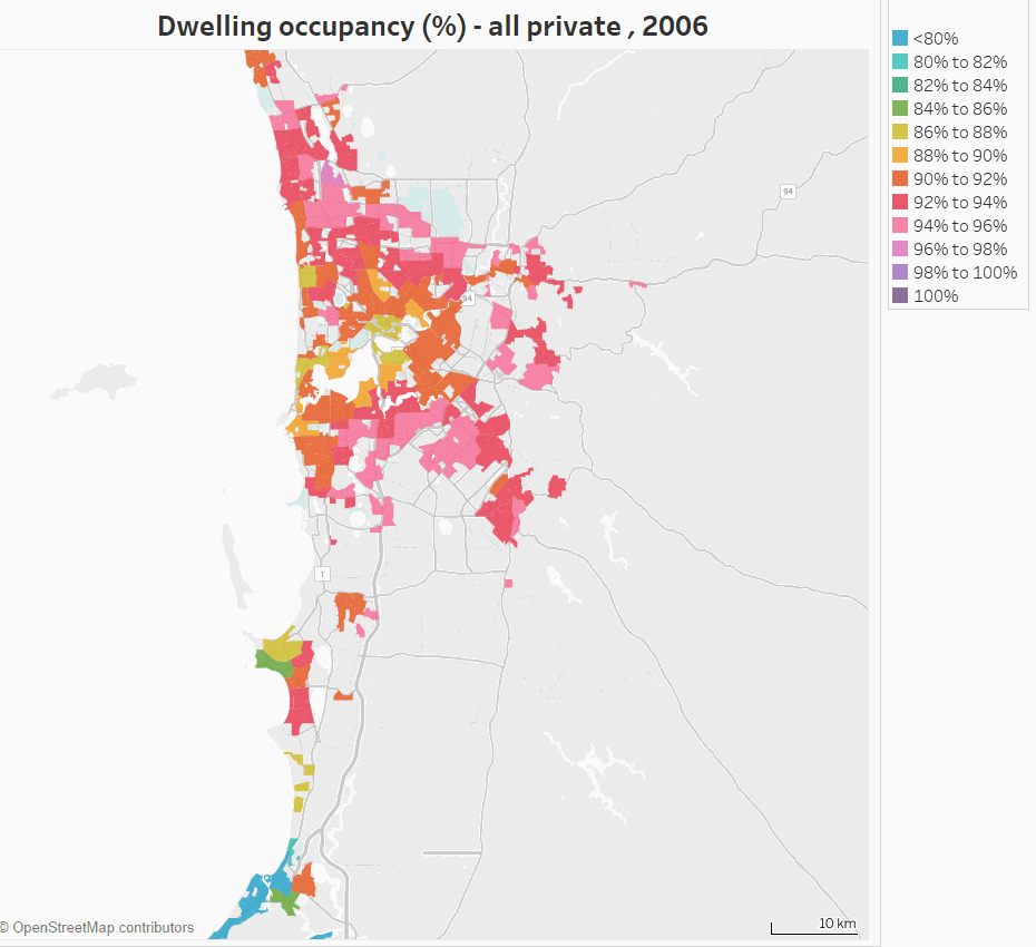
Low occupancy is evident around Mandurah in the south (a popular holiday home area). Lower occupancy has spread around the inner city, and beach-side suburbs of Scarborough, Cottesloe, Fremantle, and Rockingham (many of which are areas with higher concentrations of Airbnb properties).
The biggest declines were in Maylands, Victoria Park – Lathlain – Burswood, and South Lake – Cockburn Central. For the first two of these areas the decline was mostly in flats/units/apartments.
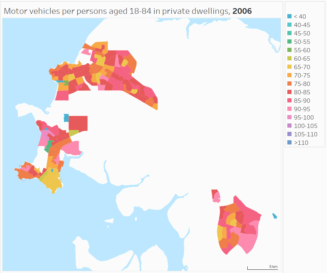
Adelaide
The lowest occupancy is on the south coast and in Glenelg. The biggest decline was in Fulham (-5%), followed by Payneham – Felixstowe (-4%):
[Canberra, Hobart and Darwin added 6 November 2017]
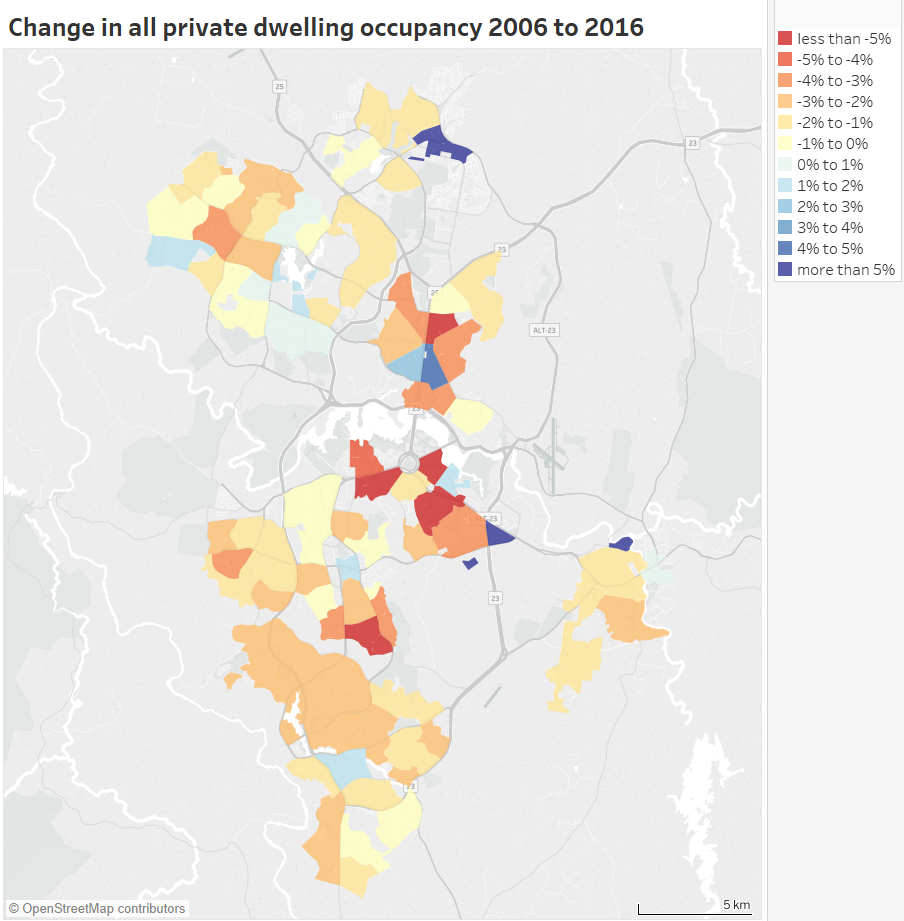
Canberra
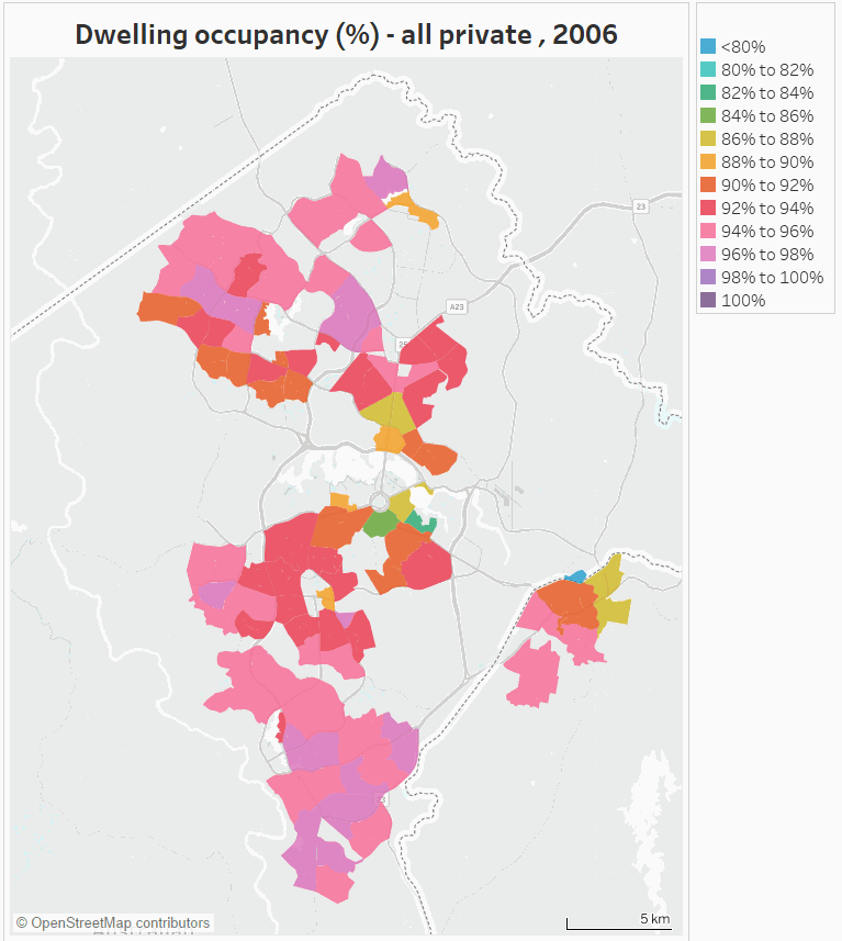
Dwelling occupancy was lowest around Parliament House (the census was not during a sitting week in 2016), and highest in the outer northern and southern suburbs. The 2006 census was during a sitting week, so it’s little surprise that big dwelling occupancy reductions were seen around Capital Hill between 2006 and 2016. There was also a 5% decline in Farrer and a 6% growth in Gungahlin between 2006 and 2016 (Gungahlin’s dwellings almost doubled between 2006 and 2011, so the 2006 result might reflect brand new dwellings awaiting occupants).
Hobart
Dwelling occupancy was lowest in central Hobart, with the biggest decline of 4% in Old Beach – Otago, but overall there was little change between 2006 and 2016 (average occupancy did drop slightly in 2011 though).
Darwin
Darwin dwelling occupancy was lowest in the city centre at 82% in 2016, while Howard Springs had 100% occupancy (in 2016). Declines are evident between 2006 and 2016 across most parts of Darwin.
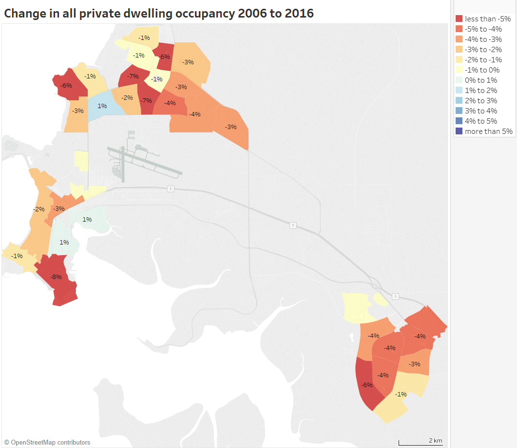
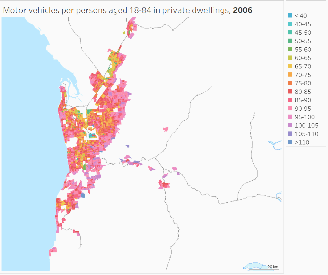
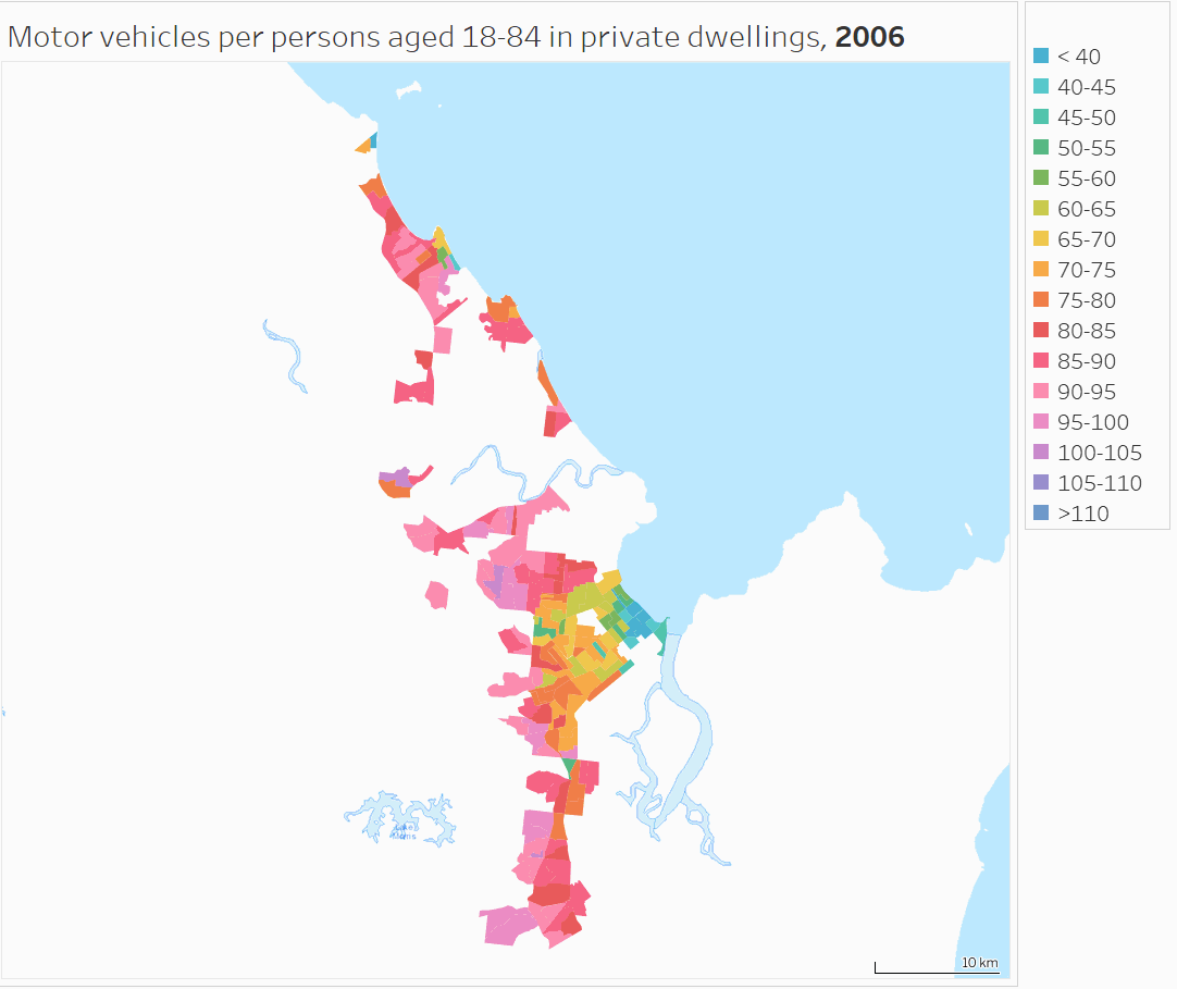
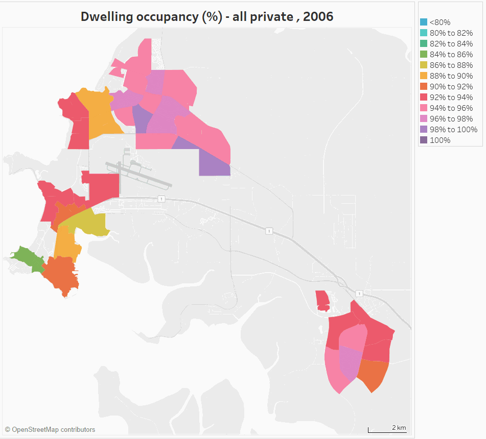
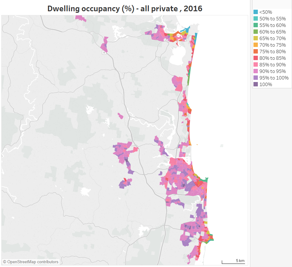
Gold Coast
Here’s a map of 2016 occupancy at SA1 level, with the original broader colour scale:
You can see quite clearly that the beach-side areas have low occupancy, while the inland areas have much higher occupancy (some at 100%). Presumably many permanent residents cannot or choose not to compete with tourism for beach-side living.
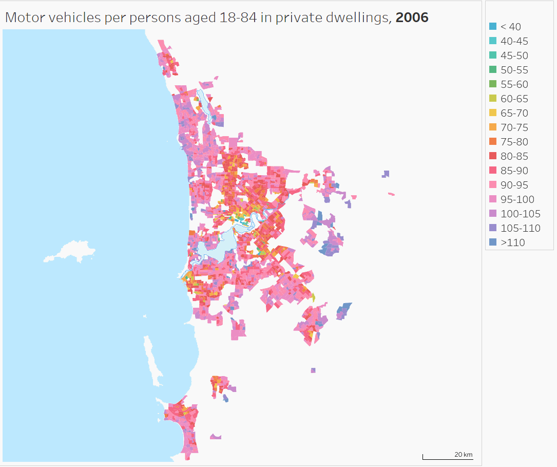
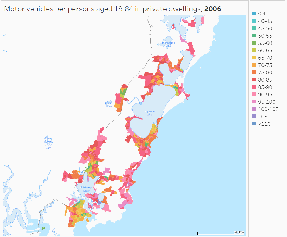
Sunshine Coast
Similar patterns are evident on the Sunshine Coast, particularly around Noosa and Sunshine Beach in the north:
If you want to see other cities, move around Australia in Tableau for occupancy maps at CD/SA1 and SA2 geography (choose you year of interest), and occupancy change maps (at SA2 geography).
So are there lots of unoccupied inner city apartments in Melbourne?
Some commentators have spoken about many inner city apartments being unoccupied – perhaps through a glut or investors chasing capital gains and not interested rental incomes.
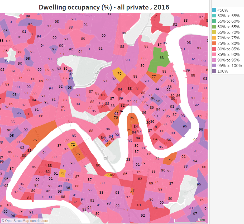
Here is dwelling occupancy in central Melbourne at SA1 geography for 2016, using the broader colour scale (also in Tableau):

There are quite a few pockets of very low occupancy, particularly areas shaded in yellows and greens. The average private dwelling occupancy for the City of Melbourne local government area was 87%, lower than the Greater Melbourne average of 91%.
The lowest occupancy is a block between Adderley, Spencer and Dudley Street in North Melbourne at 56%, which is probably related to the recent completion of an apartment tower not long before the census (from Google Street view we know it was under construction in April 2015 and completed by October 2016).
There are several patches of yellow (65-70% occupancy) in the CBD, Docklands and Southbank.
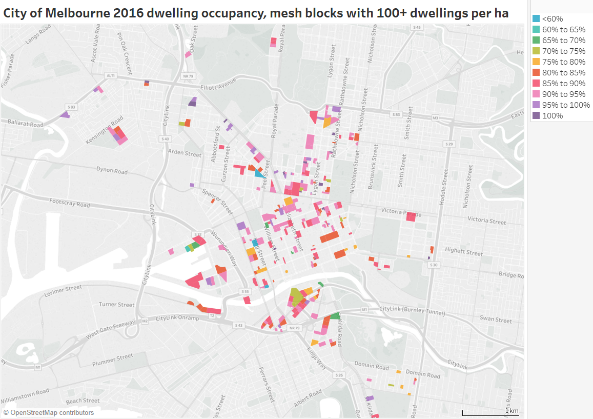
But what about apartment towers? For that we need to drill down to mesh blocks – and thankfully 2016 census data is actually provided at this level.
Here’s a map showing dwelling occupancy of mesh blocks in the City of Melbourne (local government area) with at least 100 dwellings per hectare (as an arbitrary threshold for large apartment building – see the appendix for an example of this density):
(explore in Tableau)
Some notable low occupancy apartment towers include:
- 48% for an apartment tower at 555 Flinders Street (Northbank Place Central Tower) between Spencer and King Street and the railway viaduct. It wasn’t brand new in 2016.
- 47% in a block that includes the Melbourne ONE apartment tower, possibly because it was only just opened (as I write there are still apartments for sale)
- 65% for one of the towers at New Quay, Docklands (which seems to include serviced apartments)
- 66% for a tower at 28 Southgate Ave (corner City Road), and 67% for the Quay West tower next door (almost certainly popular places for Airbnb / serviced apartments).
Several of these towers include advertised serviced apartments, and I expect the towers would contain a mix of serviced apartments, owner-occupied apartments and rentals (regular and Airbnb). However ABS advises me that field officers do speak to building managers, and are therefore likely to not code serviced apartments as private dwellings.
That said, according to the 2016 census data there were only 11 non-private dwellings in Docklands that were classified as “Hotel, motel, bed and breakfast”, and zero non-private dwellings in the New Quay apartment towers.
I snapped this picture at 9pm on a Sunday in September 2017 of the apartments at New Quay (Docklands) that at the 2016 census had 65-70% occupancy:
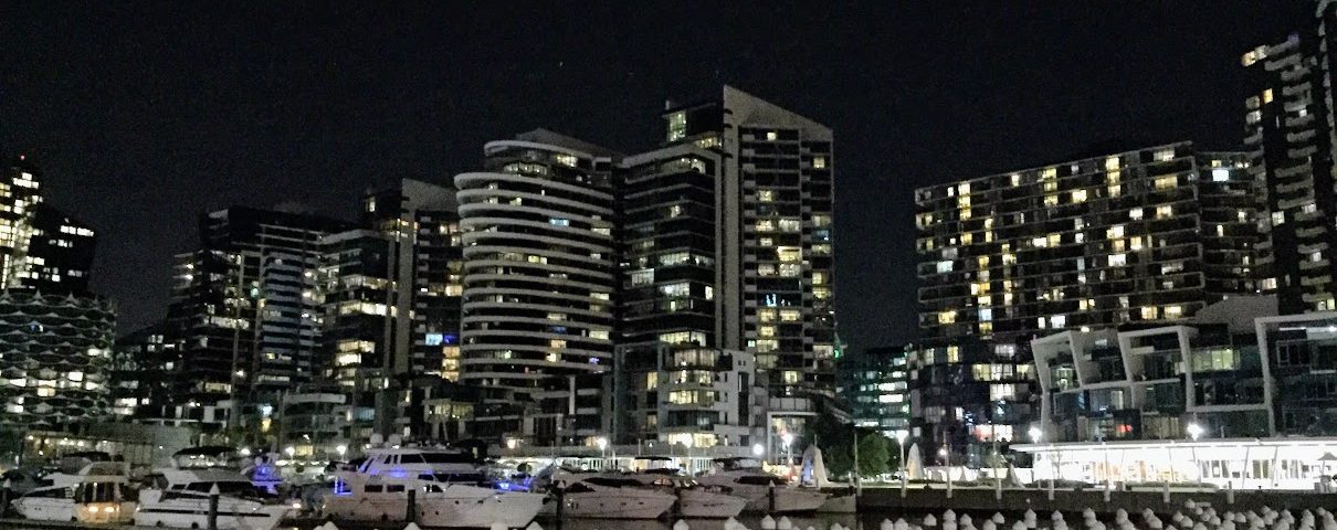
Of course you wouldn’t expect lights to be on in all rooms in all occupied dwellings at 9pm on a particular Sunday, but I dare say it’s probably a time when fewer people would be out. It looks like a lot less than a quarter of rooms are lit. I know very few of these are on Airbnb (more on that in a future post!), but I don’t know how many are actually serviced apartments.
There’s huge variation in dwelling occupancy across these mesh blocks. So is the lower occupancy more concentrated in higher density areas? Here’s a scatter plot of all mesh blocks in the City of Melbourne by dwelling density and occupancy:
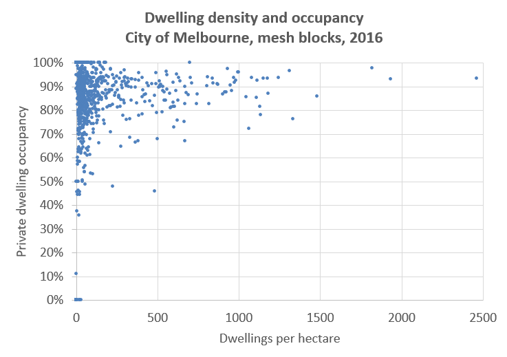
There’s not a strong relationship between density and occupancy. The variation in dwelling occupancy between mesh blocks will probably depend on a lot of local factors.
What about occupancy by dwelling type for the inner city?
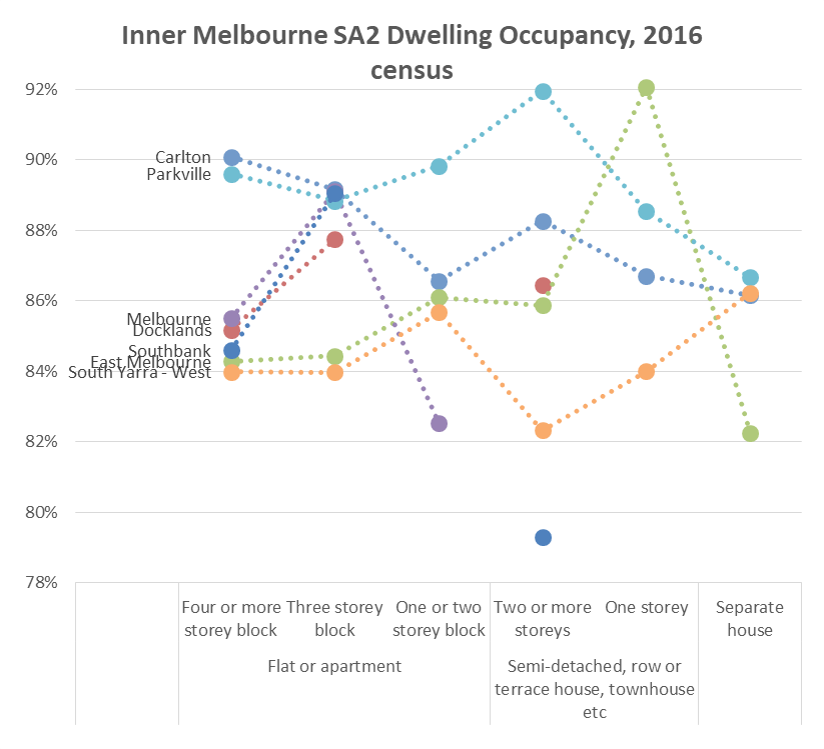
(data points removed where dwelling counts were small, the isolated blue dot at the bottom is for Southbank).
There’s no evidence that flats / apartments have lower occupancy than other housing types in the central city. However there is evidence that inner city areas have relatively lower occupancy.
So how does the occupancy of apartment blocks of 4+ storeys vary across Melbourne?
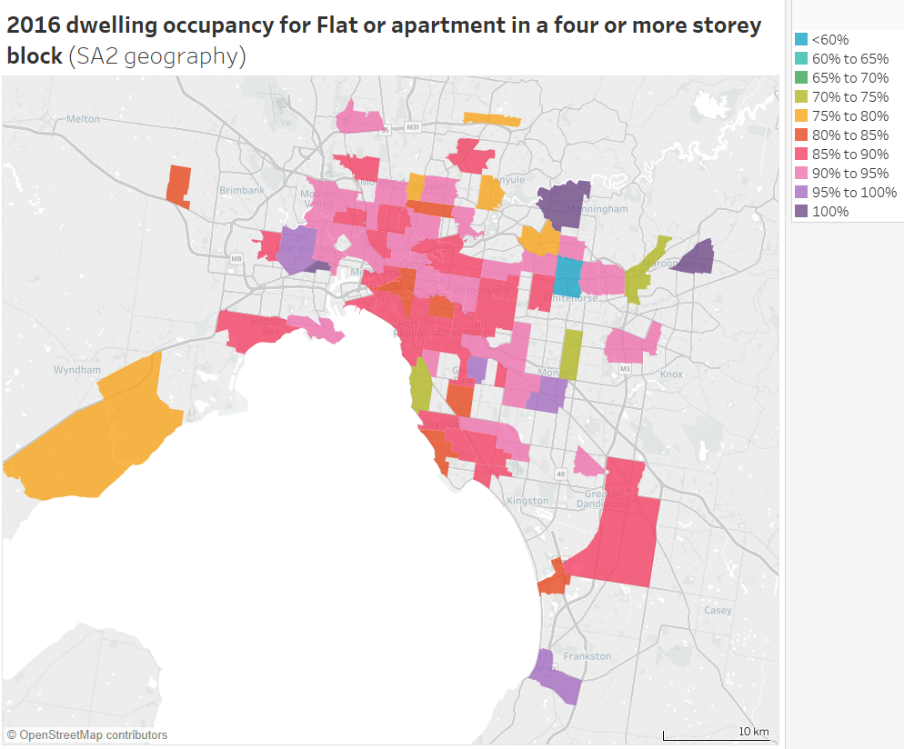
Box Hill had the lowest apartment occupancy of 50% (perhaps some were brand new?), followed by Ringwood, Glen Waverley, and Brighton in the 70-75% range. Croydon East, Templestowe , Seddon – Kingsville, Clayton, Carnegie, West Footscray, Braybrook and Frankston reported occupancy above 95%. The inner city areas were around 84-85% occupied, and these would make up the majority of such dwellings in Melbourne.
Apartments in blocks of 4+ storeys seem to have lower occupancy on average because most of them are located in the central city, which generally has lower dwelling occupancy.
Here’s a similar map (with a different colour scale) for dwelling occupancy of separate houses across the Melbourne region:
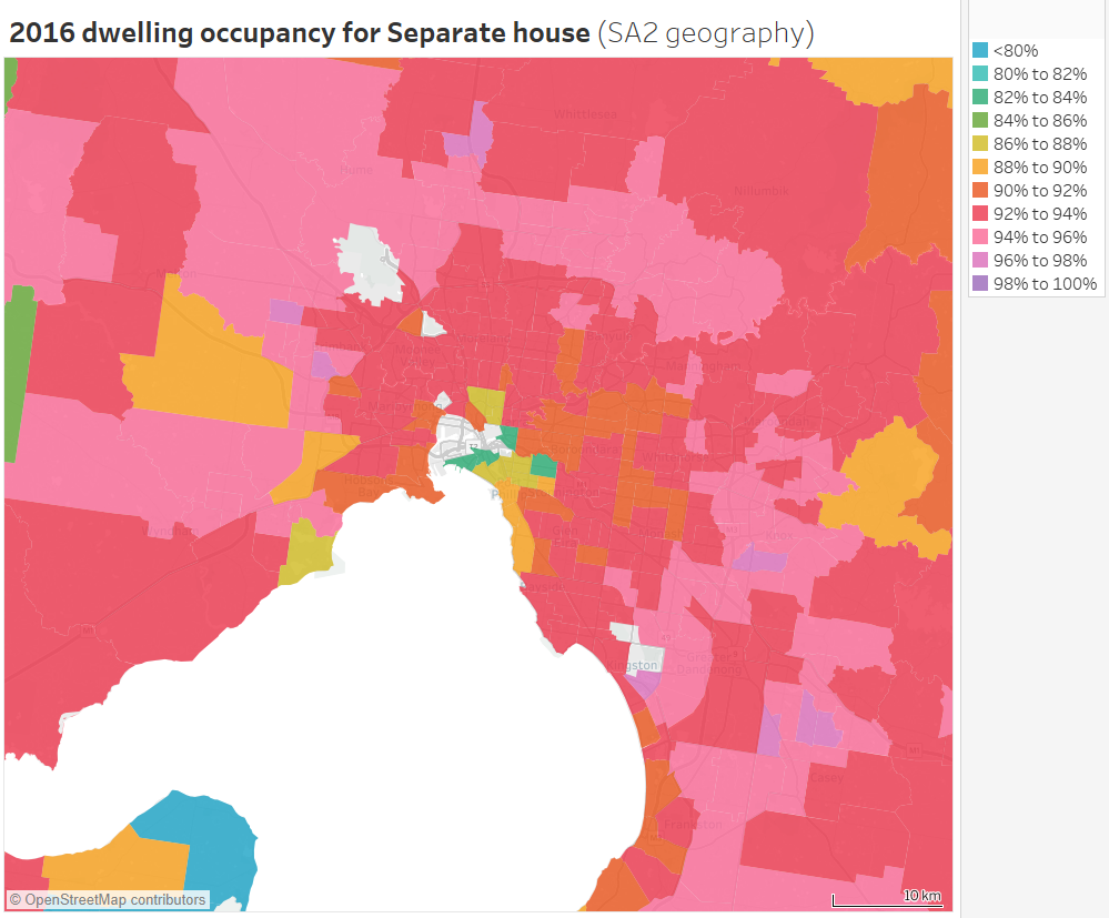
The lowest rates in metropolitan Melbourne are 82-83% in some inner city areas, while the urban growth shows up in pink and purple, mostly 94-96%.
Explore the 2016 occupancy rates at SA2 geography for different dwelling types for any part of Australia in Tableau. You can also view changes in occupancy rates since 2006 for separate houses, flats/units/apartments, and semi-detached/townhouses.
Why are there lower dwelling occupancy rates in the central city?
The census doesn’t answer this, and I’m not a housing expert, but I dare say there are plenty of plausible explanations:
- Many dwellings are rented out on Airbnb (and/or other platforms) – but are not in high demand on a weeknight in mid-winter (more on that in this post).
- Many dwellings are serviced apartments that are indistinguishable from regular private dwellings (in buildings with a mixture of dwelling use). ABS say they don’t count these as private dwellings, however they are not showing up as non-private dwellings.
- Dwellings are more likely to occupied by executives who travel more frequently.
- Dwellings might be second homes for people living outside the city.
- Dwellings might be owned by employers for interstate staff visiting Melbourne.
- Dwellings might be poorly constructed and uninhabitable (eg mould issues).
- Investors who are not interested in rental income might deliberately leave properties vacant (something that is disputed).
But I’m just speculating.
What about dwelling occupancy in the centre of other cities?
Here’s a map of the Sydney CBD area at SA1 geography:
There are some very low occupancy rates in the north end of the CBD, but very high occupancy rates around Darling Harbour and Pyrmont.
Here’s central Brisbane:
Here are occupancy rates for different dwelling types for selected inner city SA2s in Sydney, Brisbane, Adelaide and Perth:
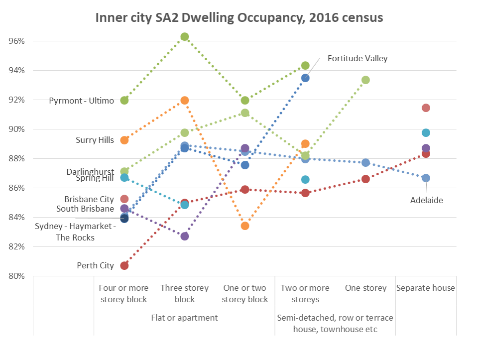
In all SA2s except Surrey Hills (Sydney) and South Brisbane, flats or apartments in 4+ storey blocks had the lowest dwelling occupancy in 2016. Only in Perth City SA2 (which is quite a bit larger than the CBD) is there a reasonably clear relationship between housing type and occupancy.
Summary of findings
Couldn’t be bothered reading all of the above, or forgot what you learnt? Here’s a summary of findings:
- Dwelling occupancy, as measured by the census, has declined in most Australian cities between 2006 and 2016 (particularly larger cities).
- Dwelling occupancy is generally very low in popular holiday home areas, but also relatively low in central city locations.
- Dwelling occupancy is generally highest in outer suburban areas.
- Higher density housing types generally have lower occupancy, but that is probably because they are more often found in inner city areas.
- There are examples of low occupancy apartment towers in Melbourne, but there’s not a clear relationship between dwelling density and dwelling occupancy in central Melbourne.
In a future post I plan to look more at why properties might be unoccupied, and for how long they are unoccupied, drawing on Airbnb and water usage datasets. I might also look at bedrooms and bedroom occupancy which is a whole other topic.
Appendix – About the census dwelling data
I’ve loaded census data about occupied and unoccupied private dwellings data into Tableau for 2006, 2011, and 2016 censuses for sixteen Australian cities at the CD (2006) / SA1 (2011,2016) level, which the smallest geography available for all censuses. I’ve mapped all these CDs and SA1s to boundaries of 2016 SA2s and 2011 Significant Urban Areas (as per my last post). Those mappings are unfortunately not perfect, particularly for 2006 CDs.
The ABS determine a private dwelling to be occupied if they have information to suggest someone was living in that dwelling on census night (eg a form was returned, or there was some evidence of occupation). Under this definition, unoccupied dwellings include those with usual residents temporarily absent, and those with no usual residents (vacant).
For my detailed maps I’ve only included CDs / SA1s with a density of 2 dwellings per hectare or more.
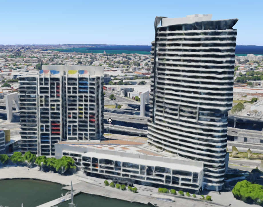
For reference, here is a Melbourne mesh block with 100 dwellings per hectare:
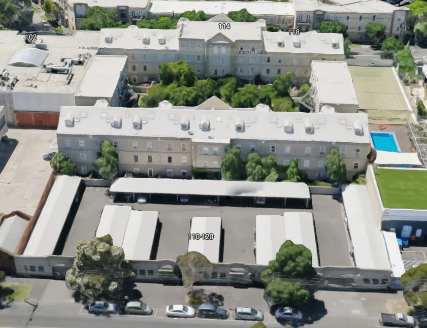
And here is a mesh block with 206 dwellings per hectare (note only a small part of mesh block footprint contains towers):


 Posted by chrisloader