I’ve recently been analysing how public transport mode share varies with age and associated demographic factors. In part 3 of that series, I found that immigrants – and particularly recent immigrants – were much more likely to use public transport (PT) in their journey to work. This post explores why that might be, using data for Melbourne from the ABS Census (mostly 2016).
About immigrant data
The census covers both temporary and permanent residents. I’ve counted all people who were born overseas and came to Australia intending to stay for at least one year as “immigrants”, regardless of whether they were temporary or permanent residents.
It’s worth looking at the number of immigrants living in Greater Melbourne by age and arrival year, as at 2016:
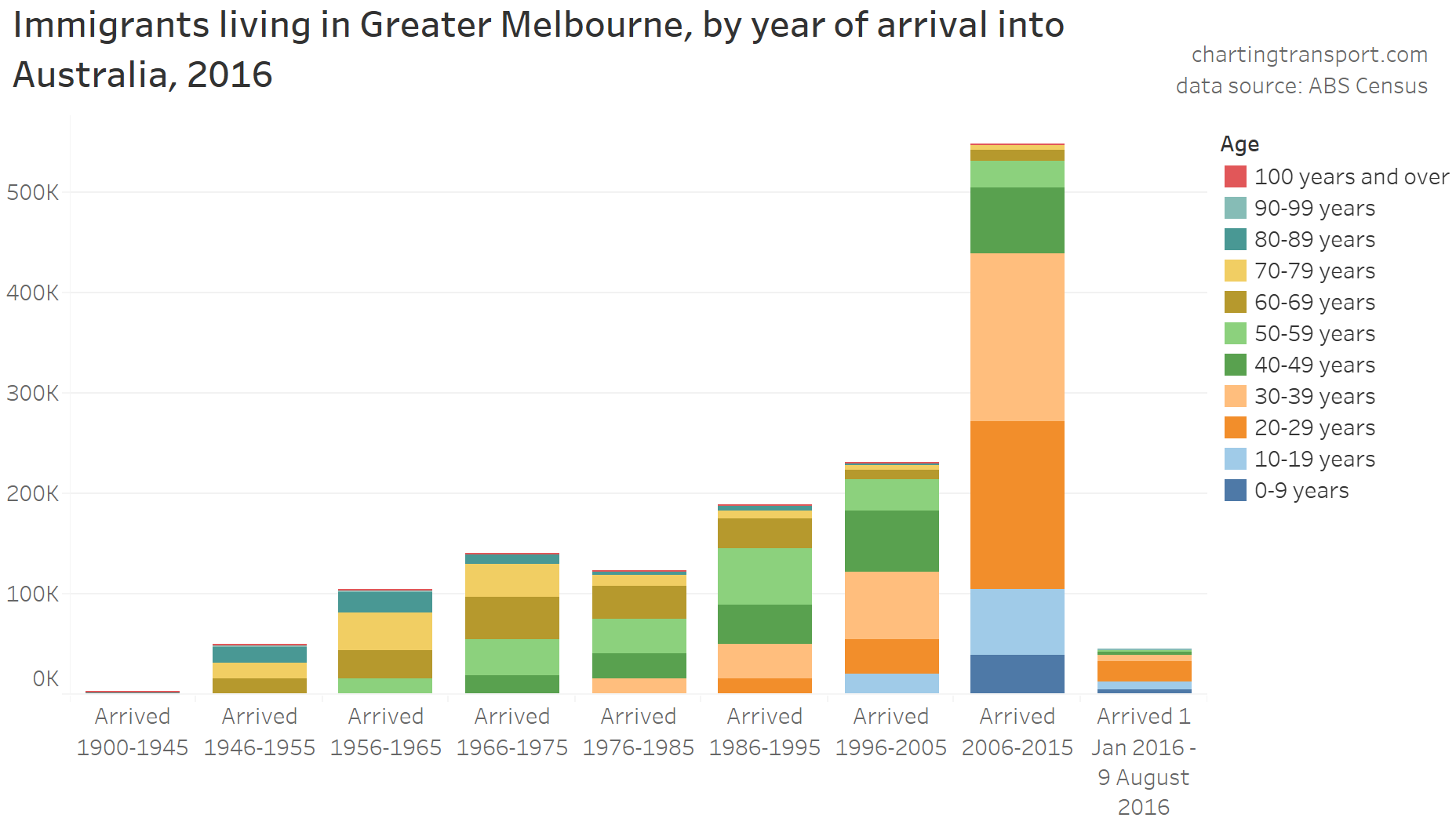
Except for the first and last columns, each column represents 10 arrival years. You can see a significantly larger population of immigrants who arrived between 2006 and 2015, and they skewed significantly to ages 20-39. We know from previous analysis that younger adults are more likely to use public transport, so age is likely to play a role.
But how many immigrants are temporary residents? The census doesn’t include a question about permanent residency, but it is possible to track arrival year range cohorts over time.
The following chart tracks the number of immigrants for arrival year ranges between the 2006, 2011 and 2016 censuses (using Significant Urban Area geography).
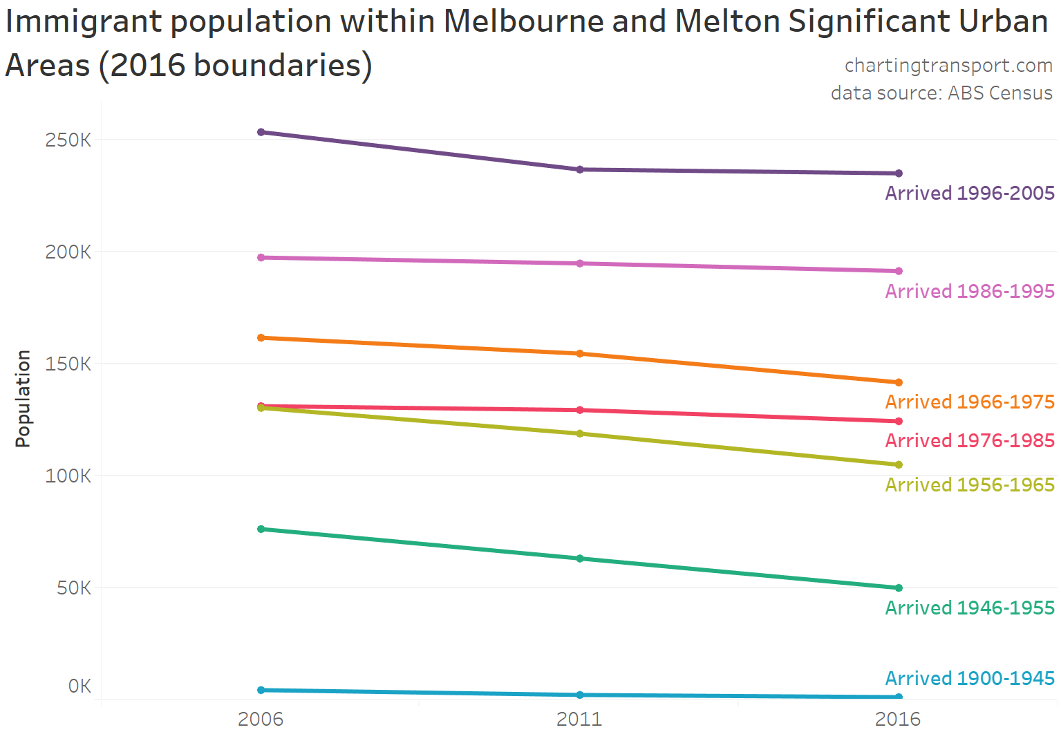
If there were a significant number of temporary residents (although still intending to stay at least one year), then you’d see a large drop in the population of people who arrived 1996 to 2005 over time between 2006 and 2011/2016. There certainly was a drop off, but it was a small proportion.
This suggests most migrants end up being long-term residents (including many who enter on temporary visas but then gain permanent residency).
Numbers in all arrival year ranges dropped slowly over time through people leaving Melbourne (and possibly Australia) and deaths (particularly for immigrants from earlier years many of whom would be in their senior years).
Immigrants and public transport mode share of journeys work
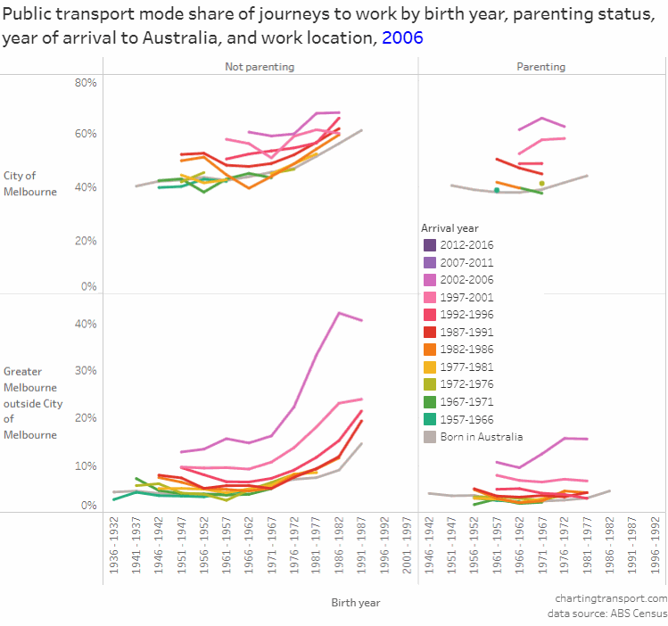
To recap my previous analysis, the relationship between immigration year and PT mode share has held for the last three censuses (2006, 2011, and 2016), regardless of parenting status, birth year, or whether the someone worked inside or outside the City of Melbourne (local government area):
So why might recent immigrants be more likely to use public transport? From looking at the data, I think there are several plausible explanations.
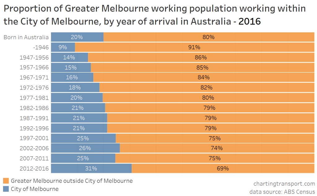
To start with, they were more likely to work in the City of Melbourne, and we know journeys to work in the City of Melbourne have much higher public transport mode shares:
They were also more likely to live in areas with lower levels of motor vehicle ownership. Each column in the following chart represents the population of immigrants for a range of arrival years, and that population is coloured based on the motor vehicle ownership rate of all residents in the (SA1) areas in which they live (including non-immigrants). Note: immigrants themselves may have had different rates of motor vehicle ownership to the average of people in the areas in which they lived.
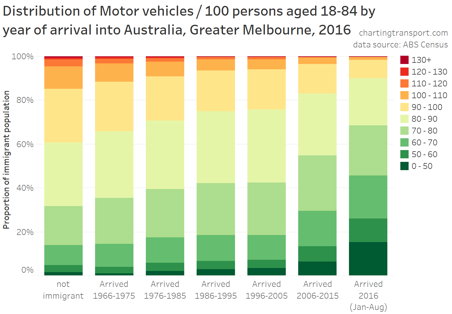
As I’ve mentioned previously, I do not have access to data to calculate the ratio of household motor vehicles to driving-aged adults within immigrant households, but I can calculate the ratio of household vehicles to all household residents (not all of whom may be of driving age).
The following chart shows that more recent immigrants were likely to have much lower levels of motor vehicle ownership that those who have been living in Australia longer.
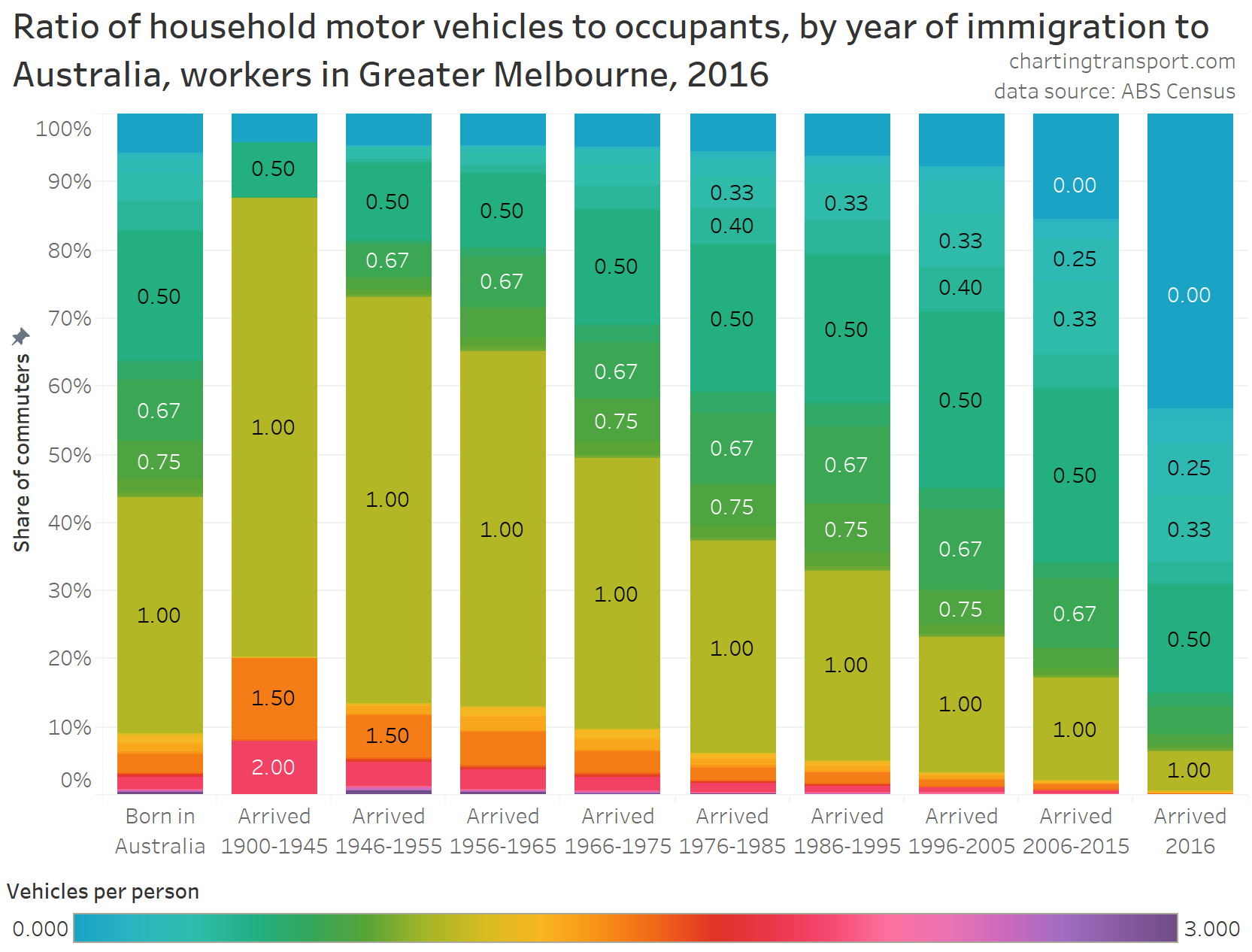
Aside: Immigrants who arrived in Australia 1900-1945 had much higher rates of motor vehicle ownership than people born in Australia, but they were also all aged over 70 in 2016.
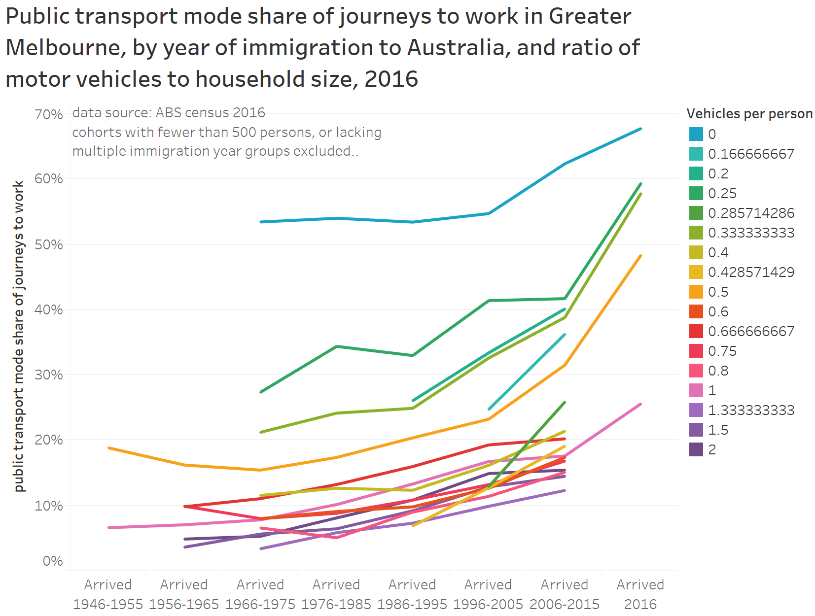
BUT if you look at PT mode shares for each vehicle : person ratio, there is still a relationship with year of arrival (see next chart), so car ownership doesn’t fully explain why recent immigrants were more likely to use public transport.
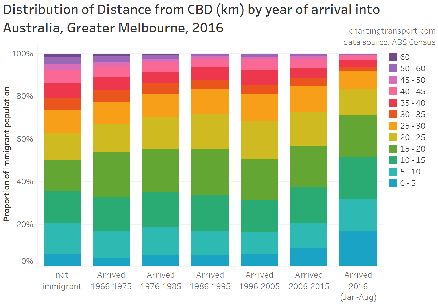
Looking at other factors, recent immigrants were slightly more likely to live closer to the city centre:
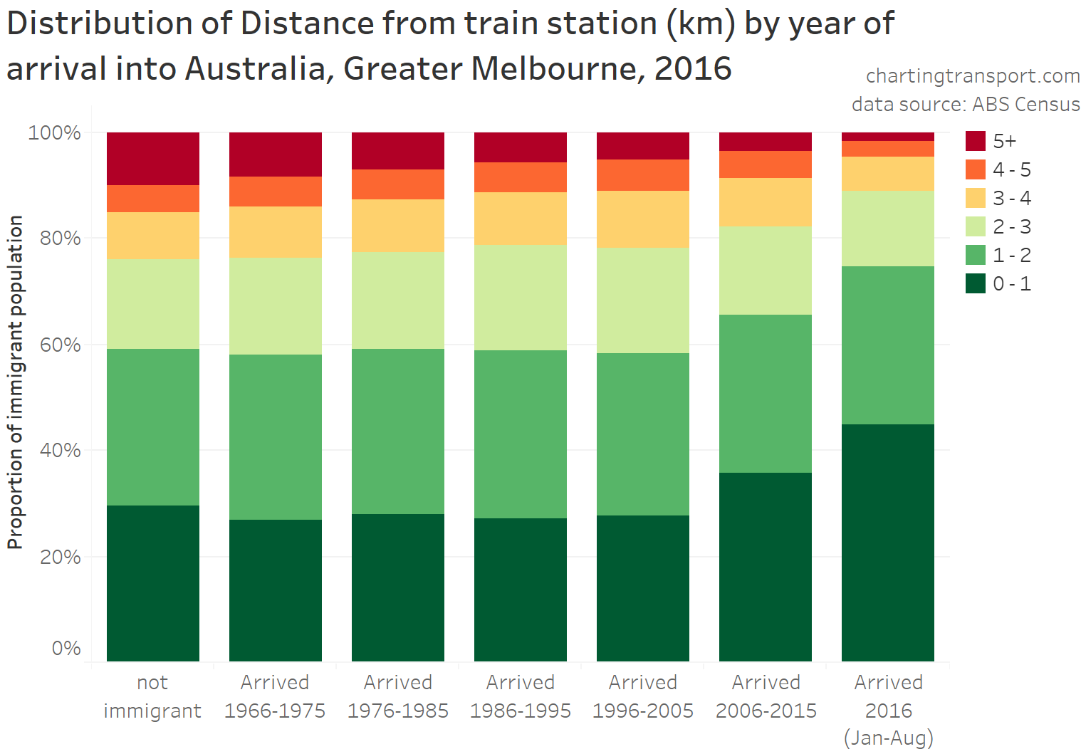
And they were more likely to live near a train station:
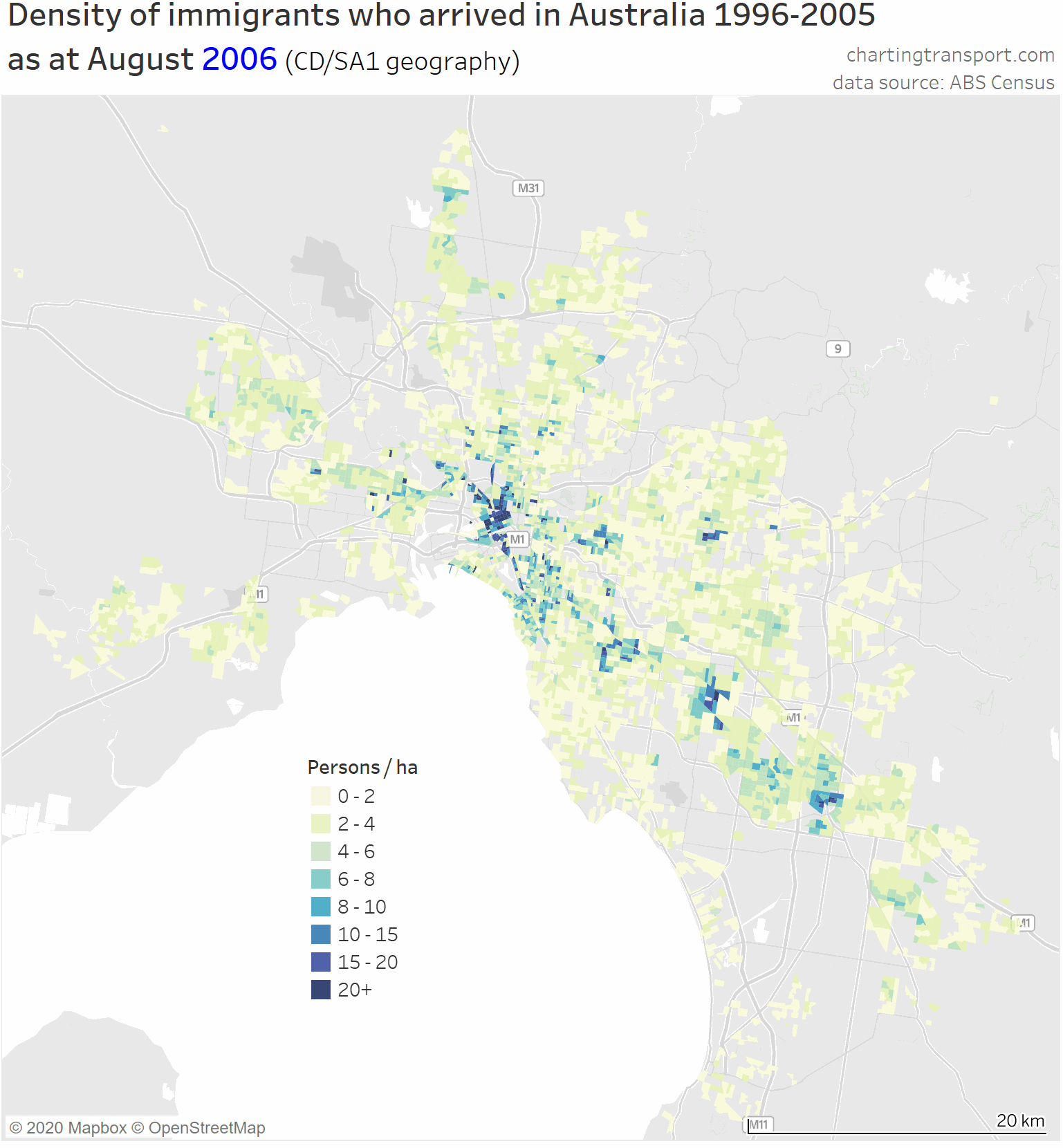
However not all recent immigrants to Melbourne lived near the city or a train station. Here’s a map showing the density of persons who arrived in Australia between 2006 and 2016 as at the August 2016 census.
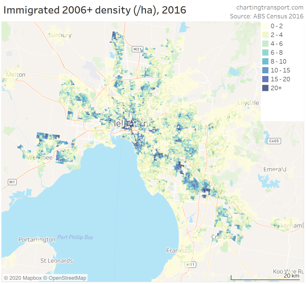
There were significant concentrations in outer growth areas such Point Cook, Tarneit, and Craigieburn. These suburbs also happen to have very well patronised rail feeder bus routes, and unusually higher concentrations of central city commuters for their distance from the CBD.
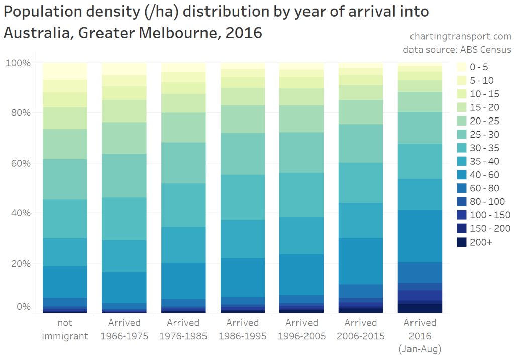
Recent immigrants were more likely to live in areas of higher residential density:
And they were more likely to work near the city centre:

More-recent immigrants were also more likely to have a higher level of educational attainment than less-recent immigrants, and generally much higher than those born in Australia:
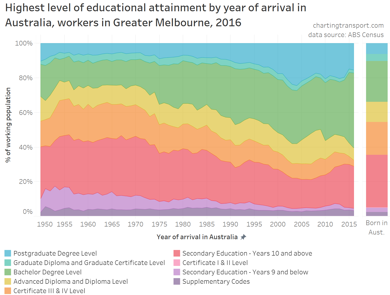
This probably reflects skilled immigration programs favouring people with higher educational qualifications. Indeed 60% of workers who arrived between January 2016 and the August 2016 census had a Bachelor or higher qualification. And we know from a previous post that highly qualified workers were more likely to work in central Melbourne, and were more likely to have used public transport in their journey to work.
Not only were more recent immigrants generally highly educated, many came to Melbourne to study to raise their educational attainment. Here is a chart showing the proportion of immigrants who were full-time or part-time students, by arrival year groups:
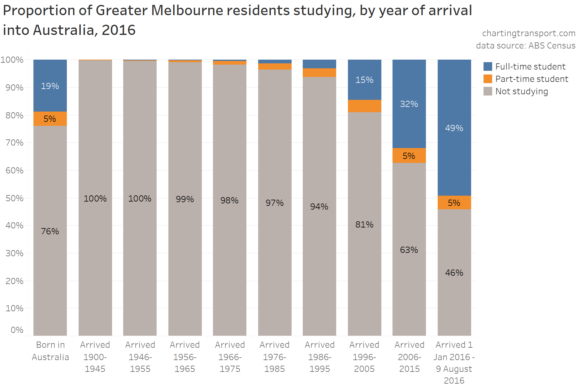
I will explore the relationship between student status and journey to work mode shares in an upcoming post.
How did immigrants shift around Melbourne over time?
Could internal migration explain why immigrants shifted away from public transport over time? Using census data across 2006, 2011, and 2016, it is possible to roughly track the population distribution of particular immigrant cohorts (although it’s not perfect because these immigrants may have moved in/out of Melbourne or left Australia between censuses, including temporary residents).
The following map shows the density of immigrants who arrived in Australia between 1996 and 2005 across census years 2006, 2011, and 2016:
In 2006 there were concentrations around the central city and many rail stations. But these concentrations reduced over time, with many of these people moving into other suburbs by 2011 or 2016 (or leaving Melbourne). In particular, many moved to outer suburbs such as Tarneit, Truganina, Point Cook, Derrimut, Craigieburn, Roxburgh Park, and Narre Warren South.
To help summarise these shifts, the following chart shows the distribution of this cohort across census years by distance from train stations, distance from the Melbourne CBD, and the motor vehicle ownership rate of the areas in which they lived:
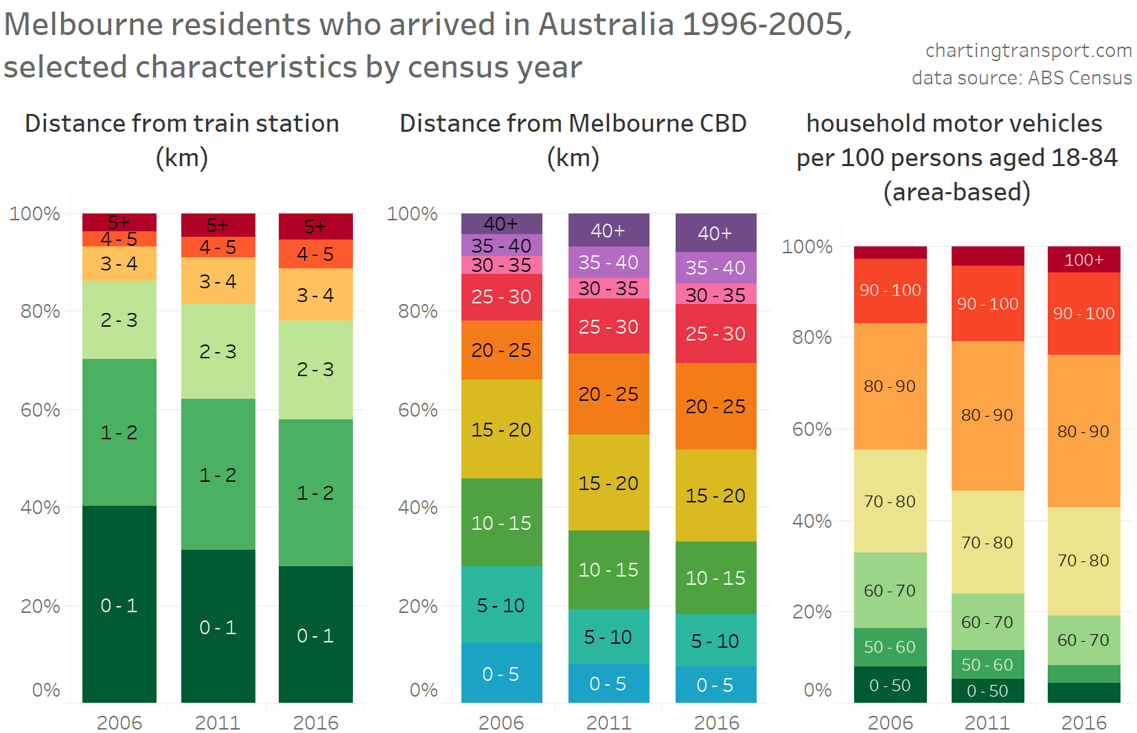
You can see that they generally moved further away from train stations, further away from the CBD, and into areas that had higher levels of motor vehicle ownership. All these shifts are associated with reduced public transport mode share, and I suspect this pattern would not be unique to those who arrived 1996-2005.
Is there a relationship between PT mode shares and where people were born?
Firstly, here’s a chart showing the birth regions of Melbourne workers who were born outside Australia, by year of immigration (mostly 5 year bands). I’ve used ABS’s country of birth groups, except that I’ve separated North America from the other Americas.
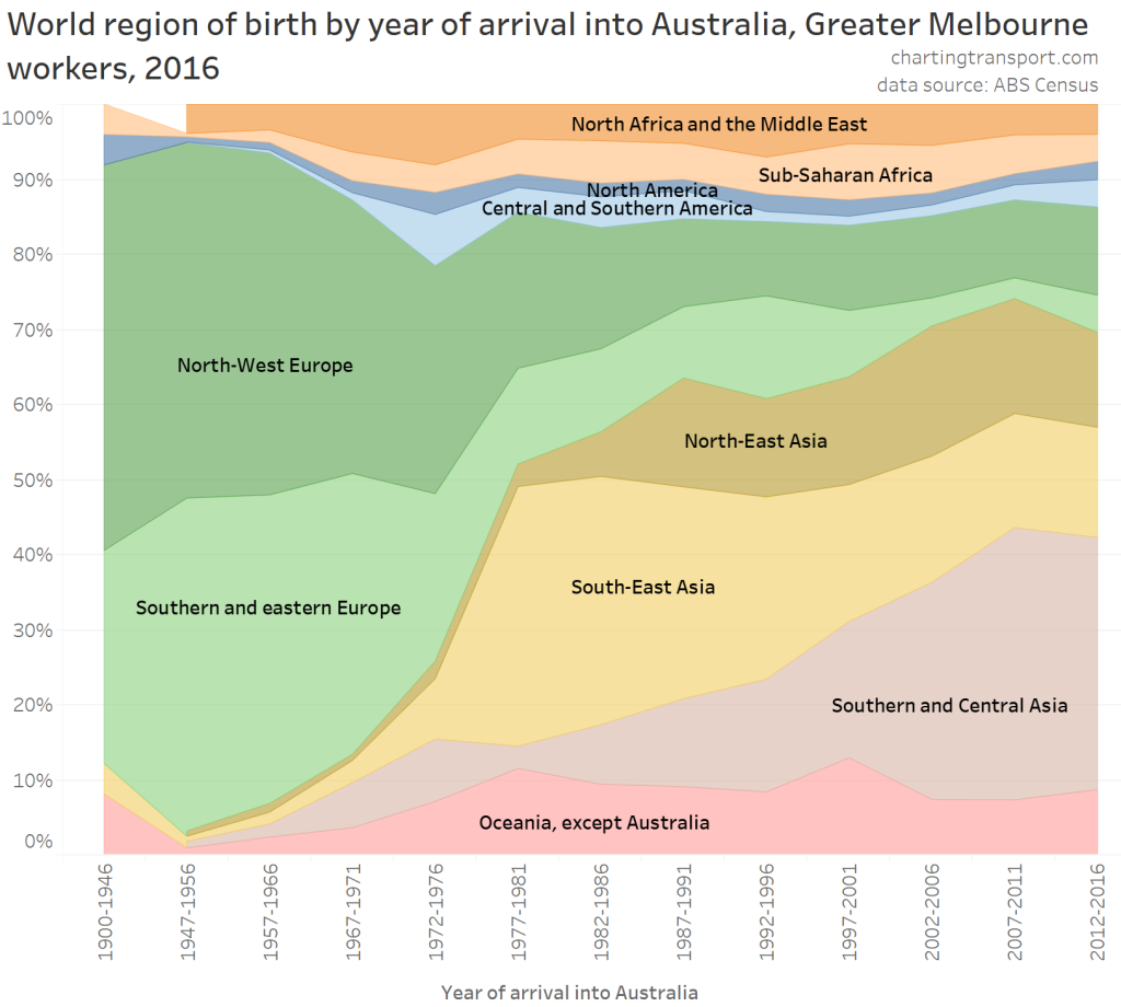
The early half of the 20th century saw significant immigration from Europe, whereas in more recent times this has shifted to Asia, with southern and central Asia now the biggest source of immigrants. (Southern and central Asia includes India, Sri Lanka, Bangladesh, many former Soviet republics south of Russia and all “-stan” countries.)
So do journey to work public transport mode shares vary by immigrants’ region of birth?

There certainly is some variance between birth regions, but not quite what I was expecting. Immigrants from seemingly car-dominated north America had much higher PT mode shares than those born in European countries with reputations for higher quality public transport.
Of course people born in different parts of the world may be more or less likely to work in the City of Melbourne, and might be more or less likely to be parents. These factors strongly influence PT mode shares. So the next chart disaggregates the data by parenting status and work location (note a different X-axis scale used for each work location division).
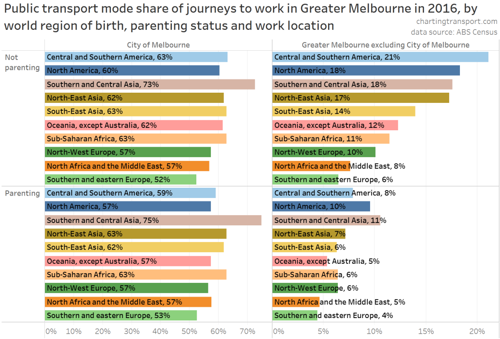
This birth regions in this chart have the same ordering as the previous chart, but in most quadrants the mode shares are no longer in order (the top-right quadrant being the exception: non-parenting, working outside the City of Melbourne). Southern and central Asia tops PT mode shares for the other three quadrants, and by quite a large margin for City of Melbourne workers.
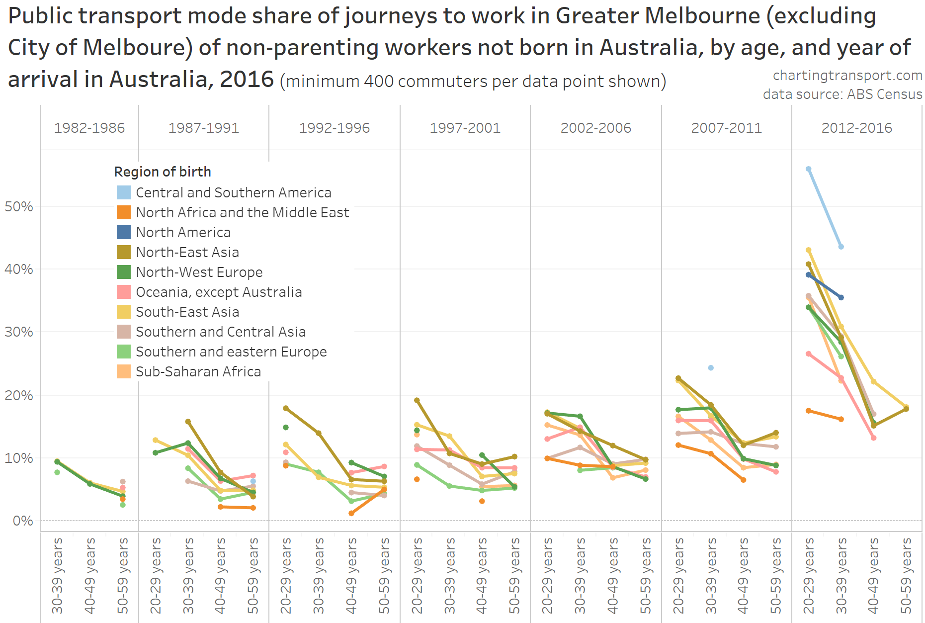
We know year of arrival into Australia is a significant factor in PT mode shares, and relative composition of immigrants has certainly changed over time. Also, age itself is likely to be a factor. The next chart adds these two dimensions. However, I have had to remove people working in the City of Melbourne, those under 20 and those over 60 – because the population for these categories became too small, introducing meaningless noise.

You can see there was a relationship between year of arrival and PT mode share within each age band, for both parenting and non-parenting workers. Central and Southern America generated the highest average PT mode shares while North Africa and the Middle East often had the lowest PT mode shares.
Here’s another look at that data, but comparing mode shares primarily by age rather than year of arrival. For this chart I’ve (also) removed parenting workers, and those who arrived before 1982, because they are mostly spread across just two 10 year age bands which isn’t really enough to show an age-based trend:
This chart shows that there was certainly a relationship between age and PT mode share for most birth regions (as well as year of arrival), at least for non-parents working outside the City of Melbourne.
I cannot be certain that this pattern also existed for all birth-regions for parenting workers and people who worked within the City of Melbourne, but I have previously shown a relationship between age and PT mode share for these categories (when ignoring birth region), so a relationship is likely.
So even with a changing mix of immigrant sources over time, age (or some other age-related factor) remains a significant factor when it comes to explaining public transport mode shares.
I hope you’ve found this at least half as interesting as I did.

