In almost every city, hordes of people commute towards the city centre in the morning and back away from the city in the evening. This largely radial travel causes plenty of congestion on road and public transport networks.
But only a fraction of commuters in each city actually work in the CBD. So just how radial are journeys to work? How does it vary between cities? And how does it vary by mode of transport?
This post takes a detailed look at journey to work data from the ABS 2016 Census for Melbourne, Sydney, and to a less extent Brisbane, Perth, Adelaide and Canberra. I’ve included some visualisations for Melbourne and Sydney that I hope you will find interesting.
How to measure radialness?
I’m measuring radialness by the difference in degrees between the bearing of the journey to work, and a direct line from the home to the CBD of the city. I’m calling this the “off-radial angle”.
So an off-radial angle of 0° means the journey to work headed directly towards the CBD. However that doesn’t mean the workplace was the CBD, it might be have been short of the CBD or even on the opposite side of the CBD.
Similarly, an off-radial angle of 180° means the journey to work headed directly away from the CBD. And a value of 90° means that the trip was “orbital” relative to the CBD (a Melbourne example would be a journey from Box Hill that headed either north or south). And then there are all the angles in between.
To deal with data on literally millions of journeys to work, I’ve grouped journeys by home and work SA2 (SA2s are roughly the size of a suburb), and my bearing calculations are based on the residential centroid of the home SA2 and the employment centroid of the work SA2.
So it is certainly not precise analysis, but I’ve also grouped off-radial angles into 10 degree intervals, and I’m mostly looking for general trends and patterns.
So how radial are trips in Melbourne and Sydney?
Here’s a chart showing the proportion of 2016 journeys to work at different off-radial angle intervals:
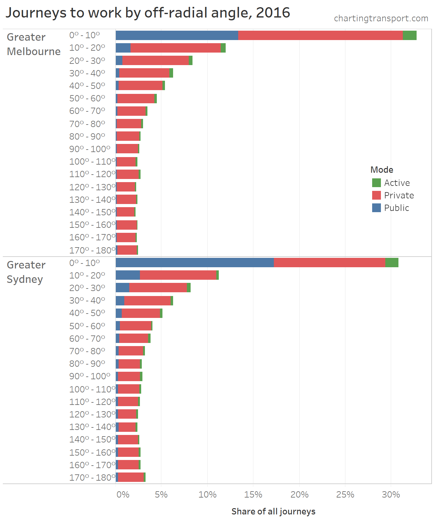
Technical note: As per all my posts, I’ve designated a main mode for journeys to work: any journey involving public transport is classed as “Public”, any journey not involving motorised transport is classed as “Active”, and any other journey is classed as “Private”.
In both cities over 30% of journeys to work were what you might call “very radial” – within 10 degrees of perfectly radial. It was slightly higher in Melbourne.
You can also see that public transport trips are even more radial, particularly in Melbourne. In fact, around two-thirds of public transport journeys to work in 2016 had a destination within 2 km of the CBD.
Melbourne’s “mass transit” system (mostly trains and trams) is very radial, so you might be wondering why public transport accounts for less than half of those very radial journeys (41% in fact).
Here are Melbourne’s “very radial” journeys broken down by workplace distance from the Melbourne CBD:

Public transport dominates very radial journeys to workplaces within 2 km of the centre of the CBD, but is a minority mode for workplaces at all other distances. Many of these highly radial journeys might not line up with a transit line towards the city, and/or there could well be free parking at those suburban workplaces that make driving all too easy. I will explore this more shortly.
Sydney however had higher public transport mode shares for less radial journeys to work. I think this can be explained by Sydney’s large and dense suburban employment clusters that achieve relatively high public transport mode shares (see: Suburban employment clusters and the journey to work in Australian cities), the less radial nature of Sydney’s train network, and generally higher levels of public transport service provision, particularly in inner and middle suburbs.
Visualising radialness on maps
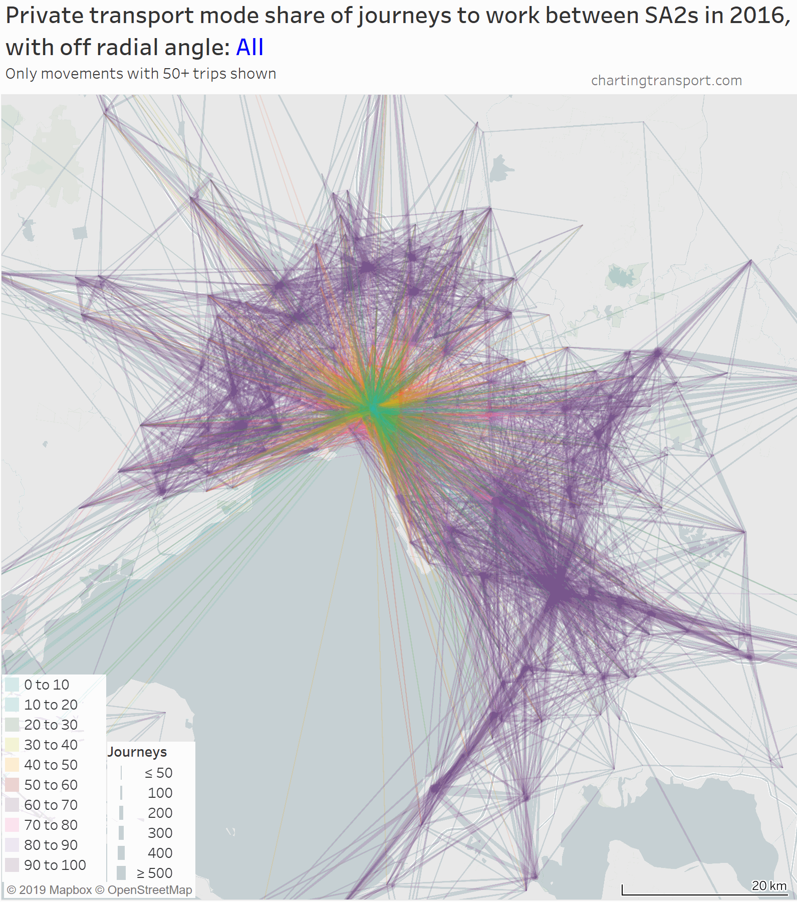
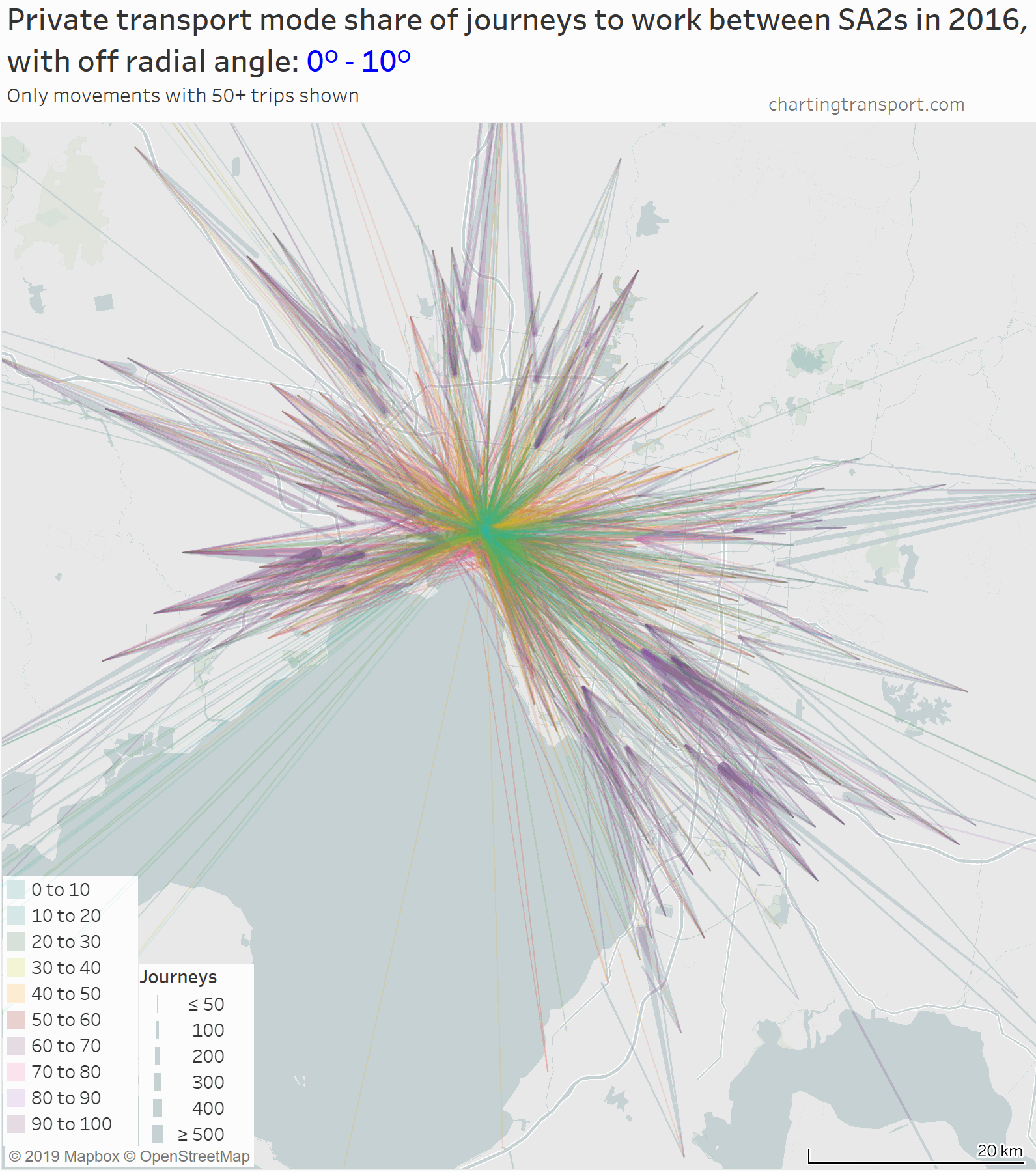
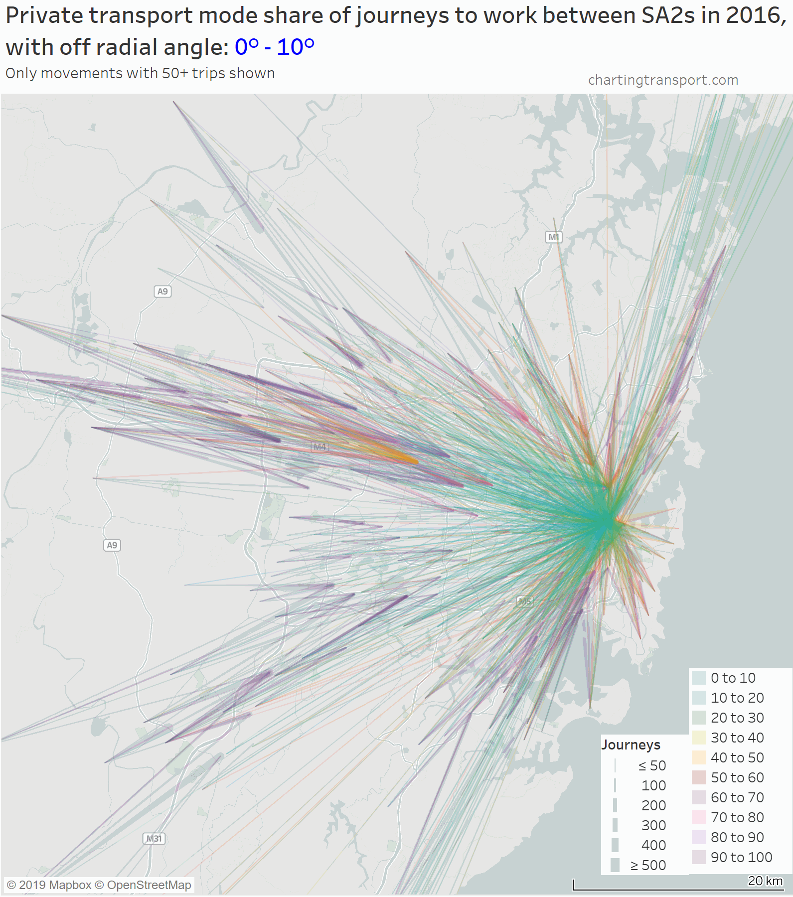
To visualise journeys to work it is necessary to simplify things a little so maps don’t get completely cluttered. On the following maps I show journey to work volumes between SA2s where there are at least 50 journeys for which the mode is known. The lines between home and work SA2s get thicker at the work end, and the thickness is proportional to the volume (although it’s hard to get a scale that works for all scenarios).
First up is an animated map that shows journeys to work coloured by private transport mode share, with each frame showing a different interval of off-radial angle (plus one very cluttered view with all trips):
(click/tap to enlarge maps)
I’ve had to use a lot of transparency so you have a chance at making out overlapping lines, but unfortunately that makes individual lines a little harder to see, particularly for the larger off-radial angles.
You can see a large number of near-radial journeys, and then a smattering of journeys at other off-radial angles, with some large volumes across the middle suburbs at particular angles.
The frame showing very radial trips was rather cluttered, so here is an map showing only those trips, animated to strip out workplaces in the CBD and surrounds so you can see the other journeys:
Private transport mode shares of very radial trips are only very low for trips to the central city. When the central city jobs are stripped out, you see mostly high private transport mode shares. Some relative exceptions to this include journeys to places like Box Hill, Hawthorn, and Footscray. More on that in a future post.
Here are the same maps for Sydney:
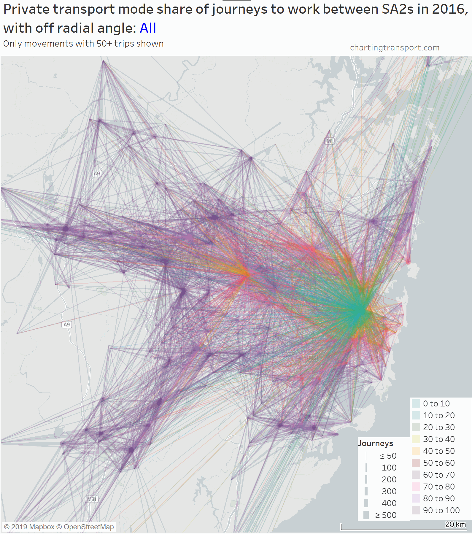
Across both of these maps you can find Sydney’s suburban employment clusters which have relatively low private transport mode shares. I explore this, and many other interesting ways to visualise journeys to work on maps in another post.
What about other Australian cities?
To compare several cities on one chart, I need some summary statistics. I’ve settled on two measures that are relatively easy to calculate – namely the average off-radial angle, and the percent of journeys that are very radial (up to 10°).
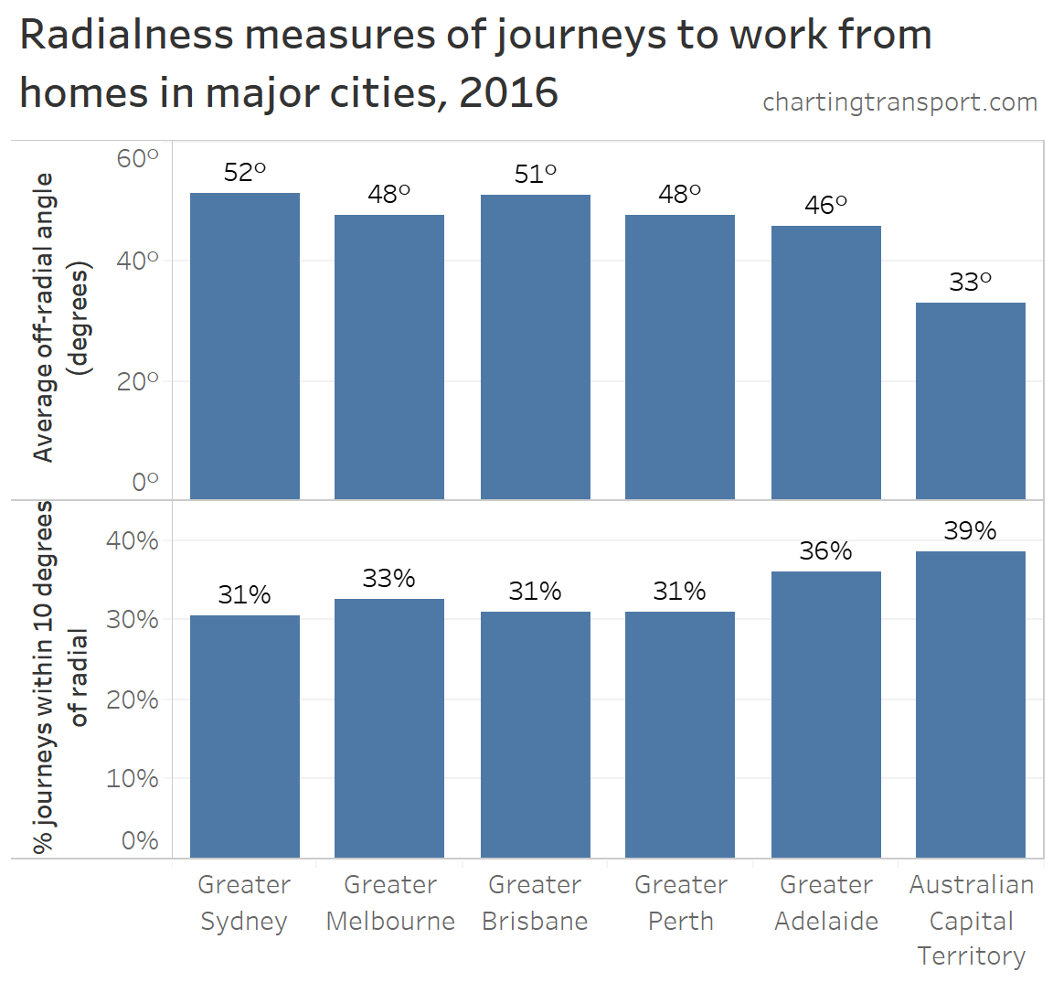
The ACT (Canberra) actually has the most radial journeys to work of these six cities, despite it being something of a polycentric city. Adelaide has the next most radial journeys to work, but there’s not a lot of difference in the largest four cities, despite Sydney being much more a polycentric city than the others. Note the two metrics do not correlate strongly – summary statistics are always problematic!
Here are those radialness measures again, but broken down by main mode:
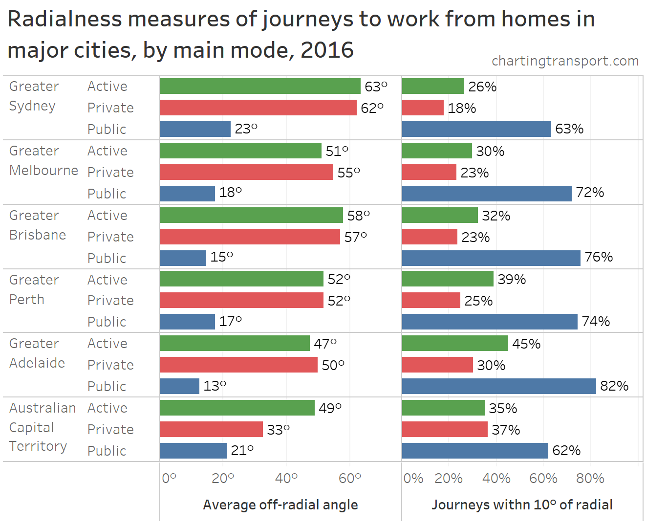
Sydney now looks the least radial of the cities on most measures and modes, particularly by public transport.
The Australian Capital Territory (Canberra) has highly radial private and active journeys to work, but much less-radial public transport journeys than most other cities. This probably reflects Canberra’s relatively low cost parking (easy to drive to the inner city), but also that the public transport bus network is orientated around the suburban town centres that contain decent quantities of jobs.
Adelaide has the most radial journeys to work when it comes to active and public transport.
What about other types of travel?
In a future post, I’ll look at the radialness of general travel around Melbourne using household travel survey data (VISTA), and answer some questions I’ve been pondering for a while. Is general travel around cities significantly less radial than journeys to work? Is weekend travel less radial than weekday travel?
Follow the blog on twitter or become an email subscriber (see top-right of this page) to get alerted when that comes out.


Wonderful, as usual Chris.
What started your journey to examine radialness, and what do you think are the implications of your findings?
LikeLike
Thanks Darren.
Public transport networks have traditionally been very radial, so I’ve been curious about how well they align with journeys to work, and whether public transport wins much mode share of radial-orientated trips to places other than the CBDs of cities. I’m not sure whether there are a lot of direct implications of this research, but hopefully it adds to understanding about how people commute around cities.
I’m even more curious about weekend travel – we now have significant traffic congestion on weekends, but often in different road corridors. Some people might argue we should refocus public transport on weekends. Much more to be revealed in the next couple of posts!
LikeLike
Excellent work as always Chris.
What I noticed most clearly was that, for Melbourne, highly radial journeys are dominated by very short distances, and that at longer distances the public transport mode share dropped off significantly. Does that suggest to you that not many people are commuting long distances by rail to CBD jobs? It would be interesting to know where those people are going – particularly with this “outer suburban ring rail” proposal in the wings.
LikeLike
I believe that dispersion and randomness reduce congestion and “radialness” increases it. Why we don’t regard dispersion and randomness as our friend, is a question. There are quite a few papers over the years, on dispersion and travel-time stability, by Peter Gordon and various colleagues, dealing with US cities. I regard radialness as the friend of rent-seekers.
LikeLike