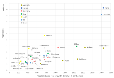
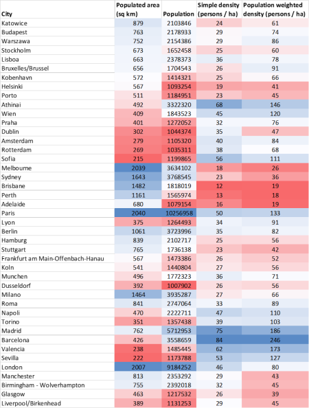
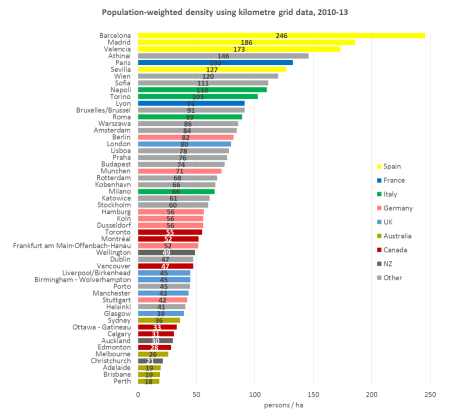
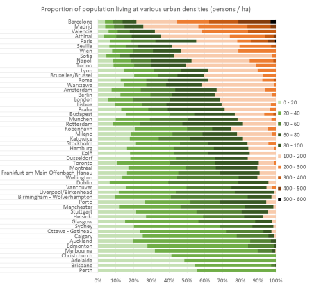
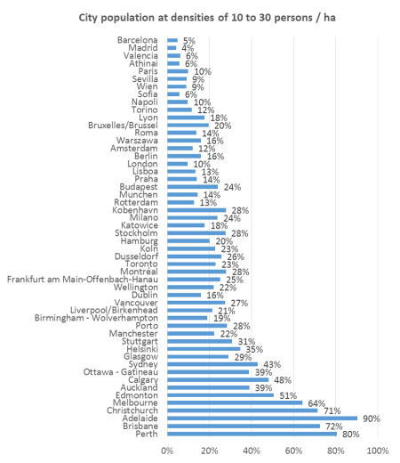
[Updated May 2019 with June 2018 population estimates and new data on components of population growth]
For a while now, I’ve been tracking urban sprawl and consolidation in Melbourne, but some interesting research prompted me to compare Melbourne to the other large Australian cities.
My question for this post: How do Australian cities compare for growing out versus up? (and by growth I’m talking about population)
Firstly, I need to define “outer” growth.
To do this, I’ve mapped the 2001, 2006, and 2011 ABS urban centre boundaries of each city. I’ve then looked at Statistical Area 3 regions within each Greater Capital City area that either saw substantial urban growth between 2001 and 2011, or were located on the fringe of the main urban area.
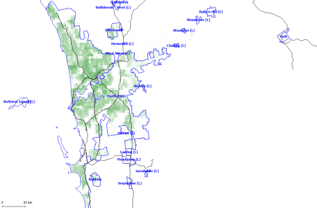
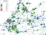
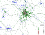
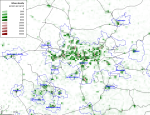
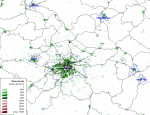
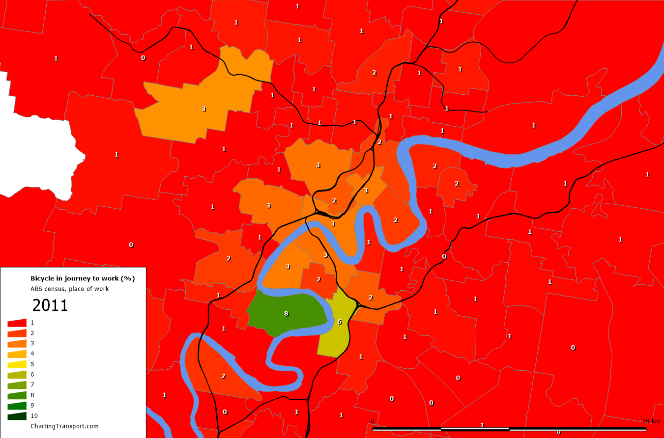
Here’s a map of Melbourne, with my designated “outer” areas shaded in a transparent blue:

The area in the middle is mostly shaded green – land considered by the ABS to be urban since at least 2001. There are a few yellow and orange areas (developed 2001-06 and 2006-11 respectively) that are not part the blue shaded “outer” area. The larger orange section visible in the south is mostly green wedge or industrial land, so does not represent growth of residential areas (maps for other cities below). The other yellow and orange areas are relatively small, and many have non-residential land uses.
I’ve done a similar process for Sydney, Perth, Adelaide, and the conurbation of South East Queensland (i.e. Brisbane, Gold Coast, and Sunshine Coast combined). See the end of this post for equivalent maps of these cities.
With an outer area defined for each city, I have calculated the annual population growth of these outer areas (based on 30 June estimates for each year) as a proportion of total population growth in each city:

As you can see almost all recent population growth in Perth is happening in the outer suburbs (in fact there was population decline in the rest of Perth in 2015-2016), while it has been around half in Melbourne and South East Queensland, and lower in other cities, although Sydney had an uptick in 2018.
For reference, here are annual population growth rates for the five cities:
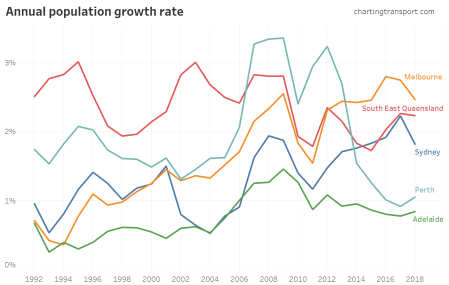
Perth saw dramatic growth between 2007 and 2013, but much less growth in the last few years, and most of that happened in outer areas. In recent years Melbourne has grown the fastest.
The population data I’m using goes back to 1991, which creates some interesting results in the early nineties (even though my defined “outer” areas are trying to measure growth from 2000 onwards). In Adelaide in 1993 the outer areas had “156%” of the city’s population growth – which actually means that the outer areas grew (by 4509 people) while the inner areas had population decline (by 1617 people). At the same time in Melbourne, “103%” of population growth occurred in the outer areas as there was a net reduction of 393 people in the inner areas of Melbourne.
This reflects a previous trend for cities to grow mostly outwards until the mid-1990s, when urban densification took off. For more on this topic see How is density changing in Australian cities? (2nd edition)
So is Perth the most sprawling large city in Australia? Well, yes in terms of percentage of population growth, but not in terms of absolute population growth in outer areas:

On my definitions of outer areas, Melbourne is charging ahead, with over 66,000 residents moving into growth areas in 2017-18. Perth peaked in 2012, but has fallen back since. Adelaide just hasn’t seen a lot of population growth in recent decades.
I’m measuring sprawl by population, but you could argue that it might be better measured by urbanised area. Unfortunately that is tricky because definitions of urbanised area have changed over time and occasionally have large jumps as non-urban wedges are absorbed.
Population growth in outer Sydney slowed dramatically between 2002 and 2006. The chart below shows there was also a slow down in non-outer areas, although it was a little less dramatic. Around this time Sydney also transitioned from around 50% of growth being in outer areas, down to around 30%.
Here is the annual population growth in the non-outer areas of each city:
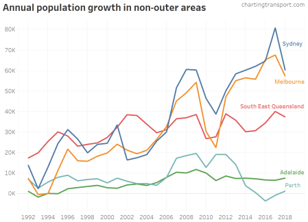
Around 2007 there was an acceleration of population growth in non-outer areas in most cities (although there was a subsequent lull around 2010-2012). In 2015-16 in Perth, the population of the non-outer areas decreased by an estimated 3524 people.
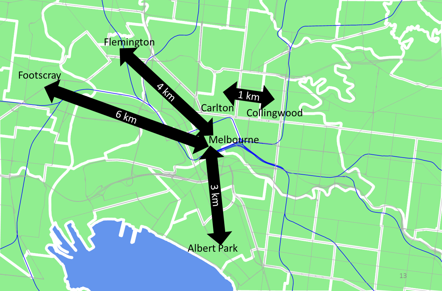
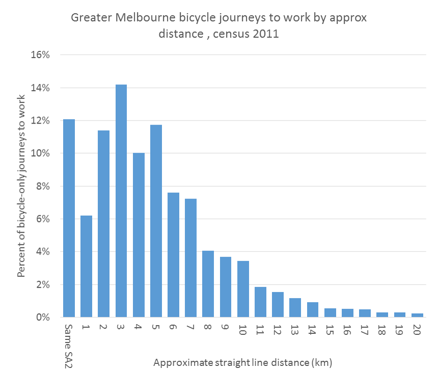
Another measure of sprawl is the average distance of residents from the city centre. Here are rough calculations for Greater Capital City areas using SA2 data (it would probably be unfair to measure all of South East Queensland against the Brisbane CBD):
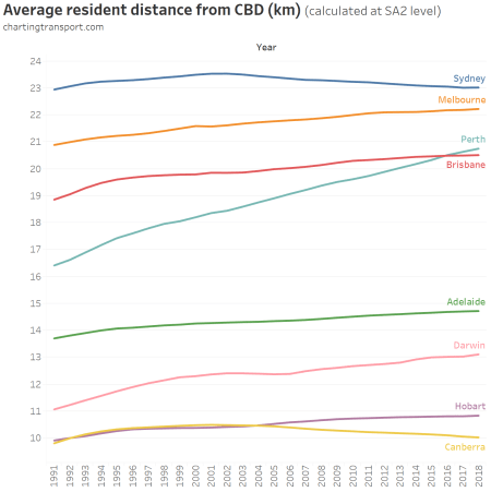
On this measure Perth is sprawling the fastest, with the average resident in 2018 being roughly 21 km from the CBD, up from just over 16 km in 1991. Sydney and Canberra have seen a reduction in average distance from the CBD, as inner areas become more dense.
A couple of things to note:
- The outer areas will have some combination of urban growth and urban densification. My guess is that most population growth will be from urban sprawl, as urban consolidation is more likely to happen in the inner and middle suburbs. But my method doesn’t attempt to remove urban consolidation in outer areas.
- You might be wondering about the inclusion of outer areas that are not experiencing urban growth. These areas are unlikely to have much population growth at all, so will have little impact on the calculations of percentage of growth in outer areas.
That said, I’ve also done a more fine grained analysis of outer growth areas using census data without these issues. See: Are Australian cities sprawling with low-density car-dependent suburbs?
Where did the new residents come from?
The ABS now publishes the components of population growth down to SA2 geography for 2016-17 onwards, so we can dig a little deeper.
Here are the components of outer suburban population growth in 2016-17 and 2017-18 (animated):
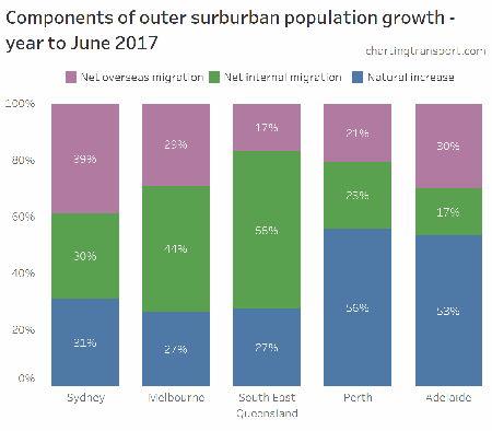
Internal migration refers to people moving to/from other parts of Australia (possibly including other parts of the city)
In Perth and Adelaide, less than half of the outer suburbs population growth was from new residents, whereas it was more like 72% in the other three urban centres. This might reflect relatively slower outer urban growth in Perth and Adelaide – with population growth coming more from existing residents growing families rather than new residents moving in.
Here are the components of population growth for the five urban centres as a whole:
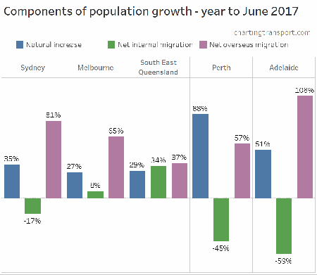
Sydney, Perth, and Adelaide have seen existing residents leave for other parts of Australia, replaced with births and international migrants.
Here’s the same for the non-outer suburbs:
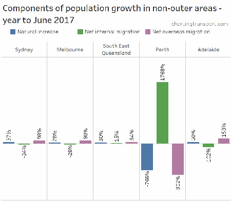
The three columns for each city do actually add to 100%. In Perth the net of the components was very little population change, so each component becomes a very large percentage of the small net total population change.
That chart is quite confusing, so instead let’s look at the underlying numbers:
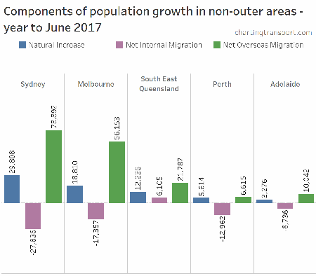
In Melbourne and Sydney, the net increase from births/deaths in non-outer areas was effectively cancelled out by people migrating away domestically (many likely to the outer suburbs of the same city), with the net population growth then mostly accounted for by net overseas immigration.
The only urban area where the existing non-outer area didn’t see net outbound domestic migration was South East Queensland.
For further analysis on the components of population growth, see Visualising the components of population change in Australia
Some non-Australian readers might be confused by the term “overseas”. We use it interchangeably with “international” because Australia has no land borders with other countries.
Appendix – Maps showing outer areas of cities
For Melbourne refer to the top of this post.
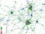
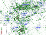
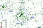
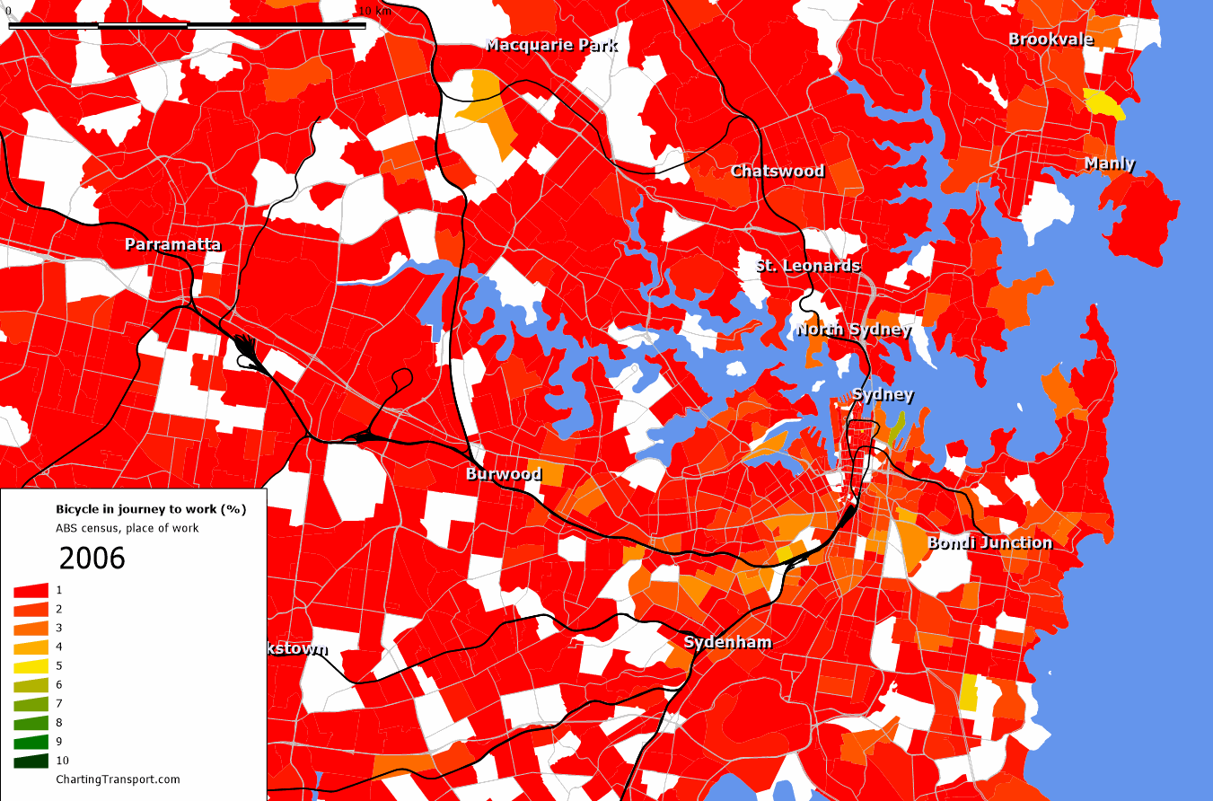
Sydney
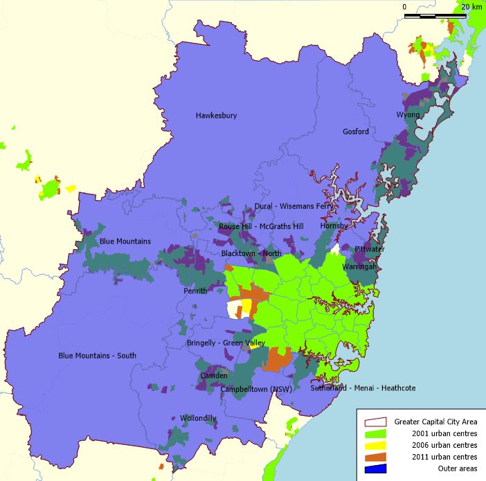
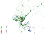
I’ve used the full Greater Capital City area, which includes the Central Coast (Gosford / Wyong). This is arguably part of a conurbation with Newcastle but I’ve kept to the Greater Sydney boundary. The large orange and yellow non-outer area to the west is mostly parkland or industrial, while the orange area to the south is mostly the Holsworth Military area which was defined as urban from 2011.
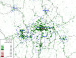
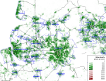
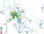
South East Queensland
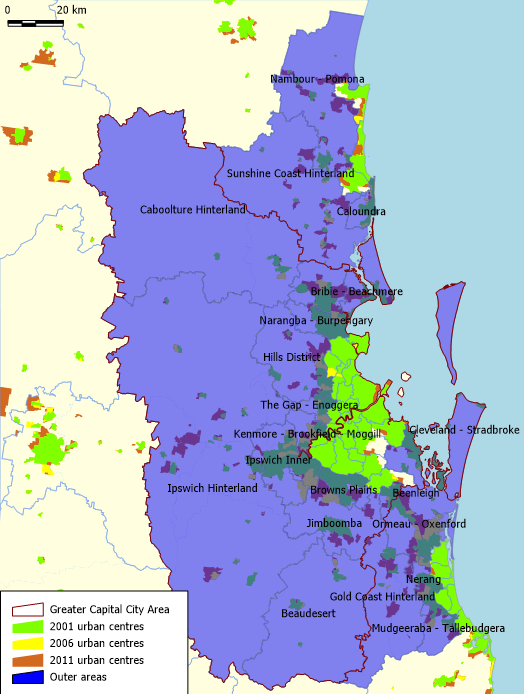
I’ve included all of Greater Brisbane, as well as the Gold Coast (as far as the border with NSW) and the Sunshine Coast. The conurbation population includes the established areas of the Gold Coast and Sunshine Coast as non-outer areas. The orange areas on the Sunshine Coast mostly contain National Parks and the airport, although it also includes the relatively new suburb of Peregian Springs, so not a perfect definition.
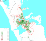
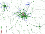
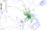
Perth

The non-outer area is fairly well-defined as almost entirely urban in 2001. The entire of the City of Joondalup (on the northern coast, mostly surrounded by Wanneroo) counts as urban in 2001, although the suburb of Iluka in the north-western corner has developed more recently, so the calculation won’t be perfect.
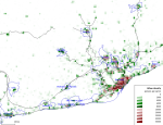
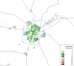
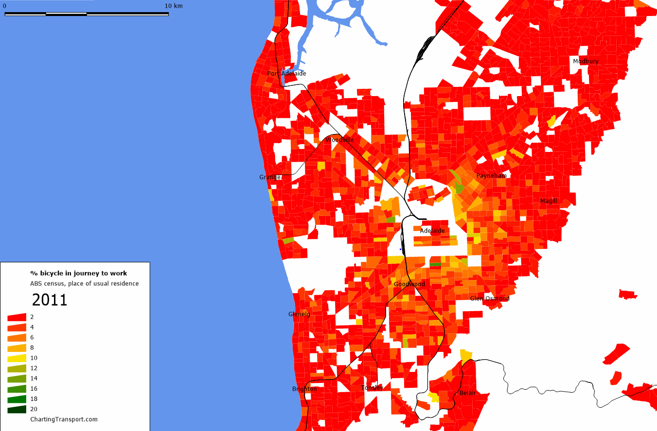
Adelaide
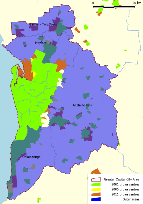
The two large orange areas in the non-outer area are non-residential, so there will be little fringe growth outside the blue area.


 Posted by chrisloader