Trends in journey to work mode shares in Australian cities to 2016 (second edition)

Tue 24 October, 2017

[Updated 1 December 2017 with reissued Place of Work data]

The ABS has now released all census data for the 2016 journey to work. This post takes a city-level view of mode share trends. It has been expanded and updated from a first edition that only looked at place of work data.

My preferred measure of mode share is by place of enumeration – ie how did you travel to work based on where you were on census night (see appendix for discussion on other measures).

I’m using Greater Capital City Statistical Areas (GCCSA) geography for 2011 and 2016 and Statistical Divisions for earlier years. For Perth, Melbourne, Adelaide, Brisbane and Hobart the GCCSAs are larger than the Statistical Divisions used for earlier years, but then those cities have also grown over time. See appendix 1 for more discussion.

Some of my data goes back to 1976 – I’ll show as much history as I have for each mode/modal combination.

Public transport mode share

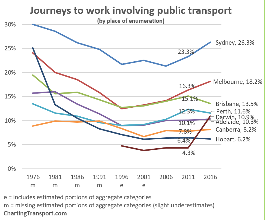
Sydney continues to have the largest public transport mode share, and the largest shift of the big cities. Melbourne also saw significant positive mode shift, but Perth and particularly Brisbane had mode shift away from public transport.

There’s so much to unpack behind these trends, particularly around the changing distribution of jobs in cities that I’m going to save that lengthy discussion for another blog post.

But what about the…

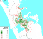
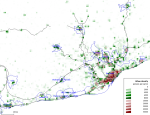
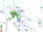
Massive mode shift to “public transport” in Darwin?!?

[this section updated 26 Oct 2017]

Yes, I have triple-checked I downloaded the right data. “Public transport” mode share increased from 4.3% to 10.9%. The number of people reporting bus-only journeys went from 1648 in 2011 to 5661 in 2016, which is growth of 244%. There has also been a spike in the total number of journeys to work in 2011, 30% higher than in 2011, while population growth was 13%.

Initially I thought this might have been a data error, but I’ve since learnt that there is a large LNG gas project just outside Darwin, and up to 180 privately operated buses are being used to transport up to 4700 workers to the site. This massive commuter task is swamping the usage of public buses.

Here’s the percentage growth in selected journey types between 2011 and 2016:

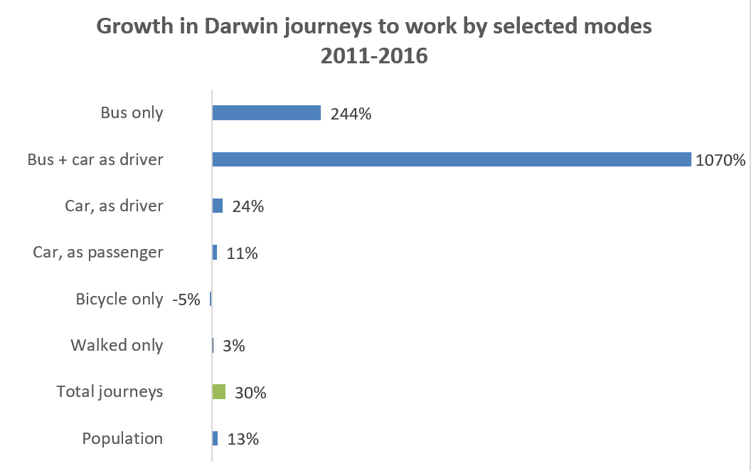
Bus + car as driver grew from 74 to 866 journeys, which reflects the establishment of park and ride sites around Darwin for the special commuter buses. Bus only journeys increased from 1953 to 5744. So it looks like most workers are getting the bus from home and/or forgot to mention the car part of their journey (in previous censuses I’ve seen many people living kilometres from a train station saying they got to work by train and walking only).

So this new project has swamped organic trends, although it is quite plausible that some people have shifted from cycling/walking to local jobs to using buses to commute to the LNG project (which is outside urban Darwin). When I look at workplaces within the Darwin Significant Urban Area (2011 boundary), public transport mode share is 6.0%, in 2016, still an increase from 4.4% in 2011. More on that in a future post.

Train

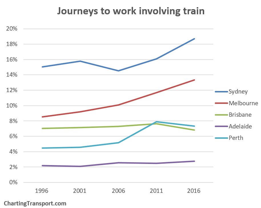
Sydney saw the fastest train mode share growth, followed by Melbourne, while Brisbane and Perth went backwards.

Bus

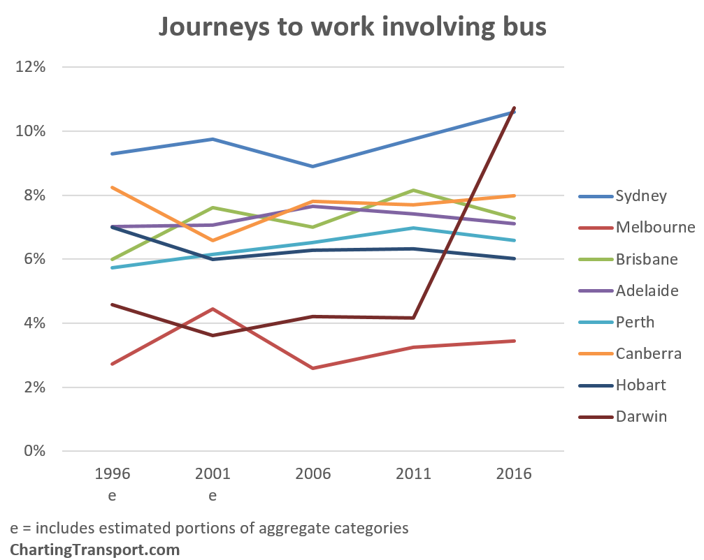
Darwin just overtook Sydney for top spot thanks to the LNG project. Otherwise only Sydney, Canberra and Melbourne saw growth in bus mode share. Melbourne’s figure remains very low, however it is important to keep in mind that trams provide most of the on-street inner suburban radial public transport function in Melbourne.

Train and bus

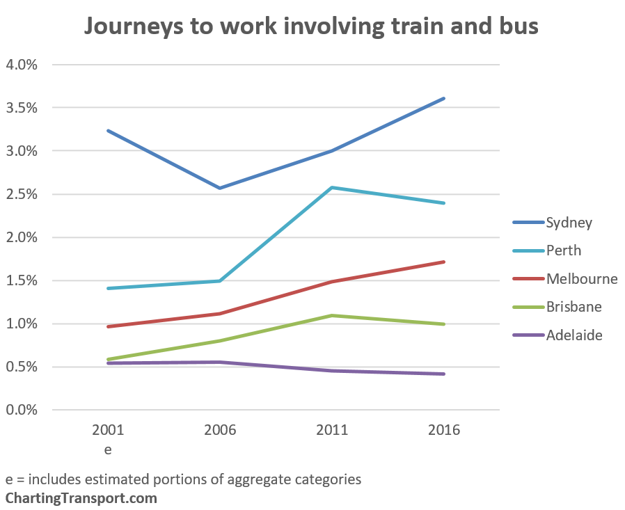
Sydney comes out on top, with a large increase in 2016 (although much of this is still concentrated around Bondi where there are high bus frequencies and no fare penalties for transfers – more on that in an upcoming post). Melbourne is seeing substantial growth (perhaps due to improvements in modal coordination), while Perth, Adelaide and Brisbane had declines in terms of mode share (Brisbane and Adelaide were also declines on raw counts, not just mode share). I’m sure some people will want to comment about degrees of modal integration in different cities.

Train and bicycle

Some cities are also trying to promote the bicycle and train combination as an efficient way to get around (they are the fastest motorised and (mostly)non-motorised surface modes because they can generally sail past congested traffic). The mode shares are still tiny however:

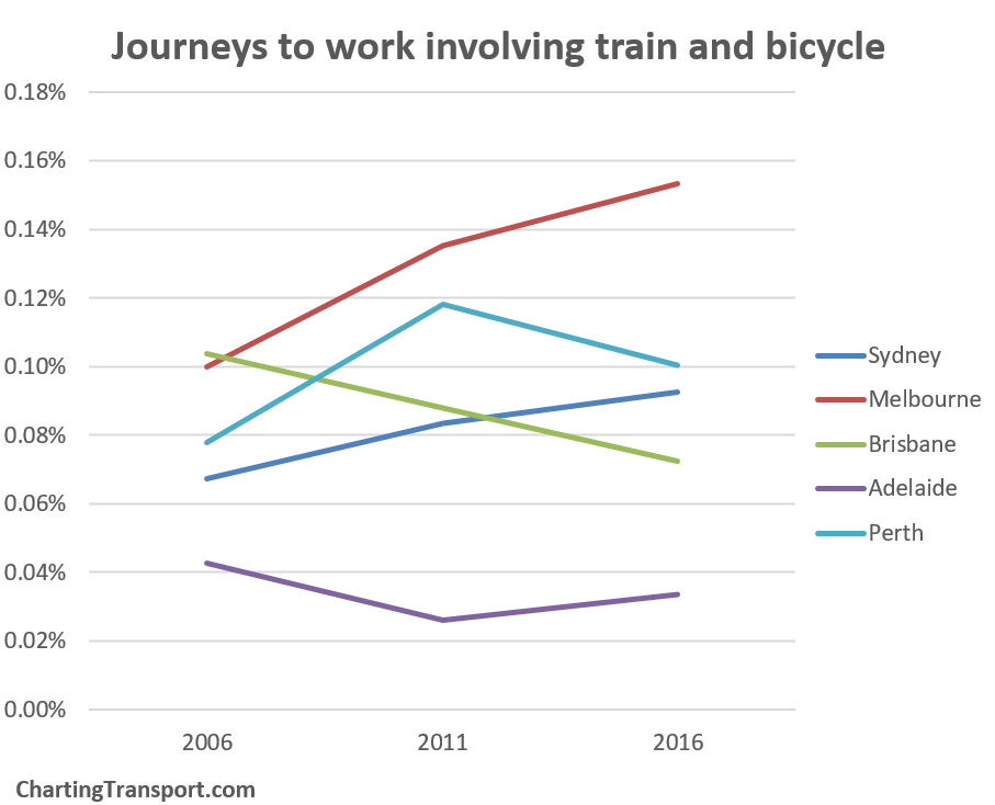
Sydney and Melbourne are growing but the other cities are in decline in terms of mode share.

As this modal combination is coming off an almost zero base, it’s also probably worth looking at the raw counts:

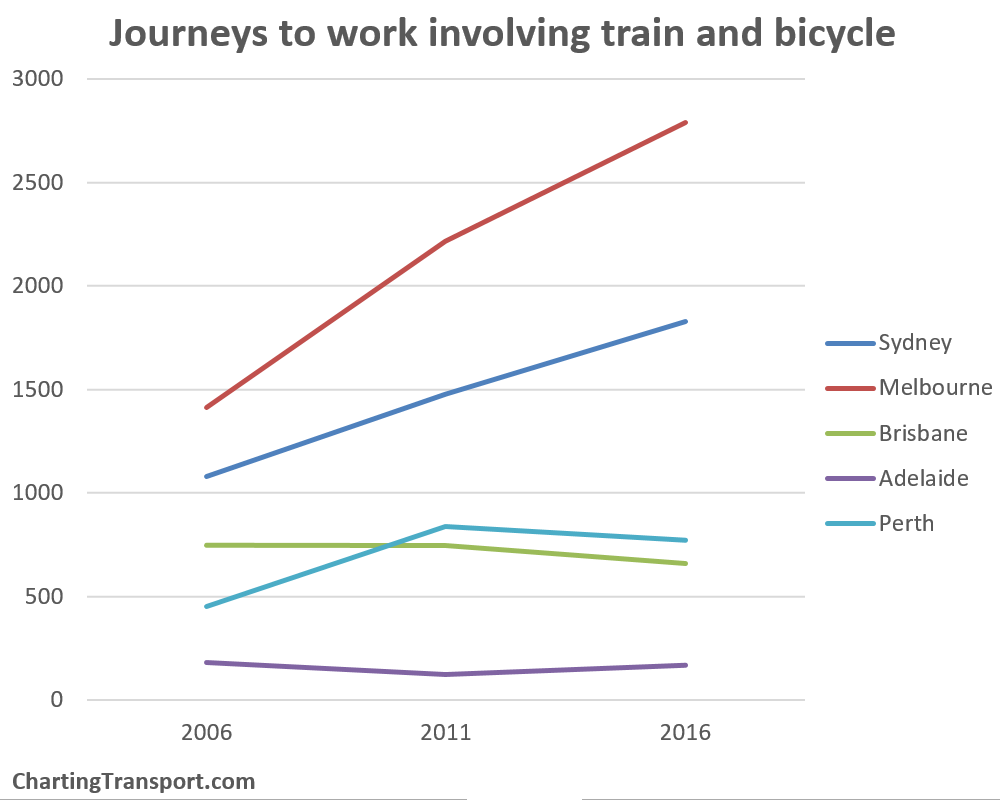
The downturns in Brisbane and Perth are not huge in raw numbers, and probably reflect the general mode shift away from public transport (which is probably more to do with changing job distributions than bicycle facilities at train stations).

Cycling

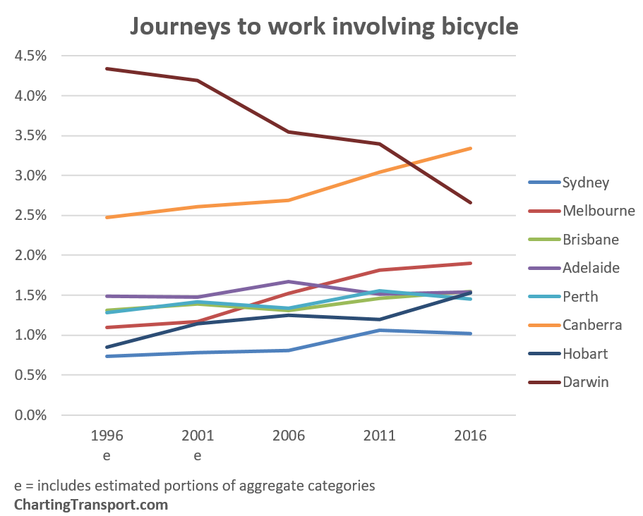
I have a longer time-series of bicycle-only mode share, compared to “involving bicycle”, so two charts here:
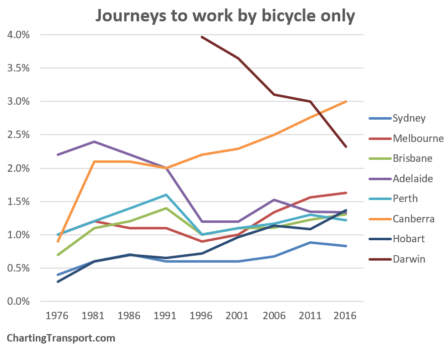
Observations:

  • Darwin lost top placing for cycling to work with a large decline in mode share (refer discussion above about the massive shift to bus).
  • Canberra took the lead with more strong growth.
  • Melbourne increased slightly between 2011 and 2016 (note: rain was forecast on census day which may have suppressed growth, more on that in a moment).
  • Hobart had a big increase in 2016, following rain in 2011.
  • Sydney remains at the bottom of the pack and declined in 2016.

Walking and cycling mode share is likely to be impacted by weather. Here’s a summary of recent census weather conditions for most cities (note: Canberra minimums were -3 in 2001, -7 in 2006, 0 in 2011 and -1 in 2016):

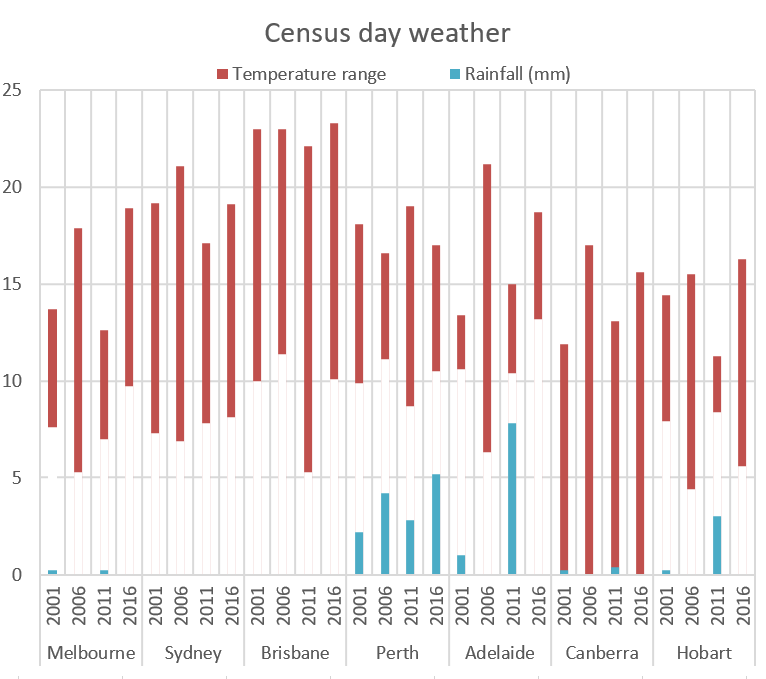
Perth had rain on all of the last four census days, while Adelaide had significant rain only in 2001 and 2011 (and indeed 2006 shows up with higher active transport mode share). Hobart had significant rain in 2011, which appears to have suppressed active transport mode share that year.

But perhaps equally important is the forecast weather as that could set people’s plans the night before. Here was the forecast for the 2016 census day,  from the BOM website the night before:

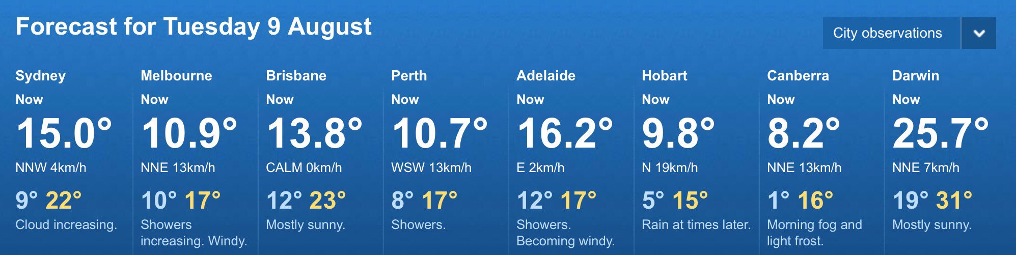
Note that it didn’t end up raining in Melbourne, Adelaide, or Hobart.

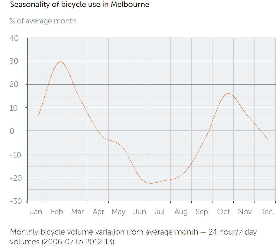
The census is conducted in winter – which is the best time to cycle in Darwin (dry season) and not a great time to cycle in other cities. However the icy weather in Canberra clearly hasn’t stopped it getting the highest and fastest growing cycling mode share of all cities!

Indeed here is a chart from VicRoads showing the seasonality of cycling in Melbourne at their bicycle counters:

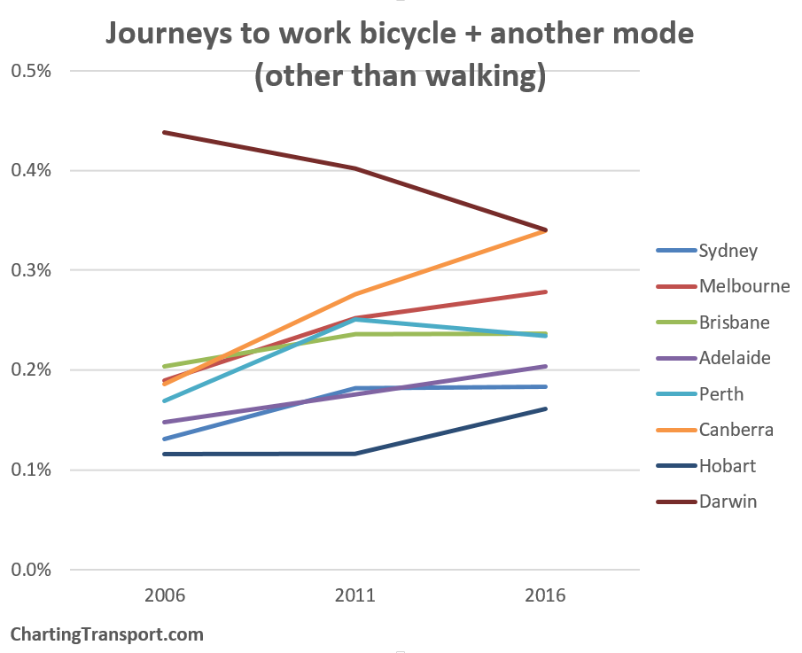
And in case you are interested, here are the (small) mode shares of journeys involving bicycle and some other modes (other than walking):

Walking only

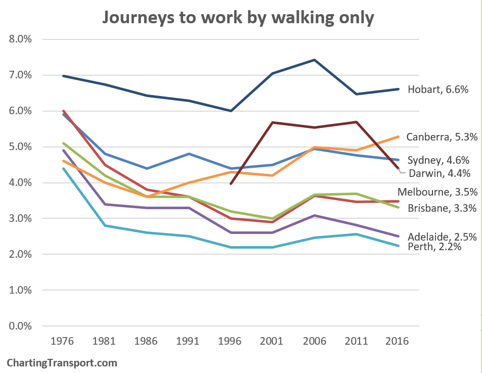
Canberra was the only city to have a big increase, while there were declines in Darwin, Perth, Adelaide, Brisbane, and Sydney.

The smaller cities had the highest walking share, perhaps as people are – on average – closer to their workplace, followed by Sydney – the densest city. But city size doesn’t seem to explain cycling mode shares.

Car

The following chart shows the proportion of journeys to work made by car only (either as driver or passenger):

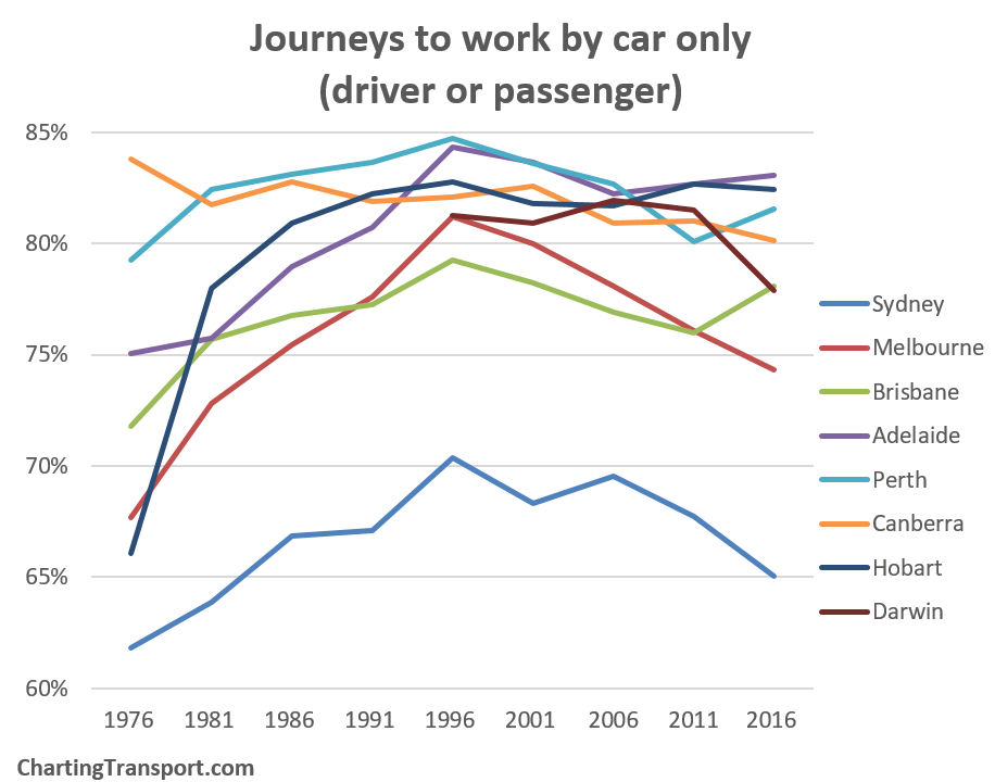
Sydney has the lowest car only mode share and it declined again in 2016. It was followed by Melbourne in 2016. Brisbane and Perth had large increases in car mode share in 2016 (in line with the PT decline mentioned above). Darwin also shows a big shift away from the car to public transport (although the total number of car trips still increased by 24%). Adelaide hit top spot, followed by Hobart and Perth.

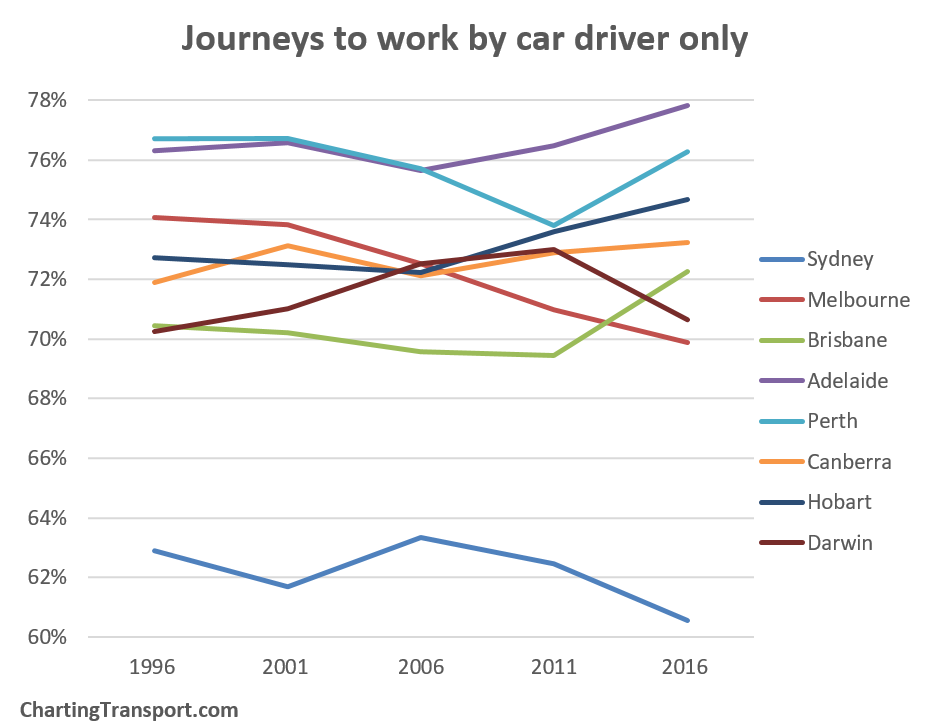
Here is car as driver only:

And here is car as passenger only:

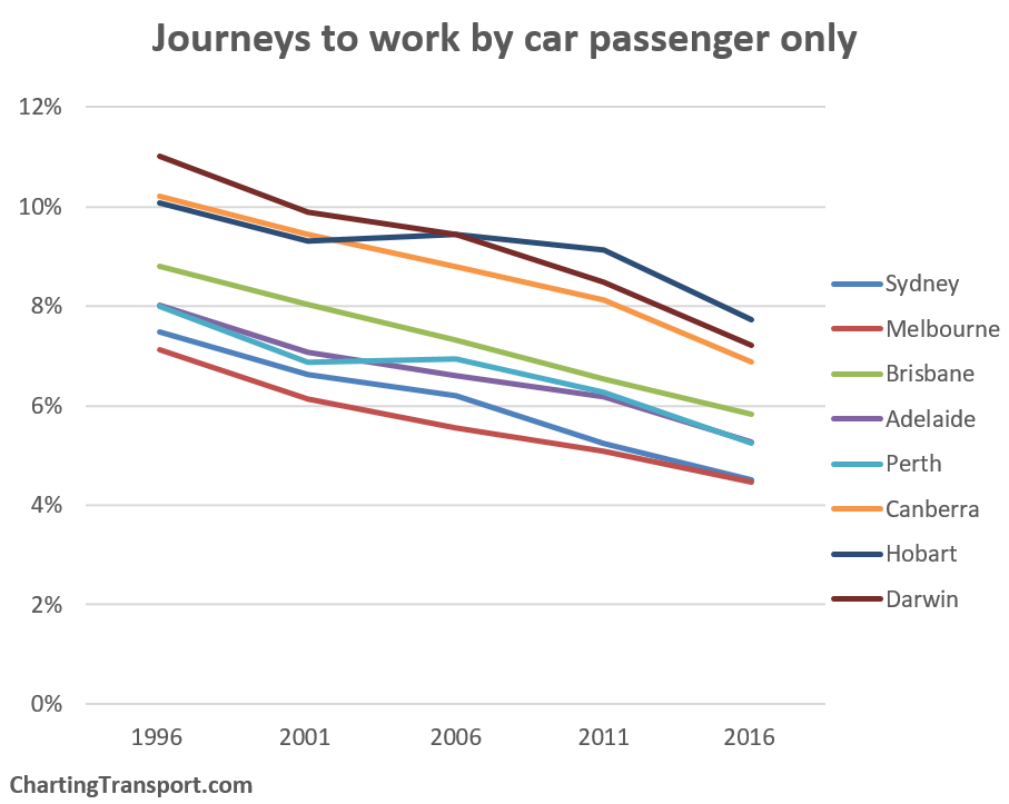
Car as passenger declined in all cities again in 2016, but was more common in the smaller cities, and least common in the bigger cities. I’m not sure why car as passenger declines paused for Perth and Sydney in 2006.

We can calculate an implied notional journey to work car occupancy by comparing car driver only and car passenger only journeys. This is not actual car occupancy, because it excludes people not travelling to work and excludes journeys that involved cars and other modes. However it does provide an indication of trends in car pooling for journeys to work.

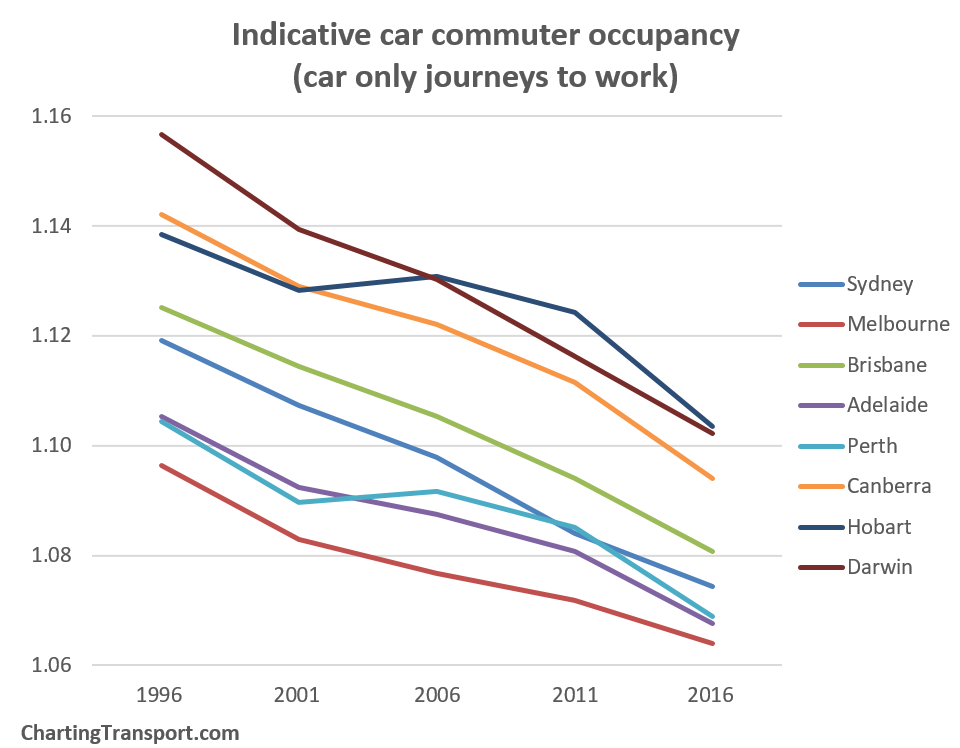
There were further significant decreases in car commuter occupancy, in line with increasing car ownership and affordability.

Private transport

Here is a chart summing all modal combinations involving cars (driver or passenger), motorcycle/scooter, taxis, and trucks, but excluding any journeys that also include public transport.

The trends mirror what we have seen above, and are very similar to car-only travel.


Overall mode split

Here’s an overall split of journeys to work by “main mode” (click to enlarge):

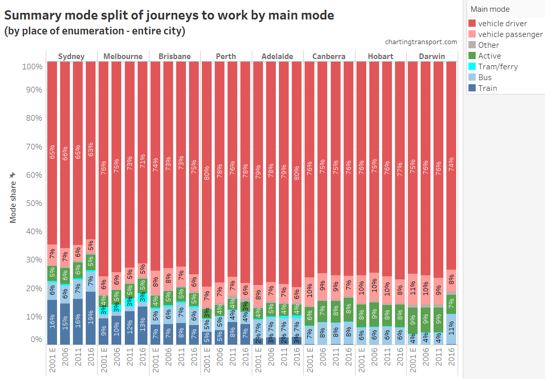
Note: the 2001 data includes estimated splits of aggregated modes based on 2006 data.

I assigned a ‘main mode’ based on a hierarchy as follows:

  • Any journey involving train is counted with the main mode as train
  • Any other journey involving bus is counted with the main mode as bus
  • Any other journey involving tram and/or ferry is counted as “tram/ferry”
  • Any other journey involving car as driver, truck or motorbike/scooter is counted as “vehicle driver”
  • Any other journey involving car as passenger or taxi is counted as “vehicle passenger”
  • Any other journey involving walking or cycling only as “active”

How different are “place of work” and “place of enumeration” mode shares?

[this section updated 1 December 2017 with re-issued Place of Work data. See new Appendix 3 below for analysis of the changes]

The first edition of this post reported only “place of work” data, as place of enumeration data wasn’t released until 11 November 2017. This second edition now focuses on place of enumeration – where people were on census night.

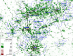
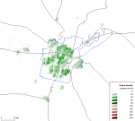
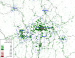
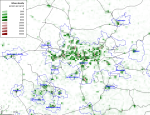
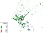
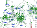
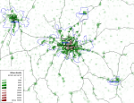
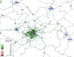
The differences are not huge, as most people who live in a city also work in that city, but there are still a number of people who leave or enter cities’ statistical boundaries to go to work. Here’s an animation showing the main mode split by place of work and enumeration so you can compare the differences (you’ll need to click to enlarge). The animation dwells longer on place of work data.

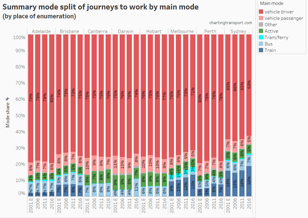
Public + active transport main mode shares are generally higher for larger cities with place of work data, and smaller for smaller cities.

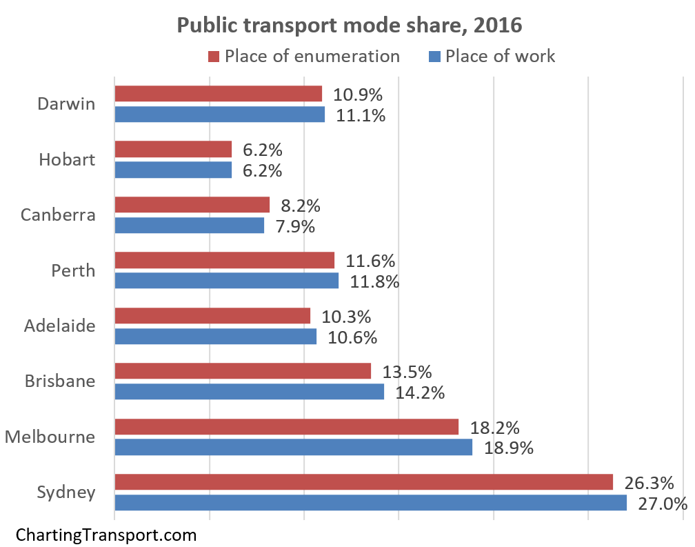
Here’s a closer look at the 2016 public transport mode shares by the two measures:

See also a detailed comparison in Appendix 1 below for 2011 Melbourne data.

I’d like to acknowledge Dr John Stone for assistance with historical journey to work data.

Appendix 1 – How to measure journey to work mode share

Firstly, I exclude people who did not work, worked at home, or did not state how they worked. The first two categories generate no transport activity, and if the actual results for “not stated” were biased in any way we would have no way of knowing how.

I prefer to use “place of enumeration” data (ie where people were on census night). “Place of usual residence” data is also available, but is unfortunately contaminated by people who were away from home on census day. The other data source is “Place of work”.

Some people might prefer to measure mode shares on Urban Centres which excludes rural areas within the larger blobs that are Greater Capital City Statistical Areas and Statistical Divisions (use this ABS map page to compare boundaries). However, “place of work” data is not readily available for that geography, and this method also excludes satellite urban centres that might be detached from the main urban centre, but are very much part of the economic unit of the city.

Another option is “Significant Urban Area”, which includes more fringe areas, and some more satellite towns, and in Canberra’s case crosses the NSW border to capture Queanbeyan.

What difference does it make?

Here’s a comparison of public transport mode shares for the different methods for 2011.

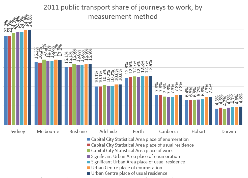
If you look closely, you’ll notice:

  • The more than you remove non-urban areas, the higher your public transport mode share, which makes sense, as those non-urban areas are mostly not served by public transport.
  • Place of usual residence tends to increase public transport mode shares for smaller cities (people probably visiting larger cities) and depresses public transport mode share in larger cities (people visiting smaller cities and towns).
  • Place of work is only readily available for Greater Capital City Statistical Areas. For the bigger cities it tends to inflate PT mode share where people might be using good inter-urban public transport options, or driving to good public transport options on the edges of cities (eg trains). However it has the opposite impact in Darwin and Canberra, where driving into the city is probably easier.

But I think the main point is that for any time series trend analysis you should use the same measure if possible.

If you want to compare the two, I’ve created a Tableau Public visualisation that has a large number of mode shares by both place of work and place of enumeration.

Appendix 2 – Estimating pre-2006 mode shares from aggregated data

For 2006 onwards, ABS TableBuilder provides counts for every possible combination of up to three modes (other than walking, which is assumed to be part of every journey). For example, in Melbourne in 2006, 36 people went to work by taxi, car as driver, and car as passenger (or so they said!). Unfortunately for years before 2006 data is not readily available with a full breakdown.

The 2001 data includes only aggregated counts for the following categories:

  • train and other (excluding bus)
  • bus and other (excluding train)
  • other two modes (no train or bus)
  • train and two other modes
  • bus and two other modes (excluding train)
  • three other modes (no train or bus)

Together these accounted for 3.7% of journeys in Melbourne and 4.5% of journeys in Sydney.

However all but two of those aggregate categories definitely involve train and/or bus, so can be included in public transport mode share calculations.

Journeys in the aggregate categories “Other two modes” and “Other three modes” might involve tram and/or ferry trips (if such modes exist in a city), but we don’t know for sure.

I’ve used the complete modal data for 2006 to calculate the percentage of 2006 journeys that fit into these two categories that are by public transport. I’ve then assumed these same percentage apply in 2001 to estimate total public transport mode shares for 2001 (for want of a better method).

Here are the 2001 relevant stats for each city:

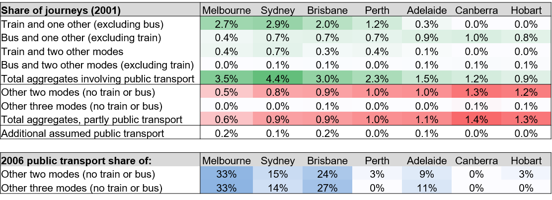
(note: totals do not add perfectly due to rounding)

The estimates add up to 0.2% to the total public transport mode shares in cities with significant modes beyond train and bus (namely ferry and tram in Sydney, tram in Melbourne, ferry in Brisbane, tram and Adelaide). This almost entirely comes from “other two modes” category while “other three modes” is tiny. For these categories, almost no journeys in Perth, Canberra and Hobart actually involved a public transport mode.

In the past I have knowingly ignored public transport journeys that might be part of these categories, which almost certainly means public transport mode share is underestimated (I suspect most other analysts have too). By including some assumed public transport journeys my estimate should be closer to the true value, which I think is better than an underestimate.

But are these reasonable estimates? Are the 2001 modal breakdowns for these categories likely to be the same as 2006? Maybe not exactly, but because we are multiplying small numbers by small numbers, the impact of slightly inaccurate estimates is unlikely to shift the total by more than 0.1%. I tested the methodology between 2006 and 2011 results (eg using 2011 full breakdown against created 2006 aggregate categories and vice versa) and the estimated total mode shares were almost always exactly the same as the perfectly calculated shares (at worst there was a difference of 0.1% when rounding to one decimal place).

In the first edition of this post I had to estimate 2016 place of work mode shares in a similar way for public and private transport, but I wasn’t confident enough to estimate mode share of journeys involving cycling.

I now have the final data and I promised to see how I went, so here’s a comparison:

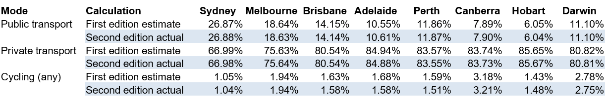
If you round to one decimal place, the estimates were no different for public and private transport and out by up to 0.1% for cycling (which is relatively significant for the small cycling mode shares).

I’ve applied a similar approach to estimate several other mode share types, and these are marked on charts.

Appendix 3 – How different is the re-issued place of work data?

In December 2017, ABS re-issued Place of Work data due to data quality issues. This is how they described it:

**The place of work data for the 2016 Census has been temporarily removed from the ABS website so an issue can be corrected. There was a discrepancy in the process used to transform detailed workplace location information into data suitable for output. The ABS will release the updated information in TableBuilder on December 2. The Working Population Profiles will be updated on December 13.**

I have loaded the new data, and here are differences in public transport and private transport mode shares for capital cities:

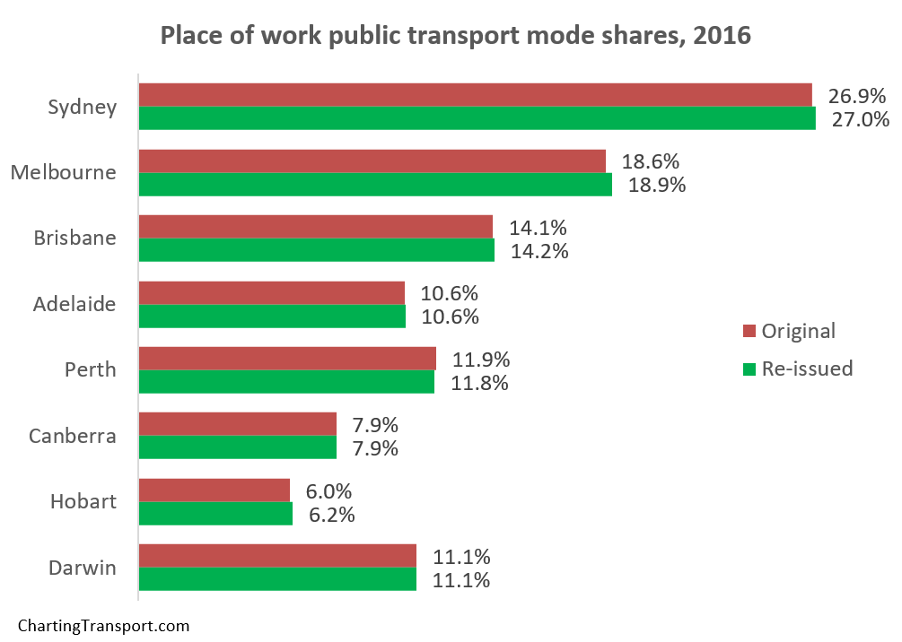
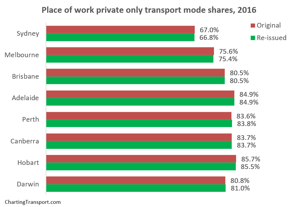
You can see differences of up to 0.3% (Melbourne PT mode share), but mostly quite small.


What does the census tell us about motor vehicle ownership in Australian cities? (2006-2016)

Sun 30 July, 2017

With the latest release of census data it’s possible to take a detailed look at motor vehicle ownership in Australian cities.  This post will look at ownership rates across time and space, and compare trends between car ownership, population growth, and population density. And this time I will cover 16 large Australian cities (but with a more detailed look at Melbourne).

I’ve measured motor vehicle ownership as motor vehicles per 100 persons in private occupied dwellings. If you want the boring but important details about how I’ve analysed the data, see the appendix at the end of this post.

I’ve used Tableau Public for this post, so all the charts and maps can be explored, and they cover all sixteen cities.

Is motor vehicle ownership increasing in all cities?

Elsewhere on this blog I’ve shown that motor vehicle ownership is increasing in all Australian states, but what about the cities? Here are the overall results for Australia’s larger cities, on motor vehicles per 100 persons basis. Note that the Y-axis only goes from 54 to 70, so the rate of change looks steeper than it really is.

(you can explore this data in Tableau)

Sydney unsurprisingly has the lowest average motor vehicle ownership, followed by Melbourne, Brisbane (Australia’s third biggest city), and then Cairns and Darwin. Perth was well on top, with Sunshine Coach rapidly increasing to claim second place. Most of the rest were around 66-68 motor vehicles per 100 persons in 2016.

But Melbourne is showing a very different trend to most other cities, with hardly any increase in ownership rate across the ten years (also, Canberra-Queanbeyan saw very little growth between 2011 and 2016).

At first I wondered whether Melbourne was a data error. However, I did the one data extract for all cities for both population and motor vehicle responses, and I’ve also checked for any potential duplicate SA1s. So I’m confident something very different is happening in Melbourne.

So let’s have a look at Melbourne in more spatial detail, starting with maximum detail over time:

(you can zoom in and explore this data in Tableau).

You can see lower ownership in the inner city, inner north, inner west, and the more socio-economically disadvantaged suburbs in the north and south-east. You can also see lower motor vehicle ownership around train lines in many middle suburbs. Other pockets of low motor vehicle ownership are in Clayton (presumably associated with university students) and Box Hill, and curiously some of the growth areas in the west and north. Very high motor vehicle ownership can be seen in wealthier areas and the outer east.

It’s a bit hard to see the trends with such a detailed map, so here’s a view aggregated at SA2 level (SA2s are roughly suburb-sized).

No doubt you are probably distracted by the changes in the legend. That’s because in 2006 there were no SA2s in the <20 and 30-40 ranges at all, and the 30-40 range is only present in 2016. That is, the legend has to expand over time to take into account SA2s with lower motor vehicle ownership rates.

You’ll notice a lot more light blue and green SA2s around the city centre, plus Clayton in the middle south-east switches to green in 2016.

Looking at it spatially, more areas appear to have increasing rather than decreasing motor vehicle ownership. But not all SA2s have the same population – or more particularly – the same population growth. So we need to look at the data in a non-spatial way.

Here’s a plot of population and motor vehicle ownership for all Melbourne SA2s, with the thin end of each “worm” being 2006 and the thick end being 2016.

Okay yes that does looks like a lot of scribbles (and you can explore the data in Tableau to find out what is what), but take a look at the patterns. There are lots of short worms heading to the right – these have very little population growth but some growth in motor vehicle ownership. Then there are lots of long worms that are heading up and to the left – which means large population growth and mostly declining motor vehicle ownership.

Here’s a similar view, but with a Y-axis of change in population since 2006:

(explore in Tableau)

The worms heading up and to the left include both inner city areas and outer growth areas. These areas seem to balance out the rest of Melbourne resulting in a stable ownership rate overall.

Some SA2s that are moving up and to the right more than others include Sunbury – South, Langwarrin, and Mount Martha. And there are a few in population decline like Endeavour Hills – South, Mill Park – South, and Keilor Downs.

The inner city results are not surprising, but declining ownership in outer growth areas is a little more surprising.

Is this to do with growth areas being popular with young families, and therefore containing proportionately more children?

Here’s a map of the percent of the population in each CD/SA1 that is aged 18-84 (ie approximately of “driving age”):

(view in Tableau)

The rates are highest in the central city and lowest in urban growth areas. And if you watch the animation closely, you’ll see areas that were “fringe growth” in 2006 have since had increasing portions of population aged 18-84, presumably as the children of the first residents have reached driving age (and/or moved out).

So what is happening with motor vehicles per 100 persons aged 18-84? Is there high motor vehicle ownership amongst driving aged people in growth areas?

Yes, a lot of growth areas are in the 80-85 range, similar to many middle suburban areas (view in Tableau)

Here’s the same thing but aggregated to SA2 level (explore in Tableau):

Motor vehicle ownership rates in most growth areas are similar to many established middle suburbs, but lower than non-growth fringe areas which show “saturated” levels of ownership (where there is roughly a one motor vehicle per person aged 18-84), particularly the outer east.

However in the outer growth areas of Sunbury (north-west) and Doreen (north-north-east), ownership rates are close to saturation in 2016.

But is the rate of motor vehicle ownership still declining amongst persons aged 18-84 in the outer growth areas? Here’s a similar chart to the previous one, but with ownership by persons aged 18-84 (explore in Tableau):

You can see most of the outer growth areas still have declining ownership rates. You can also see some established suburbs with strong population growth and increased ownership, including Dandenong and Braybrook (which includes the rapidly densifying suburbs of Maidstone and Maribyrnong).

Here’s a spatial view of the changes in ownership rates (area shading), as well as total changes in the household motor vehicle fleet (dots ). (I’ve assumed non-reporting private dwellings have the same average motor vehicle ownership as reporting dwellings in each area).

(explore in Tableau)

You can see outer growth areas shaded green (declining ownership), but also with large dots (large fleet growth).

But also you can see some declines in ownership in the middle eastern and north-eastern suburbs, and some non-growth outer suburbs, which is quite surprising. I’m not quite sure what might explain that.

You’ll also notice the scale for the dots starts at -830, which accommodates Wheelers Hill (in the middle south-east) where there has been a 2% decline in population, and 6% decline in motor vehicle fleet.

Okay, so that’s Melbourne, what about ownership rates amongst “driving aged” people in other cities?

Trends in motor vehicles per persons aged 18-84

(explore in Tableau)

The trends are similar, but Melbourne is even more interesting on this measure. It has declined from 81.3 to 80.7, bucking the trend of all other cities (although Canberra only grew from 88.4 in 2011 to 88.5 in 2016).

How does motor vehicle ownership relate to density?

Here’s a chart showing population weighted density and motor vehicle ownership for persons aged 18-84 for SA2s across all the big cities in 2016 (explore in Tableau):

Some dots (central Melbourne and Sydney) are off the chart so you can see patterns in the rest. I’ve labelled some of the outliers. The general pattern shows higher density areas generally having lower motor vehicle ownership.

Is densification related to lower motor vehicle ownership?

Here’s a chart showing how each city has moved in terms of population-weighted density (measured at CD or SA1 level) and ownership for persons aged 18-84, with the thick end of each worm 2016, and the thin end 2006.

(Note that the 2006 population weighted density figures are not perfectly comparable with 2011 and 2016 because they are measured at CD level rather than SA1 level, and CDs are slightly larger on average than SA1s)

(explore in Tableau)

You can see Sydney is a completely different city on these measures, and also that Melbourne is the only city heading to the left of the chart. Canberra is also bucking the trend between 2011 and 2016.

We can look at this within cities too. Here’s all the Local Government Areas (LGAs) for all the cities (note: City of Sydney and City of Melbourne are off the top-left of the chart)

(explore in Tableau)

Many Melbourne and Sydney LGAs are rising sharply with mostly declining motor vehicle ownership. But then there are Sydney LGAs like Woollahra, Mosman and Northern Beaches in Sydney that are showing increasing motor vehicle ownership while they densify (probably not great for traffic congestion!).

And we can then look inside cities. Here is Melbourne (again, several inner city SA2s are off the chart):

Some interesting outliers include:

  • The relatively dense Port Melbourne, Albert Park, Elwood with relatively high motor vehicle ownership.
  • The land-locked suburb of Gowanbrae with medium density but rapidly increasing car ownership (which has a limited Monday to Saturday bus service).
  • The growth area of Cranbourne South with reasonable density but more than saturated car ownership.
  • Relatively medium dense but low motor vehicle ownership of Clayton and Footscray.

Explore your own city in Tableau. You know you want to.

What are the spatial patterns of motor vehicle ownership in other cities?

The detail above has focussed on Melbourne, so here are some maps for others cities. You can explore any of the cities by zooming in from this Tableau map (be warned: it may take some time to load as I’ve ignored Tableau’s recommendations about how many showing more than 10,000 data points!). In fact for any of the maps you’ve seen on this blog, you can pan and zoom to see other cities.

To help see the changes in motor vehicle ownership between censuses more easily, I’ve prepared the following detailed animations.

Sydney


Brisbane


Adelaide

Perth

(Find Mandurah in Tableau)

Canberra

Hobart

Darwin

Cairns

Townsville

Sunshine Coast

Geelong

Central Coast (NSW)

Newcastle – Maitland

This post has only looked at spatial trends and the relationship with population density. There’s plenty more to explore about car ownership with census data, which I aim to cover in future posts.

I hope you’ve enjoyed this post, and found the interactive data at least half as fascinating as I have.

Oh, and sorry about some of the maps showing defunct train lines. I’m using what I can get from the WMS feed from Geoscience Australia.

Appendix – About the data

The Australian census includes the following question about how many registered motor vehicles were present at each occupied private dwelling on census night. This excludes motorcycles but includes some vehicles other than cars (probably mostly light vehicles).

96% of people counted in the 2016 census were in a private dwelling on census night, and 93.6% of occupied dwellings filled in the census and gave an answer to the motor vehicle question. So the data can give a very detailed – and hopefully quite accurate – picture.

I’ve used two measures of motor vehicle ownership:

  • Motor vehicles per 100 population (often referred to as “motorisation” in Europe), and
  • Motor vehicles per 100 persons aged 18-84

The first is easy to measure and easily comparable with other jurisdictions, but the second gives a better feel for what proportion of the “driving aged” population own a car. In an area with good alternatives to private transport, you might expect lower ownership rates.

Setting the lower age threshold at 18 works well for Victoria (imperfectly for other states with a lower licensing age), and 84 is an arbitrary threshold during the general decline in drivers license ownership by older people. So it’s not perfect, but is indicative, and certainly takes most children out of the equation.

As the motor vehicle question is based on what was parked at the dwelling on census night, I’ve used population present on census night (place of enumeration). That works well if someone was absent on census night and took their car with them, but not so well if they were absent and left their car behind (e.g. they took a taxi to the airport). You cannot win with that, but the census is timed in August during school and university term to try to minimise absences.

When calculating ownership rates, I’ve excluded people in dwellings that did not answer the motor vehicle question, and people in non-private dwellings. This is more robust than assumptions I made in previous posts on this topic so results will vary a little.

For 2011 and 2016, the census data provides counts of the number of dwellings with 0, 1, 2, 3, .. , 29 motor vehicles, and then bundles the rest as “30 of more”. For want of a better assumption, I’ve assumed dwellings with 30 or more motor vehicles have an average of 31 motor vehicles, which is probably conservative. But these are so rare they shouldn’t make any noticeable difference on the overall results.

As shorthand, I’ve referred to “motor vehicle ownership” rates, but you’ll note the census question includes company vehicles kept at home, so it’s not a perfect term to use, but then company vehicles are often available for general use.

I’ve used the 2011 boundaries of Significant Urban Areas (SUA) for each city, which are made up of SA2s and leave a good amount of room for urban fringe growth in 2016. However they do exclude some satellite towns (such as Melton, west of Melbourne).

I’ve extracted data at SA1 level geography for 2011 and 2016, and Collector District (CD) geography for 2006. In urban areas, SA1s average around 400 people while the older Collector Districts of 2006 averaged around 550 people. These are the smallest geographies for which motor vehicle and age data is available in each census. ABS do introduce some small data randomisation to protect privacy so there will be a little error well summing up lots of parcels.

I’ve generally excluded parcels with less than 5 people per hectare as an (arbitrary) threshold for “urban” residential areas. I’ve mapped all parcels to the 2016 boundaries of Local Government Areas and SA2s, and the 2011 boundaries of SUAs (2016 boundaries have not yet been released). Where boundaries do not line up perfectly, I’ve included a parcel in an SAU, LGA, or SA2 if more than 51% of the parcel’s area is within that boundary. The mapping isn’t perfect in all cases, particularly for growth area SA2s and 2006 CDs. See the alignments for SA2s, LGAs in Tableau.


Comparing the densities of Australian, European, Canadian, and New Zealand cities

Thu 26 November, 2015

[updated March 2016 to add Canadian and New Zealand cities]

Just how much denser are European cities compared to Australian cities? What about Canadian and New Zealand cities? And does Australian style suburbia exist in European cities?

This post calculates the population-weighted density of 53 Australian, European, and Canadian cities with a population over 1 million, plus the three largest New Zealand cities (only Auckland is over 1 million population). It also shows a breakdown of the densities at which these cities’ residents live, and includes a set of density maps with identical scale and density shading.

Why Population Weighted Density?

As discussed in previous posts, population-weighted density attempts to measure the density at which the average city resident lives. Rather than divide the total population of a city by the entire city area (which usually includes large amounts of sparsely populated land), population weighted density is a weighted average of population density of all the parcels that make up the city. As I’ve shown previously, the size of the parcels used makes a big difference in the calculation of population-weighted density, which makes comparing cities difficult internationally.

To overcome the issue of different parcel sizes, I’ve used kilometre grid population data that is now available for both Europe and Australia. I’ve also generated my own kilometre population grids for Canadian and New Zealand cities by proportionally summing populations of the smallest census parcels available.

Some measures of density exclude all non-residential land, but the square kilometre grid approach means that partially populated grid parcels are counted, and many of these parcels will include non-residential land, and possibly even large amounts of water. It’s not perfect, particularly for cities with small footprints. For example, here is a density map around Sydney harbour (where light green is lower density, dark green is medium density and red is higher density):

Sydney harbour

You can see that many of the grid cells that include significant amounts of water show a lower density, when it fact the population of those cells are contained within the non-water parts of the grid cell. The more watery cells, the lower the calculated density. This is could count against a city like Sydney with a large harbour.

Defining cities

The second challenge with these calculations is a definition of the city limits. For Australia I’ve used Urban Centre boundaries, which attempt to include contiguous urbanised areas (read the full definition). For Europe I’ve used 2011 Morphological Urban Areas, which have fairly similar rules for boundaries. For Canada I’ve used Population Centre, and for New Zealand I’ve used Urban Areas.

These methodologies tend to exclude satellite towns of cities (less so in New Zealand and Canada). While these boundaries are not determined in the exactly the same way, one good thing about population-weighted density is that parcels of land that have very little population don’t have much impact on the overall result (because their low population has little weighting).

For each city, I’ve included every grid cell where the centroid of that cell is within the defined boundaries of the city. Yes that’s slightly arbitrary and not ideal for cities with dense cores on coastlines, but at least I’ve been consistent. It also means some of the cells around the boundary are excluded from the calculation, which to some extent offsets the coastline issues. It also means the values for Australian cities are slightly different to a previous post.

All source data is dated 2011, except for France which is 2010, and New Zealand which is 2013.

Comparing population-weighted density of Australian, European, Canadian and New Zealand cities

AU EU CA NZ Population Weighted Density

You can see the five Australian cities are all at the bottom, most UK cities are in the bottom third, and the four large Spanish cities are within the top seven.

Sydney is not far below Glasgow and Helsinki. Adelaide, Perth and Brisbane are nothing like the European cities when it comes to (average) population-weighted density.

Three Canadian cities (Vancouver, Toronto and Montreal) are mid-range, while the other three are more comparable with Australia. Of the New Zealand cities, Auckland is surprisingly more dense than Melbourne. Wellington is more dense that Vancouver (both topographically constrained cities).

But these figures are only averages, which makes we wonder…

How much diversity is there in urban density?

The following chart shows the proportion of each city’s population that lives at various urban density ranges:

AU EU CA NZ urban density distribution

Because of the massive variations in density, I had to break the scale interval sizes at 100 persons per hectare, and even then, the low density Australian cities are almost entirely composed of the bottom two intervals. You can see a lot of density diversity across European cities, and very little in Australian cities, except perhaps for Sydney.

You can also see that only 10% of Barcelona has an urban density similar to Perth or Adelaide. Which makes me wonder…

Do many people in European cities live at typical Australian suburban densities?

Do many Europeans living in cities live in detached dwellings with backyards, as is so common in Australian cities?

To try to answer this question, I’ve calculated the percentage of the population of each city that lives at between 10 and 30 people per hectare, which is a generous interpretation of typical Australian “suburbia”.

AU EU CA NZ cities percent at 10 to 30 per hectare

It’s a minority of the population in all European cities (and even for Sydney). But it does exist. Here are examples of Australian-style suburbia in outer Hamburg, Berlin, LondonMilan, and even Barcelona (though I hate to think what some of the property prices might be!)

How different is population-weighted density from regular density?

Now that I’ve got a large sample of cities, I can compare regular density with population weighted densities (PWD):

PWD v regular density 2

The correlation is relatively high, but there are plenty of outliers, and rankings are very different. Rome has a regular density of 18, but a PWD of 89, while London has a regular density of 41 and PWD of 80. Dublin’s regular density of 31 is relatively close to its PWD of 47.

Wellington’s regular density is 17, but its PWD is 49 (though the New Zealand cities regular density values are impacted by larger inclusions of non-urbanised land within definitions of Urban Areas).

So what does the density of these cities look like on a map?

The following maps are all at the same scale both geographically and for density shading. The blue outlines are urban area boundaries, and the black lines represent rail lines (passenger or otherwise, and including some tramways). The density values are in persons per square kilometre (1000 persons per square kilometre = 10 persons per hectare). (Apologies for not having coastlines and for some of the blue labels being difficult to read).

Here’s Barcelona (and several neighbouring towns), Europe’s densest large city, hemmed in by hills and a coastline:

Barcelona

At the other extreme, here is Perth, a sea of low density and the only city that doesn’t fit on one tile at the same scale as the other cities (Mandurah is cut off in the south):


Perth

Here is Paris, where you can see the small high density inner core matches the high density Metro railway area:

Paris

Similarly the dense inner core of London correlates with the inner area covered by a mesh of radial and orbital railways, with relatively lower density outer London more dominated by radial railways:

London

There are many more interesting patterns in other cities.

What does this mean for transport?

Few people would disagree that higher population densities increase the viability of high frequency public transport services, and enable higher non-car mode shares – all other things being equal. But many (notably including the late Paul Mees) would argue that “density is not destiny” – and that careful design of public and active transport systems is critical to transport outcomes.

Zurich is a city often lauded for the high quality of its public transport system, and its population weighted density is 51 persons/ha (calculated on the kilometre grid data for a population of 768,000 people) – which is quite low relative to larger European cities.

In a future post I’ll look at the relationship between population-weighted density and transport mode shares in European cities.

All the density maps

Finally, here is a gallery of grid density maps of all the cities for your perusing pleasure (plus Zurich, plus many smaller neighbouring cities that fit onto the maps). All maps have the same scale and density shading colours.

Please note that the New Zealand and Canada maps do not include all nearby urbanised areas. Apologies that the formats are not all identical.


Are Australian cities becoming denser?

Tue 5 November, 2013

Please refer to a fully revised second edition of this post – published in April 2019.

[Updated April 2017 with 2015-16 population estimates. First published November 2013]

While Australian cities have been growing outwards with new suburbia, they have also been getting denser in established areas, and the new areas on the fringe are often more dense than growth areas used to be (see last post). So what’s the net effect – are Australian cities getting more or less dense?

This post also explores measures of population-weighted density for Australian cities large and small over time. It also tries to resolve some of the issues in the calculation methodology by using square kilometre geometry, looks at longer term trends for Australian cities, and then compares multiple density measures for Melbourne over time.

Measuring density

Under the traditional measure of density, you’d simply divide the population of a city by the metropolitan area’s area (in hectares). As the boundary of the metropolitan areas seldom change, the average density would simply increase in line with population with this measure. But that density value would also be way below the density at which the average resident lives because of the inclusion of vast swaths of unpopulated land within “metropolitan areas”, and so be not very meaningful.

Enter population-weighted density (which I’ve looked at previously here and here). Population-weighted density takes a weighted average of the density of all parcels of land that make up a city, with each parcel weighted by its population. One way to think about it is the residential density in which the “average resident” lives.

So the large low-density parcels of rural land outside the urbanised area but inside the “metropolitan area” count very little in the weighted average because of their small population relative to the urbanised areas. This means population-weighted density goes a long way to overcoming having to worry about the boundaries of the “urban area” of a city. Indeed, in a previous post I found that removing low density parcels of land had very little impact on calculations of population-weighted density for Australian cities. However, the size of the parcels of land used in a population-weighted density calculation will have an impact, as we will see shortly.

Calculations of population-weighted density can answer the question about whether the “average density” of a city has been increasing or decreasing. But as we will see below, using geographic regions put together by statisticians based on historical boundaries is not always a fair way to compare different cities.

Population-weighted density of Australian cities over time

Firstly, here is a look at population-weighted density of the five largest Australian cities (as defined by ABS Significant Urban Areas), measured at SA2 level (the smallest geography for which there exists a good consistent set of time-series estimates). SA2s roughly equate to suburbs.

According to this data, most cities bottomed out in density in the mid 1990s. Sydney, Melbourne and Brisbane have shown the fastest rates of densification in the last three years.

What about smaller Australian cities? (120,000+ residents in 2014):

Darwin comes out as the third most dense city in Australia on this measure, with Brisbane rising quickly in recent years into fourth place. Most cities have shown densification in recent times, with the main exception being Townsville. On an SA2 level, population weighted density in Perth hardly rose at all in 2015-16 (a year when 92% of population growth was in the outer suburbs)

However, we need to sanity test these values. Old-school suburban areas of Australian cities typically have a density of around 15 persons per hectare, so the values for Geelong, Newcastle, Darwin, Townsville, and Hobart all seem a bit too low for anyone who has visited them. I’d suggest the results may well be an artefact of the arbitrary geographic boundaries used – and this effect would be greater for smaller cities because they would have more SA2s on the interface between urban and rural areas (indeed all of those cities are less than 210,000 in population).

For reference, here are the June 2014 populations of all the above cities:

Australian cities population 2014

The following map shows Hobart, with meshblock boundaries in black (very small blocks indicate urban areas), SA2s in pink, and the Significant Urban Area (SUA) boundary in green.  You can see that many of the SA2s within the Hobart SUA have pockets of dense urban settlement, together with large areas that are non-urban – ie SA2s on the urban/rural interface. The density of these pockets will be washed out because of the size of the SA2s.

Hobart SUA image

Reducing the impact of arbitrary geographic boundaries

As we saw above, the population-weighted density results for smaller cities were very low, and probably not reflective of the actual typical densities, which might be caused by arbitrary geographic boundaries.

Thankfully ABS have followed Europe and released of a square kilometre grid density for Australia which ensures that geographic zones are all the same size. While it is still somewhat arbitrary where exactly this grid falls on any given city, it is arguably less arbitrary than geographic zones that follow traditional notions of area boundaries.

Using that data, I’ve been able to calculate population weighted density for the larger cities of Australia. The following chart shows those values compared to values calculated on SA2 geography:

pop weighted density 2011 grid and SA2 australian cities

You’ll see that the five smaller cities (Newcastle, Hobart, Geelong, Townsville and Cairns) that had very low results at SA2 level get more realistic values on the kilometre grid.

You’ll notice that most cities (except big Melbourne and Sydney) are in the 15 to 18 persons per hectare range, which is around typical Australian suburban density.

While the Hobart figure is higher using the grid geography, it’s still quite low (indeed the lowest of all the cities). You’ll notice on the map above that urban Hobart hugs the quite wide and windy Derwent River, and as such a larger portion of Hobart’s grid squares are likely to contain both urban and water portions – with the water portions washing out the density (pardon the pun!). While most other cities also have some coastline, much more of Hobart’s urban settlement is near to a coastline.

But stepping back, every city has urban/rural and/or urban/water boundaries and the boundary has to be drawn somewhere. So smaller cities are always going to have a higher proportion of their land parcels being on the interface – and this is even more the case if you are using larger parcel sizes. There is also the issue of what “satellite” urban settlements to include within a city which ultimately becomes arbitrary at some point. Perhaps there is some way of adjusting for this interface effect depending on the size of the city, but I’m not going to attempt to resolve it in this post.

International comparisons of population-weighted density

See another post for some international comparisons using square km grids.

Changes in density of larger Australian cities since 1981

We can also calculate population-weighted density back to 1981 using the larger SA3 geography. An SA3 is roughly similar to a local government area (in Melbourne at least), so getting quite large and including more non-urban land. Also, as Significant Urban Areas are defined only at the SA2 level, I need to resort to Greater Capital City Statistical Areas for the next chart:

This shows that most cities were getting less dense in the 1980s (Melbourne quite dramatically), with the notable exception of Perth. I expect these trends could be related to changes in housing/planning policy over time. This calculation has Adelaide ahead of the other smaller cities – which is different ordering to the SA2 calculations above.

On the SA3 level, Perth declined in population-weighted density in 2015-16.

When measured at SA2 level, the four smaller cities had almost the same density in 2011, but at SA3 level, there is more separating them. My guess is that the arbitrary nature of geographic boundaries is having an impact here. Also, the share of SA3s in a city that are on the urban/rural interface is likely to be higher, which again will have more impact for smaller cities. Indeed the trend for the ACT at SA3 level is very different to Canberra at SA2 level.

Melbourne’s population-weighted density over time

I’ve taken a more detailed look at my home city Melbourne, using all available ABS population figures for the geographic units ranging from mesh blocks to SA3s inside “Greater Melbourne” (as defined in 2011) or inside the Melbourne Significant Urban Area (SUA, where marked), to produce the following chart:

Note: I’ve calculated population-weighted density at the SA2 level for both the Greater Capital City Statistical Area (ie “Greater Melbourne”, which includes Bacchus Marsh, Gisborne and Wallan) and the Melbourne Significant Urban Area (slightly smaller), which yield slightly different values.

All of the time series data suggests 1994 was the turning point in Melbourne where the population-weighted density started increasing (not that 1994 was a particularly momentous year – the population-weighted density increased by a whopping 0.0559 persons per hectare in the year to June 1995 (measured at SA2 level for Greater Melbourne)).

You’ll also note that the density values are very different when measured on different geographic units. That’s because larger units include more of a mix of residential and non-residential land. The highest density values are calculated using mesh blocks (MB), which often separate out even small pockets of non-residential land (eg local parks). Indeed 25% of mesh blocks in Australia had zero population, while only 2% of SA1s had zero population (at the 2011 census). At the other end of the scale, SA3s are roughly the size of local councils and include parklands, employment land, rural land, airports, freeways, etc which dilutes their average density.

In the case of SA2 and SA3 units, the same geographic areas have been used in the data for all years. On the other hand, Census Collector Districts (CD) often changed between each five-yearly census, but I am assuming the guidelines for their creation would not have changed significantly.

Now why is a transport blog so interested in density again? There is a suggested relationship between (potential) public transport efficiency and urban density – ie there will be more potential customers per route kilometre in a denser area. In reality longer distance public transport services are going to be mostly serving the larger urban blob that is a city – and these vehicles need to pass large parklands, industrial areas, water bodies, etc to connect urban origins and destinations. The relevant density measure to consider for such services might best be based on larger geographic areas – eg SA3. Buses are more likely to be serving only urbanised areas, and so are perhaps more dependent on residential density – best calculated on a smaller geographic scale, probably km grid (somewhere between SA1 and SA2).

You may also like