With the latest release of census data it’s possible to take a detailed look at motor vehicle ownership in Australian cities. This post will look at ownership rates across time and space, and compare trends between car ownership, population growth, and population density. And this time I will cover 16 large Australian cities (but with a more detailed look at Melbourne).
I’ve measured motor vehicle ownership as motor vehicles per 100 persons in private occupied dwellings. If you want the boring but important details about how I’ve analysed the data, see the appendix at the end of this post.
I’ve used Tableau Public for this post, so all the charts and maps can be explored, and they cover all sixteen cities.
Is motor vehicle ownership increasing in all cities?
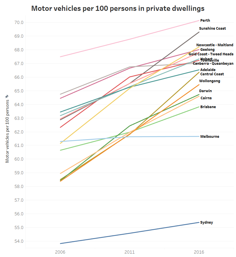
Elsewhere on this blog I’ve shown that motor vehicle ownership is increasing in all Australian states, but what about the cities? Here are the overall results for Australia’s larger cities, on motor vehicles per 100 persons basis. Note that the Y-axis only goes from 54 to 70, so the rate of change looks steeper than it really is.
(you can explore this data in Tableau)
Sydney unsurprisingly has the lowest average motor vehicle ownership, followed by Melbourne, Brisbane (Australia’s third biggest city), and then Cairns and Darwin. Perth was well on top, with Sunshine Coach rapidly increasing to claim second place. Most of the rest were around 66-68 motor vehicles per 100 persons in 2016.
But Melbourne is showing a very different trend to most other cities, with hardly any increase in ownership rate across the ten years (also, Canberra-Queanbeyan saw very little growth between 2011 and 2016).
At first I wondered whether Melbourne was a data error. However, I did the one data extract for all cities for both population and motor vehicle responses, and I’ve also checked for any potential duplicate SA1s. So I’m confident something very different is happening in Melbourne.
So let’s have a look at Melbourne in more spatial detail, starting with maximum detail over time:
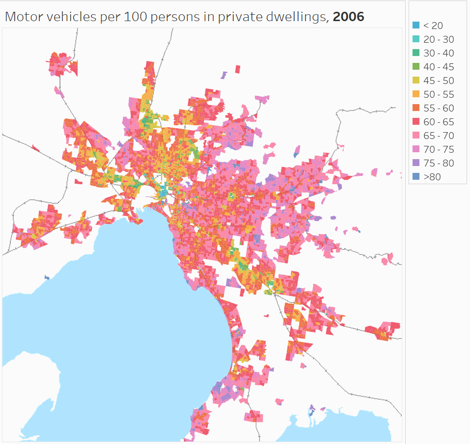
(you can zoom in and explore this data in Tableau).
You can see lower ownership in the inner city, inner north, inner west, and the more socio-economically disadvantaged suburbs in the north and south-east. You can also see lower motor vehicle ownership around train lines in many middle suburbs. Other pockets of low motor vehicle ownership are in Clayton (presumably associated with university students) and Box Hill, and curiously some of the growth areas in the west and north. Very high motor vehicle ownership can be seen in wealthier areas and the outer east.
It’s a bit hard to see the trends with such a detailed map, so here’s a view aggregated at SA2 level (SA2s are roughly suburb-sized).

No doubt you are probably distracted by the changes in the legend. That’s because in 2006 there were no SA2s in the <20 and 30-40 ranges at all, and the 30-40 range is only present in 2016. That is, the legend has to expand over time to take into account SA2s with lower motor vehicle ownership rates.
You’ll notice a lot more light blue and green SA2s around the city centre, plus Clayton in the middle south-east switches to green in 2016.
Looking at it spatially, more areas appear to have increasing rather than decreasing motor vehicle ownership. But not all SA2s have the same population – or more particularly – the same population growth. So we need to look at the data in a non-spatial way.
Here’s a plot of population and motor vehicle ownership for all Melbourne SA2s, with the thin end of each “worm” being 2006 and the thick end being 2016.
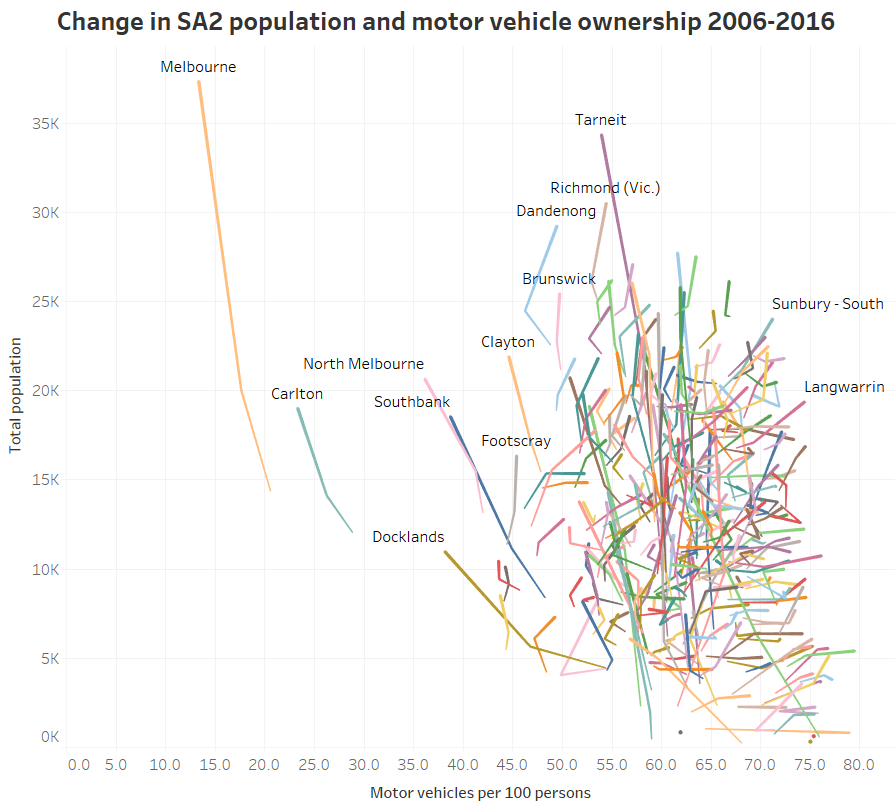
Okay yes that does looks like a lot of scribbles (and you can explore the data in Tableau to find out what is what), but take a look at the patterns. There are lots of short worms heading to the right – these have very little population growth but some growth in motor vehicle ownership. Then there are lots of long worms that are heading up and to the left – which means large population growth and mostly declining motor vehicle ownership.
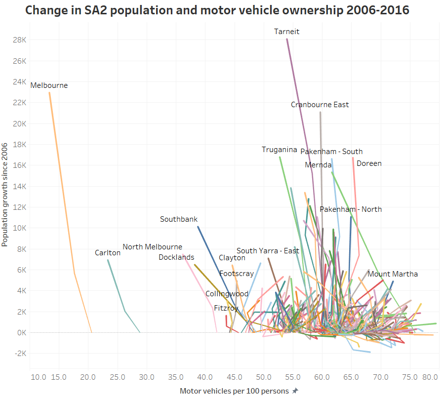
Here’s a similar view, but with a Y-axis of change in population since 2006:
 (explore in Tableau)
The worms heading up and to the left include both inner city areas and outer growth areas. These areas seem to balance out the rest of Melbourne resulting in a stable ownership rate overall.
Some SA2s that are moving up and to the right more than others include Sunbury – South, Langwarrin, and Mount Martha. And there are a few in population decline like Endeavour Hills – South, Mill Park – South, and Keilor Downs.
The inner city results are not surprising, but declining ownership in outer growth areas is a little more surprising.
Is this to do with growth areas being popular with young families, and therefore containing proportionately more children?
Here’s a map of the percent of the population in each CD/SA1 that is aged 18-84 (ie approximately of “driving age”):

(view in Tableau)
The rates are highest in the central city and lowest in urban growth areas. And if you watch the animation closely, you’ll see areas that were “fringe growth” in 2006 have since had increasing portions of population aged 18-84, presumably as the children of the first residents have reached driving age (and/or moved out).
So what is happening with motor vehicles per 100 persons aged 18-84? Is there high motor vehicle ownership amongst driving aged people in growth areas?

Yes, a lot of growth areas are in the 80-85 range, similar to many middle suburban areas (view in Tableau)
Here’s the same thing but aggregated to SA2 level (explore in Tableau):

Motor vehicle ownership rates in most growth areas are similar to many established middle suburbs, but lower than non-growth fringe areas which show “saturated” levels of ownership (where there is roughly a one motor vehicle per person aged 18-84), particularly the outer east.
However in the outer growth areas of Sunbury (north-west) and Doreen (north-north-east), ownership rates are close to saturation in 2016.
But is the rate of motor vehicle ownership still declining amongst persons aged 18-84 in the outer growth areas? Here’s a similar chart to the previous one, but with ownership by persons aged 18-84 (explore in Tableau):
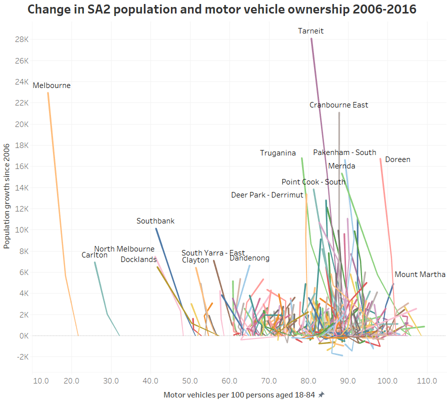
You can see most of the outer growth areas still have declining ownership rates. You can also see some established suburbs with strong population growth and increased ownership, including Dandenong and Braybrook (which includes the rapidly densifying suburbs of Maidstone and Maribyrnong).
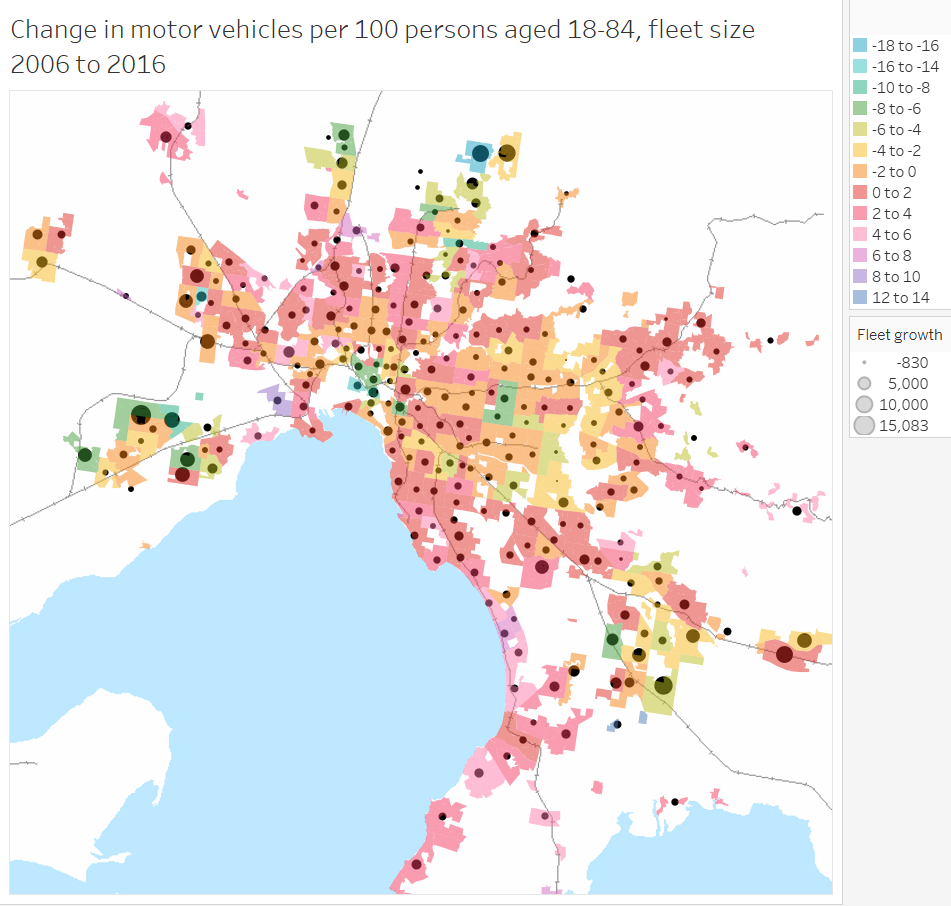
Here’s a spatial view of the changes in ownership rates (area shading), as well as total changes in the household motor vehicle fleet (dots ). (I’ve assumed non-reporting private dwellings have the same average motor vehicle ownership as reporting dwellings in each area).
(explore in Tableau)
You can see outer growth areas shaded green (declining ownership), but also with large dots (large fleet growth).
But also you can see some declines in ownership in the middle eastern and north-eastern suburbs, and some non-growth outer suburbs, which is quite surprising. I’m not quite sure what might explain that.
You’ll also notice the scale for the dots starts at -830, which accommodates Wheelers Hill (in the middle south-east) where there has been a 2% decline in population, and 6% decline in motor vehicle fleet.
Okay, so that’s Melbourne, what about ownership rates amongst “driving aged” people in other cities?
Trends in motor vehicles per persons aged 18-84
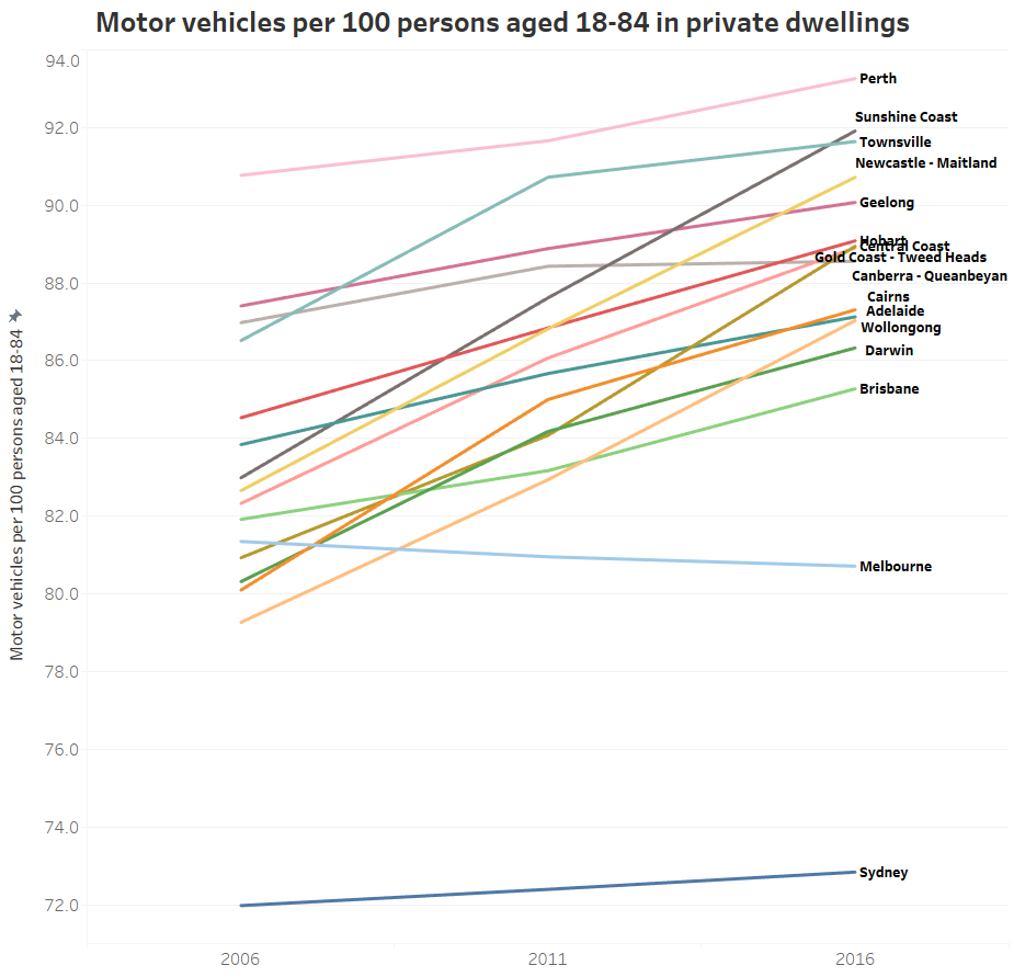 (explore in Tableau)
The trends are similar, but Melbourne is even more interesting on this measure. It has declined from 81.3 to 80.7, bucking the trend of all other cities (although Canberra only grew from 88.4 in 2011 to 88.5 in 2016).
How does motor vehicle ownership relate to density?
Here’s a chart showing population weighted density and motor vehicle ownership for persons aged 18-84 for SA2s across all the big cities in 2016 (explore in Tableau):
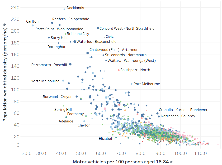
Some dots (central Melbourne and Sydney) are off the chart so you can see patterns in the rest. I’ve labelled some of the outliers. The general pattern shows higher density areas generally having lower motor vehicle ownership.
Is densification related to lower motor vehicle ownership?
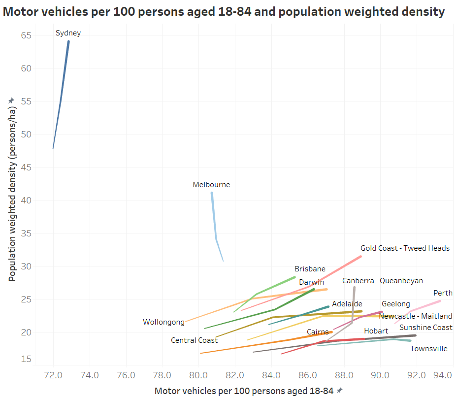
Here’s a chart showing how each city has moved in terms of population-weighted density (measured at CD or SA1 level) and ownership for persons aged 18-84, with the thick end of each worm 2016, and the thin end 2006.
(Note that the 2006 population weighted density figures are not perfectly comparable with 2011 and 2016 because they are measured at CD level rather than SA1 level, and CDs are slightly larger on average than SA1s)
(explore in Tableau)
You can see Sydney is a completely different city on these measures, and also that Melbourne is the only city heading to the left of the chart. Canberra is also bucking the trend between 2011 and 2016.
We can look at this within cities too. Here’s all the Local Government Areas (LGAs) for all the cities (note: City of Sydney and City of Melbourne are off the top-left of the chart)

(explore in Tableau)
Many Melbourne and Sydney LGAs are rising sharply with mostly declining motor vehicle ownership. But then there are Sydney LGAs like Woollahra, Mosman and Northern Beaches in Sydney that are showing increasing motor vehicle ownership while they densify (probably not great for traffic congestion!).
And we can then look inside cities. Here is Melbourne (again, several inner city SA2s are off the chart):
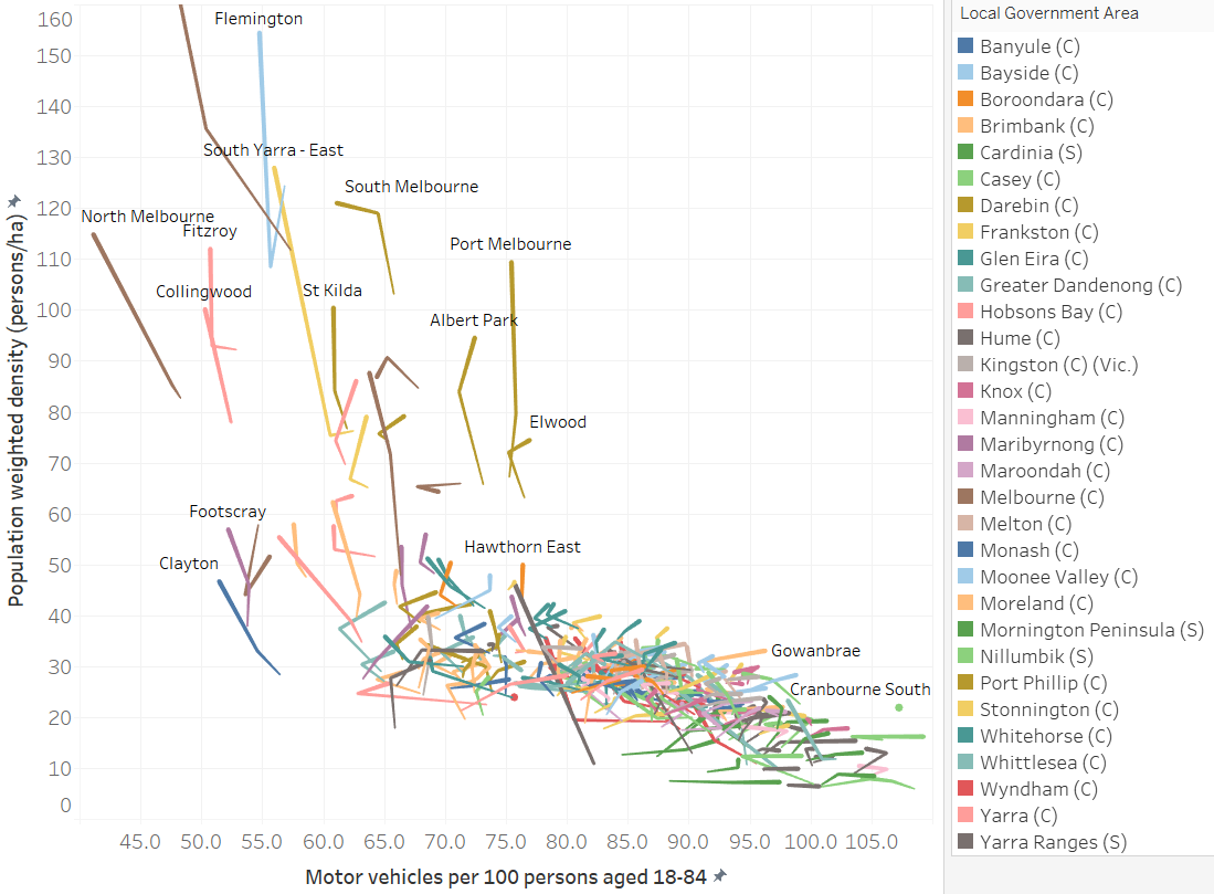
Some interesting outliers include:
- The relatively dense Port Melbourne, Albert Park, Elwood with relatively high motor vehicle ownership.
- The land-locked suburb of Gowanbrae with medium density but rapidly increasing car ownership (which has a limited Monday to Saturday bus service).
- The growth area of Cranbourne South with reasonable density but more than saturated car ownership.
- Relatively medium dense but low motor vehicle ownership of Clayton and Footscray.
Explore your own city in Tableau. You know you want to.
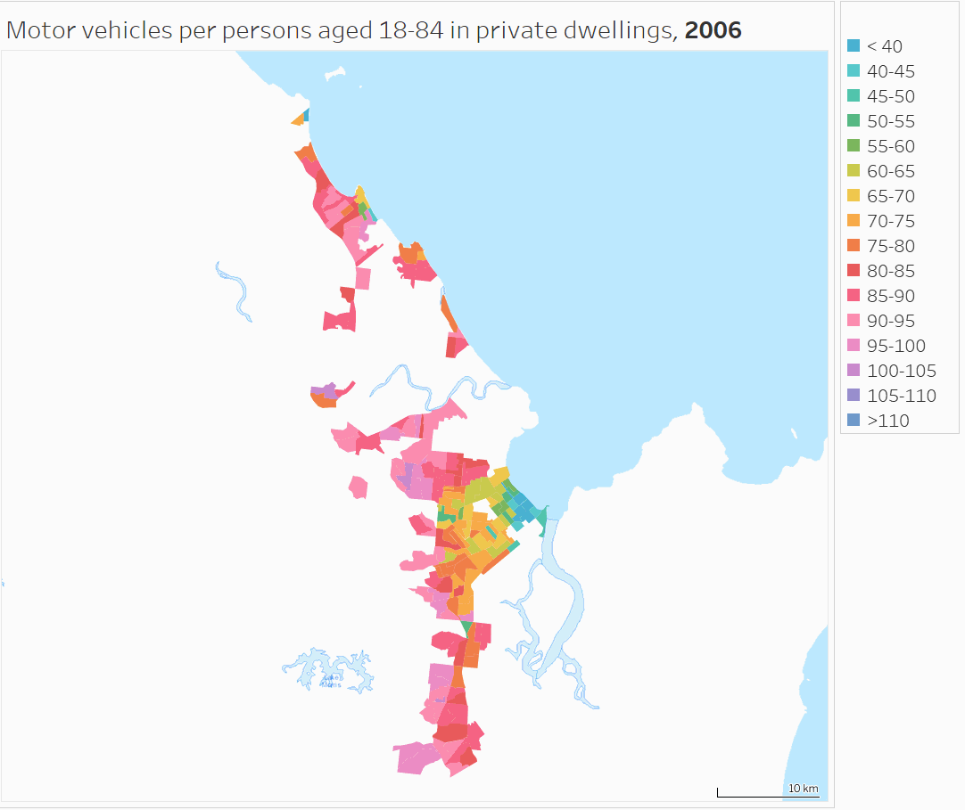
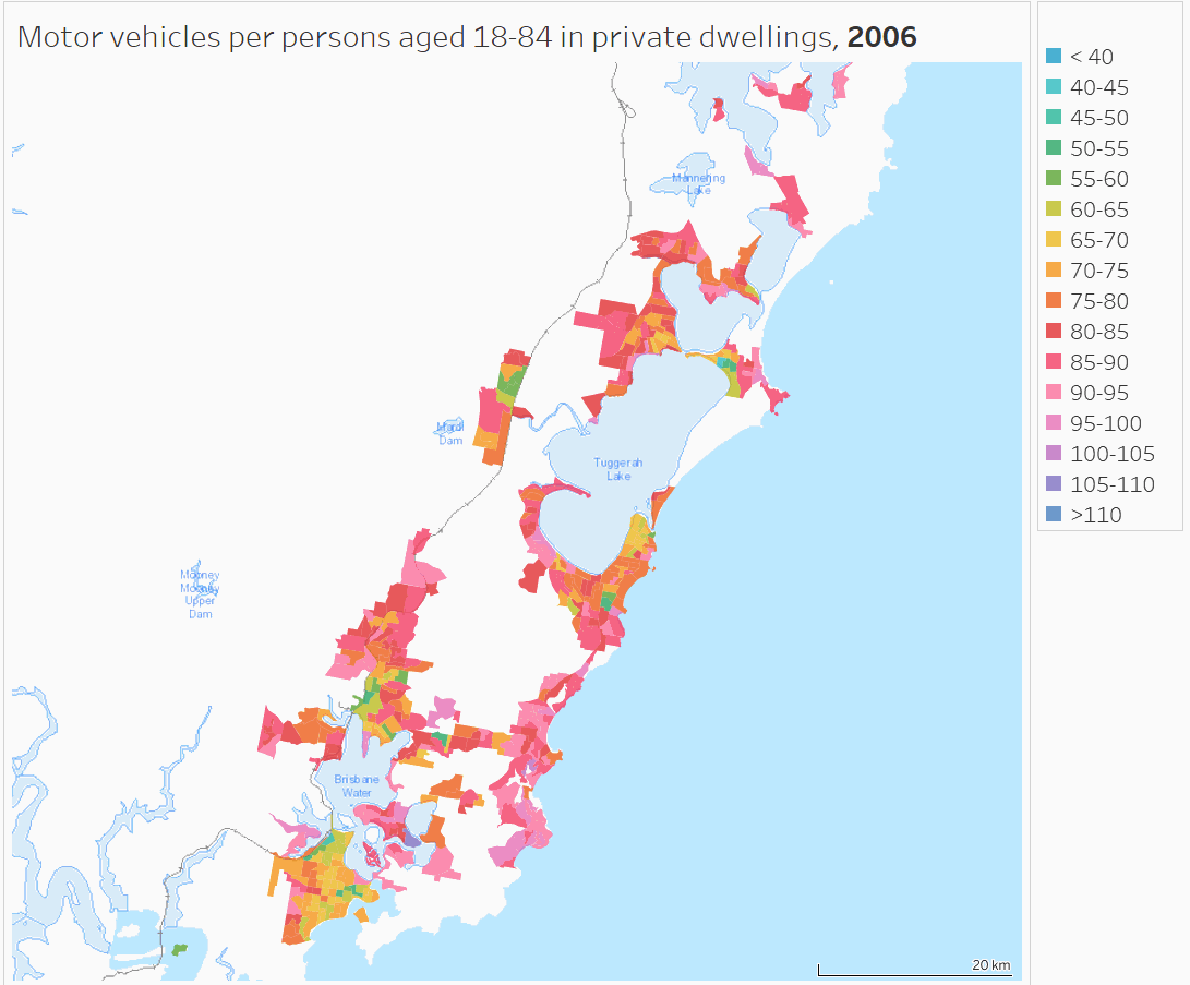
What are the spatial patterns of motor vehicle ownership in other cities?
The detail above has focussed on Melbourne, so here are some maps for others cities. You can explore any of the cities by zooming in from this Tableau map (be warned: it may take some time to load as I’ve ignored Tableau’s recommendations about how many showing more than 10,000 data points!). In fact for any of the maps you’ve seen on this blog, you can pan and zoom to see other cities.
To help see the changes in motor vehicle ownership between censuses more easily, I’ve prepared the following detailed animations.
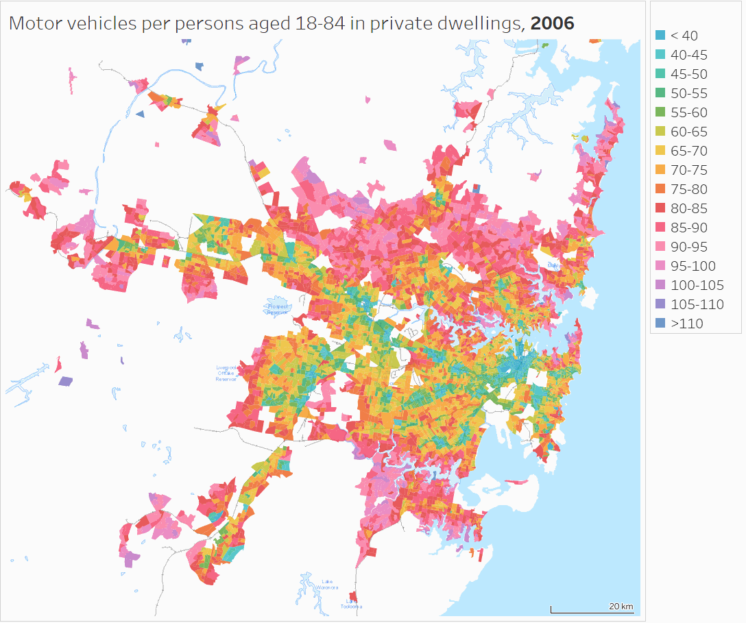
Sydney
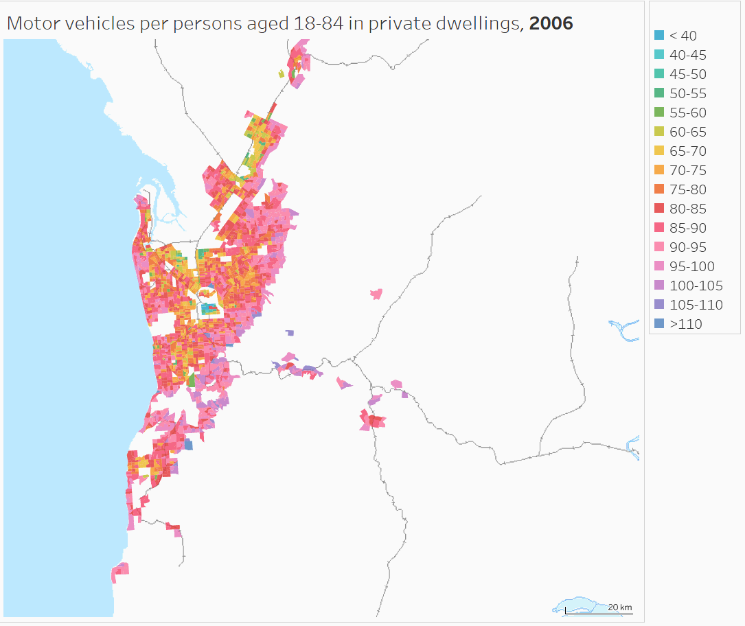
Brisbane

Adelaide
Perth
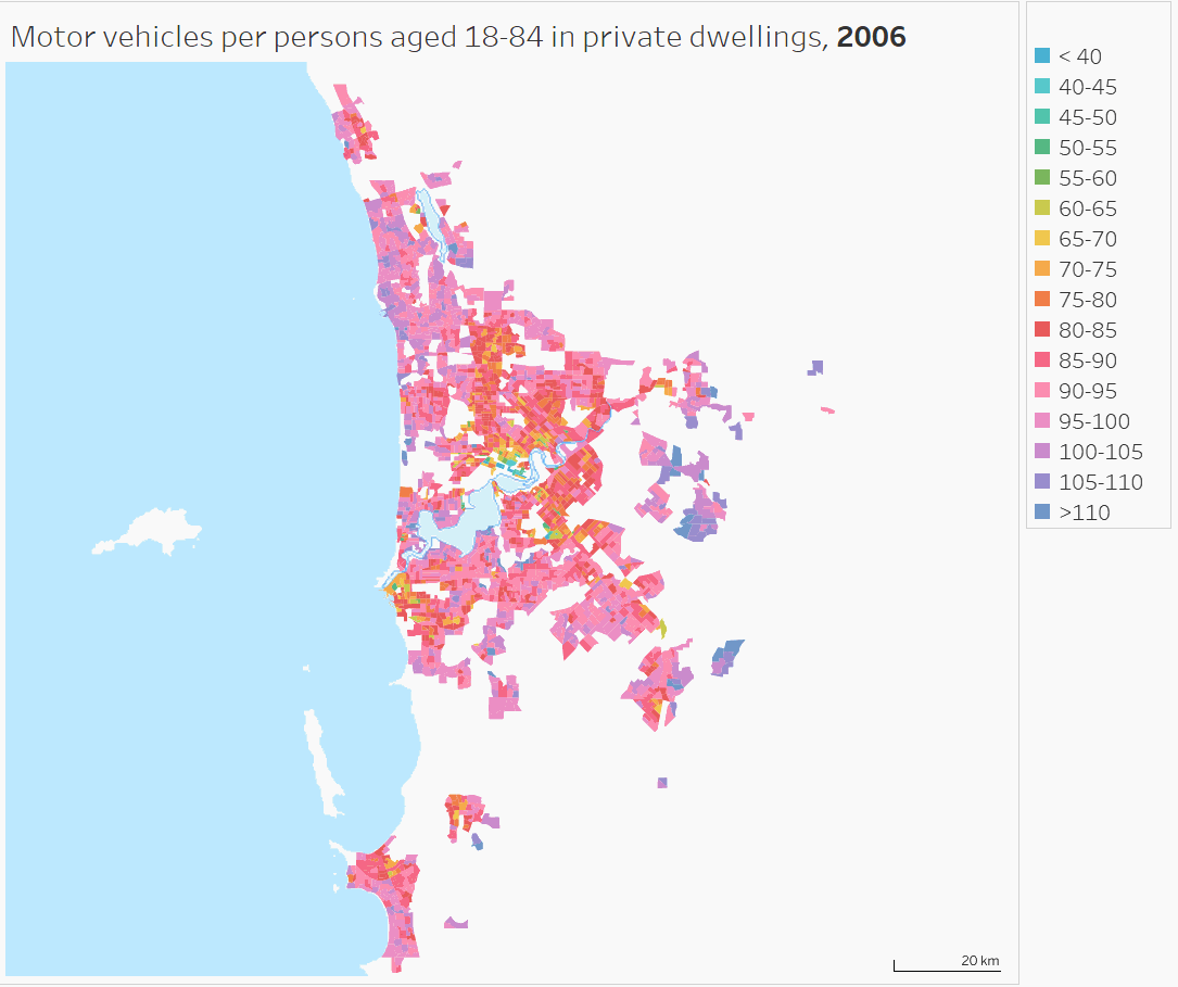
(Find Mandurah in Tableau)
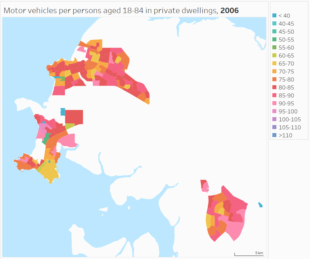
Canberra

Hobart

Darwin
Cairns
Townsville

Sunshine Coast

Geelong

Central Coast (NSW)
Newcastle – Maitland

This post has only looked at spatial trends and the relationship with population density. There’s plenty more to explore about car ownership with census data, which I aim to cover in future posts.
I hope you’ve enjoyed this post, and found the interactive data at least half as fascinating as I have.
Oh, and sorry about some of the maps showing defunct train lines. I’m using what I can get from the WMS feed from Geoscience Australia.
Appendix – About the data
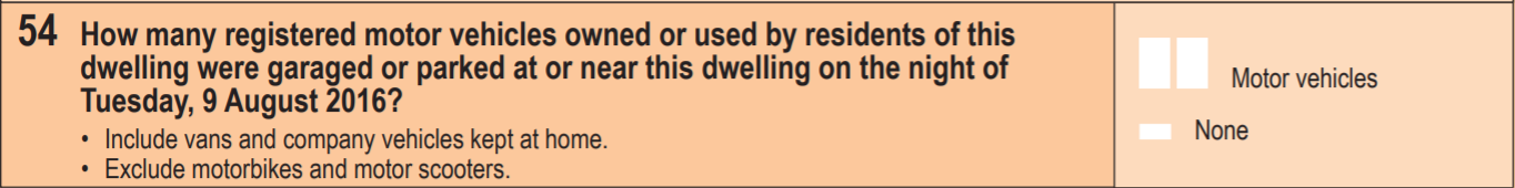
The Australian census includes the following question about how many registered motor vehicles were present at each occupied private dwelling on census night. This excludes motorcycles but includes some vehicles other than cars (probably mostly light vehicles).
96% of people counted in the 2016 census were in a private dwelling on census night, and 93.6% of occupied dwellings filled in the census and gave an answer to the motor vehicle question. So the data can give a very detailed – and hopefully quite accurate – picture.
I’ve used two measures of motor vehicle ownership:
- Motor vehicles per 100 population (often referred to as “motorisation” in Europe), and
- Motor vehicles per 100 persons aged 18-84
The first is easy to measure and easily comparable with other jurisdictions, but the second gives a better feel for what proportion of the “driving aged” population own a car. In an area with good alternatives to private transport, you might expect lower ownership rates.
Setting the lower age threshold at 18 works well for Victoria (imperfectly for other states with a lower licensing age), and 84 is an arbitrary threshold during the general decline in drivers license ownership by older people. So it’s not perfect, but is indicative, and certainly takes most children out of the equation.
As the motor vehicle question is based on what was parked at the dwelling on census night, I’ve used population present on census night (place of enumeration). That works well if someone was absent on census night and took their car with them, but not so well if they were absent and left their car behind (e.g. they took a taxi to the airport). You cannot win with that, but the census is timed in August during school and university term to try to minimise absences.
When calculating ownership rates, I’ve excluded people in dwellings that did not answer the motor vehicle question, and people in non-private dwellings. This is more robust than assumptions I made in previous posts on this topic so results will vary a little.
For 2011 and 2016, the census data provides counts of the number of dwellings with 0, 1, 2, 3, .. , 29 motor vehicles, and then bundles the rest as “30 of more”. For want of a better assumption, I’ve assumed dwellings with 30 or more motor vehicles have an average of 31 motor vehicles, which is probably conservative. But these are so rare they shouldn’t make any noticeable difference on the overall results.
As shorthand, I’ve referred to “motor vehicle ownership” rates, but you’ll note the census question includes company vehicles kept at home, so it’s not a perfect term to use, but then company vehicles are often available for general use.
I’ve used the 2011 boundaries of Significant Urban Areas (SUA) for each city, which are made up of SA2s and leave a good amount of room for urban fringe growth in 2016. However they do exclude some satellite towns (such as Melton, west of Melbourne).
I’ve extracted data at SA1 level geography for 2011 and 2016, and Collector District (CD) geography for 2006. In urban areas, SA1s average around 400 people while the older Collector Districts of 2006 averaged around 550 people. These are the smallest geographies for which motor vehicle and age data is available in each census. ABS do introduce some small data randomisation to protect privacy so there will be a little error well summing up lots of parcels.
I’ve generally excluded parcels with less than 5 people per hectare as an (arbitrary) threshold for “urban” residential areas. I’ve mapped all parcels to the 2016 boundaries of Local Government Areas and SA2s, and the 2011 boundaries of SUAs (2016 boundaries have not yet been released). Where boundaries do not line up perfectly, I’ve included a parcel in an SAU, LGA, or SA2 if more than 51% of the parcel’s area is within that boundary. The mapping isn’t perfect in all cases, particularly for growth area SA2s and 2006 CDs. See the alignments for SA2s, LGAs in Tableau.


 Posted by chrisloader