Are congestion costs going to double? An analysis of vehicle kms in Australian cities

Tue 25 October, 2011

A frequently cited forecast is that the avoidable costs of congestion in Australia will double in most Australian cities between 2005 and 2020. These BITRE forecasts were published in 2007 (Working Paper 71), assuming continued strong growth in vehicle kms in our cities (“business-as-usual” conditions). But as this blog has demonstrated several times, transport trends have not been business-as-usual in recent years.

In August 2011, BITRE published revised estimates of vehicle kms in Australia (Report 124), derived from fuel sales data (using with fleet/fuel mix and fuel intensities etc).

How are we tracking with forecast traffic volumes?

I don’t have access to the complex model BITRE used to forecast congestion costs, but vehicle kilometres is an obvious major driver of congestion costs, and it is easy to compare the 2007 forecast (Working Paper 71) of vehicle kms in major cities with the most recent estimates of actuals (Report 124):

Consistent with other evidence, the growth in vehicle kilometres appears to be significantly below forecast. In 2007, BITRE assumed that city travel growth would fall to population growth rates, and that mode shares of travel would remain static. They also assumed world oil prices would peak at around US$65 in 2008 and drop to the low US$50s by 2011 (in 2004 dollars). None of these assumptions have played out in reality.

When looking at the components of the vehicle km estimates, the estimated actuals (in Report 124) for 2009-10 appear to be 15% lower than forecasts for cars and light commercial vehicles. For trucks, the 2009-10 estimated actual is around 8% lower than forecast.

To be fair, there was little evidence of the emerging mode shifts available at the time. That said, a BITRE forecast presented at ATRF in September 2011 showed a return to business as usual upwards growth, despite the last 6 years showing little growth.

What cost of congestion might we have avoided?

The relationship between travel volume and congestion costs is not linear. It is usually conceptually represented as an exponential curve. That is, a small reduction in traffic volumes will have a large impact on congestion costs (as evidenced each school holiday period where a claimed 5% reduction in traffic volumes has a significant impact on congestion levels).

While I am not equipped to do a robust calculation, the recent shift away from private car motoring is probably having a significant impact on the avoidable costs of congestion. Estimated actual capital city vehicle kms in 2010 (117.9 billion km) were just under the forecast for 2004 (118.2 billion km). The estimated cost of congestion for forecast 2004 vehicle km levels was $9.1b, while it 2010 it was forecast to be $12.9b. Road capacity has been increased in most cities between 2004 and 2010, which would reduce congestion costs for the same traffic volume, so the difference in 2010 between actual and forecast avoidable congestion costs might be in the order of around $3 billion.

So what is happening with vehicle kms per capita?

In another post, I used BITRE yearbook data on motorised passenger kms per capita. BITRE Report 124 only includes figures on vehicle (not passenger) kms, but they are still interesting figures.

And in response to requests from across the Tasman, I’ve added New Zealand’s one “big” city Auckland (data for ‘Auckland Region’ from their Transport Indicator Monitoring Framework, accessed October 2011).

Total vehicle kms per capita appear to be trending down in all Australian cities since around 2004/2005, with the sharpest drop in Melbourne in 2008-09. Auckland appears to be showing no such trend, with perhaps a flattening at best since 2005-06 (the vehicle km data is marked as under review, as is the public transport data which shows patronage growth of 25% in the four years to 2009-10).

Comparing values for different cities requires caution. The physical size of the urbanised area, and the administrative boundaries used to define cities will have an impact. For example, Adelaide shows up with lower vehicle kms per capita than Melbourne, even though it has much lower public transport mode share. The Adelaide urban area has a smaller footprint and is more constrained than Melbourne, which might explain this difference.

Car vehicle kms per capita appear to have peaked in either 2003-04 or 2004-05 in the five big cities, with Melbourne showing the biggest decline (a 14% decline since 2004-05).

The last two charts showed financial year estimates, but data is actually available at a quarterly level. I’ve created the following chart using simple interpolation of June estimates of residential population for each of the large Australian cities:

The underlying fuel data was actually seasonally adjusted, but there still appears to be some noise in the data (or the world may just be that variable, but I doubt it).

Vehicle use outside the big cities

What about traffic volumes in the rest of Australia? I’ve extracted the five big cities (Sydney, Melbourne, Brisbane, Perth and Adelaide) from the remainder:

The reduction in vehicle use does not appear to be limited to the big cities (most of which have seen strong growth in public transport). The trends for car km per capita outside the five cities are no different to overall vehicle use.

I should note: the report does not actually specify how vehicle kms for each state were split between capital city and other areas (section 8.2, citing unpublished data), but the fractions used were published.

What about total vehicle kms in cities?

While I like to look at per capita transport usage (everything is relative), it is instructive to look at trends in total volume as well. They provide some input into whether increased road capacity might be required, for example.

This charts shows that total vehicle kms in Melbourne, Sydney and Adelaide have been relatively flat since around 2004, while Auckland, Perth and Brisbane have shown continued growth. Perth and Brisbane show a downturn only in more recent times, but have had several years of declining vehicle kms per capita, the difference probably explained by stronger population growth.

How do BITRE Melbourne figures compare with VicRoads’ data?

Here is a chart comparing vehicle km index values for Melbourne from BITRE report 124, and an index created from annual growth figures reported in VicRoads Traffic Systems Performance Monitoring reports (with fully revised history):

A significant gap opens around 2003-04, but this substantially closes from 2008-09. Both datasets show a stabilisation of total traffic volumes, with BITRE data stabilising one year later than for VicRoads. BITRE aimed to estimate total metropolitan traffic, while the VicRoads figures are based on a defined set of monitored roads that might not reflect total traffic, particularly in growth areas on the fringe.

(Note: I did a similar comparison of VicRoads data to BITRE Working Paper 71 estimates of actuals in an earlier post).

In conclusion

  • There is strong evidence that “business-as-usual” growth in vehicle kms is just not happening in Australian cities, and thus the 2007 forecast doubling of congestion costs by 2020 is very unlikely to play out.
  • The dampened growth in travel demand is probably saving the economy a few billion in avoidable congestion costs, and has implications on the need for multi-billion dollar expansions of road capacity (though changes in demand will not be uniform across road networks).
  • I’d also suggest it is important that planners and policy makers understand why travel demand trends have changed so significantly, and apply this understanding to forecasts of future demand.
I’d like to acknowledge BITRE for conducting the excellent work that went into Report 124 and making the data publicly available, without which this analysis would not have been possible.

What’s happening with car occupancy?

Sat 20 August, 2011

[updated April 2016]

Is car occupancy trending down as car ownership goes up? What factors influence car occupancy? What is the impact of parents driving kids to school?

Following a suggestion in the comments on my last post about car ownership, this post takes a detailed look at car/vehicle occupancy.

What are the trends in car occupancy? 

This first chart shows average vehicle occupancy from a number of different measures that are more recently updated:

  • Australian passenger vehicles – measured as the ratio of person-kms in passenger vehicles, to total passenger vehicle kms (both estimates, and unfortunately this can only be calculated for all of Australia, using BITRE data).
  • Sydney weekday vehicle occupancy, both per trip and per km, from the Sydney Household Travel Survey (SHHTS). These figures include all private vehicles (not just cars).
  • Melbourne weekday vehicle occupancy per km, from the Victoria Integrated Survey of Travel and Activity (2012/13 data wasn’t available at the unlinked trip level at the time of updating this post). Again, these figures include all private vehicles (not just cars).

The BITRE figures show a fairly smooth and slow downwards trend from 1.62 in 1990 to 1.57 in 2014. The Sydney figures are a little more noisy, but surprisingly quite flat around 1.37 (on a distance measure), and increasing on a trip basis (suggesting occupancy is rising on shorter trips and/or declining on longer trips). Only the BITRE figures are confined to passenger vehicles, which probably explains the differences between the series (the SHHTS and VISTA data will include private vehicles such as motorbikes, trucks and light commuter vehicles).

The census journey to work question gathers data on how people travelled to work, including car drivers and car passengers. While not a clean measure, it is possible to calculate an implied car occupancy as (car drivers + car passengers) / (car drivers). For the purposes of this calculation, I have only taken “car driver only” and “car passenger only” trips (which excludes park-and-ride and kiss-and-ride public transport trips). I do not have data on trip lengths, and average car passenger trips might be different on average to car driver trips.

There’s a pretty clear downwards trend as relatively fewer people travel to work as car passengers. In fact, the data suggests extremely low levels of car pooling, and that over 90% of car journeys to work have no passengers in most cities. But keep in mind that car-only mode share of journeys to work peaked in 1996, so the net change is proportionally less people travelling as car passengers and proportionally more people travelling on non-car modes.

So in summary, there is some evidence of very gradual declines in car occupancy for all travel purposes, and strong evidence of a decline in vehicle occupancy on the journey to work.

Trends in car occupancy by time of day

Many state road agencies make direct and regular measurements of vehicle occupancy in capital cities and their data is collated by AustRoads.

Unfortunately only four cities report such data to AustRoads. Brisbane data has several missing years – and the three most recent years’ figures reported are all identical, so I’m inclined not to plot them. That leaves Melbourne, Sydney and Adelaide. Unfortunately the AustRoads website hosting these statistics appears to no longer work, but VicRoads separately publish Melbourne data (but much less for more recent years). What follows is all the data I have been able to collect.

Firstly, all day (weekday) average occupancy:

There doesn’t appear to be much in the way of clear trends as the data seems quite noisy (I’m not sure anyone could explain the year by year variations). Perhaps Melbourne average all day occupancy was trending down.

Data is available for three sub-periods:

Again lots of noise, and no clear trends.

Noisy again. It’s looks like Melbourne is no longer trending down.

This data is remarkably flat for Sydney, while Melbourne appears to still be trending down.

It’s little surprise that AM peak has the lowest occupancy, as it is dominated by journeys to work. More on that soon.


Notes on the AustRoads/VicRoads data:

Along with the noise in the data, there is some ambiguity in the methodology. The AustRoads website reports “car” occupancy, but the methodology doesn’t seem to filter for cars. Are buses included or not? It says the survey should be undertaken in March/April to avoid school and public holidays. But March and April have heaps of holidays (Easter, Anzac Day, and Labour Day in many states).

But the AustRoads data is certainly collected on representative arterial roads, where you might expect lower occupancy because of longer trips that are more likely to be work-related.

What’s the relationship between car ownership and car occupancy?

You might expect car occupancy to go down as car ownership goes up. In other words: we have more cars and need to share them less.

Here’s what the relationship looks like for Australia as a whole (using car occupancy derived from BITRE data):

There are five quite different periods:

  • From 1993 to 1999 (bottom right) car occupancy declined as car ownership increased. As you might expect.
  • From 1999 to 2001 car ownership stalled, but car occupancy continued to decline.
  • From 2001 to 2005 car ownership rose again, but car occupancy declined more slowly.
  • From 2005 to 2010 car occupancy increased slightly, while car ownership had slow growth. This is the period when public transport mode shift took hold in most Australian cities.
  • From 2010 to 2014 car occupancy dropped more quickly, while car ownership had slow growth. In this period there was much less mode shift to public transport in most Australian cities.

The relationship is changing, probably influenced by other factors. BUT it could also be that I’m reading too much into the precision of the car occupancy figures – we are talking about variations in the fourth significant figure only for the last few years. The BITRE figures are estimates themselves. Maybe someone from BITRE would care to comment on the precision?

What about different road types?

Looking at Melbourne data in more detail, car occupancy appears to have declined most on freeways and divided arterials:

On freeways, the decline is most evident during business hours:

Here is a chart comparing car occupancy figures for arterial roads in Melbourne (2009/10):

You can see car occupancy lowest on freeways, and highest on undivided arterials with trams (all in the inner suburbs). Otherwise very little difference (in 2009/10 at least).

How do Australian cities compare?

To try to take out some of the noise, I’ll take the average of the last four years for the AustRoads data and Sydney and Melbourne household travel survey data:

Melbourne appears to have the lowest occupancy, and Sydney the highest – except when it comes to household travel survey data where Melbourne is much higher. But this might just be differences in methodologies between states.

Factors influencing car/vehicle occupancy (in Melbourne)

Having access to the 2007-08 VISTA data, it’s possible to disaggregate vehicle occupancy on almost any dimension you can imagine. I’ll try to restrict myself to the more interesting dimensions!

For most charts I have used vehicle occupancy rather than car occupancy. Cars and 4WD/SUVs combined accounted for 88% of vehicle kms in the dataset so there shouldn’t be a lot of difference. But I’ll start with looking at..

Vehicle type

Now that’s a surprise: 4WD/SUVs have a much higher average occupancy than cars. Why is that?

Are they used for different purposes?

Not a great deal of difference between cars and 4WD/SUVs, although 4WD/SUVs are slightly more commonly used to pick up or drop off someone.

More likely explanations (from the data) are:

  • 4WD/SUV come from larger households on average (3.5 people v 3.1 for cars).
  • 4WD/SUVs are also more likely than cars to belong to households that are couples with kids.
More on both of these point soon.

Day of the week

Probably not a huge surprise that cars have less occupants on weekdays than weekends. Male drivers are much more likely to have no passengers on weekdays, but an average of one passenger on weekends. Whereas there is much less variation for females.

Is this traditional gender roles in the family? (There is a chart to answer almost any question you know..)

There you go: dads much more likely to drive the family around on weekends, and mums more likely to drive them around on weekdays. And while on the subject…

Household types and sizes

Little surprise that car occupancy increases with household size. It is easier to car pool when you have the same origin.

Note that the sample size of one parent households of size 5 are small (especially for male drivers). But curiously single mothers have much higher occupancies than single fathers.

There is also a small sample of other household structures with 5 people.

Unsurprisingly, people living alone are likely to have the lowest car occupancies. With increasingly prevalence of sole person households, you might expect continuing declines in average car occupancy.

Trip purpose

Again work trips are the least likely to involve passengers, particularly on weekdays (average occupancy 1.07). Driven trips to education are not far behind. Little surprise that accompanying someone, or picking up or dropping off someone averages around 2 or more. Occupancies for personal business, shopping, recreational and social trips are in the middle, but much higher on weekends when householders are probably more likely to travel together to common destinations.

Many people would argue that demand for public transport is lower on the weekend. These figures would support that argument, but lower weekend patronage would also reflect lower service levels.

Note: the sample sizes of weekend education and accompanying someone trips were too small to be meaningful so I left them off.

Time of day

There you go, car occupancy peaks between 8 and 9am and between 3 and 4 pm on school days: parents driving kids to/from school.

But vehicle occupancy is highest on Saturday nights when people are socialising, and interestingly Sundays are well above Saturdays (less personal business on Sundays perhaps?). Non-school weekdays have higher occupancies than school weekdays, possibly with parents also taking time off work and spending time with kids.

Just looking at the school peak more closely, here is a chart showing car driver trip purposes by hour of the day on school weekdays. You’ll almost certainly have to click on this one to read the detail.

The most frightening statistics are in the school peaks. A staggering 40% of car trips between 8 and 9am, and 42% of car trips between 3 and 4pm are to pick up or drop off someone (suggesting a fault in the reported vehicle occupancy for trips picking up somebody). This will almost certainly be dominated by school children. No wonder traffic congestion eases so much in school holidays.

That said, car trips to/from school are shorter than other trip types (as we saw in an earlier post). The data suggests 19% of car kilometres of trips starting between 8-9am are to pick-up/drop-off someone, and for 3-4pm the figure is 24%. That’s still a sizeable chunk of total road traffic. It suggests there are huge congestion relief benefits to be had in getting kids to walk, ride or use public transport to/from school.

Geography

There’s not a lot of difference other than for the inner city, where school day occupancies are lower. For someone in the inner city to drive a car, they are probably heading out of the city and any other members of their household might be less likely to have the same destination and/or would have good public transport options for their travel.

The non-school weekday figures show some variation, and while the sample sizes are all over 250, there are some vehicles with an occupancy of 14 recorded. unfortunately because the underlying data is discrete, medians aren’t an easy way around this issue.

Age

This would suggest traditional gender roles are in play: Average car occupancy is highest for drivers aged 30-45, the most common age groups for parents of pre-driving aged children. And women seem to be doing more ferrying of the kids than men.  In the older age groups men are more likely to be driving with passengers.

Income

Vehicle occupancy seems to go down as we have higher incomes (moreso for females), but there seems to be some noise in the data (eg the spike at 3000 is due to one vehicle with 12 occupants). Females with lower household incomes have higher vehicle occupancies (maybe those without an income but looking after a family).

This trend reflects the fact that car/vehicle ownership goes up as wealth goes up:

The threshold for car ownership is around $1250 per week (equivalised to a single occupant household). As Australians have become increasingly wealthy in real terms, we can afford to own more cars.

Trip distance

While there is probably a little noise in this data, there is a fairly clear pattern. Very short trips and very long trips are likely to have higher occupancies. The median trip distance for non-work trips is around 4kms, while work trips are much longer, which fits with the average occupancies for different trip purposes.

In fact, here is a mode share breakdown by trip distance (for trip legs):

You can see car passenger becomes more common for very long trips (note the X axis scale is not uniform). (Don’t ask me why driving is so popular for distances of 16-16.9 kms! It’s probably a bit of noise)

And if you look at the trip purposes of these very long trips, you’ll longer trips are more likely to be social or personal business:

(note: this chart is by trips, and not trip legs)

Main Activity

Probably little surprise that those “keeping house” have the highest occupancy in general, but that full-time workers have very low occupancy on weekdays, but very high occupancy on weekends.

There you go, possibly more than you ever wanted or needed to know about vehicle occupancy!


Trends in car ownership

Sun 7 August, 2011

[post updated in April 2016 with 2015 data. For some more recent data see this post published in December 2018]

Is the rate of car ownership still growing in Australia?

Firstly, by car ownership rate I mean the ratio of the number of registered “passenger vehicles” (from the ABS Motor Vehicle Census) to population (also from ABS). So while some of the measures in the post are not strictly for cars only, I’ve not worried too much about the distinction because I’m most interested in the trends.

The oldest motor vehicle census data is from 1955, and it is no surprise to see car ownership rates in Australia have risen considerably since then:

What is interesting in this chart is the relative rate of car ownership between states and territories. The Northern Territory is consistently the lowest – I’m guessing related to remote indigenous populations with low car ownership. New South Wales may reflect the relatively dense Sydney where car ownership is less important for many. I’m not sure of the reasons for other differences. It might be slight differences in reporting from the state agencies (see ABS’s explanatory notes).

But what about the most recent trends? Here is the same data from 2000 onwards (NT off the chart): 

You can see growth across all states, although there are several periods where some states flat-lined, particularly around 2008.

So while we have reached peak car use, we haven’t reached peak car ownership as a nation.

What about car ownership in cities?

Motor vehicle ownership data is also available from the census, with data provided on the number of households with different numbers of vehicles. The 2006 census reported the number of households with every number of motor vehicles 0 to 99, and here is the frequency distribution:

household car frequency 2006

In 2011 census data ABS only report the number of households with “4 or more” motor vehicles. I’ve calculated the average number of cars for this category for 2006 for each city and applied that to the 2011 data to get total motor vehicle estimates for 2011.

The following chart shows household motor vehicle ownership rates for major city areas for 2006 and 2011 (boundaries changing slightly to include more peripheral areas that are likely to have higher car ownership):

City car ownership 2006 and 2011

Sydney has the lowest rate of motor vehicle ownership, and Perth the highest, with Melbourne showing the least growth.

Here is the relationship between car ownership and journey to work by car-only:

car ownership v car JTW

While all cities had an increase in car ownership between 2006 and 2011, all but two had a reduction in car-only mode share of journeys to work. They were Adelaide and Canberra which also had the largest increases in car ownership rates.

While cities overall show increasing ownership rates, there were reductions in motor vehicles per capita in many municipalities between 2006 and 2011, including the City of Perth, the City of Melbourne, the City of Adelaide, the City of Willoughby, and the City of North Sydney. This suggests car ownership is in decline in some inner city areas of Australian cities (more spatial detail for Melbourne is available in another post). These areas generally have good public transport and many local services within walking distance, and I’d guess many new residents are not bothering with car ownership.

The following chart compares motor vehicle ownership rates between capital city areas and the rest of each state or territory for 2011 census data:

car ownership capital v rest of state 2011

Car ownership is certainly higher outside most capital cities – except in the Northern Territory as I suspected (curiously Darwin has around the same car ownership rate as Melbourne).

How does car ownership vary by demographics?

The Victorian Integrated Survey of Travel and Activity (VISTA) provides detailed data about households in Melbourne and regional Victorian cities for the years 2007-2009. So while I cannot extract trends, we can look at the patterns of car ownership rates.

I have classified all households in the VISTA dataset into one of three categories:

  • household with no motor vehicles
  • limited motor vehicle ownership: less motor vehicles than people of driving age (arbitrarily defined as 18-80), or
  • saturated motor vehicle ownership: motor vehicle count equals or exceeds the number of people of driving age (“MV saturated” in the chart).

mv ownership by age draft

You can see that people aged 35 to 59 are least likely to live in households without motor vehicles, while younger adults are most likely to live in a household with limited car ownership. There are curiously two peaks in saturated car ownership – aged 35-39 and 60-64. The saddle in between might be explained by family households with driving age children.

The following chart looks at household car ownership by household type, with “young families” classed as households where all children are under 10 years of age.

mv ownership by hh status

Some very clear patterns emerge, with households incorporating parents and children very likely to own at least one motor vehicle. Sole person households were most likely to not own a motor vehicle. Limited motor vehicle ownership was most common in “other” household structures, parent+children households with older children, and couple households with no kids.

It seems Australians find car ownership a high priority if they have young children. Other analysis on this blog found that such households also have the lowest rates of public transport use, and a very strong inverse relationship between motor vehicle ownership and public transport use.

What about usage of each car?

Using data from the BITRE 2015 yearbook, it is possible to calculate estimated annual kms per passenger car. For this I’m comparing the number of vehicles at the motor vehicle census date with an estimate of total car kms in the previous 12 months (straight line interpolation of BITRE year ending June figures). This isn’t a perfect measure as the number of cars grows throughout the 12 month period where kilometres are taken, but it is still a guide to the trend.

The steeper downwards trend since 2005 is similar to the downwards trend in car passenger kms per capita in Australian cities:

Since around 2005, car ownership has continued to rise while car passenger kilometres per capita has fallen. This suggests we are driving cars shorter distances and/or less often.

What about motorcycles?

Are more people owning motorcycles instead of cars? Here’s the long-term trend:

You can see motorcycle ownership rates peaked around 1980, dipped in the mid 1990s and have grown significantly since around 2004 (although still very small). Does it explain the slowdown in the car ownership rate from 2008?

This chart still shows a slow-down after 2008, so it doesn’t look like rising motorcycle ownership fully explains the slow-down in car ownership. Motorcycle ownership took off in 2004, but car ownership slowed in 2008.

What about the ageing population?

Could the data be impacted by a changing age profile? We know that older aged people are less likely to have their driver’s license and are more likely to live in a household with lower car ownership (refer above), so maybe this would lead to a declining car ownership rate per head of population as a greater portion of the population is older.

Suppose most car owners are aged 18 to 80 years. Here’s the percentage of Australia’s population within that age band:

Population aged 18-80

The share has been very steady at around 73 to 74% for all of the last 21 years, which suggests little impact on overall car ownership rates. Then again, those aged 80 today are more likely to have a driver’s license that those aged 80 in 1994. So the rate of car ownership of younger people has probably grown less. We know their rate of driver’s license ownership has declined over time, but I’m not aware of any readily available data that would confirm a lower rate of car ownership by younger people over time (it’s probably available from the Sydney Household Travel Survey datasets).

Notes on the data:

  • The ABS Motor Vehicle Census has been taken in different months in different years. State population estimates are only available on a quarterly basis. I have used the nearest quarterly population figure for each motor vehicle census where they do not align (never more than one month out).

How does travel vary across Melbourne and regional centres in Victoria?

Sun 19 June, 2011

What differences are there in car use by geography, income, household type, and age?

And could you do more to reduce car use by pushing population growth to regional cities instead of the fringe of Melbourne?

I thought I’d take a closer look at travel and trip distances using massive 2007-08 VISTA dataset, and see what factors lead to variations.

In this post I look at travel distances (total and by car) and mode splits across geographies, trip purposes, incomes, ages, and household types. And more.

While the results might not be too surprising, I hope you’ll find the evidence interesting.

How do travel distances vary by geography?

In a previous post I showed that people in the outer suburbs generally have a longer median travel distance:

The patterns were not uniform in the outer suburbs. Nillumbik is the second highest on 35.1 kms per person, while Hume is much lower on 19.6. Factors such as incomes and household types might explain this variation (more on that later).

Most of my analysis will deal with six geographic zones – four rings of Melbourne, Geelong and other regional cities in the VISTA sample combined (Ballarat, Bendigo, Shepparton and the Latrobe Valley). Here’s a map of the Melbourne zones:

Note: I’ve used “city” as shorthand for the central area, and “inner” as shorthand for the inner suburban ring.

Based on those zones, here is a simpler view of daily travel distances (total and by car):

This suggests little difference in total travel distance, but significant differences in car travel distances.

I’ve not used averages because some trips were extremely long (the longest trip by an inner city resident was 833 km) which can skew the averages.

But is median the right measure of travel distance? Probably not, if you look at the following chart of the cumulative distribution of all day travel distances:

How do you read this chart? A point on each line means Y% of people travelled up to X kms per day. Essentially the lower the curve on the chart, the longer distance those people travelled.

You can see differences between distributions are not straight forward:

  • The lower half of travel distances were quite similar.
  • The differences manifest in the top half of distances. You can see that people in outer Melbourne were much more likely to clock up longer travel distances that those in the inner city. For example, 30% of people in the outer suburbs travelled more than  , while only 15% of people who live in the inner city travelled more than 40 kms.
  • In fact, there were more long distance travellers in outer Melbourne than in Geelong or the other regional centres.
  • 24% of people in the outer suburbs of Melbourne did not travel at all, while only 15% of inner city residents did not travel on the survey day. This causes the distances to cross around the median.
  • There is greater diversity in travel distances of people in the outer suburbs, including about the quarter who did not travel.

Here is the same again for car distance travelled (probably the most important chart in this post):

The differences are much clearer here, with car use and travel distance increasing through Melbourne by distance from the city, and the outer Melbourne suburbs having the longest car travel distances. Distances in Melbourne’s outer suburbs are generally longer than in Geelong and the regional centres.

Interestingly, 48% of inner city residents made no car travel at all, hence the very low median. While the city, inner and middle lines converge at a longer distance, the outer suburbs still had 10% of people doing more than 80 kms in cars.

How does mode share vary by geography?

The distributions on car distance travelled reflect mode splits across the regions. Here is a chart of mode split for trips (using the ‘main’ mode for the trip, which means car+PT trips are counted as PT):

Active and public transport mode shares fell away with distance from the centre of Melbourne. I expect this will be a product of poorer service levels, and a smaller proportion of people travelling to Melbourne’s CBD (the main market where public transport dominates).

But here’s a slightly different take, the mode share of person travel distances:

There is much less variation in public transport mode share of kms travelled. This points to people in the outer suburbs of Melbourne, Geelong and other regional centres making much longer trips when they travelled by public transport. I expect many of these will be long distance rail trips to Melbourne.

The clear difference is that people in the outer suburbs and regional cities did a lot less walking/cycling and lot more travel by car.

What about mode share of very short trips?

Walking is a significant mode in the inner city, and many destinations are within walking distance. You might think that the regional centres are similar, because they are more compact in general.

Well, it appears not. Here is a chart of mode shares of trips under 1km (probably a walkable distance for most people).

Around half the short trips in the outer suburbs , Geelong and regional centres were made by private transport – essentially cars! Why did people drive for such short trips in these areas? Is it a lack of safe places to walk/cycle? Or is it a lack of disincentives to drive?

Digging deeper, even for recreational trips of less than 1km in the outer suburbs, 30% were made by car!

Does the number of trips made vary by geography?

The following chart shows the distribution of the number of trips made. In VISTA, a trip is defined as travel between two activities.

People in the inner city generally made more trips, and those in the middle and outer suburbs made fewer trips. This will also be influencing the total distance travelled per day.

Note: very few people make only 1 trip in a day because it essentially means you start and finish you day in different locations (within the VISTA definitions of a day at least).

How do trip lengths vary?

Here is a distribution chart of lengths of trips (for any purpose):

By almost any measure, those in the outer suburbs of Melbourne made the longest trips. They were followed by people who live in the middle suburbs of Melbourne and Geelong. This means that either people choose to partake in activities that were further away, or (more likely) those activities were further away from home.

What about trip distances for different purposes?

First up, median trip distances by purpose:

Work related trip distances were clearly the longest, especially in the outer suburbs. The “median” person living in the outer suburbs of Melbourne travelled 16 kms for work (note that not all “work related” trips are to/from home).

Here’s a closer look at the distribution of trip lengths between home and work:

The differences when looking only at home to work and work to home trips is much more stark, with the outer suburbs of Melbourne fairing worst by a long way.

The median distances in Geelong and the other regional centres were actually less than the inner suburbs of Melbourne, however they have a long tail with over 10% of trips in Geelong more than 50km.

Back to the previous chart, social trips also get longer as you move to the outer suburbs of Melbourne, which suggests that outer suburbs are not as self-contained for social destinations.

Most other trips purposes had a median around 3-4 kms, although this was more like 2-3 kms in the inner city, and distances increase in the outer suburbs. Chauffeuring trips (pick up or drop off someone) show the least variability (many of these would be taking kids to/from school).

Trips to education were longest in the inner suburbs, possibly reflecting children from wealthy families attending private schools that are further away.

How does travel time vary by trip purpose?

You can see:

  • Work trips take the most time in Melbourne, but there isn’t a lot of variation. This supports the hypothesis that people have a commuting travel time budget, and generally find work within that budget.
  • Work travel times were highest in the inner suburbs (perhaps related to slower road speeds) and outer suburbs (much longer distances).
  • Education trip times were longer in the inner and middle suburbs (perhaps related to congestion and/or longer trips to private schools by children in wealthy families)
  • 10 minutes was the most common median trip time – which actually shows up as 9 minutes in the chart, owing to the way I calculate medians in Excel (sorry, not perfect, but Excel doesn’t do medians in pivot tables).

Here’s a closer look at work-home trip time distributions:

You can see big steps at the multiples of five minutes, as people tend to round estimated trip times to the nearest 5 minutes. Median trip times in Melbourne are all around 30 minutes, and much lower in Geelong and regional centres. People in the inner suburbs were least likely to have commute trips less than 20 minutes, while the outer suburbs were most likely to have trip times over 30 minutes.

How does travel speed vary by trip purpose?

As you might expect, trips were faster in the outer suburbs, probably because a combination of less congestion and more roads designed primarily to move vehicles quickly (freeways and divided arterials).

Education trips didn’t speed up as much in the outer suburbs, perhaps because they were more likely to be on public transport. Which brings us to…

How does mode share vary by trip purpose?

Around half of education trip kms were by public transport overall, although this was curiously lower in the inner city and outer suburbs.

Work trips had the next highest public transport mode share, which fell away towards the outer suburbs.

Other trip types mostly had slightly higher public transport mode shares closer to the centre of Melbourne. Note: I have not excluded very long trips from this analysis, so they might throw the figures slightly.

Here is another view, private transport mode share:

You can see more significant trends across Melbourne, as people in the inner city and suburbs were more likely to travel by active transport.

What other factors influence travel distance and mode split?

Different households will have different travel needs, and the distribution of household types across Melbourne is not even:

And median per person travel distance varied by household type:

You can see that the household types more prevalent in the outer suburbs (couples with or without kids) have the highest median car travel distances. So this will be impacting longer travel distances in the outer suburbs. You can also see that couples with kids have the highest car mode share, which is no big surprise!

Here’s a look at the distribution of total travel distance for people living in households that were couples + kids, one of the most common household type:

Couples with kids in the inner city certainly travel less distance, and while the bottom half of people were similar for other regions, the travel distances were much longer in the upper half of such people, suggesting geography still had a big impact.

Equally household incomes were not consistent across Melbourne:

Equivalised household income is a measure that allows income comparisons across different household sizes. It is calculated as household income divided by a measure of householders: the first person is assigned a value of 1.0, subsequent persons over 15 years are 0.5, and any children are 0.3.

Curiously, the inner city has the lowest income profile in Melbourne (note that VISTA 2007 did not include Southbank and Docklands residents), while the wealthy live in the inner suburbs.

It will come as little surprise that household income is a driver of total – and car-based – travel distance:

Do rich people shun public transport?


No, only the very-rich seem to shun public transport. According to the VISTA numbers (which are weighted to census 2006 demographics), only 10% of people live in households with an equivalised income over $2000.

The highest concentration of wealthy people is in the inner suburbs, travel distances are generally shorter (although income might explain longer travel distances in relatively wealthy Nillumbik).

To isolate household income, here is a distribution chart for people in households with an equivalised income of between $500 and $750 per week (the largest $250 bracket overall):

Again the lower half exhibits very little difference, while the outer suburbs of Melbourne has much longer distances in the upper half. (note the inner city line is quite jagged, because the sample size in this instance is only 204).
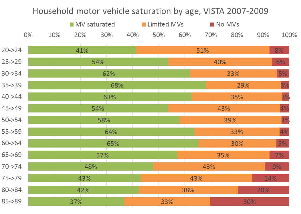
What about age:

People aged 20-64 certainly travelled longer distances. Looking at the distribution of ages, there were more people aged 20-74 living in the inner city and inner suburbs, compared to middle and outer Melbourne. There is very little difference in the percentage of the population between 25 and 64 across the regions (those with the largest car travel distances).

And yes, public transport mode share is lowest amongst very young children and the middle-aged (the later group often being the decisions makers!):

And finally (without going through all the detail here) people who work full-time tend to travel more, but they become less prevalent as you move away from the centre of Melbourne.

So, should we encourage population growth in regional centres instead of Melbourne’s outer suburbs?

Well, it’s probably the wrong question to ask! People in inner Melbourne do a lot less car travel than anywhere else. This analysis clearly shows that encouraging people to move into inner Melbourne would probably do the most to reduce car travel per capita.

People currently living in the outer suburbs of Melbourne travel more and do more car kms than those in regional cities. The main problem is that their work and social trips are much longer.

The evidence suggests putting people into regional cities would generate less car travel than putting people on the fringe of Melbourne.

However, there are several points worth considering:

  • If you can generate jobs in the outer suburbs of Melbourne, you might be able to reduce work travel distances. Easy to say, but it defies agglomeration economies that cause jobs to co-locate in the inner city and suburbs. If Melbourne’s Central Activities Areas (formerly Central Activities Districts (formerly Transit Cities)) can become significant employment destinations then that will certainly help.
  • If you do encourage people to settle in regional cities, will they have the same transport profile as existing residents? I would guess that there would be a significant difference between people living in the centre of regional cities, and those living on the fringe. The reduced car travel advantages of regional cities are probably largely eroded on the fringes of the regional cities. However, encouraging higher density in the inner areas of the regional cities would probably generate less car kms.
  • If you increase the population in regional cities without also increasing employment opportunities, you’ll create unemployment problems and/or force people to travel further to get to work. This would cancel out some of the benefits of locating people in regional centres. It may also increase demand on long distance V/line commuter trains into Melbourne (which currently consume valuable metropolitan train paths with low passenger density).

It doesn’t seem like there is much difference between the outer suburbs and regional cities. But there is a much bigger difference when you compare these with the inner suburbs of Melbourne.

If we really want to reduce car use, we’ll need to do relatively easy things like:

  • Locate people in inner city and suburban areas, where travel distances are short and there is viable high quality public transport (though it will probably require capacity upgrades)
  • Increase public transport service levels in existing outer suburbs and regional cities, with a particular focus on efficiently connecting people to employment areas by public transport.
  • Break down the barriers to walking and cycling in the outer suburbs and regional cities. Footpaths and safe places to ride would be a good start!

Notes about the data:

  • Wherever possible I have used person weightings in VISTA, which are for all week travel and align VISTA data with 2006 census data on demographics.
  • I have determined trip purpose by looking at the destination purpose of each trip. If the destination is not home, then I assign the destination purpose as the trip purpose. If the destination purpose is home, then I assign the origin purpose as the trip purpose. This gets around the common problem of nearly half of all trips having “go home” as the trip purpose, which costs you half your data when analysing by trip purpose.