We need to do better at reporting and analysing public transport patronage

Wed 12 July, 2023

Sydney’s public transport total patronage in March 2023 was at 79.5% of March 2019 patronage, but then April 2023 total patronage was 73.1% of April 2019 patronage. Does that mean there was a 6.4% decline in the rate of public transport use in April 2023? Actually, no, not at all.

The most common, simple, and obvious way to report public transport patronage is monthly totals. Plenty of agencies do this, but I’m here to argue that invites bad analysis and false conclusions. We can and need to do better.

Let me explain…

Not all days are the same

This is stating the obvious, but patronage generally varies by day of the week, and also between school and non-school weekdays. Here’s how it looks for Melbourne 2019 (thanks to newly published data):

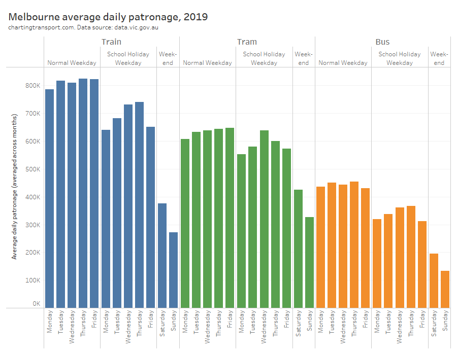
The variations across Monday to Friday have increased even more post the pandemic, but that’s another story.

Not all months are the same

Obviously months are not all the same length. A month with 31 days is generally likely to have higher patronage than a month with 28 or 30 days.

Also, most months have a number of days that is not a multiple of 7 – which means that any month is going have a different mix of days of the week in any year (although three-quarters of Februarys are an exception). And we know patronage varies by individual day of the week.

Furthermore, school holidays and public holidays don’t always fall in the same months each year. In particular, Easter is sometimes in March and sometimes in April, and many jurisdictions shift school holidays to line up with Easter in each year. The end result is that the composition of each month can vary considerably between years, both in terms of days of the week and day types.

Here’s the day type make up of each month for Victoria for 2000 to 2025:

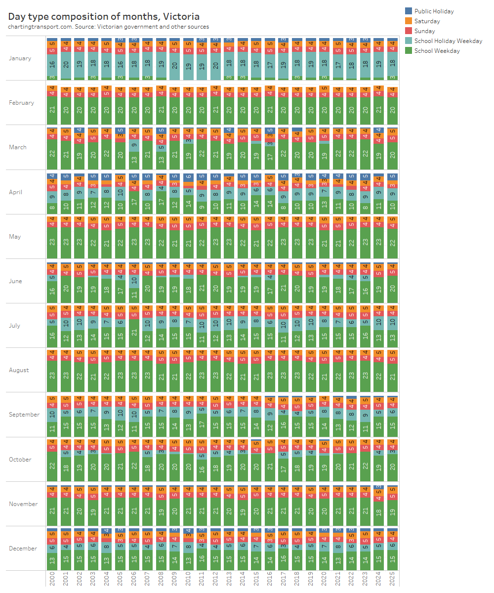
Some months are pretty consistent – May generally has 21 to 23 school weekdays. But other months vary wildly. March can have anywhere between 8 and 17 school weekdays and anywhere between 1 and 5 public holidays (counting all days of the Easter long weekend as public holidays). There are also big fluctuations in June and July, with school holidays mostly falling in July but sometimes partly or fully in June. And any given month might have 4 or 5 Saturdays and 4 or 5 Sundays (or maybe even 3 if one of them is a public holiday).

In March 2006, Victorian autumn school holidays were in March (when Melbourne hosted the Commonwealth Games) instead of the normal April, and the winter school holidays were entirely in June (normally mostly in July). This will happen again in 2026 when Victoria again hosts the Commonwealth Games.

Not all quarters are the same

If months are quite variable in composition, does aggregating to quarters reduce the issues?

In Victoria (and most Australian states), school holidays generally straddle or fall very close to the start/end of quarters. This means there is a fair amount of variability in the day type makeup of most quarters:

In Victoria, quarter 1 can have anywhere between 35 and 44 school days, and between 3 and 7 public holidays. You might also notice that a new Q3 public holiday was introduced in 2016 (Grand Final Eve in late September), and then there was a one-off extra public holiday for the Queen’s death in 2022. The number of public holidays also increases when Christmas Day falls on a Saturday or Sunday.

If you want to understand underling patronage trends, you don’t want to be led astray by these sorts of changes. Quarters are no better than months for analysing total public transport patronage.

Not all financial years are the same either

Another very common way to report patronage data – especially in annual reports – is by financial years (July – June) but they aren’t all that consistent over time either, given that school holidays can slide between June and July, like has happened in Victoria:

Hopefully you’ve got the idea that it isn’t a great idea to analyse total monthly, quarterly, or even financial year patronage if you want to assess trends over time. Yet that’s exactly the most common data you are likely to find.

Calendar years are slightly better for day type composition consistency, but in Victoria calendar years can vary between 50 and 54 school holiday weekdays. And of course every fourth year is one day longer than the others.

A better way: average daily patronage by day of the week and day type

Victoria is now publishing average daily patronage by day of the week and day type (school or non-school weekday) for each month (excluding public holidays).

This means it is possible to compile average school week patronage (being the sum of average daily Sunday, school Monday, school Tuesday, school Wednesday, school Thursday, school Friday, and Saturday patronage). An average school week patronage figure is readily calculable for all months except January (because they have few school days and variable start dates between schools make it a bit messy).

An average school week figure can be calculated regardless of shifting dates of school holidays, public holidays and the general day of the week composition of any month across years. And analysts don’t need to worry about having their own calendar of school and public holidays.

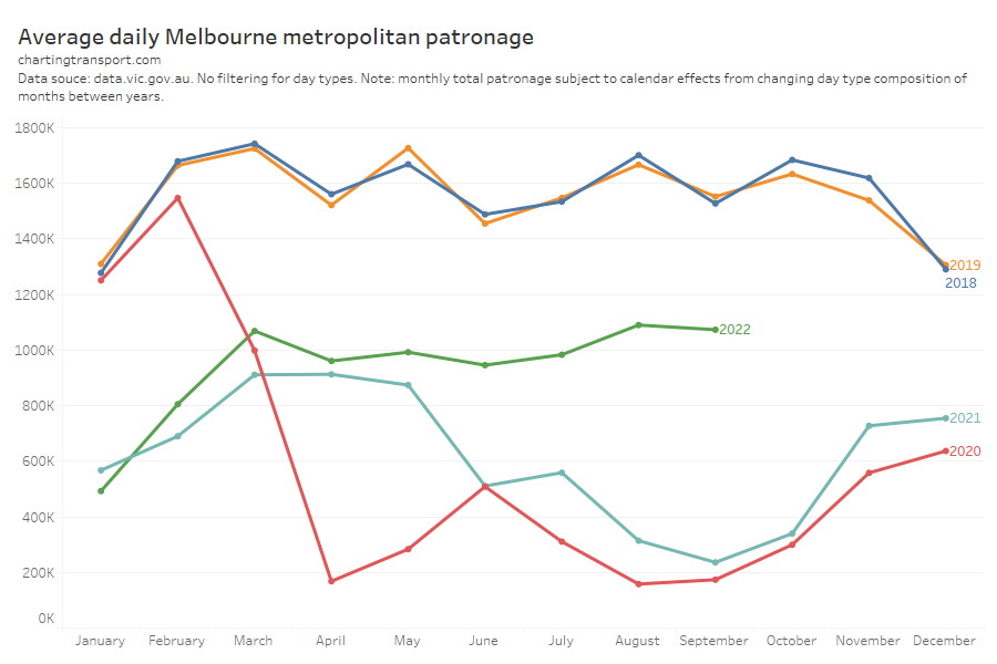
How much cleaner is average school week patronage? Victoria also publishes monthly totals, which makes it possible to compare to average school week figures, as per the following chart:

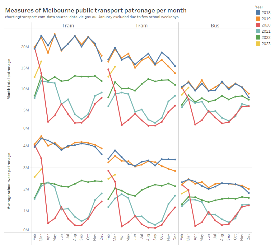
Note: This time period of course includes the COVID pandemic including lockdowns which is interesting in itself, but for the point of this post I suggest you focus on pre-pandemic years 2018 and 2019.

Monthly total patronage jumps up and down a fair bit in 2018 and 2019 (with higher totals for most 31-day months, who would have guessed?), but average school weekday patronage was relatively smooth across the year as you might expect. The average school week patronage data also shows clearly that March is the busiest month of the year. But if you looked at the monthly totals you might draw the false conclusion that days in May are generally as busy as days in March (at least for 2018).

To further illustrate the differences, the next chart compares monthly average school week patronage to total monthly patronage, for all months February 2018 to March 2023 (excluding Januarys). Each dot is a mode and a month/year, and if total monthly patronage was as good a representation of patronage as school week patronage then this would need to be a fairly thin cloud as data points.

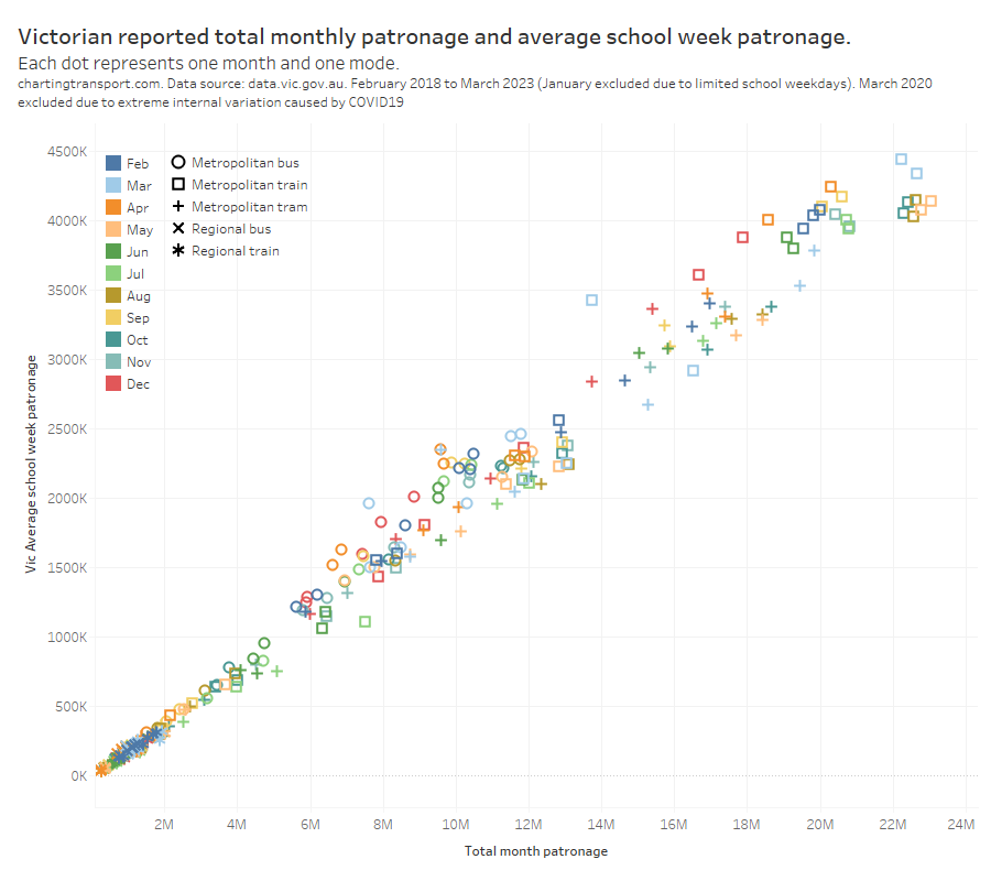
You can see the cloud is not very thin. March and April are often outliers, as they are subject to shifting Easter and school holidays.

March 2020 is actually one of the biggest outliers – as it was also when Melbourne first went into a COVID lockdown.

Another common form of analysis in recent (pandemic) times has been to compare monthly patronage to the same month in (pre-pandemic) 2019, to get an indication of patronage recovery. The following chart shows patronage relative to 2019 using both total monthly patronage and average school week patronage for Melbourne’s public transport:

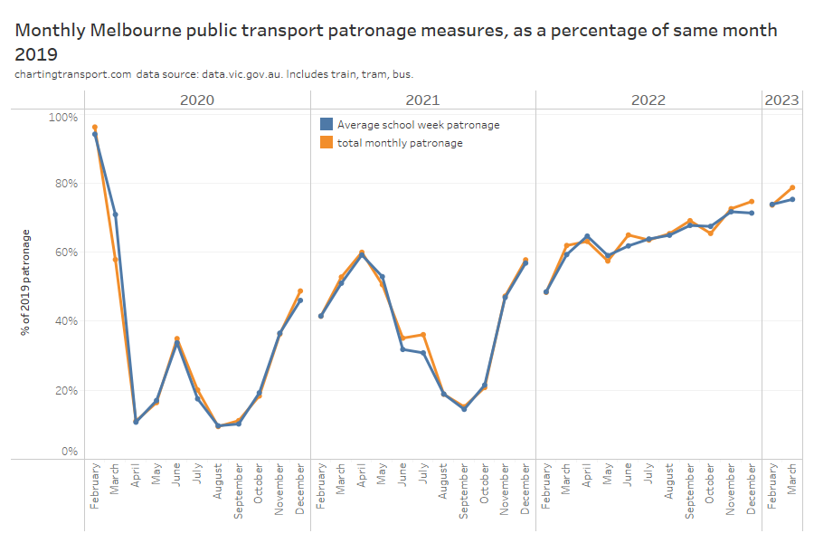
You can see the orange line (total monthly patronage) is prone to bouncing around month to month, while the blue line (average school week) generally shows a smoother trend. Someone not knowing any better might have been slightly alarmed or confused about the steep decline in total monthly patronage recovery in October 2022, whereas on the average school week measure it was only a slight drop on September 2022 (perhaps because of planned disruptions to the network?).

Total March 2023 Melbourne public transport patronage was 78.8% of the total in March 2019, but 75.3% of the March 2019 average school week patronage. The total monthly patronage approach arguably overestimates the likely underlying patronage recovery by 3.5%.

How much noise gets introduced when analysing monthly totals?

Let me introduce you to the mythical city of Predictaville. Nothing ever changes in Predictaville. There is no population growth, no behaviour change, no pandemics, no seasons, no illness. It’s very boring and entirely predictable.

Every school weekday there are exactly 440,000 public transport boardings, every school holiday weekday it is 340,000, every Saturday 195,000, Sunday 135,000, and public holiday 110,000. Remarkable round numbers, I know. It’s been like this since 2001 and all indications are that it will be like this until at least 2025.

These numbers just happen to be pretty similar to average Melbourne bus patronage in 2019, and Predictaville just happens to follow the Victorian school and public holiday calendar.

So public transport patronage growth in Predictaville is going to be exactly zero all the time, right?

That’s what you will get when measuring growth by average school weeks.

But what if you were measuring growth year on year using total monthly patronage?

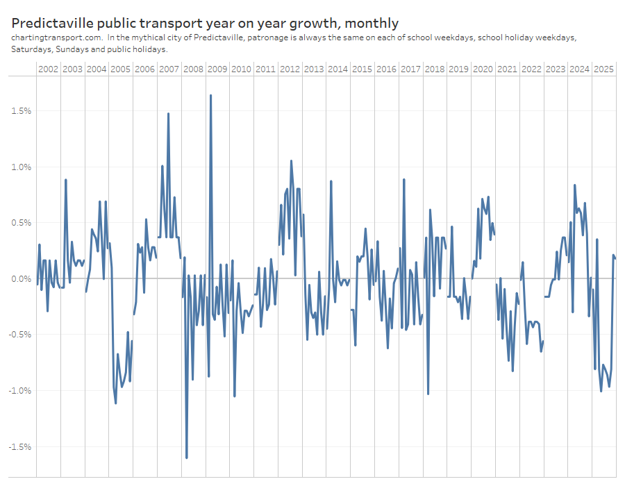
According to this measure, patronage in Predictaville sometimes grows at +1.6% per annum and sometimes declines at -1.6% per annum. You might think 2012 and 2020 were growth years, while 2005, 2008 and 2021 saw declines. All misleading.

This is actually a chart indicating the sort of avoidable error introduced when you do analysis on total monthly patronage. We don’t need and shouldn’t have this sort of error in our analysis; particularly if it is going to influence policy decisions.

How is patronage data being reported in Australia and New Zealand now?

At the time of writing…

Transperth and Wellington’s Metlink only publish monthly totals, which is problematic, as explained above.

Transport for NSW publishes monthly total patronage which is likewise problematic.

They also have an interactive dashboard that effectively provides average weekday patronage, average school weekday patronage, and average weekend/public holiday daily patronage (but not average school holiday weekday patronage). Unfortunately you cannot download this data, and it doesn’t take into account that different months contain different numbers of Sundays, Mondays, Tuesdays, Wednesday, Thursdays, Fridays, and Saturdays. We know patronage varies by day of the week. Worse still, there is likely a significant difference between typical Saturday and Sunday patronage and different months might have 4 or 5 Saturdays and 4 or 5 Sundays. This means the average weekend daily patronage figures have avoidable misleading variations between months and years.

NSW have also published very detailed Opal data for selected weeks in 2016 and 2020 (only two were pre-pandemic school weeks), but no such data on an ongoing basis.

Transport Canberra reports average weekday and weekend daily boardings by quarter, but doesn’t distinguish school and non-school weekdays and bundles public holidays with weekends, which makes it very difficult to cleanly analyse growth trends. However they also publish daily data which is useful, but you need a calendar of school and public holidays.

The South Australian government reports quarterly Adelaide boardings (buried in a dataset about complaints) which is problematic as I’ve explained above. You can also get daily Metrocard validations by route (not quite the same as boardings), although exact numbers are not reported – just bands in multiples of 10, which makes it pretty much impossible to sum to estimate total daily patronage.

Translink (south east Queensland) publishes weekly passenger trip counts (to 2 decimal places!), which is slightly better than monthly, but analysts still need to have their own calendar of school holidays or public holidays to make sense of variations week to week. And at the time of writing data unfortunately hadn’t been updated since October 2022.

Auckland publishes monthly and daily patronage figures which is very handy. The daily data allows you to construct average school week patronage, but you need a calendar of school and public holidays.

So my plea to all agencies is to consider publishing average daily patronage by day type and day of the week, as Victoria now does. This will enable external analysts to do cleaner patronage analysis with much less effort. Perhaps an organisation like BITRE could even compile a national database of such data.

Even better would be for agencies to also publish daily patronage estimates, along with a day type calendar including school and public holidays, which would enable analysts to do even more with the data.

Can we do even better for patronage reporting and analysis?

Average patronage by day of the week and day type avoids much of the misleading variations in total monthly patronage data, helping us to better understand underlying trends.

But there will still be other smaller sources of misleading variations and you could definitely take this further, for example:

  • Filter out Mondays next to a Tuesday public holiday and Fridays next to a Thursday public holiday, as these are popular days for workers to take leave to create a long weekend.
  • Likewise, filter out weeks with more two or more public holidays falling within Monday to Friday – which are also popular times to generate longer holidays with fewer annual leave days.
  • Filter out the first / last weeks of the school year if some schools follow a slightly different calendar (particularly in New Zealand). I discarded January above partly for this reason. All Decembers (in Australia at least) will also be impacted by senior students finishing school earlier, but the impact might vary year to year.
  • Filter only for weeks where both school and most universities are teaching (although that leaves you with only about six months of the year, plus not all universities follow the same academic calendar).
  • Filter out any days with free travel or large-scale disruptions (planned or unplanned). For example, free travel is usually offered on New Year’s Eve and Christmas Day in Victoria. And Sydney had several free travel days following major unplanned disruptions in 2022.
  • Filter out Saturdays and Sundays on long weekends and during school holidays, which are probably more likely to be impacted by larger scale planned disruptions.

I mentioned at the start of this post that variations in Sydney monthly total patronage recovery figures were misleading, and hopefully you now understand why. In an upcoming post I’ll estimate underlying patronage recovery across big cities in Australia and New Zealand, and explain why I think actual underlying patronage recovery in Sydney didn’t change so much between March and April 2023.


How is population density changing in Australian cities? (2023 update)

Sat 10 June, 2023

This detailed post from 2023 does not include the population latest data. For the latest summary metrics, see Trends in major city population density.

With the release of more detailed 2021 census data and June 2022 population estimates, it’s now possible to look more closely at how Australia’s larger capital cities have changed, particularly following the onset of the COVID19 pandemic in 2020.

This post examines ABS population grid data for 2006 to 2023 for Greater Capital City Statistical Areas, including:

  • Trends in overall population-weighted density for cities;
  • Changes in the distribution of population living at different densities;
  • Changes in the distribution of population living at different distances from each city’s CBD;
  • Changes in population density by distance from each city’s CBD;
  • Changes in the distribution of population living at different distances from train and busway stations;
  • Changes in population density in areas close to train and busway stations;
  • The population density of “new” urban residential areas in each city (are cities sprawling at low density?); and
  • Changes in the size of the urban residential footprint of cities.

I’ve also got some animated maps showing the density of each city over those years, and I’ve had a bit of a look at how the ABS corrected population estimates for 2007 to 2021 following the release of 2021 census data.

For some other detailed analysis – and a longer history of city population density – see How is density changing in Australian cities? (2nd edition).

I’ve not included the smaller cities of Hobart and Darwin as they have a small footprint, and too many grid cells are on the edge of an urban area.

Population weighted density

My preferred measure of city density is population-weighted density, which takes a weighted average of the density all statistical areas in a city, with each area weighted by its population (this stops lightly populated rural areas pulling down average density – for more discussion see How is density changing in Australian cities? (2nd edition)).

I also prefer to calculate this measure on a consistent statistical area geography and the only consistent statistical area geography available for Australia is the square kilometre population grid published by the ABS.

With the recent release of 2021 census data, ABS issued revised population grid estimates for all years from 2017 onwards, which saw significant corrections in some cities (see appendix for more details). There has also been a slight change in the methodology for the 2021 grid that ABS say may result in a more ‘targeted representation’, but it’s unclear what that means.

Here’s the revised trend in population weighted density calculated on square km grid geography for Greater Capital City Statistical Areas in June of each year:

Sydney has almost double the population density of most other Australian cities (on this measure), with the exception being Melbourne which sits halfway in between.

Population weighted density was rising in all cities until 2019, although the growth was notably slowing in Sydney from about 2016.

The pandemic hit in March 2020 and led to a flatlining of density in Melbourne and a decline in Sydney by June 2020, while other cities continued to densify. Then Sydney and Melbourne’s population weighted density dropped considerably in the year to June 2021 – probably a combination an exodus of temporary international migrants and internal migration away from the big cities (particularly Melbourne that had experienced long lockdowns). Most other cities flatlined between June 2020 and June 2021.

Then by June 2022 density had increased again in all cities, after international borders reopened in early 2022.

I expect some fairly substantial changes between June 2022 and June 2023 in some cities as migration has surged further and rental vacancy rates have plummeted in several cities.

Population living at different densities

The following chart shows the proportion of the population in each city living at different density ranges over time:

All cities show a sustained pre-pandemic trend towards more people living at higher densities. However the pandemic saw significant drops in people living at the higher density categories in 2021 in Melbourne, Sydney, and Canberra.

So where was this loss of density? The next chart shows the change in population for grid squares across Melbourne between June 2020 and June 2021. Larger dots are more change, blue is an increase and orange is a decline:

You can see significant declines in population (and hence population density) in the inner city areas – so much so that the dots overlap. This is likely largely explained by the exodus of many international students and other temporary migrants.

You can also see population decline around Monash University’s Clayton campus in the south-eastern suburbs.

At the same time there were large increases in population in the outer growth areas, as is normally the case. Other pockets of population growth include Footscray, Moonee Ponds, Box Hill, Port Melbourne, Clayton (M-City), and Doncaster, likely related to the completion of new residential towers.

Here’s the same for Sydney:

There was significant population decline in the inner city and around Kensington (which has a major university campus), and the largest growth was seen in urban fringe growth areas to the north-west and south-west. Pockets of population growth were also seen at Wentworth Point, Eastgardens, Mascot, North Ryde, and Mays Hill, amongst others.

Here is the same for Brisbane:

Inner-city Brisbane was much more a mixed bag, which explains the less overall change in the density composition of the city. Some areas showed declines (including St Lucia, New Farm, Kelvin Grove, Coorparoo) while others saw increases (including Fortitude Valley, West End, South Brisbane, Buranda, CBD south).

Proportion of population living at different distances from the city centre

The next chart shows the proportion of people living at approximate distance bands from each city’s CBD over time:

All cities have seen a general trend towards more of their population living further from the CBD, with the notable exception of Canberra which has seen the outer urban fringe expanding by little more than a couple of kilometres at the most, and substantial in-fill housing at major town centres and the inner city (see also animated density map below). I should note that the Greater Capital City Statistical Area boundary for Canberra is simply the ACT boundary, and does not include the neighbouring NSW urban area of Queanbeyan, which is arguably functionally part of “greater Canberra”.

In 2021, Sydney and Melbourne saw a step change towards living further out, in line with the sudden reduction in central city population.

Population density by distance from a city’s CBD

Here’s an animated chart showing how population weighted density has varied by distance from each city’s CBD over time:

In most cities there has been a trend to significantly increasing density closer to the CBD, with central Melbourne overtaking central Sydney in 2017.

Sydney has maintained significantly higher density than all other cities at most distances from CBDs, with Melbourne a fair step behind, then most other cities flatten out to around 20-26 persons/ha from around 6+km out from their CBDs in 2022.

Canberra appears to flatten out to around 20 persons/ha at 3-4 kms from its CBD (Civic) however it is important to note that Canberra has a lot of non-residential land relatively close to Civic which reduces density for many grid cells that are on an urban fringe (refer maps toward the end of this post).

Population living near rapid transit stations

I’ve been maintaining a spatial data set of rapid transit stations (train and busway stations) including years of opening and closing, and from this it’s possible to assess what proportion of each city lives close to stations:

Sydney has the largest proportion of it’s population living quite close to rapid transit stations, with Perth having the lowest.

There are step changes on this chart where new train lines have opened. Sydney, Brisbane, and Adelaide have been successful at increasing population close to stations. The opening of the Mandurah rail line made a big difference in Perth in 2009 but the city has been growing remote from stations since then (MetroNet projects will probably turn this around significantly in the next few years). Melbourne was roughly keeping the same proportion of the population close to stations although that changed in 2021 with the exodus of inner city residents (I anticipate a substantial correction in 2023).

Population density around rapid transit stations

The following animated chart shows the aggregate population-weighted density for areas around rapid transit stations in the five biggest cities over time:

Sydney has lead Australia with higher densities around train stations, followed by Melbourne. Perth has only slightly higher densities around stations (in aggregate) compared to other parts of the city. Population density is generally lower around Adelaide train and busway stations compared to the rest of the city – the antithesis of transit orientated development.

How dense are new urban areas?

I’ve previously looked at the density of outer urban growth areas on my blog, and here is another way of looking at that using square kilometre grid data.

I’ve attempted to identify new urban residential grid squares by filtering for squares that averaged less than 5 persons per hectare in 2006 and more than 5 persons per hectare in 2022 (using 5 persons/ha as an arbitrary threshold for urban residential areas, and I think that’s a pretty low threshold).

The vast bulk of these grid cells (and associated population) are on the urban fringe, but a handful in each city are brownfield sites that were previously non-residential (for Melbourne 99% of the population of these grid cells are in urban fringe areas).

It’s also not perfect because square kilometre grid cells will often contain a mix of residential and non-residential land uses, but it is analysis that can be done easily and quickly, and in aggregate I expect it will be broadly indicate of overall patterns.

The following chart shows the population of new urban residential grid cells (since 2006), and the proportion of this population by 2022 population density:

You can see Melbourne has almost double the population in these new urban residential grid squares compared to Perth, Brisbane, and Sydney. This indicates Melbourne has been sprawling more than any other city since 2006. Slow-growing Adelaide only put on about 56k people in new urban grid squares, slightly less than Canberra.

The bottom half of the chart shows that new urban grid squares in Sydney, Melbourne, and Canberra are generally much more dense than those in other cities. This likely reflects planning policies for higher residential densities in new urban areas in those cities. In fact, all of these grid cells with density 40+ in 2022 are on the urban fringes, except one brownfield cell in Mascot (Sydney).

But of course planning policies can change over time, so here is the equivalent chart looking at new urban residential squares since 2012:

It’s not a lot different. The density of these more recent new urban residential grid cells is generally highest in Sydney, following by Melbourne and Canberra. New urban residential grid cells in Adelaide mostly had fewer than 20 persons/ha, but then also there are not that many such grid cells and they didn’t have much population in 2022.

Perth has managed one new grid cell with over 40 persons/ha in 2022 – it is located in Piara Waters (which has many single storey houses with tiny backyards).

How much has the urban footprint of cities been expanding?

The population grid data only measures residential population so it cannot be used to estimate the size of the total urban footprint of cities over time, but we can use it to estimate the urban residential footprint. I’ve again used 5 persons/ha as a threshold, and here’s how the cities have growth since 2006:

Melbourne and Sydney had much the same footprint in 2006 but Melbourne has since grown significantly larger in size than Sydney, although Sydney still has a larger Capital City Statistical Area population.

The bottom half of the chart shows that Perth has had the largest percentage growth in urban residential area, followed by Brisbane then Melbourne. Sydney and Adelaide have had the least growth in footprint, and are also seeing the least population growth in percentage terms.

Animated density maps of Australian cities

Here are some animated density maps for Australia’s six largest cities from 2006 to 2022 for you to ponder.

Some things to watch for:

  • Limited urban sprawl and significant densification of pockets of established areas in Canberra
  • Much larger areas of higher density in Sydney and Melbourne
  • Relatively high densities in some urban growth areas in Melbourne, Brisbane, and Sydney from the late 2010s
  • Low density sprawl in Perth, but also densification of some inner suburban areas (along the Scarborough Beach Road and Wanneroo Road corridors, and inner suburbs like Subiaco and North Perth)
  • Limited urban sprawl in Adelaide, along with densification of inner suburbs

Appendix: Corrections to ABS population estimates following Census 2021

The 2021 census resulted in quite large revisions to estimated population in many cities as shown in the following chart.

Melbourne’s estimated 2021 population was revised down 2.4%, Sydney down 1.9%, while Canberra and Hobart were revised up more than 5%. To be fair to the ABS, the pandemic and border closures were unprecedented and their impacts on regional population were not easy to predict.

These corrections sum to a linear trend between 2016 and 2021 at the city level, although there was a redistribution of the estimated population within each city.

The following chart shows some detail of estimated population revisions at SA2 level for Melbourne in 2021:

The biggest reduction was in Carlton (-25% right next to University of Melbourne), and there were also reductions near other university campuses, including Kingsbury (-19%), Burwood (-14%) and Clayton (-13%). The biggest upwards revision was Fishermans Bend (+84%), and there were plenty of upwards revisions in outer urban growth areas.

And here is Sydney:

There were big reductions in Kensington (-28%, centred on UNSW), Redfern-Chippendale (-17%), many other areas near university campuses, and around the Sydney CBD.

Like Melbourne, urban growth areas on the fringe were revised upwards, including +35% in Riverstone-Marden Park.


How did Perth’s CBD end up with 19% more private transport commuters in 2021?

Sat 3 June, 2023

Note: Since publishing this post, it has come to my attention that Perth’s Fremantle train line was closed on census day in 2021, which may have impacted mode shares in Perth.

ABS census data tells us that Perth’s CBD experienced a massive 19% jump in the number of private transport commuter trips between 2016 and 2021. That’s over 5000 more journeys – mostly as car drivers – and is quite likely to have made traffic congestion worse.

So how did that happen? Where were these extra commuters travelling to? Were there particular changes in the modal mix in different parts of the CBD? Was this growth enabled by a big increase in car parking capacity? And what has been happening to car park pricing?

This post digs a little deeper following my last post that explored the impact of COVID on journey to mode shares in Australian cities in 2021.

A quick recap of overall changes in journey to work in the Perth CBD

Here’s the volume of Perth CBD commuters by main mode, including working at home in 2011, 2016, and 2021:

See my last post for my definition of the Perth CBD. A trip involving any public transport is classed as public, a trip that involves only walking or cycling is classed as active, and any other form of travel is classed as private.

At the 2021 census, Perth was COVID-free with relatively few restrictions on intra-state movement or activity.

Total employment in the CBD grew by a massive 26% from 82,214 in 2016 to 103,944 in 2021. Private transport trips increased by 19%, but because this was less growth than overall employment growth there was actually a commuter mode shift away from private transport of 1.6% (from 36.5% to 34.9%).

The biggest increase in CBD worker volumes was in those who worked at home.

Public transport commuting to the CBD increased by only 85 trips between 2016 and 2021, but still accounted for more trips than private transport.

LATE EDIT: It’s just come to my attention that the Fremantle train line was closed on the day of the 2021 census (10 August), which will have suppressed public transport mode share in the western suburbs.

My last post concluded there was likely a significant mode shift from public transport to remote working. There was some mode shift away from public transport and towards remote working and private transport for some middle age groups, although some of this shift is likely to be a normal trend seen as people age (and become parents). I was unable to identify occupations that saw a substantial mode shift from public transport to private transport, although some occupations saw a lot more private transport growth than public transport growth.

This post now takes that analysis a bit further by looking at spatial variations in the modal mix by workplace location.

Where were the extra private transport commuters working?

Here’s the change in private commuter trips for each destination zone around the Perth CBD:

Note: the circles aren’t always drawn in the middle of each destination zone, aren’t intended to highlight any particular location within each zone, and may not be representative of major car park locations.

There were both increases and decreases around the CBD. I’m going to focus in more detail on the following high-growth destination zones that I’ve arbitrarily named by a dominant building, precinct, or bordering streets:

Most of the zones that saw a big increase in private transport commuter trips also saw a big increase in public transport trips.

Capital Square saw jobs more than triple between 2016 and 2021 as a major new development was completed (including the new Woodside headquarters). It had the largest increase in private transport trips, but even more new trips were by public transport. The development includes five levels of car parking on a fairly large site (at least 659 car parks according to some planning documents). It also saw the largest growth in active transport commuter trips of any destination zone in the Perth CBD.

The zone I have labelled Kings Square (which includes Perth Arena and the new Shell and HBF buildings) saw only slightly more new public transport trips than new private transport trips, despite Perth train station being inside the zone.

The Royal Perth Hospital zone had almost all of its net job growth accounted for by private transport, some of which would have been shift workers. This is consistent with my last post that found a large increase in private transport commuters under the “carers and aids” and “health and welfare support” occupation groups. The hospital is directly adjacent to McIver train station, served by multiple train lines.

One mixed-use block between Terrace Road, Victoria Avenue, Adelaide Terrace, and Hill Street had an increase in private trips and a decrease in public trips. It’s difficult to speculate why this occurred due to the diverse mix of land uses.

The Elizabeth Quay zone saw more growth in private trips than public trips, despite being immediately adjacent to Elizabeth Quay train station. I’ve not been able to identify any large new car parks in the area. Car parks immediately north of the development site were offering $25 all-day car parking at the time of writing which I suspect the average employee might not consider particularly affordable.

The Brookfield Place and Central Park zones mostly saw a big increase in the number of remote workers.

Outside the CBD, the biggest decline in private trips was -1863 in a zone near West Leederville station where the Princess Margaret Hospital for Children closed in 2018 (replaced by the Perth Children’s Hospital in Nedlands).

Where was there a shift from public to private transport?

The following map shows destination zones where there was a decline in public transport trips and an increase in private transport trips (no zones showed the opposite flow):

Just under than half of the destination zones around the Perth CBD saw some sort of net shift to private transport, and most of these were very small numbers. In total these zones account for 492 trips within for my definition of the Perth CBD, about 0.5% of all workers. A net shift from public transport explains less than 10% of the total increase in private transport commuter trips.

This is consistent with analysis in my last post (which disaggregated by birth cohorts and occupations) and again suggests the growth in private trips was broadly in line with the overall growth in CBD employment. It also fits with the hypothesis that the biggest mode shift was from public transport to remote working.

Another way of analysing mode shift is to look the percentage change in private transport mode share by zone:

In the western part of the main CBD area there were many zones with a large mode shift away from private transport, and many of these zones had high employment density.

In fact, the next chart shows how employment density and private transport mode share changed between 2016 and 2021 in the Perth CBD, with the thin end of each ‘comet’ being 2016 and the thick end being 2021 (I’ve arbitrarily named several more destination zones based on major landmarks or surrounding streets).

Note: some destination zones include significant land that is not built up (eg parkland, water bodies, and/or freeway interchanges) and these will have understated employment density. This incudes Convention/Exhibition and Elizabeth Quay.

The dominant pattern is that the zones with high and increasing employment density mostly saw declining private transport mode share, although the “Terrace / Hill / Victoria” block was a standout exception having increasing employment density and increasing private mode share.

How did the CBD absorb so many more car commuters?

It’s hard to know for sure but some possible explanations include:

  • New car parking supply: I’ve already mentioned the Capital Square development that included five levels of parking. Locals might know of other new large CBD car parks, but I’ve struggled to identify any large car parks on Parkopedia or Google Maps that didn’t already exist in 2016. Many new office buildings don’t appear to include large car parks.
  • Perth was in a “mining downturn” in 2016: The Perth CBD only added 1.7k jobs between 2011 and 2016, and there was no significant increase in private commuter trips. According to a Property Council report in August 2016, Perth was experiencing very high office vacancy rates (21.8%) and had been experiencing a decline in office space demand that started around 2013. So it seems quite plausible that car parking supply grew between 2011 and 2016, but commuter parking demand only grew strongly after 2016.
  • Reduced short-term parking demand? Perhaps there has been a decline in demand for short-term parking (through the normalisation of online business meetings) enabling more all-day parking. But I’m just speculating.

Someone reading this from the parking industry might be able to share some insights (please add comments).

What’s been happening to Perth CBD car parking prices?

Like Sydney and Melbourne, Perth has a CBD parking levy – an annual fee collected by government per space. Here’s what’s been happening to the levy prices in real terms:

The parking levy increased substantially in real terms in 2010 and again between 2014-2016, but in recent years has not been keeping up with inflation. Between 2016 and 2021 there was almost no real change in the levy.

So what’s been happening to car park prices?

The City of Perth itself operates a large number of CBD car parks and in 2021/22 parking revenue accounted for 36% of its total income (source: budget 2022-23).

Thanks to the incredible resource that is the Wayback Machine, I’ve been able to dig out prices at their CBD car parks right back to 2001-02. For the sake of manageable analysis I’ve focussed on four relatively large central CBD car parks – Concert Hall (399 spaces), Convention Centre (1428 spaces), Elder Street (1052 spaces) and Pier Street (680 spaces). Here’s how those prices have changed over time, in nominal and real terms:

The 2010 and 2015 jumps in the pricing levy were clearly reflected in retail parking prices.

In real terms, parking prices peaked around 2015-2017 and have been in decline since then. Prices for several car parks were cut substantially in 2017/18 – perhaps as a belated response to a reduction in office commuter demand during the mining downturn. Then parking prices were frozen from 2019 to 2022 – presumably due to the pandemic.

So despite the massive increase in CBD parking demand, the City of Perth reduced – rather than increased – all-day parking prices, and so has probably also missed out on significant additional revenue. This has arguably helped facilitate the big increase in commuter traffic volumes, along with the likely associated urban amenity impacts of more traffic in the CBD.

The City of Perth is a democratic local government so it’s probably not going to behave in an entirely economically rational way when it comes to price setting. Prices are also locked in for each financial year so are much less dynamic. So what have commercial parking operators been doing?

Unfortunately I’ve not been able to use the Internet Archive to find historical commercial car parking prices in the Perth CBD back to 2016. What I can tell you is that “flexi” online parking at the Wilson Parking run Central Park car park has risen from $19 in October 2021 to $26 in May 2023 – suggesting commercial operators are not afraid to change their pricing. That said, the Kings Complex car park (517 Hay Street, near Pier Street) has had no increase in its online daily rate between October 2021 and May 2023 ($18).

So what is Perth’s parking policy?

The current Perth parking policy (2014) states:

“This policy recognises that vehicular access to, from and within central Perth is a critical element in ensuring its continued economic and social viability. It also continues to recognise the need to preserve and enhance the city’s environment. The policy aims to address these needs by supporting the provision of a balanced transport network in order to manage congestion and provide for the efficient operation of the transport network to, from and within the city centre.”

I suspect the term “balanced transport” is indicative of not trying to shift travel towards more sustainable, non-car modes. And I guess it would also be hard for the City of Perth to start discouraging something that generates more than one third of its annual revenue. Although an increase in prices might increase revenue, even if it reduces demand.

Furthermore, the Western Australian government is also continuing to widen Perth’s freeways, in the hope this might reduce traffic congestion. I’m not sure many cities have succeeded with such strategies, but good luck Perth!

Finally…

Wasn’t Perth public transport patronage below pre-pandemic levels in 2021?

I noted above that there were just 85 additional public transport commuters to Perth’s CBD in 2021 compared to 2016. But Perth’s overall public transport patronage in August 2021 was around 22%* below that in August 2016. If the number of CBD public transport commuters didn’t decline, the overall patronage decline must represent a mode shift away from public transport for trips to other destinations and/or for purposes other than travelling to work (and/or a decline in the number of such trips made by any mode).

*August 2016 had one more school weekday and one fewer Sunday than August 2021 which means we cannot directly compare total monthly patronage of the two months but they will be fairly close. It would be much cleaner to compare average school weekday patronage figures between months and years, but unfortunately few agencies publish such numbers (Victoria does now).


What can the 2021 census tell us about commuting to work in Australia’s big CBDs during the COVID19 pandemic?

Sun 2 April, 2023

The bustling Central Business Districts (CBDs) of Australia’s biggest cities were the powerhouses of the Australian economy, underpinned by public transport networks that delivered hundreds of thousands of commuters each weekday. But the COVID19 pandemic significantly disrupted CBD commuting. Working remotely from home became not just acceptable, but temporarily mandatory, and public transport patronage crashed during lockdowns.

So what might be the new normal in a post-pandemic work for commuting to our CBDs? Will people shift from public to private transport, driving up traffic congestion? How many – and what sorts of people – might work from home?

This post will try to shed some light on those questions by examining what the 2021 Australian census can tell us about how travel to our CBDs altered during the COVID19 pandemic, particularly the differences between locked-down and COVID-free cities. I’ll look at patterns and trends by age, occupation, and commuting distance. I’ll finish with a look at recent transport indications in Melbourne.

As a transport planner, I’m particularly interested in CBDs as there is a significant contest for market share between public and private transport. Before the pandemic, public transport dominated commuter mode share in the biggest CBDs, and CBDs make up a significant share of all public transport commuter trips.

Reminder: what was happening on Census day 2021

Melbourne and Sydney were in “lockdown” with workers required to work from home if possible. Brisbane was just out of lockdown, and the other cities were pretty much COVID-free, although Adelaide had experienced a short lockdown in July 2021. Here’s a summary of some key metrics (CBD office occupancy data sourced from the Property Council):

*The Property Council reported a figure of 60% for August 2021, but this would have been illegal on 10 August as there was a 50% capacity limit just after lockdown. We don’t know the exact dates when the office occupancy survey was conducted, I can only assume later in that month when restrictions were eased. 47% of CBD employees reported working remotely on census day.

What is a Central Business District?

I think of Central Business Districts as the civic, commercial, and business centre of a city, generally characterised by an area dense employment. Unfortunately the ABS’s SA2 boundaries don’t really align with these areas – especially Perth (pre 2021) and Adelaide where the SA2s covering the CBD also included areas of single-storey semi-detached housing.

So for this analysis I’ve created my own CBD boundaries for Australia’s five largest cities. I’ve selected a set of destination zones that were relatively dense in 2021. I’ve tried for reasonably smooth boundaries, and have tried to avoid under-developed areas that might have cheaper car parking. I’ve then created equivalent sets of 2011 and 2016 destination zones – as similar as possible to the 2021 boundary – with the one exception of the Melbourne CBD from which I have excluded south-western parts of Docklands in 2011 due to low employment densities in that year (much of the land was yet to be developed and instead occupied by surface car parking).

Here are maps of these CBD areas. I’ve transparently shaded the CBD for each census year in a different colour which mostly overlap to show dark green. Purple areas are where boundaries are not identical for all years.

Here are the mode splits for those CBD areas, including those who worked at home:

As you would expect, working at home dominated in locked-down Sydney and Melbourne in 2021, but was also quite common in Brisbane and Adelaide. In COVID-free Perth, working at home only accounted for 15.5% of CBD employees with the other 84.5% attending their workplaces on census day.

Public transport mode shares increased between 2011 and 2016 in all CBDs except Brisbane, but then in 2021 there was a significant shift away from all travelling modes to working at home in all cities.

The working at home share may include people who routinely work from their home in a CBD area. To get some idea about these numbers, I’ve split the worked at home share for 2021 into those who lived inside and outside the CBD:

Only a tiny share of CBD workers worked at home and also lived within the CBD. Some of these will have been working remote from their regular workplace and others will have been routinely working at home (I could try to split these apart with deeper analysis but it doesn’t seem worthwhile with such small numbers).

How did working at home vary by age of CBD workers?

A really interesting finding here is that working at home peaked for those in their early 40s in almost all cities – an age with plenty of parents with child caring responsibilities. Teenagers and those in their early 20s were the least likely to work from home, probably because they were more likely to be in jobs not amenable to working at home (eg retail and hospitality). But perhaps also some younger white collar workers may have preferred to build professional networks by being present in the CBD.

In Adelaide and Perth there was a definite trend that younger commuters were more likely to use public transport, and older commuters more likely to use private transport. This was consistent with all cities in earlier censuses (although this was not the case in Brisbane in 2021).

This got me thinking. The COVID19 pandemic and ~18 month border closure surely had some impact on the age distribution of the CBD workforce.

Indeed, here’s a look at the age composition of CBD workers over time:

Between 2011 and 2016 all cities showed a shift in the age composition towards older employees, perhaps as the cohorts of more highly educated Australians got older, people stay in the workforce until later in life, and/or other changing demographics of our cities.

But in most cities (perhaps not Adelaide) there seemed to be a larger shift towards older workers between 2016 and 2021. I suspect this will reflect fewer recent skilled migrants and international students in 2021.

We know from other analysis (see: Why are younger adults more likely to use public transport? (an exploration of mode shares by age – part 1)) that younger adults generally have higher rates of public transport use, so the shift in demographics might be favouring a mode shift away from public transport – all other things being equal (which of course they are not). There was mostly a shift towards public transport for CBD workers between 2011 and 2016, so other factors must have had an overriding impact.

How did working at home vary by CBD worker occupation?

I’ve sorted the occupations by overall worked at home share, which was similar across the cities. This list roughly sorts from blue collar to white collar and I haven’t seen any surprises in this chart. I’ll come back to occupations shortly.

How did working at home vary by distance from work?

The following chart shows working at home rates by approximate distance from home to work, for central area workers.

Technical note: For this analysis I’ve used journey to work data disaggregated by home SA2, work SA2, and whether or not workers worked at home. I’ve defined central city areas as collections of SA2s (so different boundaries to my CBD areas). Distances between home and work SA2s are calculated on SA2 centroids then aggregated to ranges.

In all cities there was a general trend to higher rates of working at home for people living further from the central city, although Sydney rates of remote working were high at all distances (the strictness of lockdown probably overriding the impact of commuting distance). This pattern in other cities likely reflects the increased incentive to work from home when you have a longer commute to avoid.

Did COVID lead to a mode shift from public to private transport?

Some transport planners have been concerned that COVID19 might lead to a permanent mode shift from public transport to private transport, probably for two reasons:

  1. A reduction in total commuter demand might make private transport slightly more competitive (eg if parking costs reduce), resulting in a different mode split equilibrium. We can only really test this aspect in Perth and Adelaide as they were COVID-free but with a small but significant share of workers working remotely.
  2. People have a fear of becoming infected by COVID19 on public transport and therefore switch to private transport (although COVID can also spread in workplaces of course). It’s a bit harder to test this as Sydney and Melbourne were in lockdown (movement restrictions no doubt had much more impact than infection fear). Perth, Canberra, and Adelaide were COVID-free, although there might have been a some fear of undetected COVID circulating – and indeed that was probably happening in Canberra which went into lockdown a few days after the census. Brisbane was just out of lockdown with some restrictions remaining so infection fear may have been higher than in Perth and Adelaide. However the level of infection fear in these “COVID-free” cities in 2021 would certainly be less than that in 2022 and 2023 where COVID is known to be circulating in the community (although there’s since been plenty of opportunity to get vaccinated).

The hypothesis I want to test for COVID-free cities is that there was a mode shift from public transport to private transport, alongside the overall mode shift to working at home.

Okay, so what can census data tell us?

Unfortunately it’s almost impossible to know the behaviour change of individuals who had the same home and work locations in 2016 and 2021 without another data source. I don’t have access to the census longitudinal dataset and that might not even have a sufficient sample of CBD workers who didn’t change home or work location between the two censuses.

But I can explore this question by looking at the changes in overall volumes and mode shares, and then drilling down into different age and occupation cohorts.

How much mode shift was there between travelling modes?

Let’s first look at the overall change in mode split of people who did commute to CBDs in the last three-four censuses (I have 2006 data for Melbourne and Sydney, but only for those who travelled):

On this split, all cities saw a significant mode shift to private transport travel in 2021. The smallest was 4% in COVID-free Perth, while the largest was 18% in locked-down Sydney.

To explore further, here are the total volumes of commuters to CBDs for each mode, across the last three-four censuses:

In the locked-down cities there was a substantial drop in both public and private transport commuters in 2021, although a larger proportional drop for public transport (in line with mode shifts seen above).

But I’m particularly interested in the then COVID-free cities of Adelaide and Perth, that exhibited COVID-free travel behaviour. Let’s start with a deep dive for Perth.

How did commuting behaviour change for Perth CBD commuters between 2016 and 2021?

The overall CBD workforce increased substantially from 83.0k to 105.7k, and this increase saw 5,164 more private transport trips, and about 85 more public transport trips. But the biggest net increase was for working at home.

If we include remote working, the overall mode share of private transport declined by 1.6% from 36.5% to 34.9%. Any mode shift from public transport to private transport was swamped by the overall shift to working remotely.

But does the overall pattern mask some mode shifts within age or occupation groups?

Did some age groups shift modes more than others? Initially for this analysis I started to look at the change in modal mix by five year age group, but of course the people within these 5 year age bands entirely change between censuses (that are held five years apart), so that wouldn’t be measuring behaviour change of a similar group of people.

Instead I’ve looked at the change in modal mix by approximate birth year cohorts (we only know people’s age in August, so the birth year groups are approximate – for example someone aged 25 at the 2021 census could have been born anytime between 11 August 1995 and 10 August 1996, but I’ve allocated them to the 1996 to 2000 cohort).

Here is the net change in volume of Perth CBD workers by birth year cohort and commuter mode (I’ve included the age of this cohort in 2021 at the bottom of the chart for reference).

As you would expect, people aged in their 20s in 2021 made up a significant share of new CBD employees, and workers aged 60+ in 2021 (55+ in 2016) had a net reduction as many went into retirement.

Public transport had the largest share of net new trips for those aged 20-24 in 2021, although a substantial share also travelled by private transport. There was a more even split of net new trips for those aged 25-29 in 2021.

There was also substantial employee growth for people aged 30+ in 2021 (unlike in 2016), and for those aged 30-54 in 2021 the biggest change was a net increase in working at home.

There were increases in private transport use and decreases in public transport use for those aged 30 to 54 in 2021. This was a net 2270* commuters – about 2.1% of the overall CBD workforce (*summing the absolute values of the smaller of the public or private transport shift). But the overall private transport mode shift was -1.6% so changes in other age groups (particularly young adults) washed out all of this shift of middle-aged workers.

Was this mode shift for middle aged workers something to do with COVID, or was it something that was destined to happen anyway? On this blog I’ve explored the relationship between age and public transport mode share in great detail, and there’s certainly a pattern of decline with age, particularly as people become parents. See: Why are younger adults more likely to use public transport? (an exploration of mode shares by age) – part 1, part 2, and part 3.

What about mode changes for different occupations? Here’s a look at commuter volume changes by mode and occupation for Perth’s CBD:

The Perth CBD put on a lot more professionals and specialist managers between 2016 and 2021, and working at home accounted for most of this net growth. The number of new public and private trips varied considerably by category but private transport growth outnumbered public transport growth for most professions.

In particular, almost all the growth in health professionals, protective service workers, and carers and aides was accounted for by private transport. These are occupations where working remotely from home is often difficult, and the high rates of private transport growth might also reflect significant rates of shift work where off-peak public transport service levels are often less competitive with private transport.

There are not many occupations that saw a net shift from public to private transport – these included office managers, program administrators, and clerical and office support workers. But again these numbers were tiny compared to the size of the Perth CBD workforce – suggesting there was very little net shift from public to private transport.

Overall there was a 1.6% shift away from private transport commuting to the Perth CBD, with most of the other mode shift being from public transport to remote working. The evidence from Perth does not support the hypothesis.

How did commuting behaviour change for Adelaide CBD commuters?

Adelaide saw only a tiny increase in the number of private transport commuters, but a significant decrease in the number of people who travelled on public transport. Overall there was a 5.3% shift away from private transport mode share (when you include remote working).

As per the analysis for Perth, here’s the change in volume of trips by mode and birth year:

For Adelaide most of the net mode shift also appears to be from public transport to working remotely. There was a net increase in private transport commuting for people aged 15 to 34 in 2021, and a small decline in private transport trips for older age groups.

There was only a tiny net shift from public to private transport of 526 people within those aged 30-39 in 2021.

Like Perth, working at home accounted for a smaller share of the employment growth for younger adults.

Here’s a look at occupations for Adelaide:

Again, the biggest mode shift here appears to have been from public transport to working at home, with the notable exception again of carers and aides, and health professionals (although small numbers). In most occupations there was also a mode shift away from private transport. Very few occupations show a net shift from public transport to private transport in Adelaide.

The evidence of Adelaide does not support the hypothesis of mode shift from public to private transport. The biggest change was a mode shift from public transport to remote working (plus some mode shift from private transport to remote working).

How did the mix of CBD car commuters change?

Yet another way of looking at potential mode shifts is whether the people driving to work in the CBD in 2021 were any different to previous censuses. For this analysis I’ve filtered for commuters to CBDs who did not use any public transport, but did travel as a vehicle driver or on motorbike/scooter (you might argue “Truck” should be included as well, but we don’t know whether there people were drivers or passengers and the numbers are tiny so I don’t think it is material).

Firstly here is the occupation split of vehicle drivers to work in the five CBDs over the last three censuses:

In most cities, there was a noticeable change in occupation share between 2016 and 2021 towards technicians and trade, labourers, machinery operators and drivers, and community and personal service workers, and away from professionals and managers. Basically a shift from white collar to blue/fluoro collar jobs, as many white collar workers shifted to working remotely. This shift was largest in the locked down cities of Melbourne and Sydney, but was also visible in Adelaide and Brisbane to a lesser extent.

It is also interesting to look at the change in volumes. Note the Y-axis on the following chart has an independent scale for each occupation group, with the biggest occupation groups at the top:

In locked-down Sydney and Melbourne, there was a massive decrease in white collar workers and an increase in machinery operators and drivers. Melbourne also saw an increase in labourers and community and personal service workers. This might reflect a reduction in car parking prices, although I cannot find evidence that prices were actually lower on census day (the City of Melbourne waived parking fees and restrictions from just after the census).

Diving deeper, there was a big increase in protective service workers in the Melbourne CBD, and about 2166 of them drove to work in 2021 (up from 1660 in 2016). This may reflect the opening of the new Victorian Police Centre in Spencer Street in 2020, complete with 600 car parks. Indeed the destination zone that includes this building (and Southern Cross Station) saw an increase of 769 private transport commuters between 2016 and 2021, the biggest increase of any CBD destination zone.

In COVID-free Perth there was an increase in professionals, clerical and administrative workers, managers, community and personal service workers, and machinery operators and drivers who drove to work, and there was only a decline in sales workers.

So what have I learnt from the latest census data?

I’ve covered a bit of ground, so here’s a summary of key findings and some discussion:

  • Locked-down Sydney and Melbourne saw a significant shift to remote working of CBD employees in 2021. COVID-free CBDs saw much less shift to remote working (Adelaide 24% and Perth 15%).
  • Remote working was most common for middle-aged CBD employees (peaking at 40-44 age bracket), and much lower for younger adults and a little less common for older employees.
  • All CBDs saw a step change in the workforce age composition between 2016 and 2021, shifting to an older workforce, probably related to the halt to immigration during the pandemic.
  • In most cities, remote working in 2021 was slightly more common for CBD employees who lived further from their CBD.
  • In all cities, the main mode shift between 2016 and 2021 seems to be from public transport to remote working.
  • No city saw a net mode shift from public transport to private transport (when you include remote working in the modal mix). The main mode shift in COVID-free cities appears to be from public transport to remote working. However it is entirely possible that some public transport commuters switched to private transport, but this was more than offset by other commuters who shifted from private transport to remote working. Few age or occupation cohorts saw a net shift from public to private transport.
  • The only CBD to see a significant increase in private transport commuter trips was Perth (with +5164). However this was still a net mode shift away from private transport mode share due to massive growth in overall CBD employment between 2016 and 2021. I’m curious about how this happened, and I will explore it further in an upcoming post.
  • Occupations likely to include many shift workers saw the biggest net private transport commuter growth in Adelaide and Perth – including health professionals, protective service workers (including police), carers, and aids.

So what can we expect in a “post-pandemic” world?

At the 2021 census all Australian cities were either in lockdown or were perceived to be COVID-free. No Australian cities were “living with COVID”, and in the cities with COVID circulating, few workers faced a choice between workplace attendance and remote working.

At the time of writing (March 2023), COVID is circulating across Australia and there are very few restrictions to restrict spread. There is an ongoing risk of COVID infection when using public transport and attending an indoor workplace (although you can choose to wear a mask of course).

Is this leading to a mode shift from public to private transport in this “post-pandemic” world? Have we even reached a new steady state? The best data to answer this will come from the 2026 census.

In the meantime I have had a quick look at some transport indicators for Melbourne.

Vehicle traffic through CBD intersections in 2022 (excluding Q1) was consistently below 2019 levels in the AM peak in most parts of the CBD. However it’s only a rough indication as much of this traffic will be for purposes other than private transport commuting to the CBD (eg deliveries, through-traffic, buses, etc) (I’ve excluded signals on Wurundjeri Way which is likely to have much through-traffic).

The next chart shows average daily patronage for metropolitan trains, trams, and buses in Melbourne based on published total monthly patronage data but not taking into account the different day type compositions of months between years (I’d much prefer to use average school weekday patronage data to avoid calendar effects, but that data series only ran as far as June 2022 at the time of writing).

This data suggests CBD private transport commuter volumes in 2022 might be a bit below 2019 levels, while there has been a substantial reduction in public transport commuting. This is consistent with what was seen in Adelaide in the 2021 census – mostly a mode shift from public transport to remote working. Furthermore, if there has been a significant increase in Melbourne CBD employment, private transport mode share (when you include remote working) is more likely to have declined below 2019 levels.

Is infection fear still influencing mode choice?

The largest COVID wave in Victoria (so far at the time of writing) occurred in January 2022 peaking at 1229 people in hospital and there was significant public transport patronage suppression (well beyond the usual summer holiday lull) as many people choose to stay home (or were sick and had to stay home). Infection fear was probably having a big impact, as I recall there were few restrictions regarding workplace attendance.

There was also a fairly large COVID wave in winter 2022 peaking at 906 hospitalisations in July, but the above chart shows no significant associated reduction in public transport patronage. This suggests infection fear was probably having a very small impact on transport behaviour in mid-2022.

Certainly in my experience few people are wearing masks on Melbourne’s public transport at the time of writing, but maybe a cautious minority have still not returned to the network.

Emerging indications are that public transport patronage is returning even more strongly in February and March 2023, which might reflect even lower levels of infection fear (hospitalisation numbers have also reached the lowest numbers since September 2021), and/or it might reflect a surge in population growth and CBD employment/student numbers. Things to keep an eye on over time!