Over a quarter of Sydney commuters (26.3%) went to work by public transport in 2016, the highest rate of Australian cities, and an increase of 3.0% on 2011. This post provides an overview of mode shares and mode shifts across Sydney from 2006 to 2016 (following on from my previous analysis of Melbourne and Brisbane).
I’m going to mostly look at trends in private motorised transport mode shares, as it is generally the least space-efficient and most polluting method of travel on a per person basis, and many cities aim to shift people away from private transport to active or public transport.
Firstly, here are private transport mode shares by home location (click to enlarge or explore in Tableau Public but be patient):

You can see lower private mode shares in the inner city and around train lines, as you might expect. In many places private transport accounts for a minority of commuters.
Here are the private transport mode shifts by home location (also in Tableau):
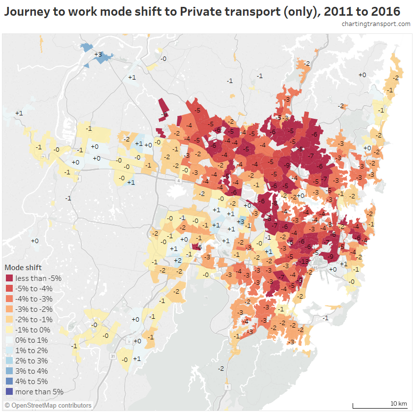
There were significant mode shifts away from private transport almost all over Sydney, but particularly strong in the inner south, inner west, north shore and hills area, including many areas served only by buses for public transport.
You can see the mode split of net new commuter origins on the next chart, with public transport dominating new trips from many areas on the north shore, eastern suburbs, and inner west and south-west (also in Tableau):

Private transport dominated new commuters in the outer western suburbs. Compared to other cities, a smaller proportion of new commutes came from the outer fringe, which may partly explain why Sydney had the strongest mode shift to public transport.
Here’s another look at that data, with the private transport mode share of net new journeys to work:
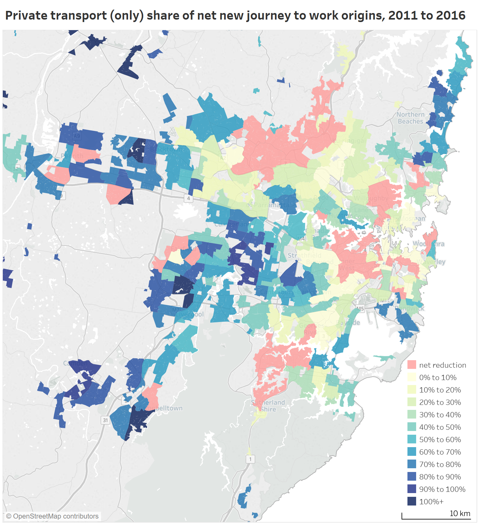
In many parts of Sydney there was an absolute reduction in the number of private transport journeys to work (pink areas), and many where it represented a small minority. Private transport did however dominate new commutes from most outer western suburbs and the northern beaches.
Summarising the above, Sydney saw public transport journeys grow faster than private transport journeys across all but the outer suburbs:

Here are the private transport mode shares by work location (also in Tableau):
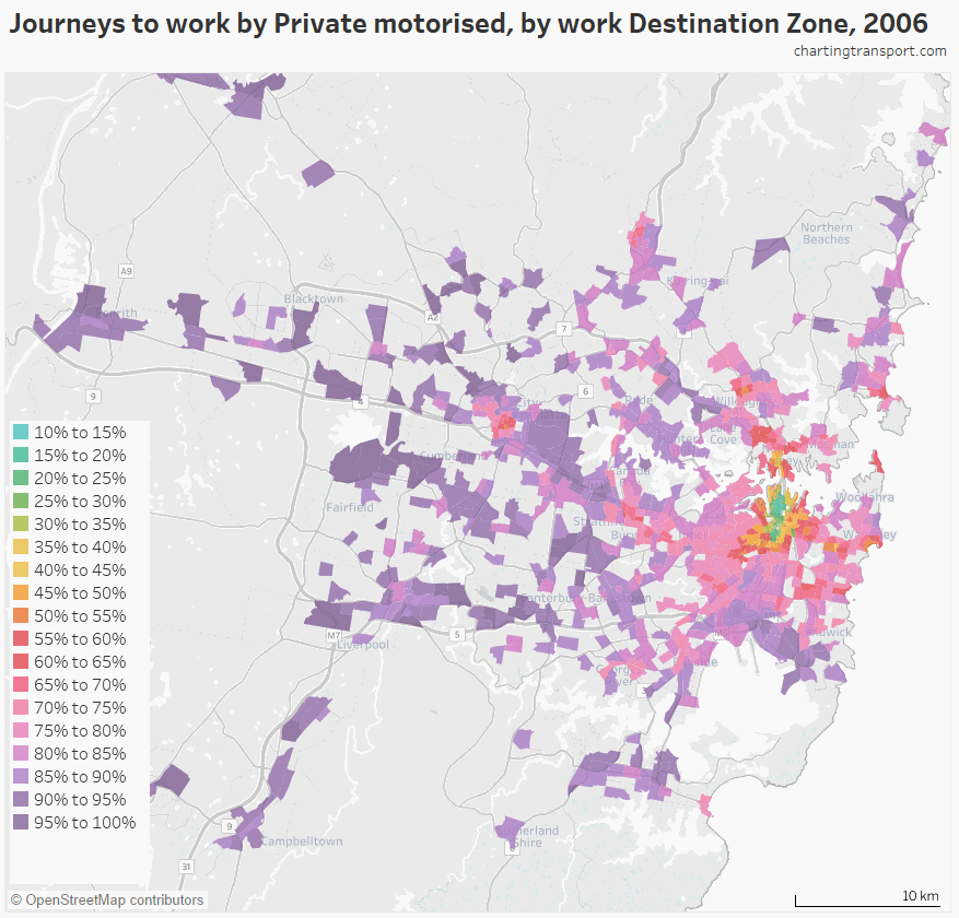
Sydney is distinctly different to the other cities in that there are many major employment centres outside the CBD with quite low private mode shares. The lowest 2016 private transport mode share destination zone in Macquarie Park was 59%, in Strathfield was 53%, in Manly was 55%, in Parramatta was 40%, in Chatswood was 40%, in St Leonards was 43%, in Bondi Beach was 43%, in Burwood was 46%, in Kensington was 45%, in Bondi Junction was 35%, and in North Sydney was 22%. Refer to my recent post about suburban employment clusters for more on this.
The Sydney CBD itself has a destination zone with only 6% private mode share in 2016. Sub-50% private mode shares stretch out from the CBD as far as Newtown south-west of the CBD.
Here are private transport mode shifts by work location:

There were significant mode shifts away from private transport across much of Sydney, with the largest in Mascot (-9%, noting that train fares were reduced at stations in Mascot in March 2011), and 7% declines in Sydney Airport, Kogarah, Waterloo – Beaconsfield, Newtown – Camperdown – Darlington, Redfern – Chippendale, Chatswood (East) – Artarmon. There was a 6% mode shift away from private transport in both North Ryde and Macquarie Park, where new train stations opened in 2009.
Here is a map showing the volume and mode split of new commuter destinations in Sydney:
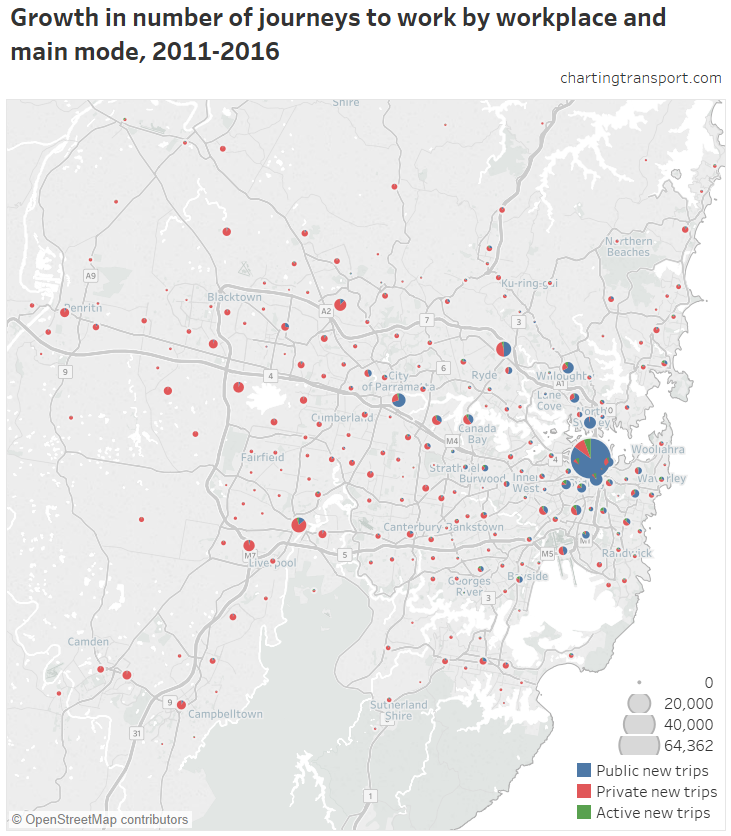
The Sydney CBD is such a big pie chart it swamps all others with 63,732 new commuters, 86% of which were accounted for by public transport. Public transport also dominated in North Sydney – Lavender Bay (which actually had a net reduction in private transport trips), Surrey Hills (88% by public transport) and Pyrmont – Ultimo (84% by public transport).
It’s also notable that Sydney’s major regional centres had a significant share of their jobs growth accounted for by public transport trips, as explored in my earlier post on employment clusters.
Here’s a map of private transport mode share of net new trips by workplace:
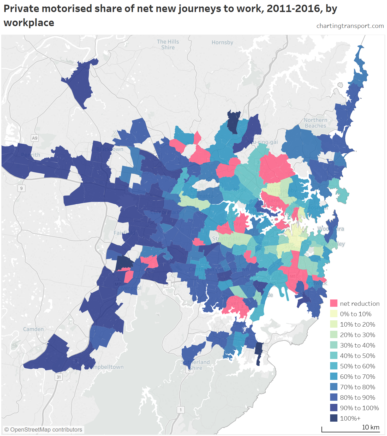
There was a net reduction in private transport journeys to many SA2s, including North Sydney, Homebush, Epping – North Epping, and Mascot – Eastlakes (note: some others might be artifacts of boundary changes between 2011 and 2016). Private transport again dominated new journeys to the outer west and northern beaches.
You can see on the following chart that the central city accounted for a significant portion of the jobs growth and public transport accounted for almost all of those new trips, which helps explain the overall shift to public transport. Private transport only significantly dominated new jobs more than 10 km from the city centre.

For more on the journey to work, you might like another post about likely factors explaining city-wide mode shifts across Australia’s larger cities.
About the data
The mode share maps are filtered for residential areas (CD or SA1) with at least 5 persons/hectare or destination zones (DZs) with at least 4 jobs/hectare (as appropriate). Mode shifts, mode splits, and mode shares of net new commutes are calculated and shown on 2016 SA2 boundaries, with 2006 and 2011 CDs, SA1s and DZs mapped to 2016 SA2 boundaries on a majority overlap basis (mostly a perfect alignment, but sometimes not). I’ve only counted people who travelled on census day and stated what mode(s) they used, and – for work destinations – where the work SA2 is known. See my Brisbane post for a longer explanation.

