With the COVID19 pandemic seemingly behind us, what has been happening to public transport patronage? Has it recovered to 2019 levels? In which cities is public transport patronage recovering the strongest?
This post provides my best estimates of how much public transport patronage has recovered in major Australian and New Zealand cities.
In my last post I talked about the problems when transit agencies only publish monthly total patronage (or weekly or quarterly totals). For those cities that don’t publish more useful data, I’ve used what I think is a reasonable methodology to try to adjust those figures to take into account calendar effects.
Unlike most of my posts, I’ll present the findings first then explain how I got them (because I reckon a good portion of even this blog’s readers might be less interested in the methodology).
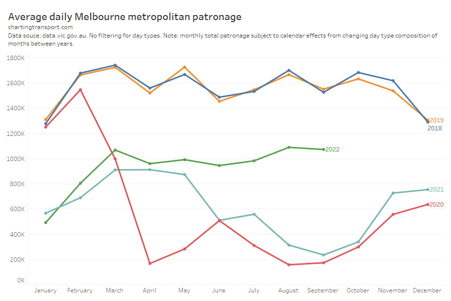
Estimates of typical school week public transport patronage recovery
Here’s a chart comparing estimated typical school week patronage per month to the same month in 2019 (the year before the COVID19 pandemic) where clean data is available. My confidence levels around estimates for each city is discussed further below.
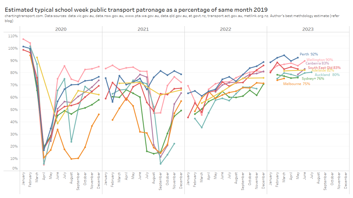
Technical notes: Sydney+ refers to the Opal ticketing region that includes Greater Sydney, Newcastle/Hunter, Blue Mountains, and the Illawarra. Typical school week patronage is the sum of the median patronage for each day of the week (where available), otherwise an estimate of average school week patronage. More explanation below.
Perth has been at or near the top of patronage recovery for most recent months, perhaps partly boosted by a new rail line opening to the airport and High Wycombe in October 2022.
Wellington – which I suspect is an unsung public transport powerhouse – is in second place at 90%, whilst all other cities are between 75% and 83%.
Looking at the 2023 data, most cities appear to be relatively flat in their patronage recovery (except Perth and Wellington), which might suggest that travel patterns have settled following the pandemic (including a share of office workers working remotely some days per week).
How does patronage recovery compare to population growth?
I’ve calculated the change in population for each city since June 2019. For South East Queensland I’ve used an approximation of the Translink service area, and for “Sydney+” I’ve used an approximation of the Opal fare region covering Sydney and surrounds. At the time of writing, population estimates were only available until June 2022.
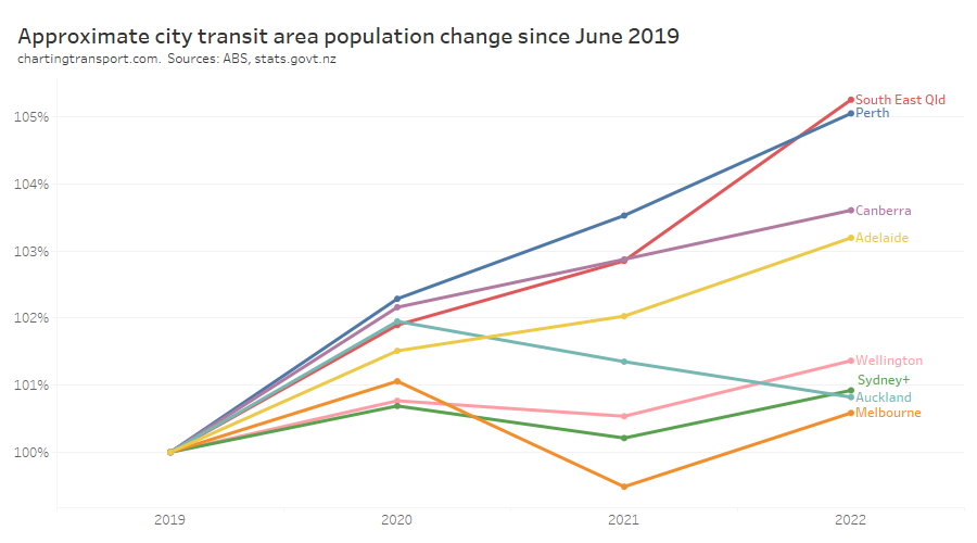
There are significant differences between the cities.
So how does public transport patronage recovery compare to population change? The following chart shows June 2022 patronage and population as a proportion of June 2019 levels:

The changes in population are much smaller than the changes in patronage and I have deliberately used a similar scale on each axis to illustrate this. Population growth certainly does not explain most of the variation in patronage recovery, but it is very likely to be a factor.
Perth had the highest patronage recovery in June 2022, but only some of this could be attributed to high population growth. Wellington had little population growth but the second highest patronage recovery to June 2022.
Perth might have the highest patronage recovery rate overall because it spent the least amount of time under lockdown, and so commuters had less time getting used to working at home. Melbourne, Sydney, Canberra, and Auckland spent the longest periods under lockdown, and – with the exception of Canberra – seem to be tracking at the bottom end of the patronage recovery ratings, which might reflect their workers becoming more comfortable with working from home during the pandemic. However I’m just speculating.
How has patronage recovery varied by day type?
Here’s patronage recovery for school weekdays (for cities which publish weekday data):
Note: Canberra estimates are only available for July to December because daily patronage data has unfortunately not been published for January to June 2019.
And here is the same for weekends (again for the same four cities that publish weekend data):
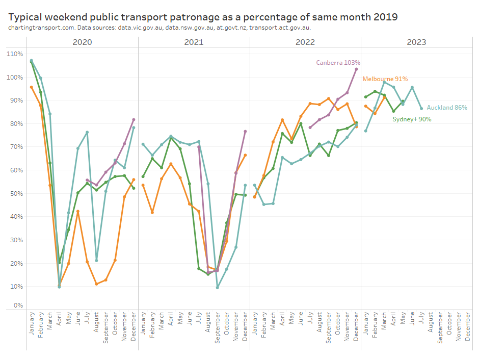
Weekend patronage is a bit more volatile as weekends typically have varying levels of major events and planned service disruptions. Most months also only have 8 weekend days, so a couple of unusual days can skew the month average and create “noise” in the data.
However all cities have been above 90% patronage recovery on weekends. Weekend patronage has returned more strongly than weekday patronage, probably because new remote working patterns only significantly impact weekdays.
How has patronage recovery varied between cities by mode?
I’m only confident about predicting modal patronage in cities that report daily or average day type patronage by mode, as the day type weightings used from another city might not apply equally to all modes.
Here is school weekday train patronage recovery for Sydney, Melbourne, and Auckland:
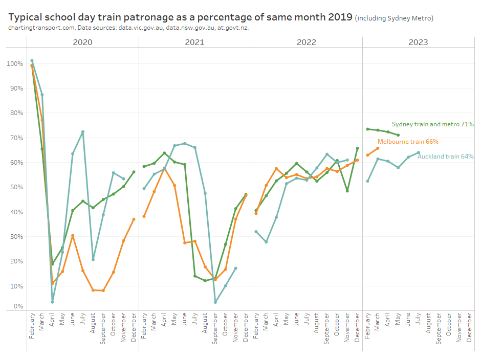
Auckland is slightly below Sydney and Melbourne, and recovery rates are lower than public transport overall. I suspect this may be due to train networks having a significant role in CBD commuting – a travel market most impacted by remote working.
And here is the data for weekends:

Curiously there is a lot more variation between cities. There’s also a lot more variation between months, which could well be related to the “noise” of occasional planned service disruptions and major events.
Here is average school day bus patronage for four cities where data is available:
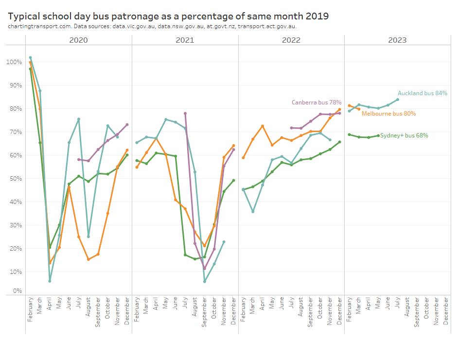
Bus patronage recovery is lowest in Sydney, perhaps because buses play a more significant role in Sydney CBD commuter travel which will be impacted by working from home (Melbourne’s bus services are mostly not focussed on the CBD). However buses also play a major role in public transport travel to the CBDs of Auckland and Canberra, although with probably lower public transport mode shares (unfortunately it doesn’t seem possible to get public transport mode share for the Auckland CBD from 2018 NZ Census data).
And for completeness, here is a chart for weekend bus patronage:
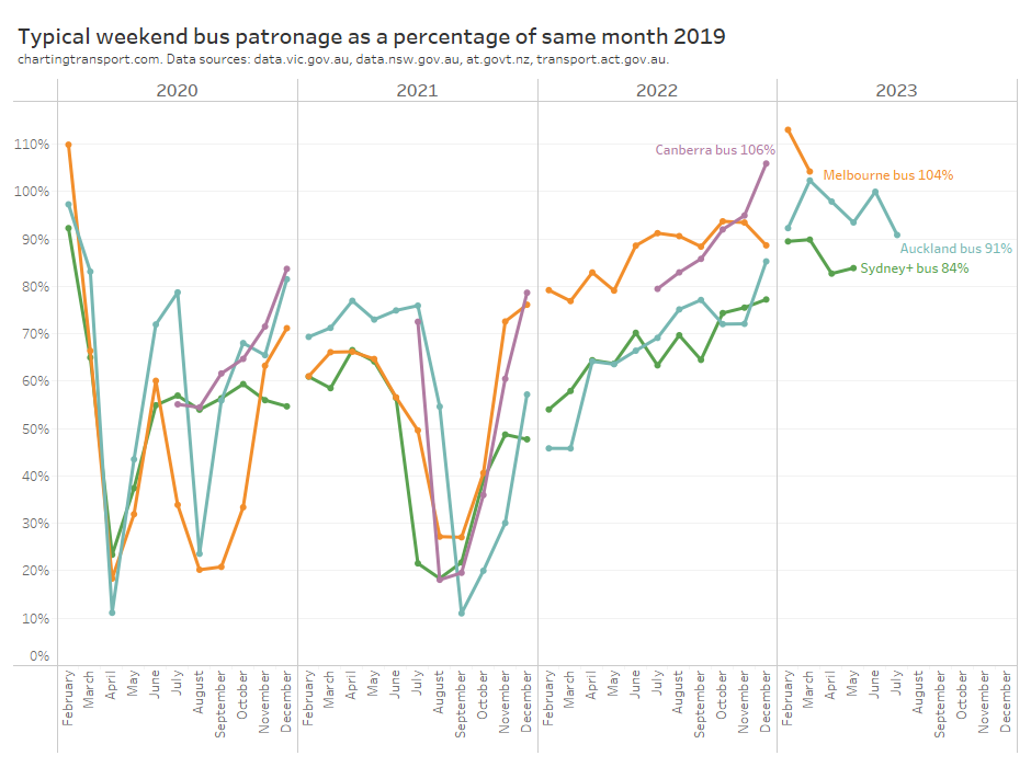
Weekend bus patronage recovery is higher than weekdays, and higher than weekend train patronage recovery, in all cities. Reported weekend bus patronage in Canberra, Melbourne, and Auckland has exceeded 2019 level in recent months.
How good are these estimates?
Some agencies publish very useful data such as daily patronage or day type average patronage, while others only publish monthly or quarterly totals which is much less useful for trend analysis. Here’s a summary of how I estimated time-series patronage and therefore patronage recovery in each city (which I will explain below).
| City/region | Data used to estimate time-series patronage | Confidence |
| Melbourne | Reported average patronage by day of the week and day type | High |
| Sydney+ = Greater Sydney, Newcastle/Hunter, Blue Mountains, Wollongong (Opal catchment) | Reported average school weekday and average weekend day patronage per month (dashboard) | Moderate |
| South East Queensland (Translink) – including Brisbane, Gold Coast, Sunshine Coast | Reported weekly totals, aggregated to months, and adjusted by day type weightings calculated for Melbourne 2022. | Lower |
| Adelaide | Reported quarterly totals, adjusted by day type weightings calculated for Auckland 2022. | Lower |
| Perth | Reported monthly totals, adjusted by day type weightings calculated for Auckland 2022. | Lower |
| Canberra | Reported daily patronage (from July 2019) and monthly total patronage for May and June 2019 adjusted by day type weightings calculated for Canberra 2022 (weekdays) and 2019 (weekends and public holidays). Data pre-May 2019 has been excluded as there was a step change in boardings when a new network was implemented in late April 2019. May 2019 has been included however I should note it had unusually high boardings. | Moderate |
| Auckland | Reported daily patronage (up to 23 July 2023 at the time of writing). | High |
| Wellington | Reported monthly totals, adjusted by day type weightings calculated for Auckland 2022. | Lower |
For Melbourne and Auckland excellent data is published that allows calculation of typical school week patronage for February to December, which gives me high confidence in the estimates. Canberra has published daily patronage data but only from July 2019 so I’ve had to estimate school week patronage for May and June 2019 from monthly totals (process described below).
You’ll notice I’ve referred to “typical” patronage rather than average patronage. For cities with daily data, I’ve summed the median patronage of each relevant day of the week, rather than taking a simple average of days of that day type in the month. Taking the median can help remove outlier days, and summing over the days of the week means I’m weighting each day of the week equally, regardless of how many occurrences there are in a month (eg a month with 5 Sundays and 4 Saturdays). For Melbourne I’ve only got the average patronage per day of the week, but I’m still summing one value of each day of the week.
Transport for NSW have an interactive dashboard from which you can manually transcribe (but not copy or download) the average school weekday patronage and average weekend daily patronage for each mode and each month. I’ve compiled a typical school week estimate using 5 times the average school weekday plus 2 times the average weekend day. This is likely pretty close to what true average school week patronage is (more discussion below).
But what about the other cities?
How can you estimate patronage trends in cities where only monthly, quarterly, or weekly total patronage data is available?
Rather than simply calculating percentage patronage recovery on monthly totals (which has all the issues I explained in my previous post), I’ve made an attempt to compensate for the day type composition of each month in each city.
Basically this method involves calculating a weighting for each month, based on the day type composition of each month. If you divide total monthly patronage by the sum of weightings for all days of each month you can get a school weekday equivalent figure on which you can do time series analysis.
This requires a calendar of day types, and assumptions around the relative patronage weightings of each day type.
I’ve compiled calendars for each city using various public sources (including this handy machine readable public holiday data by data.gov.au).
Technical note: In New Zealand it seems schools generally are able to vary their start and end of year by up to 5 regular weekdays. I’ve excluded these 10 weekdays from many calculations because they do not represent clean school or school holiday weekdays. For December 2019 I have also excluded two weeks for Auckland due to unusually low reported patronage due to bus driver industrial action.
The assumed day type weightings need to come from another city, on the hope that they will be similar to the true value. But which city, and measured in what year?
I’ve calculated the relative patronage weights of each day type for Melbourne, Canberra, Auckland, plus one school week sample from February 2020 for Sydney+ (Opal region). These are indexed to a school Monday being 1.
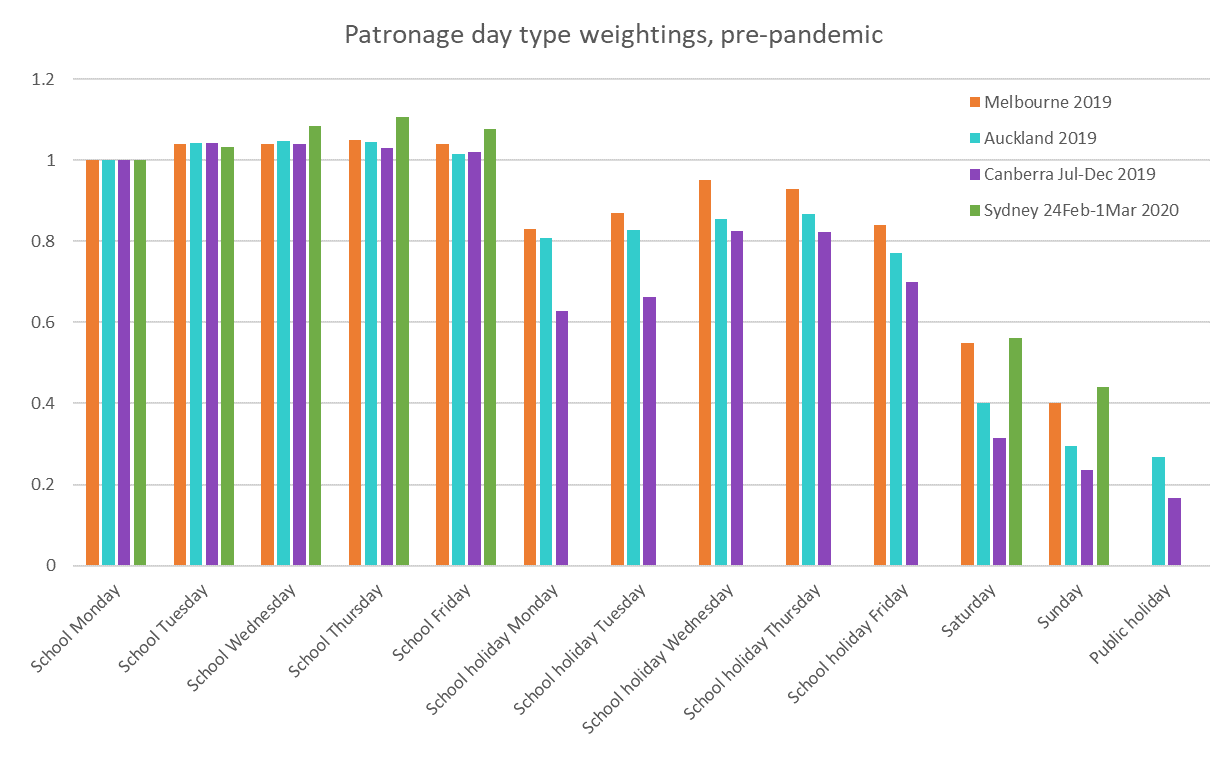
Note: no data is available for public holidays in Melbourne, and the Sydney data does not include school holiday weekdays or public holidays.
Melbourne, Canberra, and Auckland weightings are pretty similar across days of the week for school days, but Melbourne’s school holiday weekdays and weekends were relatively busier than both Auckland and Canberra. The Canberra school holiday figures are highly variable between weekdays and are only available for the second half of 2019 (so are impacted more significantly by the timing of Christmas).
The data suggests the big cities of Sydney and Melbourne attract much more weekend patronage compared to the smaller cities. They also have higher public transport mode shares – refer Update on Australian transport trends (December 2022) for comparisons between Australia cities. In terms of public transport share of journeys to work, Auckland was at around 14% in 2018, while Melbourne was 18.2% in 2016). This suggest Melbourne day type weightings might be suitable for larger cities while Auckland day type weightings might be suitable for smaller cities.
The next question is: which year’s weightings should be used? The chart above showed day type weightings from pre-pandemic times, but it turns out they have changed a bit since the pandemic. Here are 2022 day type weightings:
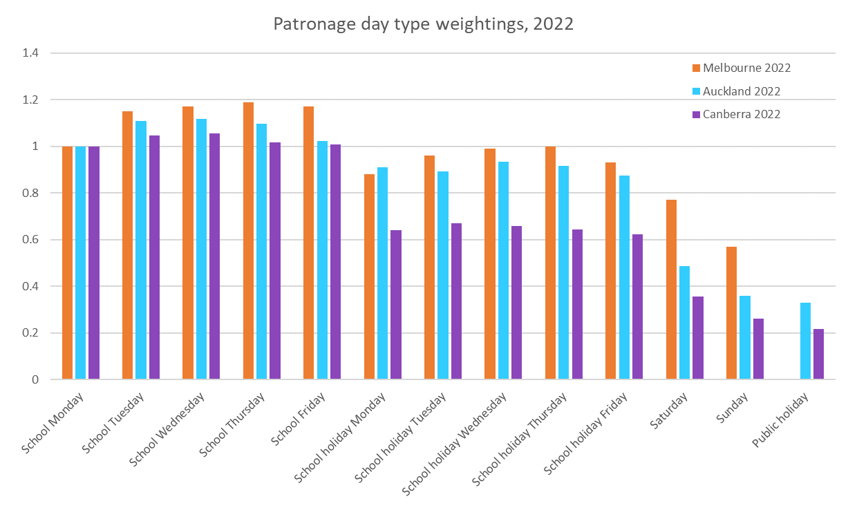
In all cities in 2022 there is a lot more variation across Monday to Friday school days (Mondays and Fridays being popular remote working days) and school holiday weekdays are much more similar between Melbourne and Auckland, while weekends remain quite different.
In fact here’s how the cities with available data compare for ratios between weekends and school weekdays in 2019 and 2022:
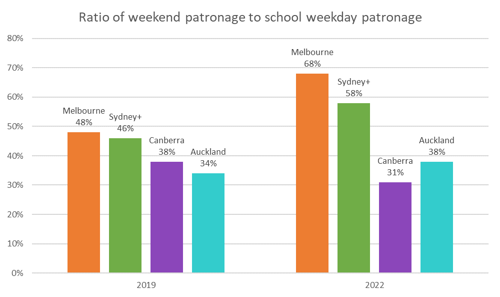
The ratios increased in all cities between 2019 and 2022 except Canberra. The 2019 ratios are remarkably close between Melbourne and Sydney, but the 2022 data shows a higher weighting for weekends in Melbourne than Sydney. The Auckland and Canberra ratios are substantially lower in both years. The ratio went down in Canberra in 2022 possibly due to issues obtaining enough drivers to run weekend timetables in that city.
So what day type weightings should we use for each city?
Should we use Melbourne, Auckland, or Canberra weightings, and from what year should we derive these weightings? And how worried should we be about getting these weightings right?
Well, Auckland provides us with daily patronage data for a “medium sized” city, which allows us to compare calculated typical school week patronage, and also allows calculations as if only more summary data was available (as per other cities). However we need to exclude both January and December, as there were no normal school weekdays in those months in 2019.
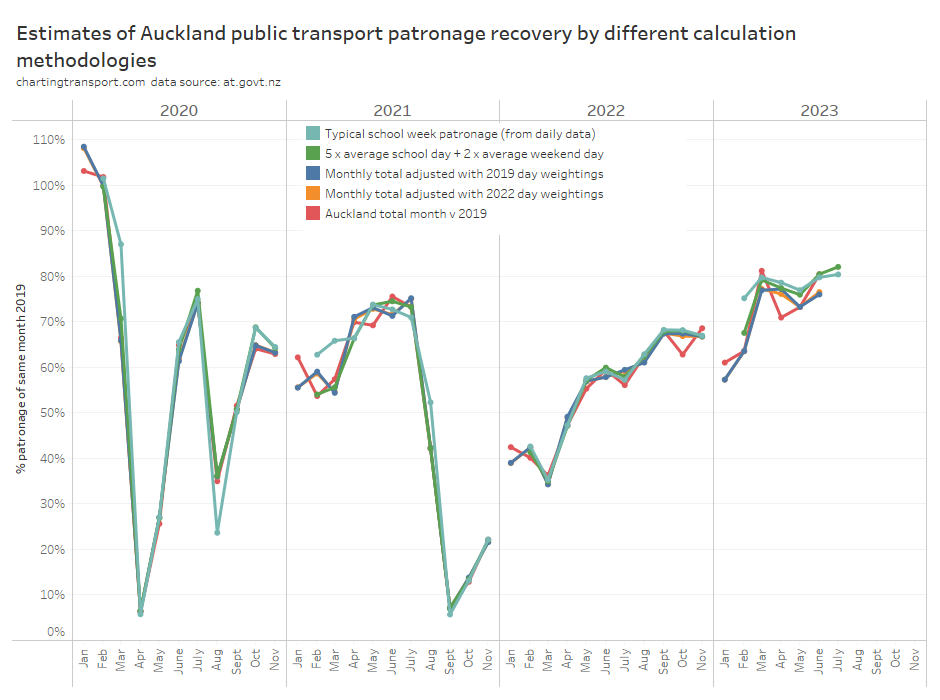
The red line (total monthly patronage with no calendar effect adjustments) has the most fluctuations month to month and I’m pretty confident this is misleading for all the reasons mentioned in my last post.
Most of the other methodologies produce a figure fairly close to the best estimate (teal line), except in 2021 and 2023.
The green line (compiled 5 x average school day + 2 x average weekend day) is mostly within 2% of the (arguably) best estimate, but there are variations that will be explained by the green line not taking into account the day of the week composition of the month, nor excluding outlier busy/quiet days (unlike medians). So if you only have average school weekday and average weekend day data you’re not going to be too far off the best estimate. That gives me “moderate” confidence to use Sydney’s average school weekday and average weekend day patronage data to estimate patronage recovery.
But what if you only have total monthly patronage and have to use day type weightings? It’s a bit hard to see the differences in the above chart, so here’s a zoom in for 2022 and 2023:
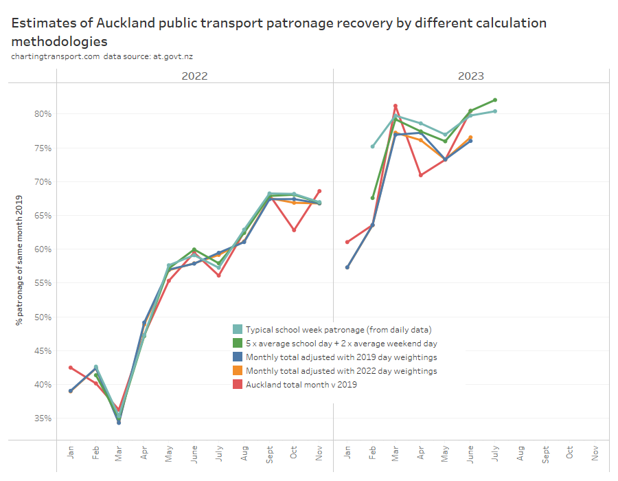
There’s not a lot of difference between the 2019 and 2022 day type weightings, and notably both methods underestimate patronage recovery for most months of 2023, which is not ideal. Note: February 2023 had several days of significant disruptions due to major flooding events which impacted most measures (except the “typical school week” measure that uses medians to reduce the impact of outliers).
Sydney also provides data that allows us to compare day type weighting estimates to the probably quite good compiled school week estimate (based on 5 average school weekdays and 2 average weekend days). The next chart includes estimates of Sydney patronage recovery using day type weightings from Melbourne and Auckland for different years:
Technical note: I have assumed Melbourne public holidays have the same day type weighting as Sundays, for want of more published data.
The estimates are mostly pretty close, but let’s zoom into recent months to see the differences between the methodologies more clearly:
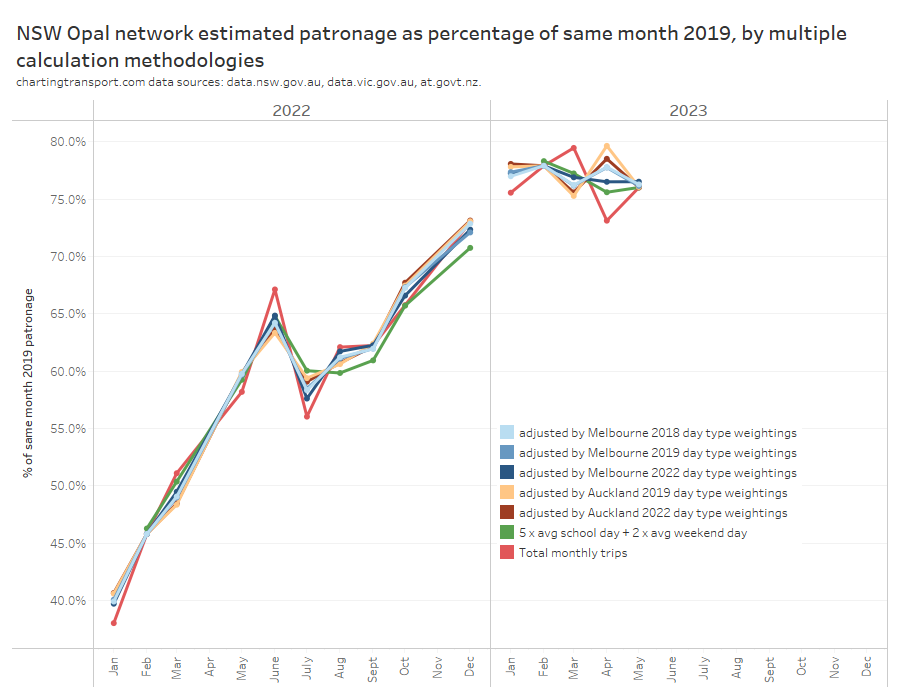
The closest estimate to the compiled average school week data is using Melbourne 2022 day type weightings to adjust monthly totals (the difference is up to 0.9% in April 2023). This suggests Melbourne is probably the best city from which to source day type weightings to apply to Sydney (both large cities), and 2022 (a post-pandemic year) might be a better source year for these weightings. That’s consistent with Sydney having similar ratios of weekday to weekend patronage as Melbourne.
You can see the red line (a simple total monthly patronage comparison) is again often the biggest outlier, which is what happens when you don’t control for calendar effects. I mentioned at the start of my last post that the raw monthly totals suggested a misleadingly large 6.4% drop in patronage recovery from 79.5% in March 2023 to 73.1% in April 2023. On the average school week estimates, patronage recovery dropped only 1.8% from 77.2% to 75.6%.
So which city’s day type weightings are most appropriate for the smaller cities of Perth, Adelaide, Wellington, and Brisbane that don’t currently publish day type patronage? Does it even make a lot of difference?
Well here are patronage recovery estimates for Adelaide, Brisbane, Wellington, and Perth using both Melbourne and Auckland day type weightings from 2022.

Most of the estimates are within 1%, although there are some larger variances for Wellington and Perth.
The Wellington recovery line is smoother for Melbourne weightings in 2021, but smoother with Auckland weightings in 2022 and 2023 (so far). The Wellington estimates can differ by up to 2% and a smoother trend line may or may not mean that one source city for day type weightings is better than the other.
The fact that Melbourne day weightings worked better than Auckland day weightings when it came to Sydney suggests that larger city weightings might be appropriate for other large cities, and perhaps smaller city weightings might be appropriate for other smaller cities.
I have adopted Melbourne day type weightings for South East Queensland, and Auckland day type weightings for Adelaide, Perth, and Wellington, on the principle that larger cities are likely to have relatively higher public transport patronage on weekends (compared to weekdays). Of course I would really rather prefer to not have make assumptions.
That was pretty complicated and involved – is there a lazy option?
Okay, so if you don’t have – or want to compile – calendar data and/or you don’t want to use day type weightings from another city, you can still compile rolling 12 month patronage totals and compare those year-on-year to estimate patronage growth.
The worst times of year at which to measure year-on-year patronage growth are probably at the end of March, June, September, and December (because of when school holidays fall). Of course being quarter ends, these are also probably the most common times it is measured!
It’s slightly better to measure year on year growth for 12 month periods ending with February, May, August, and/or November, as years ending in these months will contain four complete sets of school holidays, and exactly one Easter (at least for countries with similar school terms to Australia and New Zealand). However there will still be errors because of variations in day type composition of those 12 month periods.
In my last post I introduced the mythical city of Predictaville, where public transport patronage is perfectly constant by day type and they follow Victorian school and public holidays. Here is what Predictaville patronage growth would look like measured year on year at end of November each year:

Calculated growth ranges between +0.8% and -0.9%, which is about half as bad as +1.6% to -1.6% when measured at other month ends, but still not ideal (the true value is zero). The errors in the real world will depend on the relative mix of patronage between day types (Predictaville patronage per day type was modelled on Melbourne’s buses).
That’s a not-too-terrible option for patronage growth, but if you are interested in patronage recovery versus 2019 on a monthly basis, I’m not sure there is any reasonable lazy option.
Let’s hope the usefulness of published patronage data improves soon so complicated assumptions-based calendar adjustments and problematic lazy calculation options can be avoided!


 Posted by chrisloader