Once again, the good folks at the Bureau of Infrastructure, Transport and Regional Economics (BITRE) have published their annual yearbook chock full of data just before Christmas. This annual post aims to turn the numbers into insights about transport trends in Australia.
I’ll cover vehicle kilometres, passenger kilometres, mode shares, car ownership, driver’s licence ownership, greenhouse gas emissions, and transport costs. This year there’s also a new section of freight volumes and mode shares.
While most data series are available up until 2020-21, at the time of writing there were only June 2021 estimates of population for states and territories, not cities. So most charts for cities will end at 2019-20, the financial year in which the COVID19 pandemic had significant impacts for only the last third (i.e. from March 2020).
I will finish the post with some thoughts about what the data suggests for post-pandemic transport trends. Settle in, there are quite a few charts!
Vehicle kilometres travelled
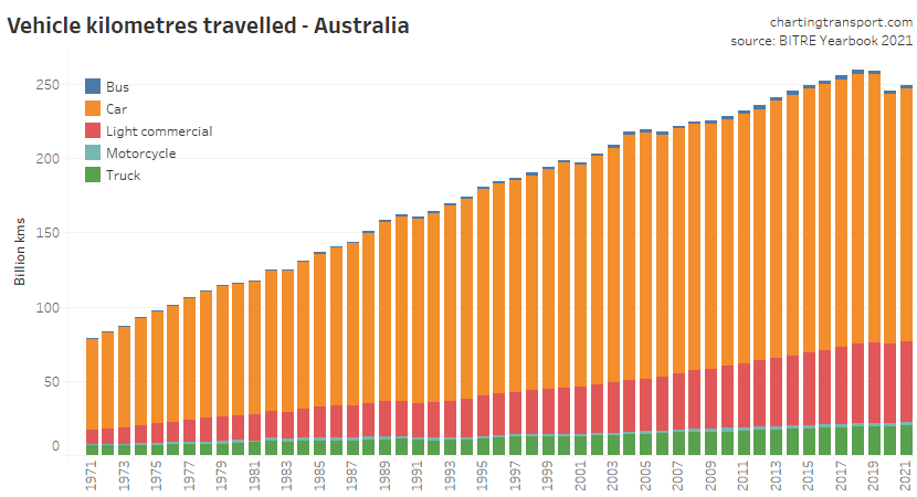
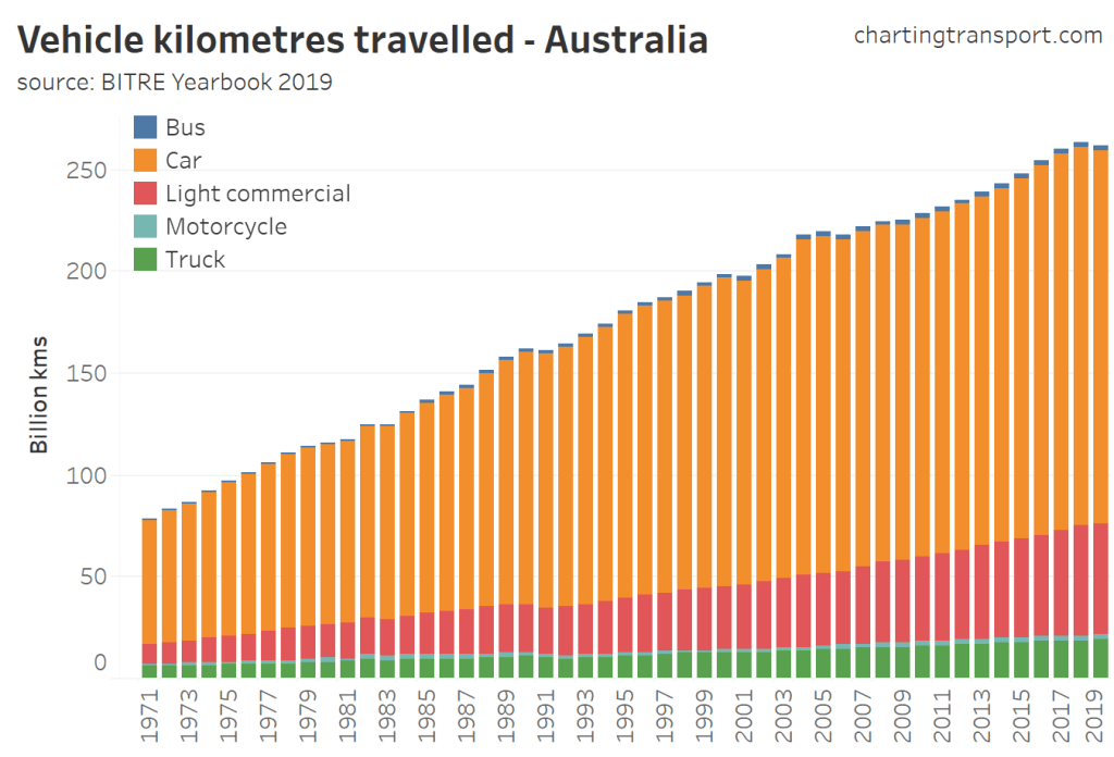
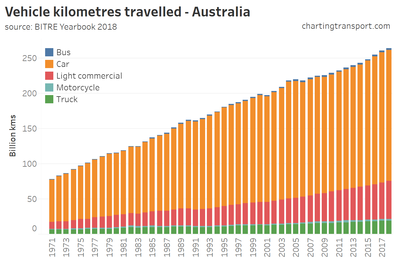
Total vehicle kms travelled in Australia increased slightly in 2020-21, after a small but significant fall in 2019-20 due to the pandemic.
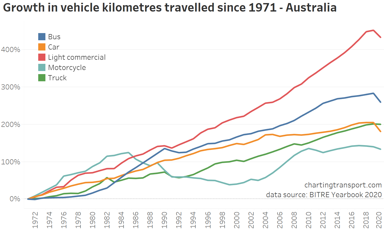
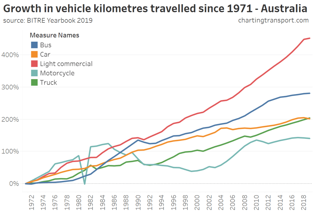
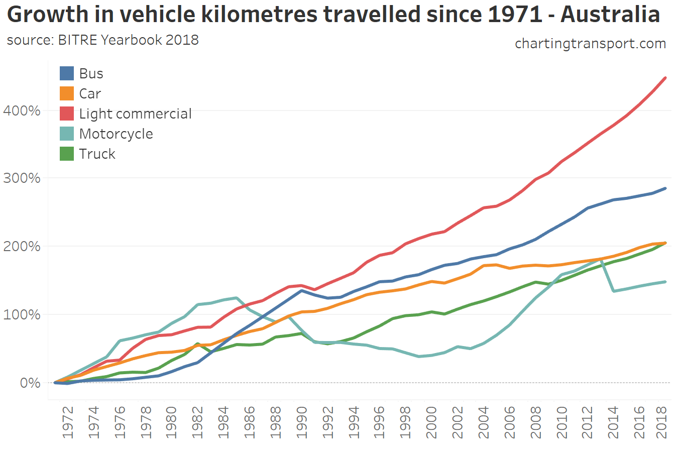
Here’s the percentage growth by vehicle type since 1971:
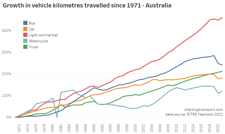
Light commercial vehicles have seen the largest growth overall since 1971, followed by buses (mostly in the 1980s), with motorcyles having the least growth.
In percentage terms, buses saw the largest decline in vkms with the pandemic (I’m guessing largely related to charter and tour operations), but there were also substantial declines for cars and motorcycles as people endured lockdowns and borders were closed. There was no clear impact on trucks and only a small impact on light commercial vehicles. All vehicle types except buses rose in total vehicle kms in 2020-21.
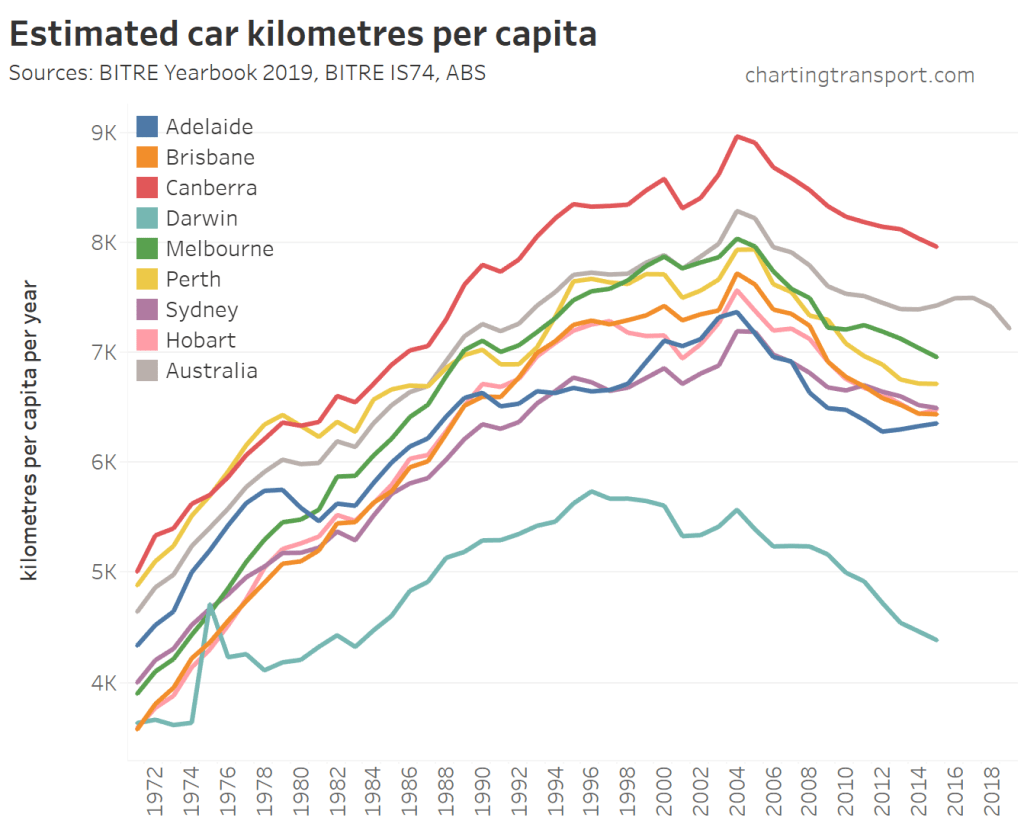
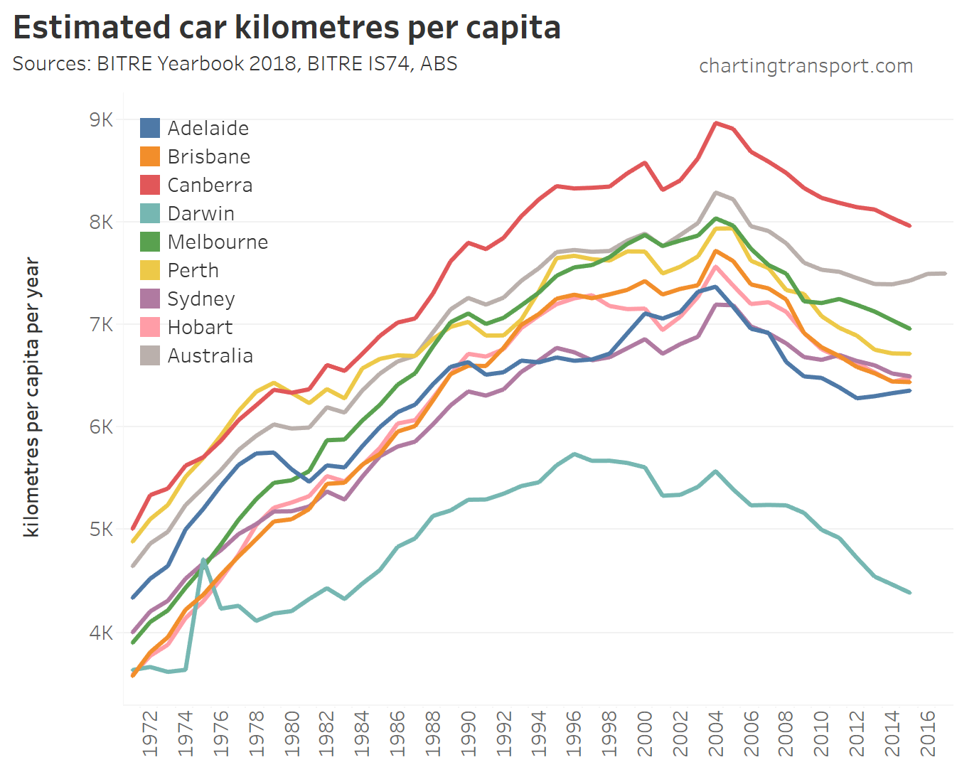
Vehicle kilometres travelled per capita
Here’s a view at the state and national level:
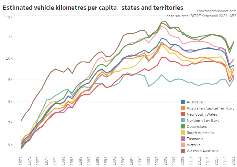
Vehicle kms per capita peaked in all states in 2004 or 2005 and have declined since then, with some variation between states.
Vehicle kms per capita were highest in Queensland and Western Australia, and lowest in the Northern Territory, followed by New South Wales, South Australia and the ACT – at least until the COVID19 pandemic.
All states saw a big reduction in 2019-20 with the pandemic (although less so in the NT which I understand didn’t lock down), and things bounced up in 2020-21 in all states except Victoria – no doubt due to a long lockdown in the second half of calendar 2020 due to a second wave of COVID19.
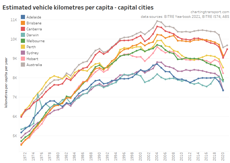
Similar patterns were seen in cities (data for most cities is only until 2019-20). Before the pandemic, Melbourne and Sydney showed the biggest declines in vehicle kms per capita.
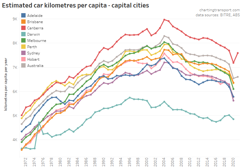
BITRE have been kind enough to supply me with estimates of car vehicle kilometres for cities (not yet part of the yearbook data), which show similar patterns:
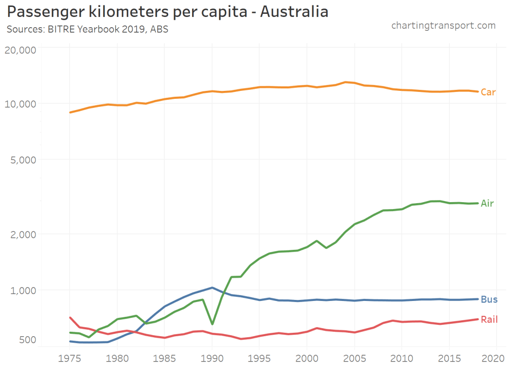
Passenger kilometres travelled
Firstly here are passenger kilometres travelled at the national level – and note I have used a log-scale on the Y-axis.
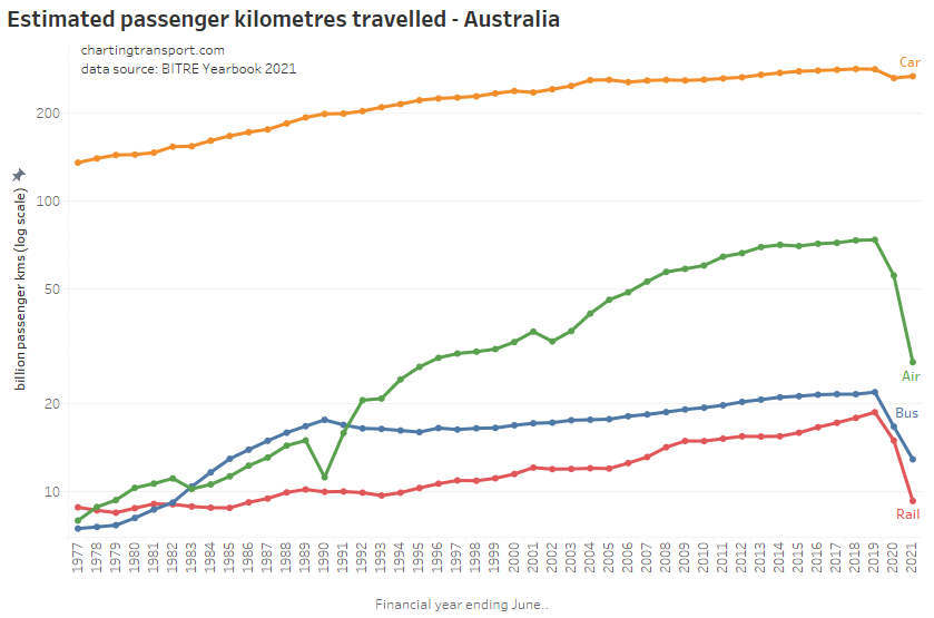
The COVID19 pandemic brought massive reductions in rail, bus, and air passenger kilometres travelled, and a smaller reduction in car passenger kilometres. This will likely reflect a significant proportion of the workforce shifting to working at home, an aversion to shared transport, and the closure of interstate borders during the pandemic.
Prior to the pandemic, there was a massive increase in air travel between the mid-1980s and the early 2010s, and rail saw strong growth from 2005.
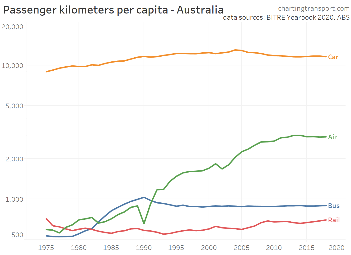
Here’s passenger kms per capita:
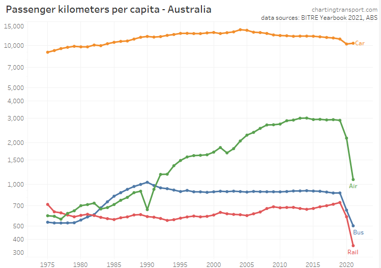
Car passenger travel per capita peaked in 2004, and domestic air travel per capita peaked around 2014. Bus travel per capita peaked in 1990, the same year aviation was significantly disrupted by a pilot’s strike. Rail passenger travel was growing strongly until the pandemic hit.
The next sections will look at passenger kms (total and per capita) for capital cities, by mode.
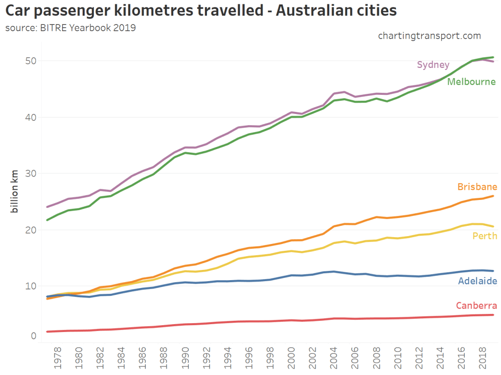
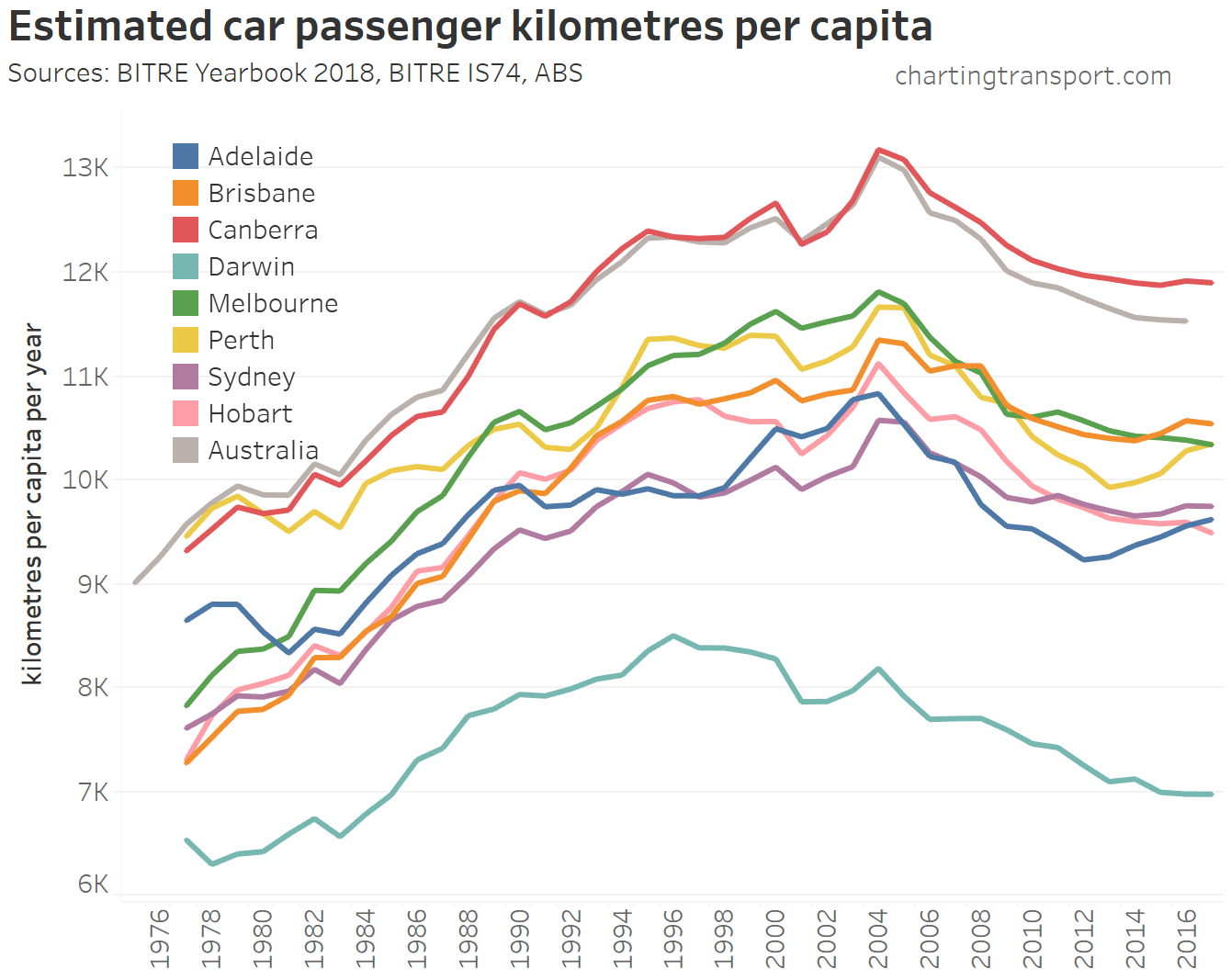
Car passenger travel
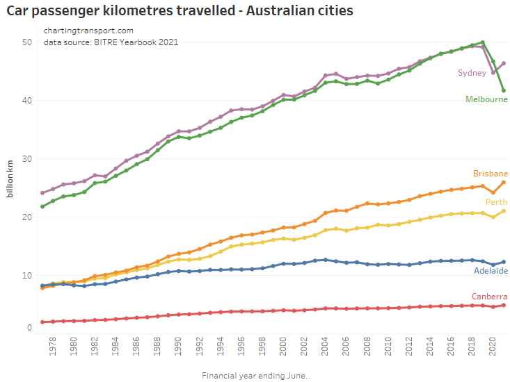
After a long run of strong growth, the pandemic brought declines in car travel in all cities in 2019-20. There was a bounce back in 2020-21, except Melbourne which saw a further decline to 17% below 2019-20 levels (roughly equal to 2003 levels), no doubt due to COVID19 lockdowns. 2020-21 car passenger kms in Perth, Adelaide, and Brisbane were above 2019-20 volumes, suggesting a snap back to the growth trend.
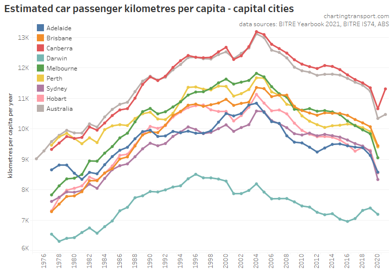
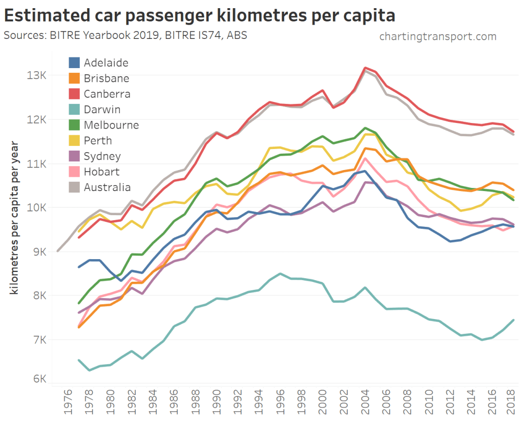
All cities saw a significant decline in car passenger kms per capita in 2019-20, due to the pandemic.
The longer-term trend shows peaking of car use in 2004 or 2005 in all cities.
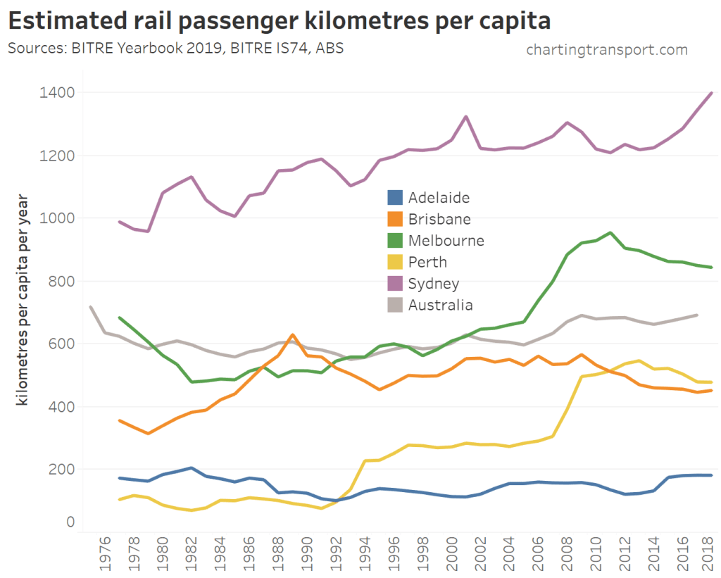
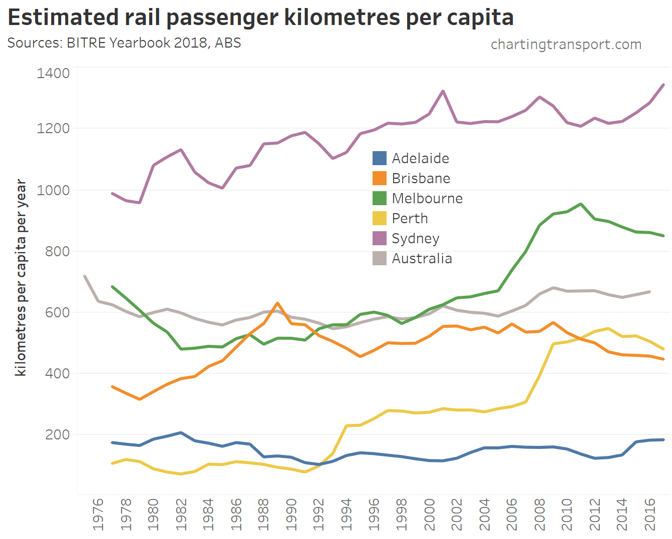
Rail passenger travel
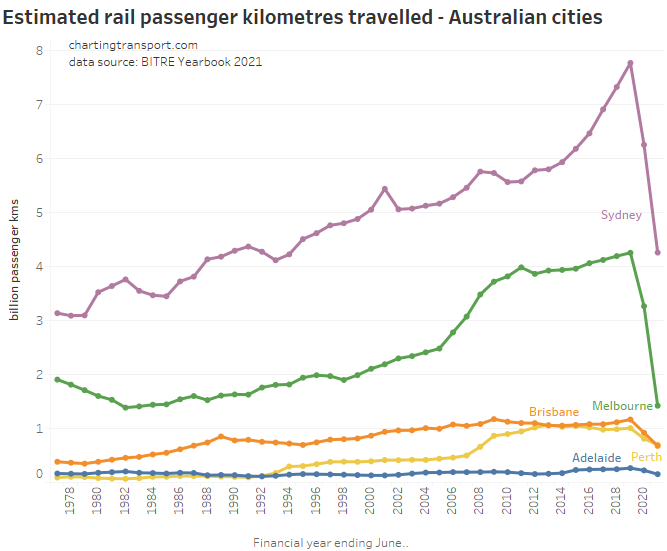
There were massive reductions in (heavy) rail passenger kms in both 2019-20 and 2020-21 with the COVID19 pandemic, as many central city workers shifted to working from home and cities went into lockdown.
Just before the pandemic, Sydney’s rail passenger kms were rocketing up. Sydney’s rail network carries significantly larger volumes than Melbourne despite having almost the same population.
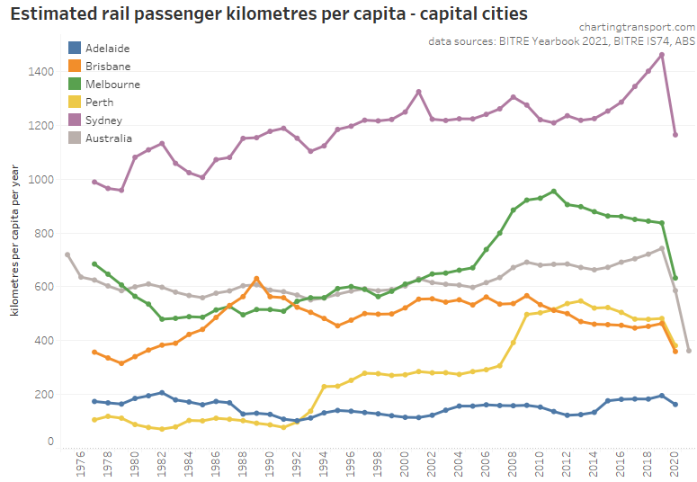
Before the pandemic, rail passenger kms per capita were increasing in Sydney, declining in Melbourne, and increased slightly in other rail cities in 2018-19. Things obviously changed with the pandemic in 2019-20.
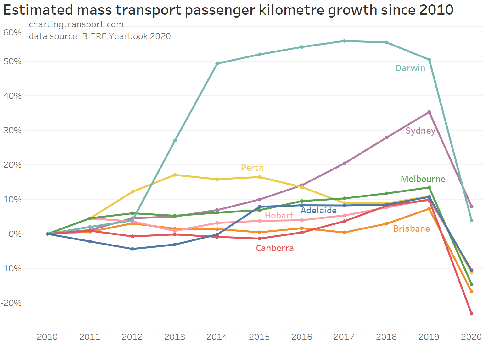
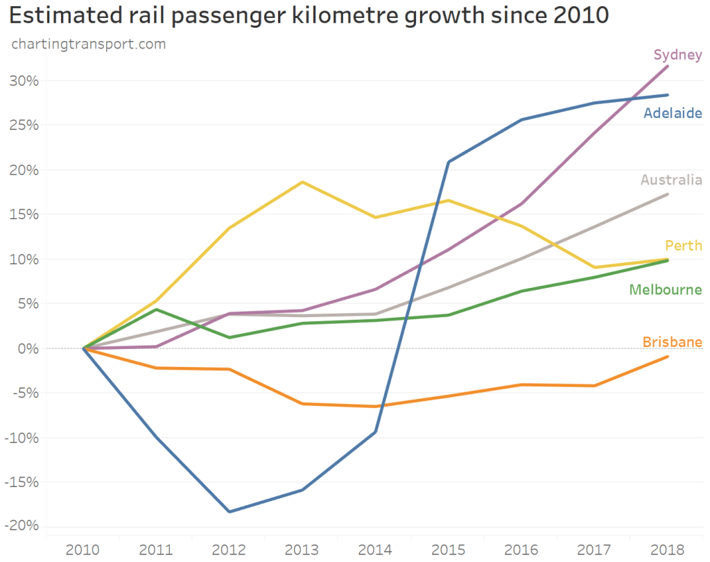
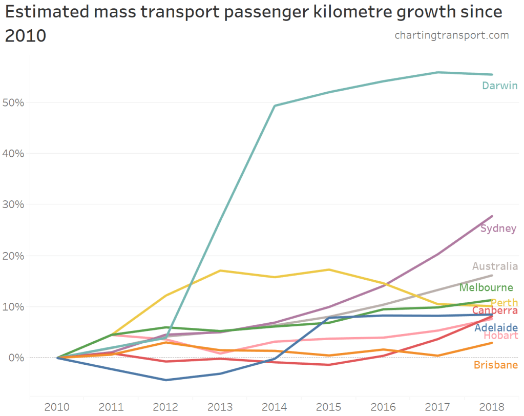
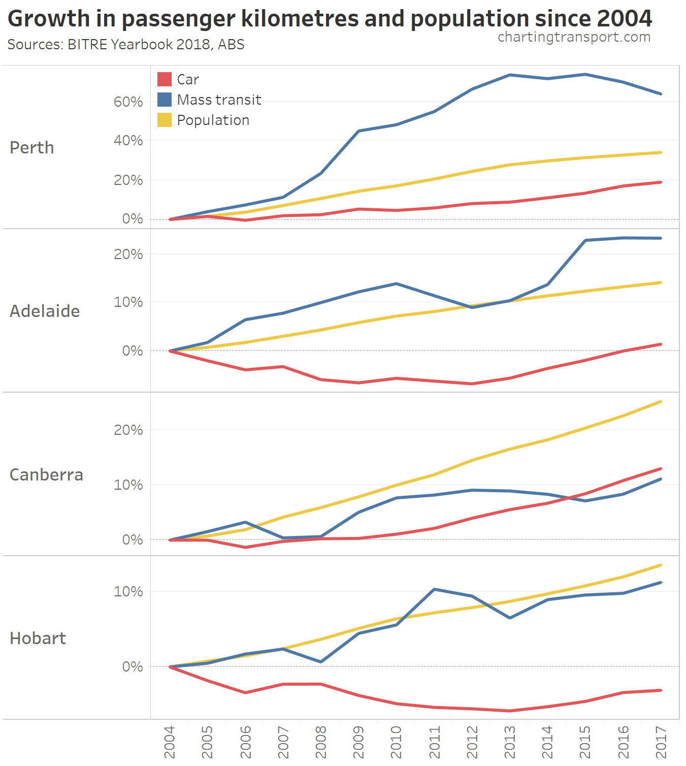
Here is growth in rail passenger kms since 2010:
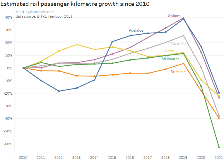
Pre-pandemic, Adelaide and Sydney has the strongest growth relative to 2010, while Brisbane had the least. However the chart would look quite different with a different base year (eg Perth would look worst on a base year of 2013). Adelaide train patronage was significantly impacted in the period 2011-2014 by electrification and other upgrade works that involved extended line closures.
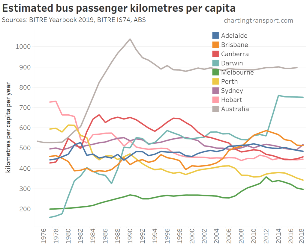
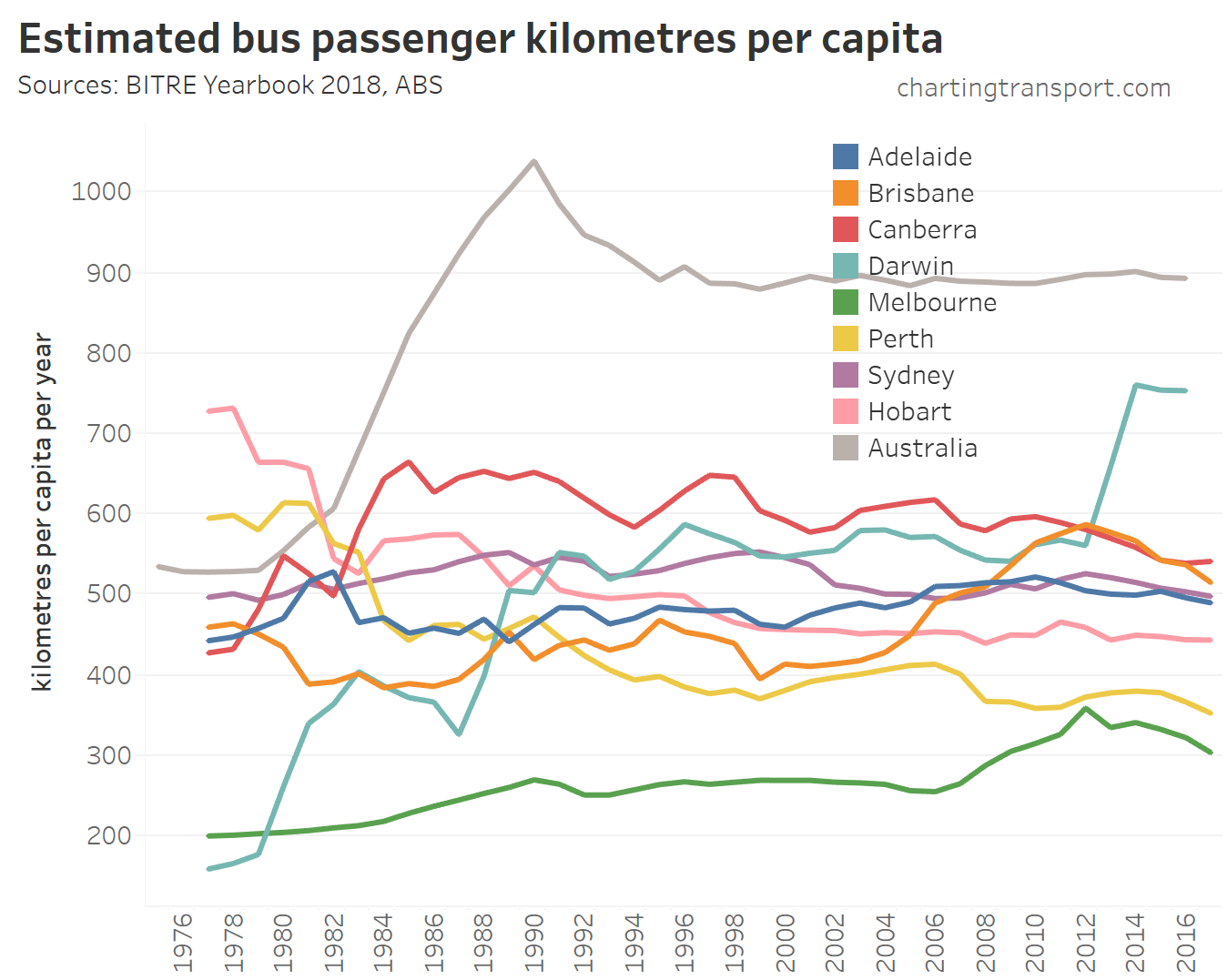
Bus passenger travel
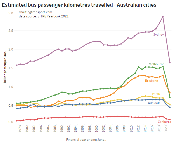
Sydney has the highest bus use of all Australian cities. It’s worth noting that Melbourne is unique in that trams dominate inner city radial street-based public transport, resulting in a lower rate of bus use compared to other cities.
All cities saw big bus patronage reductions with the pandemic, with Melbourne bus usage falling below than of Brisbane in 2020-21.
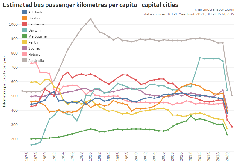
In per capita terms, Darwin has seen a massive increase in bus use due to a large staff bus network being created for a major LNG project just outside of Darwin.
Sydney overtook Brisbane for bus use per capita in 2017-18, perhaps due to some service investment, network reform, and/or reduced transfer penalties from fare reform. Brisbane saw massive increases in bus usage between 2004 and 2012, likely related to the expansion of the busway network and some service upgrades (including “BUZ” routes), which might then have been eroded by significant fare hikes.
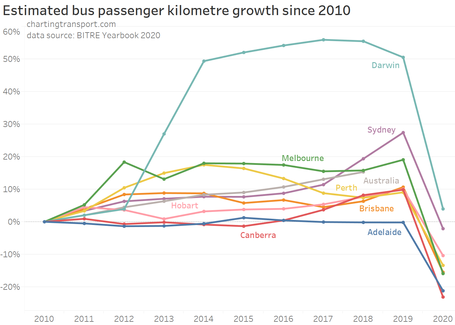
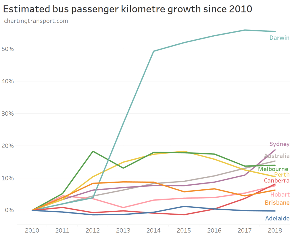
Growth in bus passenger kms since 2010 shows these patterns in another way:
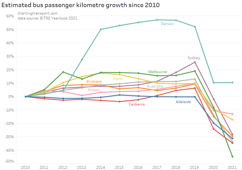
Pre-pandemic, Sydney and Canberra were showing particularly strong growth. Perth peaked in 2014 – which might be partly explained by a decentralisation of employment (see: What might explain journey to work mode shifts in Australia’s largest cities? (2006-2016)).
Again, these types of charts would look quite different if a different reference year was applied.
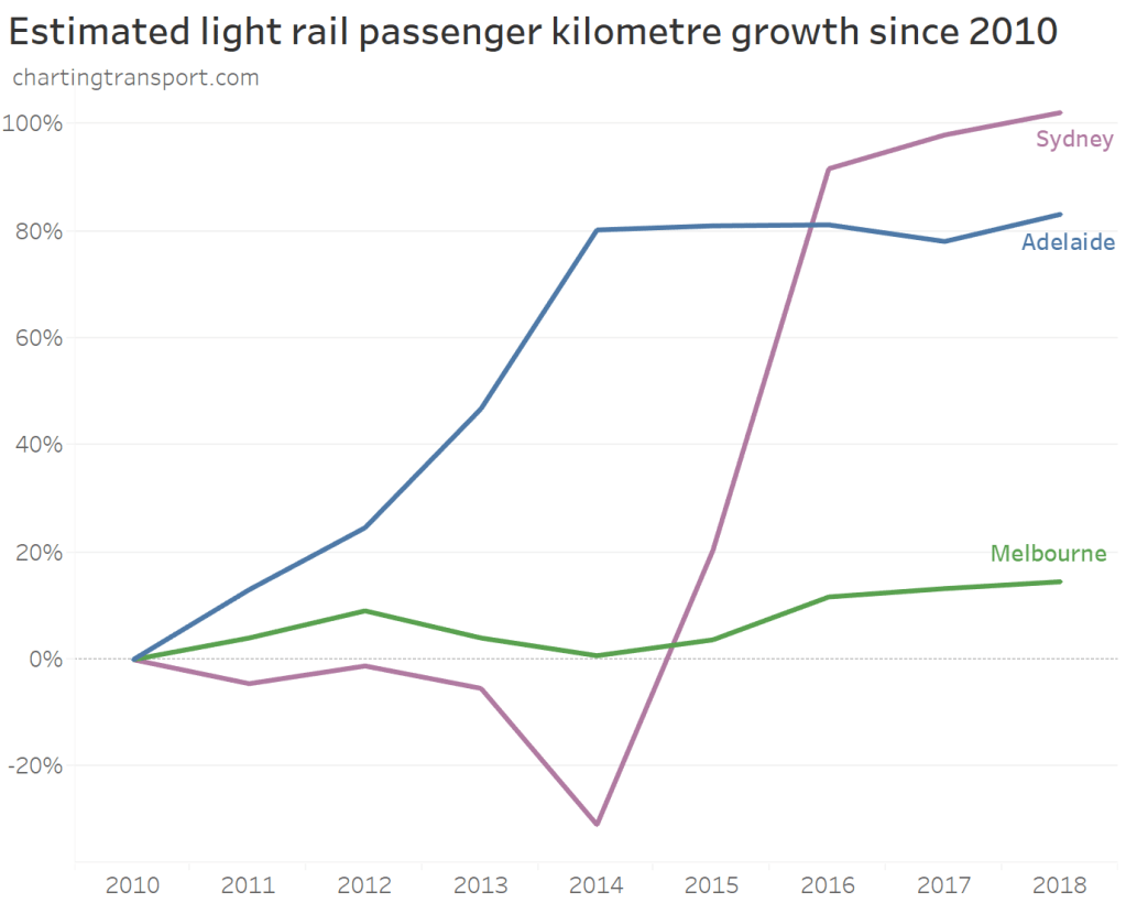
Light rail passenger travel
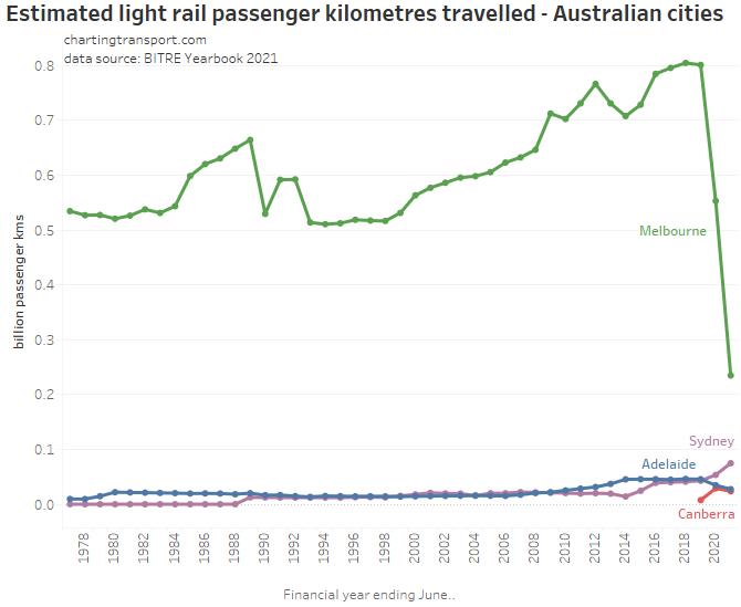
Melbourne has by far the largest light rail network, so little surprise it has the highest passenger kms. None of these light rail networks are designed to serve the entire city, so we need to be cautious comparing cities, and I won’t provide a per capita chart.
Despite the COVID19 pandemic, Sydney saw an increase in light rail use in 2019-2020, which would reflect the opening of the new south-eastern lines to Randwick and Kingsford in December 2019.
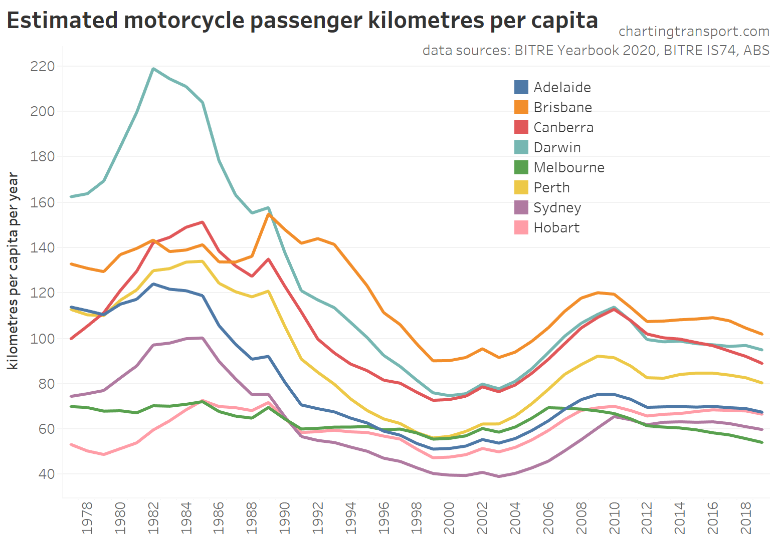
Motorcycle passenger travel
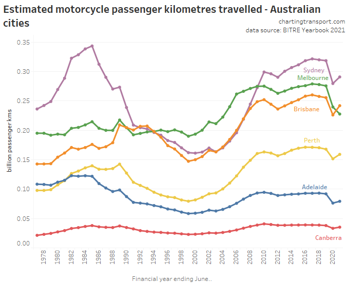
Motorcycle travel had a dip in the 1990s on these figures, then picked up strongly in the early 2000s. The patterns in 2019-2021 are similar to car passenger travel.
On this data, Melbourne bucked the trend of other cities in 2006 and started a decline in motorcycle travel. However all these figures are estimates only, and I would not be surprised if there were some “broad” assumptions behind the estimates, as motorcycle travel doesn’t usually get a lot of measurement attention, and most of the cities are estimated to have remarkably similar trends.
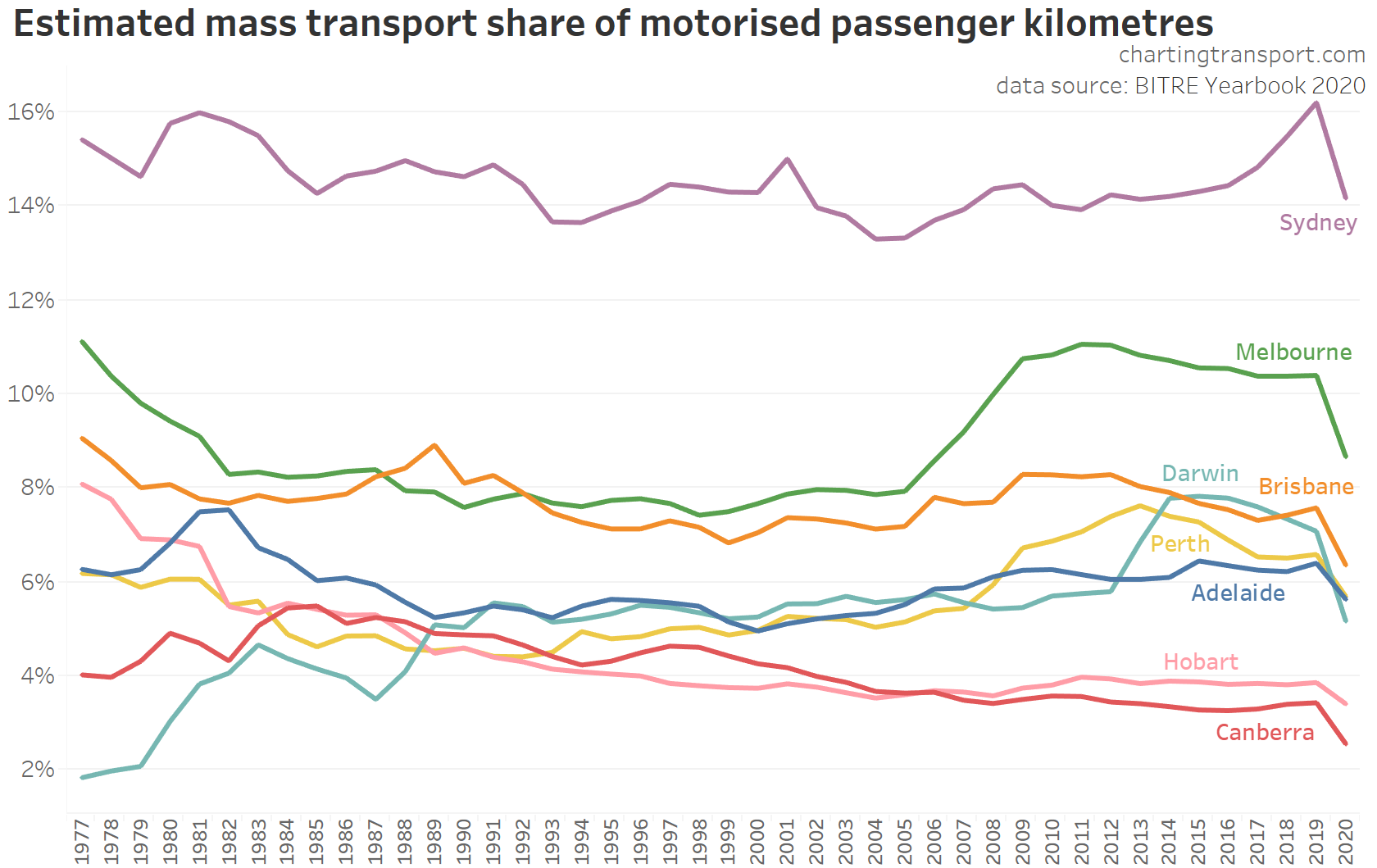
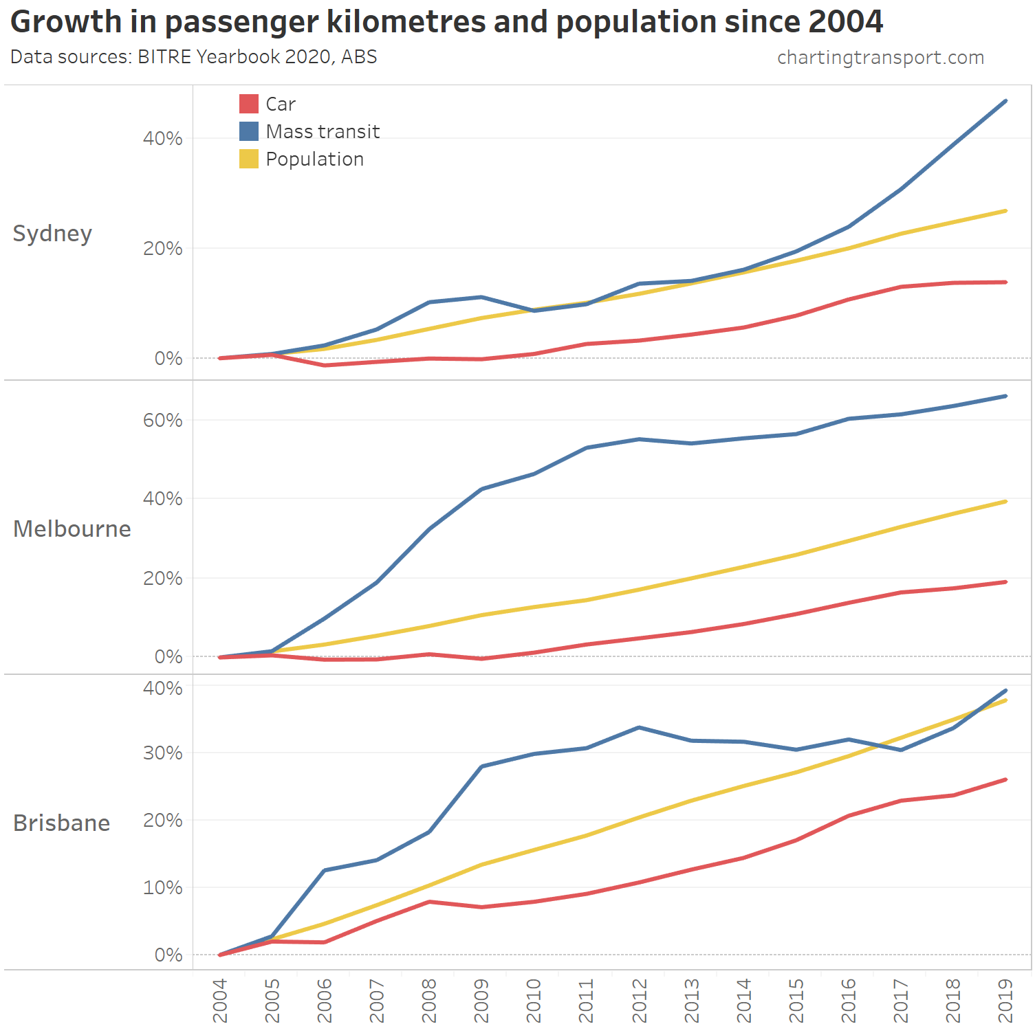
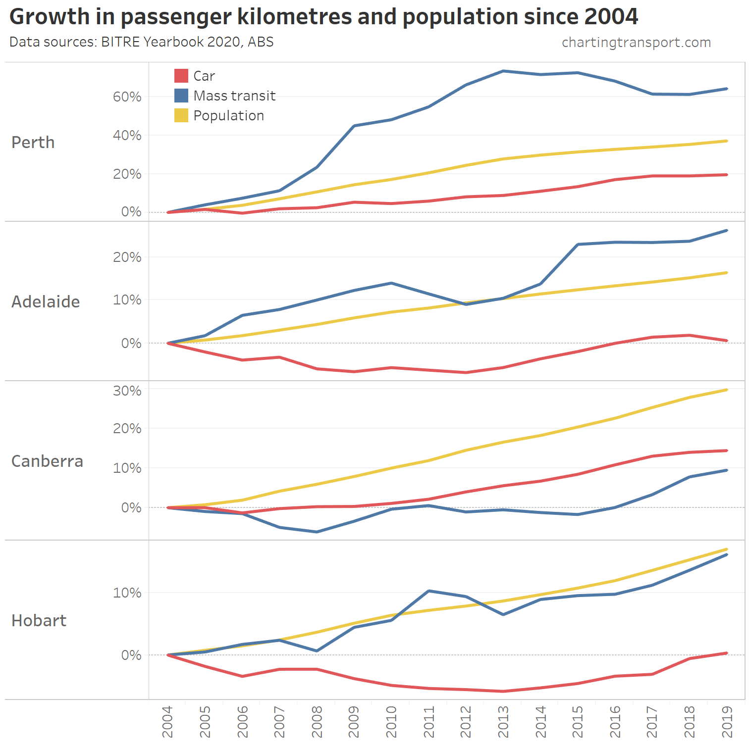
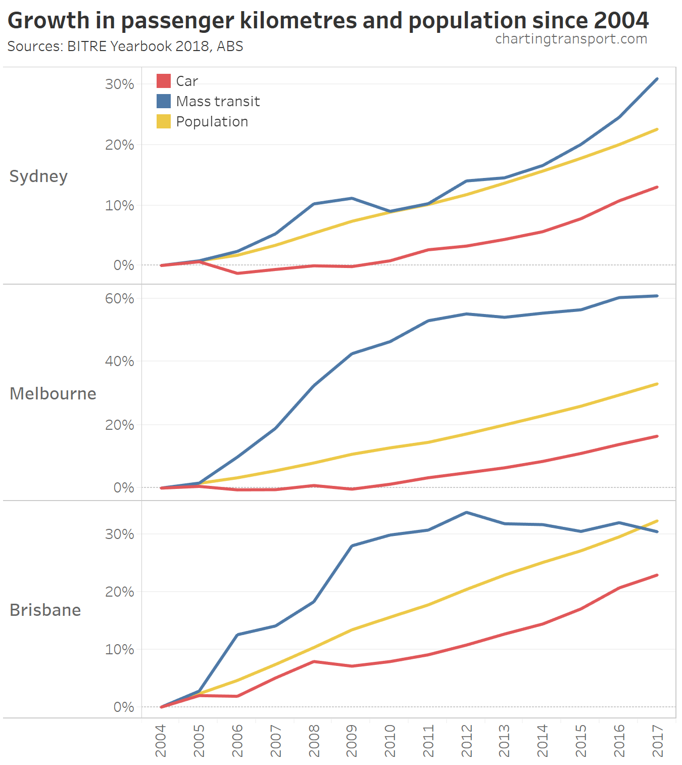
Mass transit mode share of passenger kilometres
It is possible to calculate the ratio of “mass” transit passenger kms (rail, light rail, ferry, and bus) against total passenger kms in cities, which essentially provides a mode share. Note however that this will include estimates of private bus travel, so it’s not exactly public transport mode share, but probably not far off.
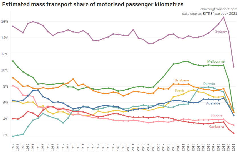
The pandemic has led to significant falls in mass transit mode share in all cities, with perhaps the largest reduction in Melbourne (again, likely related to the second wave lockdown in 2020-21).
As I’ve shown on this blog several times, a significant portion of public transport travel is around journeys to work and education in city centres, a trip type that became a lot less frequent during the pandemic as people work and learn from home. The removal of these trips from total travel has undoubtedly shifted the overall mode share calculation.
What’s not yet clear to me is the extent to which trips not suppressed by the pandemic might have shifted from public to private transport, and whether these trips might shift back to public transport “after” the pandemic (assuming there comes a time when there is no longer heightened infection fear).
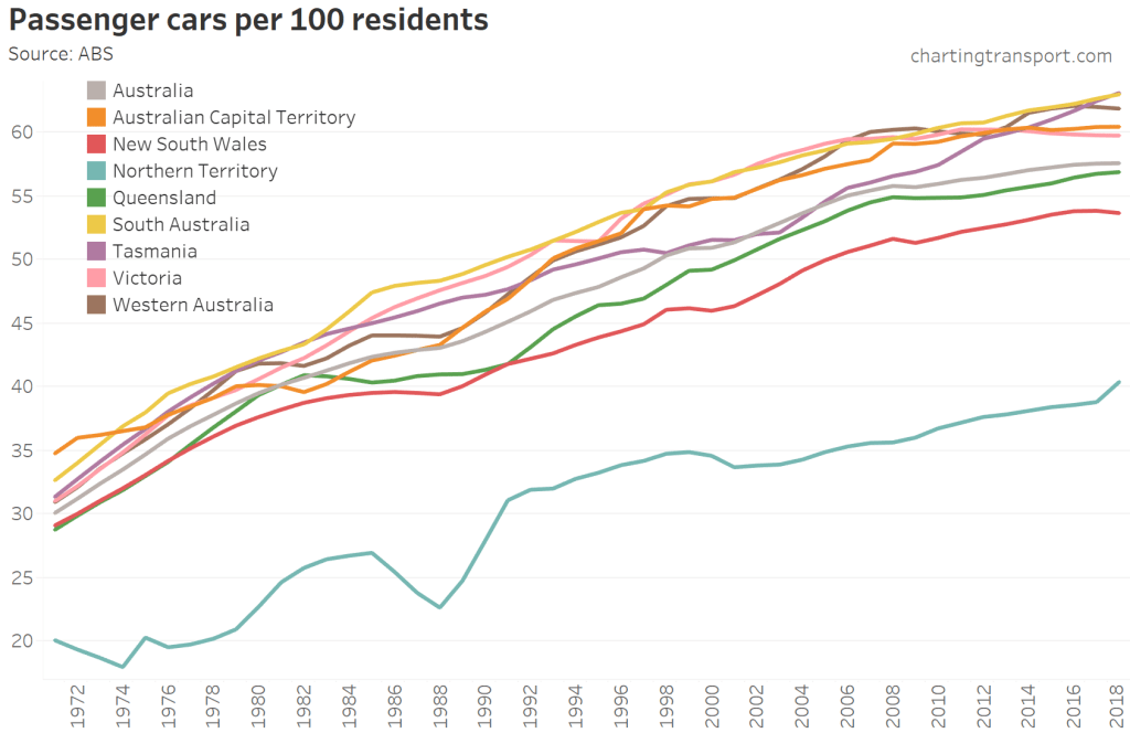
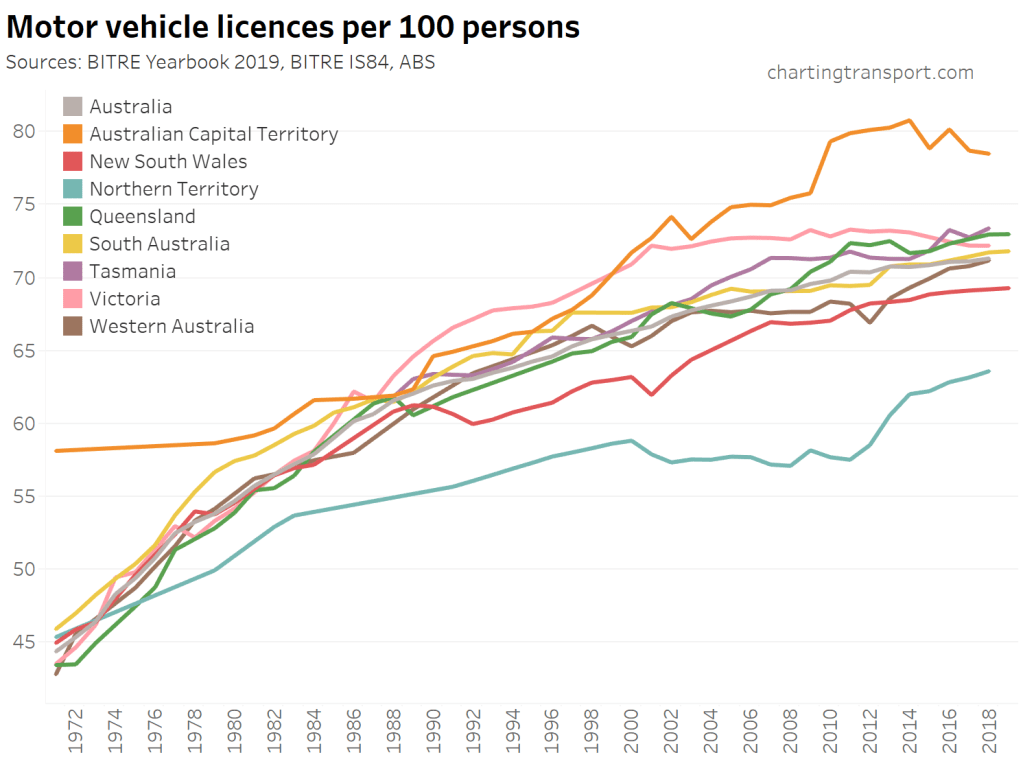
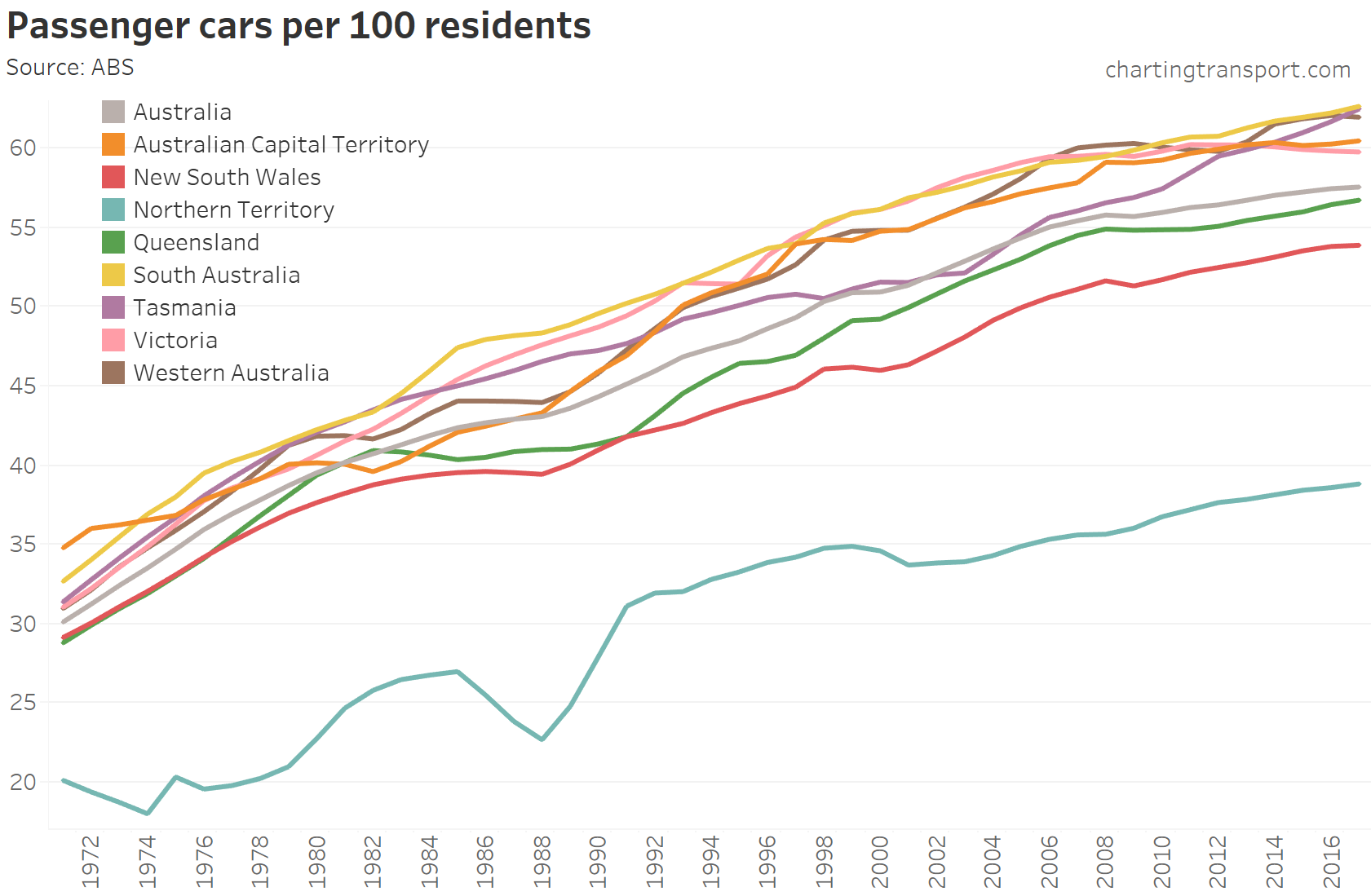
Car ownership
The following charts use vehicle count data from the ABS Motor Vehicle Census, with January 2021 unfortunately the last census taken (although hopefully Austroads take over in 2022). I’ve calculated per capita car ownership using interpolation from the most recent ABS population estimates at the time of writing.
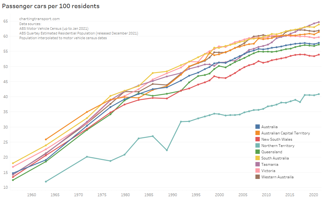
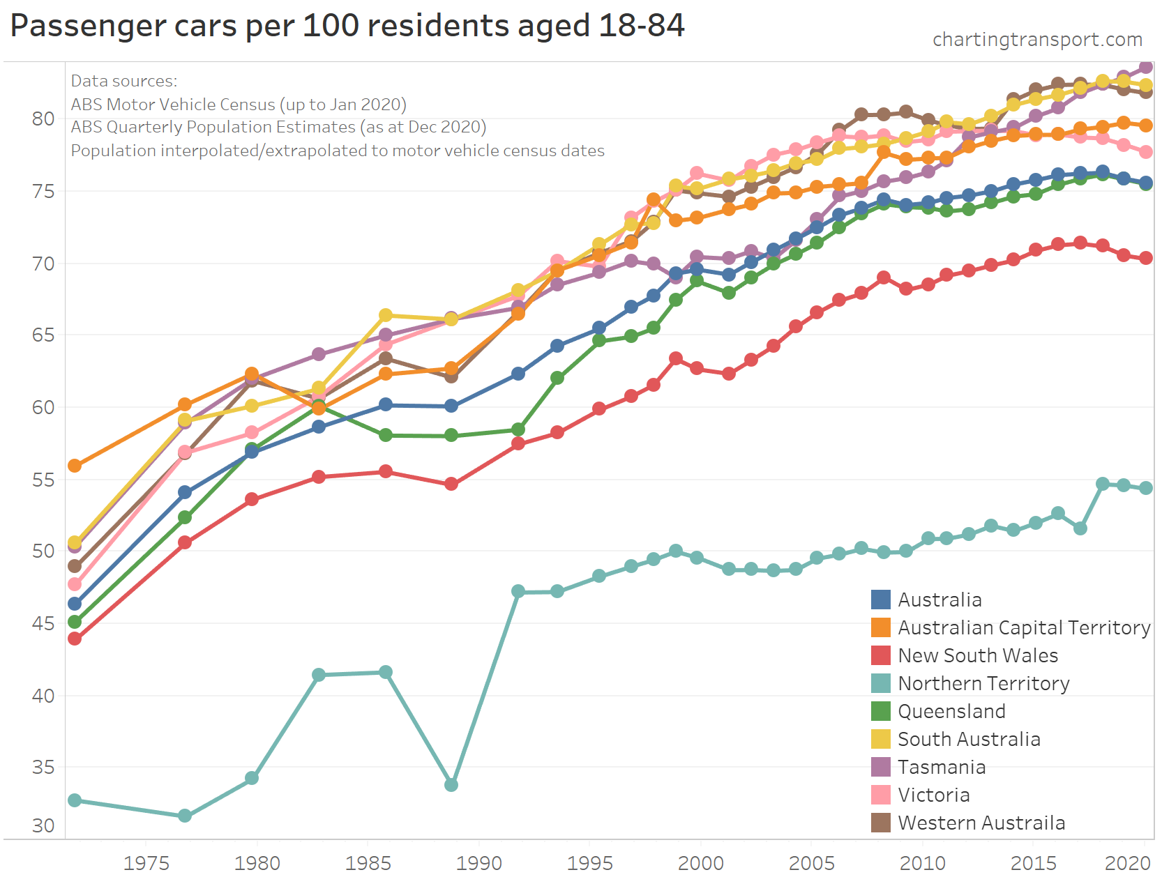
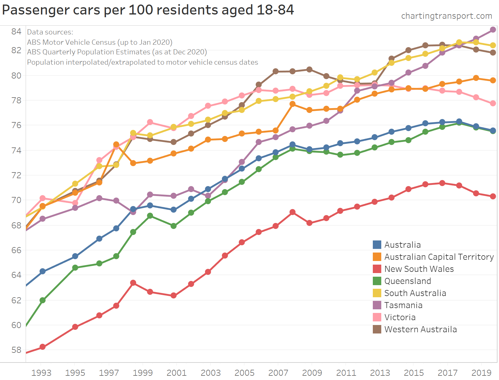
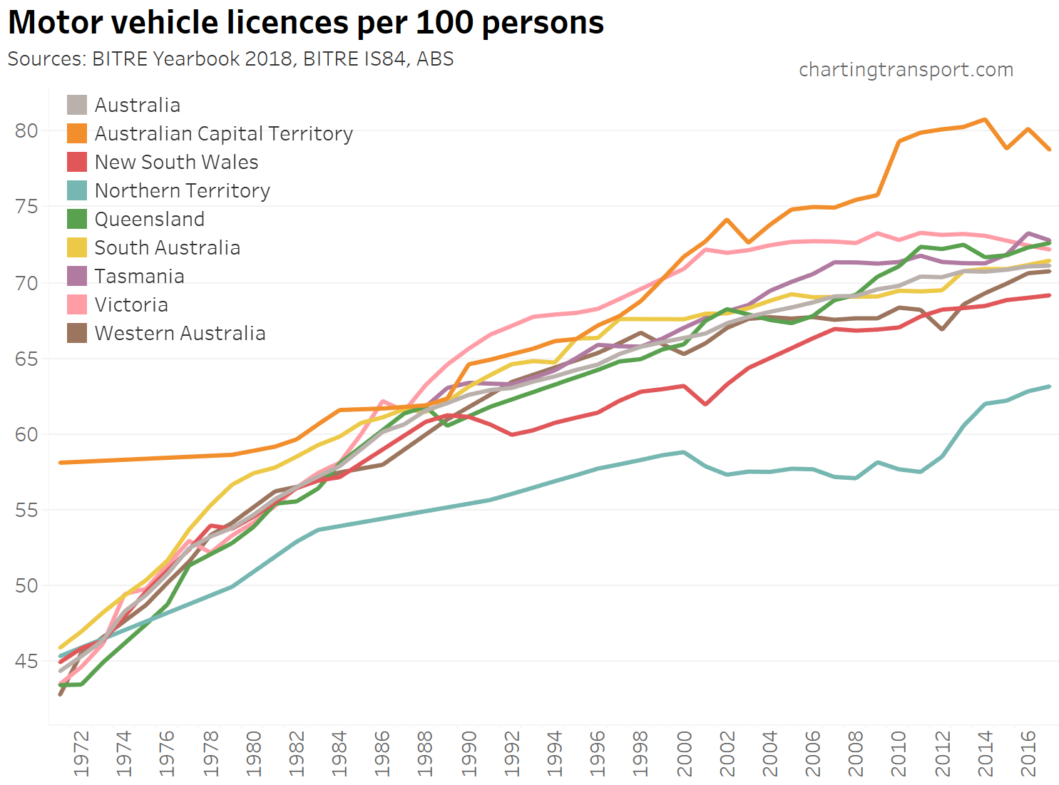
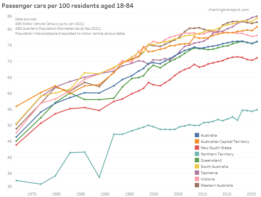
Not everyone is of driving age, so I usually also look at motor vehicles per 100 residents aged 18-84, as an approximate representation of people of driving age:
Here’s a closer look at the last few decades:
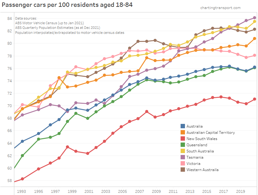
Motor vehicle ownership has risen considerably since the survey began. However from around 2017 until the pandemic it actually decreased in most Australian states and territories (Tasmania an exception).
There has been a small but significant uptick in motor vehicle ownership in January 2021 in all states. As I mentioned in my recent blog post on motor vehicle ownership by age, I see two likely main reasons for this:
- A lack of recent international immigrants during the pandemic – who generally have very low rates of motor vehicle ownership in the first years in Australia, and are skewed towards young adult age bands which themselves also have lower rates of motor vehicle ownership in general.
- A mode shift from public transport, as people want to avoid the risk of catching COVID19 on public transport (whether this risk is large or small). However with working/learning from home, it’s hard to know how much of this is mode shift of continued trips, versus trips of certain modes not being made as often.
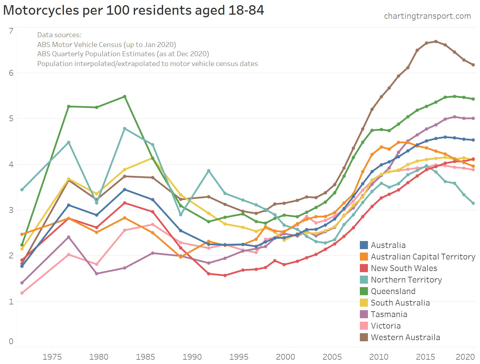
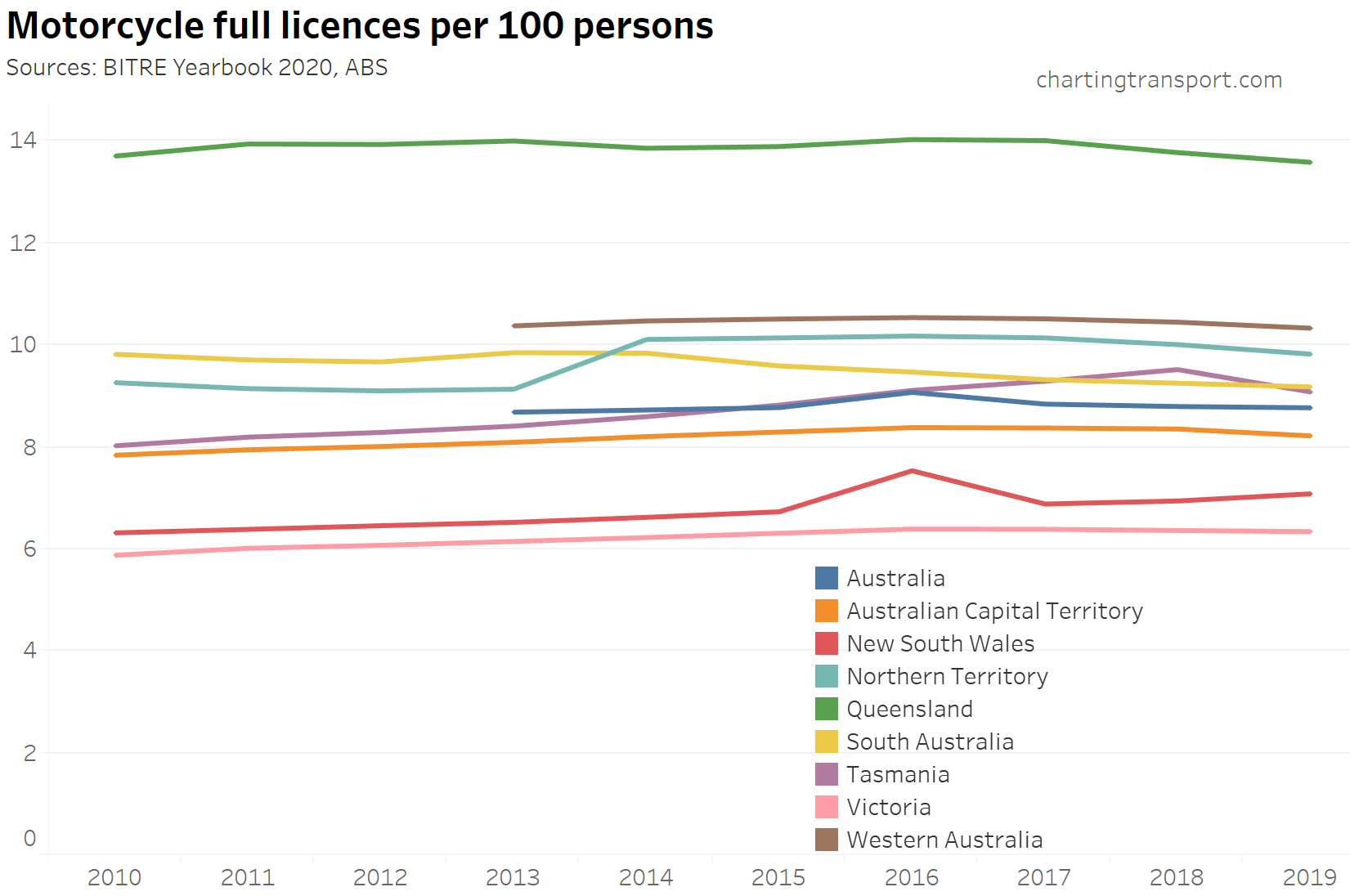
Motorcycle ownership
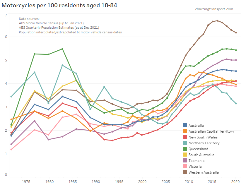
This chart shows a slightly different pattern to that of motorcycle passenger kilometres per capita in cities (above). Ownership and usage bottomed out around the 1990s or 2000s (depending on the state/city). However ownership has risen in most states since then, but usage apparently peaked around 2009 in most cities. This perhaps suggests motorcycles are now more a recreational – rather than everyday – vehicle choice. But I really don’t follow motorcycle trends closely so cannot be too sure.
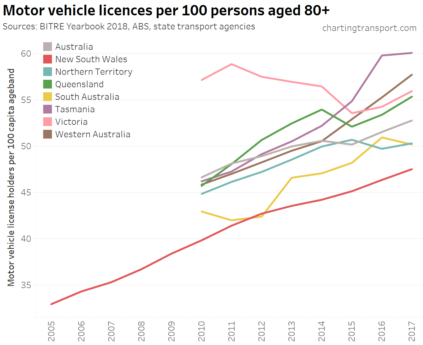
Driver’s licence ownership
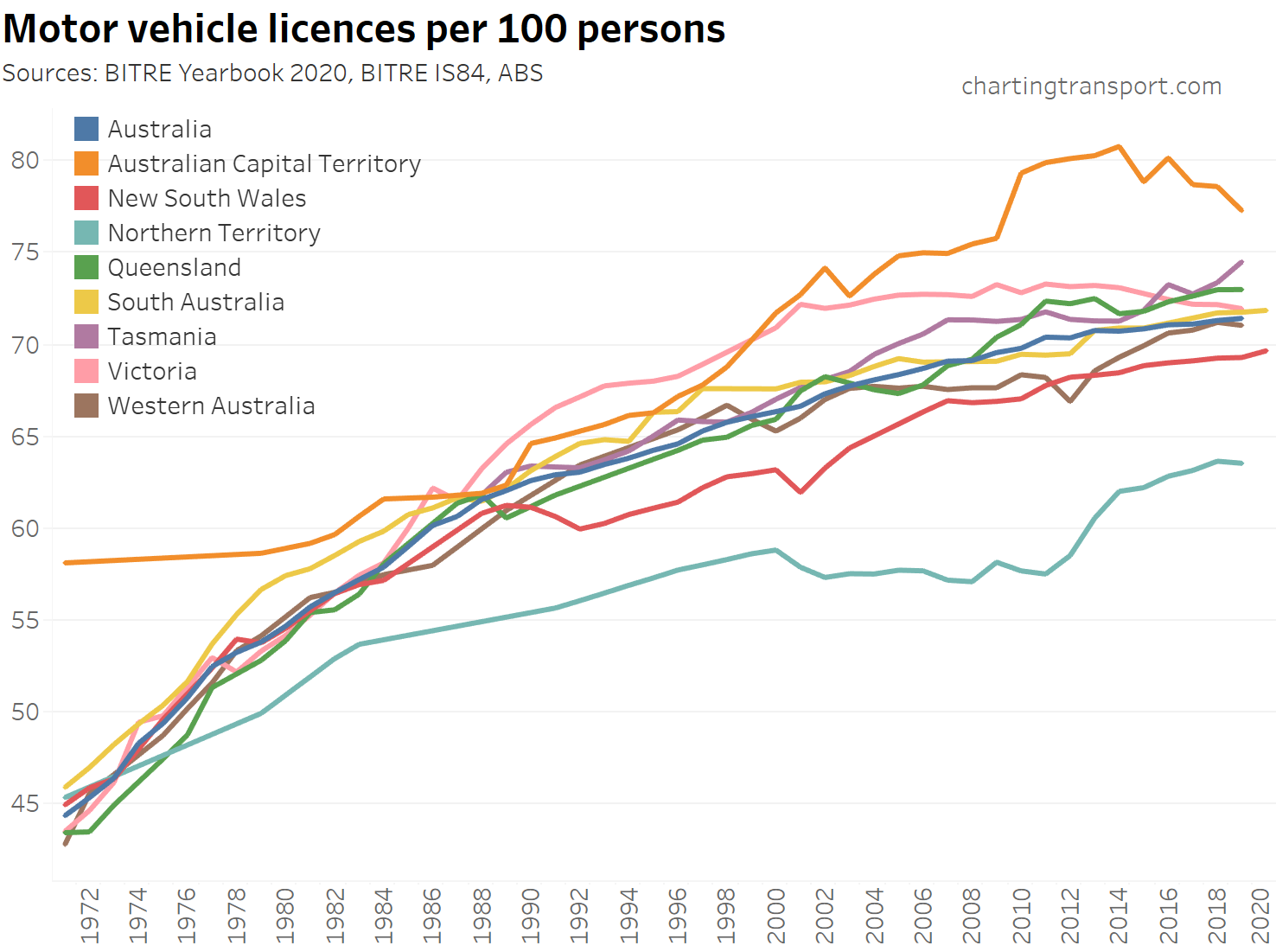
Thanks to BITRE Information Sheet 84, the BITRE Yearbook 2021, and some useful state government websites (NSW, SA, Qld), here is motor vehicle licence ownership per 100 persons (of any age) from June 1971 to June 2020 or June 2021 (only some state agencies have published 2021 data at the time of writing):
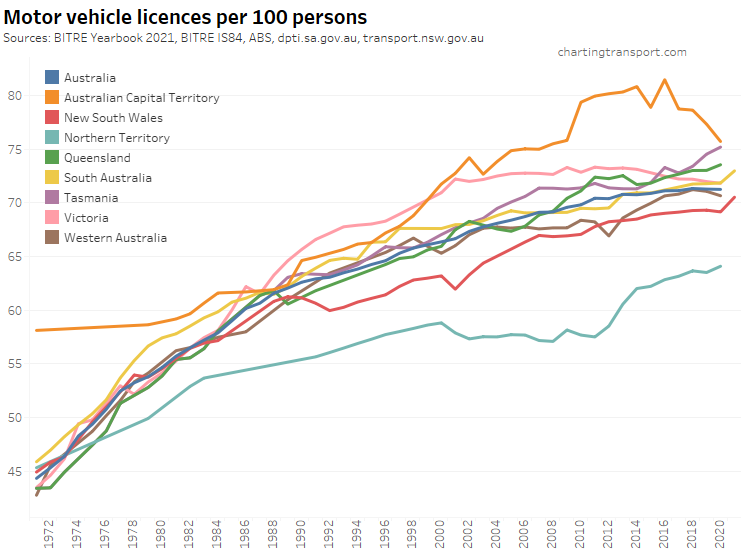
Technical note: the ownership rate is calculated as the sum of car, motorbike and truck licenses – including learner and probationary licences, divided by population. Some people have more than one driver’s licence so it’s likely to be an over-estimate of the proportion of the population with any licence.
There’s been slowing growth over time, although Victoria has actually seen slow decline since 2011, and the ACT peaked in 2016.
However in both states with 2021 data (South Australia and New South Wales) there was a significant uptick in 2021 of more than 1 licence per 100 people. This is likely related to the pandemic – either more people opting for a driver’s licence to shift away from shared modes, and/or a lack of recent immigrants (many were young adults) who usually take some time to get their licence. I would not be surprised to see similar trends in other states when data is made available.
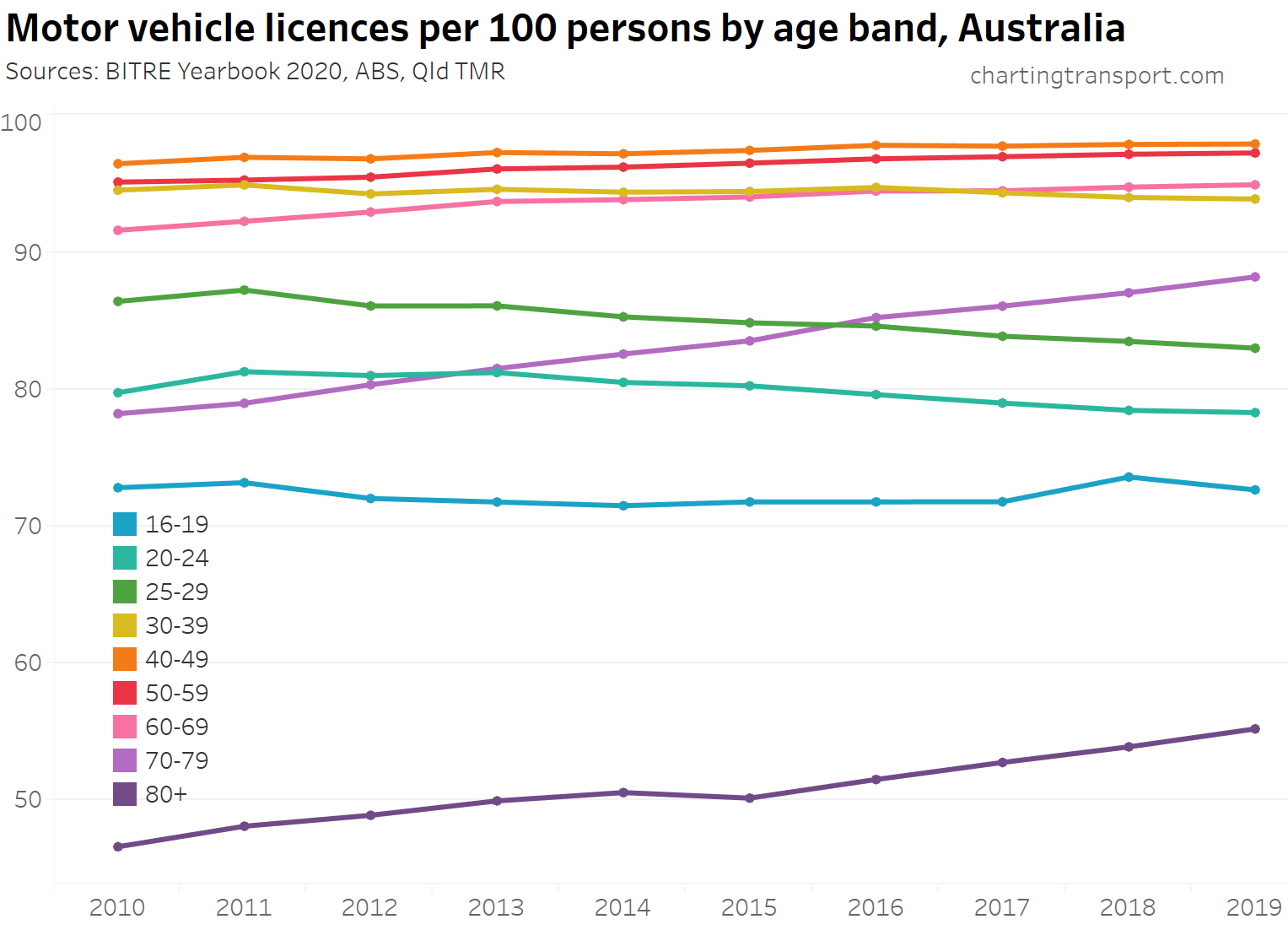
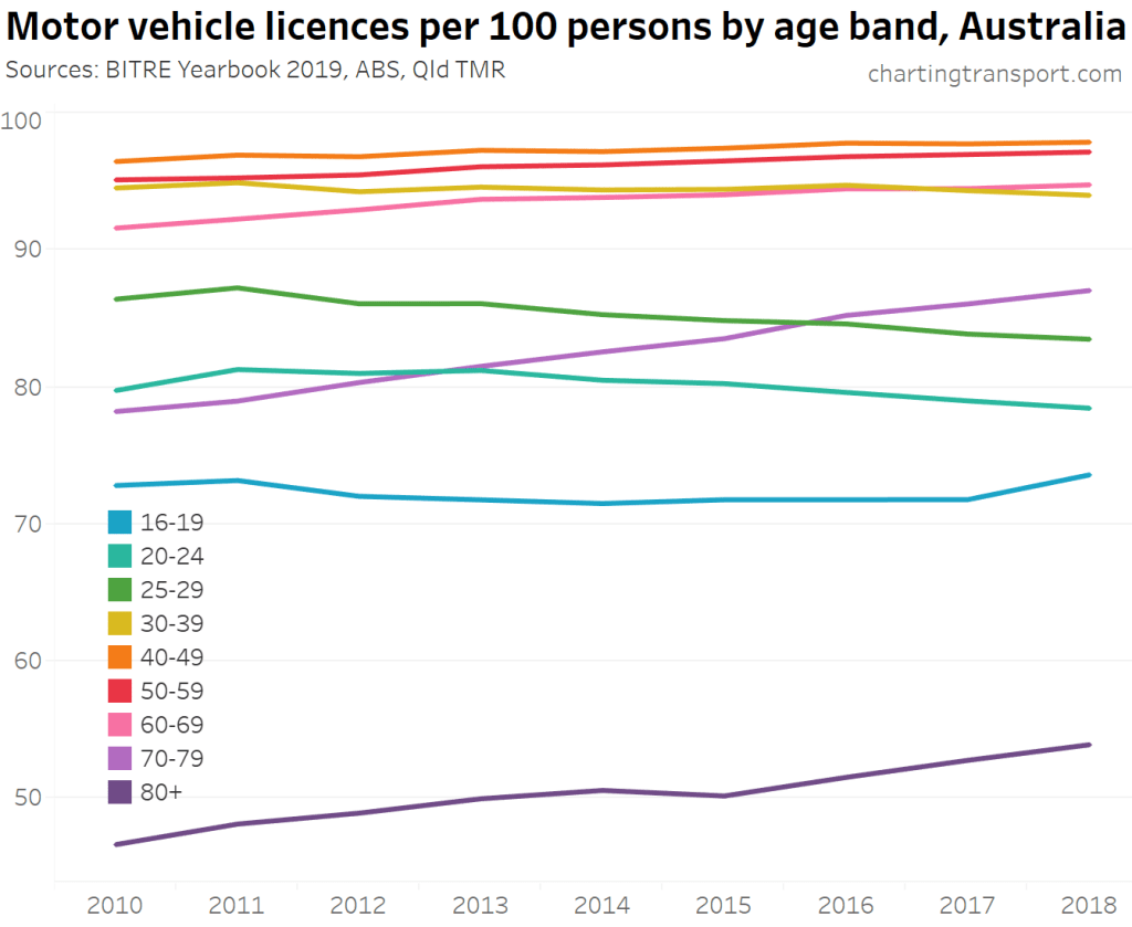
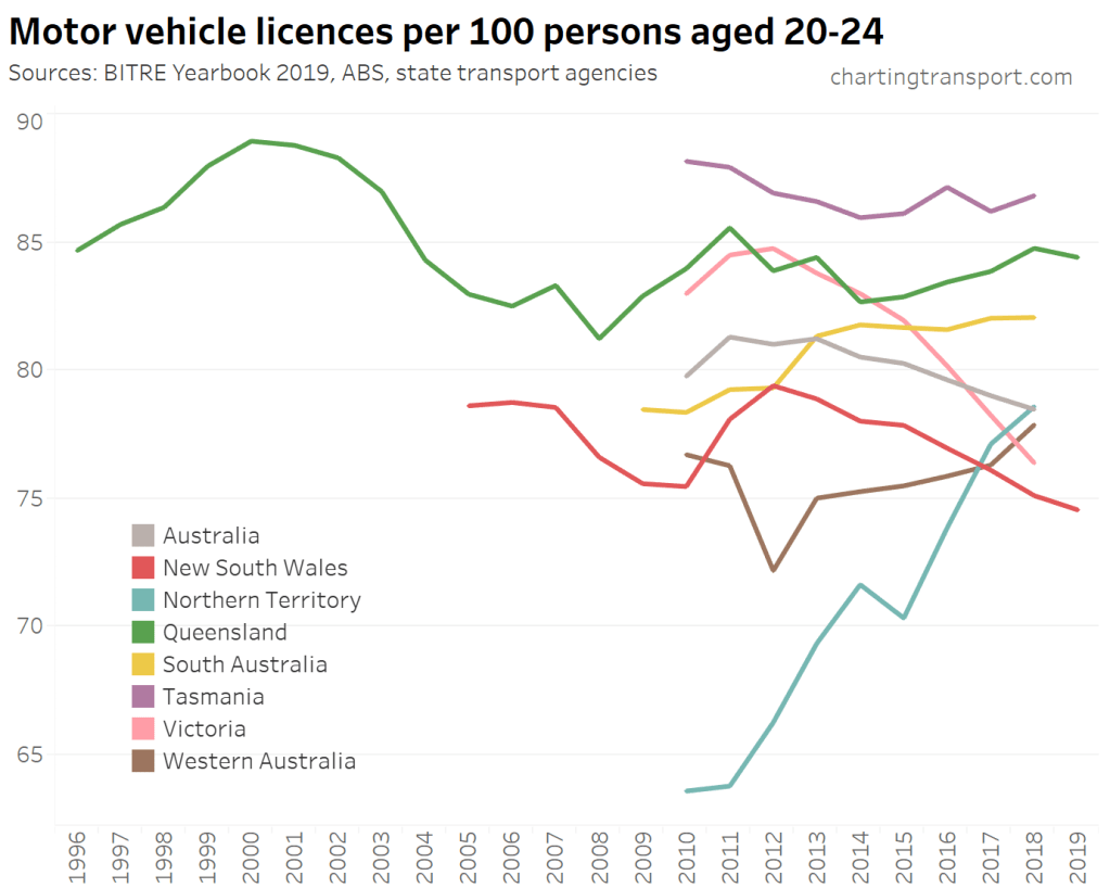
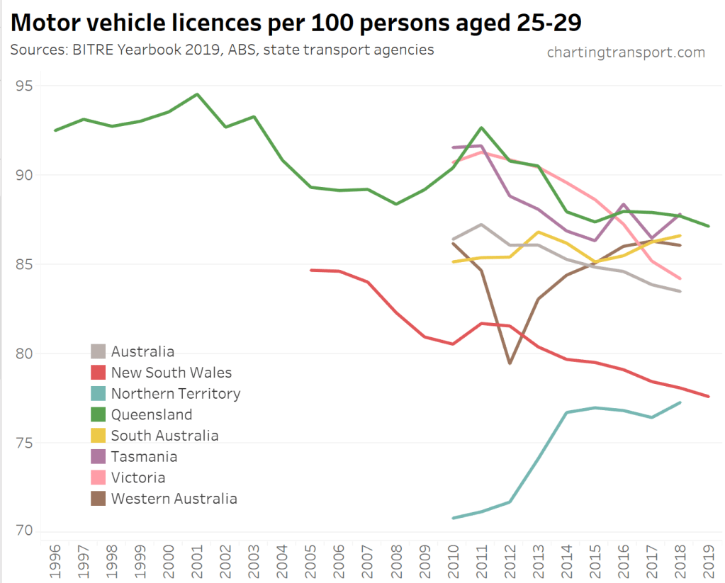
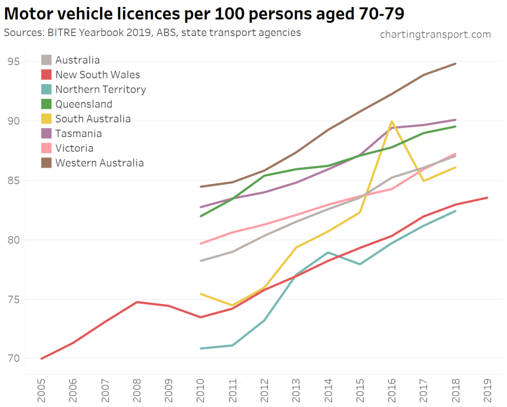
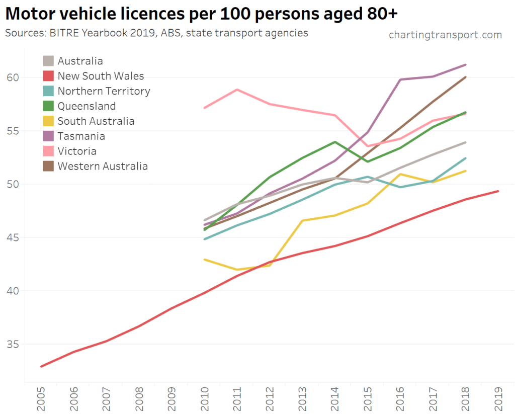
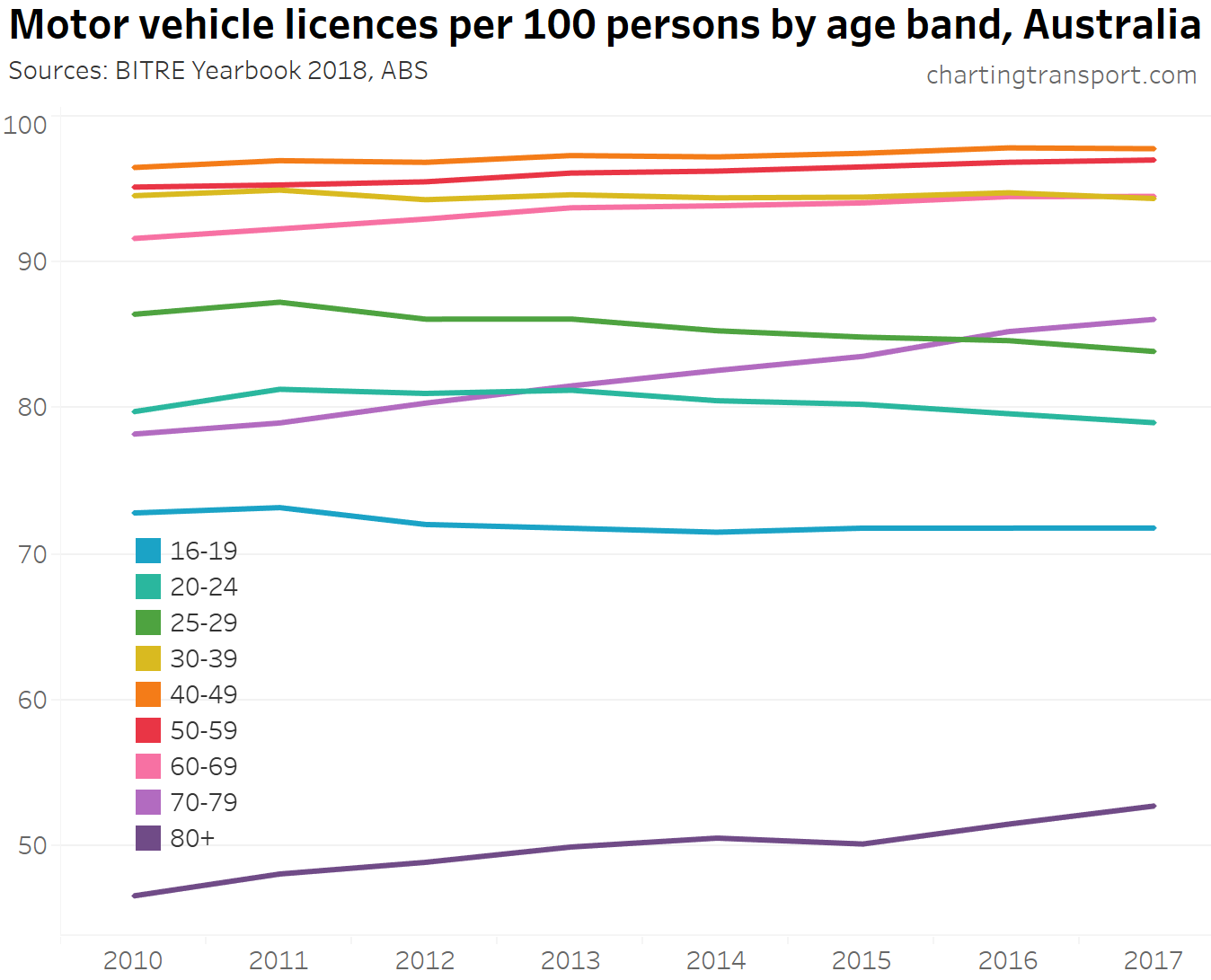
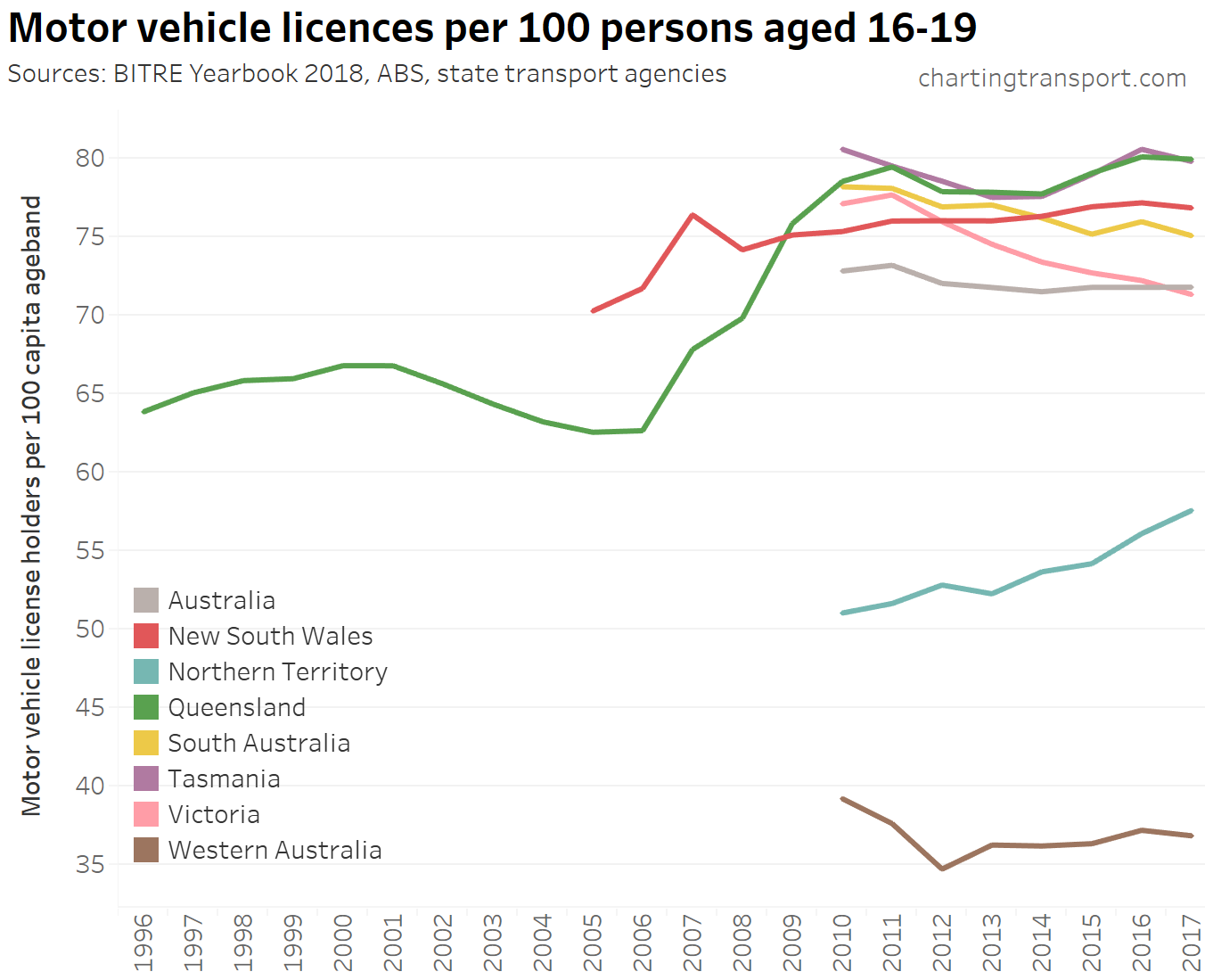
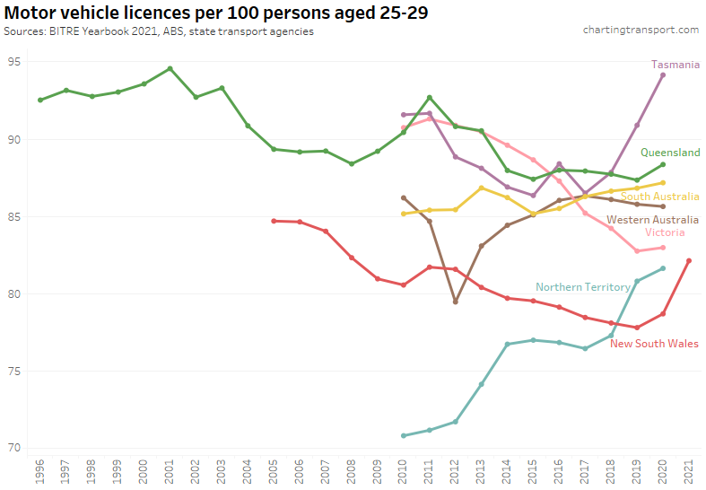
Here’s a breakdown by age bands for Australia as a whole:
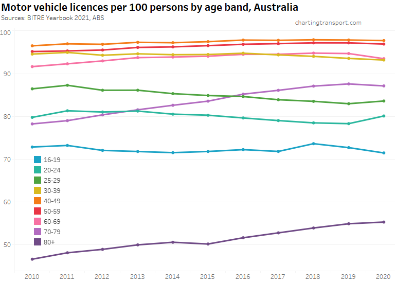
Licencing rates had been increasing over time for those aged over 40 (most strongly for those aged over 70) up until 2019, but that changed for the 60-69 and 70-79 bands in 2020.
Licencing rates had been declining for those aged under 40 until 2019, although there was a notable uptick in licence ownership for 16-19 year-olds in 2018, and increases in 2020 for those aged 20-29.
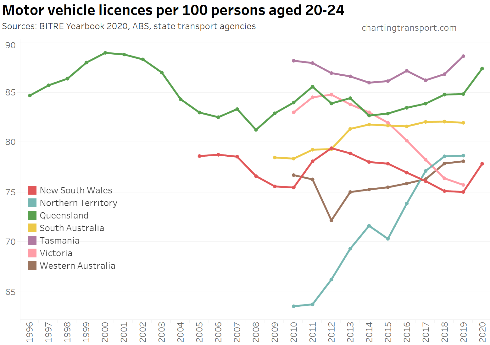
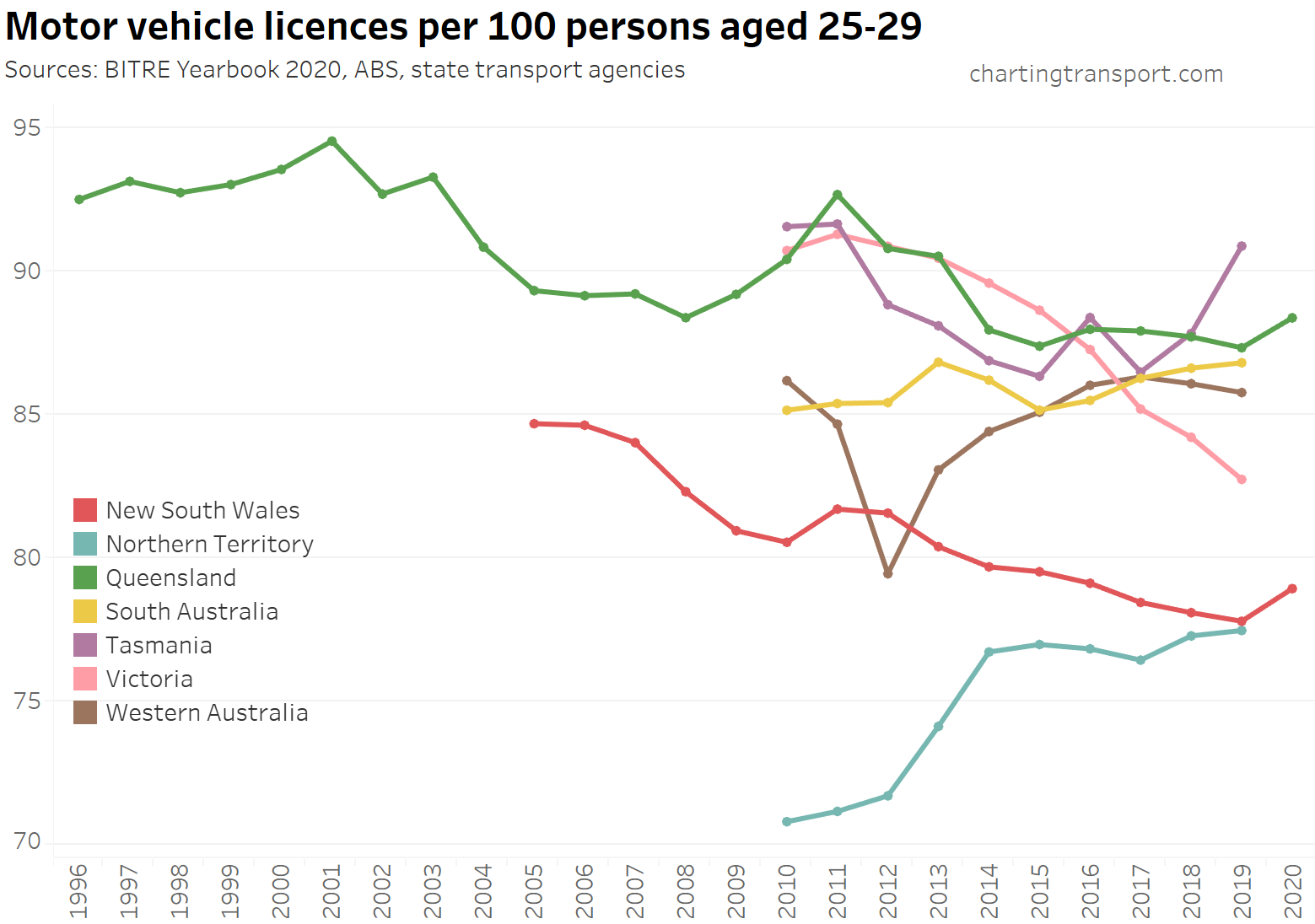
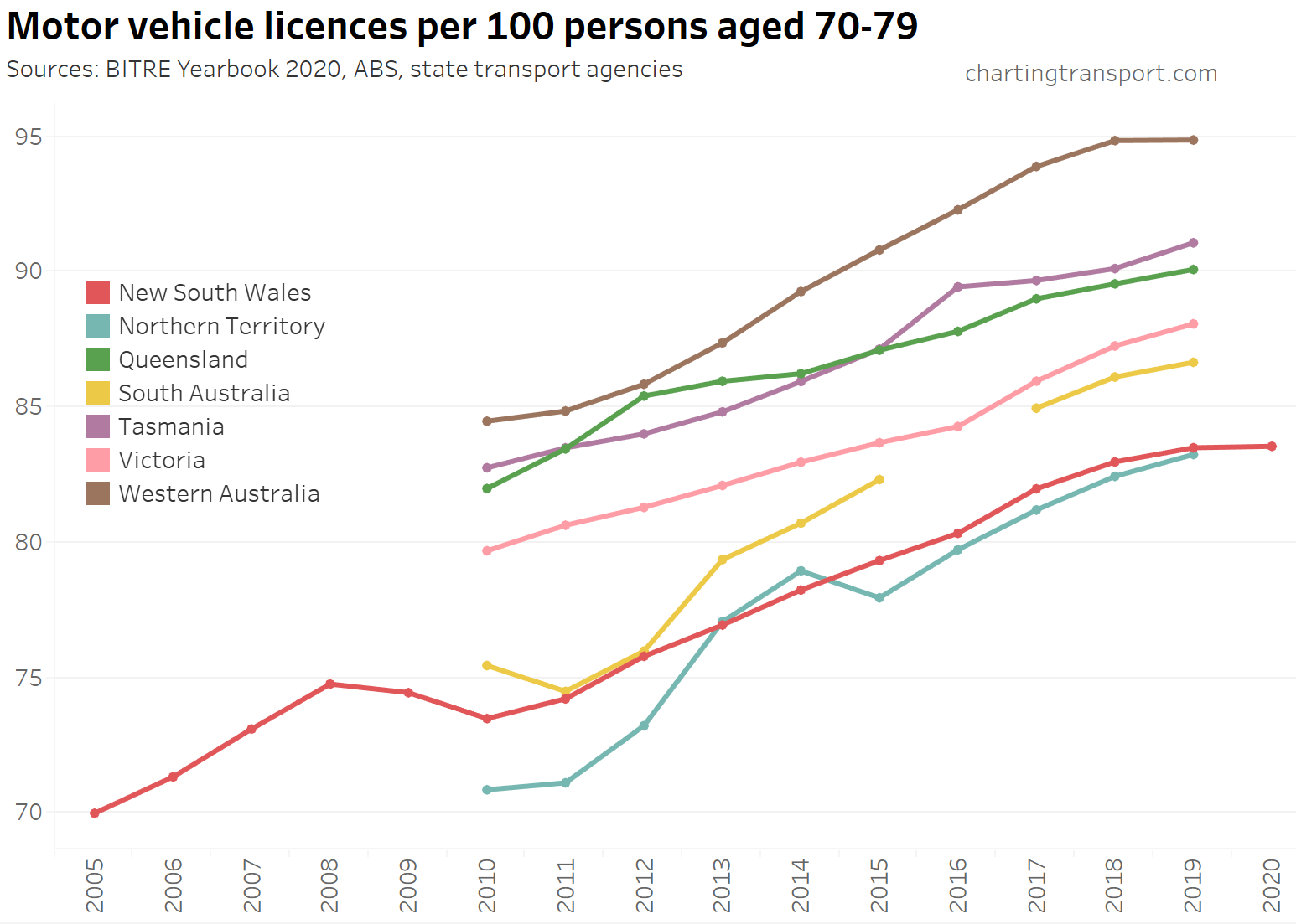
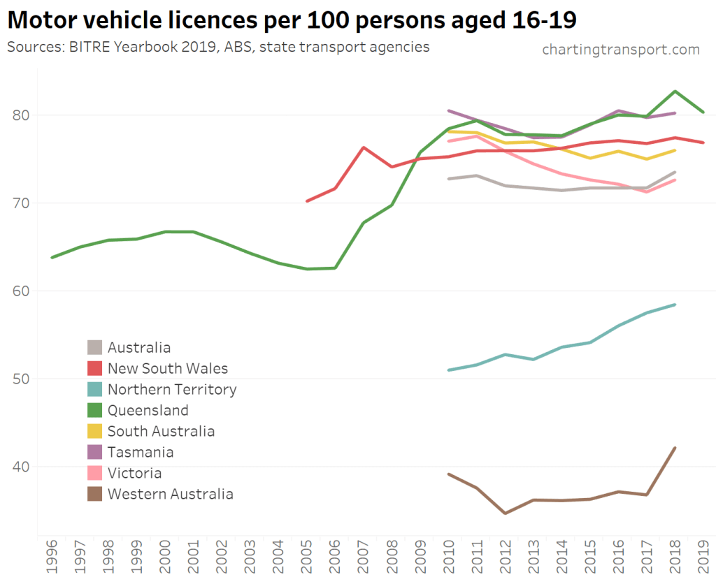
However the above charts show national trends that can wash out variations at the state level. So let’s break it down for states per age band:
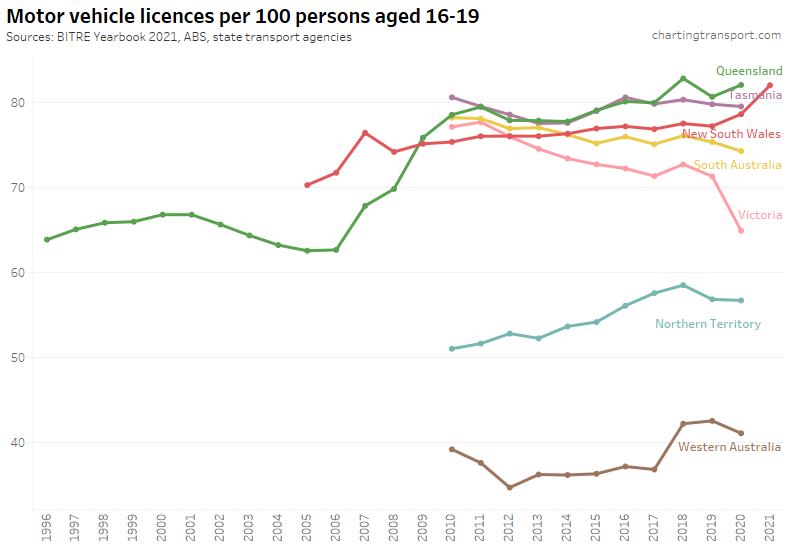
Licence ownership rates for teenagers has been declining significantly in Victoria, with a large fall in 2020. There were also declines in 2020 in Tasmania, South Australia and Western Australia. NSW had a significant increase in 2020, and even more so in 2021.
Note: the differences between states for this age band at least partly reflect different minimum ages for licencing.
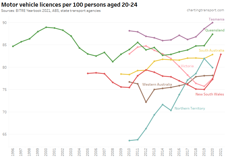
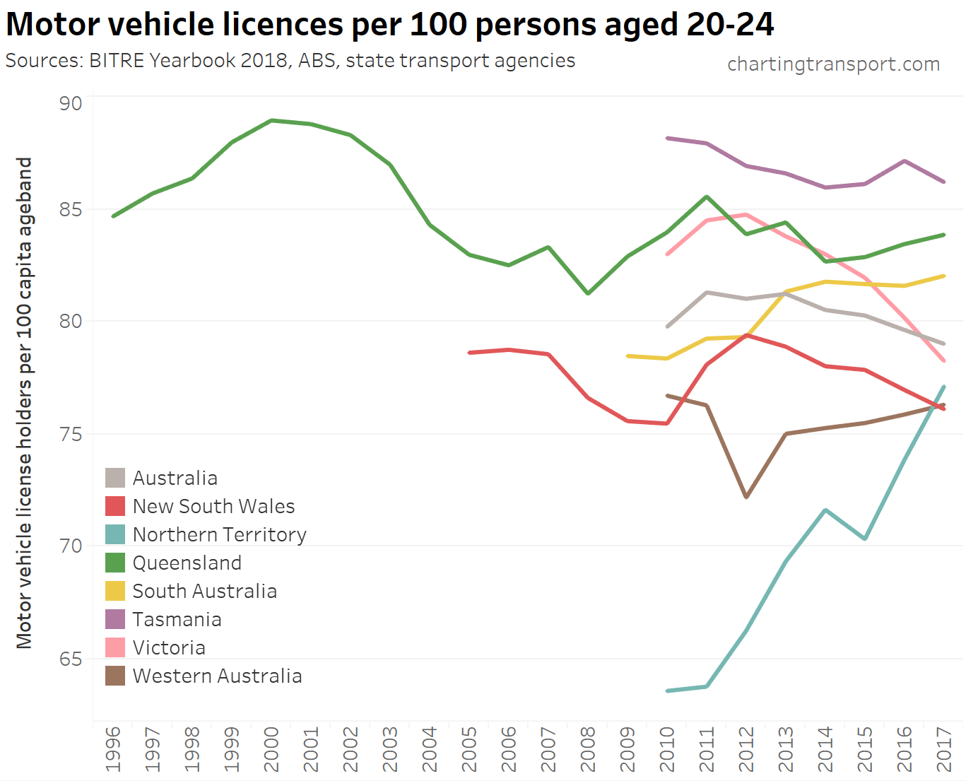
The largest states of Victoria and New South Wales were trending downwards until 2019, but have since shot back up, quite spectacularly in NSW. This might partly reflect the absence of new immigrants who generally have low levels of driver’s licence ownership. There may also be issues with ABS’s population estimates in the unprecedented pandemic.
All states showed an increase in 2020 except the Northern Territory.
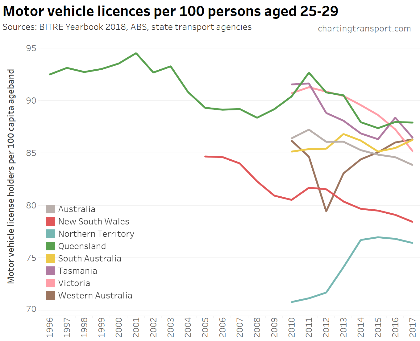
Victoria and New South Wales did have a downwards trend in this age band, but that turned around in 2020. Tasmania and the ACT have shot up since 2017.
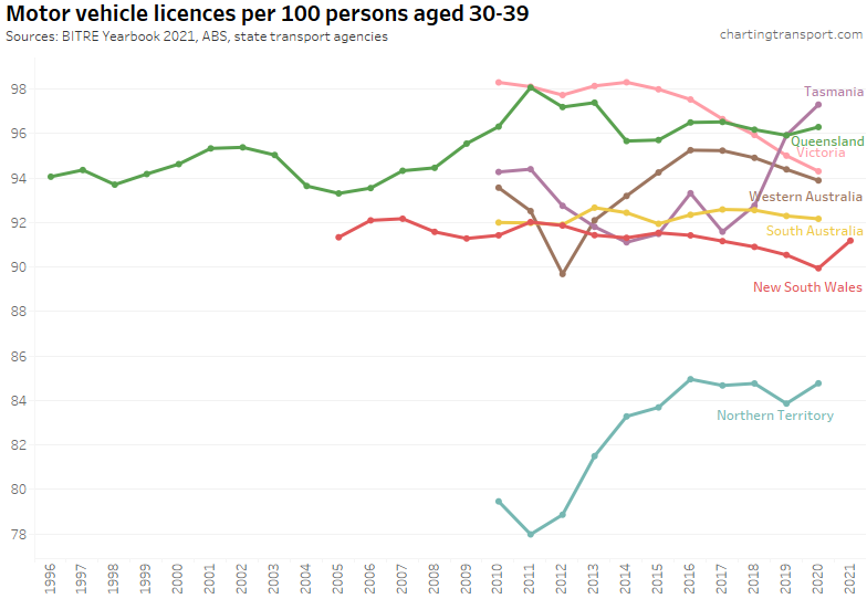
Licence ownership for those in their 30s had been declining in NSW, SA, WA and Victoria up to 2020, with NSW again showing an uptick in 2021. Tasmania has seen strong growth in recent years.
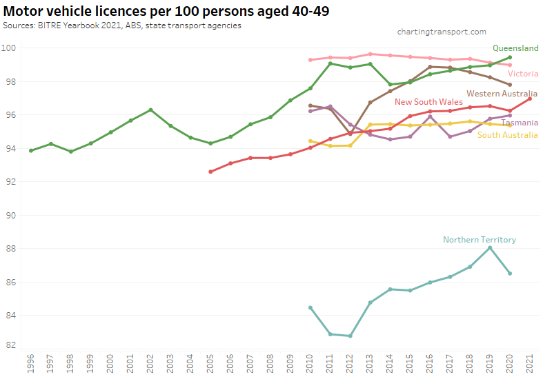
Licence ownership for those in their 40s was declining slightly in SA, Victoria, and WA until 2020, but was still very high. NSW had a smaller uptick in this age band in 2021, compared to younger age bands.
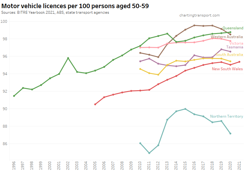
Licence ownership for those in their 50s was declining slightly until 2020 in most states (except Queensland and Tasmania). NSW had a relatively small uptick in 2021 compared to younger age bands.
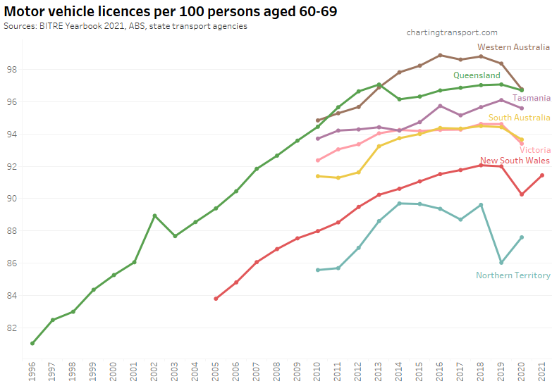
Licence ownership for those in their 60s was slowly growing in most states until 2019 but then fell in 2020 with the pandemic. The 2021 uptick in NSW did not fully recover from the drop in 2020.
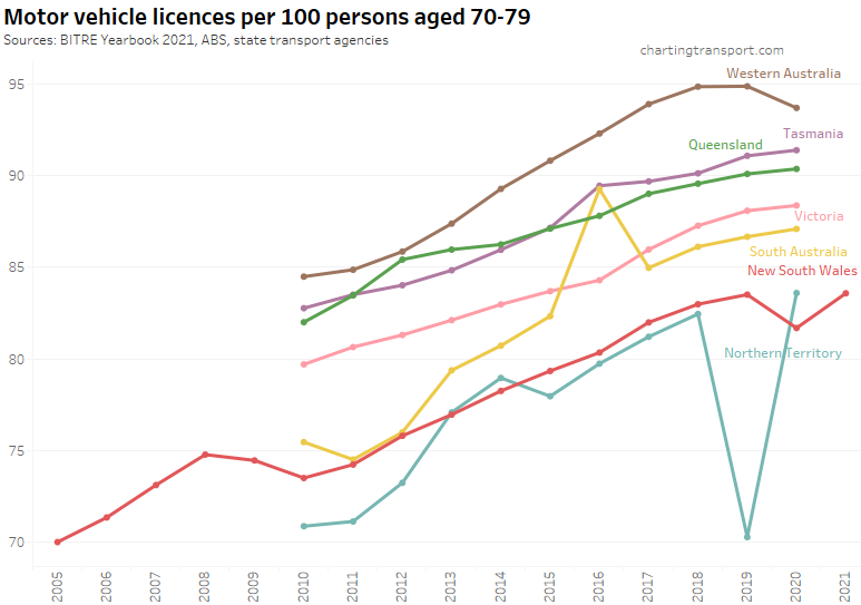
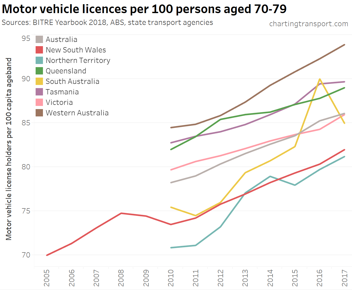
Licencing rates for those in their 70s have been growing strongly in all states (except recently in WA). NSW saw a dip in 2020, but bounced back in 2021. I suspect a data error for NT in 2019.
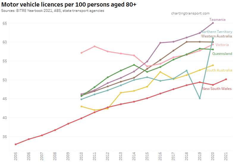
Licencing rates for those over 80 were increasing in most states to 2020, and NSW only had a small dip in 2020.
New South Wales is the first state to give us insights into the impact of the pandemic, so here is a look at the licencing trends per age band in that state:
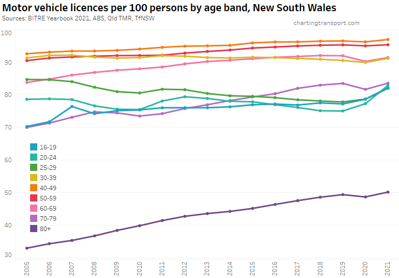
You can see more clearly the big growth for those aged under 30 (people who generally used public transport more often before the pandemic), whilst older age groups (60+) saw a temporary decline in licence ownership in 2020 with a bounce-back in 2021.
See also an older post on driver’s licence ownership for more detailed analysis.
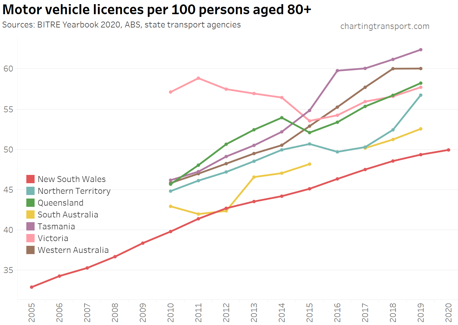
For completeness, here is a chart showing motorcycle full licence ownership rates:
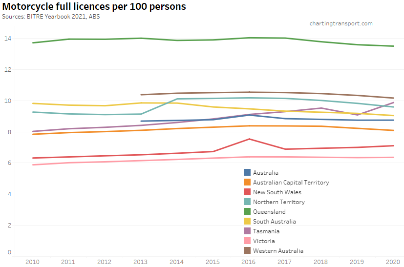
Queensland has two types of motorcycle licence and I suspect many people hold both, which might explain a licence ownership rate being so much higher than other states.
Freight
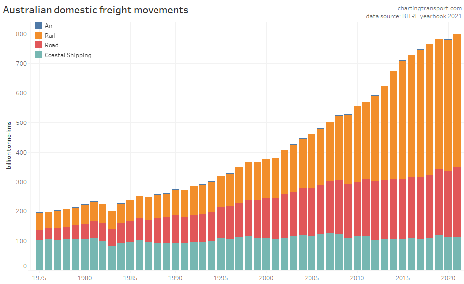
There has been a massive increase in domestic freight volumes since the 1970s, and according to this data, rail has accounted for most of this growth in recent decades. However keep in mind that a majority of these freight-kilometres are bulk commodities (such as iron ore, coal, and grain) which are ideally suited to energy-efficient rail and coastal shipping. Indeed in 2020-21, road transport only moved 11% of bulk goods, and 93% of rail freight movements were bulk goods.
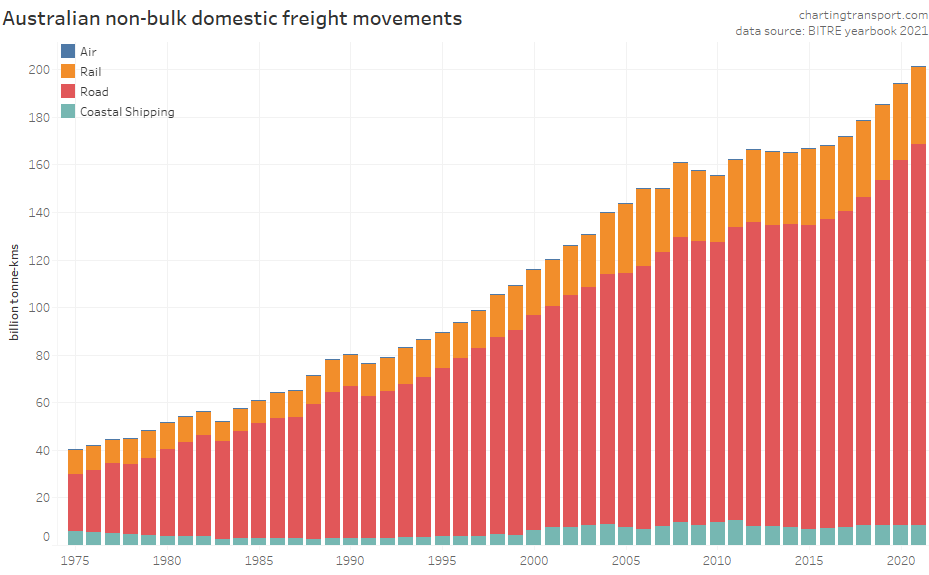
Here are the volumes for non-bulk freight movements, which are arguably more contestable:
And non-bulk freight mode shares:
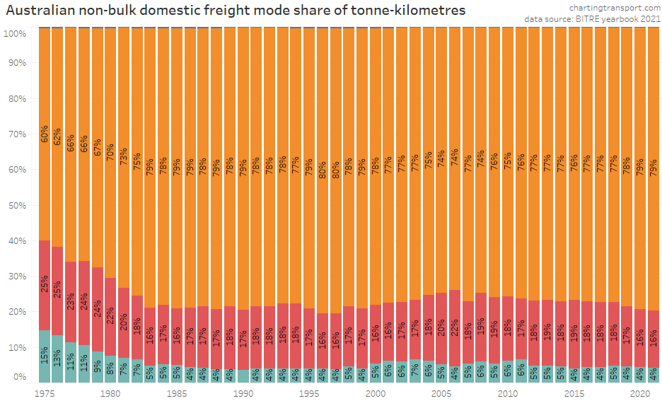
Road transport dominates non-bulk freight movements in Australia, while air freight is trivial in terms of volume (but probably non-trivial in terms of value). Coastal shipping’s mode share fell significantly in the late 1970s and early 1980s but has remained mostly around 4-6% since then.
Rail transport’s mode share of freight movements declined in the 1970s and 1980s, had a small peak of 22% in 2006, but has fallen back to 16% in 2021. That’s despite the estimated rail freight volume in 2020-21 being the highest of any year reported – it’s just that road volumes have grown even more.
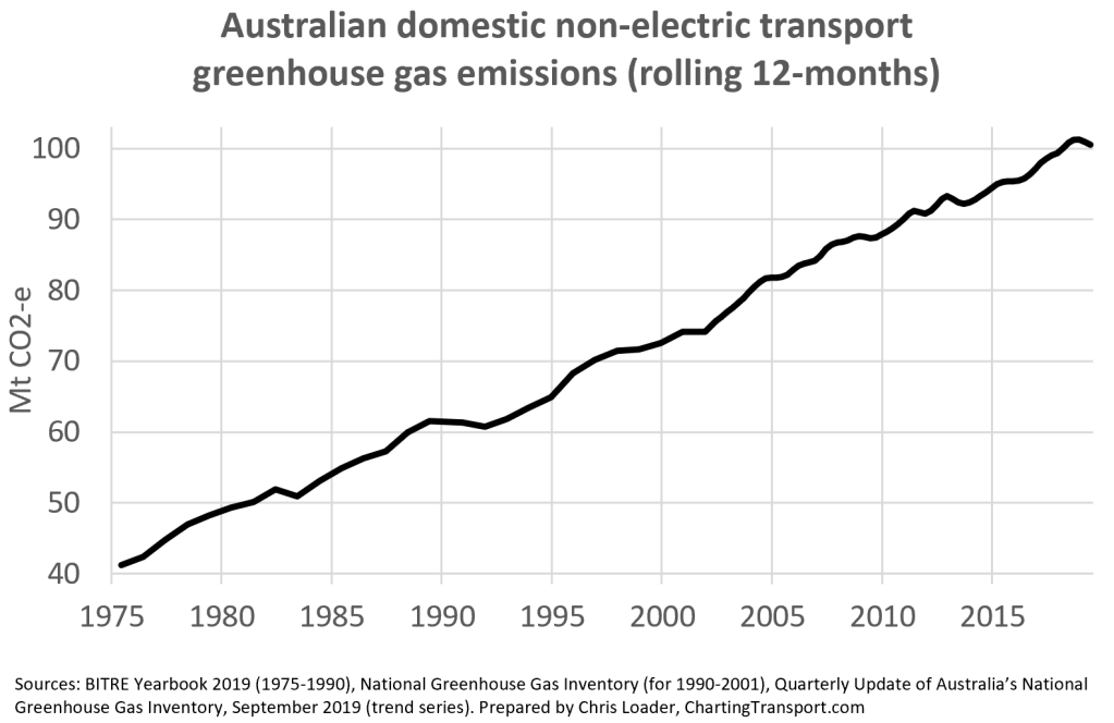
Transport greenhouse gas emissions
Total emissions
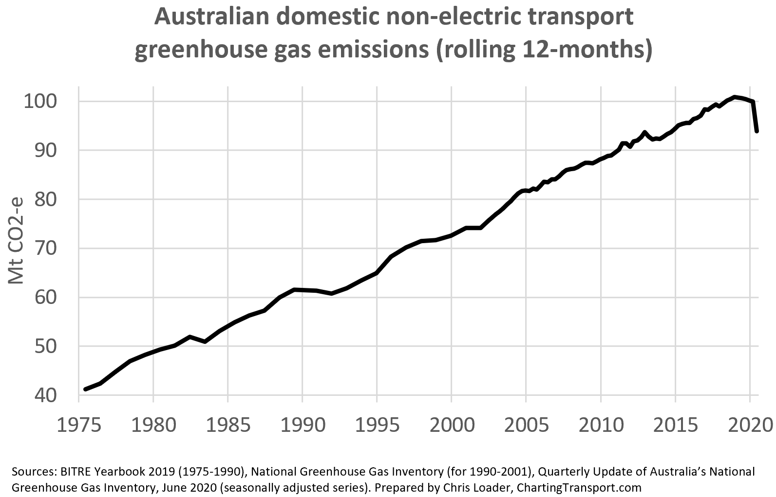
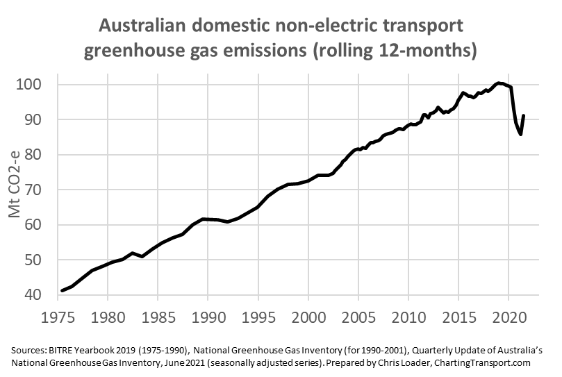
According to the latest quarterly figures, Australia’s domestic non-electric transport emissions peaked in around 2018, and had been slightly declining ahead of the COVID19 pandemic.
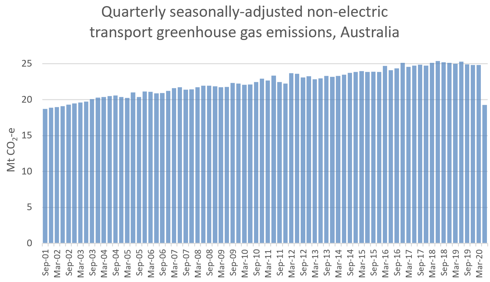
The above chart showing rolling 12-month figures, which hides the big and sudden changes in recent quarters. So here’s a look at seasonally-adjusted transport emissions by quarter:
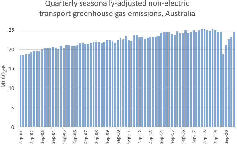
Data available at the time of writing was to June 2021, a quarter with fewer impacts from the pandemic (there were some lockdowns in Melbourne). As pandemic conditions eased (before the COVID19 delta wave in the second half of 2021), transport emissions shot back up to near-2019 levels. I expect we will see a decline in the September 2021 data as Victoria and NSW experienced COVID lockdowns. Reductions in Australia’s transport emissions so far appear to be only temporary.
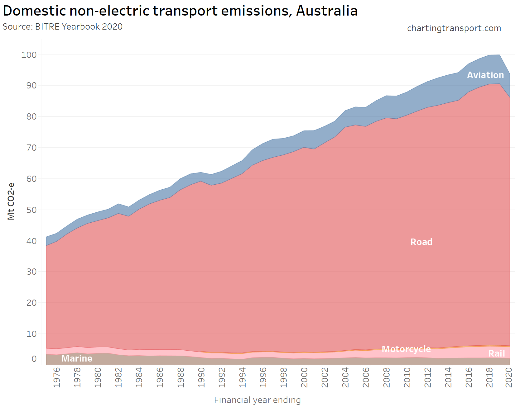
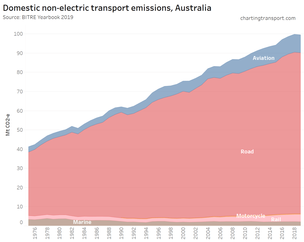
The next chart shows a long term trend of rapid rising annual transport emissions (according to BITRE data):
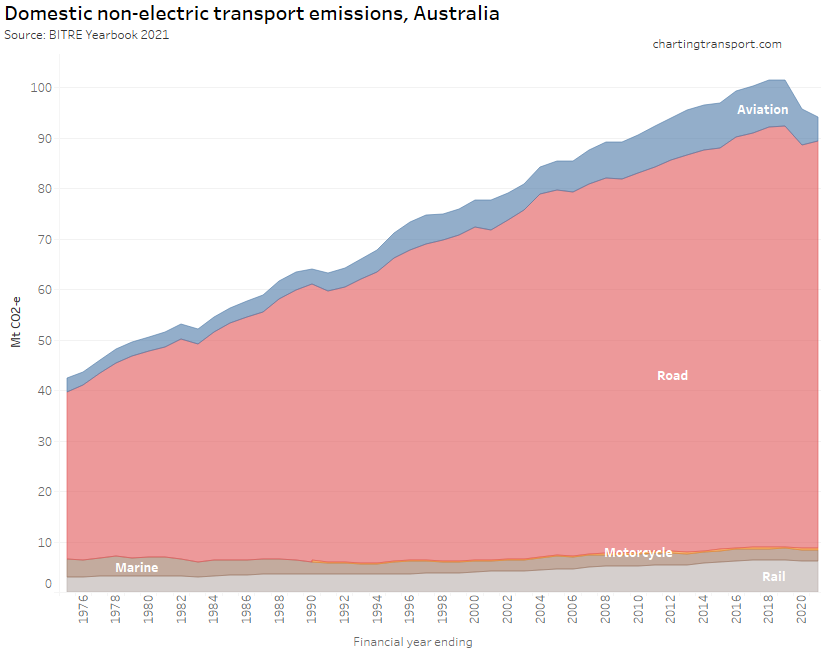
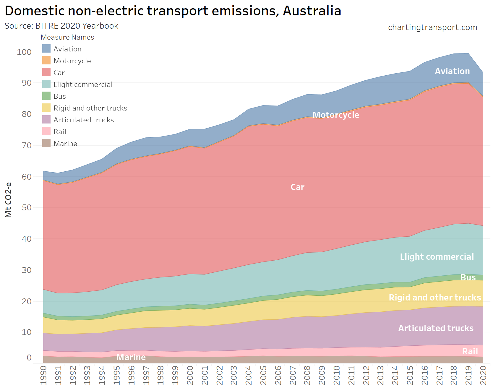
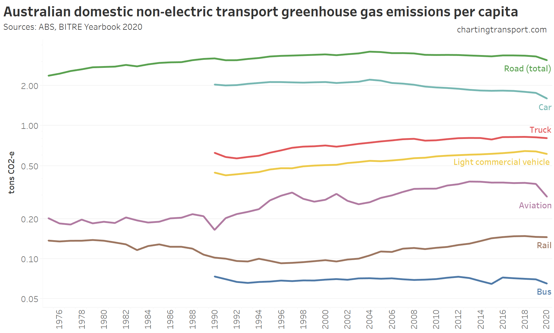
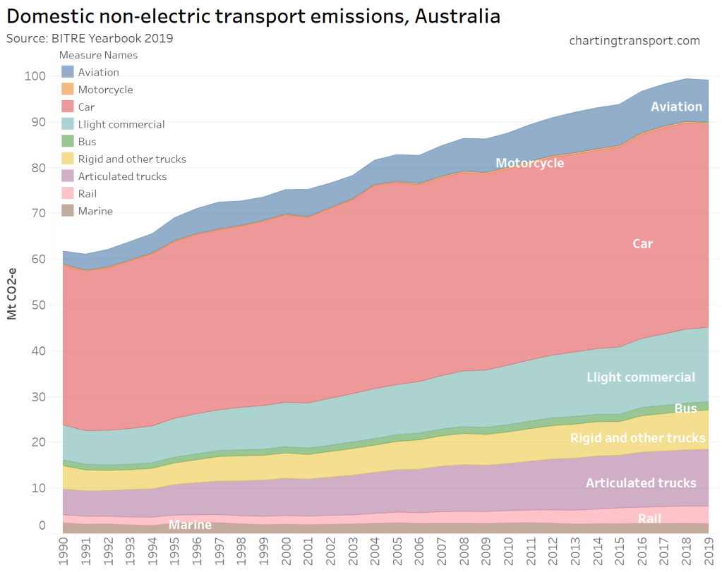
A more detailed breakdown of road transport emissions is available from 1990 onwards:
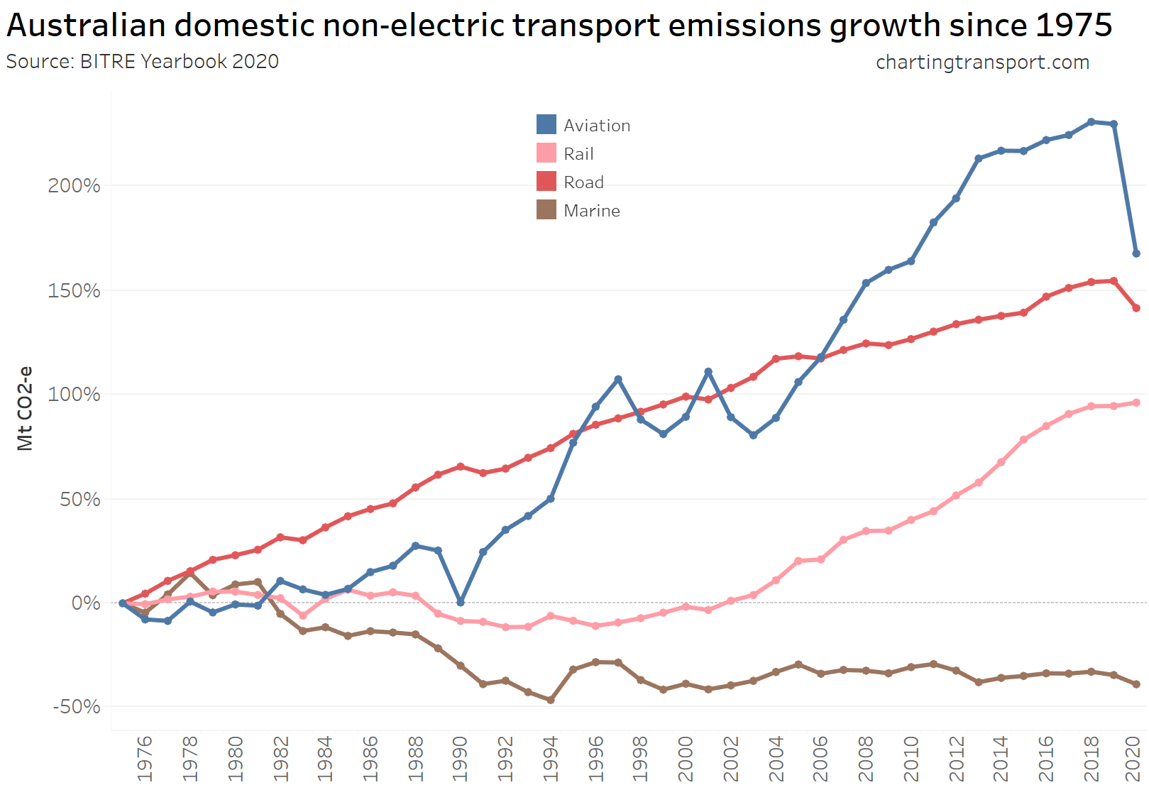
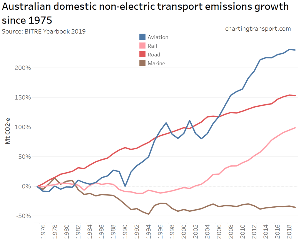
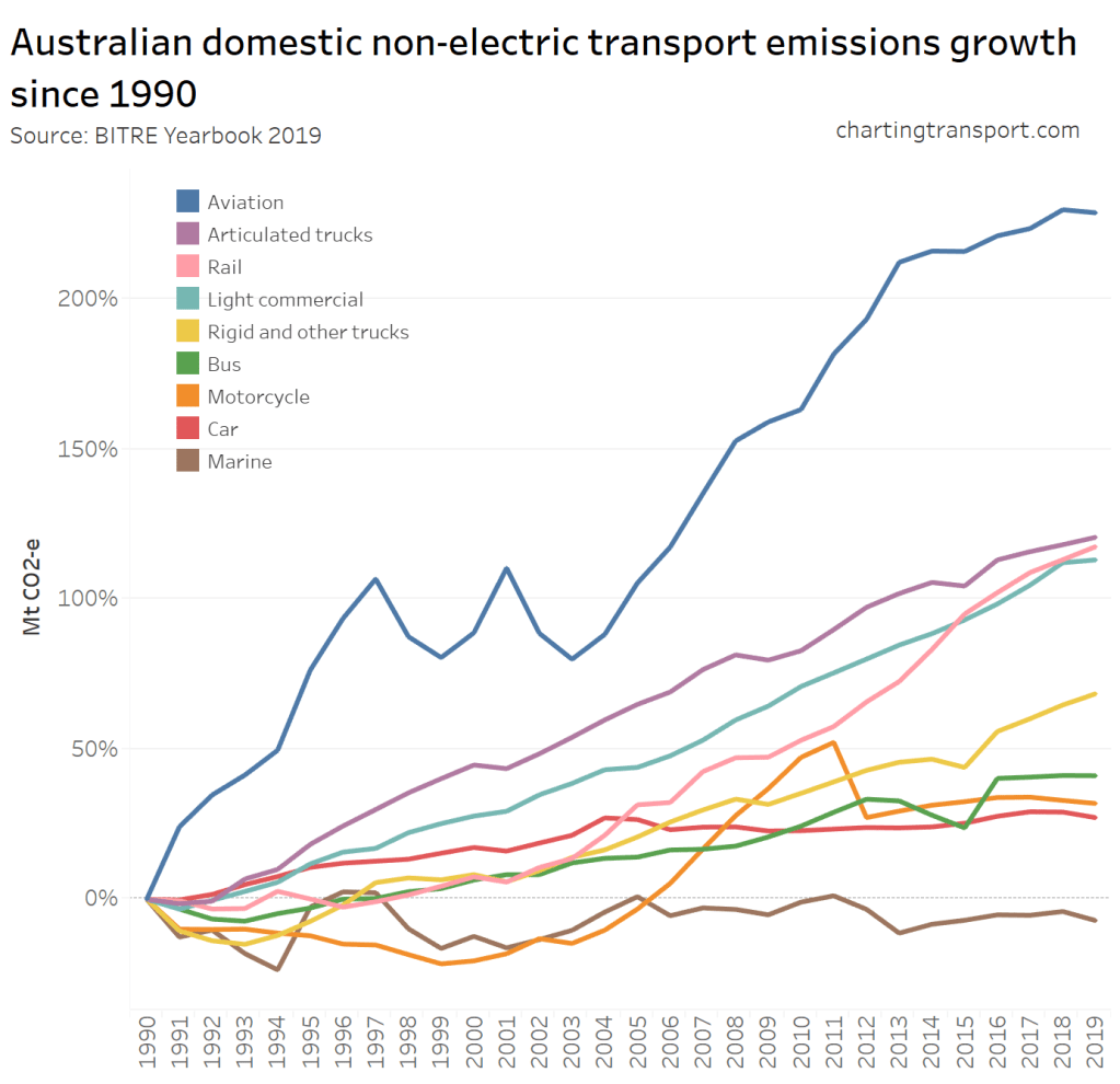
To better see the trends per mode, here is net growth since 1975:
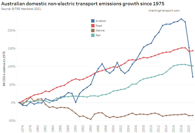
Domestic aviation emissions have seen the biggest reduction from the COVID19 pandemic, followed by road emissions. Rail and marine emissions have also shown a decline in the last two years, however I cannot be certain to what extent this is due to the pandemic.
Road emissions grew steadily until 2019, while aviation emissions took off around 1991 (pardon the pun). You can see that 1990 saw a lull in aviation emissions, probably due to the pilots strike around that time.
In the years before the pandemic, non-electric rail emissions grew strongly, mostly driven by increases in bulk freight volumes (as discussed above). I suspect the small decline in rail emissions in recent years is unlikely to be related to diesel passenger trains (most of which have continued to run to normal timetables during the pandemic).
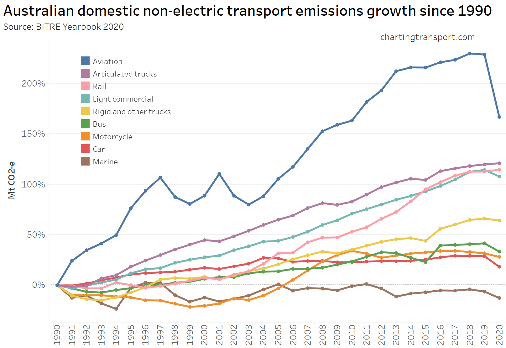
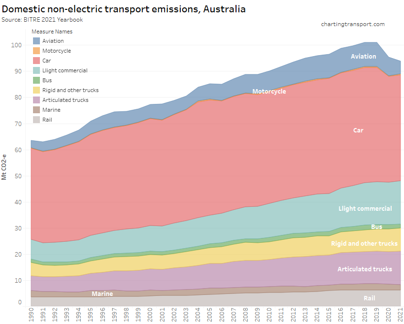
The next chart shows growth by sector since 1990 (including a more detailed breakdown of road transport):
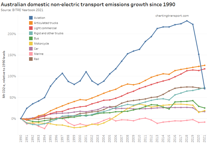
This data suggests the pandemic has had no impact on truck emissions, but has reduced car, bus, and light commercial vehicle emissions.
Per capita emissions
While per capita emissions aren’t directly relevant to climate change impacts, it is interested to look at whether emissions growth has decoupled from population growth for different modes. Note I’ve used a log scale on the Y-axis.
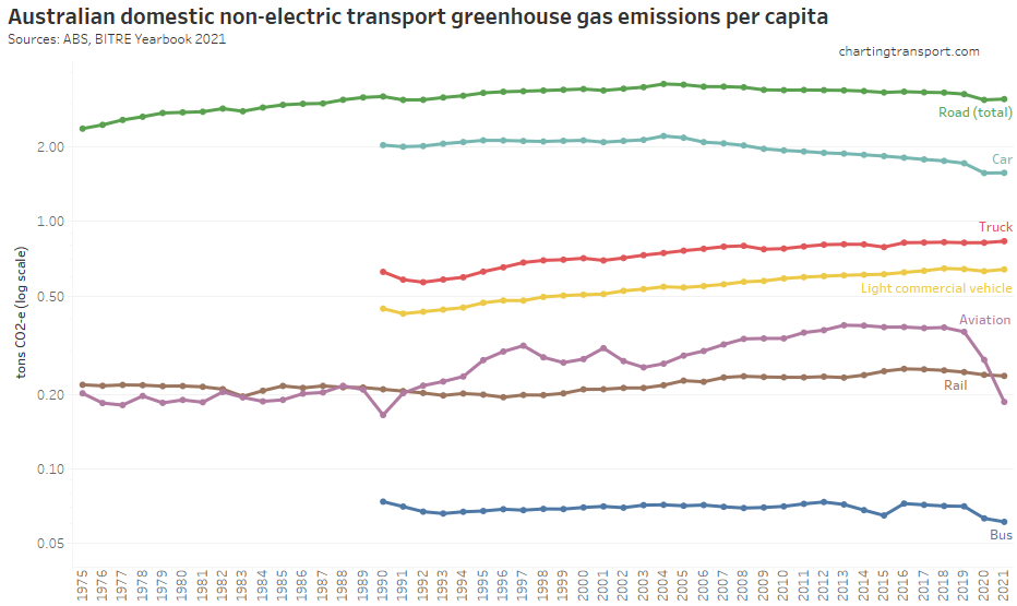
Per capita car emissions for all modes except trucks have been in decline in recent years – and more so with the pandemic. Aviation and bus emissions per capita have fallen the most with the pandemic.
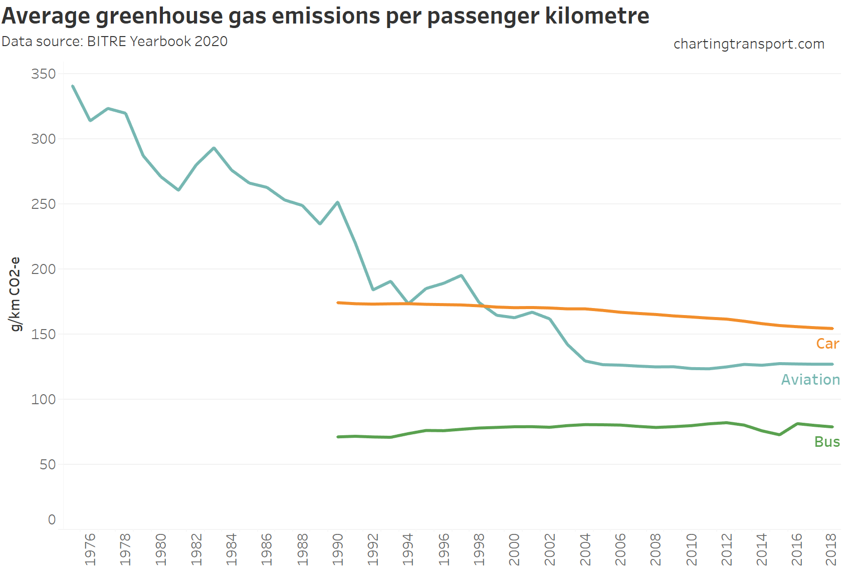
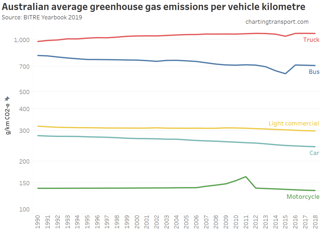
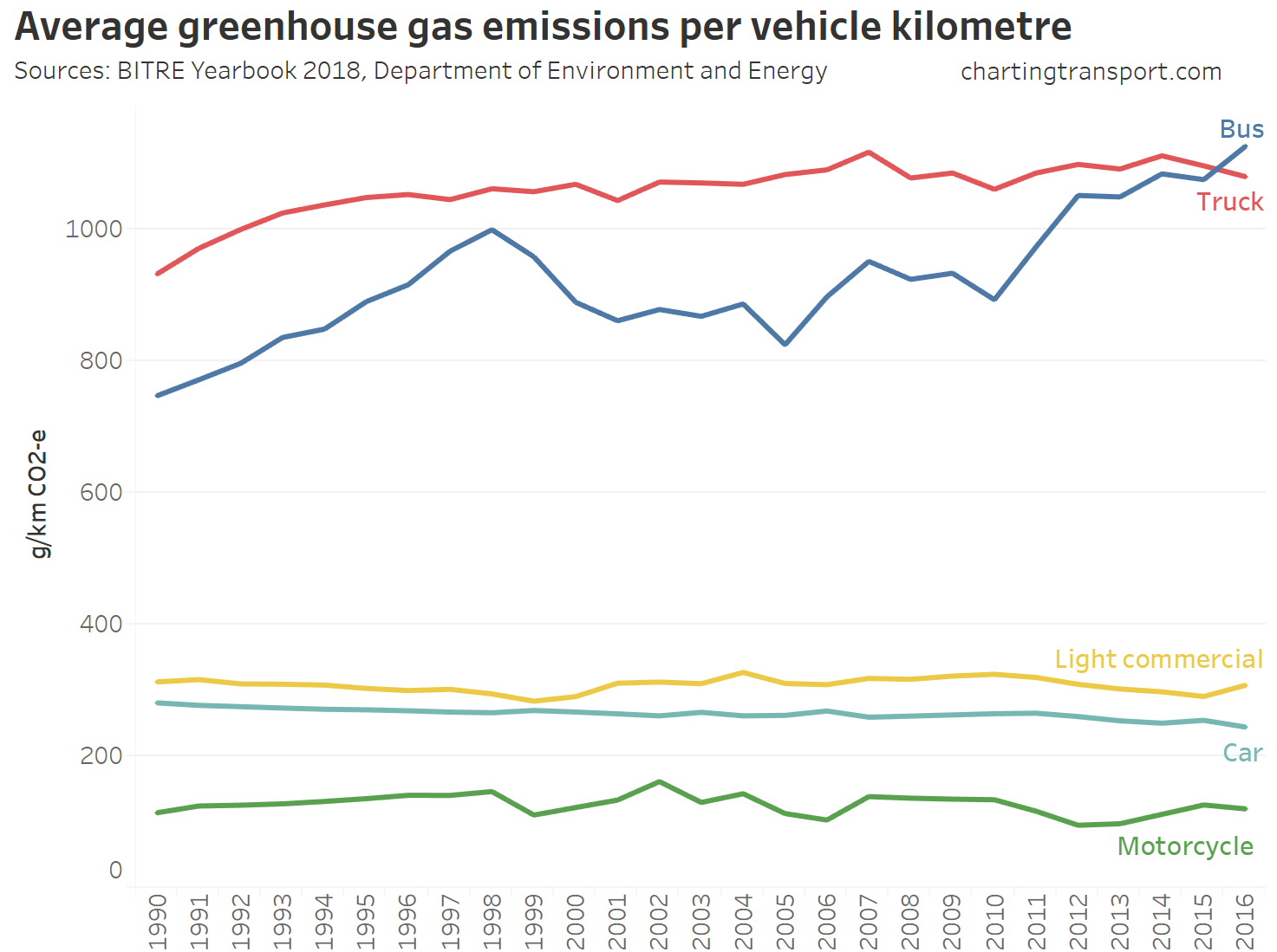
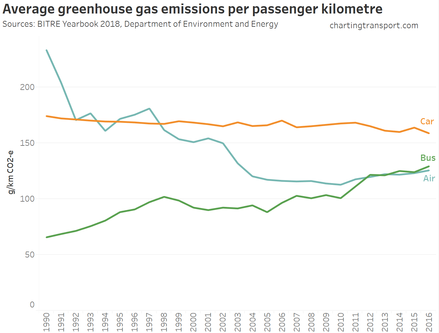
Emissions intensity
We can also calculate emissions per vehicle kms travelled. I’ve labelled the value estimates for 2021 (note again a log scale on the Y axis).
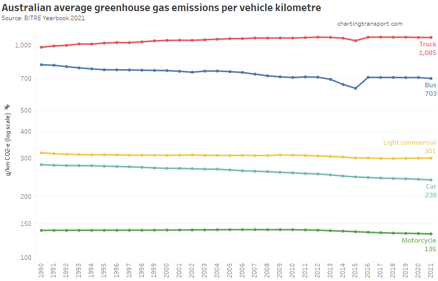
There has been a slow decline in emissions per km for cars, motorcycles and buses, while light commercial vehicles remain flat, and emissions per truck km have increased (although average truck loads have also increased over time).
I’d like to be able to calculate freight emissions intensity per tonne-kilometre by mode, but it’s hard to do that sensibly with the available data (eg rail emissions are not split by freight and passenger, and many flights carry both passengers and freight).
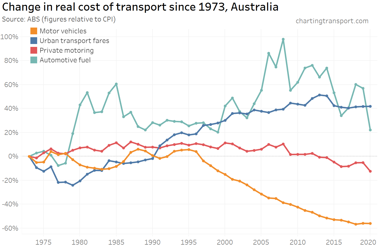
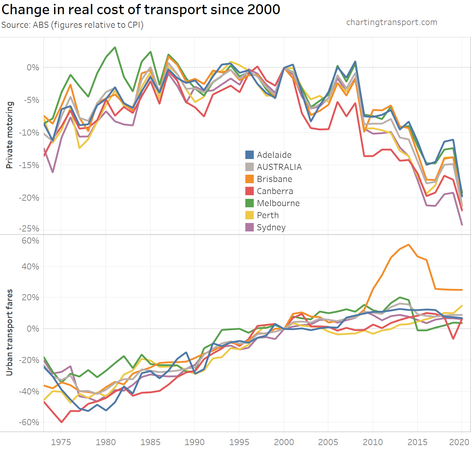
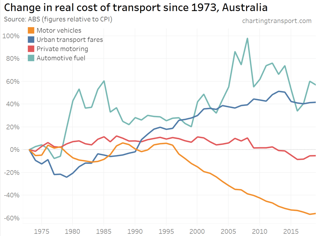
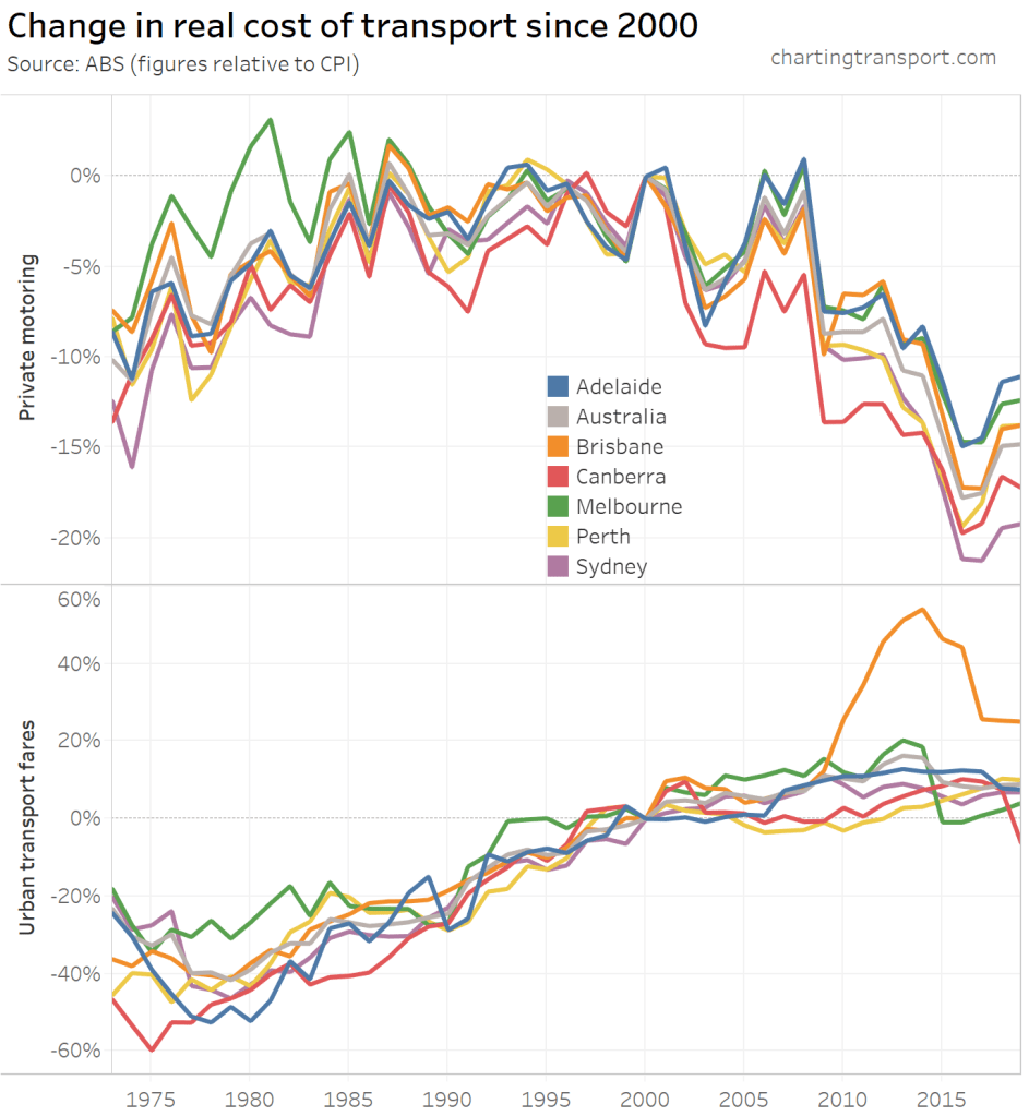
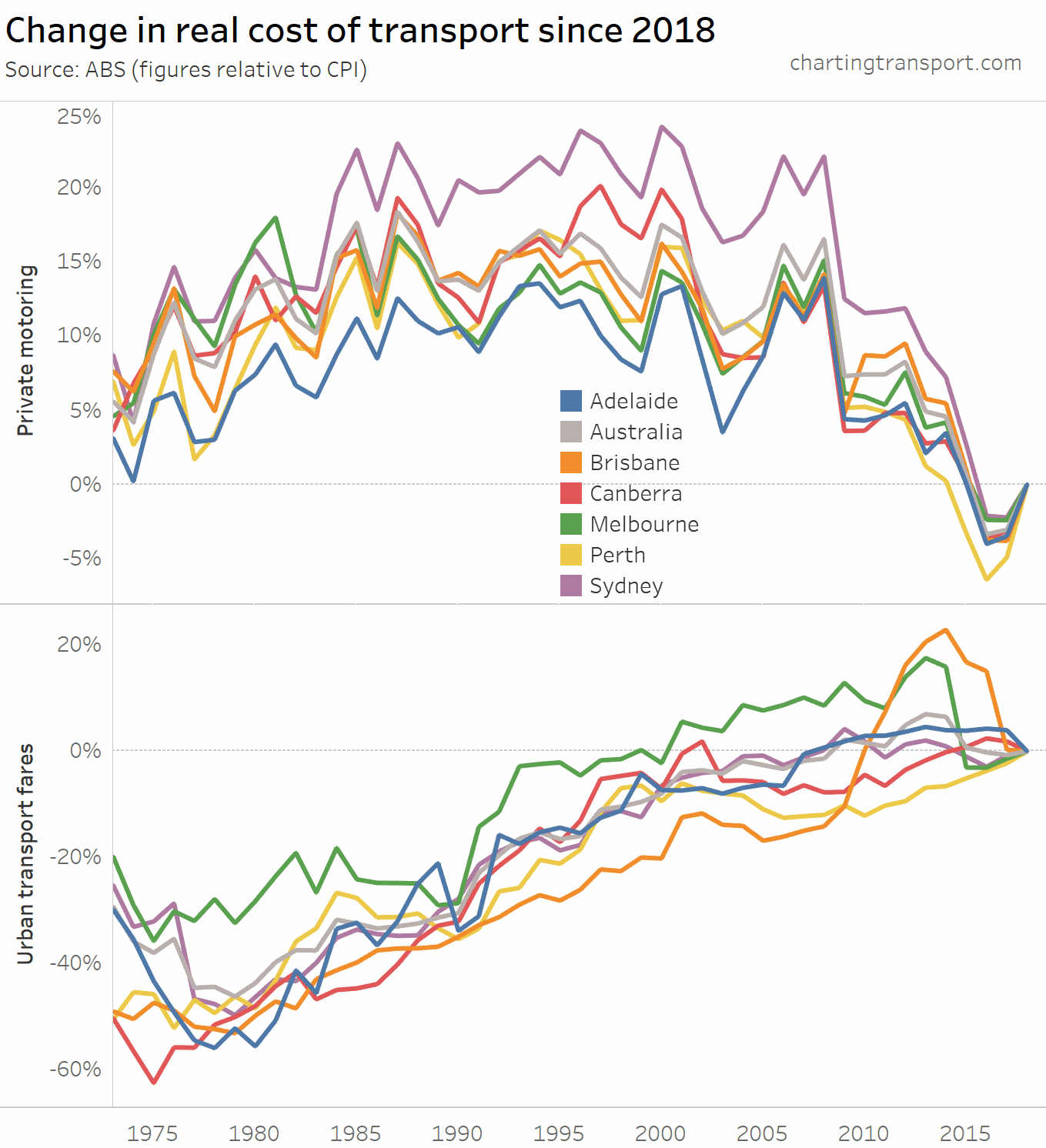
Transport costs
The final category for this post is the real cost of transport from a individual perspective. Here are headline real costs (relative to CPI) for Australia, using ABS data:
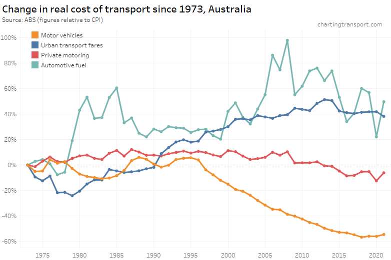
Technical note: Private motoring is a combination of factors, including motor vehicle retail prices and automotive fuel. Urban transport fares include public transport as well as taxi/ride-share (which possibly move quite independently, which is a little frustrating).
The cost of private motoring has tracked relatively close to CPI, although it seems to be trending down since 2008, probably largely related to reductions in the price of automotive fuel (which peaked in 2008). The real cost of motor vehicles has plummeted since 1996, although it may have bottomed out in 2018.
Urban transport fares have increased faster than CPI since the late 1970s, although they have grown slower than CPI (on aggregate) since 2013.
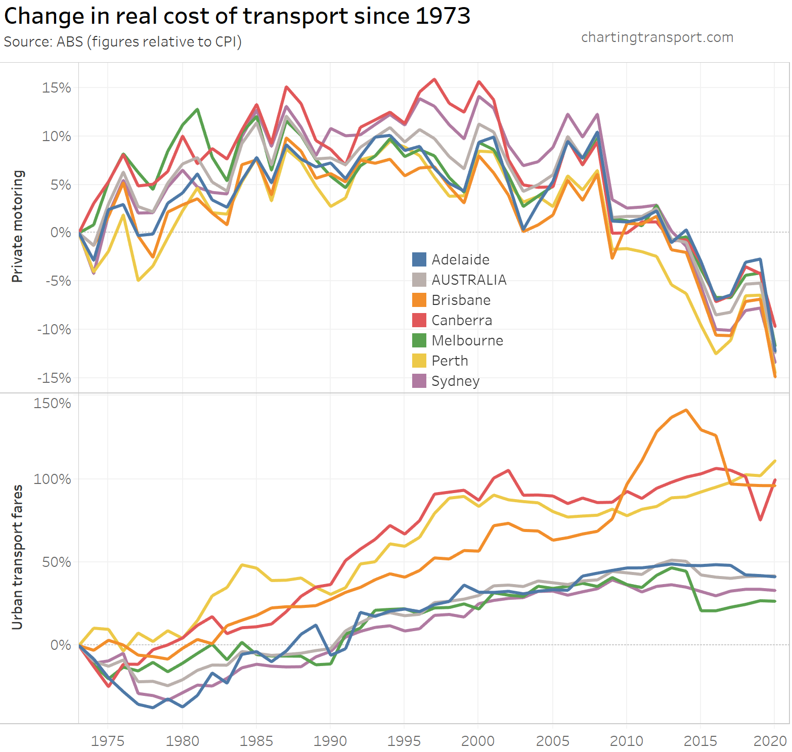
However the above chart shows a weighted average of capital cities, which washes out patterns in individual cities.
Here’s a breakdown of the change in real cost of private motoring and urban transport fares since 1973 by city (note different Y-axis scales):
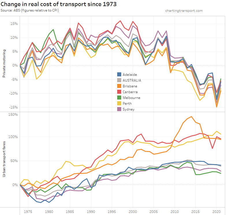
Technical note: I suspect there is some issue with the urban transport fares figure for Canberra in June 2019. The index values for March, June, and September 2019 were 116.3, 102.0, and 118.4 respectively.
Urban transport fares have grown the most in Brisbane, Perth and Canberra – relative to 1973.
However if you choose a different base year you get a different chart:
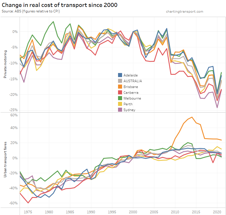
What’s most relevant is the relative change between years – eg. you can see Brisbane’s experiment with high urban transport fare growth between 2009 and 2017 in both charts.
Melbourne recorded a drop in urban transport fares in 2015, which coincided with the capping of zone 1+2 fares at zone 1 prices.
What do these trends suggest for post-pandemic transport?
There are some emerging trends in the data above that suggest a shift towards private transport:
- An uptick in driver’s licence ownership in 2021 evidenced in NSW and South Australia, and likely replicated in other states (data not yet available). The increases were sharpest for young adults, normally a natural market for public transport. Motor vehicle licence ownership has a strong relationship with mode choice, and even if/when the fear of infection on public transport is gone, there may be some people who stick to habits formed during the pandemic. See also: Why are younger adults more likely to use public transport? (an exploration of mode shares by age – part 2)
- Likewise, an uptick in motor vehicle ownership in all states in 2021 could also see some people sticking to new driving habits formed during the pandemic. Again, see Why are younger adults more likely to use public transport? (an exploration of mode shares by age – part 2)
- The biggest reductions in transport volumes were seen in public transport, no doubt strongly associated with office workers switching to working from home during the pandemic (a large portion of whom work in CBDs). They will likely not return to working in the office as frequently as they did before the pandemic, and this may see future public transport patronage and mode share lower than pre-pandemic projections. In other analysis (not yet published here sorry) I’ve found high rates of pre-pandemic public transport use amongst occupations that are most likely amenable to working from home.
However a shift to private transport will hit headwinds if traffic congestion rises (a highly effective form of demand management) and/or car parking prices increase.
Also, the resumption of international migration will probably see an influx of people who are less likely to own and use private vehicles, at least in their early years of living in Australia (see: Why were recent immigrants to Melbourne more likely to use public transport to get to work?) – although this may depend on their perspectives of infection risk.
I think a key issue will be whether a heightened fear of infection can ultimately be removed on public transport, which would enable people to switch back to using public transport, or resume making trips where public transport is/was the “default” mode for many (eg commuting to CBDs).
A sustained mode shift to private transport following the pandemic could have significant consequences for increasing traffic congestion and transport emissions (not to mention many other issues).


 Posted by chrisloader