In my last post on this topic, I asked the question: who drives to work in major Australian city CBDs? This post will now look at where these drivers came from, and more specifically which parts of each city produced disproportionately large volumes of CBD drivers at high mode shares. I’ll also explore why some rapid transit lines are less successful at winning CBD commuter mode share.
In this post I’m using 2016 census data at SA2 geography (as the 2021 census was significantly impacted by COVID19). I’m focussed on “private transport” trips, that included car, truck, motorbike/scooter, and/or taxi but no modes of public transport. Over 80% of these journeys involved a car as driver, truck, or motorcycle/scooter, so it is likely the commuter was a driver.
I’m showing “rapid transit” lines and stations that were in operation in 2016 on these maps. My main criteria for a line being classed as rapid transit is that vehicles operate in an exclusive right of way completely separated from road traffic. So this includes regular train services, the Adelaide O-Bahn (guided busway), and the Brisbane busways. I’ve not included Sydney’s T-ways (busways and bus lanes) or any light rail lines because most have at-grade intersections with the road network that can cause delays. While these lines will perform better than buses and trams in mixed-traffic, they will generally be slower than other “rapid” trains.
If you are short on time, there’s a summary of themes at the end of this post.
Sydney
Here’s the private transport mode share of journeys to the Sydney CBD by home SA2 for 2016:
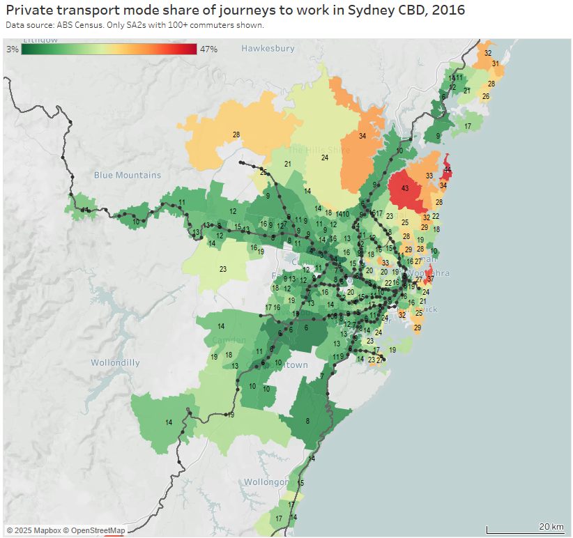
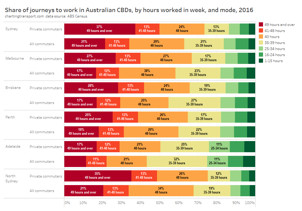
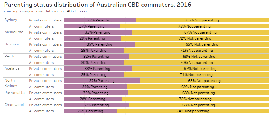
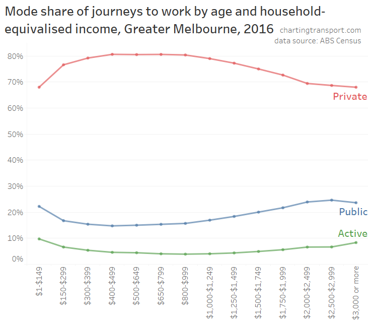
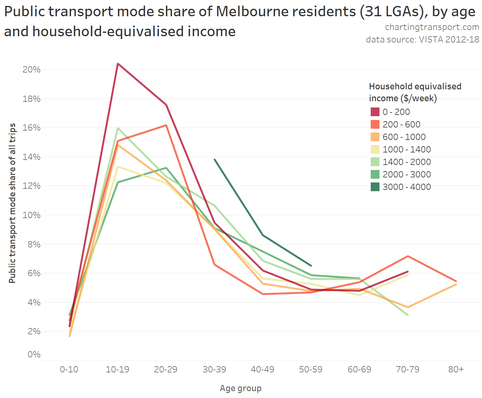
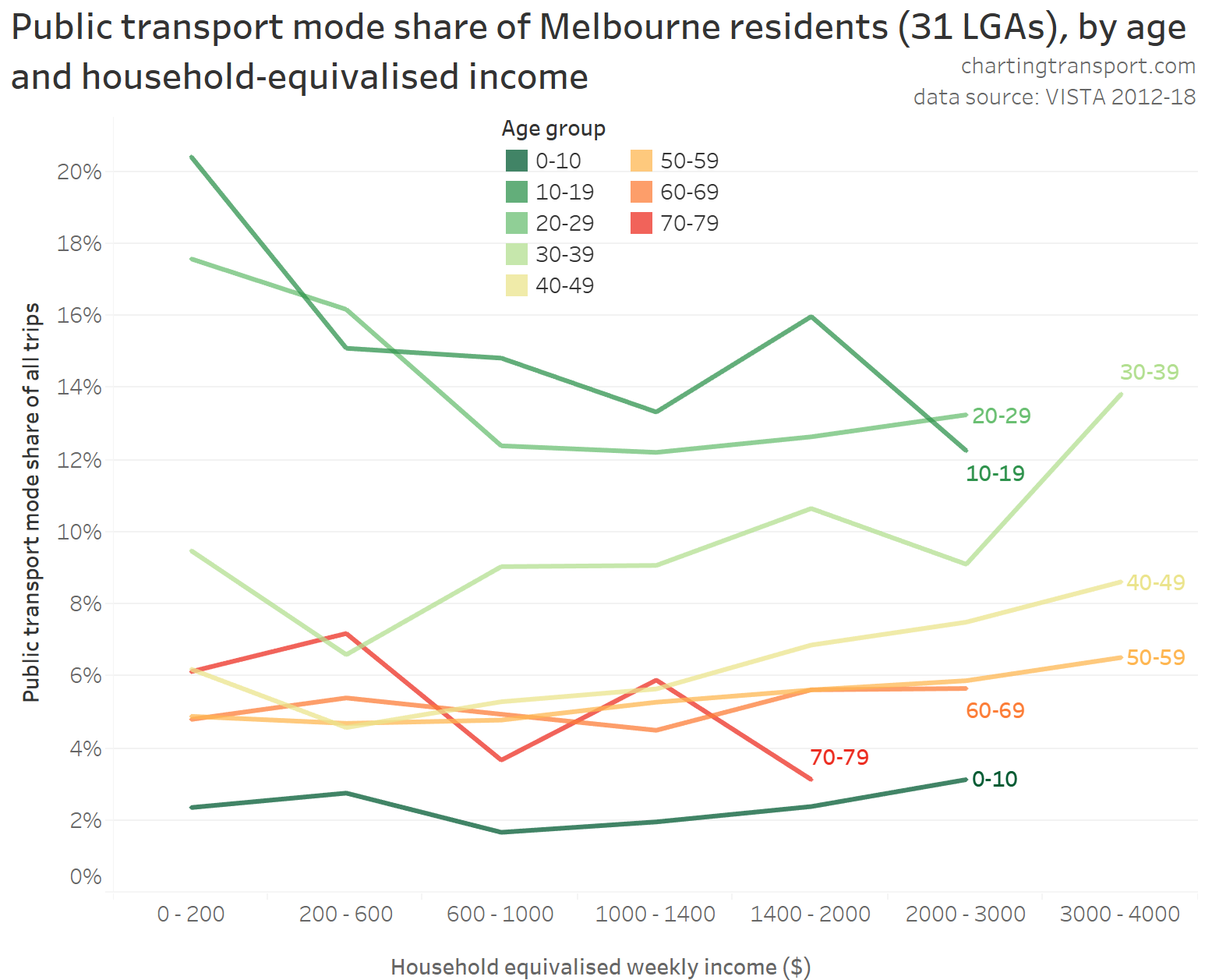
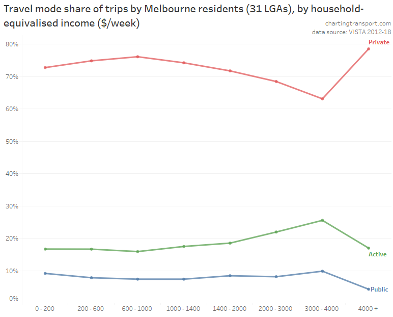
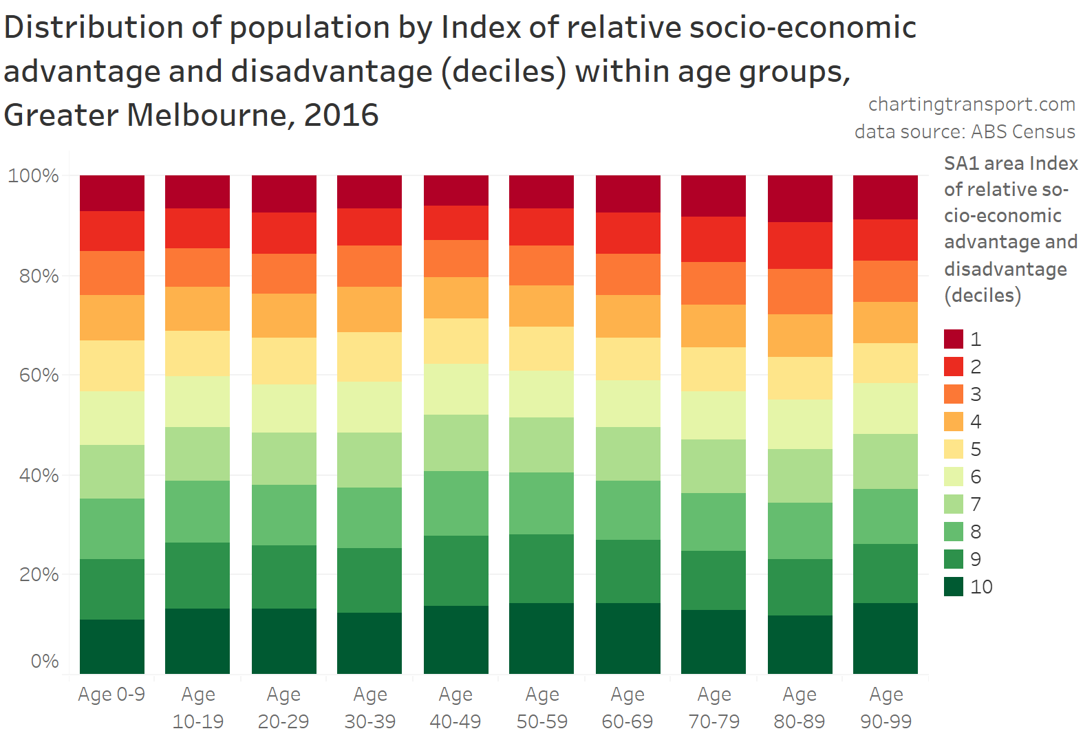
The highest private transport mode shares were on the north shore (except Manly which has a fast ferry), parts of The Hills Shire, and some eastern beachside suburbs. Many of these areas lack rapid transit access to the Sydney CBD. They are also quite socio-economically advantaged areas, as the following chart shows:
As a planner, I’m interested in home locations that are both generating particularly large volumes of private transport trips – and have high private transport mode shares. Public transport is generally highly competitive for CBD commuters (due to traffic congestion and parking costs) so these areas might be opportunities for mode shift if public transport can be made more rapid.
The next chart shows both the CBD private transport volumes and mode share at home SA2 geography. Areas with large circles that are orange to red are generating large volumes of private transport trips at a relatively high private transport mode share.
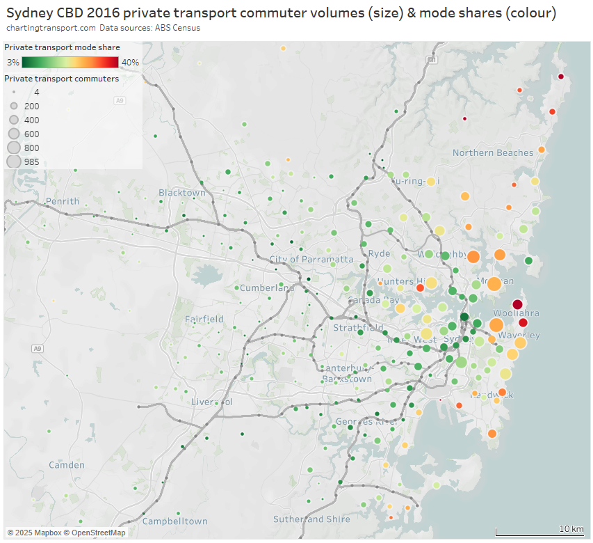
The areas of Sydney generating large volumes of private transport trips at a high mode share were mostly remote from rapid transit, including:
- harbourside areas to the west, some of which will be served by the Sydney Metro West project
- much of the north-eastern suburbs, some parts now served by the B-Line (an on-road bus rapid transit service that commenced in 2017)
- some southern suburbs around Botany Bay such as Sans Souci, Ramsgate, and Sylvania that are remote from rail, and some suburbs south of the Cronulla train line (where on-road travel to the Sydney CBD via the Captain Cook Bridge is much more direct)
- the eastern beachside suburbs, some of which are now served by the new L2 and L3 light rail lines, and also Woollahra which has an unbuilt train station
Melbourne
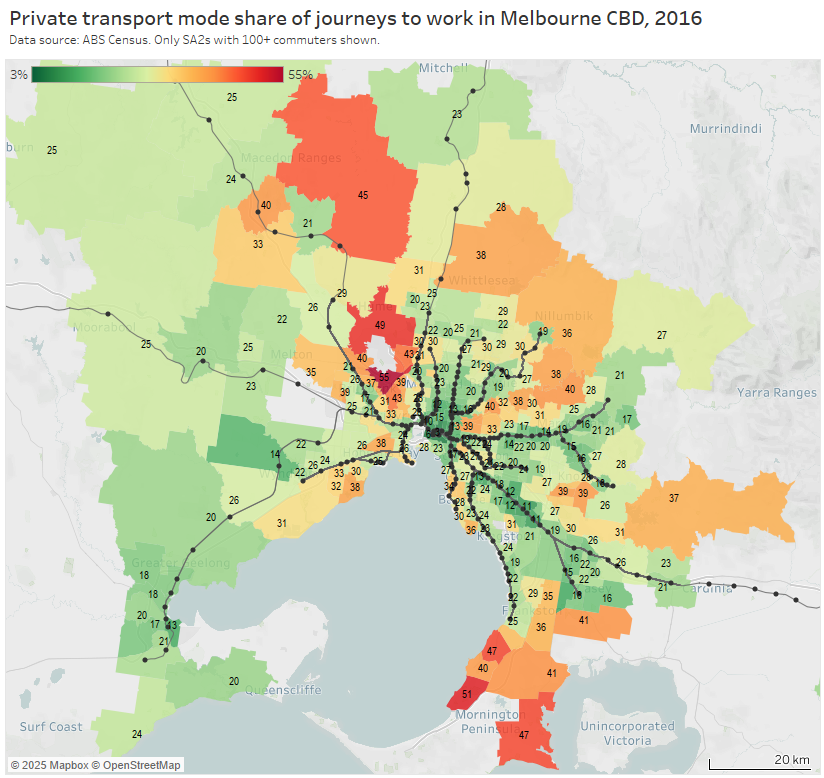
Firstly, private transport mode shares (note the colour scale for this map varies for each city):
Secondly, private transport volumes and mode shares:
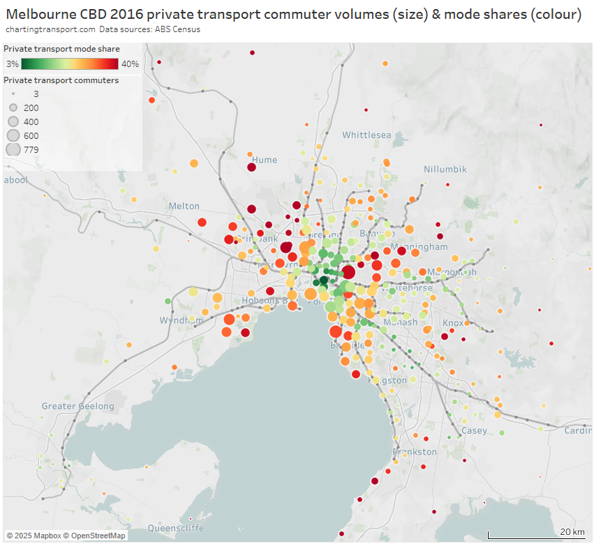
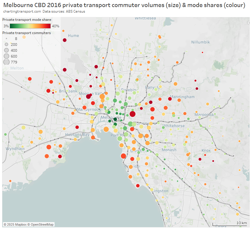
And the same again but with the inner and middle suburbs enlarged:
Areas with high private transport volumes and mode shares include:
- Kew (779 trips and 39% private mode share) – which is connected to the CBD by two tram routes and two bus corridors, all involving mixed-traffic operations so not very “rapid”
- the Balwyn North / Templestowe / Doncaster corridor – which is remote from the train network – although does have some high-frequency Eastern Freeway bus routes that operate with many bus priority lanes but certainly not full separation from traffic and intersection delays (a busway is under construction for the Eastern Freeway section of these routes)
- Point Cook and Altona Meadows in the south-west – these areas are connected to the train network by some well-patronised feeder bus services
- Brighton in the southern bayside suburbs – directly linked to the CBD by the Sandringham train line, but also some of the most socio-economically advantaged areas in Melbourne
- several inner south-eastern suburbs including Toorak, Malvern, and Glen Iris, that are also relatively socio-economically advantaged and served by trams and trains
- areas between the Sunbury and Craigieburn train lines in the north-west, including Maribyrnong, Keilor East, Niddrie, and Airport West (a planned new train station at Keilor East promises to reduce public transport journey times to the city by 20 minutes, so may trigger significant mode shift in this corridor)
- some transit-rich inner areas along the Craigieburn line (including Essendon, Moonee Ponds, Ascot Vale) which might reflect train crowding issues experienced in 2016 (when ten AM peak trains were above the crowding benchmark – see report)
- Caroline Springs, Hillside, and Taylors Hill between the Sunbury and Melton lines (these areas have since benefitted from the opening of the Caroline Springs Train Station in 2017 and bus frequency upgrades)
- Altona North which is relatively remote from train stations – it has a relatively frequent freeway express bus service to the CBD that operates in mixed traffic on the congested Westgate Bridge from a rarely used park-and-ride facility. There have also been calls to reopen Paisley station in North Altona (trains only currently pass there on weekdays until around 7:30pm).
- Greenvale in the northern suburbs, a low-density socio-economically advantaged suburb that was served by one not-very-direct or frequent bus route in 2016 (a second bus route has been added since), and has reasonably good freeway access to the central city
- bayside suburbs south of Frankston (including Mount Eliza) – the commuter car park at Frankston station has since been expanded by 500 spaces.
- areas around Rowville – which have high private transport mode shares but relatively small and low-density CBD commuter volumes. Rowville has long been the subject of advocacy for a train or trackless tram line, and currently has a high frequency bus route connecting it to the Dandenong train line, plus express buses to Glen Waverley station in peak periods.
Brisbane
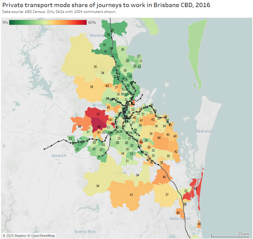
Note: the large green island to the north-east is Moreton Island, and it shares an SA2 with Scarborough and Newport on the mainland (very different areas!). I dare say there are unlikely to be many CBD commuters living on Moreton Island, and the 31% private mode share probably mostly reflects mainland commuters.
And an enlargement of the inner suburbs:
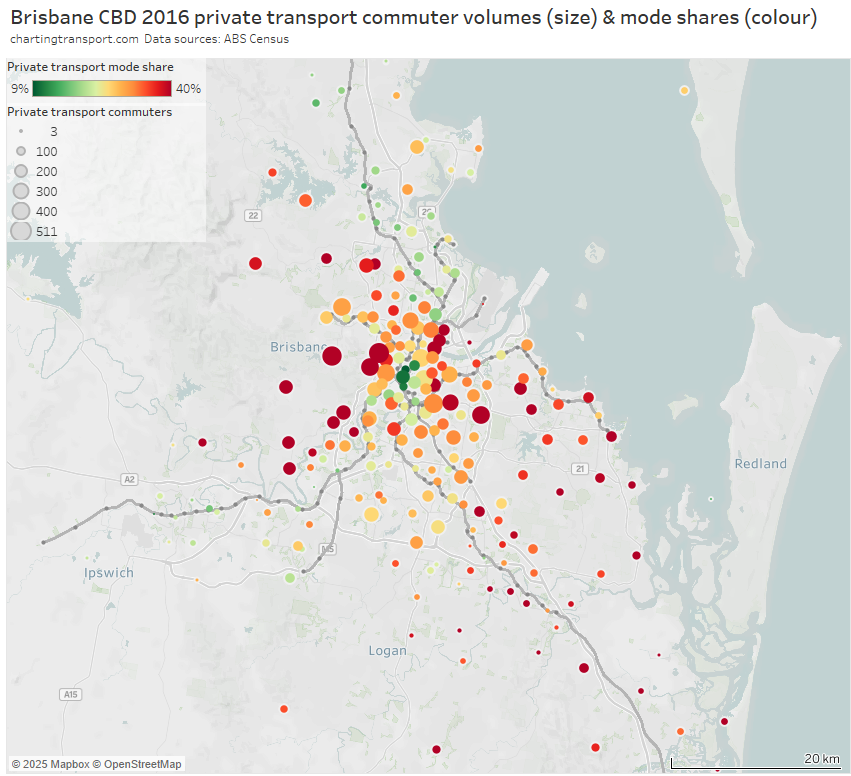
Areas with high private transport volumes and mode shares include:
- the eastern corridor through Camp Hill and Carindale between the Cleveland line and the south-east busway – on-road bus upgrades have been recently implemented out towards Carindale
- the outer ends of the Cleveland rail line in the eastern suburbs – perhaps related to the relative indirectness of the train line for travel to the CBD. Slightly more direct travel to the CBD will be possible with the Cross River Rail project providing an interchange opportunity at Boggo Road.
- western suburbs that are remote from train lines and busways, including Ashgrove, Bardon, The Gap, Chapel Hill, and Brookfield – Kenmore Hills
- some inner suburbs to the north-east of the CBD including Hamilton, Ascot, and Hendra – some of which are served by the indirect and half-hourly Doomben line
- areas between the Ferny Grove and Nambour lines in the northern suburbs – although mode shift might occur in response to the recent northern transitway upgrades through to Chermside
- Norman Park in the inner eastern suburbs served by the Cleveland line – perhaps because the train takes a very indirect route to the CBD from there, and the area is relatively socio-economically advantaged
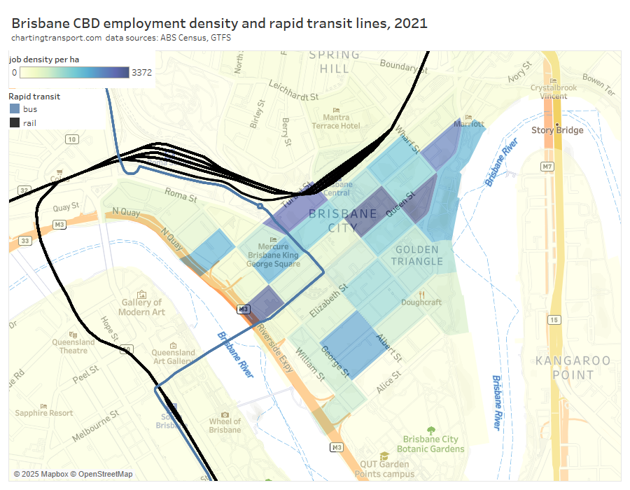
The following map shows Brisbane’s Central Station is not actually very central to the core of the CBD. You can also see the very indirect path of train lines approaching the city from the south (and east).
Perth
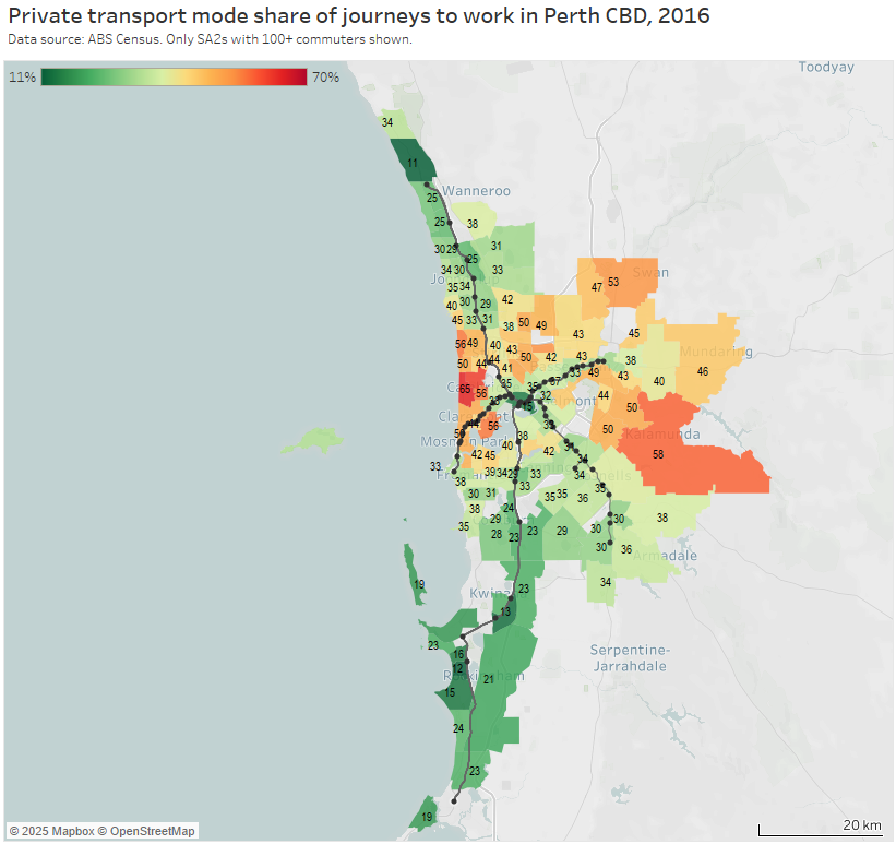
Note: Rottnest Island is included in the Fremantle SA2 but is unlikely to have had many Perth CBD commuters, so the colouring is probably misleading (same issue as Moreton Island).
For the private transport volume and mode share map I’ve had to stretch the colour scale to max out at 60% to better differentiate the SA2s:
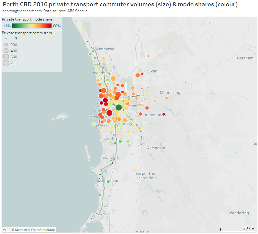
And an enlargement of the inner and middle suburbs:
Areas with high private transport volumes and mode shares included:
- western suburbs between the Joondalup and Fremantle rail lines, including 50% private mode share from Scarborough – where a trackless tram to the city has been proposed, and high frequency on-road bus route 990 operates to Glendalough Station and the Perth CBD.
- Nedlands – Dalkeith – Crawley on the northern banks of the Swan River west of the city, which is a relatively advantaged area remote from the Fremantle train line – partially served by high frequency bus route 995.
- northern suburbs between the Joondalup and Midland rail lines including Dianella, Yokine – Coolbinia – Menora, and Nollamara. There have been past plans for light rail and bus rapid transit along Alexander Drive in this corridor, and a high frequency bus route 960 was introduced in October 2016 (shortly after the census) now supported by about 2.6 km of peak period bus lanes closer to the city.
- north-eastern suburbs including Morley, Ballajura, and Ellenbrook – which are now served by the recently opened Ellenbrook train line
- suburbs between Fremantle and the Mandurah rail line including Melville, Applecross, Palmyra
- Cottesloe / Claremont / Mosman Park areas on the Fremantle train line. These suburbs rank high on socio-economic advantage (but I do wonder if there might have been a disruption on the Fremantle line at the time of the census, as there was in 2021)
- suburbs to the east out towards Kalamunda – although the private commuter volumes are small and sparse. The new Airport / High Wycombe train line has likely shifted some of these trips to public transport.
- Stirling / Osborne Park / Balcatta / Hamersley / Karrinyup / Carine / Innaloo / Doubleview around the Joondalup (northern) line. Some but not all of these areas are at the higher end of socio-economic advantage. But also it’s important to note that the stations on these lines are much further apart and are located in a freeway median – so most commuters need to use a non-walking mode to get to them (or use an on-road bus route direct to the city where these exist). This probably makes public transport less attractive for these commuters
- Manning – Waterford, Applecross, and Booragoon on the Mandurah (southern) line. Again these areas are relatively socio-economically advantaged and non-walk modes are required to get to widely-spaced stations in a freeway median
To further illustrate the station catchment issues, here’s a screengrab from Apple maps for Glendalough station on the Joondalup line, about 6 km from the Perth CBD:
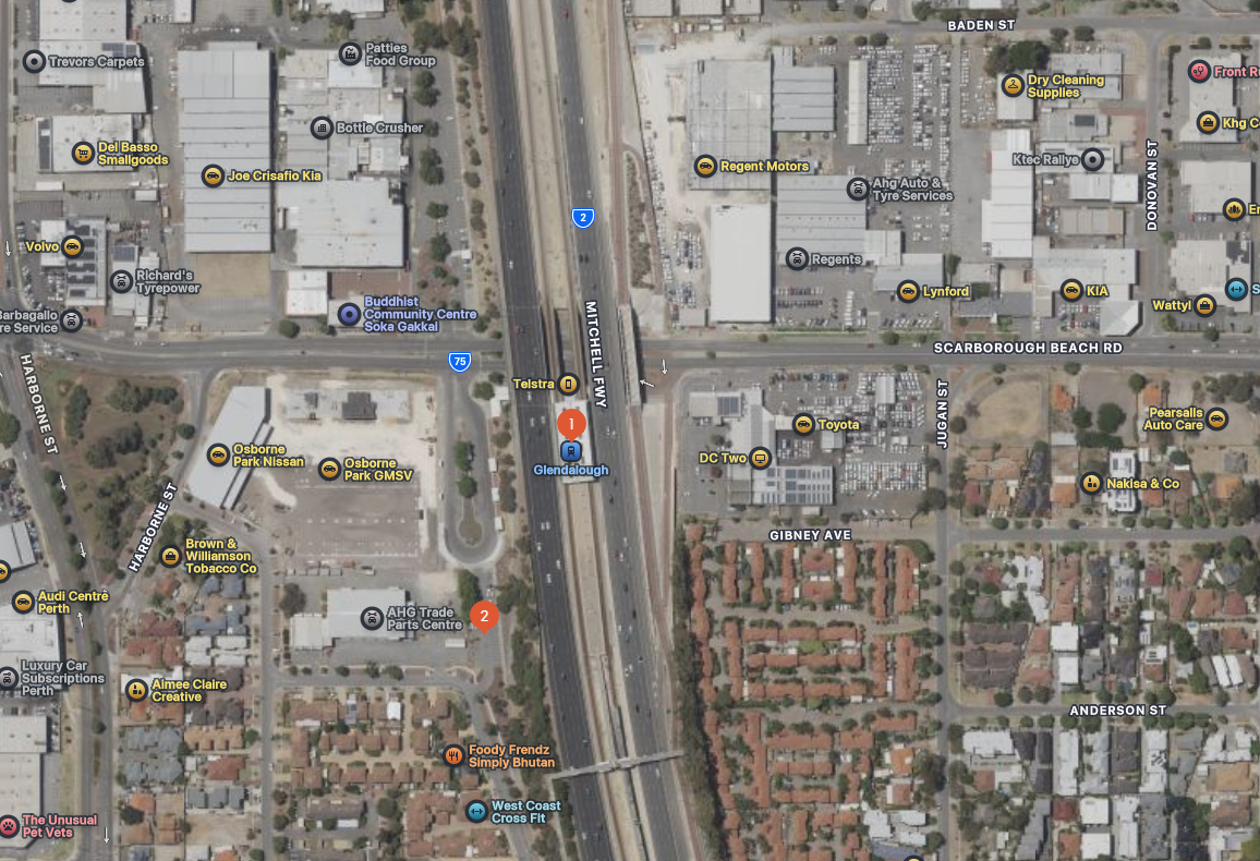
Land use around this station is predominantly car dealerships(!). The nearby residential areas are mostly 1-2 storeys, and there looks to be very poor pedestrian connectivity to the station from the residences to the south-east
I suspect adding more stations to the Joondalup and Mandurah lines in the inner suburbs probably wouldn’t have a huge impact on mode share because the lines are situated in freeway corridors with poor pedestrian walk up potential, and of course more stations would slow down trains and disadvantage commuters from further out (although some express running may be possible). It would probably also be hard to squeeze in more stations in the freeway corridors.
Perhaps a take-away here is that for the inner suburbs, rapid transit needs to be a walk-up proposition to compete with private transport.
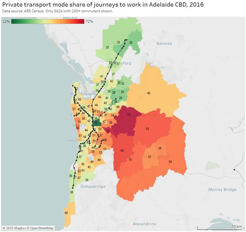
Adelaide
For the volume and mode share map I’ve again had to stretch the red colour scale to 60%:
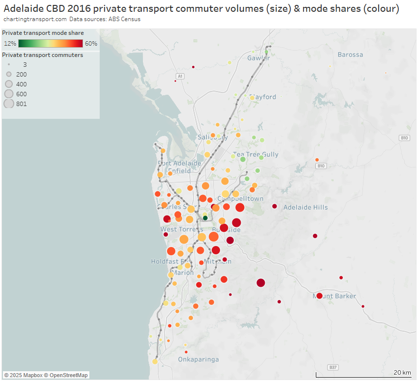
Areas of high private transport volumes and mode shares include:
- the western suburbs in between the Grange and Seaford lines
- areas around the Grange rail line in the western suburbs – possibly related to its half-hourly frequency and indirect path to the CBD
- the eastern suburbs which lack rapid transit lines
- some of the inner suburbs around the O-Bahn busway, which might be related to widely spaced stations in a river corridor (more on this below)
- the Adelaide Hills, which includes many low density residential areas (such as Stirling / Aldgate)
- the outer areas of the Belair rail line – which is highly indirect as it winds its way down the hills. Road connections from Belair to the CBD are much more direct and therefore time-competitive.
- also the inner southern suburbs around the Belair rail line. To access the CBD the line snakes its way around the western and north-western edge of the city area and then terminates in the north-western edge of the core CBD area, making for an indirect journey from the southern suburbs to the core of the CBD. This probably explains why it struggles to compete with direct road links. (I’m also struck by the almost complete lack of transit-orientated development around most train stations in Adelaide!).
For those less familiar with the Adelaide CBD, here’s a map showing the train lines and O-Bahn bus corridor (the busway component actually ends at the eastern edge of the CBD), on top of employment density. Adelaide Train Station is unfortunately just outside the dense core of the CBD with many potential commuters having to walk several blocks.
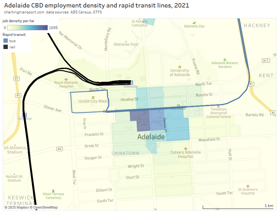
Of course realigning rail corridors is hardly easy or cheap. Infrastructure South Australia’s 20-year State Infrastructure Strategy includes a recommendation to investigate of the viability of an underground rail link (delivery in 5-10 years) – with the objective of overcoming a capacity-limited Adelaide Railway Station (refer recommendation 23). I think this recommendation justification overlooks the possibly much larger benefits it would deliver in terms of faster / more direct access to the core of the CBD which could enable significant mode shift to public transport across large parts of Adelaide.
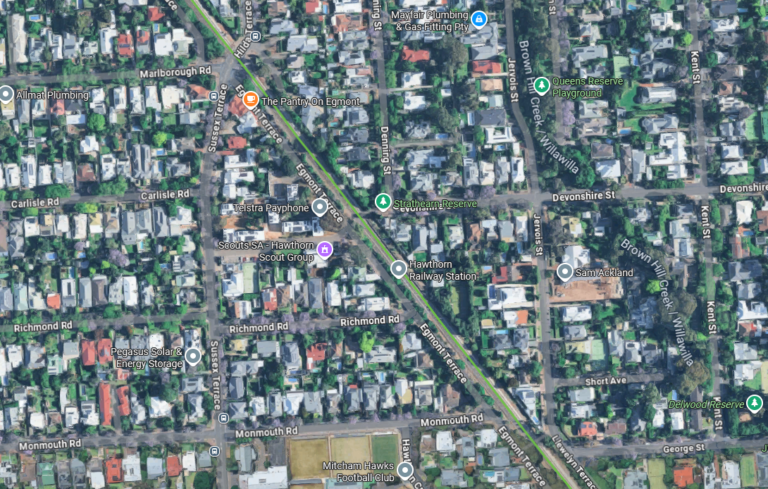
Below is a Google maps screengrab of Adelaide’s Hawthorn station on the Belair line, about 5 km south of the CBD, where trains run about every 15 minutes in peak periods. The station is surrounded by low density residential areas, with many blocks big enough to accommodate private swimming pools. There’s not even a hint of transit orientated development here, which seems typical of most Adelaide train stations, even those in the inner suburbs with decent frequencies (as a Melbournian I find this scenario rather foreign!). Without a concentration of population around rapid transit stations, you are likely to see lower public transport mode shares at SA2 geography.
Whether developers would consider apartments around these stations as viable is another question.
Curiously, the lowest suburban private transport mode shares in Adelaide were mostly around the northern end of the Adelaide O-Bahn (Tea Tree Gully area). This confirms that a fast and frequent service to the core of the Adelaide CBD can be a competitive public transport offer. The O-Bahn’s strengths probably lie in its speed (a product of very wide station spacing), most commuters not needing to change buses to get onto the rapid section (although this can impact legibility and frequency), and providing direct access to the central core of the CBD. These attributes are not shared by much of Adelaide’s train network which probably explains it’s relatively poor mode share performance.
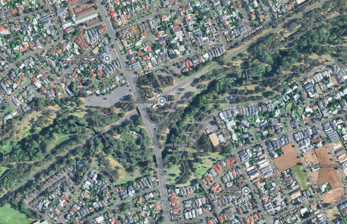
However the O-Bahn’s speed and alignment provides much less utility to the inner suburbs, in a very similar way to Perth’s Joondalup and Mandurah railway lines. Below is a Google Maps screengrab of Klemzig interchange O-Bahn station, about 6km from the Adelaide CBD. The station is immediately surrounded by car parks and beautiful parklands, and then relatively low density residential (peppered with a few terrace/townhouses). This makes for a rather limited walking catchment population.
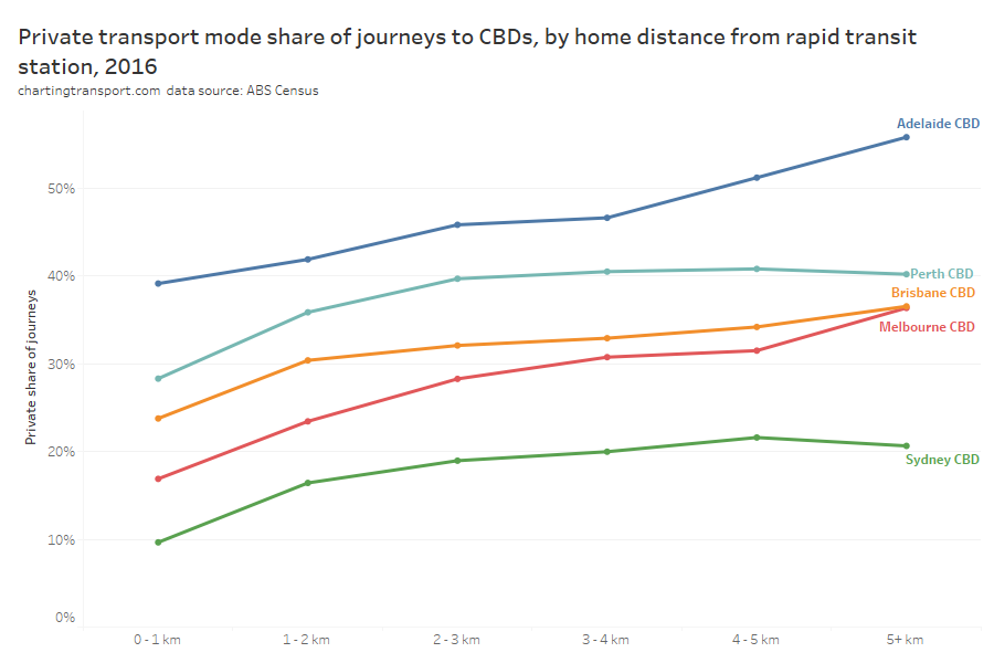
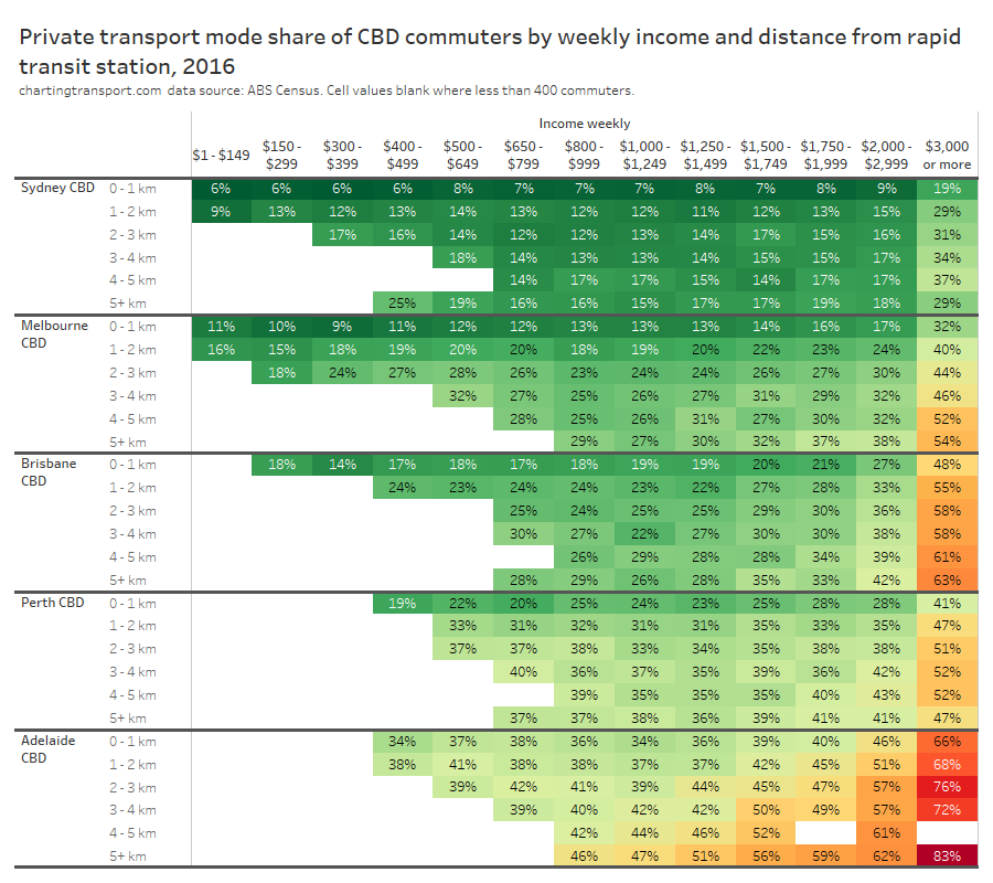
How do mode shares vary by distance from CBDs and distance from stations?
The heatmap table below shows private transport mode shares by distance from CBDs and distance from rapid transit stations. Note the number of commuters in each grid cell varies considerably.
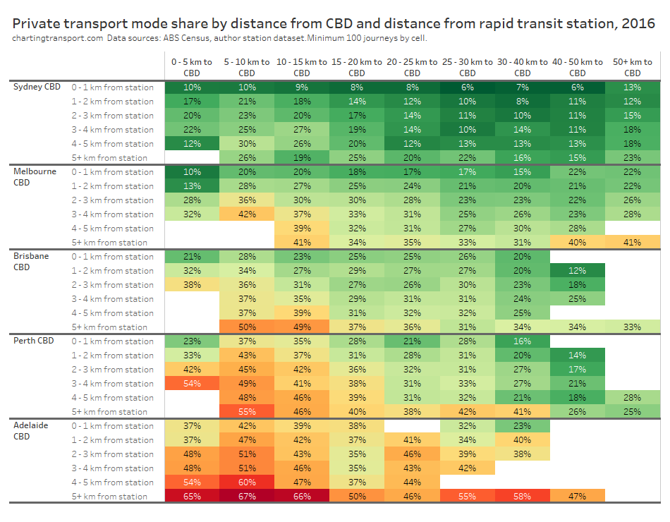
Within each city, some of the the highest private transport mode shares were seen for commuters living 5-10 km from their CBD and being distant from a rapid transit station. For these commuters private transport is likely often more cost- and time- competitive than on-road public transport. These areas are often highly advantaged suburbs, where CBD parking costs might be less of a concern for commuters.
Private transport mode shares were often lower for suburbs further from CBDs, even those not adjacent to rapid transit stations. For these commuters park-and-ride or bus feeder travel to train lines is likely more competitive with driving. These commuters can often be less socio-economically advantaged – and so a long drive to expensive CBD parking each day would be a significant barrier. For many parts of Sydney and Melbourne, such longer distance car commutes might also pass through several motorway toll gates.
Could public transport fare policies explain differences between cities? In Adelaide and Melbourne it is no more expensive to travel to the CBD from the outer suburbs than the inner suburbs, making public transport travel from the outer suburbs more cost-competitive. Sydney, Perth, and Brisbane had fares roughly proportional to travel distance in 2016, yet private transport mode shares were still relatively low in the outer suburbs. This suggests outer suburban commuters might not be highly sensitive to public transport fares, as other factors likely drive mode choice.
What are some common themes across cities?
Here are some take-aways that resonate for me:
- Indirect train lines are less competitive: Brisbane, Adelaide, and Sydney have some rail routes that follow rather indirect paths to their CBDs, which reduce the travel time competitiveness of rail over private transport and thus impact mode shares.
- CBD train stations probably need to be central to dense employment zones to win mode share: Adelaide and Brisbane currently lack train stations in the centre of their CBDs which makes public transport less competitive for CBD destinations more remote from stations. Brisbane will address this problem with Cross River Rail and Adelaide wants to plan for new underground rail.
- There’s only so much you can do in the most socio-economically advantaged suburbs: Many cities have areas that are well served by rapid transit but still have high private transport mode shares. These tend to be some of the most advantaged suburbs, where many CBD workers are likely to be on high incomes and don’t wear the costs of private commuting. Shifting these commuters to public transport would probably require significant private transport disincentives.
- Cities are filling many of the rapid transit gaps already: Many cities have projects (some completed since 2016) to improve public transport access to areas of high private transport volumes and mode share. I’m less familiar with Brisbane but was pleasantly surprised to discover projects to improve public transport in many of the corridors that were generating significant private transport trips in 2016 (although many were only semi-rapid on-road routes). This post might help planners and advocates identify projects and/or service uplifts that could tap into strong areas of latent demand. Of course introducing rapid transit will be more challenging / expensive in some corridors than others.
- Inner suburban stations are probably mostly useful for commuters within walking distance. Some inner suburbs of Perth with nearby stations on the northern and southern rail lines, and some suburbs around the Adelaide O-Bahn stations have relatively high private transport mode share, probably because relatively few people live within walking distance of these stations. While many of these commuters could probably use a feeder bus to reach these stations, this adds journey time and connection risk making it less competitive with private transport (although higher bus frequencies can certainly help).
- CBD commuters from the outer suburbs are quite willing to travel to rapid transit stations. We have seen relatively low private transport mode shares in many outer suburban areas – even when the nearest rapid transit station is a few kilometres away. The time and risk involved in using a feeder bus or commuter car park does not seem to harm public transport’s relative competitiveness for CBD commuters from the outer suburbs. Public transport fares don’t seem to be a major issue either.
I hope you’ve found this post interesting. I feel like I’ve learnt quite a bit from this analysis.
It’s certainly hard to capture all the nuance that might be applicable across all five cities, but let me know in the comments if you see more themes in the data.


 Posted by chrisloader