Central Business District (CBD) generally have expensive car parking, congested radial roads, and public transport that is usually frequent, direct, and often fast. CBDs in larger cities are naturally strong markets for public transport.
Yet around three hundred thousand Australians drove to work in CBDs of Australian cities in 2016. Who are these people, and why might they have chosen to drive? And could they be enticed away from private transport?
I’ve touched on these topics a little in the past (see: The journey to work and the city centre (Australian cities 2001-2011), What can the 2021 census tell us about commuting to work in Australia’s big CBDs during the COVID19 pandemic?), but some recent social media discourse, an increase in the Melbourne central area parking levy, and the introduction of congestion pricing in New York has inspired me to tackle this question afresh and dig a bit deeper.
This post explores the factors of distance from rapid transit, income, occupation, public v private sector, hours worked, age, gender, parenting status, and distance from work.
Short on time? Just want the answers? Skip to the summary of findings.
About the data
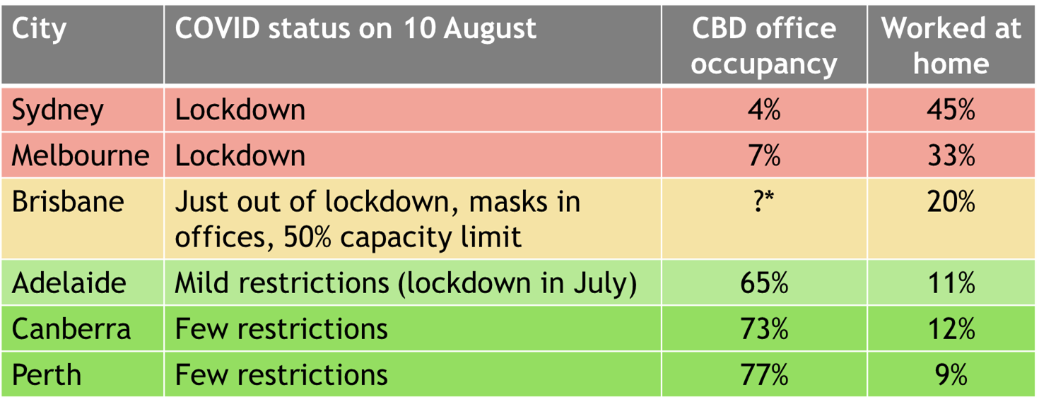
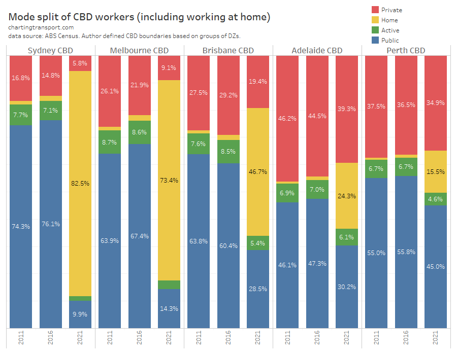
I am focussing on mostly 2016 census data, as the 2021 census was heavily impacted by the COVID19 pandemic, with Sydney and Melbourne in lockdown on census day. Of course, travel behaviour in 2025 will be a bit different to 2016, however I would expect a lot of the mode choice fundamentals to be very similar for people making trips to CBDs (some might just be commuting fewer days per week).
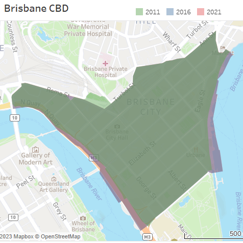
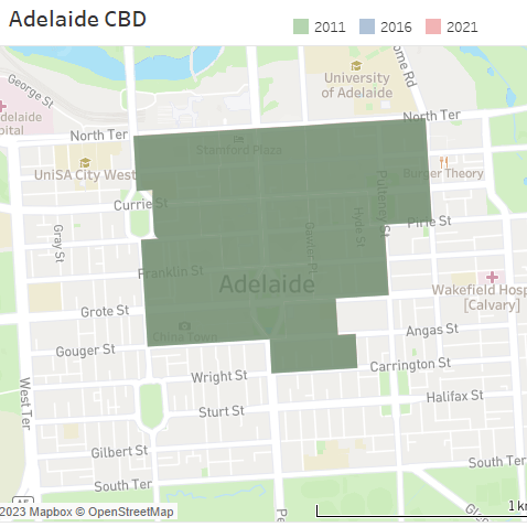
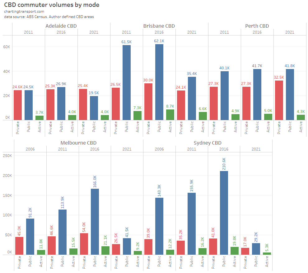
I’ve looked at CBDs in all Australian cities with a population of 100,000+ (except the Sunshine Coast and Gold Coast that lack a clear central CBD). Furthermore, I’ve included some of the larger suburban employment clusters in Sydney that look and feel like CBDs (something quite unique to Sydney – see Suburban employment clusters and the journey to work in Australian cities). Private mode shares are very high for the smaller CBDs, so many of the charts in this post will focus on the larger CBDs where differences in private mode shares can be seen against many variables.
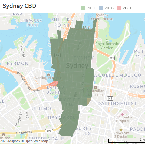
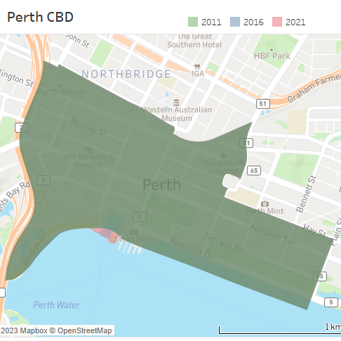
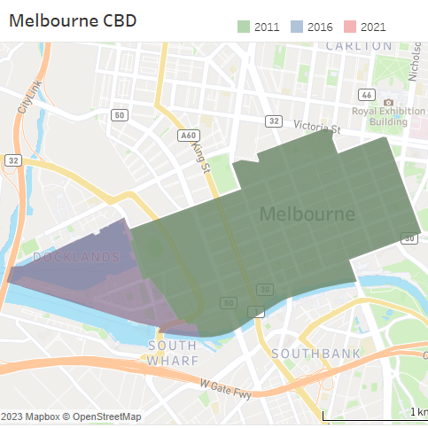
For each CBD I’ve chosen Destination Zones (DZs) that represent the core area of employment density – there is usually a high-contrast in density between a central area and its surroundings that enables a logical grouping of DZs. For the larger city CBDs, I’ve used the same areas as this post.
A lot of smaller cities have a major hospital facility close to the CBD, but just beyond the other areas of higher employment densities, and I’ve erred on the side of not including these destination zones, as we already know that hospitals have peculiar mode shares for employees (likely owing to shift work).
My analysis focuses on mostly on private transport mode share – that is people who used one or more modes of private transport (car, truck, motorbike, taxi), and no modes of public transport (train, tram, bus, ferry). Most – but not all – of these people drove a vehicle, but I’m going to use “driving” as a shorthand for headings in this post.
I don’t have access to unit-record census data, so I cannot easily apply regression-style models to determine factors for individual mode choice. Instead I’ll separately examine the relationship between mode share and various combinations of personal variables (as I often do on this blog).
Did commuters drive because they lived far from rapid transit?
I think of rapid transit as transit services where vehicles move at decent speed on a direct path along their own right of way with no delays from other traffic. This includes train lines, metros, busways, and potentially light rail (however most light railways in Australian cities are not completely separated from regular road traffic).
If people don’t have rapid transit close to their home, you’d expect private transport to be a more attractive option for commuting to CBDs.
The following chart shows the private transport mode share of journeys to major city CBDs by home distance from a train or busway station:
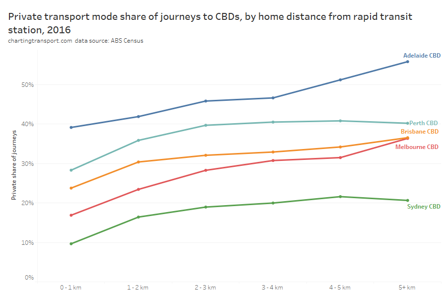
Probably unsurprisingly, people living further from a rapid transit station were generally slightly more likely to use private transport to get to work, as public transport was probably less convenient (they would need to use a feeder bus, bicycle, or car to reach a station, or use slower on-street buses or trams all the way).
Perth private mode shares flatlined (on average) for distances of 2+ km from a station, suggesting Perth still has relatively attractive CBD public transport options for these areas (which includes both high frequency feeder bus services and direct to CBD bus services). However at the same time, Melbourne had lower CBD private transport mode shares than Perth at all distances from train stations.
However the differences in mode share between the cities were often as significant as the differences by station proximity for any one city.
A full 40% of Adelaide CBD commuters who lived within 1 km of a train station used private transport to get to work (probably not helped by the non-central location of Adelaide Train Station).
BUT, if you look at the distribution of commuter home locations by distance from train stations you get a different picture.
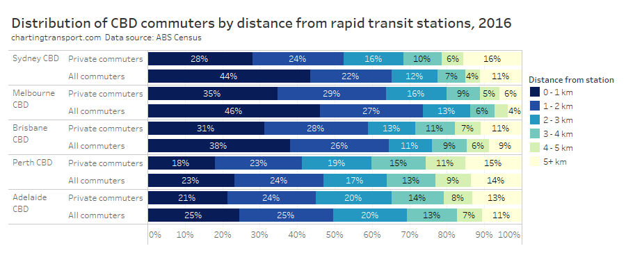
In Melbourne and Sydney almost half of CBD commuters lived within 1 km of a train or busway station, and they certainly had a lower private transport mode share. But still, 35% of Melbourne CBD private commuters, and 28% of Sydney CBD private transport commuters lived within 1 km of a train or busway station. That is, despite having good access to high quality public transport they choose private transport.
There must be another reason why these people chose private transport. It might be related to service quality (crowding was a significant issue on Melbourne’s train network in 2016), or it might be something else. I can only easily investigate this in terms of demographic variables so lets get into that.
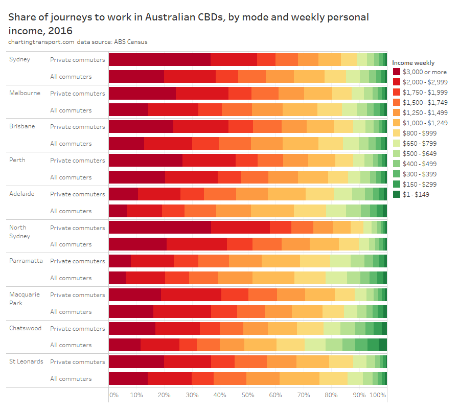
Did commuters drive because they were on higher incomes?
Here’s the private transport mode share of commuters by personal weekly income for all of the CBDs:
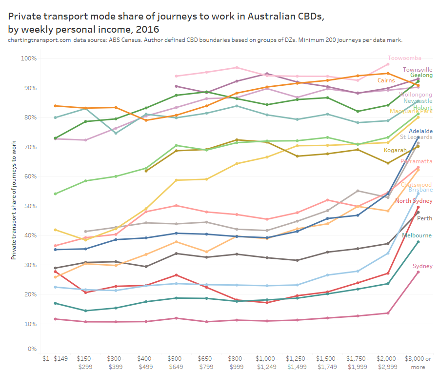
This chart shows a very clear trend – that private transport mode share peaked for people in the highest income bracket in most CBDs (especially large CBDs and suburban Sydney CBDs). No doubt this includes many executives who aren’t fussed by – or don’t themselves pay – parking costs (and possibly also car operating costs). I’ve shown before there’s generally a strong relationship between mode split and paid parking, but these people at the top income band were probably not being influenced much by price signals.
In fact, I recently spoke to an executive who was considering opting for a work car. He said that on an out-of-pocket basis it was cheaper for him to drive to work in his CBD than to use public transport!
Back to the chart.. If you ignore the top income band, for the larger CBDs private transport mode share was low and only rose slowly with income. The Sydney regional centres of North Sydney and Chatswood seem to show the strongest relationship between increasing income and increasing private mode share.
But what if we look at the volumes of commuters by income? The next chart shows the income distribution of private transport commuters, together with all commuters for reference (highest incomes on the left):
This chart shows that private commuter trips heavily skewed towards the highest income bands. Almost 37% of people who used private transport to the Sydney CBD had a weekly income in the top band ($3000+), yet that income band only accounted for 20% of overall commuters.
So it’s pretty clear that income had a strong relationship with private transport mode share, with commuters on high income more likely to drive and being disproportionately represented in general traffic and car parks. Having said that, a majority of commuters in the top income band still did not use private transport in Sydney, Melbourne, and Perth.
CBD parking levies will therefore disproportionately impact high income commuters (or their employers).
So we have disproportionate representation of high income earners and people living near rapid transit station driving to work. How are these dimensions related?
Did commuters drive because they had a high income, even though they lived close to rapid transit stations?
For this analysis I’ve combined the dimensions of income and proximity to rapid transit. Here is private transport mode share across these two dimensions:
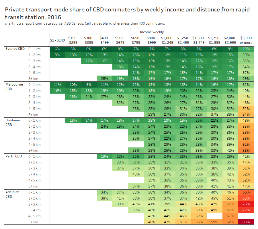
The relationship between income and private transport mode share generally held up at all distances from a rapid transit station, and the relationship between distance from a rapid transit station and private mode share held up across most income bands.
So we know that people on high incomes were over-represented in private transport trips, and they also had relatively higher private transport mode shares even if they were close to rapid transit stations.
So were CBDs filled with the cars of high income commuters who lived close to rapid transit but choose not to use it? The following chart shows these commuters as a proportion of all commuters, and as a proportion of private commuters:
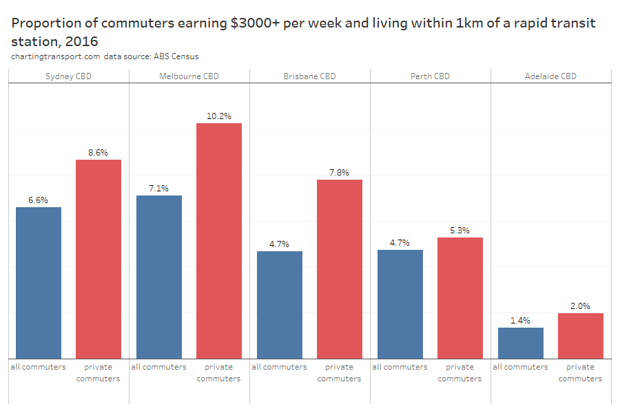
These commuters were certainly over-represented in the private transport volumes, but still didn’t make up a large proportion of the private transport volume.
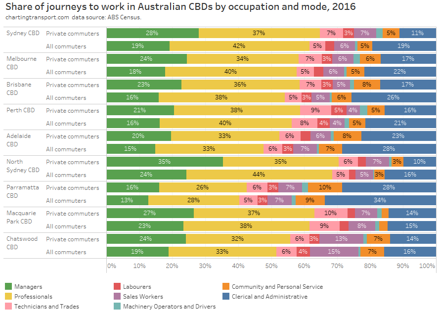
Did commuters drive because of their occupation?
A common refrain when it comes to mode choice is that some types of workers cannot use public transport because they carry a lot of gear around with them.
Another explanation for high private transport mode share might be people more likely to be working shift work, and therefore needing to travel at times when public transport is less frequent, or perhaps not available at all.
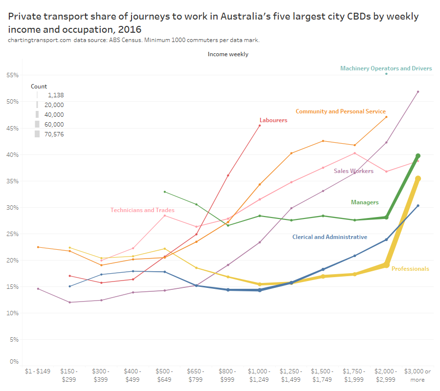
To explore this question, the following chart shows average private transport mode share by occupation (ANZSCO level 1) and income, across Australia’s five largest city CBDs. The line thickness represents the number of commuters with occupation and income range (I’ve excluded low volume data points).
Observations:
- Machinery operators and drivers had very high private transport mode share – but there weren’t many of them and those that make the chart were on high incomes. I am guessing many commuted using their work vehicle, or were train drivers who might have registered a CBD station as their place of employment but might not have driven there (in other exploration I’ve found unusually long commute distances for employees in destination zones around Melbourne’s two main train stations).
- Community and personal service workers tended to have higher private transport mode shares, particularly those on higher incomes – and I suspect many of these might have worked shifts, and therefore commuted when public transport is less available/attractive.
- Labourers, community and personal service workers, technicians and trades, and sales workers had a strong relationship between income and private mode share.
- Managers and professionals did not show strong increasing private transport mode share with increasing income, except for the top income band. I suspect these are largely office workers commuting in traditional peak periods where public transport is an attractive and competitive option.
- For managers, professionals, and clerical and administrative workers, private transport mode shares were higher for those earning less than $800 per week, than those earning closer to $1000 per week. I suspect many of these people might have been working part-time and/or shift work, where public transport might be less convenient. More on that shortly.
- Clerical and administrative workers showed a slightly stronger relationship between income and private transport trends towards higher incomes. I suspect this occupation actually includes a lot of finance professionals but I’m not quite sure why they would have a higher private transport mode share than other professionals (maybe they worked longer hours?).
But how much did each of these occupation categories contribute to total private transport trips to CBDs?
If you study this chart, you’ll see that managers were the most over-represented occupation making up private transport trips, with the starkest difference in North Sydney. Professionals were actually under-represented in private transport trips in all cities, particularly the largest CBDs.
And those machinery operators and drivers who had such high private transport share – made up only a tiny portion of CBD workforces.
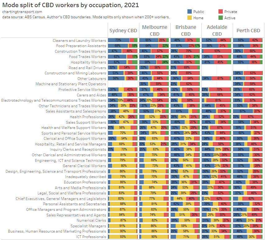
So were some types of managers more likely to use private transport than others? Here’s a heatmap table looking at private transport mode share by occupation AND industry of employment:
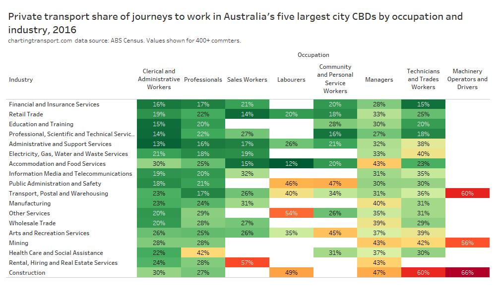
Some more distinct patterns emerge here. Managers in the construction, mining, rental, hiring and real estate services, manufacturing, and accommodation and food service industries had significantly higher private transport mode shares than managers in other industries. I suspect these could be explained by high salaries (eg mining), shift work (accommodation and food services), and need for a vehicle during the work day (rental, hiring, and real estate).
You can also see some other high private transport mode shares that seem pretty explainable:
- 47% for public administration and safety / community and personal service workers – which probably includes a lot of police who might have done shift work,
- 42% for professionals in health care and social assistance – probably including many shift working hospital staff,
- 57% for sales workers in rental, hiring, and real estate services, who possibly need their car for work and/or are allowed to take company cars home.
So far I’ve been speculating about mode shares for more specific occupation types, but it is possible to drill down the ANZSCO codes to understand things more deeply. First up, here are the average private transport mode shares and commuter volumes for level 2 occupation categories:
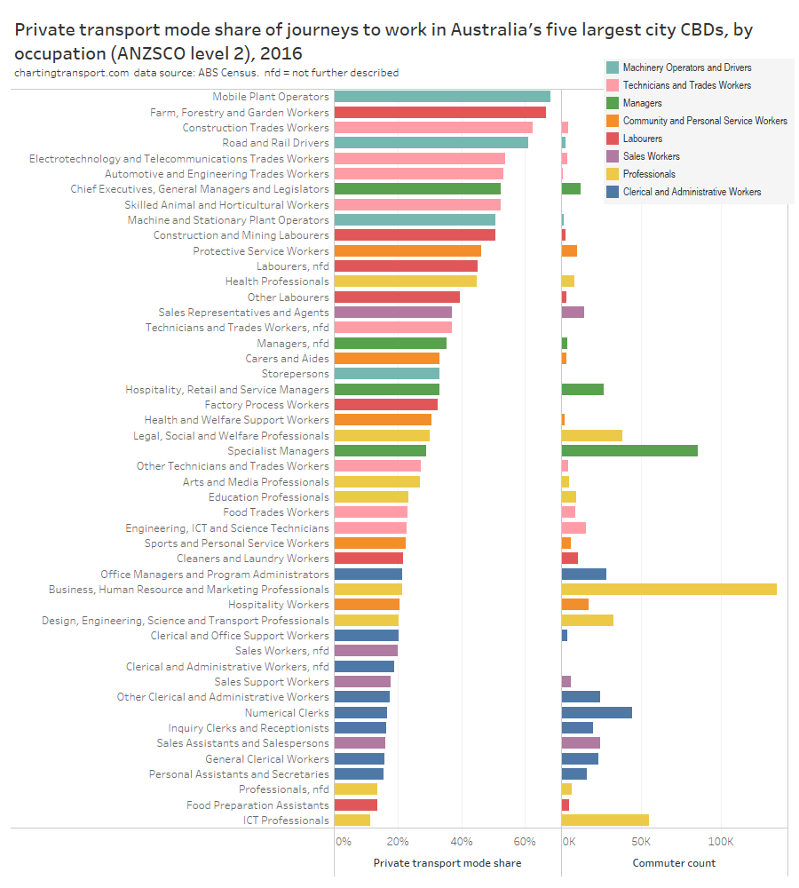
The highest private transport mode share was for mobile plant operators, but also there were only 421 such commuters across the five cities. The first large occupation category with a high private transport mode share was Chief Executives, General Managers and Legislators.
So while private transport mode shares do vary by occupation and industry, it seems to boil down to higher private transport mode share for people working shift work, people whose day job involves operating a motor vehicle, and tradies who clearly need to bring specialist equipment, amongst others. However these workers are a fairly small proportion of all CBD workers.
I’ve dug even deeper down to ANZSCO level 4 occupations. The top ten occupations with the highest private transport mode share (minimum 100 commuters) were:
- 86% automobile drivers (no surprise here, this presumably this includes taxi drivers)
- 81% bus and coach drivers (but only 165 workers across the five cities)
- 81% earthmoving plant operators
- 80% primary school teachers (that was unexpected!)
- 79% surgeons (likely some shift work)
- 75% fire and emergency workers (no doubt including many shift workers)
- 75% truck drivers
- 74% wall and floor tilers
- 73% air conditioning and refrigeration mechanics
- 72% aged and disability carers (many shift workers?)
Working down the list, other occupations of interest (to me) include:
- legislators at 67% – sometimes parliament sits until very late at night
- registered nurses at 61% – many shift workers no doubt
- chief executives and managing directors at 55% – not quite as high as I expected – 46% in Sydney, 52% in Melbourne, and 73+% in the other cities (for interest: public transport mode shares were 45% in Sydney and 37% in Melbourne)
- train and tram drivers at 48% – but much higher in Perth, Brisbane, and Adelaide (only 42% in Melbourne and 23% in Sydney)
- police at 47% – likely many shift workers
- software and applications programmers at 8% – at the very bottom of the list
And here’s the top ten occupations (at level 4) that used private transport to get to work, by volume :
- 5.1% Barristers & Solicitors*
- 4.5% Accountants and accounting clerks*
- 3.1% Advertising, public relations and sales managers
- 2.3% Contract, program and project administrators
- 2.2% Management and organisation analysts
- 2.0% ICT managers
- 1.9% Chief executives and managing directors
- 1.7% General Clerks
- 1.7% Real Estate Sales Agents
- 1.7% General Managers
These ten occupations accounted for 26.7% of all private transport commuter trips to work in CBDs in the five cities in 2016. I would expect many people with these occupations to also be on high incomes.
*I’ve (arbitrary) bundled two similar occupations here.
Were private sector commuters more likely to drive?
While private sector workers had the highest private transport mode share in most of the big cities (except Perth), there are big differences between occupations, so I think it’s worth looking at private mode shares by both occupation and sector of employment:
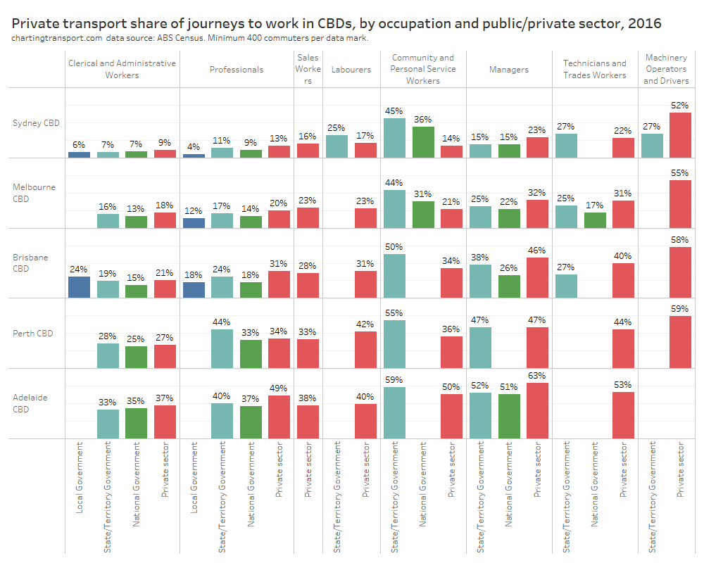
Local government professionals had the lowest private transport mode share in Sydney, Melbourne, and Brisbane.
The starkest difference between public/private sectors was in the “community and personal service workers” occupation category. I would expect many of the state government workers in this category to be hospital staff and police, many of whom would have been working shift work.
Any approach to congestion pricing in CBD areas might want to give consideration to these essential shift workers, who generally made up around 5% of CBD commuters (on a Tuesday at least, and it will vary by CBD).
Did commuters drive because they worked more hours per week?
The census asks people how many hours they worked in the previous week – which hopefully also generally reflects how many hours they might have worked in the week of the census (there will be some minor exceptions, such as people returning from leave). The following chart shows the relationship between hours worked and private transport mode share across all the CBDs:
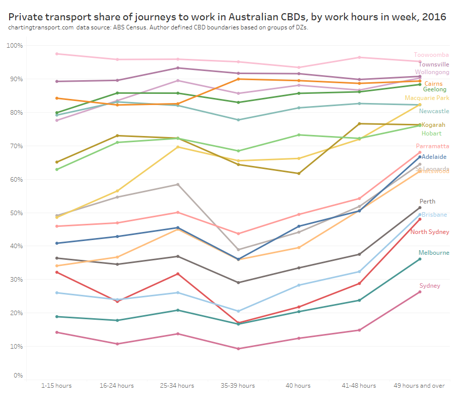
For the smaller CBDs there was very high mode private share, no matter what the working hours, so I will focus in the on larger CBDs.
In the larger CBDs:
- Private transport mode share was lowest for those reporting 35-39 hours. About a quarter of these were public sector workers – the highest public sector share for any grouping of worked hours.
- Private transport mode share had a mini-peak for 25-34 hours, which probably represents many people working part time 3-4 days per week. Perhaps these people were juggling other responsibilities and activities (eg parenting, studying) and decided a car better supported their complex multi-stop travel journeys? We will come back to parenting shortly.
- Private transport mode share increased as hours worked increased from 35+ hours, peaking at those working 49+ hours in the week. Perhaps people working very long hours could not afford the extra time to use any other mode, perhaps they commuted outside traditional peak periods (perhaps as shift workers, or just because of very long days in the office), and/or perhaps they were very high income earners (more on this shortly).
One word of caution on this is that some people on higher incomes might not have worked many hours in the week before the census for random reasons (eg they were on leave). When I look at the approximate average income per hour worked of people who worked 1-15 hours, it was much higher than all other hours-worked bands.
Here’s a view of the distribution of commuters (private transport commuters and all commuters) by hours worked in the last week for larger CBDs:
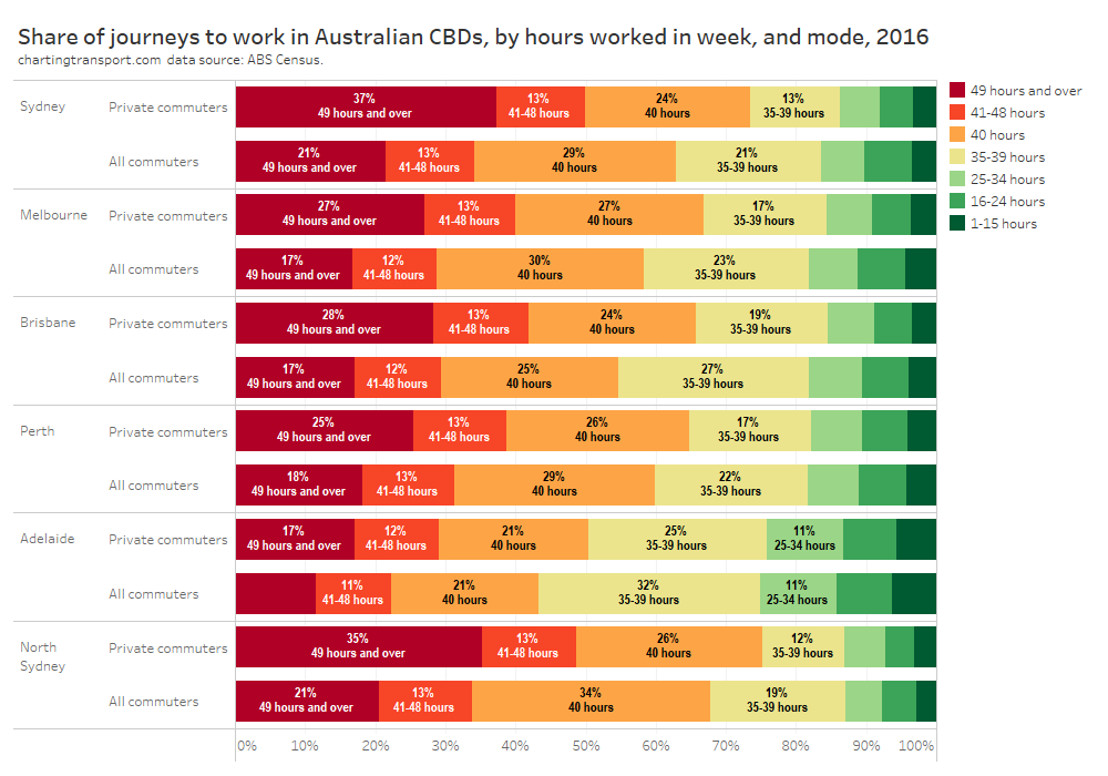
Commuters using private transport absolutely skewed toward people working longer hours (compared to all commuters). In particular a large share of private transport commuters worked 49 hours or more, which I’d suggest is pretty extreme overtime (these people are probably also time-poor so might be prepared to pay a premium for a faster mode of transport).
People working long hours naturally tended to have higher incomes. I’ve roughly estimated the average hourly income for each range of worked hours, and this shows a big step up in hourly income at 40 hours per week, and then another step up for those working 49+ hours per week. People working 40+ hours were also much more likely to be working in the private sector.
However not everyone working long hours was on a high income, so I’m wondering if these variables are strongly co-correlated.
Here’s a chart showing private transport mode share by hours worked and weekly income for the five big city CBDs combined:
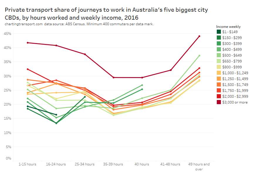
The chart suggests that both hours worked and weekly income were relatively independent drivers of mode share. Private transport mode share was higher for people on higher incomes regardless of hours worked. Private transport mode share was lowest for people working 35-39 hours across all income bands, except people on the lowest incomes working limited hours.
There were just under a thousand people working 49+ hours on a relatively low weekly income of $500-$649 who had a 37% private transport mode share across the five big cities. perhaps these people were working multiple jobs and/or shift work. These commuters were probably doing it tough with high transport costs and lower incomes – but thankfully there weren’t many of them.
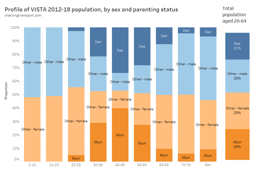
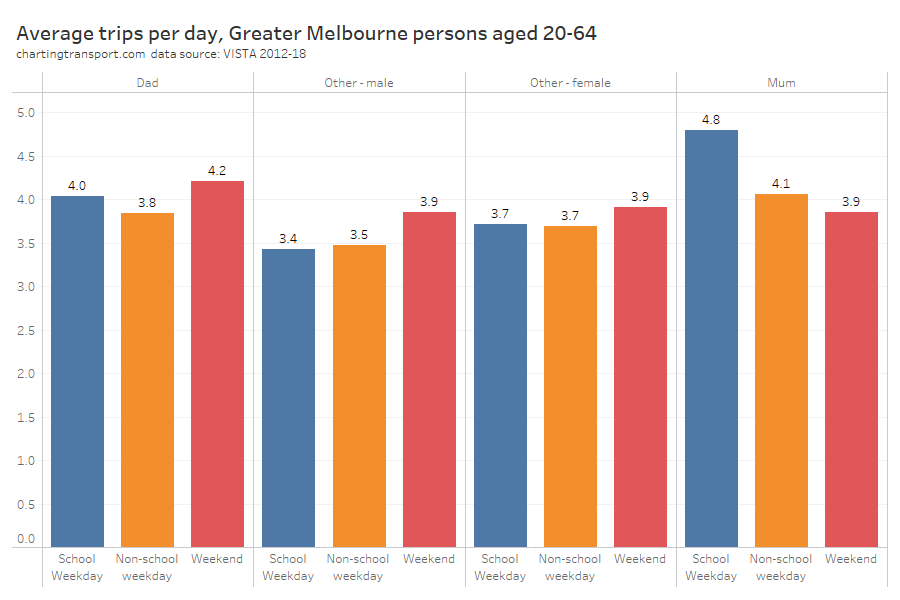
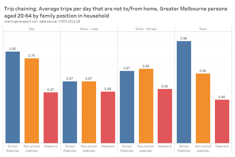
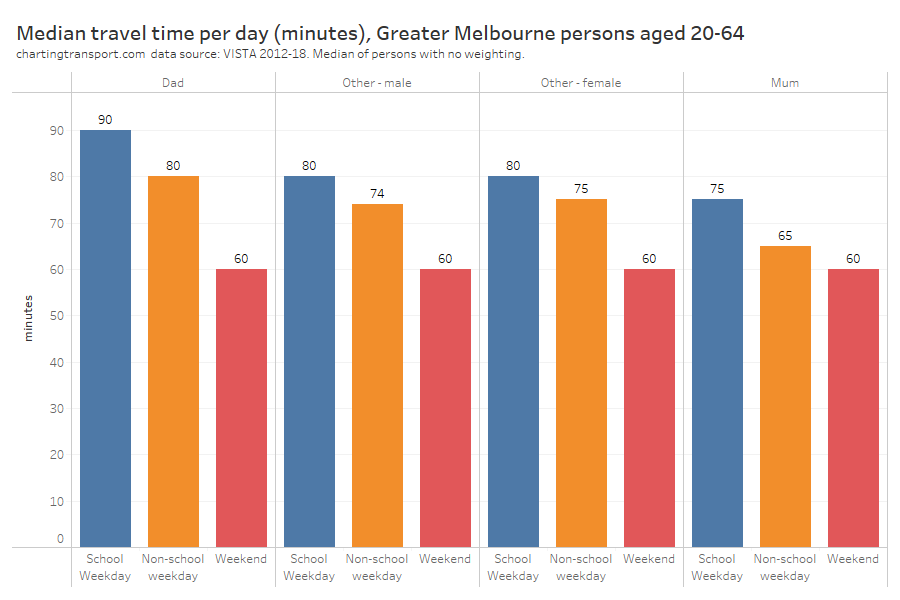
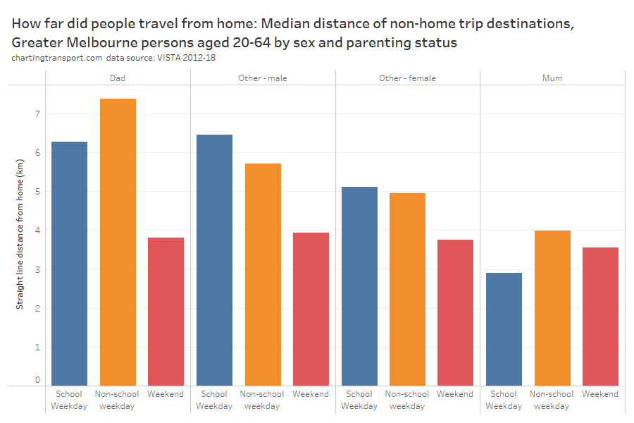
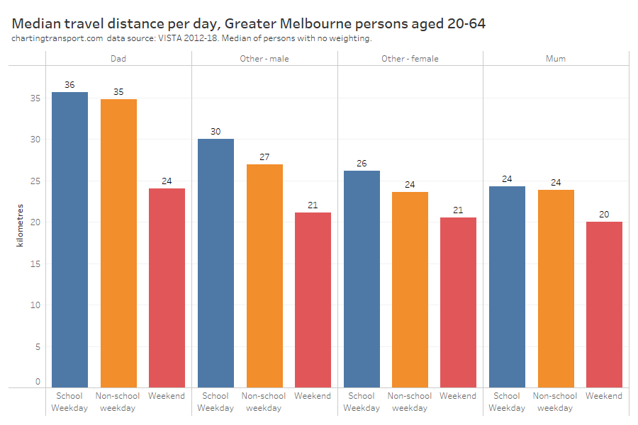
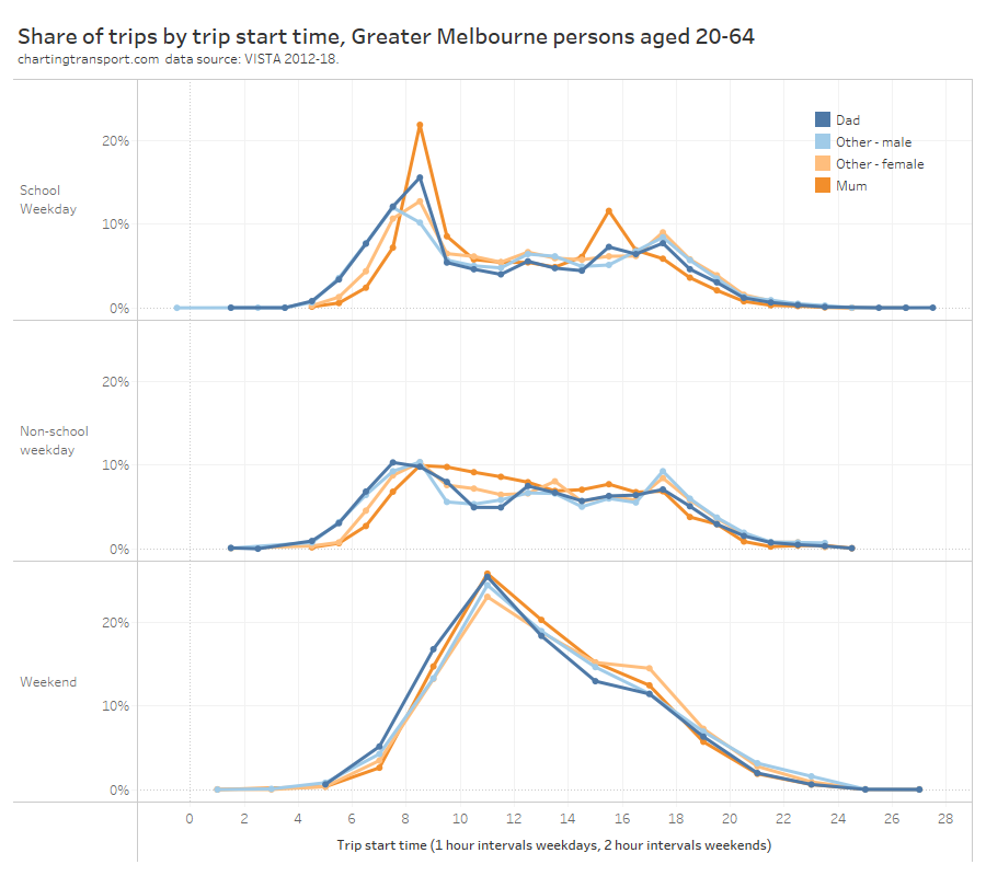
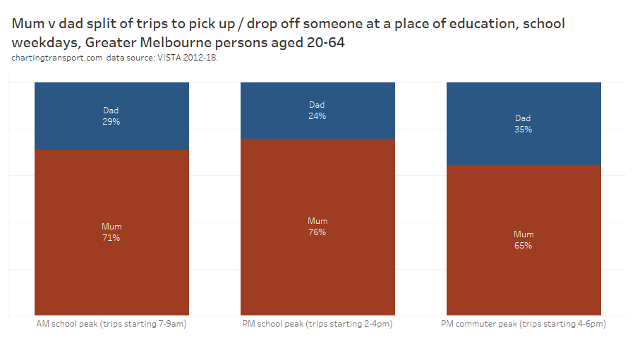
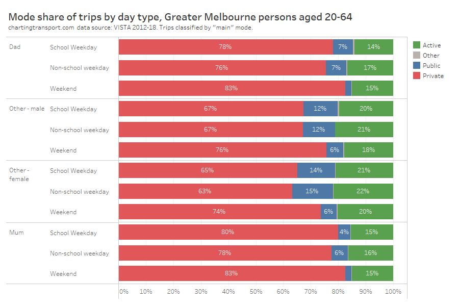
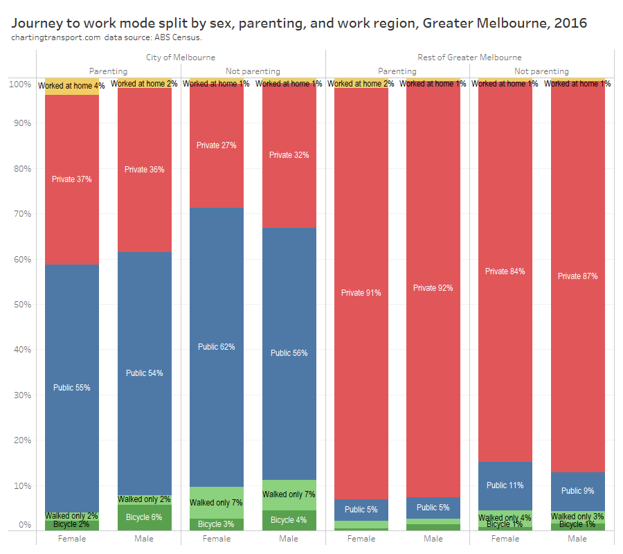
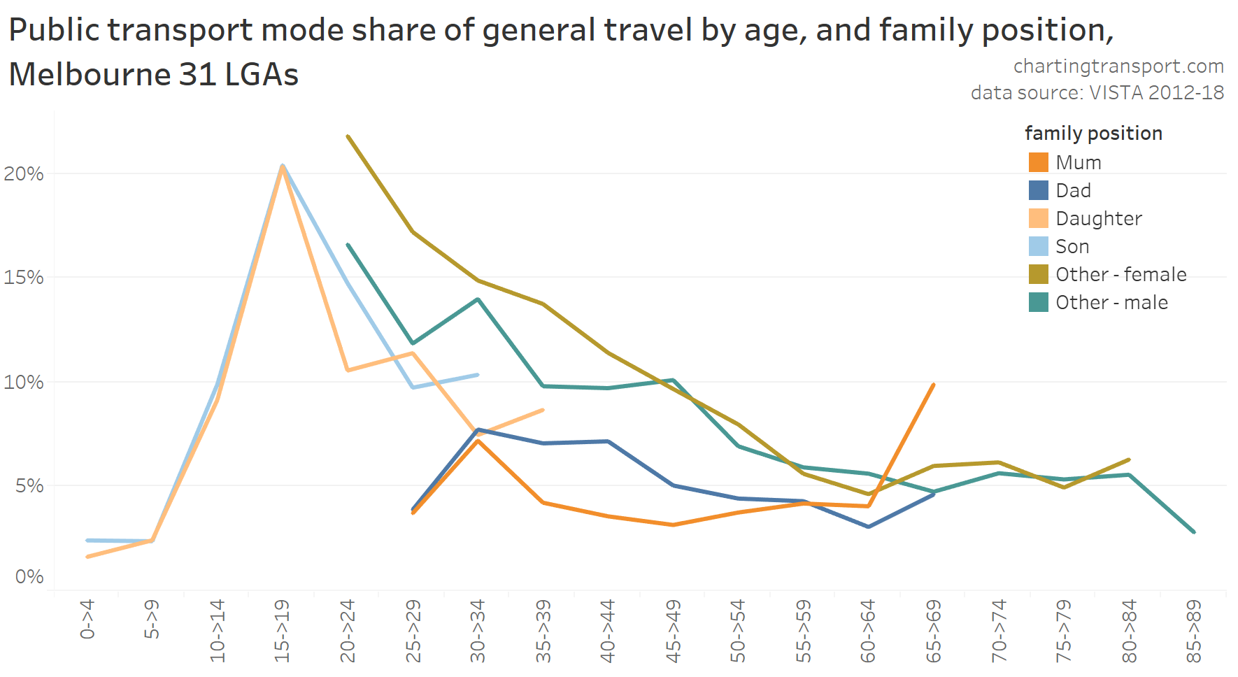
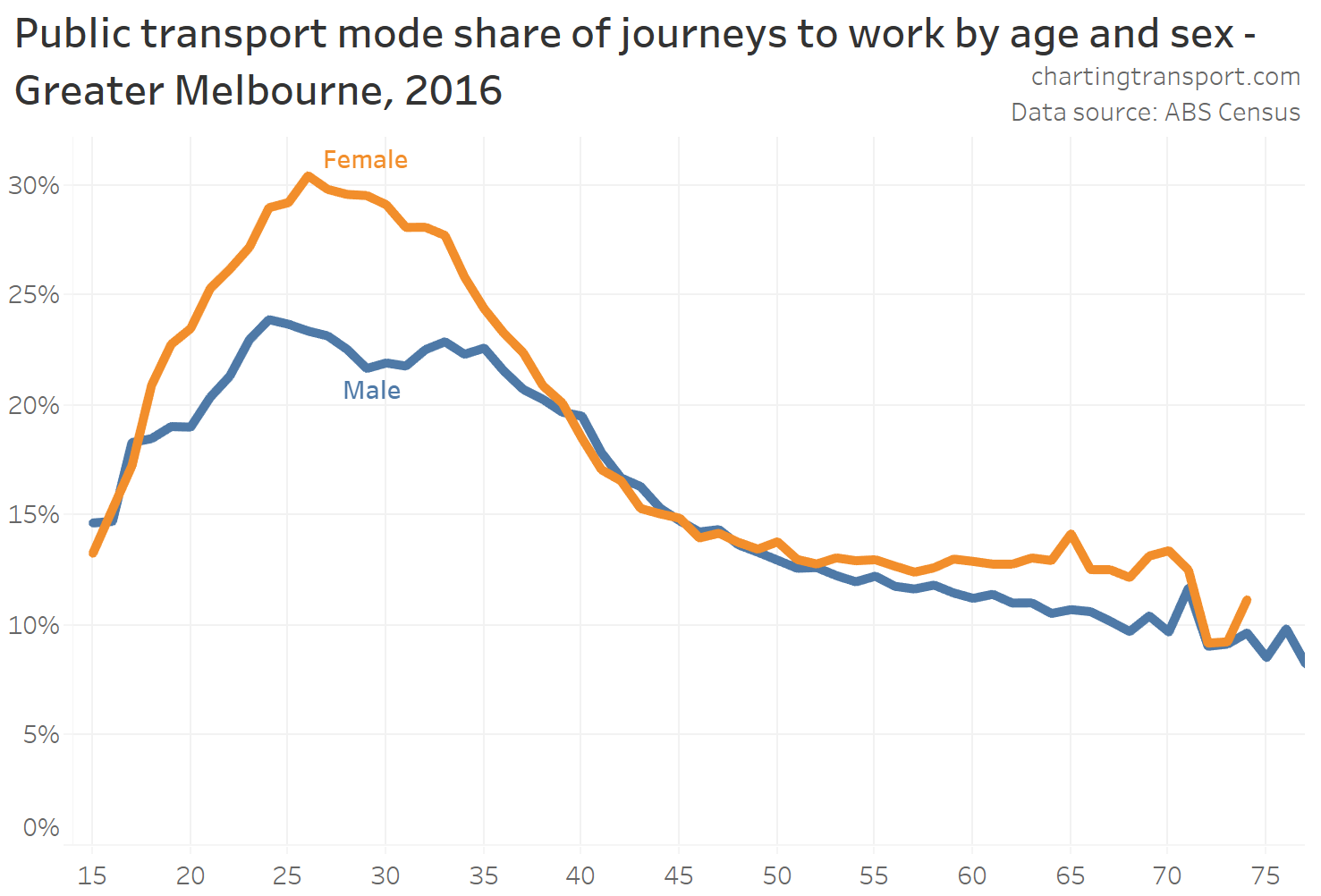
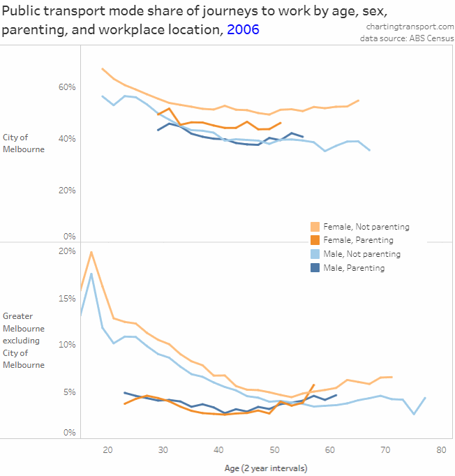
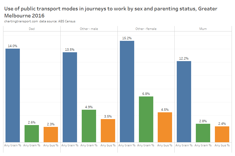
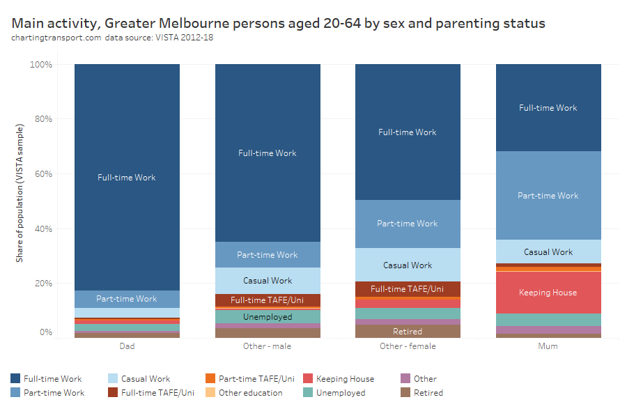
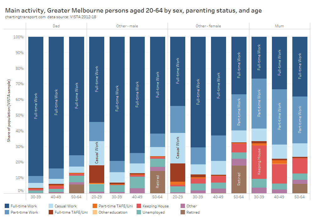
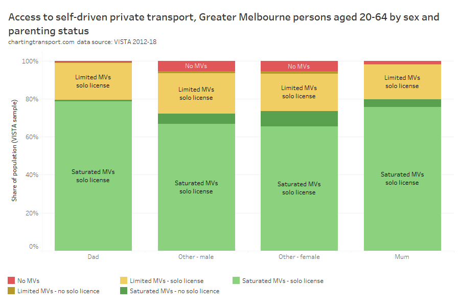
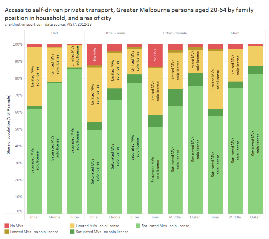
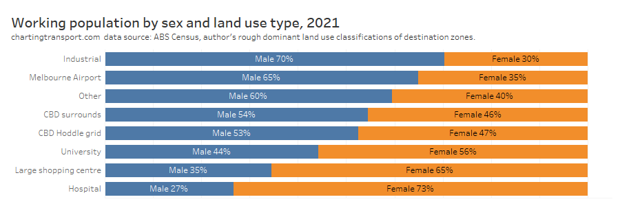
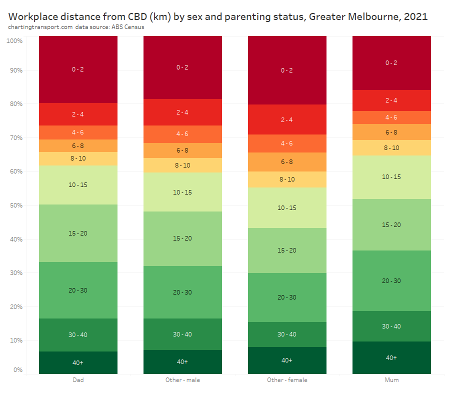
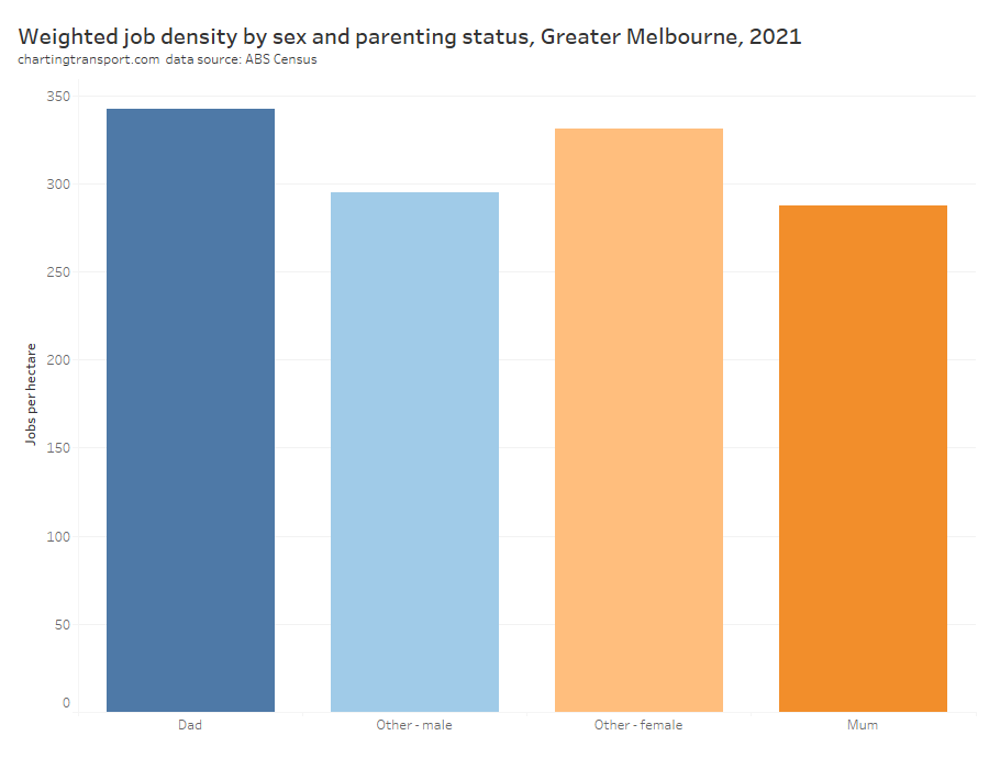
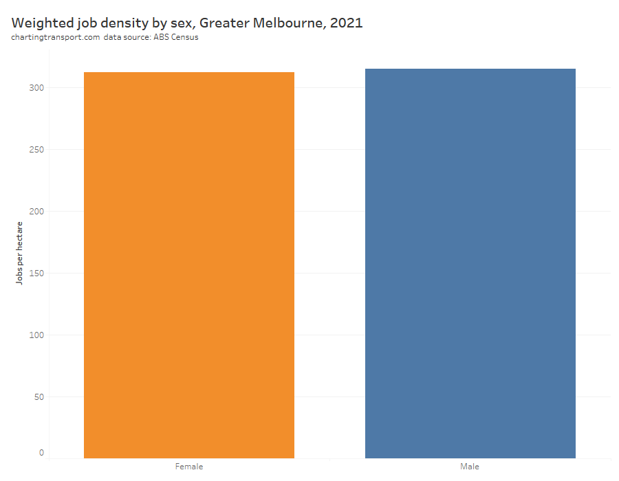
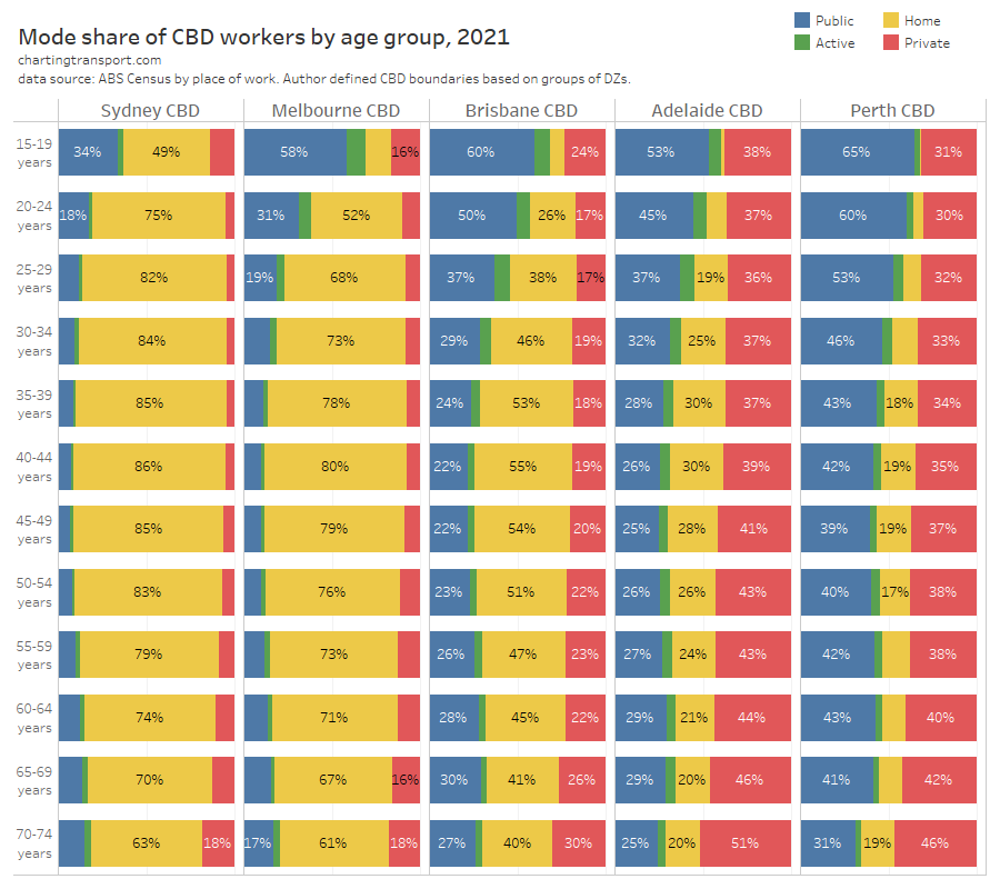
Were older and/or parenting commuters more likely to drive?
In answering this question I’m going to also throw in the dimension of gender, as these three dimensions have shown up to be quite significant when it comes to mode shares generally in my previous analysis (see: How and why do travel patterns vary by gender and parenting status?).
Technical note: I am talking about gender, but the data reported by ABS is actually based on (binary) sex.
Here’s how private transport CBD commuter mode shares vary across age, gender, and parenting status:
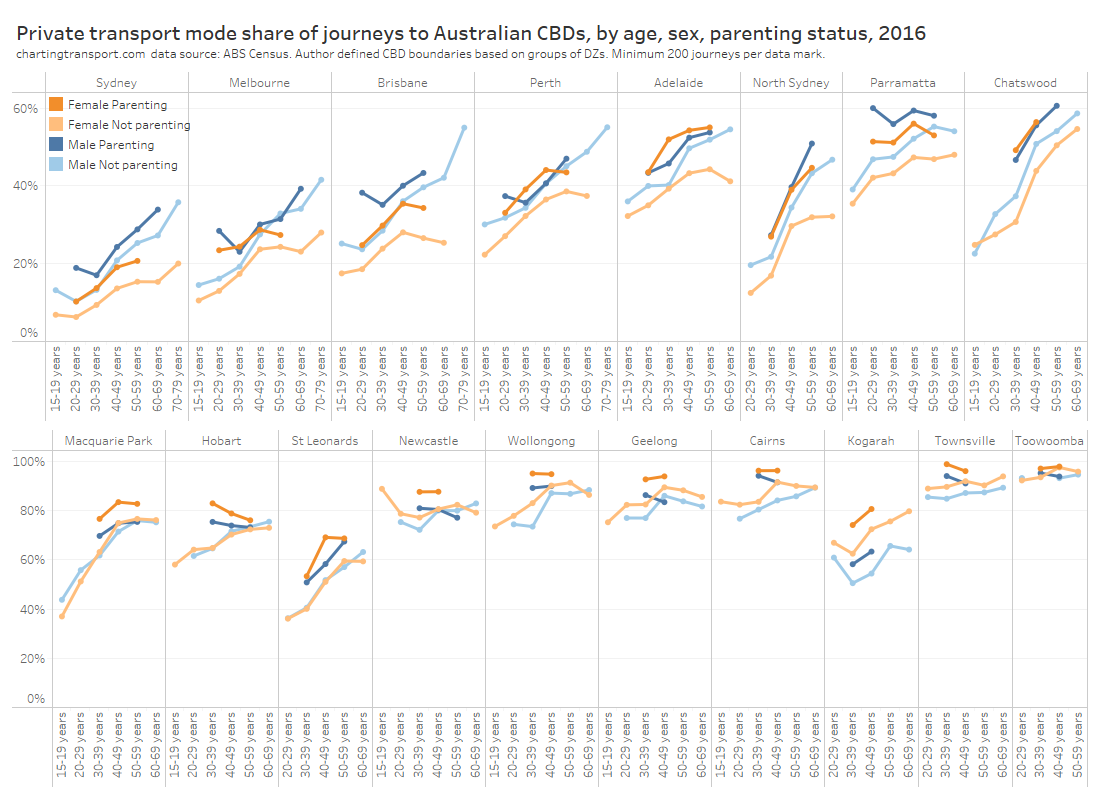
There’s a bit going on here:
- For males, there’s generally a strong relationship with private transport mode share increasing with increasing age.
- For females, private transport mode share generally increased with age, but sometimes flatlined or declined for females over 50.
- Parents generally had higher private transport mode shares, with dads having higher shares than mums in the largest centres, but then curiously mums had higher private shares in the smaller CBDs.
- For non-parenting workers, males had higher private transport mode shares in the bigger CBDs, but again this curiously flipped for the smaller CBDs.
Here’s the distribution of CBD commuters by age for private commuters, and all commuters:
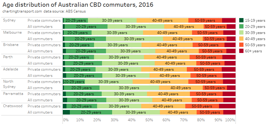
Private transport commuters are significantly skewed towards older age bands in most CBDs. Commuters over the age of 40 made up 41% of all Sydney CBD commuters, but accounted for 57% of private transport journeys. Melbourne was similar.
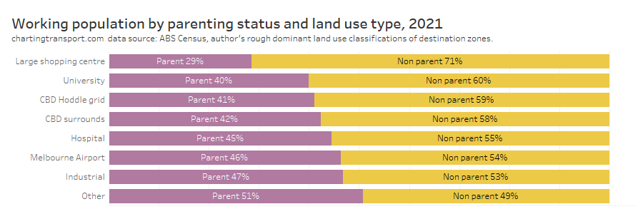
Here’s the distribution of parenting status for private commuters and all commuters:
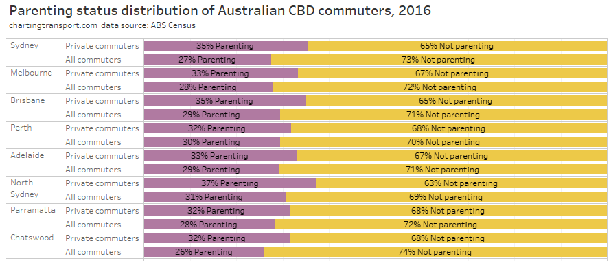
Parents were slightly over-represented in private transport commuters in most CBDs, but the majority of private commuters were still non-parents.
Here’s the gender distribution (reminder: ABS census data only includes binary sex):
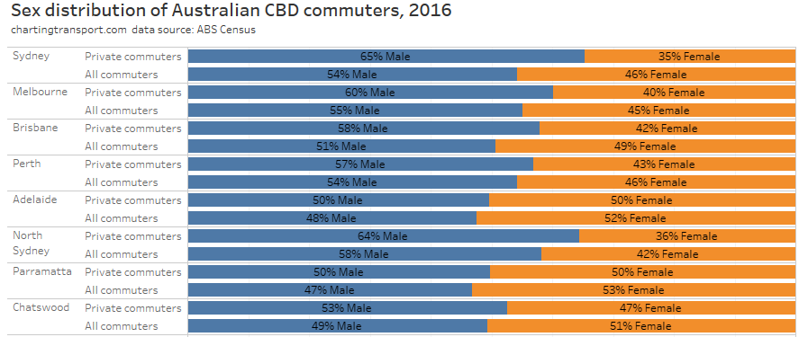
Males were over-represented in private transport commuters, but not always by a large margin.
So are older commuters more likely to drive to work simply because they are more likely to be earning high incomes?
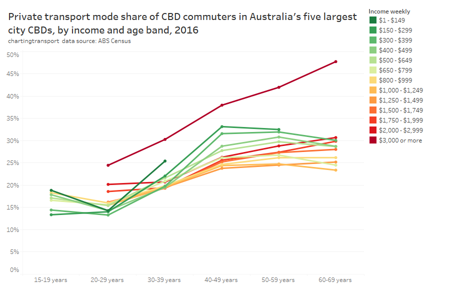
It looks like there was a strong relationship between age and mode choice, regardless of income band.
I suspect the peak in lower income commuters in their 40s might reflect part time parenting commuters. Younger people on higher incomes were much less likely to choose private transport.
This is all similar to previous analysis on public transport mode share in general against these variables (see: Why are young adults more likely to use public transport? (an exploration of mode shares by age – part 4). Older people generally used public transport less often, regardless of income and parenting status.
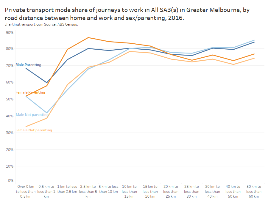
Did commuters drive because they were a long way from their CBD?
For people who drove to work in CBD, how far did they live from their CBD? And so, will CBD parking levies disproportionately hit people in the inner or outer suburbs?
The next chart shows the distribution of CBD commuter home locations by distance from CBDs for all commuters, and private transport commuters (ABS calculates or estimates the on-road distance between each employee’s home and work location).
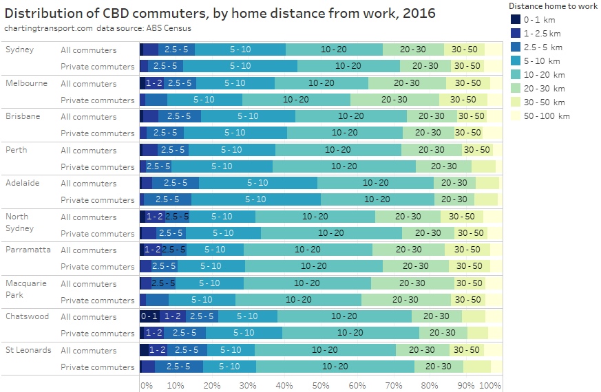
For very short journeys driving probably isn’t competitive with walking, so in all cities few private transport commutes were less than 2.5 km.
But if you look at the further distance bands, there’s not a lot of difference between private commuters compared to all commuters. In Melbourne private commuters skew slightly further out, while in Sydney they skew slightly further in. It varies a little by city.
It is also worth noting that CBD commuters don’t tend to live a long way from the CBD, because not many people make life choices that require long distance commutes. Around two-thirds of Sydney and Melbourne CBD commuters lived within 20km of the city.
The following chart show the mode split of people who travelled to work, based on their distance from home to work:
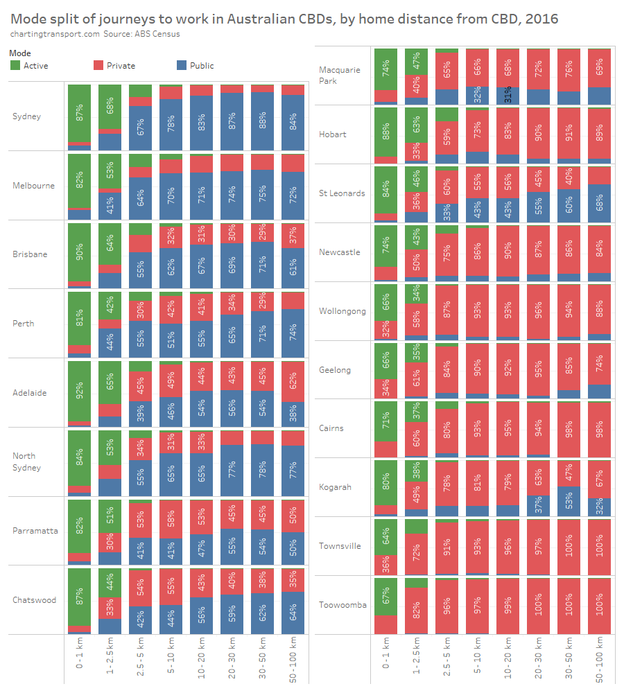
Observations:
- Active transport dominates very short trips, especially in the biggest CBDs. Walking is way cheaper than public or private transport, and possibly often faster. Public transport mode share for very short journeys was tiny, except for the Melbourne CBD which is probably explained by the Free Tram Zone in the CBD area making very short tram trips to work free (although a similar effect doesn’t show up for Perth CBD’s Free Transit Zone).
- Active transport mode share fades away by 5 km from the CBD, and then it’s a contest between private and public transport. Public transport won the largest share in the biggest CBDs, while private transport dominated for the smaller CBDs.
- For distances of more than 5 km, the split between public and private transport shows different patterns in different CBDs.
- For Perth, Wollongong, Geelong, and the Sydney secondary CBDs of North Sydney, Parramatta, Chatswood, St Leonards, and Kogarah, public transport mode share increased with increasing distance. The secondary CBDs in Sydney are all well connected by the train network, and perhaps this is competing well with road tolls for private transport that generally increase with distance travelled. Perth, Wollongong, and Geelong are well connected by rail for many long distance commuters which might influence this pattern (rail being relatively cost and time competitive for longer distance trips).
- For many CBDs the mode split remains fairly flat across distances, except for a spike in private mode share for trips 50-100km in Brisbane, Adelaide, and Parramatta.
- Kogarah keeps showing up with wacky patterns in these charts. Public transport mode share is only strong for trips of 20-50 km, which probably represents many trips where metropolitan train travel is highly time and cost competitive.
This means that there isn’t a clear over-representation of private transport users for shorter or longer distances across the cities (beyond ~5km from CBD). Private transport commuters tend to travel similar distances to public transport commuters.
As something of an aside – another way of looking at this data is the estimated approximate average distance to work (I have to estimate these because journey lengths are reported in bands rather than precise figures). The following chart shows the approximate average distance to work, and the width of the bars is scaled to the relative mode share of each mode. So a skinny line shows the average distance of a minority mode.
Technical note: To calculate the approximate average distance from home, I take a weighted average of the mid-distances of each reported distance band, with the weighting based on the number of commuters reported in each distance band (I hope that makes sense!).
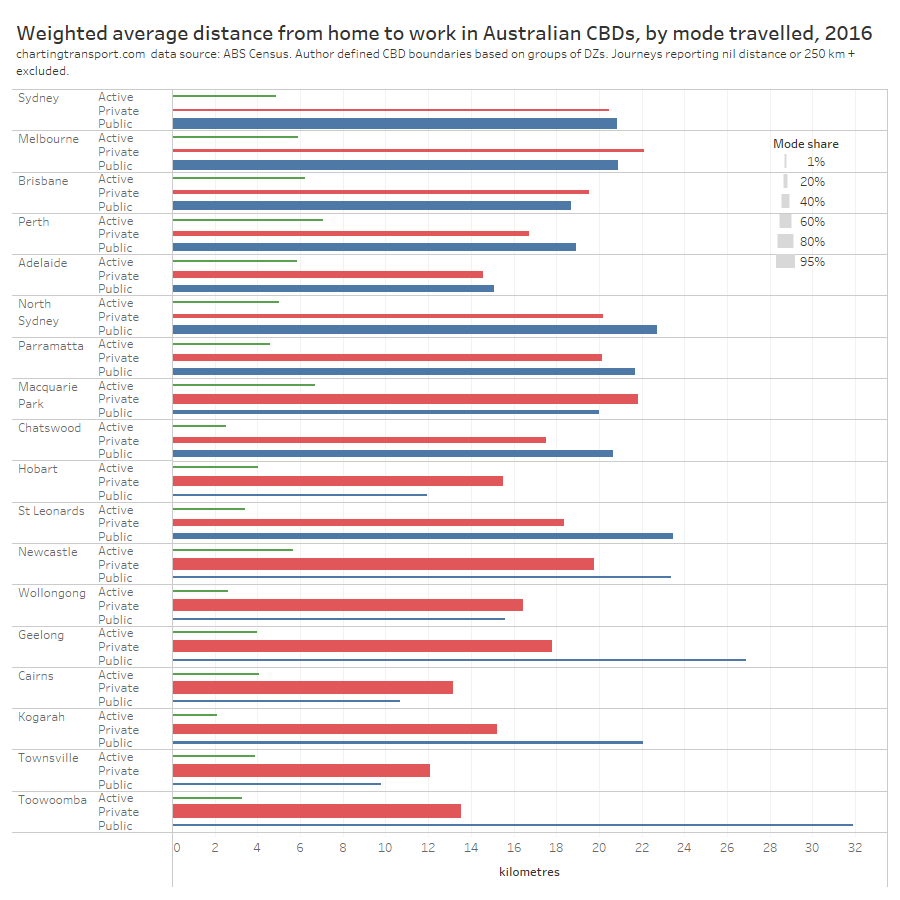
For the Sydney CBD, public transport trips had a slightly longer average commuting distance than private transport, but for the Melbourne CBD it was the other way around. There’s no clear pattern for the larger CBDs.
However for the smaller CBDs public transport tended to have much longer average distances (with Toowoomba the longest). This suggests public transport was more competitive for longer travel distances to smaller cities.
In summary – who drove to work in Australian CBDs in 2016?
My analysis has found that people with the following characteristics were significantly over-represented in private transport CBD commuting in Australia’s largest cities:
- commuters on the highest incomes
- commuters working very long hours
- commuters living further from rapid transit stations
- commuters who were parenting
- older commuters (particularly for males)
- males
- commuters likely to be doing shift work – particularly police and medical workers
CBD commuters living within around 5 km of large CBDs and within around 2.5 km of smaller CBDs were more likely to use active transport for obvious reasons. Beyond these near-CBD areas, there were not clear relationships between mode split and distance from CBD.
There were also some types of commuters who had high private transport mode shares, but made up only a small volume of CBD commuters so were not significantly over-represented in private transport commuting. These included:
- Part-time workers on high incomes
- Workers who need a motor vehicle as part of their day job
What can public transport agencies do to try to shift these private transport CBD commuters towards public transport?
Many of these private transport commuters were on high incomes, and didn’t choose public transport, even though it was relatively close to home. These commuters probably won’t respond to fare reductions, but they (or their employers) may respond to private transport disincentives (eg parking levies, reduced parking availability, (de)congestion charging, changes to tax incentives).
For commuters working part time, shift work, and/or long hours, public transport agencies might want to ensure there is a reasonably frequent services from early morning until well into the evening on rapid transit lines. In 2017 Sydney boosted off peak train frequencies to 15 minutes or better over a very long span of hours, and patronage grew strongly (until the pandemic hit).
For parenting commuters, perhaps locating childcare centres, kindergartens, and schools closer to rapid transit stations might make it easier to mix work and parenting responsibilities while travelling on public transport. But of course relocating such facilities is hardly trivial, and high land values around rapid transit stations would also be a challenge. It may however assist with getting higher public transport mode shares for school travel, which is a significant travel demand in peak periods.
I haven’t been able to explore the issue of public transport service quality and mode choice, but ensuring public transport has sufficient capacity and reliability would obviously be desirable, and I suspect might be particularly important to people on higher incomes and/or working longer hours who consider themselves time-poor.
Of course the absence of rapid transit is associated with higher private transport mode share in most cities. Public transport agencies might want to consider which parts of their cities are generating higher concentrations of private transport CBD commuters, and whether that might be related to public transport service quality. All cities will have areas remote from rapid transit stations, but only some of these areas will have higher concentrations of CBD employees.
My next post on this topic will look at the spatial distribution CBD commuter mode shares and private commuter volumes in the larger cities.


 Posted by chrisloader