10 August 2021 was an Australian census like no other. Sydney and Melbourne were under fairly strict “lockdown” restrictions due to the COVID19 pandemic, Brisbane was two days out of a lockdown, while Adelaide, Perth, and Canberra had temporarily eliminated COVID and were living a life of few restrictions.
So how did the way people go to work change? There’s lots to unpack on this question and I’ll do that over a few blog posts.
This post will focus on how many people worked from home in 2021, how many of these people were working remotely, how this compared across locked-down and COVID-free cities, which occupations were more likely to work from home in different cities, and what this might mean for future public transport patronage. I’ll also have a quick look at what proportion of employees were not working on census day.
What was happening on Census day 2021?
Melbourne and Sydney were in “lockdown” with workers required to work from home if possible, Brisbane was just out of lockdown, while the other cities were pretty much COVID-free, although Adelaide had experienced a short lockdown in July 2021. Here’s a summary of some key metrics (CBD office occupancy sourced from the Property Council):
*The Property Council reported a figure of 60% for August 2021, but this would have been illegal on 10 August as there was a 50% capacity limit. We don’t know the exact dates when the survey was conducted, I can only assume later in that month when restrictions were eased. 47% of Brisbane CBD employees reported working at home on census day.
How have mode shares changed between censuses?
Given working at home now represents a much more significant share of all workers, I’ve calculated public transport mode shares both including and excluding people who travelled to a workplace:
It will be no surprise that public transport mode shares dropped dramatically in most cities. The biggest mode share drops were in the locked down cities of Melbourne and Sydney, but there were large falls also in Brisbane and Adelaide (which was also impacted by closure of the Gawler train line during 2021). Relatively COVID-free Canberra and Perth saw more modest reductions in line with the trend from 2011 to 2016, and for Canberra there was little change in the public transport mode share of people who did travel to work.
Here’s a look at the total mode split (including people who worked at home as a “mode”):
The largest rates of working at home in 2021 were unsurprisingly in the most COVID-impacted cities at the time.
The biggest mode shift in 2021 was from public transport to working-at-home, but there were also mode shifts away from active transport and private transport, even in the COVID-free cities.
How many people were working remotely?
All of Australia had experienced COVID lockdowns in March 2020, and for that period a significant portion of the workforce suddenly transitioned to working at home. What was a fringe activity in 2016 suddenly became the new normal for many employees and employers. This was most acutely noticed in the central business districts of our cities where office workers went almost entirely remote.
As discussed in my previous post on this topic, historically most people who worked at home on census day reported their work SA2 as the same as their home SA2, and I am assuming the vast majority of these people have their home as their regular workplace.
To better understand working at home, I’ve extracted worked at home counts from the 2011, 2016 and 2021 censuses, and then split the “worked at home” workers by whether or not their workplace SA2 was the same as their home SA2.
This allows an estimation of the number and share of people who worked remotely and those who regularly worked at home. I say estimation because the ABS aims to protect privacy by “randomly” adjusting small numbers in downloadable data and never reports values of 1 or 2. When I add up the number of people remote working within Greater Melbourne in 2021, 22% of that total comes from counts of 3 people between specific home SA2 – work SA2 pairs (Sydney was 21%, Brisbane 24%, Perth 29%). The true count for many of these pairs will not be exactly 3 people, so summing lots of small volumes that are “randomly adjusted” may result in a biased accumulation of small number errors. For 2011 and 2016 the summation of remote workers includes an even larger share of 3s so I’m not going to give the summation value here, but I’m confident the true summation is still tiny (much less than 1%).
These imperfect estimates of “home in work SA2” share and “remote working” shares don’t perfectly add up to the known total working at home share for the city (eg Sydney the sum was 2% over the actual for 2021 but other cities were pretty close). For want of a better method, I’ve scaled these estimated volumes such that their sum equals the known total worked at home volume, and I’m not going to quote any decimal places.
Here are my estimated shares of workers who classify as “remote working” and “home in workplace SA2” by census year:
The pre-COVID regularly working at home rates were mostly around 4-5%, but this was estimated to have increased significantly in Sydney, Melbourne, and Brisbane in 2021. I suspect this is a mix of people who gave up their regular workplace and permanently shifted to working at home and some people who filled in the census inaccurately and indicated that their workplace at the time was their home, even though that might have been a temporary arrangement during COVID restrictions.
The COVID-free cities experienced remote working rates of only 4-6%, whereas the heavily restricted cities of Sydney and Melbourne had remote working rates of 36% and 26% respectively.
Where was remote working most common?
What follows are maps showing estimated rates of remote working for workplace SA2s across the five big cities. There’s definitely an issue of aggregating many small numbers that are ‘randomly adjusted’, so I’m not going to report exact numbers, but rather classify SA2s into bands.
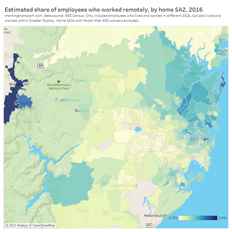
Here are the remote working hotspots for Sydney:
The highest rates of remote working were seen for workplaces in the dense employment areas of central Sydney, North Sydney, Macquarie Park / Ryde, Parramatta, Rhodes, and Kensington (which is dominated by a university campus). All white collar hotspots.
Here’s Melbourne:
Melbourne had a lot fewer remote working hotspots, in line with it having a lot fewer suburban employment clusters (see: Suburban employment clusters and the journey to work in Australian cities). Apart from the central city and inner suburbs, remote working hotpots included SA2s with large university campuses such as Kingsbury, Burwood, and Hawthorn.
Remote working was less prevalent in Brisbane so I’ve used a different colour scale:
And for the COVID-free cities I’ve used an even smaller colour scale and focussed on SA2s that had rates above 5%.
Adelaide:
I’m not sure why there was a relatively high rate of remote working in Lockleys in the inner-west. Does anyone have any thoughts on this?
Canberra:
Perth:
Remote working was unsurprisingly more common in CBDs, some inner-city SA2s that contain concentrations of white collar employment, and some suburban SA2s that contain universities.
Central business districts are obvious areas to see high levels of remote working. My next post in this series will focus in more detail on changing commuter patterns for CBD workers in Australia’s five biggest cities.
Which occupation types transitioned to working at home?
The following chart shows the rates of working at home by occupation for locked down Sydney and Melbourne in 2021:
As you read down the occupations listed there are no great surprises, with white collar jobs showing much higher rates of working at home. I’ve classified the occupations into four different bands of working at home rates based on conditions in locked-down Sydney and Melbourne. I’ll re-use these groupings for other cities shortly.
Many of these occupations had high public transport mode shares in 2016 (at least for Greater Melbourne), which is consistent with the dramatic drops in public transport volumes and mode share:
Many of the occupations with high public transport mode share in 2016 had high rates of working at home in 2021 (top right quadrant of the chart).
How do locked down cities compare to COVID-free Perth in 2021? The following chart includes Sydney and Perth for comparison purposes:
The occupations with relatively higher rates of working at home in Perth 2021 were fairly similar to those in Sydney, just at a much smaller scale (about four times). Occupations with much lower working at home rates in Perth than Sydney include education workers (schools and universities were not running remotely in Perth). Arts and media professionals topped working from home in Perth – but this occupation group also had relatively high rates of working at home in 2016. Other occupations with high levels of working from home in Perth were famers and farm managers (for obvious reasons) and ICT professionals (likely very adaptable to working remotely).
The following chart again compares 2021 working from home mode shares with 2016 public transport mode shares, but this time for Perth:
The same white-collar jobs appear in the top-right of the chart, suggesting a significant mode shift from public transport to working at home.
Here’s a look at public transport and worked-at-home mode shifts by occupation across the six big cities:
You can clearly see the relationship between public transport and home-working mode shifts, particularly for Sydney, Melbourne, and Brisbane. The relationships is very roughly that the working at home mode shift was around double the public transport mode shift. However the relationship is a little less clear in Adelaide, Perth, and Canberra.
I think this tells us that occupations that had high rates of public transport use in pre-pandemic times are mostly the same occupations that are highly amenable to working remotely. And of course these occupations have concentrations of workers in CBDs (hence the high use of public transport). To the extent that employers facilitate ongoing working from home, there will likely be a reduction in public transport commuter volumes. From a congestion and emissions point of view, that’s undoubtedly a good thing. There are of course also arguments about the agglomeration benefits of workers being physically in the same place.
Are occupations more amenable to working from home on the rise?
Thinking to the future, are these occupations with higher rates of working at home in 2021 on the rise or decline? The following chart attempts to answer this question:
Unfortunately I’m not sure the chart provides a clear answer. Many people were simply unable to work due to lockdowns on census day in Sydney and Melbourne. They aren’t on the chart. This appears to skews the overall share of jobs by category in those cities to the “High” end.
In the COVID-free cities, there doesn’t appear to be a clear trend over time. In 2016 the “High” occupations reduce share in all cities but then bounced back up in 2021.
However one important insight from this chart is that Canberra has the largest share of “High” occupations – followed by the bigger cities of Sydney and Melbourne. These cities are likely to have more specialist white collar professionals, and therefore they may have higher overall rates of ongoing remote working in the post-pandemic world. Public transport patronage will likely take longer to return to pre-pandemic levels these cities.
One final thing…
How many people were not working on census day in 2021?
Not every employed person works on census day, perhaps because they work part-time, casual, shift-work, or were unable to work that day. And of course in August 2021 a lot more people than usual were unable to work in Sydney and Melbourne. Here’s a look at the share of employed people who did not work on census day, by occupation category and census year:
After a downwards trend between 2006 and 2016, most occupation categories in most cities had a big uptick in not working on census day in 2021, most notably in Sydney where there were very strict lockdown rules. Curiously these upticks were present even in COVID-free cities like Adelaide, Perth, and Canberra, possibly reflecting an overall economic downturn, a lack of interstate and international travel, supply chain breakdowns, and/or maybe some other factors.
I hope you’ve found this post interesting. I’ll be unpacking more census data in some upcoming posts, including a more detailed look at CBD workers and a look at changes in demographics – particularly from the impact of suspending immigration during the pandemic. Stay tuned.
Can we learn anything from pre-pandemic working-at-home patterns that will help us predict transport demand “after” the pandemic?
This post investigates work-at-home patterns from the ABS census 2016 for the six largest Australian cities, with some deeper dives for Melbourne and Sydney. I’ll answer questions such as: What occupations and industries were more likely to work-at-home? How did work-at-home rates vary by home and work locations? How many people had their home double as their workplace? Who was ‘remote working’ at home away from their regular workplace?
I’ve found the results quite interesting – and not quite what you might expect from the our current pandemic perspective.
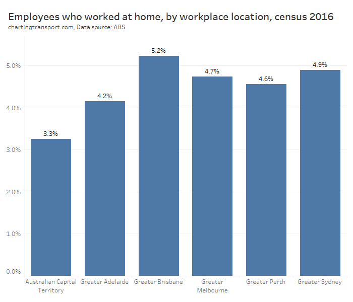
What proportion of workers worked at home in 2016?
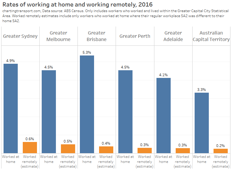
The following table shows between 3.3% and 5.2% of major city workers reported that they “worked at home” on census day in 2016 in Australia’s six largest cities:
This highest rate was in Brisbane, and the lowest in Canberra.
What occupations were more likely to work at home in 2016?
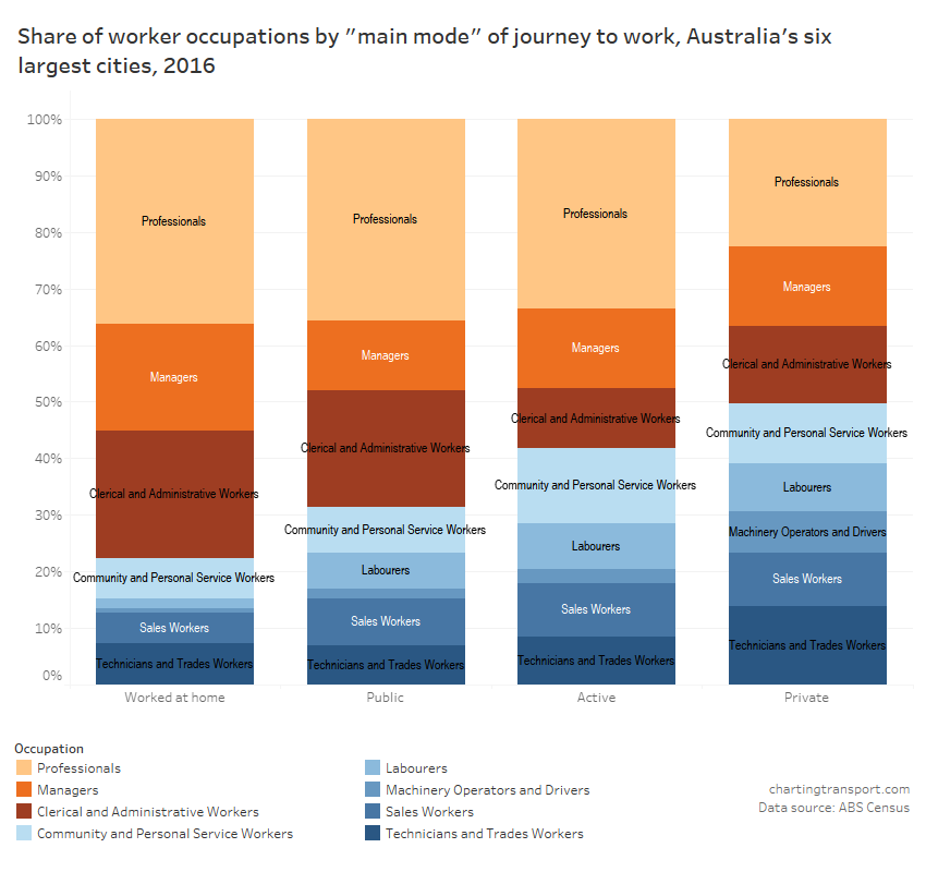
Here’s a chart showing 2016 journey to work mode shares across Australia’s six largest cities by main occupation category. Normally I exclude people working at home from mode share charts, but for this analysis I’m including “worked at home” as a “mode”:
Technical note: As usual on my blog, public includes all journeys involving a bus, tram, train and/or ferry trip, Active includes walk-only and cycle-only journeys, with all other journeys counted as Private.
You’ll notice the occupations with the highest rates of working at home were also the occupations with the highest public transport mode shares – professionals, clerical and administrative workers, and managers.
Here’s another view of that data, this time providing the occupation breakdown of commuters for each “mode”:
Again you can clearly see the same three occupation categories that dominated both working at home and public transport commuting.
No surprises there, right? These occupations generally spend a lot of time in offices either at computers or meeting with others – which can more easily be done online so are more likely to be amenable to working from home. The other occupation categories are more likely to necessitate working at a specific workplace.
But there are lots of different types of managers and professionals and they work in many different industries, so let’s dig a little deeper.
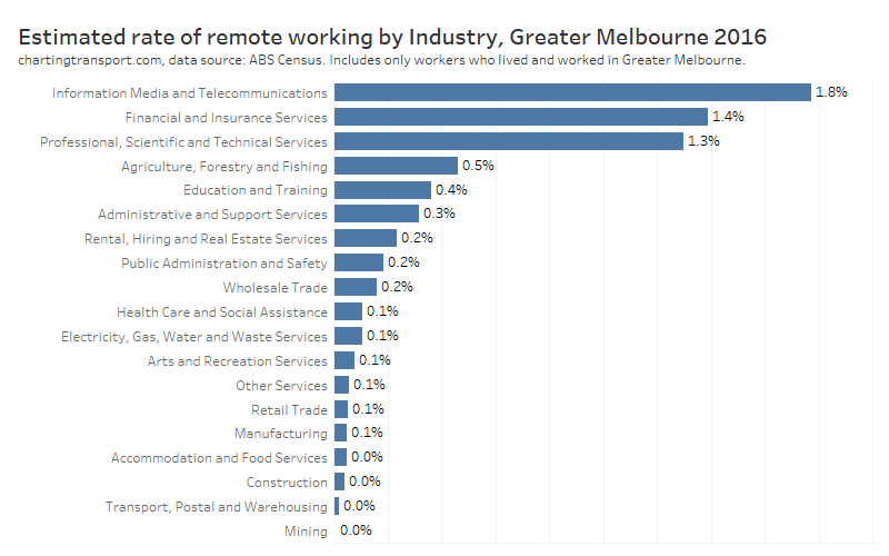
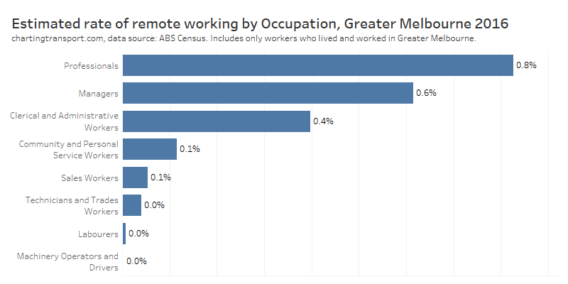
How did working at home vary by employment industry?
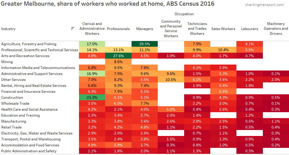
Here’s a look at the worked-at-home rates in 2016 by industry and occupation (highest level categories). I’ve sorted the occupations and industries such that the highest rates of worked-at-home are towards to the left and top of the table respectively.
The highest rates of working at home were found in Agriculture, Forestry and Fishing, Arts and Recreational Services, and Construction. Not exactly the sorts of jobs you would expect to fill multiple CBD office towers.
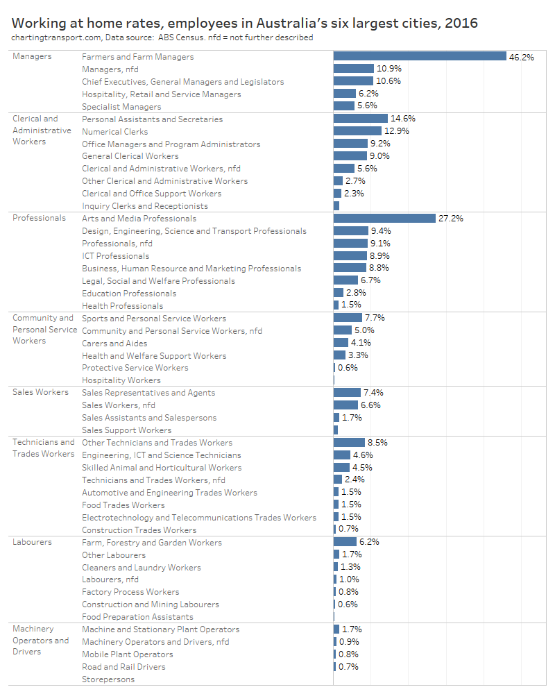
It’s also worth looking at the second level of occupation classifications:
Now we start to see working at home rates are very high for farm managers and arts and media professionals. For many of these people their workplace is quite likely to also be their home.
Many occupations that you might expect to be generally office-based had a working at home rate of around 9% – including HR, marketing, ICT, design, engineering, science and transport professionals.
How did working at home vary by home location?
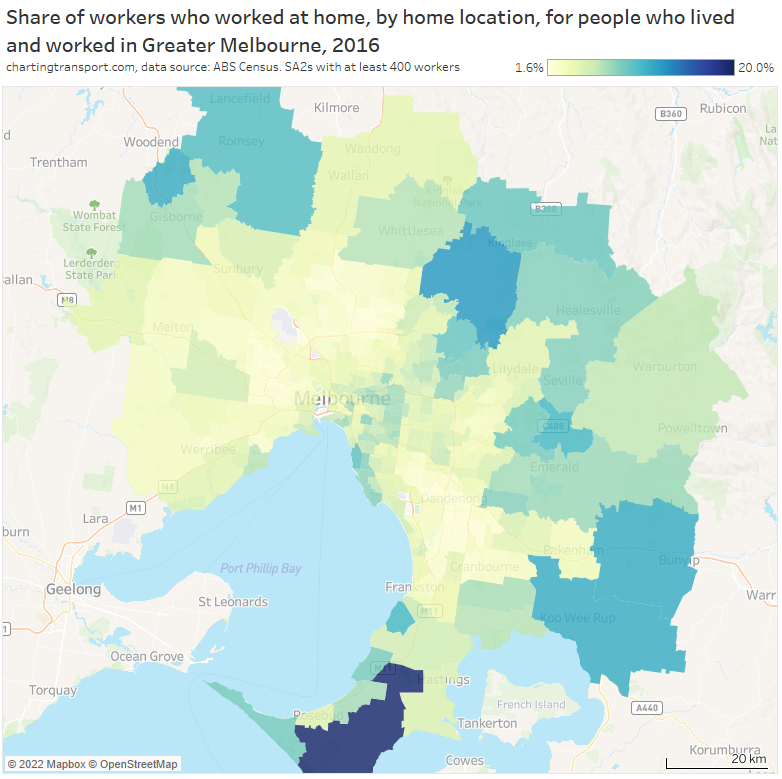
Here’s a map showing working at home rates for SA2s across Greater Melbourne:
Working at home rates were highest in peri-urban areas, higher than the average in more advantaged suburbs of Melbourne, and the lowest rates of working at home were for employees from more disadvantaged areas.
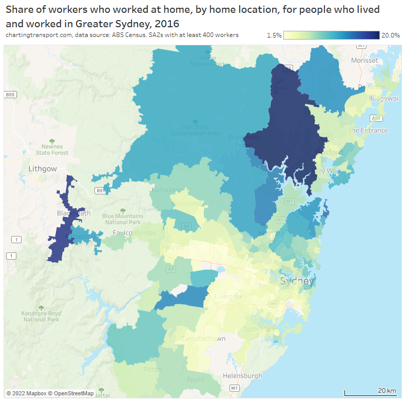
Here’s the same for Sydney:
The highest rates were also seen in peri-urban areas of Greater Sydney, and the generally wealthy upper north shore.
How did working at home vary by workplace location?
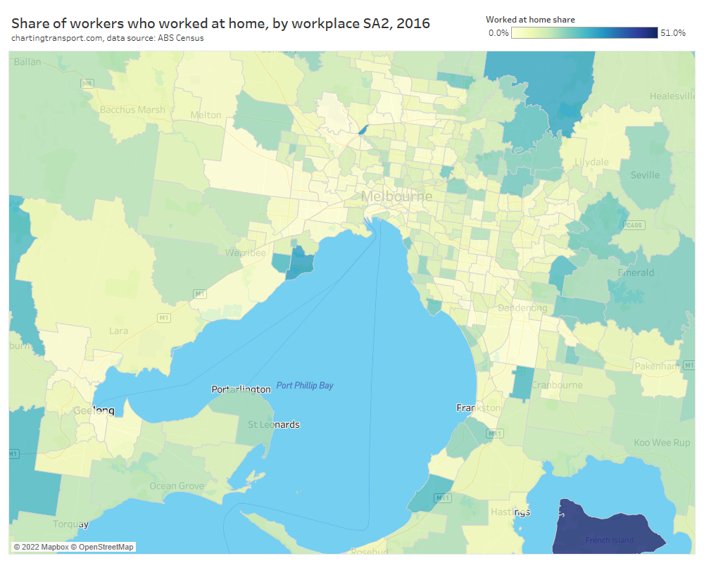
Here’s a chart showing the worked at home share for the Melbourne and Geelong region, by workplace location.
The highest worked at home rate was 47.5% seen on French Island – a sparsely populated island south-east of Melbourne which contains many small farms and some tourist facilities. Other worked-at-home hotspots include the Point Cook East SA2 (which includes an air force base) and Panton Hill – St Andrews (which I understand contains many small farms). In fact, worked-at-home rates were again generally much higher in peri-urban areas and very low in suburban areas.
Some of the lowest rates of working at home were seen for employees in industrial areas and at Melbourne Airport. Many of these jobs are probably hard to do remotely.
2.0% of Melbourne CBD workers worked at home on census day in 2016. And the SA2s surrounding the CBD were all below 3%.
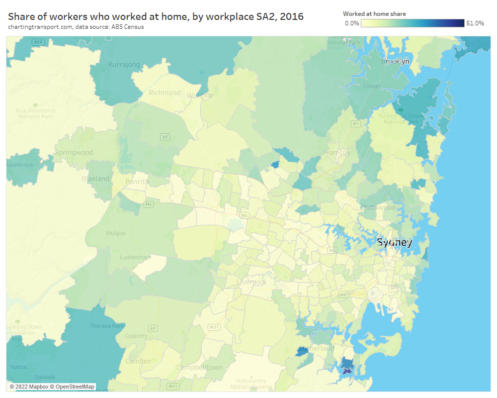
Here’s the same map for Sydney:
Again the highest rates of employees working at home were seen in peri-urban areas, and the Sydney CBD saw 1.9% of employees working at home.
These maps tell us that working at home in 2016 was most common in peri-urban areas, and relatively rare in dense employment areas such as CBDs. The COVID19 pandemic triggered significant levels of working at home during lockdown periods which emptied central city office towers and has remained quite common ever since. So it is likely that the profile of people working at home has changed significantly since 2016 to include a lot more white collar workers.
The fact that working at home rates were high in peri-urban areas when measured as both home location and work location suggests that for many people their home is their workplace. So…
How common was remote working in 2016?
You might have noticed that I’ve been referring to “worked at home” rather than the currently popular term “working from home”. That’s not just because its the wording used by the ABS in reporting the census, but because “working from home” is a little ambiguous as to whether people are working at home and away from their regular workplace, or whether their home is also their regular workplace. Perhaps a better term to describe people working at home and away of their regular workplace is “remote working”.
I have extracted worked-at-home workers’ home and work SA2 locations for people who lived and worked in Greater Melbourne and found that 89% of workers who worked at home, had their usual place of work in the same SA2 as where they lived (SA2s are roughly the size of a suburb).
So while 4.5% of workers who both lived and worked in Greater Melbourne worked at home in 2016, only 0.48% worked at home on census day when their regular workplace was in a different SA2. Remote working was an order of magnitude smaller than working at home.
Now it is also possible that some workers who lived and regularly worked in the same SA2 were actually working at home remote from their workplace on census day. However I expect this to be rare, and some further analysis (detailed in the appendix to the post) found that the almost every worker who worked and lived in the same SA2 had their home SA1 area intersect or overlap with their workplace Destination Zone (both the smallest census land areas available). This doesn’t guarantee that their home was their regular workplace, but it makes it quite probable. These workers would mostly not have had a very long commute, so there would be little incentive to remote work to avoid commuting effort. Also, I’ve found people who travelled to work in the same SA2 as they lived were slightly more likely to work in accommodation and food services, construction and retail trade – industries that are likely to require worksite attendance.
So I think I can fairly safely estimate the 2016 remote working rate in Greater Melbourne to have been 0.5%.
I’ve repeated this calculation for Australia’s six largest cities:
I’ve ordered the cities by working population, and you can see remote working rates decline across the chart for smaller cities. This might reflect there being a larger incentive to avoid longer and/or expensive commutes in larger cities by remote working.
Curiously Brisbane had the highest rate of workers whose home doubled as their workplace (4.9%), while the Australian Capital Territory (i.e. Canberra) had the lowest rates of both working at home and remote working.
I think these quite small estimated rates of remote working are an important finding, as several recent reports from the Productivity Commission, SGS Economics and Planning, Monash University, and iMove may have conflated working from home with working remotely at home, at least in their discussion of the topic. It’s critical that these metrics are not mixed up. And thankfully I’m not aware of any obvious miscalculations in their work.
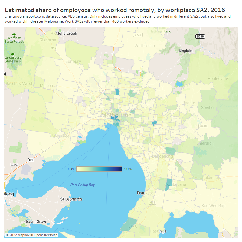
How did rates of remote working vary across workplace locations in 2016?
The following maps exclude people who lived and worked in the same SA2, to get an estimate of remote working by workplace SA2:
The estimated remote working rate peaked for the Docklands SA2 at 1.8%, with Melbourne’s CBD at 1.7%, Southbank at 1.5%, and Albert Park at 1.4%. These are higher than the worked-at-home rates calculated above for all employees who regularly worked in the city centre, because they remove people who regularly work at their home in the central city.
There were also some seemingly random suburban locations with similar rates of remote working such as Forest Hill and Fawkner at 1.6%.
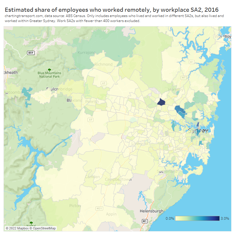
Here’s the equivalent map for Sydney:
There was a curious hot spot of West Pennant Hills at 5.5%, while the Sydney CBD area was 1.8%, North Sydney – Lavender Bay 2.3%, Macquarie Park – Marsfield 2.0%, and North Ryde – East Ryde 1.8%.
How did rates of remote working vary by home SA2?
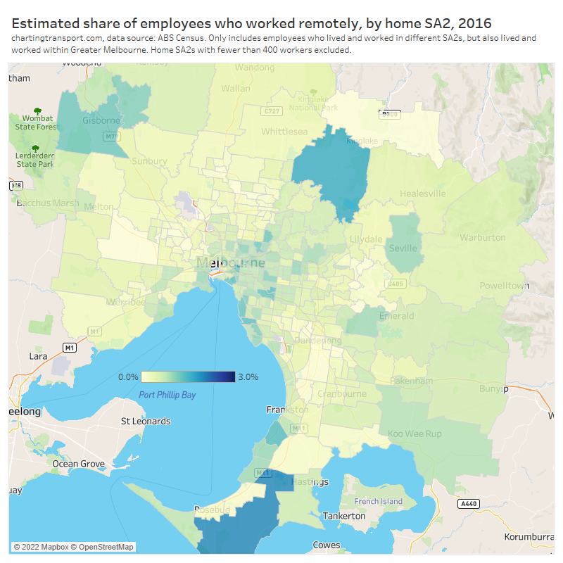
Here’s a map estimating remote working rates by home location for Melbourne in 2016:
Generally higher rates were seen in peri-urban areas with Flinders at 2.0%, Mount Eliza at 1.4%, Gisborne at 1.2%, and Panton Hill – St Andrews at 1.6%. This may reflect “sea-changers” and “tree-changers” avoiding a long commute to work. The lowest rates were seen in the more disadvantaged areas of Melbourne, which probably reflects such employees being more likely to work in occupations that require attendance at their workplace.
And for Greater Sydney:
Higher rates of remote working were seen across the upper north shore, with Avalon – Palm Beach at 2.4%, and in many peri-urban areas. But the highest rate was seen at Blackheath – Megalong Valley (in the Blue Mountains) with 3.5%.
In what occupations and industries was remote working more common in 2016?
It’s stretching what you can do with ABS TableBuilder, but I’ve extracted counts of workers by home SA2, work SA2, industry main code, and whether the worker travelled to work or worked at home, for Greater Melbourne for 2016. I’ve then filtered for workers whose regular workplace is not in their home SA2. It’s a little problematic in that about one quarter of the non-zero records in this data were a value of 3, and ABS never reports counts of 1 or 2 as it uses randomisation to protect privacy for very small counts. So the totals are accumulating the impacts of lots of small random adjustments, but it’s not clear that this would introduce a bias to the overall estimate, but we should still treat these with caution and I’m not going to quote more than one decimal place. That said, the estimates do seem very plausible:
The industries with the highest estimated rates of remote working are mostly white collar jobs, whilst those industries with the lowest rates are more blue collar.
I did the same analysis for occupations, and again there are few surprises in the estimated rates of remote work across the categories:
What will the 2021 census tell us?
The 2021 census was conducted during a period of tight lockdowns in Victoria and New South Wales. Most other states had relatively few restrictions, but had experienced lockdowns in 2020, so were arguably in a “post pandemic” scenario – at least temporarily. So it will be very interesting to compare 2016 rates of remote working to those in different cities in 2021. For cities that were not in lockdown we will likely get a good sense of which occupations had high rates of (unforced) remote working, which will be very useful for modelling future rates of remote working and the ongoing impact on transport demand.
I expect the patterns across industries and occupations will be similar between 2016 and 2021, but with much higher rates of remote working in 2021.
The data will be released in October 2022 and I’ll be keen to calculate remote working estimates and share those on the blog.
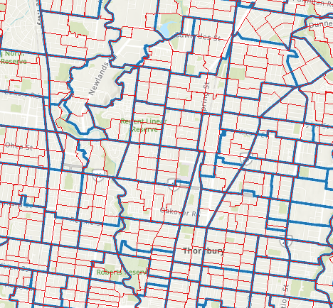
Appendix: Did anyone live and work in the same SA2 but not have their workplace at their home?
To try to answer this I extracted data for “worked at home” cases in Greater Melbourne at the maximum available resolution – SA1 for home location and Destination Zone for workplaces, and determined whether their home SA1 intersected with their workplace Destination Zone. An intersection between these areas doesn’t guarantee the workplace is at their home, but the absence of an intersection does guarantee that the workplace is not at their home.
Here’s a map extracted from maps.abs.gov.au that shows 2016 destination zone boundaries in blue, and SA1 boundaries in red for part of the northern suburbs of Melbourne:
I dare suggest that if someone lived in an SA1 that intersected with their regular workplace Destination Zone, it’s pretty likely that they ordinarily worked at home.
This analysis is stretching the data, because when you extract small counts from ABS they apply random small adjustments to protect privacy and also you never see a count of 1 or 2 people. Problematic as it is, the sum of people living and working in the same SA2, but living in an SA1 that does not intersect the destination zone in which they work was just 95 for all of Greater Melbourne, out of around 70,000 people who lived and worked in the same SA2. This is a lower bound on the true number, but I expect the true number to still be very small. Hence I’m comfortable with an estimate of 0.5% remote working in Melbourne in 2016 (to one decimal place).
Another potential issue is that SA2s are not consistently sized across cities, and are generally smaller in Brisbane and Canberra. This means remote working from a nearby workplace would be more likely to be detected those cities. However I suspect these instances will still be tiny, and the estimated remote working rates in Brisbane and Canberra certainly don’t appear to be outliers.
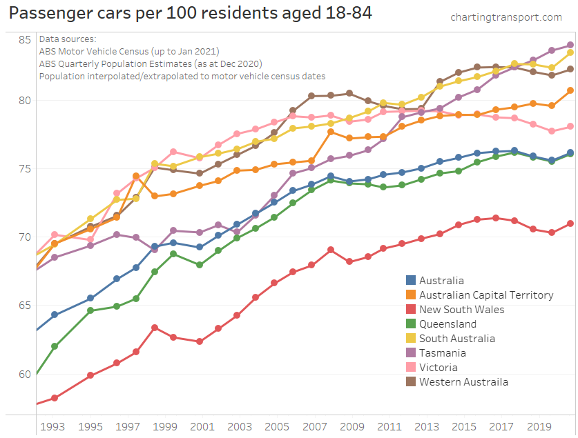
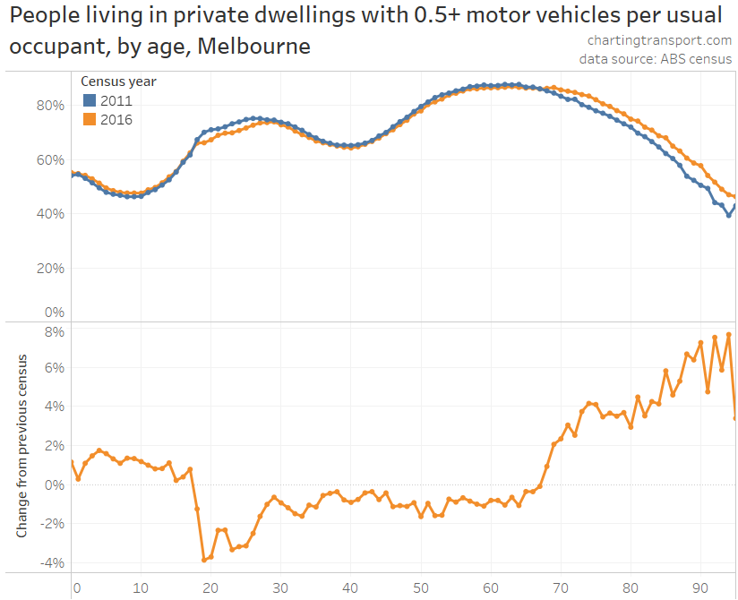
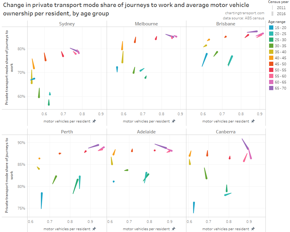
Motor vehicle ownership has a strong relationship with private transport mode share, and has recently seen declines in some Australian cities (e.g. Melbourne). In addition, we know that younger adults more recently have been deferring the acquisition of a driver’s licence (see: Update on Australian transport trends (December 2020)), so have they also been deferring motor vehicle ownership? For which age ranges has motor vehicle ownership increased and decreased? How might this have influenced journey to work mode shares? And how do changes in motor vehicle ownership relate to changes in driver’s licence ownership?
This post aims to answer those questions for Australia’s six largest cities, primarily using 2011 and 2016 census data, but also using household travel survey data for Melbourne.
But first…
A quick update on motor vehicle ownership trends in Australia
As I was writing this post, ABS released data for their Census of Motor Vehicle use – January 2021 (sadly the last motor vehicle census run by the ABS). I’ve matched this up with the latest available population data, and found a small but significant uptick in motor vehicle ownership rates in all Australian states in 2021 following the onset of the COVID-19 pandemic:
It could also reflect a mode shift from public to private transport, as people seek to avoid the perceived risk of COVID-19 infection on public transport.
But there’s another likely explanation of this uptick and it relates to ages, so keep reading.
What does household travel survey data tell us about motor vehicle ownership by age in Melbourne?
My preferred measure is the ratio of household motor vehicles to adults of driving age (notionally 18 to 84).
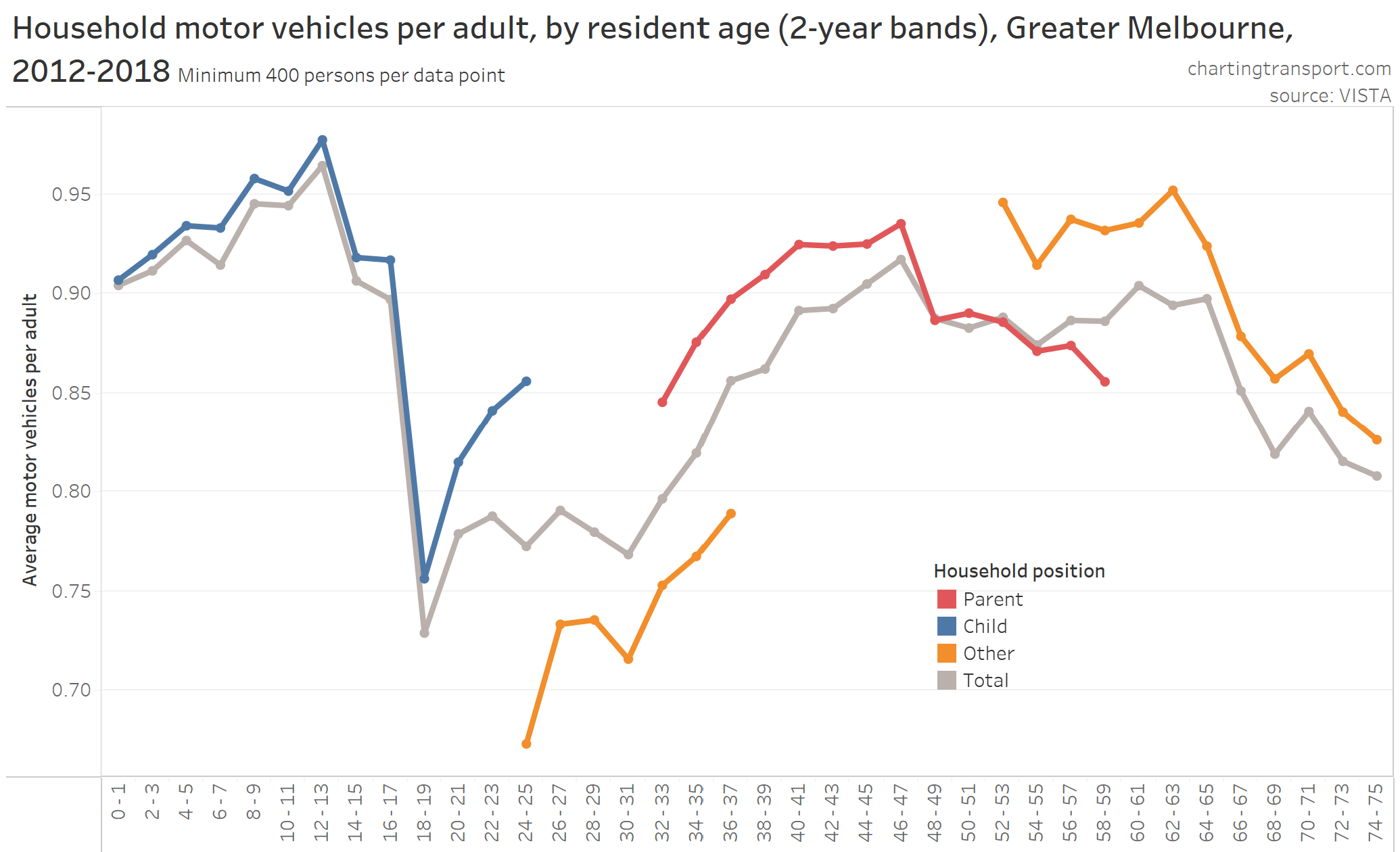
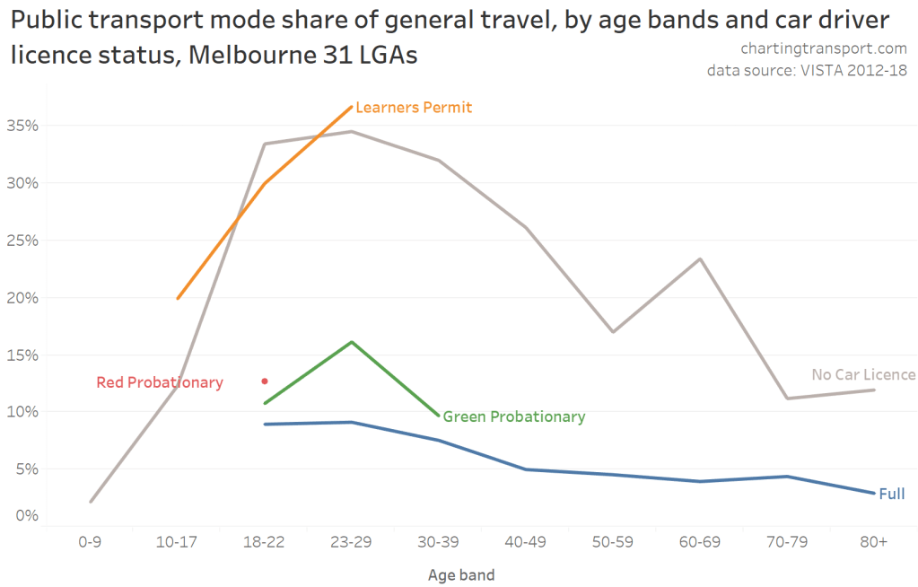
Using Melbourne household travel survey data (VISTA), I can calculate the average ratio by age group pretty easily, and the following chart also breaks this down for parents, children, and other people (living in households without parent-children relationships):
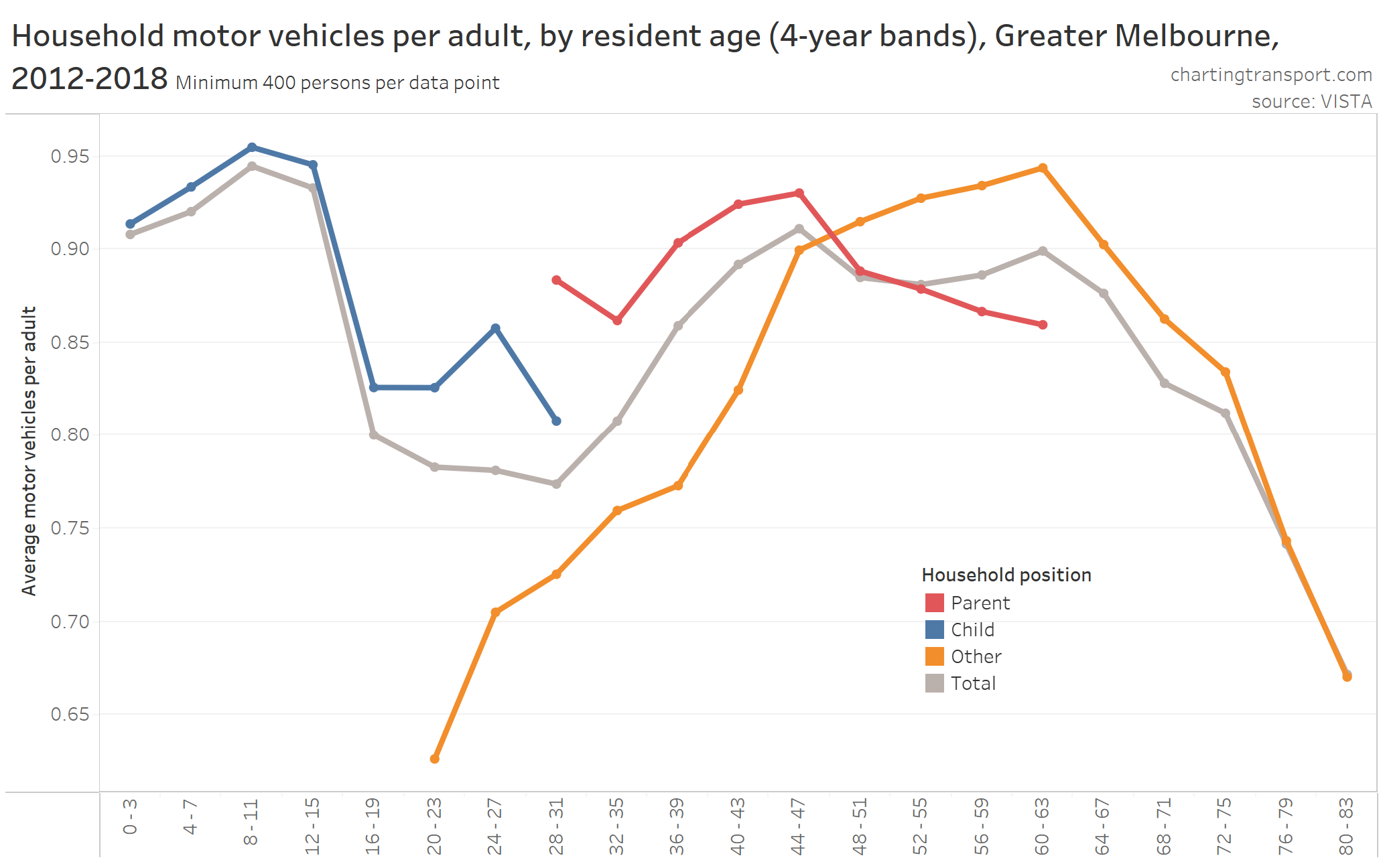
With 2-year age bands there is a limited span of age ranges for some categories due to the small survey sample sizes (I’m only showing data points with 400+ people). So here is a similar chart using 4-year age bands, which washes out some detail but provides values for wider age ranges:
You can see some pretty clear patterns. Motor vehicle ownership was high for households with children (peaking for ages 12-13), parents – particularly in their late 40s, and those aged in their 50s and early 60s in households without children. Average motor vehicle ownership was lowest for young adults living away from their parents, and for those in older age groups.
Unfortunately the VISTA dataset isn’t really big enough to enable significant analysis of changes over time – the sample sizes for age bands get too thin when you split the data over years or even groups of years. I’d like to understand changes over time, so…
What can census data tell us about motor vehicle ownership by age?
Unfortunately it’s not possible to calculate the ratio of household motor vehicles to adults using Census (of Housing and Population) data (at least when using ABS Census TableBuilder).
The numerator is pretty easy for the 2011 and 2016 censuses which classify private dwellings as having zero, 1, 2, 3, 4, …, 28, 29, or “30 or more” motor vehicles. Only a very small number of households report 30+ motor vehicles. Unfortunately the 2006 census’s top reporting category is “4 or more” motor vehicles which means you cannot calculate the motor vehicle ratio for many households.
My preferred denominator – the number of adults of driving age – is not available in ABS’s Census TableBuilder. The closest I can get is the “number of persons usually resident” for dwellings – and private dwelling are classified as having 1, 2, 3, 4, 4, 5, 6, 7, or “8 or more” usual residents in the 2006, 2011 and 20216 censuses. Obviously I cannot calculate the ratio of motor vehicles to usual residents if there were “8 or more” usual residents.
(For the census data nerds out there: I tried to get a good guess of adults by using family composition, but it can only distinguish parents (who may or may not be of driving age), children under 15, and dependent students aged 15-24. And worse still, that doesn’t work for multi-family households, and you cannot filter for single family households as well as distinguish family types.)
So I’m stuck with household motor vehicles per person usually resident. And an obvious drawback is that motor vehicle ownership will be lower for adults living in households with children, compared to those without children.
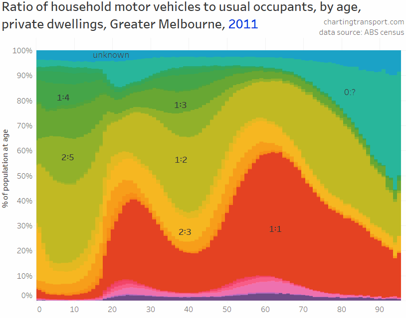
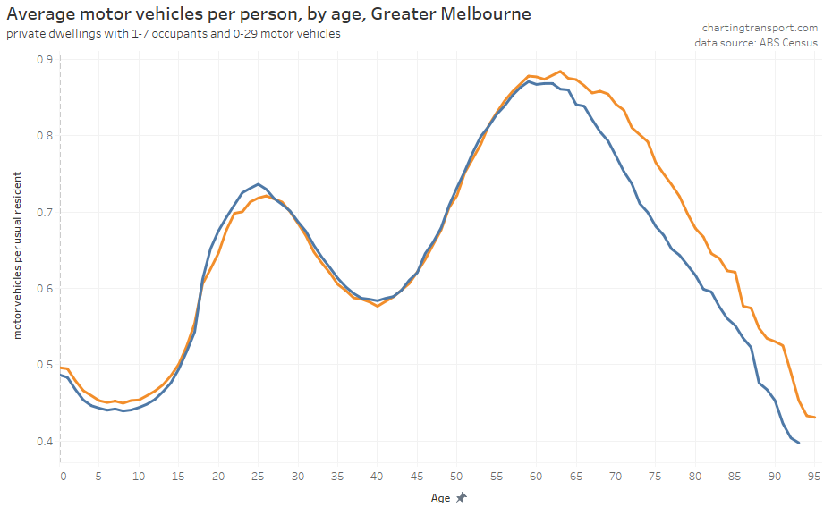
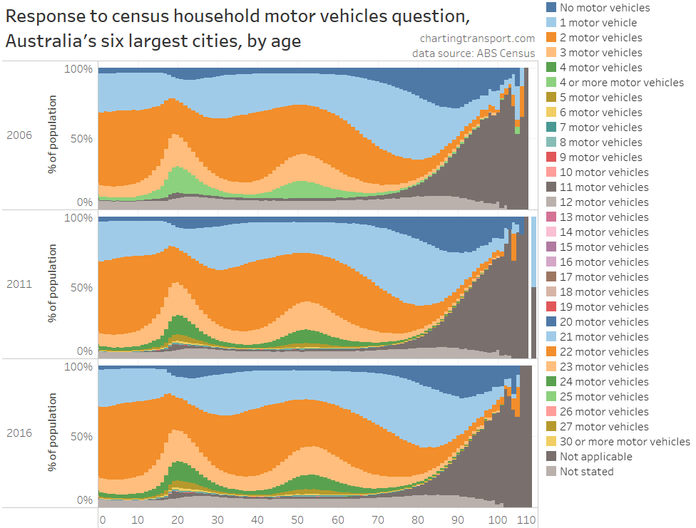
Here’s the distribution of motor vehicle : household size ratios for Greater Melbourne for 2011 and 2016 (I’ve left out 2006 because too many households cannot be calculated). There are a lot of different ratio values, but only about a dozen common ratios, several of which I have labelled on the chart.
Sure enough, there were much lower ownership ratios for children’s households, and adult ages where children were more likely to be resident (generally mid-20s to around 60). Higher ratios peaked for people in their early 60s and then steadily declined into older ages, with most people in their 90s living in dwellings with no motor vehicles (if they are not living in non-private dwellings). For adults in their 60s, one car per person was the most common ratio.
I can also calculate the average motor vehicle ownership ratio for each age as an aggregate statistic (excluding 3-4% of households where I don’t know the precise number of residents and motor vehicles). Here’s how that looks for 2011 and 2016:
As mentioned, I cannot calculate this ratio for households where I don’t know the precise number of both motor vehicles and usual residents (or where I don’t know the number of usual residents, but do know there were zero motor vehicles). Across Australia’s five biggest cities that’s 4.1% of population in the 2016 census, 3.4% in 2011, and 10.4% in 2006 (but much higher proportions of younger adults). They sound like small numbers, but aren’t that small when you consider the shifts in ownership between censuses.
But there is another way to classify households with fewer unknowns – whether they have:
no motor vehicles;
fewer usual residents than motor vehicles; or
at least one motor vehicle per usual resident.
The benefit of this approach is that you can classify almost half of the households where you cannot calculate an exact ratio:
If a household had 30+ motor vehicles (very rare) but fewer than 8 usual residents, then it had at least one vehicle per person.
If a household had 4+ motor vehicles (quite common in 2006 census) and 4 or fewer usual residents, then it had at least one vehicle per person.
If a household had 8+ usual residents (about 1.3% of population in 2016), but 7 or fewer motor vehicles (93.5% of the 1.3%), then it had less than one vehicle per person.
Across Australia’s biggest five cities I can now classify all but 2.5% of the 2016 population, 2.3% of the 2011 population and 6.1% of the 2006 population.
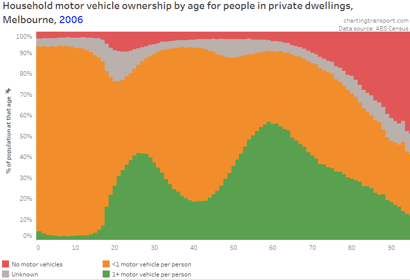
The next chart shows the distribution of this categorisation for Melbourne (using Melbourne Statistic Division for 2006, and “Greater Melbourne” for 2011 and 2016). I’ve put the remaining people living in uncategorisable households (“unknown”) in between 0 and <1 motor vehicles per person, as it is likely households who did not answer the question about household motor vehicles probably had few or no motor vehicles (refer to the appendix at the end of this post for more discussion).
I have also removed people who did not provide an answer to the usual residents question (hoping they are not overly biased – they are probably households who didn’t respond to the census), and non-private dwellings (where motor vehicle ownership is not recorded).
The patterns are similar to the previous chart, with a double hump pattern of 1+ motor vehicles per person. There are some changes over time, which I’ll discuss shortly.
Unfortunately the unknown band is still pretty wide in 2006 – in fact I still cannot categorise around 15% of 20 year olds in 2006 (many must have lived in households with 4+ motor vehicles), so it doesn’t really support good time series evaluation between 2006 and 2011.
So how has motor vehicle ownership by age changed over time in Melbourne?
Many of the previous charts were animated over 2-3 censuses but there’s a lot of take in with different lines moving in different directions for different age groups. To help to get better sense of those changes, what follows are a set a static charts, and then some discussion summarising the patterns.
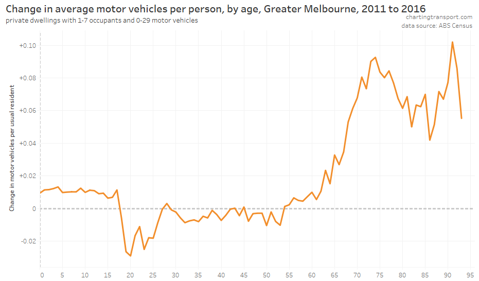
Firstly, the change in average motor vehicles per usual resident for each age year (but only for households where the exact number of motor vehicles and usual residents is known):
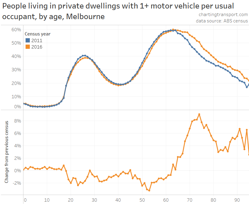
Secondly, here’s a static chart that shows the proportion of population living in households known to have 1+ motor vehicles per person for both 2011 and 2016 for Melbourne, and the difference between 2011 and 2016 (I’ve excluded 2006 as there were too more unknowns). I haven’t removed uncategorisable households from the calculations, on the assumption they bias towards lower motor vehicle ownership (as discussed above).
This chart shows very little change for children under 18, but also very few such households had 1+ motor vehicle per occupant in 2011 or 2016 so it’s not a very useful metric. Lower ownership ratios are much more common for households with children, so here’s a chart showing the proportion of the population living in dwellings with at least 0.5 motor vehicles per person, and the change between 2011 and 2016: (I used equivalent rules to classify households with 8+ usual residents or 30+ motor vehicles, where possible)
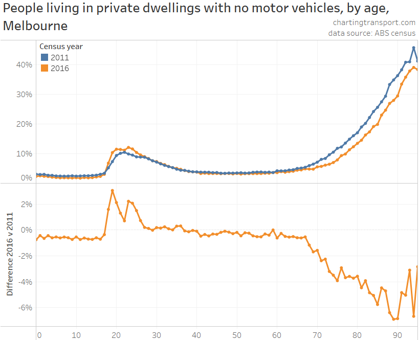
And finally, here’s a chart showing the proportion of the population living in dwellings reported to have no motor vehicles (probably an underestimate as I think many “not stated” responses are likely to be zero motor vehicles).
Each of these charts paints a similar picture. Here’s a summary by age ranges:
Age range
Motor vehicle ownership trend
0-17
Slight increase
18-26
Certainly a decline, including around 1-2% more people living in dwellings with no motor vehicles.
27-45
Small decline of around 2-3% living in households with 1+ or 0.5+ motor vehicles per person. But there was no significant increase in households with no motor vehicles, and average motor vehicles per person was relatively stable.
46-64
Very small decline (around 1%) of people living in households with 1+ and 0.5+ motor vehicles per person, but little change in households without motor vehicles.
65+
Significant increase in metrics of motor vehicle ownership, and a significant decline in dwellings without any motor vehicles.
So while overall motor vehicle ownership in Melbourne declined between 2011 and 2016, it was mostly in working aged adults, partly offset by family households and older adults increasing their rates of motor vehicle ownership.
And going back to the uptick in motor vehicle ownership in January 2021… recent immigrants to Australia have skewed towards young adults (particularly through skilled migrant visas). The massive reductions in immigrants in 2021 will mean the population contains proportionately fewer young adults – who generally have low car ownership, particularly recent immigrants. This slightly but significantly smaller number of young adults will no longer be fully offsetting those over 70 who are increasingly retaining motor vehicles longer into their life.
What about other Australian cities?
As above, I’ll present a series of charts showing the various metrics then summarise the trends.
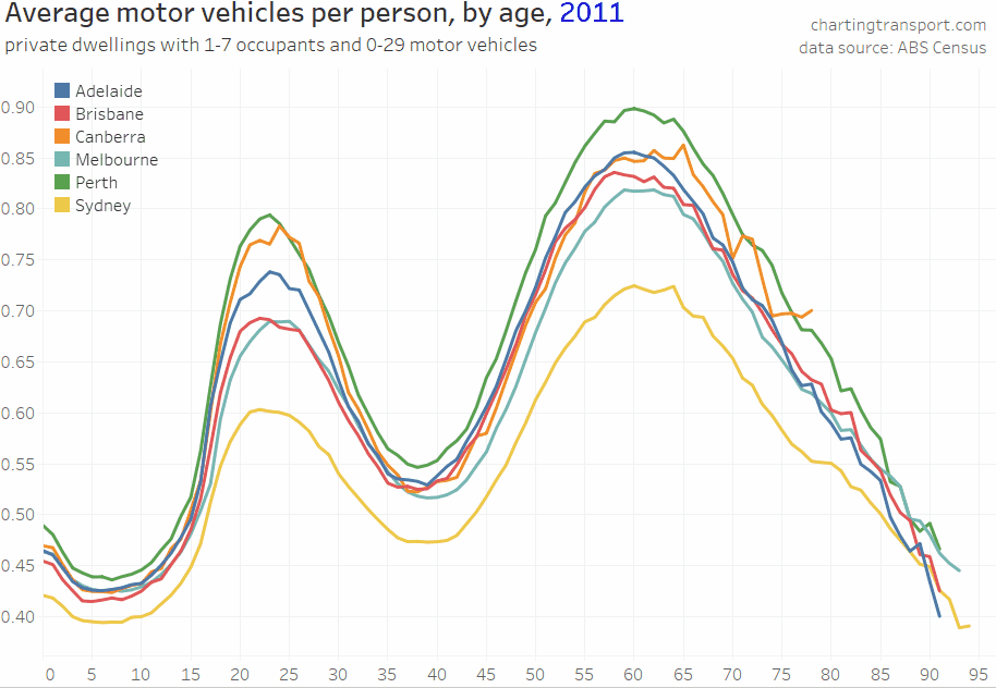
Firstly, a chart showing the average ratio of motor vehicles per resident by age for all cities between 2011 and 2016 – for private dwellings where the exact number of vehicles and usual occupants is known:
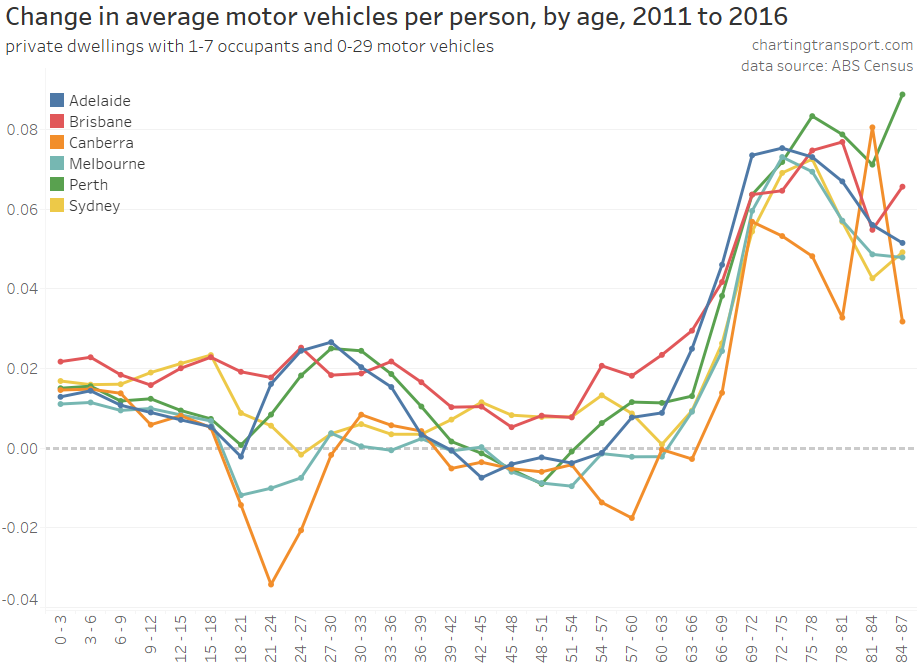
To help see those changes, here is a static chart showing the change in average motor vehicles per person by age (I’ve used three-year age bands as the data otherwise gets a bit too noisy):
Here’s an animated chart showing the percentage of people living in private dwellings with 1+ motor vehicle per person:
There’s a lot going on in that animation (and the data gets a bit noisy for Canberra due to the relatively small population), so next is a chart showing the difference in population living with 1+ motor vehicles per usual resident:
As before, the threshold of 1 motor vehicle per person is not useful for examining the households of children, so here’s a similar change chart for the 0.5 motor vehicles per person threshold:
These difference charts mostly form duck-shaped curves with a slight increases for children, a mixture of increases and decreases for working aged adults, and a large increase for older adults (particularly for those in their 70s).
For young adults (18-30), motor vehicle ownership mostly declined in Melbourne and Canberra, but for Perth and Adelaide there was a large increase in ownership for those aged 21-39.
There was less change in ownership for those aged 40-54. On the metrics of proportion of population with 1+ and 0.5+ motor vehicles per resident there was a small decline in all cities, but for average motor vehicles per person, some cities declined and some increased. So perhaps the amount of variation in motor vehicle ownership narrowed in this age range.
Melbourne was mostly at the bottom of the pack, with Brisbane, Adelaide or Perth mostly on top.
To continue this analysis, I want to know whether these changes in motor vehicle ownership might be impacted mode share, but first we need to look at…
How did journey to work mode shares change by age?
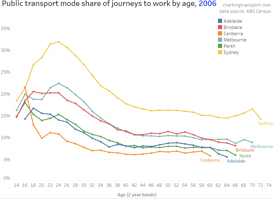
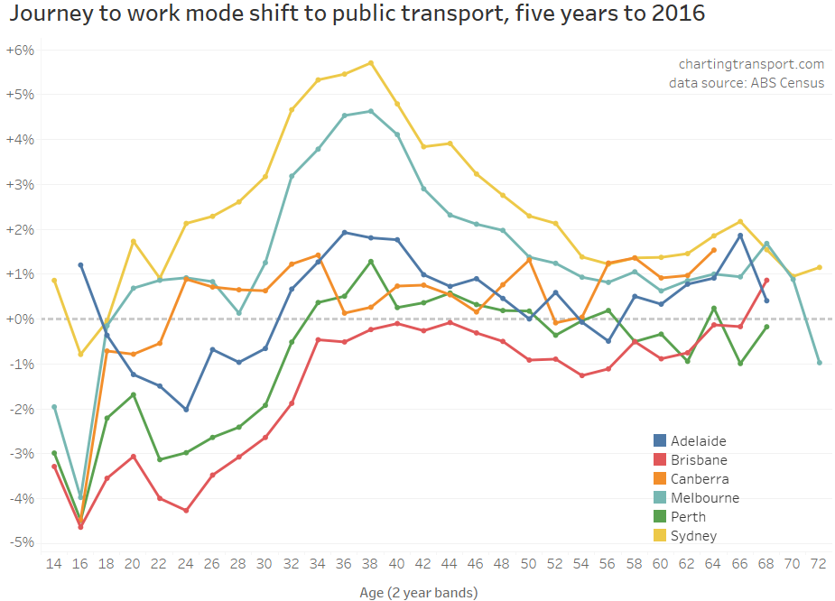
Here are public transport mode shares of journeys to work by age for Australia’s six biggest cities, 2006 to 2016:
Public transport mode shares were much higher for younger adults in all cities in all censuses. Most cities rose between 2006 and 2011, but then different cities went in different directions between 2011 and 2016.
Here’s the mode shift between 2006 and 2011:
Most cities and ages had a mode shift towards public transport, particularly for those aged around 30, but less so for young adults.
Here’s the mode shift between 2011 and 2016:
Between 2011 and 2016 there was a mode shift to public transport in most cities for people in their 30s and 40s, but for younger adults there was a decline in public transport mode share in most cities, with only Sydney, Melbourne, and Canberra seeing growth.
However we are talking about motor vehicle ownership, and declining motor vehicle ownership may be because of mode shifts to walking, cycling, and/or public transport. So it is worth also looking at private transport mode shares (journeys involving private motorised modes but not public transport modes).
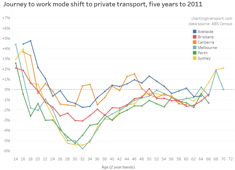
To help see the differences, here is the mode shift for private transport 2006 to 2011:
There’s a similar curve for all cities, but different cities are higher or lower on the chart. There was a shift towards private transport for young workers, a shift away in most cities for those in their 20s and 30s, and smaller shifts for those in their 40s and 50s
And from 2011 to 2016:
Again similar curves across the cities, with younger adults again more likely to shift towards private transport in most cities, a big shift away from private transport for those in their 30s and early 40s in Sydney and Melbourne, and smaller shifts for those in their 50s and 60s.
What’s really interesting here is that the mode share and mode shift curves are similar shapes across most cities (except the much smaller city of Canberra). There are some age-related patterns of travel behaviour change consistent across Australia’s five biggest cities.
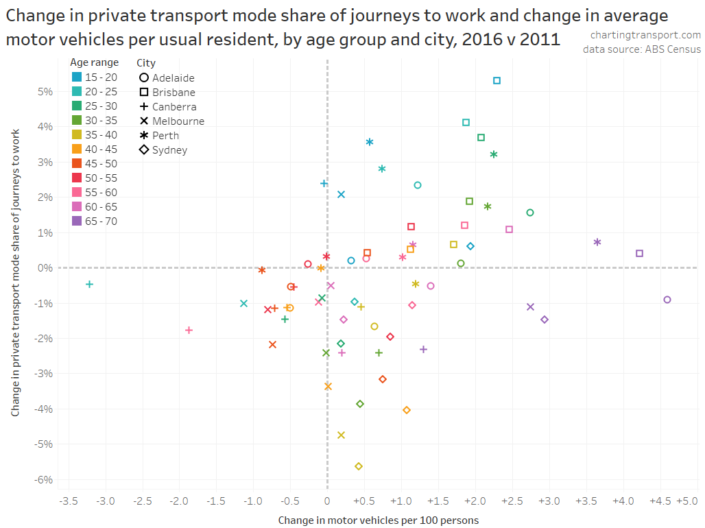
How did changes in motor vehicle ownership compare to changes in private transport mode share?
If motor vehicle ownership increases you might expect an increase in private transport mode shares, and likewise you might expect a decrease in ownership to relate to a decline in private transport mode shares.
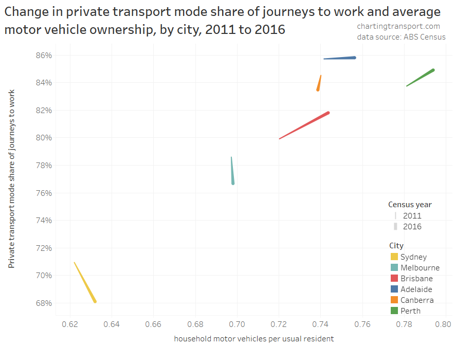
Indeed when you look at cities as a whole, there is generally a strong relationship between these measures, although different cities moved in different directions between 2011 and 2016.
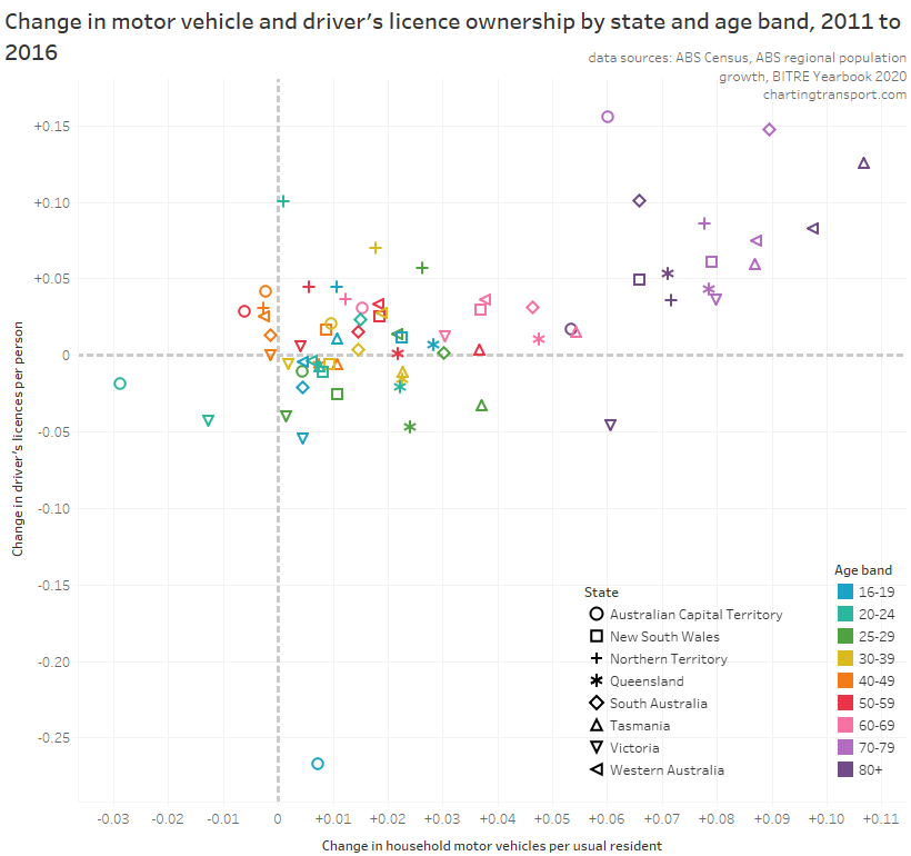
In this post I’m interested in shifts for people in different age groups. The following chart shows the changes in motor vehicle ownership and private transport mode shares for each city and age group: (note different axis scales are used in each row of charts)
However I’m particularly interested in the change in these factors, rather than where they landed in each of 2011 and 2016. So the following chart plots the change in motor vehicles per 100 persons and the change in private transport mode share of journeys to work between 2011 and 2016 for five-year age bands (noting that of course every living person got five years older between the censuses).
That’s a busy chart but let me take you though it.
There’s one mostly empty quadrant on this chart (top-left): for no city / age band combinations did motor vehicle ownership decline but private transport mode share increase, which isn’t really surprising.
But in city / age band combinations where motor vehicle ownership did increase there there wasn’t always an increase in private transport mode shares – quite often there was actually a decline. So increasing motor vehicle ownership doesn’t necessarily translate into higher private transport mode shares – for journeys to work at least. Perhaps increasing affordability of motor vehicles means more people own them, but don’t necessarily switch to using them to get to work.
The largest declines in private transport mode share occurred in city/age band combinations that actually saw a slight increase in motor vehicle ownership.
The cloud is quite spread out – which to me suggests that motor vehicle ownership is probably not a major explanation for changes in mode share between 2011 and 2016 – there must be many other factors at play to explain changes in mode shares across cities. Indeed, see my post What might explain journey to work mode shifts in Australia’s largest cities? (2006-2016) for more discussion on these likely factors.
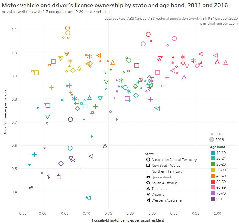
What is the relationship between motor vehicle ownership and driver’s licence ownership?
I’d prefer not to be using state level data as city and country areas might wash each other out, but I’d don’t have a lot of choice because of data availability. (Licencing data is available at postcode resolution in New South Wales (see How and why does driver’s licence ownership vary across Sydney?), but unfortunately you cannot disaggregate by both geography and age.)
Here’s another (busy) chart showing the relationship between licence and motor vehicle ownership by age band and city, across 2011 and 2016:
The main thing to take away here is that most of the points are within a diagonal cloud from bottom-left to top-right – as you might expect: there is less value having a driver’s licence if you don’t own a car, and little point owning a car if you don’t have a licence to drive it. The exceptions to the diagonal cloud are mostly age bands 30-39 and 40-49, where the average motor vehicle ownership rates are lower because many of these people often have children in their households, and I cannot remove children from the calculation using census data.
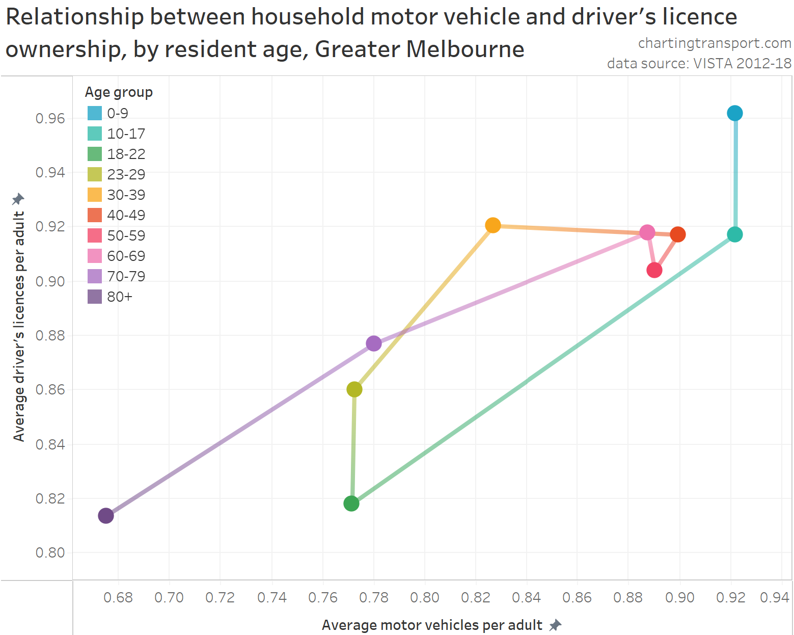
But I can control for the issue of children by going back to city geography by using household travel survey data for Melbourne (VISTA, 2012-2018). The following chart shows the relationship between average motor vehicle and driver’s licence ownership for adults by different age brackets.
The data points again generally form a diagonal cloud as you’d expect. Higher motor vehicle ownership generally correlates with higher licence ownership.
The change in ownership rates by age are interesting. Children under 10, on average, lived in households where adults have very high levels of motor vehicle and licence ownership. Licence ownership was slightly lower for adults in households with children aged 10-17 (although this could just be “noise” from the survey sample). Young adults (18-22) then on average lived in households with relatively low motor vehicle and licence ownership. As you move into older age brackets licence ownership increased, followed by increases in motor vehicle ownership, with both peaking again around ages 40-69 (although not as high as households with children). Those aged 70-79 and 80+ then had significantly lower rates of licence and vehicle ownership, as you might expect as people age and become less able to drive. These patterns are fairly consistent with the census data scatter plot, except for the key parenting age bands of 30-39 and 40-49 where the census data analysis cannot calculate ownership per adult (just per person).
How has licence and motor vehicle ownership been changing for different age groups?
Across Australia, licence ownership has been increasing in recent years for older adults (particularly those over 70), and declining in those aged under 30 in states such as Victoria, New South Wales and Tasmania (for more detail see Update on Australian transport trends (December 2020)).
The following chart shows state-level changes in motor vehicle ownership and licence ownership between 2011 and 2016 by age bands: (note different scales on each axis)
This chart also shows something of a direct relationship between changes in motor vehicle and licence ownership, with people aged 70+ having the largest increases in both measures (except for Victorians aged 80+ who saw a decline in licence ownership). Younger age bands often had a decline in licence ownership, even if motor vehicle ownership in their households increased slightly (on average). For those aged in their 40s, there was generally an increase in licence ownership but only small changes in motor vehicle ownership – including slight declines in most states.
Teenagers in the ACT were an outlier, where there was a significant decline in licence ownership between 2011 and 2016 that someone with local knowledge might be able to explain.
Overall the relationship between changes licence ownership and changes in motor vehicle ownership is not super strong. Increasing licence ownership does not automatically translate into increasing motor vehicle ownership. There must be more factors at play.
I hope you’ve found this post interesting.
Appendix: What about households where census data is missing?
The non-response rate to the question about household motor vehicles was around 8.4% in 2016 (up from 6.5% in 2011) and most of these were for people who did not respond to the census at all. Non-response was fairly consistent across age groups as the next chart shows. Quite a few people had a response to the question about number of usual occupants, but did not respond to the question about motor vehicles. Poking around census data, these people often:
didn’t answer other questions;
were less likely to be in the labour force;
were generally on lower incomes;
were more likely to be renting;
were less likely to have a mortgage; and
were more likely to live in a flat, apartment or unit, and less likely to live in a standalone/separate house.
So my guess is that they were less likely to have high motor vehicle ownership.
The number of “not applicable” responses increased significantly into older age groups, and I expect most of these will be people in non-private dwellings (e.g. aged care). I have removed people with “not applicable” responses for usual occupants and household motor vehicles as they are likely to be non-private dwellings.
The chart gets a bit noisy for ages above 100 as very few such people live in private dwellings.
In a recent post I confirmed the link between driver’s licence ownership and public transport use at the individual level in Melbourne:
Unfortunately, spatial data around driver’s licence ownership is quite scarce in Australia, so not a lot is known about the spatial variations of licence ownership, nor what might explain them.
However, Transport for New South Wales do publish quarterly licensing statistics at the postcode level, and so this post takes a closer look at the patterns and possible demographic explanations of driver licence ownership across Sydney. I’ll also touch on the relationship between licence ownership and journey to work mode shares.
I have measured rates of licence ownership at the postcode level, and then compared these with other demographic factors that have shown to be significant in explaining variations in public transport mode shares in Melbourne (see my series on “Why are young adults more likely to use public transport”, parts 1, 2, and 3). These factors include socio-economic advantage and disadvantage, workplace location, age, recency of immigration, educational attainment, parenting status, motor vehicle ownership, population weighted density, proximity to high quality public transport, English proficiency, and student status.
I’m sorry it’s not a short post, but I have put some less profound analysis in appendices.
About the data
To calculate licence ownership rates you need counts of licences and population for geographic areas for the same point in time (or very close). Estimates of postcode population are only available from census data, so for most of the following analysis, I’ve combined 2016 “quarter 2” driver’s licence numbers (which includes learner permits) with (August) 2016 ABS census population counts. This is of course pre-COVID19, and patterns may (or may not) have changed since then.
I’ve mostly used population counts for persons aged 16-84. Obviously there are people over the age of 84 with licences, but I am attempting to discount people who may lose their eligibility to hold a licence due to aging.
I’ve also mapped postcodes to the Greater Sydney Greater Capital City Statistical Area boundary, and filtered for postcodes with a significant region within the Greater Sydney boundary (note that the boundaries do not perfectly align).
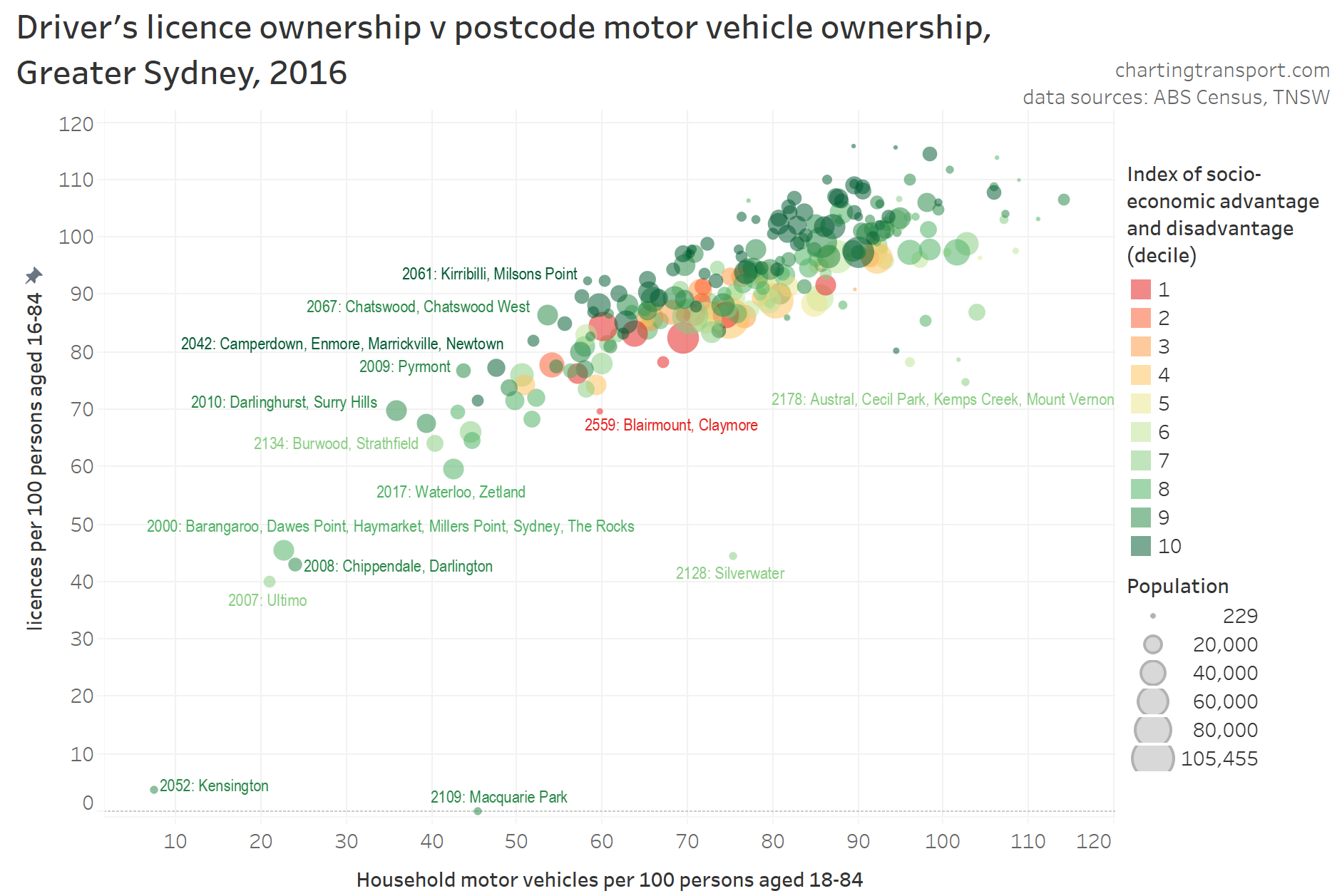
How does driver’s licence ownership vary across Sydney?
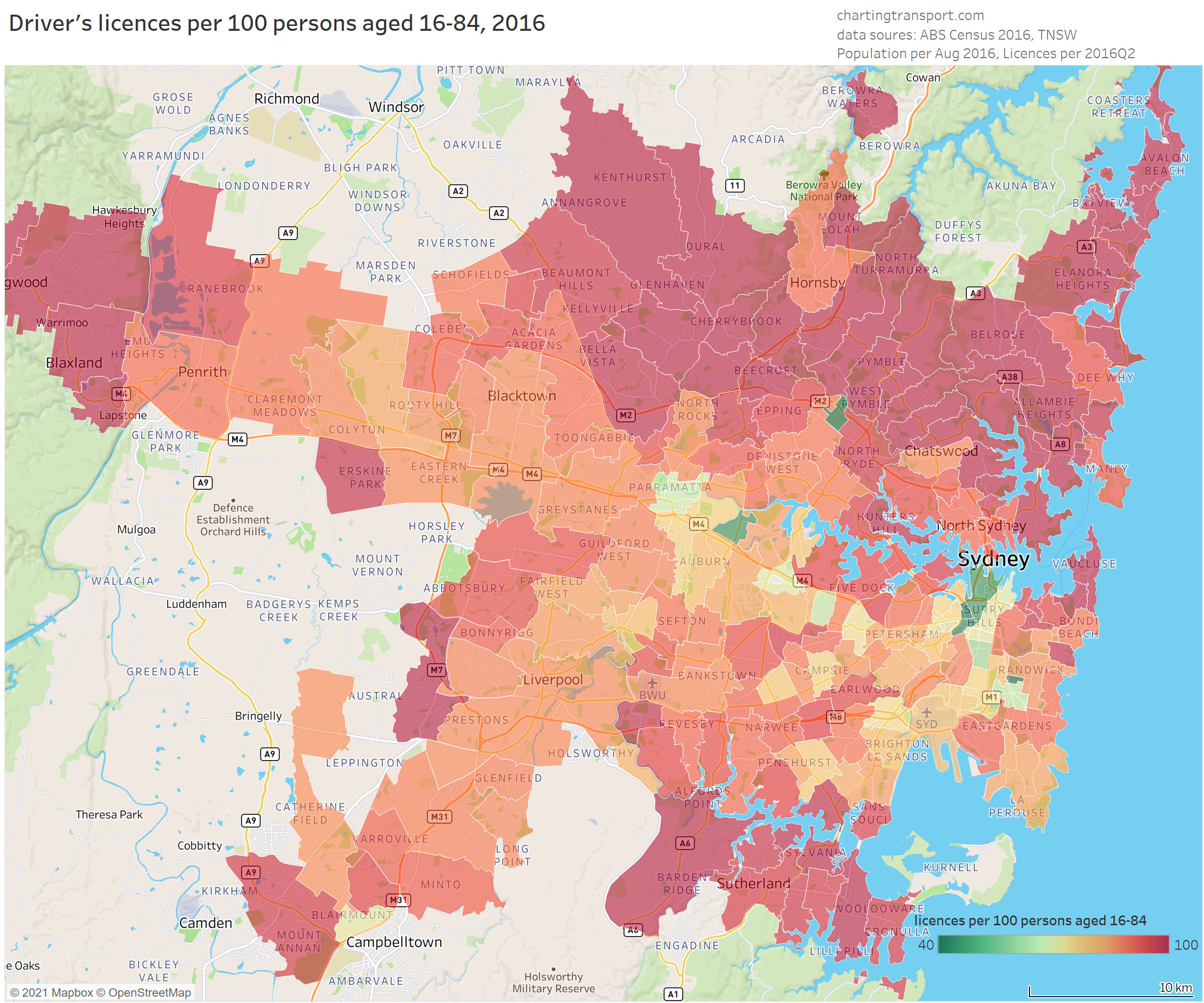
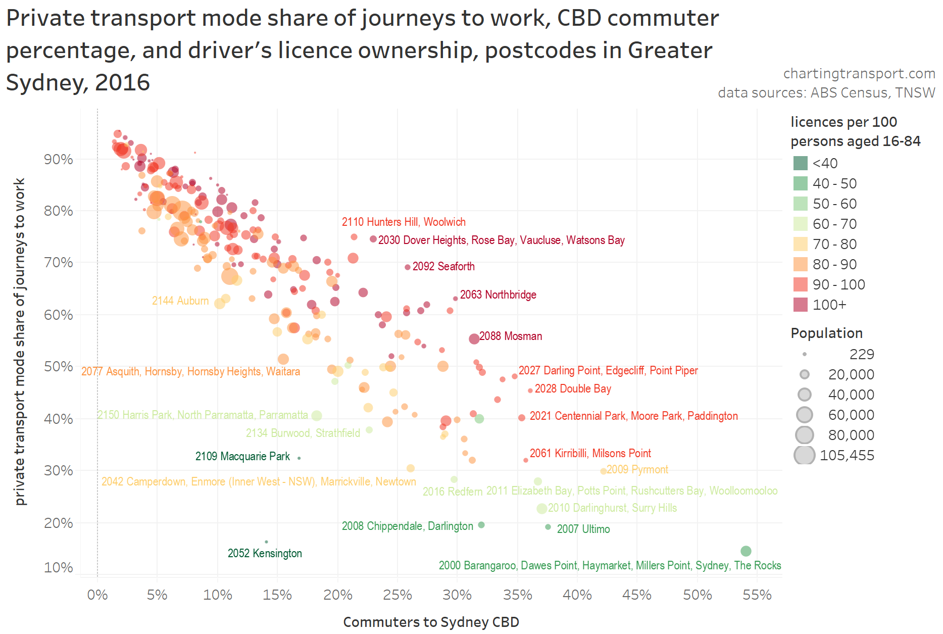
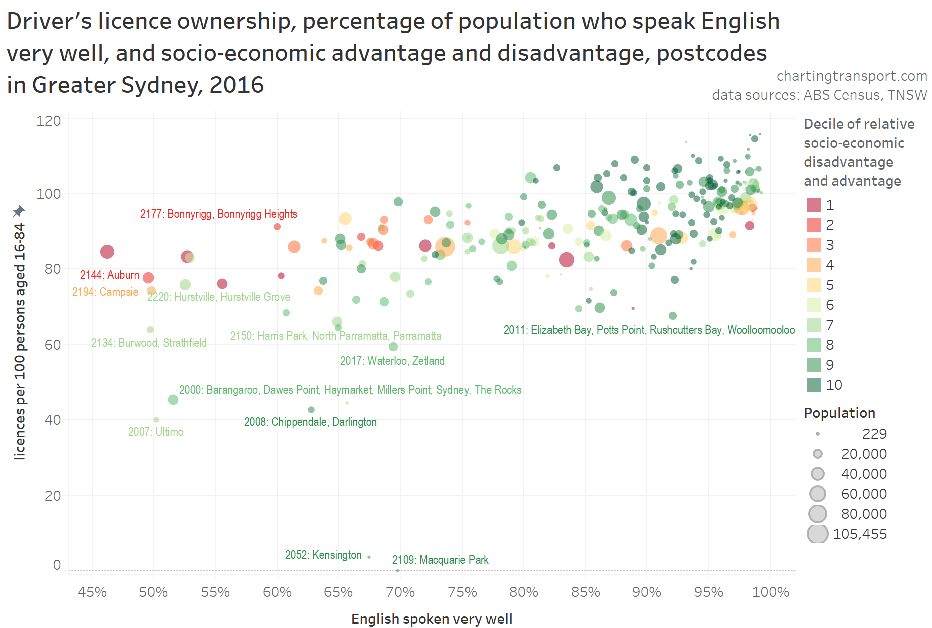
Here’s a map showing 2016 licence ownership rates for Sydney postcodes, with red signifying very high ownership, and green very low.
Technical note: For this map I have filtered to only show postcodes averaging at least 3 persons per hectare to focus on urban Sydney, but some excluded postcodes will be a mix of urban and non-urban land use so this is imperfect. Postcodes are not a great spatial geography for analysis as they vary significantly in size, but unfortunately that’s how the data is published (much easier for TNSW to extract I am sure).
The lowest licence ownership rates can be seen in and around the Sydney CBD, around major university campuses (especially UNSW/Randwick, Macquarie Park, University of Sydney/Camperdown), and at Silverwater (which includes a large Correctional Complex – inmates probably don’t renew their licence and would have a hard time gaining one!). There are also relatively low rates in some inner southern suburbs, in and near Parramatta, and near Sydney Airport.
Most outer urban postcodes have very high levels of licence ownership. One exception is postcode 2559 in the outer south-west, which contains a large public housing estate in the suburb of Claymore. More on that shortly.
Is there a relationship between licence ownership and journey to work transport mode share?
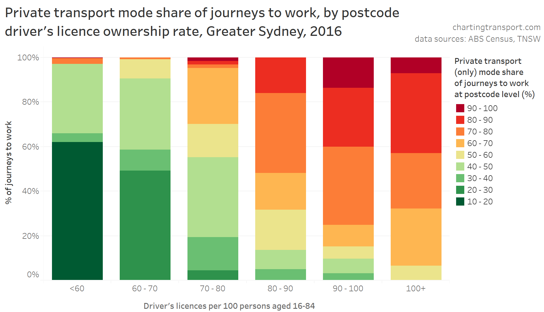
It will probably surprise no one that there was a relationship between driver’s licence ownership and private transport mode share of journeys to work. The following chart shows the average postcode mode share for the commuter population within specified bands of driver’s licence ownership.
I should point out that this a relationship, but not necessarily direct causality (either way). People might be more likely to get a driver’s licence because that is the only practical way to get work from where they live, and other people who do not want to – or cannot – get a driver’s licence may be able to choose to live and work in places that don’t require private transport to get to work.
And then there are some postcodes with pretty much saturated driver’s licence ownership but less than 60% private transport journey to work mode shares (top right). I’ll have more to say on these postcodes shortly.
The rest of this post will consider potential explanations for the spatial patterns of licence ownership, using demographic data for postcodes.
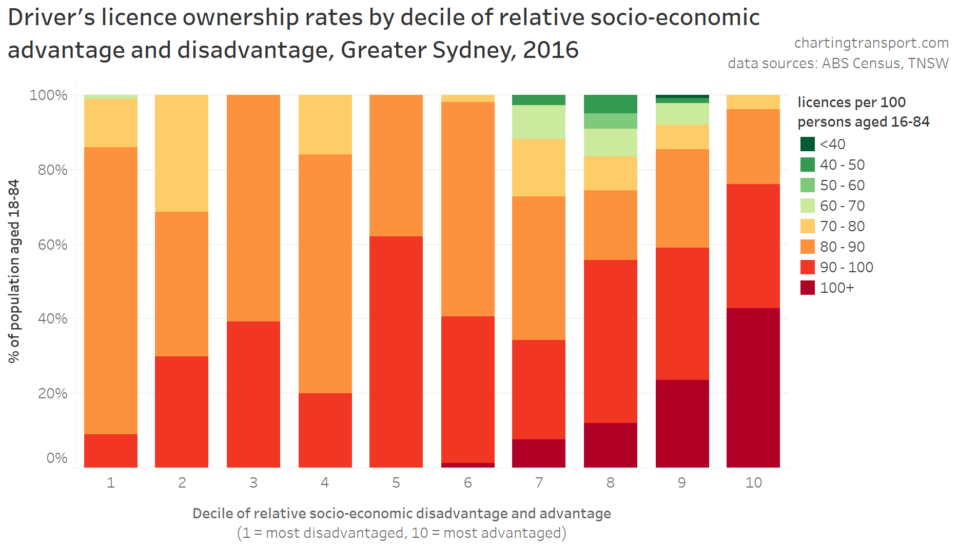
Near-saturated licence ownership was more common in the more advantaged postcodes, but lower rates of licence ownership were seen in postcodes in deciles 1, 7, and 8. Decile 1 stands to reason as areas of disadvantage (probably including many people unable to get a driver’s licence, eg due to disability), and the postcodes with very low licence ownership rates in deciles 7 and 8 contain or are adjacent to major university campuses.
However there are postcodes with licence ownership rates below 80 in all deciles – the relationship here is not super-strong and there are many exceptions to the pattern.
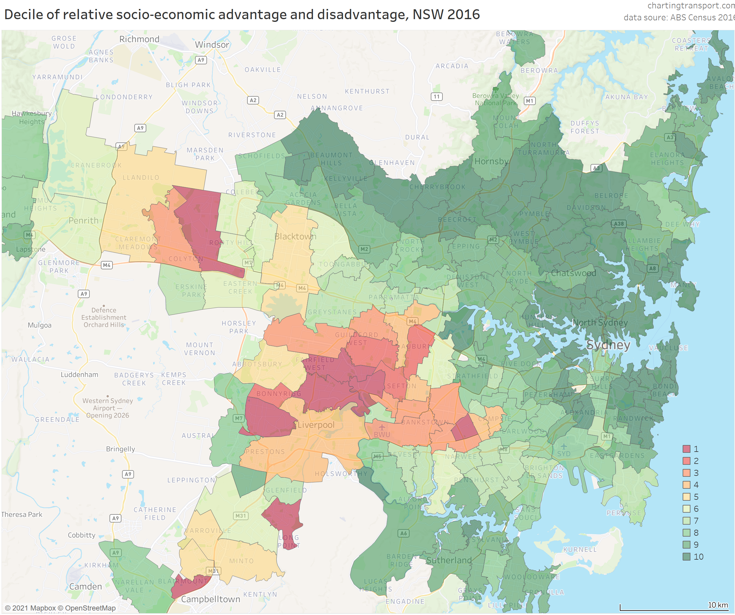
For people less familiar with the demographics of Sydney, here is a map showing 2016 ISRAD deciles for Sydney postcodes. Note that these deciles are calculated relative to the entire New South Wales population, and Sydney overall is more advantaged than the rest of the state, hence more green areas than red.
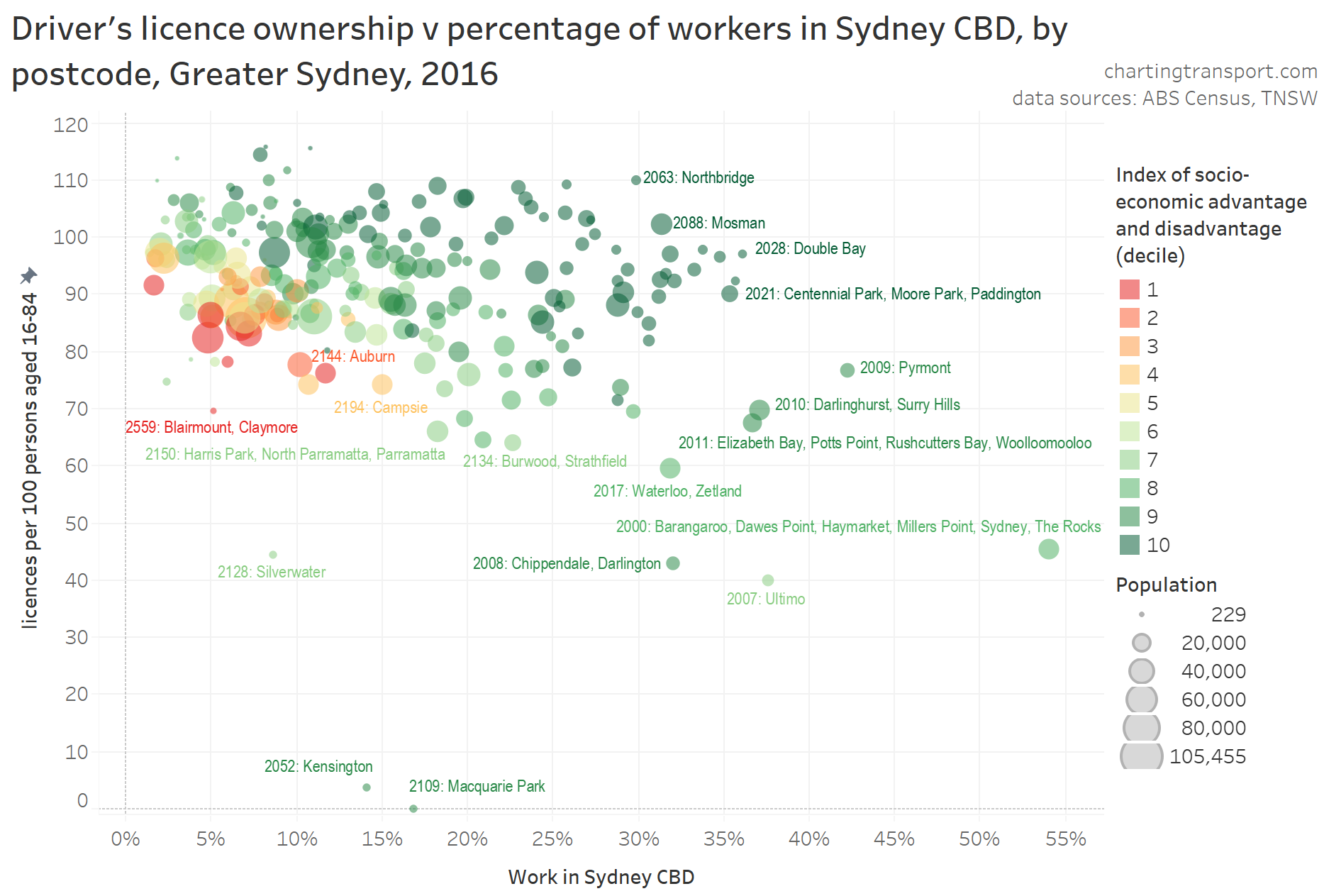
Here’s a scatter plot that shows that relationship. I’ve added socio-economic advantage and disadvantage colouring for further context, and labelled selected outlier and cloud-edge postcodes (unfortunately there is a slight bias against labelling postcodes containing many suburbs).
There is perhaps a weak relationship between work in Sydney CBD percentage and licence ownership, with postcodes containing larger shares of commuters going to the CBD (30%+) having lower licence ownership.
The chart also shows that disadvantaged postcodes generally had both fewer CBD commuters (as a proportion) and lower rates of licence ownership.
Commuter mode shares were much more strongly related to workplace location than licence ownership, as the following chart shows. Note that for this chart colour indicates licence ownership rate.
Within the main cloud, postcodes with lower rates of licence ownership (shades of orange) had slightly lower private transport mode shares and/or slightly lower percentage of commuters heading to the CBD. The upper outliers from the cloud include many wealthy postcodes that were not well connected to the CBD by the train network, while postcodes in the bottom-left of the cloud are on the train network.
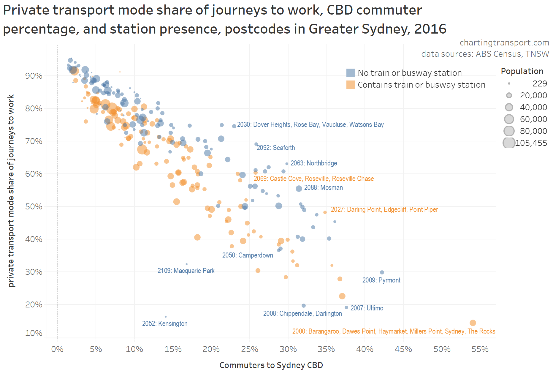
To explore that further, here’s a similar chart, but with the data marks coloured by a relatively blunt measure: whether or not the postcode contained a train or busway station (based on point locations for stations, which is not perfect as some postcodes are very large and only part of the area might be within reach of a station, while other postcodes might have a station just outside the area):
Generally the postcodes with a train or busway station are towards the bottom-left of the cloud, and those without towards the top-right. I’ve labelled a few exceptions, which include university suburbs such as Macquarie Park, Kensington, Camperdown, and some larger postcodes where a station only serves a minority of the postcode area (eg 2027 and 2069).
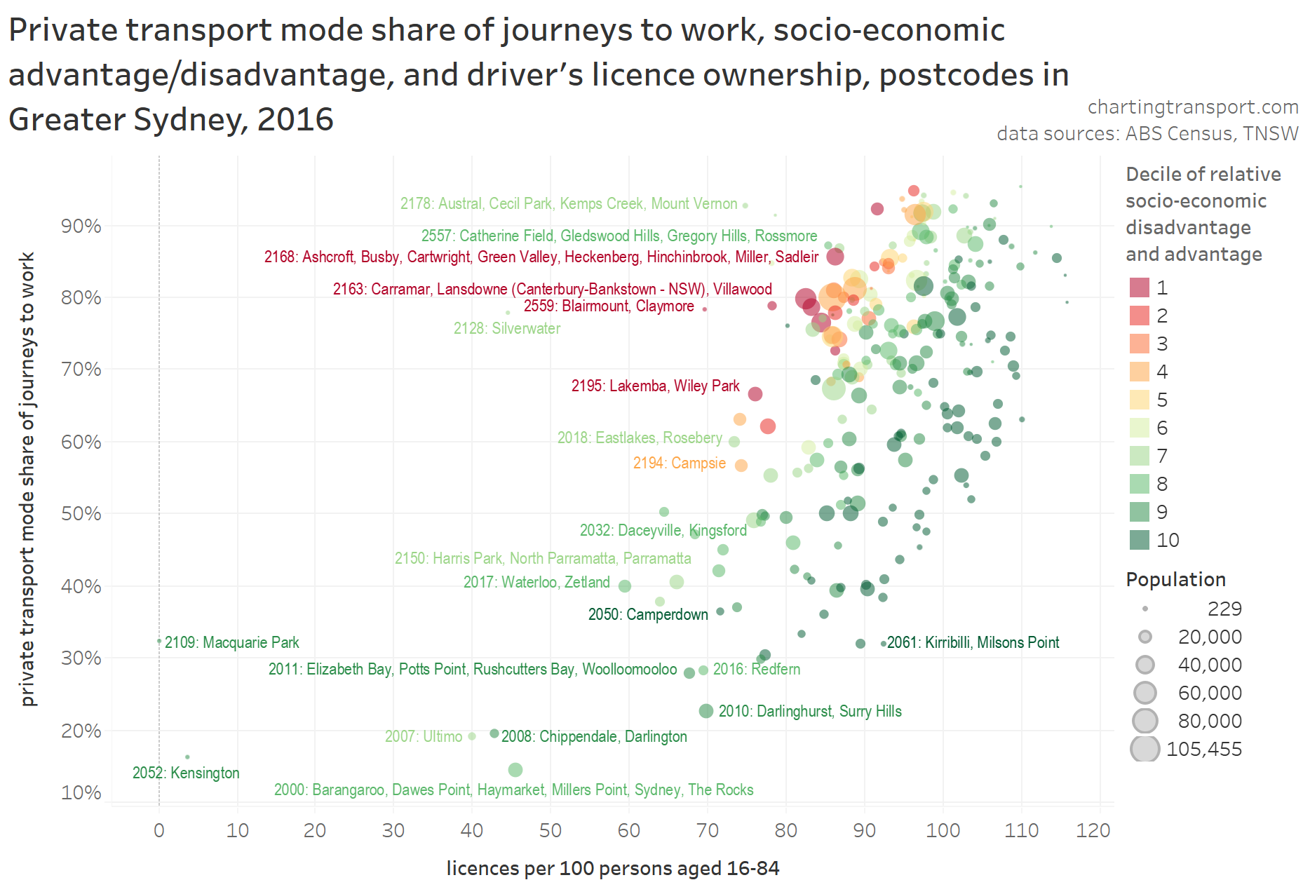
The next chart plots commuter mode shares, licence ownership, and socio-economic advantage/disadvantage:
You can see a significant – but not tight – relationship between licence ownership and commuter mode share. Within the main cloud, disadvantaged postcodes are to the top-left, and the more advantaged postcodes to the bottom-right. That is, many disadvantaged postcodes had high private transport mode share despite lower licence ownership, and many more advantaged areas had lower private mode share despite higher licence ownership.
This suggests licence ownership was not the strongest driver of commuter mode choice, at least at the postcode level. Workplace location seems far more influential.
Many advantaged areas are closer to CBD(s) and often have higher quality public transport, walking, and cycling options. People in more advantaged areas are also more likely to work in well-paying jobs in the central city, where public transport is a more convenient and affordable mode. These people also probably face fewer barriers in obtaining a driver’s licence for when they do want to drive (eg access to a car).
While disadvantaged postcodes generally had lower rates of licence ownership, fewer people in these postcodes worked in the Sydney CBD, and they also tended to have high private transport commuter mode shares. I suspect this may be related to many lower income workplace locations being generally less accessible by public transport (particularly jobs in industrial areas). Any cost advantage of public transport is less likely to offset the relatively high convenience of private transport (not to suggest the design quality of public transport services is not important, and not to go into the issues of capital v operating cost of private transport).
However, I suspect public transport could be more competitive for travel from these disadvantaged low-licence-ownership areas to local schools and activity centres. I am aware of some disadvantaged areas of Melbourne that have highly productive bus routes, but not necessarily high public transport mode shares of journeys to work (particularly parts of Brimbank). These areas may be worth targeting for all-day public transport service upgrades, to contribute to both patronage growth and social inclusion objectives.
Just to round this out, here’s a very similar chart, but with Sydney CBD commuter percentage used for colour:
For most rates of licence ownership, there was a wide range of private transport mode shares and a wide range of Sydney CBD commuter percentages. There is a relationship between licence ownership and mode share, but it is not nearly as tight as the relationship between Sydney CBD commuter percentage and mode share.
Age
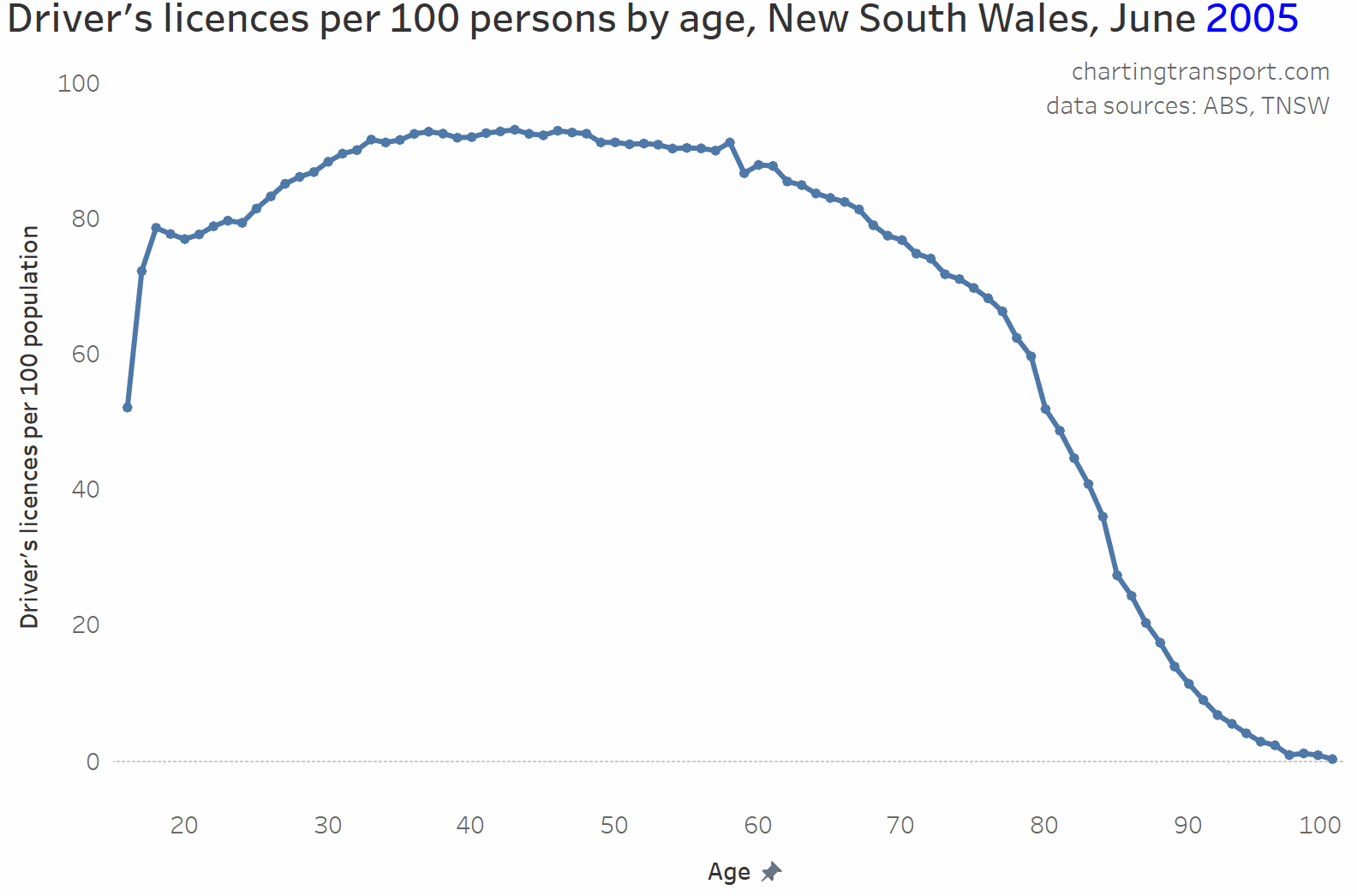
There’s obviously a relationship between age and licence ownership and NSW thankfully publishes detailed data on licence ownership by individual age. The following chart shows licence ownership by age, animated over time from 2005 to 2020.
Licence ownership peaks for ages around 35-70, and is lower for younger adults and tails off for the elderly as people become less capable of driving.
But there is a very curious dip in licence ownership around age 23-24, which became more pronounced after around 2008. Why might this be?
One hypothesis: People getting learner’s permits around age 18 but not progressing to a full licence and having their learner’s permit expire after 5 years – i.e. around age 22 or 23. I wonder whether people are getting a learner’s permit largely for proof of age purposes. NSW does have a specific Photo Card you can get for that, but the fee is $55 (or $5 at the time you get your driver’s licence), whereas a learner’s permit costs just $25 (and an Australia Post Keypass proof of age card costs $40). As of September 2020, there were 185,329 people aged 18-25 with a Photo Card, and 211,004 people aged 16-25 with a learner’s permit (unfortunately data isn’t available for perfectly aligning age ranges). Did something change about proof of age in 2008? I don’t live in Sydney but maybe locals could comment further on this?
However, I think I have uncovered a more likely explanation which I’ll discuss in the next section.
It would stand to reason that postcodes with more people in age ranges with lower licence ownership might have lower rates of licence ownership overall. I’ve calculated the ratio of the population aged 35-69 (roughly the peak licence-owning age range for 2016) to the population aged 15-84 (roughly the age range of most licence holders) for all postcodes to create the following chart:
You can see a very strong relationship between age make-up and licence ownership rates for postcodes (a linear regression gives an R-squared of 0.75). That is, the more the population skews to people aged 35-69, generally the higher the licence ownership rate.
While I cannot directly match licence ownership and immigrant status at the individual level, I can compare these measures at the postcode level.
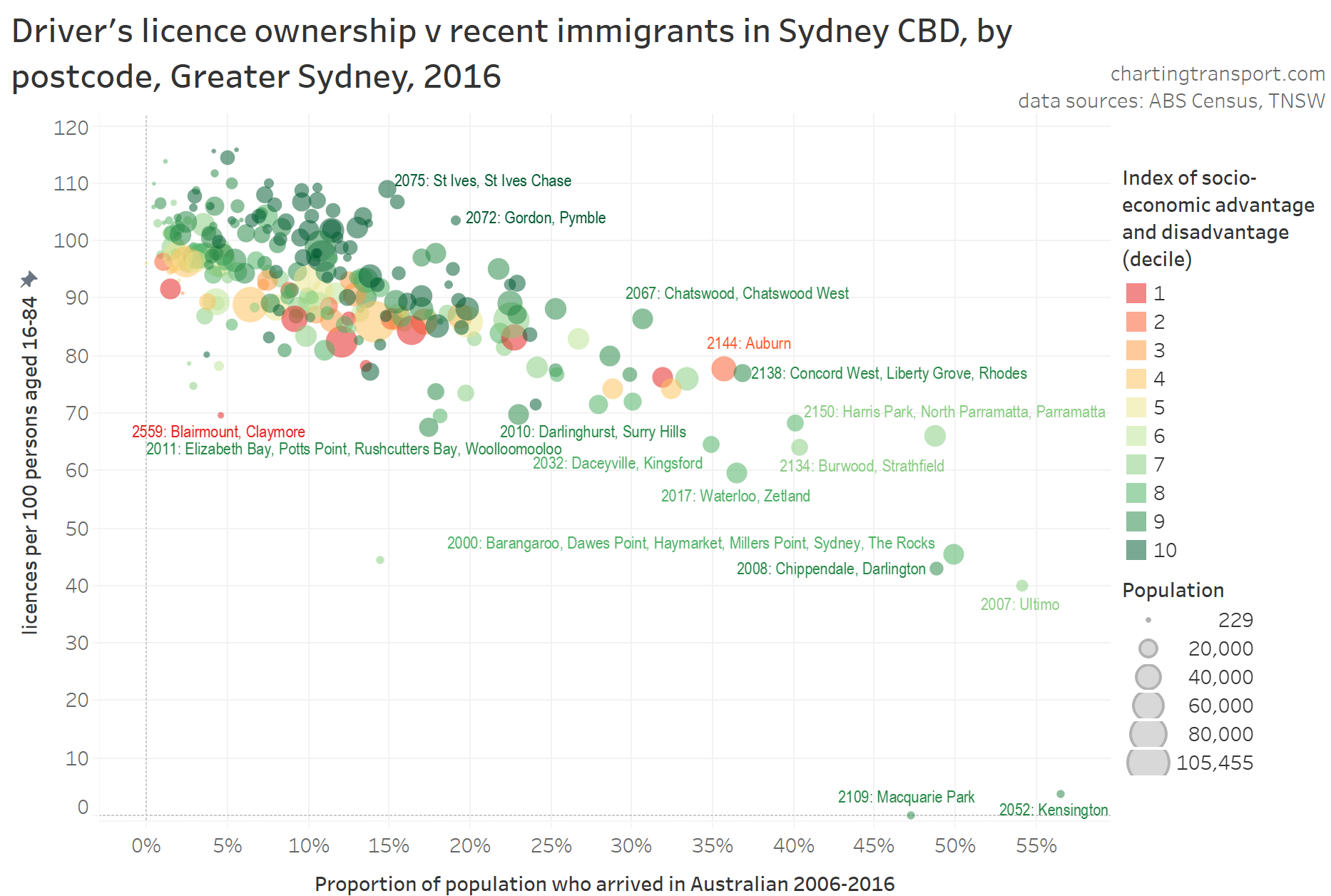
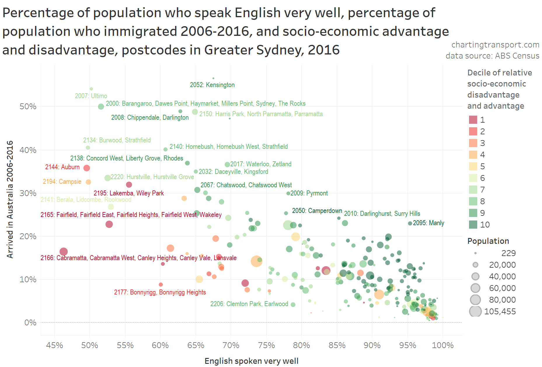
For the following chart I have classified postcodes by the percentage of residents who arrived between 2006 and 2016 – as at the 2016 census (my arbitrary definition of “recent immigrants” based on available data for this analysis), and compared that with licence ownership levels.
This chart shows a fairly strong relationship, and suggests more recent immigrants were less likely to have a driver’s licence – although the relationships is weaker for more disadvantaged postcodes (red/orange postcodes).
So why might recent immigrants be less likely to have a licence?
As we’ve already seen, some of these postcodes with low licence ownership are adjacent to universities, and no doubt included many international students who did not have a need for licence to get to study or work.
Many other skilled immigrants would work in the CBD(s), for which high quality public transport connections are generally available. In Melbourne, I found many recent immigrants live closer to the city where public transport is more plentiful, and many also live near train stations. Sydney is likely to be similar (more on that in a moment).
For some it might be because they cannot (yet) afford private transport (particularly immigrants on humanitarian visas) and/or that they don’t have sufficient English to get a learner’s permit (more on that later).
For some it might be that they are happy and attuned to using public transport, walking and/or cycling to get around, like they did in their country of origin. However when I analysed Melbourne commuter PT mode shares by immigrant country of origin, I didn’t find relationships I expected.
The age profile of immigrants skew towards younger adults, who for various reasons are less likely to own a driver’s licence.
I had wondered if some immigrants were driving using international licences instead, but NSW rules state that you can only drive on an international licence for up to three months, so that’s unlikely to explain the pattern.
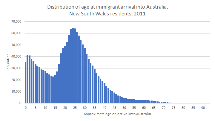
Here’s a chart showing that immigrants skew towards young adults. The chart shows the New South Wales 2011 population for each calculated approximate age of immigrants when they arrived in Australia (= age + arrival year – 2011) (the best data I have available at present):
The most common ages at arrival were around 23-25 years. Sound familiar? It is also the age where driver’s licence ownership rates dip in New South Wales. I reckon there’s a good chance the influx of immigrants of this age may explain the dip in licence ownership rates for people in their early 20s.
My recent Melbourne research found recent immigrants were also less likely to own a motor vehicle. This evidence suggests low rates of driver’s licence ownership is also strongly related to the relatively high use of public transport by recent immigrants.
For reference, here’s a map showing the percentage of residents in 2016 who had moved to Australia between 2006 and 2016. If you know a little about the urban geography of Sydney, you’ll see higher concentrations around the CBDs, university campuses, and along some major train lines.
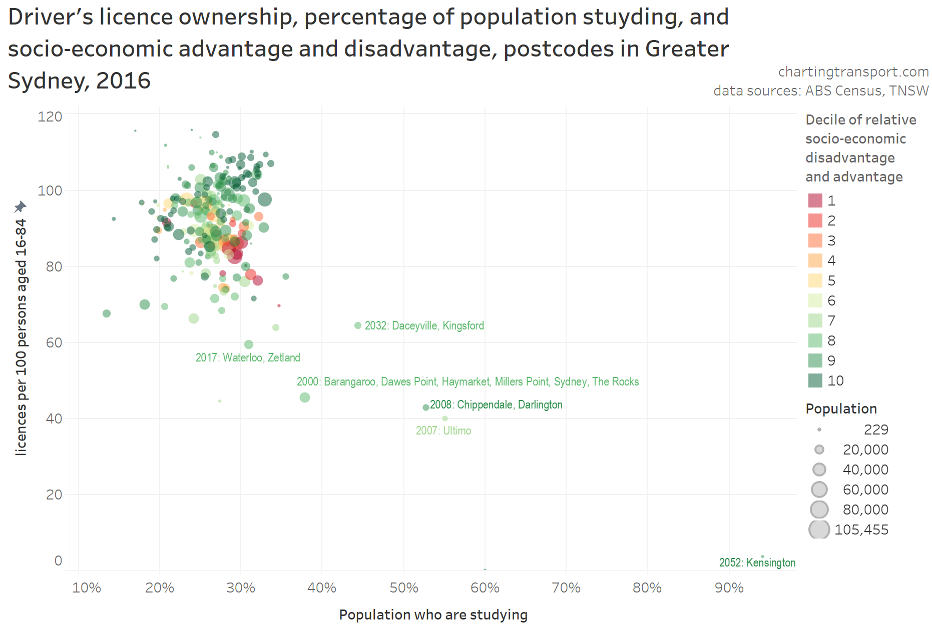
Parenting status
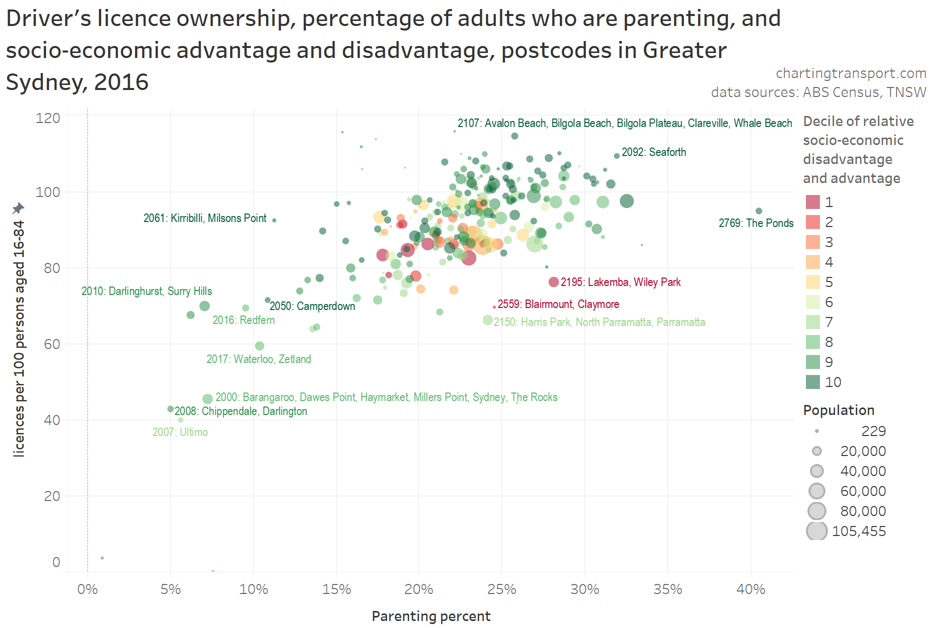
We know parents are less likely to use public transport (at least in Melbourne, but probably in all Australian cities), so are they also more likely to own a driver’s licence? The following data compares licencing and parenting rates (defined as proportion of adults doing unpaid caring work for their own children aged under 15) for postcodes:
There is a significant relationship, with postcodes with higher rates of parenting generally have higher rates of driver’s licence ownership. This may well be related to licence ownership rates also peaking for people of the most common parenting ages, and also the fact many young families live in the outer suburbs (where private transport is often more competitive than public transport). The postcodes with the lowest licence ownership rates also have very low proportions of parents (and probably contain many young adults who are studying).
For reference here is a map of parenting percentages for Sydney postcodes:
Motor vehicle ownership
It stands to reason that areas with higher driver’s licence ownership rates might also have higher motor vehicle ownership rates. I’ve calculated the ratio of persons aged 18-84 to household motor vehicles for each postcode, to create the following chart:
You can see the relationship is very strong, with more advantaged (and often near-CBD) postcodes towards the top of the cloud, and more disadvantaged postcodes mostly at the bottom and middle of the cloud.
Silverwater is an outlier – but I should point out that my calculation of motor vehicle ownership only counts people living in private dwellings while licence ownership is for all residents (including the many who resided in Silverwater’s correctional facilities).
There are also a small curious bunch of outliers with around 100 motor vehicles per 100 persons aged 18-84 but only 70-90 licences per 100 persons aged 16-84. These include urban fringe suburbs such as Marsden Park, Riverstone, Oakville, Rossmore, Gregory Hills, Leppington, Voyager Point, Kemps Creek, and Horsley Park. Perhaps these areas may contain farm vehicles that might skew the motor vehicle ownership rates.
While spatial data about licence ownership is unfortunately not readily available for most states of Australia, this chart suggested that motor vehicle ownership (something thankfully still captured by the census, despite ABS trying to drop the question) is a reasonably strong proxy for licence ownership.
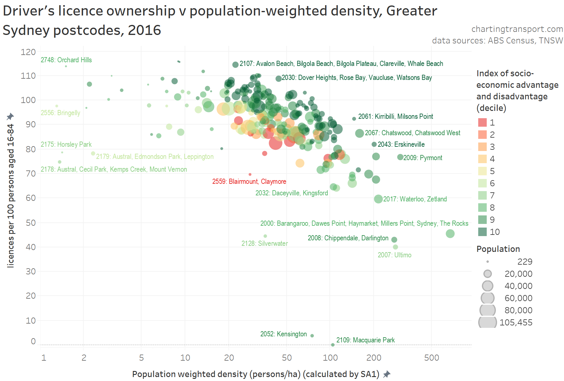
Population weighted density
Given postcodes can be quite large (one has a population of over 100,000!), I prefer to use population-weighted density as a metric of urban density (as opposed to raw density). Here’s how that related to licence ownership (note a log scale on the X-axis):
That’s a pretty strong relationship, and of course not unexpected. Areas with higher population density generally have great public transport services, and more services and jobs would likely be accessible by walking, reducing the need for a car or driver’s licence.
Proximity to high quality public transport
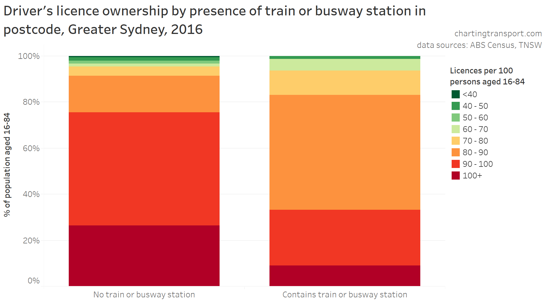
I’ve previously confirmed a relationship between public transport mode share and proximity to high quality public transport, so does the presence of high quality public transport also relate to driver’s licence ownership?
As mentioned above, I’ve classified postcodes as to whether or not there was a train or busway station contained within the postcode boundary in 2016. It’s a blunt measure because stations may only serve a small part of large postcodes, or there may be a station just outside a postcode’s boundary that still provides good rail access to that postcode. Some postcodes were also served by light rail and/or very high frequency bus services, just not a train or busway station. I’d love to be able to look at licence ownership by distance from stations, but licensing data is unfortunately only available for postcodes, which does not provide enough resolution.
You can see postcodes with a station generally have lower rates of licence ownership than those without, but there is still plenty of variance across postcodes.
The green postcodes in the top of the left column include Camperdown (University of Sydney, close to the CBD with very high frequency on-road buses), Ultimo (just next to Central Station and the CBD), Kensington (includes UNSW campus, with strong bus (and now light rail) connections), Chippendale / Darlington (wedged between Central and Redfern Stations), and Waterloo / Zetland (very close to Green Square Station and also served by high frequency on-road buses).
Many of the postcodes with stations but high licence ownership (bottom of right hand column) are in the outer suburbs, where train frequencies may be lower, and public transport services in non-radial directions may have lower quality.
So the exceptions to the relationship are quite explainable, and I’d suggest there is a strong relationship. Again, it may be people without a licence choosing to live near public transport, and/or people not near high quality public transport deciding they must have a licence to get around.
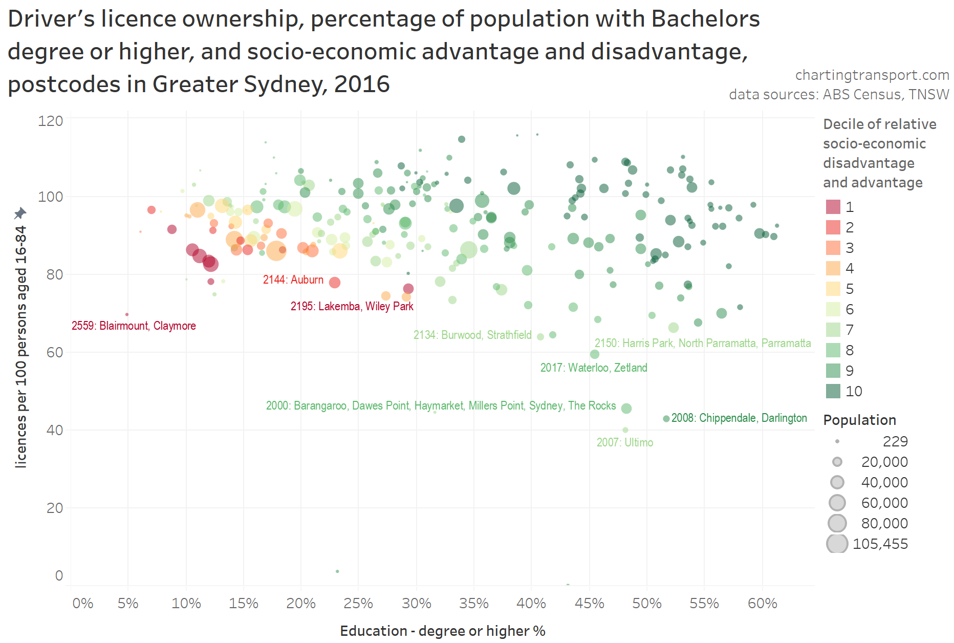
Educational qualifications
I have also found a relationship between educational qualifications and commuter mode shares in Melbourne, so are licencing rates related to levels of educational attainment in Sydney?
There’s not much of a relationship happening here between licence ownership and education, other than some inner city postcodes with a high proportion of educated residents and lower rates of licence ownership. There is of course an (expected) relationship between advantage and education.
But just on that, one curious outlier postcode on the chart is Lakemba / Wiley Park (2195), with 29% of the population having a Bachelor’s degree or higher, but it being in the most disadvantaged decile. This postcode has a large proportion of people not born in Australia, with significant numbers born in Lebanon and Bangladesh. Perhaps this reasonably well-educated but highly disadvantaged population is a product of lack of recognition of overseas qualifications, and/or maybe issues with discrimination.
Distance from Sydney CBD
In Melbourne, distance from the CBD has a strong relationship with mode choice, and I would not be surprised if there was similarly a relationship with licence ownership. However Melbourne only has one large dense employment cluster (the central city), while Sydney has multiple large dense employment clusters which is likely to lead to different patterns (see Suburban employment clusters and the journey to work in Australian cities).
From the first map in this post you cannot see a strong relationship between licence ownership and distance from the Sydney CBD – it is clear that many other factors are influencing licence ownership rates across Sydney (such as proximity to university campuses and employment clusters). Having said that, it seems clear that most “outer” suburban postcodes have high levels of licence ownership, but distance from the CBD is probably not a good proxy for “outer”.
Also some postcodes are quite large, and are a little problematic to assign to a distance value or range from the CBD, and the presence of two large harbours means crow-flies distance to the Sydney CBD is not necessarily reflective of ease/speed of travel to the Sydney CBD.
For these reasons I’ve not crunched data on home distance from the Sydney CBD. With a lot more effort, perhaps a metric could be created that considers travel time to Sydney’s major centres (although these centres vary in size).
Which factors have the strongest relationship with licence ownership?
The factors shown above had the strongest relationships with licence ownership (I tested three other factors which had weaker relationships, covered in the appendices below).
I put all the factors for Greater Sydney postcodes into a simple linear multiple regression model, and without labouring the details, I found that the following factors were significant at explaining postcode licence ownership rates (each with p-values less than 0.05 and overall an R-squared of 0.83), listed with the most significant first:
Ratio of population aged 35-69 : population aged 15-84. For every 1% this ratio is higher, licence ownership per 100 persons aged 16-84 is generally 1.0 higher (all other things being equal)
Rate of motor vehicle ownership: every extra motor vehicle per 100 persons aged 18-84, there are generally 0.35 more licences per 100 persons aged 16-84 (all other things being equal)
People who have a bachelors degree or higher: For every 1% this is higher, licence ownership per 100 persons aged 16-84 is generally 0.18 higher (all other things being equal)
Postcodes containing or adjacent to a major university campus or correctional centre. These postcodes generally had 14 fewer licences per 100 persons aged 18-64 (all other things being equal)
Factors that fell out of the regression as not significant were Sydney CBD commuter percentage, presence of a train or busway station, socio-economic advantage/disadvantage, population weighted density, parenting percentage, student status, and percent of population speaking English very well. Of course many of these metrics would correlate with the four significant factors above.
I was a little surprised to see educational qualifications show up as significant, given the weak direct relationship seen in the scatter plot, however the impact was small (0.18) and it may be acting as a proxy for other factors such as proportion of commuters working in the Sydney CBD (which was the “strongest” factor that fell out – having a p-value of 0.11).
This analysis was done using postcode level which has issues in terms of blending populations. It is possible to look at individuals using household travel survey data, and I’ve had a quick look using VISTA data from Melbourne. Without going into full detail in this post, I’ve found stronger relationships with age, sex, household income, parenting status, main activity, distance from train stations, and a weaker relationship with distance from CBD. Maybe that could be the focus of a future post.
I hope you’ve found this interesting.
Appendix 1: English proficiency
Probably related to recent immigrant figures, postcodes with a larger proportion of residents speaking English very well generally had slightly higher levels of licence ownership, although the relationship is not tight:
Curiously though, the relationship seems to be stronger for more advantaged postcodes. Disadvantaged postcodes with lower levels of English proficiency still had licence ownership rates of around 80 per 100 persons aged 16-84 (top-left of the cloud).
As an aside: is English proficiency lower in postcodes with many recent immigrants?
The answer is yes, but lower levels of English proficiency are not always explained by recent immigration. Of course some of the recent immigrants will speak English very well (many settling in places like Manly, Darlinghurst, Waterloo, Pyrmont), while others will not, depending on their country of origin. The large red dot to the bottom-left is postcode 2166, which includes the migrant area of Cabramatta (sorry about the label that overlaps other data points). It would appear that this postcode has many longer term residents who don’t speak English very well (although they might rank themselves as speaking English “well” rather than “very well”, which is below my arbitrary threshold of “very well” plus native English speakers).
Appendix 2: Student status
I have recently found a relationship between student-status and and journey to work mode shares in Melbourne (although yet to be published at the time of writing). So does the proportion of residents (over 15) who are studying have a relationship with driver licence ownership rates?
Here’s a scatter plot, with socio-economic advantage and disadvantage overlaid:
Apart from some exceptional postcodes with larger proportions of students, there appears to be little to no relationship between studying and licence ownership.
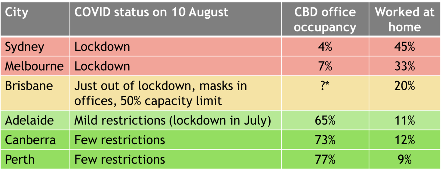
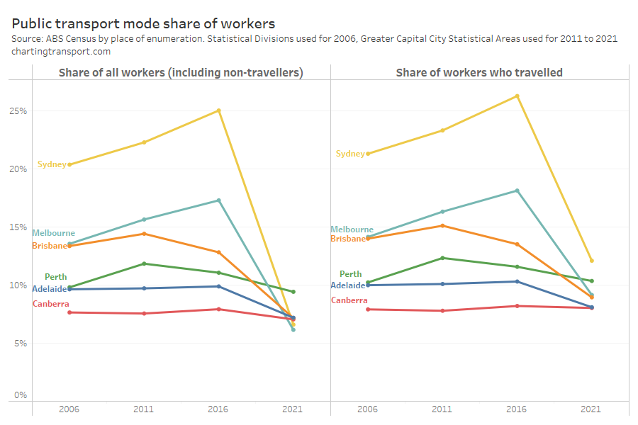
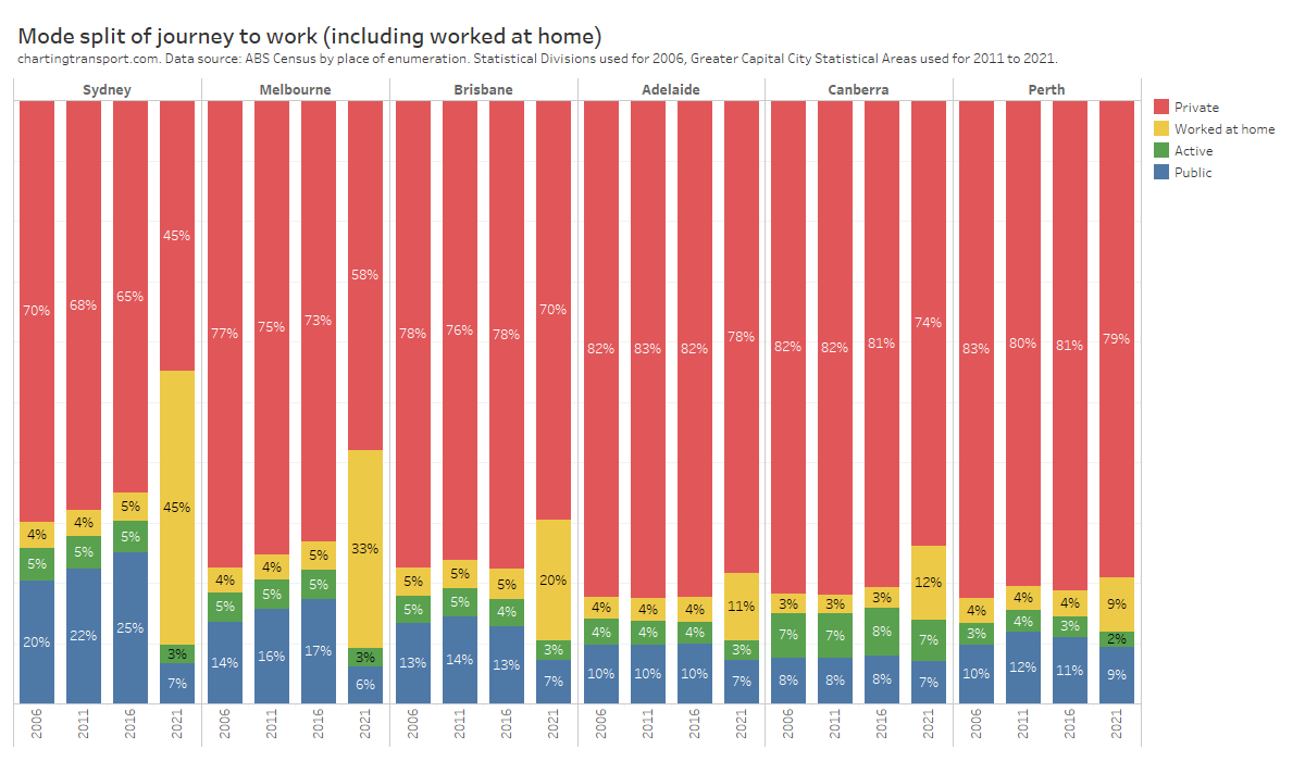
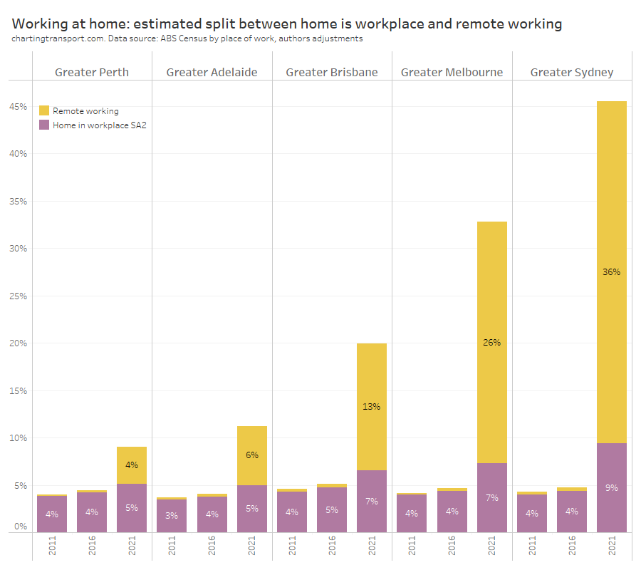
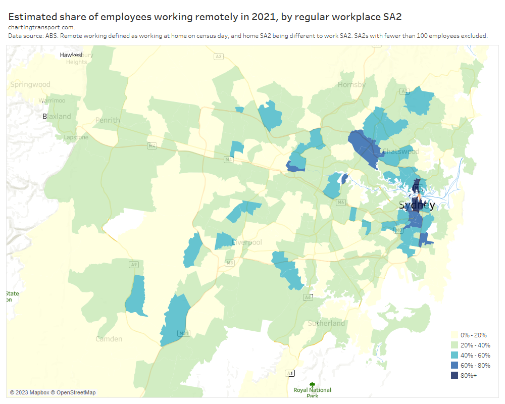
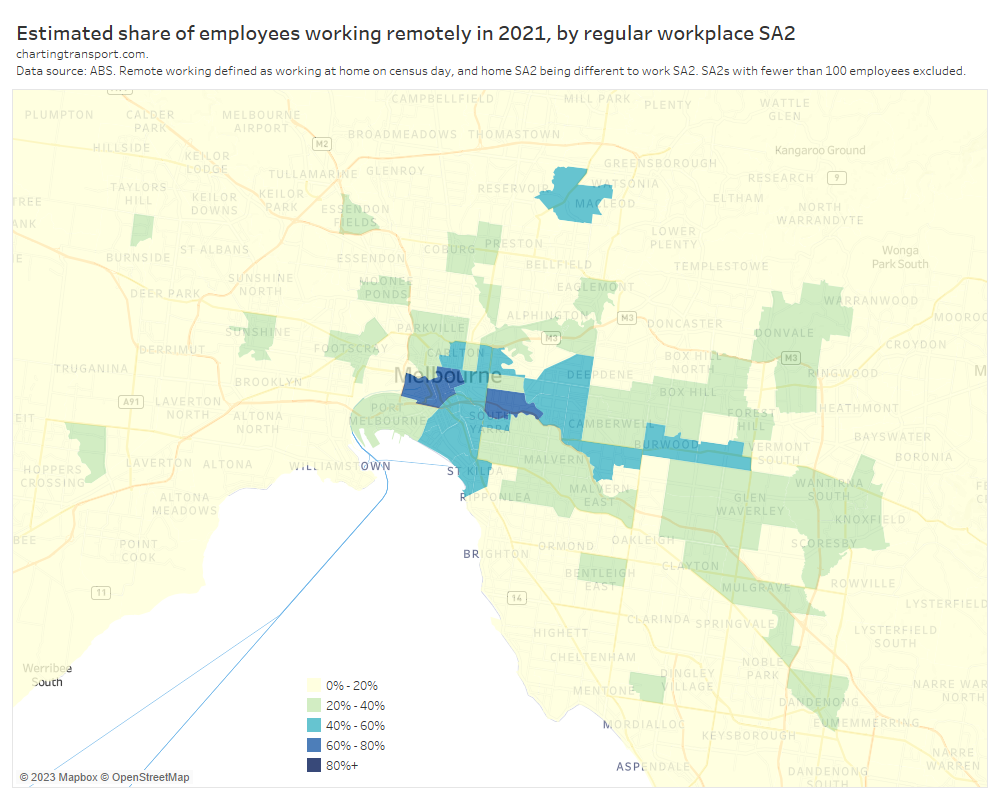
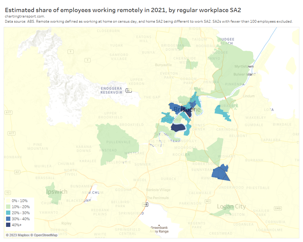
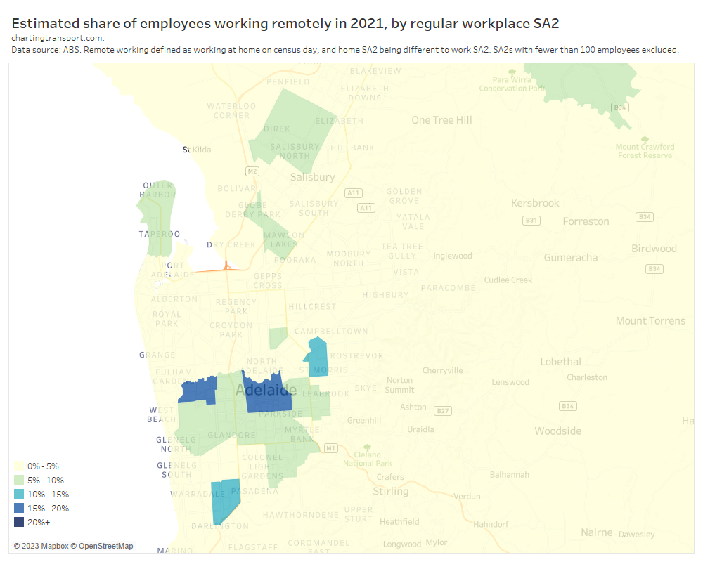
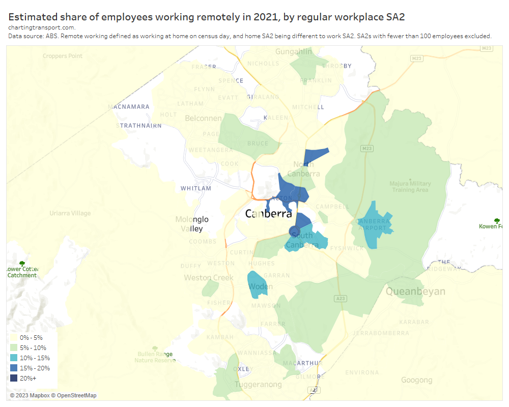
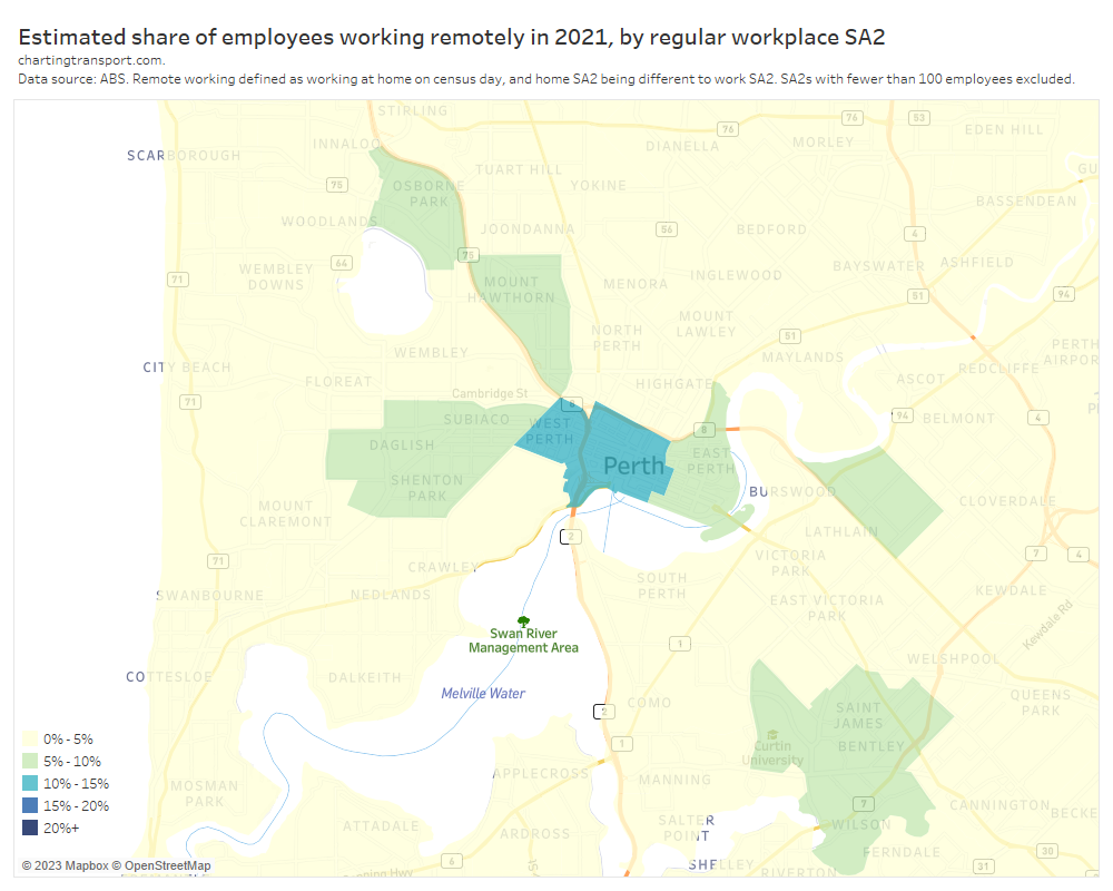
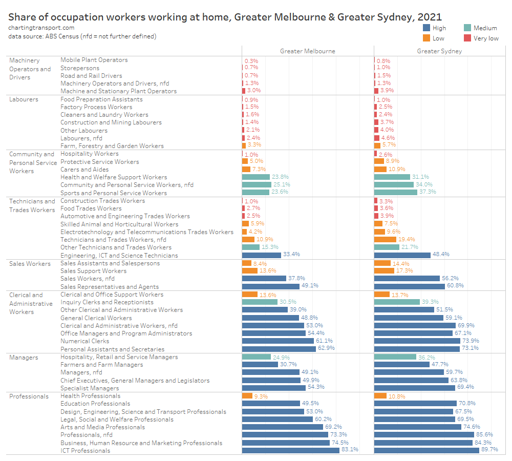
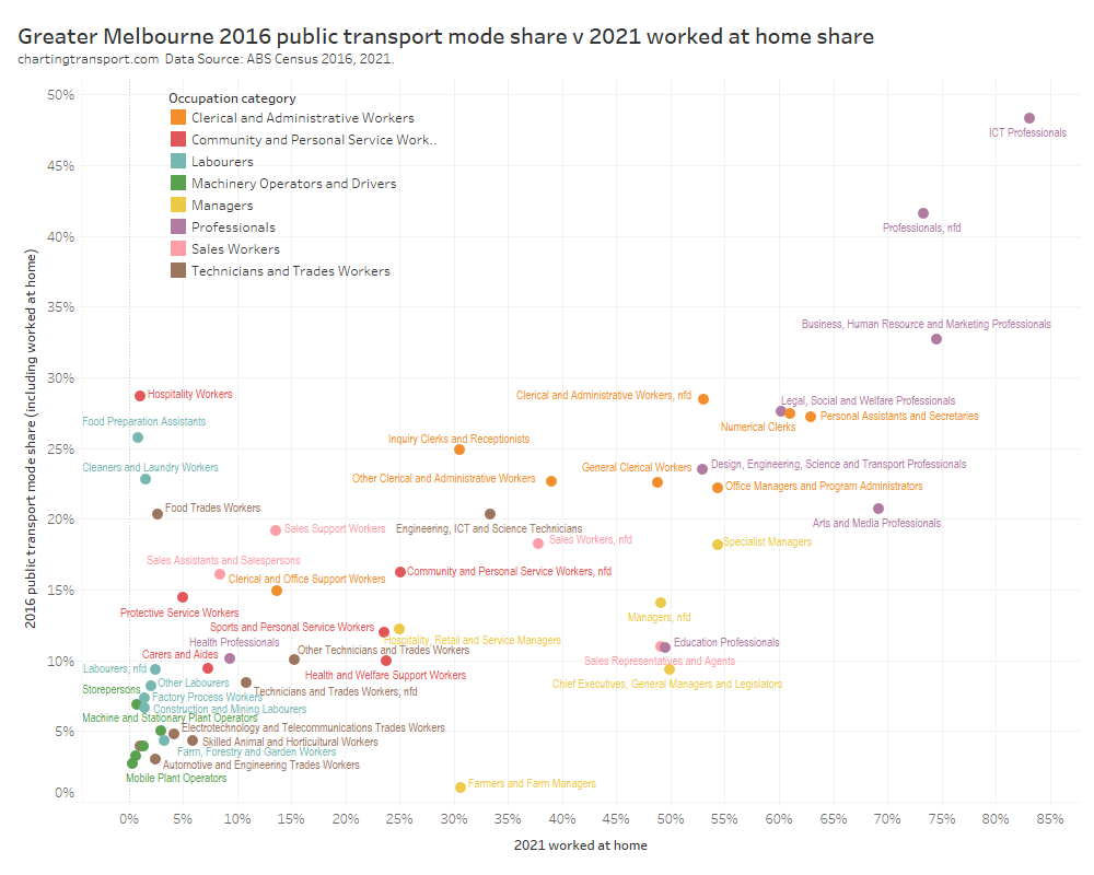
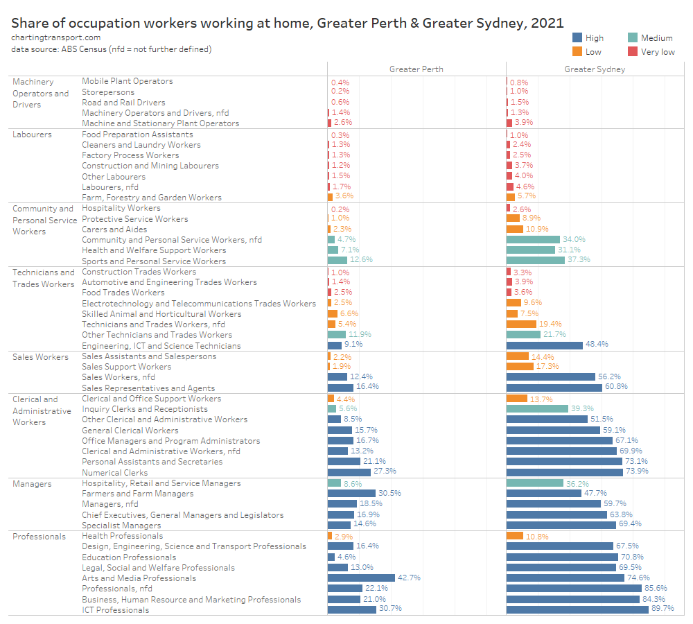
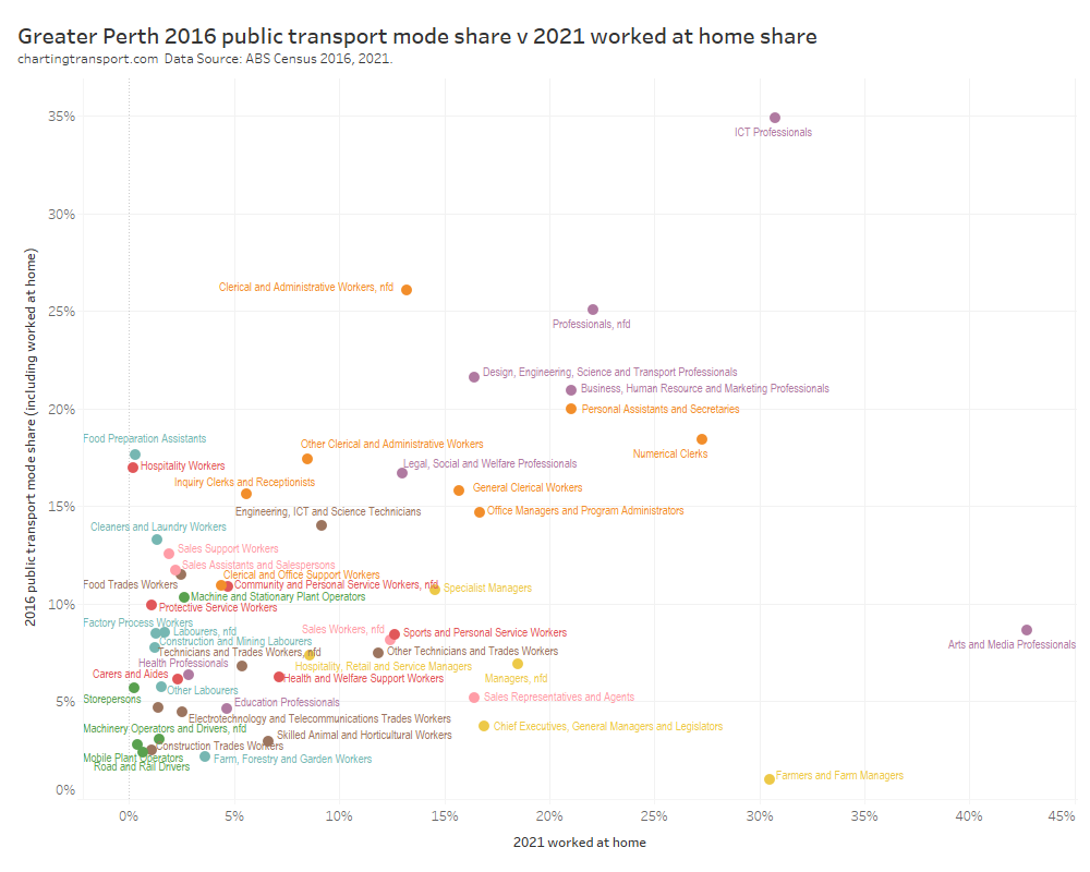
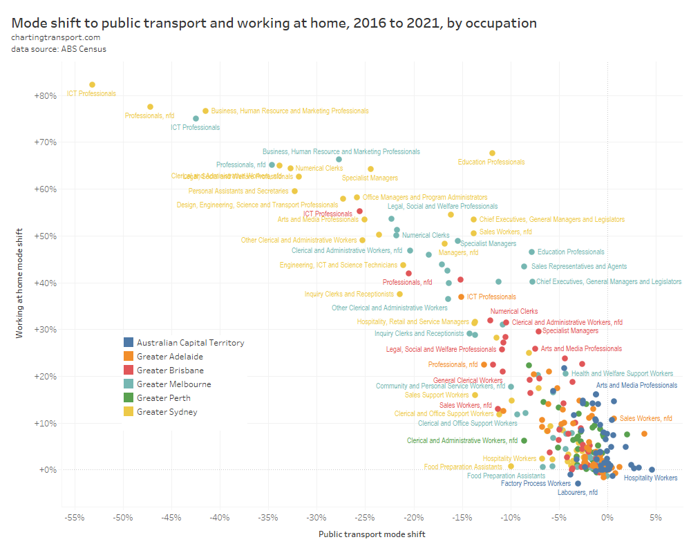
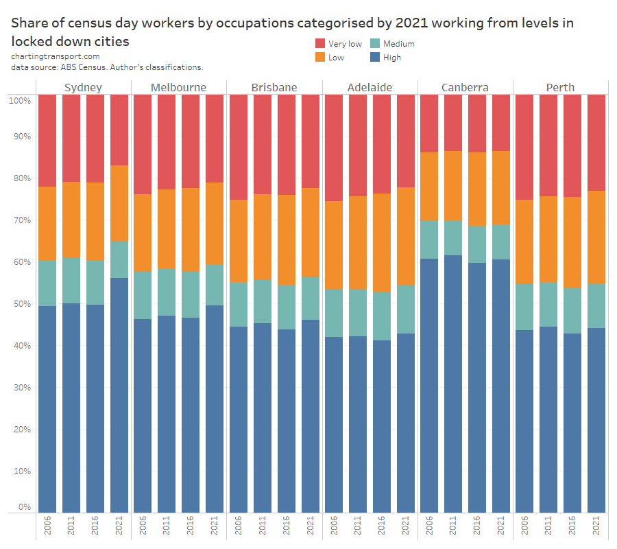
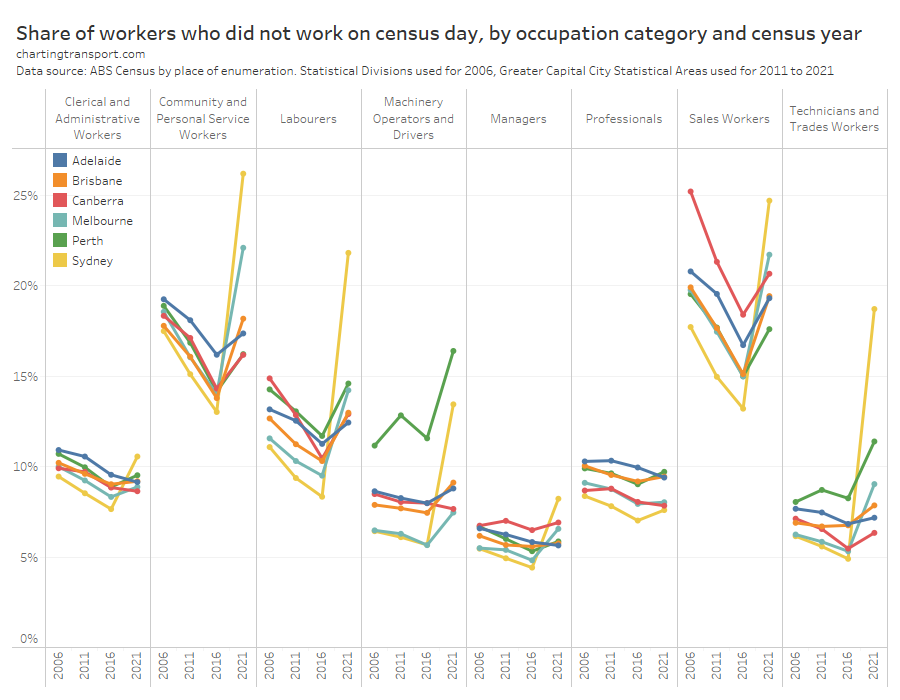


 Posted by chrisloader