How has motor vehicle ownership changed in Australian cities for different age groups?

Sun 18 July, 2021

Motor vehicle ownership has a strong relationship with private transport mode share, and has recently seen declines in some Australian cities (e.g. Melbourne). In addition, we know that younger adults more recently have been deferring the acquisition of a driver’s licence (see: Update on Australian transport trends (December 2020)), so have they also been deferring motor vehicle ownership? For which age ranges has motor vehicle ownership increased and decreased? How might this have influenced journey to work mode shares? And how do changes in motor vehicle ownership relate to changes in driver’s licence ownership?

This post aims to answer those questions for Australia’s six largest cities, primarily using 2011 and 2016 census data, but also using household travel survey data for Melbourne.

But first…

A quick update on motor vehicle ownership trends in Australia

As I was writing this post, ABS released data for their Census of Motor Vehicle use – January 2021 (sadly the last motor vehicle census run by the ABS). I’ve matched this up with the latest available population data, and found a small but significant uptick in motor vehicle ownership rates in all Australian states in 2021 following the onset of the COVID-19 pandemic:

Image

I suspect this uptick will be at least partly due to a massive reduction in immigrants into Australia – who I’ve recently found to have much lower rates of motor vehicle ownership for the first few years they live in Australia (see Why were recent immigrants to Melbourne more likely to use public transport to get to work?) and also probably low motor vehicle ownership – see How and why does driver’s licence ownership vary across Sydney?).

It could also reflect a mode shift from public to private transport, as people seek to avoid the perceived risk of COVID-19 infection on public transport.

But there’s another likely explanation of this uptick and it relates to ages, so keep reading.

What does household travel survey data tell us about motor vehicle ownership by age in Melbourne?

My preferred measure is the ratio of household motor vehicles to adults of driving age (notionally 18 to 84).

Using Melbourne household travel survey data (VISTA), I can calculate the average ratio by age group pretty easily, and the following chart also breaks this down for parents, children, and other people (living in households without parent-children relationships):

With 2-year age bands there is a limited span of age ranges for some categories due to the small survey sample sizes (I’m only showing data points with 400+ people). So here is a similar chart using 4-year age bands, which washes out some detail but provides values for wider age ranges:

You can see some pretty clear patterns. Motor vehicle ownership was high for households with children (peaking for ages 12-13), parents – particularly in their late 40s, and those aged in their 50s and early 60s in households without children. Average motor vehicle ownership was lowest for young adults living away from their parents, and for those in older age groups.

Unfortunately the VISTA dataset isn’t really big enough to enable significant analysis of changes over time – the sample sizes for age bands get too thin when you split the data over years or even groups of years. I’d like to understand changes over time, so…

What can census data tell us about motor vehicle ownership by age?

Unfortunately it’s not possible to calculate the ratio of household motor vehicles to adults using Census (of Housing and Population) data (at least when using ABS Census TableBuilder).

The numerator is pretty easy for the 2011 and 2016 censuses which classify private dwellings as having zero, 1, 2, 3, 4, …, 28, 29, or “30 or more” motor vehicles. Only a very small number of households report 30+ motor vehicles. Unfortunately the 2006 census’s top reporting category is “4 or more” motor vehicles which means you cannot calculate the motor vehicle ratio for many households.

My preferred denominator – the number of adults of driving age – is not available in ABS’s Census TableBuilder. The closest I can get is the “number of persons usually resident” for dwellings – and private dwelling are classified as having 1, 2, 3, 4, 4, 5, 6, 7, or “8 or more” usual residents in the 2006, 2011 and 20216 censuses. Obviously I cannot calculate the ratio of motor vehicles to usual residents if there were “8 or more” usual residents.

(For the census data nerds out there: I tried to get a good guess of adults by using family composition, but it can only distinguish parents (who may or may not be of driving age), children under 15, and dependent students aged 15-24. And worse still, that doesn’t work for multi-family households, and you cannot filter for single family households as well as distinguish family types.)

So I’m stuck with household motor vehicles per person usually resident. And an obvious drawback is that motor vehicle ownership will be lower for adults living in households with children, compared to those without children.

Here’s the distribution of motor vehicle : household size ratios for Greater Melbourne for 2011 and 2016 (I’ve left out 2006 because too many households cannot be calculated). There are a lot of different ratio values, but only about a dozen common ratios, several of which I have labelled on the chart.

Sure enough, there were much lower ownership ratios for children’s households, and adult ages where children were more likely to be resident (generally mid-20s to around 60). Higher ratios peaked for people in their early 60s and then steadily declined into older ages, with most people in their 90s living in dwellings with no motor vehicles (if they are not living in non-private dwellings). For adults in their 60s, one car per person was the most common ratio.

I can also calculate the average motor vehicle ownership ratio for each age as an aggregate statistic (excluding 3-4% of households where I don’t know the precise number of residents and motor vehicles). Here’s how that looks for 2011 and 2016:

As mentioned, I cannot calculate this ratio for households where I don’t know the precise number of both motor vehicles and usual residents (or where I don’t know the number of usual residents, but do know there were zero motor vehicles). Across Australia’s five biggest cities that’s 4.1% of population in the 2016 census, 3.4% in 2011, and 10.4% in 2006 (but much higher proportions of younger adults). They sound like small numbers, but aren’t that small when you consider the shifts in ownership between censuses.

But there is another way to classify households with fewer unknowns – whether they have:

  • no motor vehicles;
  • fewer usual residents than motor vehicles; or
  • at least one motor vehicle per usual resident.

The benefit of this approach is that you can classify almost half of the households where you cannot calculate an exact ratio:

  • If a household had 30+ motor vehicles (very rare) but fewer than 8 usual residents, then it had at least one vehicle per person.
  • If a household had 4+ motor vehicles (quite common in 2006 census) and 4 or fewer usual residents, then it had at least one vehicle per person.
  • If a household had 8+ usual residents (about 1.3% of population in 2016), but 7 or fewer motor vehicles (93.5% of the 1.3%), then it had less than one vehicle per person.

Across Australia’s biggest five cities I can now classify all but 2.5% of the 2016 population, 2.3% of the 2011 population and 6.1% of the 2006 population.

The next chart shows the distribution of this categorisation for Melbourne (using Melbourne Statistic Division for 2006, and “Greater Melbourne” for 2011 and 2016). I’ve put the remaining people living in uncategorisable households (“unknown”) in between 0 and <1 motor vehicles per person, as it is likely households who did not answer the question about household motor vehicles probably had few or no motor vehicles (refer to the appendix at the end of this post for more discussion).

I have also removed people who did not provide an answer to the usual residents question (hoping they are not overly biased – they are probably households who didn’t respond to the census), and non-private dwellings (where motor vehicle ownership is not recorded).

The patterns are similar to the previous chart, with a double hump pattern of 1+ motor vehicles per person. There are some changes over time, which I’ll discuss shortly.

Unfortunately the unknown band is still pretty wide in 2006 – in fact I still cannot categorise around 15% of 20 year olds in 2006 (many must have lived in households with 4+ motor vehicles), so it doesn’t really support good time series evaluation between 2006 and 2011.

So how has motor vehicle ownership by age changed over time in Melbourne?

Many of the previous charts were animated over 2-3 censuses but there’s a lot of take in with different lines moving in different directions for different age groups. To help to get better sense of those changes, what follows are a set a static charts, and then some discussion summarising the patterns.

Firstly, the change in average motor vehicles per usual resident for each age year (but only for households where the exact number of motor vehicles and usual residents is known):

Secondly, here’s a static chart that shows the proportion of population living in households known to have 1+ motor vehicles per person for both 2011 and 2016 for Melbourne, and the difference between 2011 and 2016 (I’ve excluded 2006 as there were too more unknowns). I haven’t removed uncategorisable households from the calculations, on the assumption they bias towards lower motor vehicle ownership (as discussed above).

This chart shows very little change for children under 18, but also very few such households had 1+ motor vehicle per occupant in 2011 or 2016 so it’s not a very useful metric. Lower ownership ratios are much more common for households with children, so here’s a chart showing the proportion of the population living in dwellings with at least 0.5 motor vehicles per person, and the change between 2011 and 2016: (I used equivalent rules to classify households with 8+ usual residents or 30+ motor vehicles, where possible)

And finally, here’s a chart showing the proportion of the population living in dwellings reported to have no motor vehicles (probably an underestimate as I think many “not stated” responses are likely to be zero motor vehicles).

Each of these charts paints a similar picture. Here’s a summary by age ranges:

Age rangeMotor vehicle ownership trend
0-17Slight increase
18-26Certainly a decline, including around 1-2% more people living in dwellings with no motor vehicles.
27-45Small decline of around 2-3% living in households with 1+ or 0.5+ motor vehicles per person. But there was no significant increase in households with no motor vehicles, and average motor vehicles per person was relatively stable.
46-64Very small decline (around 1%) of people living in households with 1+ and 0.5+ motor vehicles per person, but little change in households without motor vehicles.
65+Significant increase in metrics of motor vehicle ownership, and a significant decline in dwellings without any motor vehicles.

So while overall motor vehicle ownership in Melbourne declined between 2011 and 2016, it was mostly in working aged adults, partly offset by family households and older adults increasing their rates of motor vehicle ownership.

And going back to the uptick in motor vehicle ownership in January 2021… recent immigrants to Australia have skewed towards young adults (particularly through skilled migrant visas). The massive reductions in immigrants in 2021 will mean the population contains proportionately fewer young adults – who generally have low car ownership, particularly recent immigrants. This slightly but significantly smaller number of young adults will no longer be fully offsetting those over 70 who are increasingly retaining motor vehicles longer into their life.

What about other Australian cities?

As above, I’ll present a series of charts showing the various metrics then summarise the trends.

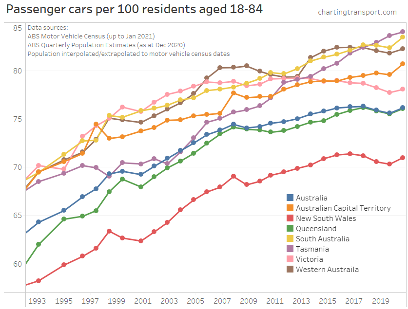
Firstly, a chart showing the average ratio of motor vehicles per resident by age for all cities between 2011 and 2016 – for private dwellings where the exact number of vehicles and usual occupants is known:

To help see those changes, here is a static chart showing the change in average motor vehicles per person by age (I’ve used three-year age bands as the data otherwise gets a bit too noisy):

Here’s an animated chart showing the percentage of people living in private dwellings with 1+ motor vehicle per person:

There’s a lot going on in that animation (and the data gets a bit noisy for Canberra due to the relatively small population), so next is a chart showing the difference in population living with 1+ motor vehicles per usual resident:

As before, the threshold of 1 motor vehicle per person is not useful for examining the households of children, so here’s a similar change chart for the 0.5 motor vehicles per person threshold:

These difference charts mostly form duck-shaped curves with a slight increases for children, a mixture of increases and decreases for working aged adults, and a large increase for older adults (particularly for those in their 70s).

For young adults (18-30), motor vehicle ownership mostly declined in Melbourne and Canberra, but for Perth and Adelaide there was a large increase in ownership for those aged 21-39.

There was less change in ownership for those aged 40-54. On the metrics of proportion of population with 1+ and 0.5+ motor vehicles per resident there was a small decline in all cities, but for average motor vehicles per person, some cities declined and some increased. So perhaps the amount of variation in motor vehicle ownership narrowed in this age range.

Melbourne was mostly at the bottom of the pack, with Brisbane, Adelaide or Perth mostly on top.

To continue this analysis, I want to know whether these changes in motor vehicle ownership might be impacted mode share, but first we need to look at…

How did journey to work mode shares change by age?

Here are public transport mode shares of journeys to work by age for Australia’s six biggest cities, 2006 to 2016:

Public transport mode shares were much higher for younger adults in all cities in all censuses. Most cities rose between 2006 and 2011, but then different cities went in different directions between 2011 and 2016.

Here’s the mode shift between 2006 and 2011:

Most cities and ages had a mode shift towards public transport, particularly for those aged around 30, but less so for young adults.

Here’s the mode shift between 2011 and 2016:

Between 2011 and 2016 there was a mode shift to public transport in most cities for people in their 30s and 40s, but for younger adults there was a decline in public transport mode share in most cities, with only Sydney, Melbourne, and Canberra seeing growth.

However we are talking about motor vehicle ownership, and declining motor vehicle ownership may be because of mode shifts to walking, cycling, and/or public transport. So it is worth also looking at private transport mode shares (journeys involving private motorised modes but not public transport modes).

To help see the differences, here is the mode shift for private transport 2006 to 2011:

There’s a similar curve for all cities, but different cities are higher or lower on the chart. There was a shift towards private transport for young workers, a shift away in most cities for those in their 20s and 30s, and smaller shifts for those in their 40s and 50s

And from 2011 to 2016:

Again similar curves across the cities, with younger adults again more likely to shift towards private transport in most cities, a big shift away from private transport for those in their 30s and early 40s in Sydney and Melbourne, and smaller shifts for those in their 50s and 60s.

What’s really interesting here is that the mode share and mode shift curves are similar shapes across most cities (except the much smaller city of Canberra). There are some age-related patterns of travel behaviour change consistent across Australia’s five biggest cities.

How did changes in motor vehicle ownership compare to changes in private transport mode share?

If motor vehicle ownership increases you might expect an increase in private transport mode shares, and likewise you might expect a decrease in ownership to relate to a decline in private transport mode shares.

Indeed when you look at cities as a whole, there is generally a strong relationship between these measures, although different cities moved in different directions between 2011 and 2016.

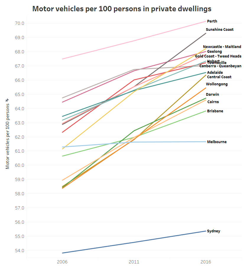
In this post I’m interested in shifts for people in different age groups. The following chart shows the changes in motor vehicle ownership and private transport mode shares for each city and age group: (note different axis scales are used in each row of charts)

However I’m particularly interested in the change in these factors, rather than where they landed in each of 2011 and 2016. So the following chart plots the change in motor vehicles per 100 persons and the change in private transport mode share of journeys to work between 2011 and 2016 for five-year age bands (noting that of course every living person got five years older between the censuses).

That’s a busy chart but let me take you though it.

There’s one mostly empty quadrant on this chart (top-left): for no city / age band combinations did motor vehicle ownership decline but private transport mode share increase, which isn’t really surprising.

But in city / age band combinations where motor vehicle ownership did increase there there wasn’t always an increase in private transport mode shares – quite often there was actually a decline. So increasing motor vehicle ownership doesn’t necessarily translate into higher private transport mode shares – for journeys to work at least. Perhaps increasing affordability of motor vehicles means more people own them, but don’t necessarily switch to using them to get to work.

The largest declines in private transport mode share occurred in city/age band combinations that actually saw a slight increase in motor vehicle ownership.

The cloud is quite spread out – which to me suggests that motor vehicle ownership is probably not a major explanation for changes in mode share between 2011 and 2016 – there must be many other factors at play to explain changes in mode shares across cities. Indeed, see my post What might explain journey to work mode shifts in Australia’s largest cities? (2006-2016) for more discussion on these likely factors.

What is the relationship between motor vehicle ownership and driver’s licence ownership?

As I’ve previously covered on this blog (eg see: Update on Australian transport trends (December 2020)), data is available on the number of licenced drivers by different age groups, but only at the state level.

I’d prefer not to be using state level data as city and country areas might wash each other out, but I’d don’t have a lot of choice because of data availability. (Licencing data is available at postcode resolution in New South Wales (see How and why does driver’s licence ownership vary across Sydney?), but unfortunately you cannot disaggregate by both geography and age.)

Here’s another (busy) chart showing the relationship between licence and motor vehicle ownership by age band and city, across 2011 and 2016:

The main thing to take away here is that most of the points are within a diagonal cloud from bottom-left to top-right – as you might expect: there is less value having a driver’s licence if you don’t own a car, and little point owning a car if you don’t have a licence to drive it. The exceptions to the diagonal cloud are mostly age bands 30-39 and 40-49, where the average motor vehicle ownership rates are lower because many of these people often have children in their households, and I cannot remove children from the calculation using census data.

But I can control for the issue of children by going back to city geography by using household travel survey data for Melbourne (VISTA, 2012-2018). The following chart shows the relationship between average motor vehicle and driver’s licence ownership for adults by different age brackets.

The data points again generally form a diagonal cloud as you’d expect. Higher motor vehicle ownership generally correlates with higher licence ownership.

The change in ownership rates by age are interesting. Children under 10, on average, lived in households where adults have very high levels of motor vehicle and licence ownership. Licence ownership was slightly lower for adults in households with children aged 10-17 (although this could just be “noise” from the survey sample). Young adults (18-22) then on average lived in households with relatively low motor vehicle and licence ownership. As you move into older age brackets licence ownership increased, followed by increases in motor vehicle ownership, with both peaking again around ages 40-69 (although not as high as households with children). Those aged 70-79 and 80+ then had significantly lower rates of licence and vehicle ownership, as you might expect as people age and become less able to drive. These patterns are fairly consistent with the census data scatter plot, except for the key parenting age bands of 30-39 and 40-49 where the census data analysis cannot calculate ownership per adult (just per person).

How has licence and motor vehicle ownership been changing for different age groups?

Across Australia, licence ownership has been increasing in recent years for older adults (particularly those over 70), and declining in those aged under 30 in states such as Victoria, New South Wales and Tasmania (for more detail see Update on Australian transport trends (December 2020)).

The following chart shows state-level changes in motor vehicle ownership and licence ownership between 2011 and 2016 by age bands: (note different scales on each axis)

This chart also shows something of a direct relationship between changes in motor vehicle and licence ownership, with people aged 70+ having the largest increases in both measures (except for Victorians aged 80+ who saw a decline in licence ownership). Younger age bands often had a decline in licence ownership, even if motor vehicle ownership in their households increased slightly (on average). For those aged in their 40s, there was generally an increase in licence ownership but only small changes in motor vehicle ownership – including slight declines in most states.

Teenagers in the ACT were an outlier, where there was a significant decline in licence ownership between 2011 and 2016 that someone with local knowledge might be able to explain.

Overall the relationship between changes licence ownership and changes in motor vehicle ownership is not super strong. Increasing licence ownership does not automatically translate into increasing motor vehicle ownership. There must be more factors at play.

I hope you’ve found this post interesting.

Appendix: What about households where census data is missing?

The non-response rate to the question about household motor vehicles was around 8.4% in 2016 (up from 6.5% in 2011) and most of these were for people who did not respond to the census at all. Non-response was fairly consistent across age groups as the next chart shows. Quite a few people had a response to the question about number of usual occupants, but did not respond to the question about motor vehicles. Poking around census data, these people often:

  • didn’t answer other questions;
  • were less likely to be in the labour force;
  • were generally on lower incomes;
  • were more likely to be renting;
  • were less likely to have a mortgage; and
  • were more likely to live in a flat, apartment or unit, and less likely to live in a standalone/separate house.

So my guess is that they were less likely to have high motor vehicle ownership.

The number of “not applicable” responses increased significantly into older age groups, and I expect most of these will be people in non-private dwellings (e.g. aged care). I have removed people with “not applicable” responses for usual occupants and household motor vehicles as they are likely to be non-private dwellings.

The chart gets a bit noisy for ages above 100 as very few such people live in private dwellings.


What does the census tell us about motor vehicle ownership in Australian cities? (2006-2016)

Sun 30 July, 2017

With the latest release of census data it’s possible to take a detailed look at motor vehicle ownership in Australian cities.  This post will look at ownership rates across time and space, and compare trends between car ownership, population growth, and population density. And this time I will cover 16 large Australian cities (but with a more detailed look at Melbourne).

I’ve measured motor vehicle ownership as motor vehicles per 100 persons in private occupied dwellings. If you want the boring but important details about how I’ve analysed the data, see the appendix at the end of this post.

I’ve used Tableau Public for this post, so all the charts and maps can be explored, and they cover all sixteen cities.

Is motor vehicle ownership increasing in all cities?

Elsewhere on this blog I’ve shown that motor vehicle ownership is increasing in all Australian states, but what about the cities? Here are the overall results for Australia’s larger cities, on motor vehicles per 100 persons basis. Note that the Y-axis only goes from 54 to 70, so the rate of change looks steeper than it really is.

(you can explore this data in Tableau)

Sydney unsurprisingly has the lowest average motor vehicle ownership, followed by Melbourne, Brisbane (Australia’s third biggest city), and then Cairns and Darwin. Perth was well on top, with Sunshine Coach rapidly increasing to claim second place. Most of the rest were around 66-68 motor vehicles per 100 persons in 2016.

But Melbourne is showing a very different trend to most other cities, with hardly any increase in ownership rate across the ten years (also, Canberra-Queanbeyan saw very little growth between 2011 and 2016).

At first I wondered whether Melbourne was a data error. However, I did the one data extract for all cities for both population and motor vehicle responses, and I’ve also checked for any potential duplicate SA1s. So I’m confident something very different is happening in Melbourne.

So let’s have a look at Melbourne in more spatial detail, starting with maximum detail over time:

(you can zoom in and explore this data in Tableau).

You can see lower ownership in the inner city, inner north, inner west, and the more socio-economically disadvantaged suburbs in the north and south-east. You can also see lower motor vehicle ownership around train lines in many middle suburbs. Other pockets of low motor vehicle ownership are in Clayton (presumably associated with university students) and Box Hill, and curiously some of the growth areas in the west and north. Very high motor vehicle ownership can be seen in wealthier areas and the outer east.

It’s a bit hard to see the trends with such a detailed map, so here’s a view aggregated at SA2 level (SA2s are roughly suburb-sized).

No doubt you are probably distracted by the changes in the legend. That’s because in 2006 there were no SA2s in the <20 and 30-40 ranges at all, and the 30-40 range is only present in 2016. That is, the legend has to expand over time to take into account SA2s with lower motor vehicle ownership rates.

You’ll notice a lot more light blue and green SA2s around the city centre, plus Clayton in the middle south-east switches to green in 2016.

Looking at it spatially, more areas appear to have increasing rather than decreasing motor vehicle ownership. But not all SA2s have the same population – or more particularly – the same population growth. So we need to look at the data in a non-spatial way.

Here’s a plot of population and motor vehicle ownership for all Melbourne SA2s, with the thin end of each “worm” being 2006 and the thick end being 2016.

Okay yes that does looks like a lot of scribbles (and you can explore the data in Tableau to find out what is what), but take a look at the patterns. There are lots of short worms heading to the right – these have very little population growth but some growth in motor vehicle ownership. Then there are lots of long worms that are heading up and to the left – which means large population growth and mostly declining motor vehicle ownership.

Here’s a similar view, but with a Y-axis of change in population since 2006:

(explore in Tableau)

The worms heading up and to the left include both inner city areas and outer growth areas. These areas seem to balance out the rest of Melbourne resulting in a stable ownership rate overall.

Some SA2s that are moving up and to the right more than others include Sunbury – South, Langwarrin, and Mount Martha. And there are a few in population decline like Endeavour Hills – South, Mill Park – South, and Keilor Downs.

The inner city results are not surprising, but declining ownership in outer growth areas is a little more surprising.

Is this to do with growth areas being popular with young families, and therefore containing proportionately more children?

Here’s a map of the percent of the population in each CD/SA1 that is aged 18-84 (ie approximately of “driving age”):

(view in Tableau)

The rates are highest in the central city and lowest in urban growth areas. And if you watch the animation closely, you’ll see areas that were “fringe growth” in 2006 have since had increasing portions of population aged 18-84, presumably as the children of the first residents have reached driving age (and/or moved out).

So what is happening with motor vehicles per 100 persons aged 18-84? Is there high motor vehicle ownership amongst driving aged people in growth areas?

Yes, a lot of growth areas are in the 80-85 range, similar to many middle suburban areas (view in Tableau)

Here’s the same thing but aggregated to SA2 level (explore in Tableau):

Motor vehicle ownership rates in most growth areas are similar to many established middle suburbs, but lower than non-growth fringe areas which show “saturated” levels of ownership (where there is roughly a one motor vehicle per person aged 18-84), particularly the outer east.

However in the outer growth areas of Sunbury (north-west) and Doreen (north-north-east), ownership rates are close to saturation in 2016.

But is the rate of motor vehicle ownership still declining amongst persons aged 18-84 in the outer growth areas? Here’s a similar chart to the previous one, but with ownership by persons aged 18-84 (explore in Tableau):

You can see most of the outer growth areas still have declining ownership rates. You can also see some established suburbs with strong population growth and increased ownership, including Dandenong and Braybrook (which includes the rapidly densifying suburbs of Maidstone and Maribyrnong).

Here’s a spatial view of the changes in ownership rates (area shading), as well as total changes in the household motor vehicle fleet (dots ). (I’ve assumed non-reporting private dwellings have the same average motor vehicle ownership as reporting dwellings in each area).

(explore in Tableau)

You can see outer growth areas shaded green (declining ownership), but also with large dots (large fleet growth).

But also you can see some declines in ownership in the middle eastern and north-eastern suburbs, and some non-growth outer suburbs, which is quite surprising. I’m not quite sure what might explain that.

You’ll also notice the scale for the dots starts at -830, which accommodates Wheelers Hill (in the middle south-east) where there has been a 2% decline in population, and 6% decline in motor vehicle fleet.

Okay, so that’s Melbourne, what about ownership rates amongst “driving aged” people in other cities?

Trends in motor vehicles per persons aged 18-84

(explore in Tableau)

The trends are similar, but Melbourne is even more interesting on this measure. It has declined from 81.3 to 80.7, bucking the trend of all other cities (although Canberra only grew from 88.4 in 2011 to 88.5 in 2016).

How does motor vehicle ownership relate to density?

Here’s a chart showing population weighted density and motor vehicle ownership for persons aged 18-84 for SA2s across all the big cities in 2016 (explore in Tableau):

Some dots (central Melbourne and Sydney) are off the chart so you can see patterns in the rest. I’ve labelled some of the outliers. The general pattern shows higher density areas generally having lower motor vehicle ownership.

Is densification related to lower motor vehicle ownership?

Here’s a chart showing how each city has moved in terms of population-weighted density (measured at CD or SA1 level) and ownership for persons aged 18-84, with the thick end of each worm 2016, and the thin end 2006.

(Note that the 2006 population weighted density figures are not perfectly comparable with 2011 and 2016 because they are measured at CD level rather than SA1 level, and CDs are slightly larger on average than SA1s)

(explore in Tableau)

You can see Sydney is a completely different city on these measures, and also that Melbourne is the only city heading to the left of the chart. Canberra is also bucking the trend between 2011 and 2016.

We can look at this within cities too. Here’s all the Local Government Areas (LGAs) for all the cities (note: City of Sydney and City of Melbourne are off the top-left of the chart)

(explore in Tableau)

Many Melbourne and Sydney LGAs are rising sharply with mostly declining motor vehicle ownership. But then there are Sydney LGAs like Woollahra, Mosman and Northern Beaches in Sydney that are showing increasing motor vehicle ownership while they densify (probably not great for traffic congestion!).

And we can then look inside cities. Here is Melbourne (again, several inner city SA2s are off the chart):

Some interesting outliers include:

  • The relatively dense Port Melbourne, Albert Park, Elwood with relatively high motor vehicle ownership.
  • The land-locked suburb of Gowanbrae with medium density but rapidly increasing car ownership (which has a limited Monday to Saturday bus service).
  • The growth area of Cranbourne South with reasonable density but more than saturated car ownership.
  • Relatively medium dense but low motor vehicle ownership of Clayton and Footscray.

Explore your own city in Tableau. You know you want to.

What are the spatial patterns of motor vehicle ownership in other cities?

The detail above has focussed on Melbourne, so here are some maps for others cities. You can explore any of the cities by zooming in from this Tableau map (be warned: it may take some time to load as I’ve ignored Tableau’s recommendations about how many showing more than 10,000 data points!). In fact for any of the maps you’ve seen on this blog, you can pan and zoom to see other cities.

To help see the changes in motor vehicle ownership between censuses more easily, I’ve prepared the following detailed animations.

Sydney


Brisbane


Adelaide

Perth

(Find Mandurah in Tableau)

Canberra

Hobart

Darwin

Cairns

Townsville

Sunshine Coast

Geelong

Central Coast (NSW)

Newcastle – Maitland

This post has only looked at spatial trends and the relationship with population density. There’s plenty more to explore about car ownership with census data, which I aim to cover in future posts.

I hope you’ve enjoyed this post, and found the interactive data at least half as fascinating as I have.

Oh, and sorry about some of the maps showing defunct train lines. I’m using what I can get from the WMS feed from Geoscience Australia.

Appendix – About the data

The Australian census includes the following question about how many registered motor vehicles were present at each occupied private dwelling on census night. This excludes motorcycles but includes some vehicles other than cars (probably mostly light vehicles).

96% of people counted in the 2016 census were in a private dwelling on census night, and 93.6% of occupied dwellings filled in the census and gave an answer to the motor vehicle question. So the data can give a very detailed – and hopefully quite accurate – picture.

I’ve used two measures of motor vehicle ownership:

  • Motor vehicles per 100 population (often referred to as “motorisation” in Europe), and
  • Motor vehicles per 100 persons aged 18-84

The first is easy to measure and easily comparable with other jurisdictions, but the second gives a better feel for what proportion of the “driving aged” population own a car. In an area with good alternatives to private transport, you might expect lower ownership rates.

Setting the lower age threshold at 18 works well for Victoria (imperfectly for other states with a lower licensing age), and 84 is an arbitrary threshold during the general decline in drivers license ownership by older people. So it’s not perfect, but is indicative, and certainly takes most children out of the equation.

As the motor vehicle question is based on what was parked at the dwelling on census night, I’ve used population present on census night (place of enumeration). That works well if someone was absent on census night and took their car with them, but not so well if they were absent and left their car behind (e.g. they took a taxi to the airport). You cannot win with that, but the census is timed in August during school and university term to try to minimise absences.

When calculating ownership rates, I’ve excluded people in dwellings that did not answer the motor vehicle question, and people in non-private dwellings. This is more robust than assumptions I made in previous posts on this topic so results will vary a little.

For 2011 and 2016, the census data provides counts of the number of dwellings with 0, 1, 2, 3, .. , 29 motor vehicles, and then bundles the rest as “30 of more”. For want of a better assumption, I’ve assumed dwellings with 30 or more motor vehicles have an average of 31 motor vehicles, which is probably conservative. But these are so rare they shouldn’t make any noticeable difference on the overall results.

As shorthand, I’ve referred to “motor vehicle ownership” rates, but you’ll note the census question includes company vehicles kept at home, so it’s not a perfect term to use, but then company vehicles are often available for general use.

I’ve used the 2011 boundaries of Significant Urban Areas (SUA) for each city, which are made up of SA2s and leave a good amount of room for urban fringe growth in 2016. However they do exclude some satellite towns (such as Melton, west of Melbourne).

I’ve extracted data at SA1 level geography for 2011 and 2016, and Collector District (CD) geography for 2006. In urban areas, SA1s average around 400 people while the older Collector Districts of 2006 averaged around 550 people. These are the smallest geographies for which motor vehicle and age data is available in each census. ABS do introduce some small data randomisation to protect privacy so there will be a little error well summing up lots of parcels.

I’ve generally excluded parcels with less than 5 people per hectare as an (arbitrary) threshold for “urban” residential areas. I’ve mapped all parcels to the 2016 boundaries of Local Government Areas and SA2s, and the 2011 boundaries of SUAs (2016 boundaries have not yet been released). Where boundaries do not line up perfectly, I’ve included a parcel in an SAU, LGA, or SA2 if more than 51% of the parcel’s area is within that boundary. The mapping isn’t perfect in all cases, particularly for growth area SA2s and 2006 CDs. See the alignments for SA2s, LGAs in Tableau.


How and why does driver’s licence ownership vary across Sydney?

Sat 27 February, 2021

In a recent post I confirmed the link between driver’s licence ownership and public transport use at the individual level in Melbourne:

Unfortunately, spatial data around driver’s licence ownership is quite scarce in Australia, so not a lot is known about the spatial variations of licence ownership, nor what might explain them.

However, Transport for New South Wales do publish quarterly licensing statistics at the postcode level, and so this post takes a closer look at the patterns and possible demographic explanations of driver licence ownership across Sydney. I’ll also touch on the relationship between licence ownership and journey to work mode shares.

I have measured rates of licence ownership at the postcode level, and then compared these with other demographic factors that have shown to be significant in explaining variations in public transport mode shares in Melbourne (see my series on “Why are young adults more likely to use public transport”, parts 1, 2, and 3). These factors include socio-economic advantage and disadvantage, workplace location, age, recency of immigration, educational attainment, parenting status, motor vehicle ownership, population weighted density, proximity to high quality public transport, English proficiency, and student status.

I’m sorry it’s not a short post, but I have put some less profound analysis in appendices.

About the data

To calculate licence ownership rates you need counts of licences and population for geographic areas for the same point in time (or very close). Estimates of postcode population are only available from census data, so for most of the following analysis, I’ve combined 2016 “quarter 2” driver’s licence numbers (which includes learner permits) with (August) 2016 ABS census population counts. This is of course pre-COVID19, and patterns may (or may not) have changed since then.

I’ve mostly used population counts for persons aged 16-84. Obviously there are people over the age of 84 with licences, but I am attempting to discount people who may lose their eligibility to hold a licence due to aging.

I’ve also mapped postcodes to the Greater Sydney Greater Capital City Statistical Area boundary, and filtered for postcodes with a significant region within the Greater Sydney boundary (note that the boundaries do not perfectly align).

How does driver’s licence ownership vary across Sydney?

Here’s a map showing 2016 licence ownership rates for Sydney postcodes, with red signifying very high ownership, and green very low.

Technical note: For this map I have filtered to only show postcodes averaging at least 3 persons per hectare to focus on urban Sydney, but some excluded postcodes will be a mix of urban and non-urban land use so this is imperfect. Postcodes are not a great spatial geography for analysis as they vary significantly in size, but unfortunately that’s how the data is published (much easier for TNSW to extract I am sure).

The lowest licence ownership rates can be seen in and around the Sydney CBD, around major university campuses (especially UNSW/Randwick, Macquarie Park, University of Sydney/Camperdown), and at Silverwater (which includes a large Correctional Complex – inmates probably don’t renew their licence and would have a hard time gaining one!). There are also relatively low rates in some inner southern suburbs, in and near Parramatta, and near Sydney Airport.

Most outer urban postcodes have very high levels of licence ownership. One exception is postcode 2559 in the outer south-west, which contains a large public housing estate in the suburb of Claymore. More on that shortly.

Is there a relationship between licence ownership and journey to work transport mode share?

It will probably surprise no one that there was a relationship between driver’s licence ownership and private transport mode share of journeys to work. The following chart shows the average postcode mode share for the commuter population within specified bands of driver’s licence ownership.

I should point out that this a relationship, but not necessarily direct causality (either way). People might be more likely to get a driver’s licence because that is the only practical way to get work from where they live, and other people who do not want to – or cannot – get a driver’s licence may be able to choose to live and work in places that don’t require private transport to get to work.

And then there are some postcodes with pretty much saturated driver’s licence ownership but less than 60% private transport journey to work mode shares (top right). I’ll have more to say on these postcodes shortly.

The rest of this post will consider potential explanations for the spatial patterns of licence ownership, using demographic data for postcodes.

Socio-economic advantage and disadvantage

The following chart compares licence ownership with ABS’s Index of Socio-economic relative advantage and disadvantage (ISRAD, part of SEIFA), at the postcode level:

Near-saturated licence ownership was more common in the more advantaged postcodes, but lower rates of licence ownership were seen in postcodes in deciles 1, 7, and 8. Decile 1 stands to reason as areas of disadvantage (probably including many people unable to get a driver’s licence, eg due to disability), and the postcodes with very low licence ownership rates in deciles 7 and 8 contain or are adjacent to major university campuses.

However there are postcodes with licence ownership rates below 80 in all deciles – the relationship here is not super-strong and there are many exceptions to the pattern.

For people less familiar with the demographics of Sydney, here is a map showing 2016 ISRAD deciles for Sydney postcodes. Note that these deciles are calculated relative to the entire New South Wales population, and Sydney overall is more advantaged than the rest of the state, hence more green areas than red.

Workplace location

Workplace location is a known major driver of commuter mode share, with people working in the CBD much more likely to commute by public or active transport (see Why are younger adults more likely to use public transport? (an exploration of mode shares by age – part 2, plus analysis below). So how does it compare with licence ownership?

Here’s a scatter plot that shows that relationship. I’ve added socio-economic advantage and disadvantage colouring for further context, and labelled selected outlier and cloud-edge postcodes (unfortunately there is a slight bias against labelling postcodes containing many suburbs).

There is perhaps a weak relationship between work in Sydney CBD percentage and licence ownership, with postcodes containing larger shares of commuters going to the CBD (30%+) having lower licence ownership.

The chart also shows that disadvantaged postcodes generally had both fewer CBD commuters (as a proportion) and lower rates of licence ownership.

Commuter mode shares were much more strongly related to workplace location than licence ownership, as the following chart shows. Note that for this chart colour indicates licence ownership rate.

Within the main cloud, postcodes with lower rates of licence ownership (shades of orange) had slightly lower private transport mode shares and/or slightly lower percentage of commuters heading to the CBD. The upper outliers from the cloud include many wealthy postcodes that were not well connected to the CBD by the train network, while postcodes in the bottom-left of the cloud are on the train network.

To explore that further, here’s a similar chart, but with the data marks coloured by a relatively blunt measure: whether or not the postcode contained a train or busway station (based on point locations for stations, which is not perfect as some postcodes are very large and only part of the area might be within reach of a station, while other postcodes might have a station just outside the area):

Generally the postcodes with a train or busway station are towards the bottom-left of the cloud, and those without towards the top-right. I’ve labelled a few exceptions, which include university suburbs such as Macquarie Park, Kensington, Camperdown, and some larger postcodes where a station only serves a minority of the postcode area (eg 2027 and 2069).

The next chart plots commuter mode shares, licence ownership, and socio-economic advantage/disadvantage:

You can see a significant – but not tight – relationship between licence ownership and commuter mode share. Within the main cloud, disadvantaged postcodes are to the top-left, and the more advantaged postcodes to the bottom-right. That is, many disadvantaged postcodes had high private transport mode share despite lower licence ownership, and many more advantaged areas had lower private mode share despite higher licence ownership.

This suggests licence ownership was not the strongest driver of commuter mode choice, at least at the postcode level. Workplace location seems far more influential.

Many advantaged areas are closer to CBD(s) and often have higher quality public transport, walking, and cycling options. People in more advantaged areas are also more likely to work in well-paying jobs in the central city, where public transport is a more convenient and affordable mode. These people also probably face fewer barriers in obtaining a driver’s licence for when they do want to drive (eg access to a car).

While disadvantaged postcodes generally had lower rates of licence ownership, fewer people in these postcodes worked in the Sydney CBD, and they also tended to have high private transport commuter mode shares. I suspect this may be related to many lower income workplace locations being generally less accessible by public transport (particularly jobs in industrial areas). Any cost advantage of public transport is less likely to offset the relatively high convenience of private transport (not to suggest the design quality of public transport services is not important, and not to go into the issues of capital v operating cost of private transport).

However, I suspect public transport could be more competitive for travel from these disadvantaged low-licence-ownership areas to local schools and activity centres. I am aware of some disadvantaged areas of Melbourne that have highly productive bus routes, but not necessarily high public transport mode shares of journeys to work (particularly parts of Brimbank). These areas may be worth targeting for all-day public transport service upgrades, to contribute to both patronage growth and social inclusion objectives.

Just to round this out, here’s a very similar chart, but with Sydney CBD commuter percentage used for colour:

For most rates of licence ownership, there was a wide range of private transport mode shares and a wide range of Sydney CBD commuter percentages. There is a relationship between licence ownership and mode share, but it is not nearly as tight as the relationship between Sydney CBD commuter percentage and mode share.

Age

There’s obviously a relationship between age and licence ownership and NSW thankfully publishes detailed data on licence ownership by individual age. The following chart shows licence ownership by age, animated over time from 2005 to 2020.

Licence ownership peaks for ages around 35-70, and is lower for younger adults and tails off for the elderly as people become less capable of driving.

But there is a very curious dip in licence ownership around age 23-24, which became more pronounced after around 2008. Why might this be?

One hypothesis: People getting learner’s permits around age 18 but not progressing to a full licence and having their learner’s permit expire after 5 years – i.e. around age 22 or 23. I wonder whether people are getting a learner’s permit largely for proof of age purposes. NSW does have a specific Photo Card you can get for that, but the fee is $55 (or $5 at the time you get your driver’s licence), whereas a learner’s permit costs just $25 (and an Australia Post Keypass proof of age card costs $40). As of September 2020, there were 185,329 people aged 18-25 with a Photo Card, and 211,004 people aged 16-25 with a learner’s permit (unfortunately data isn’t available for perfectly aligning age ranges). Did something change about proof of age in 2008? I don’t live in Sydney but maybe locals could comment further on this?

However, I think I have uncovered a more likely explanation which I’ll discuss in the next section.

It would stand to reason that postcodes with more people in age ranges with lower licence ownership might have lower rates of licence ownership overall. I’ve calculated the ratio of the population aged 35-69 (roughly the peak licence-owning age range for 2016) to the population aged 15-84 (roughly the age range of most licence holders) for all postcodes to create the following chart:

You can see a very strong relationship between age make-up and licence ownership rates for postcodes (a linear regression gives an R-squared of 0.75). That is, the more the population skews to people aged 35-69, generally the higher the licence ownership rate.

Recent immigrants

My previous analysis found a strong relationship between public transport use and recency of immigration to Australia (see: Why were recent immigrants to Melbourne more likely to use public transport to get to work?). So does a similar relationship apply for licence ownership?

While I cannot directly match licence ownership and immigrant status at the individual level, I can compare these measures at the postcode level.

For the following chart I have classified postcodes by the percentage of residents who arrived between 2006 and 2016 – as at the 2016 census (my arbitrary definition of “recent immigrants” based on available data for this analysis), and compared that with licence ownership levels.

This chart shows a fairly strong relationship, and suggests more recent immigrants were less likely to have a driver’s licence – although the relationships is weaker for more disadvantaged postcodes (red/orange postcodes).

So why might recent immigrants be less likely to have a licence?

  • As we’ve already seen, some of these postcodes with low licence ownership are adjacent to universities, and no doubt included many international students who did not have a need for licence to get to study or work.
  • Many other skilled immigrants would work in the CBD(s), for which high quality public transport connections are generally available. In Melbourne, I found many recent immigrants live closer to the city where public transport is more plentiful, and many also live near train stations. Sydney is likely to be similar (more on that in a moment).
  • For some it might be because they cannot (yet) afford private transport (particularly immigrants on humanitarian visas) and/or that they don’t have sufficient English to get a learner’s permit (more on that later).
  • For some it might be that they are happy and attuned to using public transport, walking and/or cycling to get around, like they did in their country of origin. However when I analysed Melbourne commuter PT mode shares by immigrant country of origin, I didn’t find relationships I expected.
  • The age profile of immigrants skew towards younger adults, who for various reasons are less likely to own a driver’s licence.
  • I had wondered if some immigrants were driving using international licences instead, but NSW rules state that you can only drive on an international licence for up to three months, so that’s unlikely to explain the pattern.

Here’s a chart showing that immigrants skew towards young adults. The chart shows the New South Wales 2011 population for each calculated approximate age of immigrants when they arrived in Australia (= age + arrival year – 2011) (the best data I have available at present):

The most common ages at arrival were around 23-25 years. Sound familiar? It is also the age where driver’s licence ownership rates dip in New South Wales. I reckon there’s a good chance the influx of immigrants of this age may explain the dip in licence ownership rates for people in their early 20s.

My recent Melbourne research found recent immigrants were also less likely to own a motor vehicle. This evidence suggests low rates of driver’s licence ownership is also strongly related to the relatively high use of public transport by recent immigrants.

For reference, here’s a map showing the percentage of residents in 2016 who had moved to Australia between 2006 and 2016. If you know a little about the urban geography of Sydney, you’ll see higher concentrations around the CBDs, university campuses, and along some major train lines.

Parenting status

We know parents are less likely to use public transport (at least in Melbourne, but probably in all Australian cities), so are they also more likely to own a driver’s licence? The following data compares licencing and parenting rates (defined as proportion of adults doing unpaid caring work for their own children aged under 15) for postcodes:

There is a significant relationship, with postcodes with higher rates of parenting generally have higher rates of driver’s licence ownership. This may well be related to licence ownership rates also peaking for people of the most common parenting ages, and also the fact many young families live in the outer suburbs (where private transport is often more competitive than public transport). The postcodes with the lowest licence ownership rates also have very low proportions of parents (and probably contain many young adults who are studying).

For reference here is a map of parenting percentages for Sydney postcodes:

Motor vehicle ownership

It stands to reason that areas with higher driver’s licence ownership rates might also have higher motor vehicle ownership rates. I’ve calculated the ratio of persons aged 18-84 to household motor vehicles for each postcode, to create the following chart:

You can see the relationship is very strong, with more advantaged (and often near-CBD) postcodes towards the top of the cloud, and more disadvantaged postcodes mostly at the bottom and middle of the cloud.

Silverwater is an outlier – but I should point out that my calculation of motor vehicle ownership only counts people living in private dwellings while licence ownership is for all residents (including the many who resided in Silverwater’s correctional facilities).

There are also a small curious bunch of outliers with around 100 motor vehicles per 100 persons aged 18-84 but only 70-90 licences per 100 persons aged 16-84. These include urban fringe suburbs such as Marsden Park, Riverstone, Oakville, Rossmore, Gregory Hills, Leppington, Voyager Point, Kemps Creek, and Horsley Park. Perhaps these areas may contain farm vehicles that might skew the motor vehicle ownership rates.

While spatial data about licence ownership is unfortunately not readily available for most states of Australia, this chart suggested that motor vehicle ownership (something thankfully still captured by the census, despite ABS trying to drop the question) is a reasonably strong proxy for licence ownership.

Population weighted density

Given postcodes can be quite large (one has a population of over 100,000!), I prefer to use population-weighted density as a metric of urban density (as opposed to raw density). Here’s how that related to licence ownership (note a log scale on the X-axis):

That’s a pretty strong relationship, and of course not unexpected. Areas with higher population density generally have great public transport services, and more services and jobs would likely be accessible by walking, reducing the need for a car or driver’s licence.

Proximity to high quality public transport

I’ve previously confirmed a relationship between public transport mode share and proximity to high quality public transport, so does the presence of high quality public transport also relate to driver’s licence ownership?

As mentioned above, I’ve classified postcodes as to whether or not there was a train or busway station contained within the postcode boundary in 2016. It’s a blunt measure because stations may only serve a small part of large postcodes, or there may be a station just outside a postcode’s boundary that still provides good rail access to that postcode. Some postcodes were also served by light rail and/or very high frequency bus services, just not a train or busway station. I’d love to be able to look at licence ownership by distance from stations, but licensing data is unfortunately only available for postcodes, which does not provide enough resolution.

You can see postcodes with a station generally have lower rates of licence ownership than those without, but there is still plenty of variance across postcodes.

The green postcodes in the top of the left column include Camperdown (University of Sydney, close to the CBD with very high frequency on-road buses), Ultimo (just next to Central Station and the CBD), Kensington (includes UNSW campus, with strong bus (and now light rail) connections), Chippendale / Darlington (wedged between Central and Redfern Stations), and Waterloo / Zetland (very close to Green Square Station and also served by high frequency on-road buses).

Many of the postcodes with stations but high licence ownership (bottom of right hand column) are in the outer suburbs, where train frequencies may be lower, and public transport services in non-radial directions may have lower quality.

So the exceptions to the relationship are quite explainable, and I’d suggest there is a strong relationship. Again, it may be people without a licence choosing to live near public transport, and/or people not near high quality public transport deciding they must have a licence to get around.

Educational qualifications

I have also found a relationship between educational qualifications and commuter mode shares in Melbourne, so are licencing rates related to levels of educational attainment in Sydney?

There’s not much of a relationship happening here between licence ownership and education, other than some inner city postcodes with a high proportion of educated residents and lower rates of licence ownership. There is of course an (expected) relationship between advantage and education.

But just on that, one curious outlier postcode on the chart is Lakemba / Wiley Park (2195), with 29% of the population having a Bachelor’s degree or higher, but it being in the most disadvantaged decile. This postcode has a large proportion of people not born in Australia, with significant numbers born in Lebanon and Bangladesh. Perhaps this reasonably well-educated but highly disadvantaged population is a product of lack of recognition of overseas qualifications, and/or maybe issues with discrimination.

Distance from Sydney CBD

In Melbourne, distance from the CBD has a strong relationship with mode choice, and I would not be surprised if there was similarly a relationship with licence ownership. However Melbourne only has one large dense employment cluster (the central city), while Sydney has multiple large dense employment clusters which is likely to lead to different patterns (see Suburban employment clusters and the journey to work in Australian cities).

From the first map in this post you cannot see a strong relationship between licence ownership and distance from the Sydney CBD – it is clear that many other factors are influencing licence ownership rates across Sydney (such as proximity to university campuses and employment clusters). Having said that, it seems clear that most “outer” suburban postcodes have high levels of licence ownership, but distance from the CBD is probably not a good proxy for “outer”.

Also some postcodes are quite large, and are a little problematic to assign to a distance value or range from the CBD, and the presence of two large harbours means crow-flies distance to the Sydney CBD is not necessarily reflective of ease/speed of travel to the Sydney CBD.

For these reasons I’ve not crunched data on home distance from the Sydney CBD. With a lot more effort, perhaps a metric could be created that considers travel time to Sydney’s major centres (although these centres vary in size).

Which factors have the strongest relationship with licence ownership?

The factors shown above had the strongest relationships with licence ownership (I tested three other factors which had weaker relationships, covered in the appendices below).

I put all the factors for Greater Sydney postcodes into a simple linear multiple regression model, and without labouring the details, I found that the following factors were significant at explaining postcode licence ownership rates (each with p-values less than 0.05 and overall an R-squared of 0.83), listed with the most significant first:

  • Ratio of population aged 35-69 : population aged 15-84. For every 1% this ratio is higher, licence ownership per 100 persons aged 16-84 is generally 1.0 higher (all other things being equal)
  • Rate of motor vehicle ownership: every extra motor vehicle per 100 persons aged 18-84, there are generally 0.35 more licences per 100 persons aged 16-84 (all other things being equal)
  • People who have a bachelors degree or higher: For every 1% this is higher, licence ownership per 100 persons aged 16-84 is generally 0.18 higher (all other things being equal)
  • Postcodes containing or adjacent to a major university campus or correctional centre. These postcodes generally had 14 fewer licences per 100 persons aged 18-64 (all other things being equal)

Factors that fell out of the regression as not significant were Sydney CBD commuter percentage, presence of a train or busway station, socio-economic advantage/disadvantage, population weighted density, parenting percentage, student status, and percent of population speaking English very well. Of course many of these metrics would correlate with the four significant factors above.

I was a little surprised to see educational qualifications show up as significant, given the weak direct relationship seen in the scatter plot, however the impact was small (0.18) and it may be acting as a proxy for other factors such as proportion of commuters working in the Sydney CBD (which was the “strongest” factor that fell out – having a p-value of 0.11).

This analysis was done using postcode level which has issues in terms of blending populations. It is possible to look at individuals using household travel survey data, and I’ve had a quick look using VISTA data from Melbourne. Without going into full detail in this post, I’ve found stronger relationships with age, sex, household income, parenting status, main activity, distance from train stations, and a weaker relationship with distance from CBD. Maybe that could be the focus of a future post.

I hope you’ve found this interesting.

Appendix 1: English proficiency

Probably related to recent immigrant figures, postcodes with a larger proportion of residents speaking English very well generally had slightly higher levels of licence ownership, although the relationship is not tight:

Curiously though, the relationship seems to be stronger for more advantaged postcodes. Disadvantaged postcodes with lower levels of English proficiency still had licence ownership rates of around 80 per 100 persons aged 16-84 (top-left of the cloud).

As an aside: is English proficiency lower in postcodes with many recent immigrants?

The answer is yes, but lower levels of English proficiency are not always explained by recent immigration. Of course some of the recent immigrants will speak English very well (many settling in places like Manly, Darlinghurst, Waterloo, Pyrmont), while others will not, depending on their country of origin. The large red dot to the bottom-left is postcode 2166, which includes the migrant area of Cabramatta (sorry about the label that overlaps other data points). It would appear that this postcode has many longer term residents who don’t speak English very well (although they might rank themselves as speaking English “well” rather than “very well”, which is below my arbitrary threshold of “very well” plus native English speakers).

Appendix 2: Student status

I have recently found a relationship between student-status and and journey to work mode shares in Melbourne (although yet to be published at the time of writing). So does the proportion of residents (over 15) who are studying have a relationship with driver licence ownership rates?

Here’s a scatter plot, with socio-economic advantage and disadvantage overlaid:

Apart from some exceptional postcodes with larger proportions of students, there appears to be little to no relationship between studying and licence ownership.


Update on Australian transport trends – January 2022

Sun 23 January, 2022

Once again, the good folks at the Bureau of Infrastructure, Transport and Regional Economics (BITRE) have published their annual yearbook chock full of data just before Christmas. This annual post aims to turn the numbers into insights about transport trends in Australia.

I’ll cover vehicle kilometres, passenger kilometres, mode shares, car ownership, driver’s licence ownership, greenhouse gas emissions, and transport costs. This year there’s also a new section of freight volumes and mode shares.

While most data series are available up until 2020-21, at the time of writing there were only June 2021 estimates of population for states and territories, not cities. So most charts for cities will end at 2019-20, the financial year in which the COVID19 pandemic had significant impacts for only the last third (i.e. from March 2020).

I will finish the post with some thoughts about what the data suggests for post-pandemic transport trends. Settle in, there are quite a few charts!

Vehicle kilometres travelled

Total vehicle kms travelled in Australia increased slightly in 2020-21, after a small but significant fall in 2019-20 due to the pandemic.

Here’s the percentage growth by vehicle type since 1971:

Light commercial vehicles have seen the largest growth overall since 1971, followed by buses (mostly in the 1980s), with motorcyles having the least growth.

In percentage terms, buses saw the largest decline in vkms with the pandemic (I’m guessing largely related to charter and tour operations), but there were also substantial declines for cars and motorcycles as people endured lockdowns and borders were closed. There was no clear impact on trucks and only a small impact on light commercial vehicles. All vehicle types except buses rose in total vehicle kms in 2020-21.

Vehicle kilometres travelled per capita

Here’s a view at the state and national level:

Vehicle kms per capita peaked in all states in 2004 or 2005 and have declined since then, with some variation between states.

Vehicle kms per capita were highest in Queensland and Western Australia, and lowest in the Northern Territory, followed by New South Wales, South Australia and the ACT – at least until the COVID19 pandemic.

All states saw a big reduction in 2019-20 with the pandemic (although less so in the NT which I understand didn’t lock down), and things bounced up in 2020-21 in all states except Victoria – no doubt due to a long lockdown in the second half of calendar 2020 due to a second wave of COVID19.

Similar patterns were seen in cities (data for most cities is only until 2019-20). Before the pandemic, Melbourne and Sydney showed the biggest declines in vehicle kms per capita.

BITRE have been kind enough to supply me with estimates of car vehicle kilometres for cities (not yet part of the yearbook data), which show similar patterns:

Passenger kilometres travelled

Firstly here are passenger kilometres travelled at the national level – and note I have used a log-scale on the Y-axis.

The COVID19 pandemic brought massive reductions in rail, bus, and air passenger kilometres travelled, and a smaller reduction in car passenger kilometres. This will likely reflect a significant proportion of the workforce shifting to working at home, an aversion to shared transport, and the closure of interstate borders during the pandemic.

Prior to the pandemic, there was a massive increase in air travel between the mid-1980s and the early 2010s, and rail saw strong growth from 2005.

Here’s passenger kms per capita:

Car passenger travel per capita peaked in 2004, and domestic air travel per capita peaked around 2014. Bus travel per capita peaked in 1990, the same year aviation was significantly disrupted by a pilot’s strike. Rail passenger travel was growing strongly until the pandemic hit.

The next sections will look at passenger kms (total and per capita) for capital cities, by mode.

Car passenger travel

After a long run of strong growth, the pandemic brought declines in car travel in all cities in 2019-20. There was a bounce back in 2020-21, except Melbourne which saw a further decline to 17% below 2019-20 levels (roughly equal to 2003 levels), no doubt due to COVID19 lockdowns. 2020-21 car passenger kms in Perth, Adelaide, and Brisbane were above 2019-20 volumes, suggesting a snap back to the growth trend.

All cities saw a significant decline in car passenger kms per capita in 2019-20, due to the pandemic.

The longer-term trend shows peaking of car use in 2004 or 2005 in all cities.

Rail passenger travel

There were massive reductions in (heavy) rail passenger kms in both 2019-20 and 2020-21 with the COVID19 pandemic, as many central city workers shifted to working from home and cities went into lockdown.

Just before the pandemic, Sydney’s rail passenger kms were rocketing up. Sydney’s rail network carries significantly larger volumes than Melbourne despite having almost the same population.

Before the pandemic, rail passenger kms per capita were increasing in Sydney, declining in Melbourne, and increased slightly in other rail cities in 2018-19. Things obviously changed with the pandemic in 2019-20.

Here is growth in rail passenger kms since 2010:

Pre-pandemic, Adelaide and Sydney has the strongest growth relative to 2010, while Brisbane had the least. However the chart would look quite different with a different base year (eg Perth would look worst on a base year of 2013). Adelaide train patronage was significantly impacted in the period 2011-2014 by electrification and other upgrade works that involved extended line closures.

Bus passenger travel

Sydney has the highest bus use of all Australian cities. It’s worth noting that Melbourne is unique in that trams dominate inner city radial street-based public transport, resulting in a lower rate of bus use compared to other cities.

All cities saw big bus patronage reductions with the pandemic, with Melbourne bus usage falling below than of Brisbane in 2020-21.

In per capita terms, Darwin has seen a massive increase in bus use due to a large staff bus network being created for a major LNG project just outside of Darwin.

Sydney overtook Brisbane for bus use per capita in 2017-18, perhaps due to some service investment, network reform, and/or reduced transfer penalties from fare reform. Brisbane saw massive increases in bus usage between 2004 and 2012, likely related to the expansion of the busway network and some service upgrades (including “BUZ” routes), which might then have been eroded by significant fare hikes.

Growth in bus passenger kms since 2010 shows these patterns in another way:

Pre-pandemic, Sydney and Canberra were showing particularly strong growth. Perth peaked in 2014 – which might be partly explained by a decentralisation of employment (see: What might explain journey to work mode shifts in Australia’s largest cities? (2006-2016)).

Again, these types of charts would look quite different if a different reference year was applied.

Light rail passenger travel

Melbourne has by far the largest light rail network, so little surprise it has the highest passenger kms. None of these light rail networks are designed to serve the entire city, so we need to be cautious comparing cities, and I won’t provide a per capita chart.

Despite the COVID19 pandemic, Sydney saw an increase in light rail use in 2019-2020, which would reflect the opening of the new south-eastern lines to Randwick and Kingsford in December 2019.

Motorcycle passenger travel

Motorcycle travel had a dip in the 1990s on these figures, then picked up strongly in the early 2000s. The patterns in 2019-2021 are similar to car passenger travel.

On this data, Melbourne bucked the trend of other cities in 2006 and started a decline in motorcycle travel. However all these figures are estimates only, and I would not be surprised if there were some “broad” assumptions behind the estimates, as motorcycle travel doesn’t usually get a lot of measurement attention, and most of the cities are estimated to have remarkably similar trends.

Mass transit mode share of passenger kilometres

It is possible to calculate the ratio of “mass” transit passenger kms (rail, light rail, ferry, and bus) against total passenger kms in cities, which essentially provides a mode share. Note however that this will include estimates of private bus travel, so it’s not exactly public transport mode share, but probably not far off.

The pandemic has led to significant falls in mass transit mode share in all cities, with perhaps the largest reduction in Melbourne (again, likely related to the second wave lockdown in 2020-21).

As I’ve shown on this blog several times, a significant portion of public transport travel is around journeys to work and education in city centres, a trip type that became a lot less frequent during the pandemic as people work and learn from home. The removal of these trips from total travel has undoubtedly shifted the overall mode share calculation.

What’s not yet clear to me is the extent to which trips not suppressed by the pandemic might have shifted from public to private transport, and whether these trips might shift back to public transport “after” the pandemic (assuming there comes a time when there is no longer heightened infection fear).

Car ownership

The following charts use vehicle count data from the ABS Motor Vehicle Census, with January 2021 unfortunately the last census taken (although hopefully Austroads take over in 2022). I’ve calculated per capita car ownership using interpolation from the most recent ABS population estimates at the time of writing.

Not everyone is of driving age, so I usually also look at motor vehicles per 100 residents aged 18-84, as an approximate representation of people of driving age:

Here’s a closer look at the last few decades:

Motor vehicle ownership has risen considerably since the survey began. However from around 2017 until the pandemic it actually decreased in most Australian states and territories (Tasmania an exception).

There has been a small but significant uptick in motor vehicle ownership in January 2021 in all states. As I mentioned in my recent blog post on motor vehicle ownership by age, I see two likely main reasons for this:

  • A lack of recent international immigrants during the pandemic – who generally have very low rates of motor vehicle ownership in the first years in Australia, and are skewed towards young adult age bands which themselves also have lower rates of motor vehicle ownership in general.
  • A mode shift from public transport, as people want to avoid the risk of catching COVID19 on public transport (whether this risk is large or small). However with working/learning from home, it’s hard to know how much of this is mode shift of continued trips, versus trips of certain modes not being made as often.

Motorcycle ownership

This chart shows a slightly different pattern to that of motorcycle passenger kilometres per capita in cities (above). Ownership and usage bottomed out around the 1990s or 2000s (depending on the state/city). However ownership has risen in most states since then, but usage apparently peaked around 2009 in most cities. This perhaps suggests motorcycles are now more a recreational – rather than everyday – vehicle choice. But I really don’t follow motorcycle trends closely so cannot be too sure.

Driver’s licence ownership

Thanks to BITRE Information Sheet 84, the BITRE Yearbook 2021, and some useful state government websites (NSWSAQld), here is motor vehicle licence ownership per 100 persons (of any age) from June 1971 to June 2020 or June 2021 (only some state agencies have published 2021 data at the time of writing):

Technical note: the ownership rate is calculated as the sum of car, motorbike and truck licenses – including learner and probationary licences, divided by population. Some people have more than one driver’s licence so it’s likely to be an over-estimate of the proportion of the population with any licence.

There’s been slowing growth over time, although Victoria has actually seen slow decline since 2011, and the ACT peaked in 2016.

However in both states with 2021 data (South Australia and New South Wales) there was a significant uptick in 2021 of more than 1 licence per 100 people. This is likely related to the pandemic – either more people opting for a driver’s licence to shift away from shared modes, and/or a lack of recent immigrants (many were young adults) who usually take some time to get their licence. I would not be surprised to see similar trends in other states when data is made available.

Here’s a breakdown by age bands for Australia as a whole:

Licencing rates had been increasing over time for those aged over 40 (most strongly for those aged over 70) up until 2019, but that changed for the 60-69 and 70-79 bands in 2020.

Licencing rates had been declining for those aged under 40 until 2019, although there was a notable uptick in licence ownership for 16-19 year-olds in 2018, and increases in 2020 for those aged 20-29.

However the above charts show national trends that can wash out variations at the state level. So let’s break it down for states per age band:

Licence ownership rates for teenagers has been declining significantly in Victoria, with a large fall in 2020. There were also declines in 2020 in Tasmania, South Australia and Western Australia. NSW had a significant increase in 2020, and even more so in 2021.

Note: the differences between states for this age band at least partly reflect different minimum ages for licencing.

The largest states of Victoria and New South Wales were trending downwards until 2019, but have since shot back up, quite spectacularly in NSW. This might partly reflect the absence of new immigrants who generally have low levels of driver’s licence ownership. There may also be issues with ABS’s population estimates in the unprecedented pandemic.

All states showed an increase in 2020 except the Northern Territory.

Victoria and New South Wales did have a downwards trend in this age band, but that turned around in 2020. Tasmania and the ACT have shot up since 2017.

Licence ownership for those in their 30s had been declining in NSW, SA, WA and Victoria up to 2020, with NSW again showing an uptick in 2021. Tasmania has seen strong growth in recent years.

Licence ownership for those in their 40s was declining slightly in SA, Victoria, and WA until 2020, but was still very high. NSW had a smaller uptick in this age band in 2021, compared to younger age bands.

Licence ownership for those in their 50s was declining slightly until 2020 in most states (except Queensland and Tasmania). NSW had a relatively small uptick in 2021 compared to younger age bands.

Licence ownership for those in their 60s was slowly growing in most states until 2019 but then fell in 2020 with the pandemic. The 2021 uptick in NSW did not fully recover from the drop in 2020.

Licencing rates for those in their 70s have been growing strongly in all states (except recently in WA). NSW saw a dip in 2020, but bounced back in 2021. I suspect a data error for NT in 2019.

Licencing rates for those over 80 were increasing in most states to 2020, and NSW only had a small dip in 2020.

New South Wales is the first state to give us insights into the impact of the pandemic, so here is a look at the licencing trends per age band in that state:

You can see more clearly the big growth for those aged under 30 (people who generally used public transport more often before the pandemic), whilst older age groups (60+) saw a temporary decline in licence ownership in 2020 with a bounce-back in 2021.

See also an older post on driver’s licence ownership for more detailed analysis.

For completeness, here is a chart showing motorcycle full licence ownership rates:

Queensland has two types of motorcycle licence and I suspect many people hold both, which might explain a licence ownership rate being so much higher than other states.

Freight

There has been a massive increase in domestic freight volumes since the 1970s, and according to this data, rail has accounted for most of this growth in recent decades. However keep in mind that a majority of these freight-kilometres are bulk commodities (such as iron ore, coal, and grain) which are ideally suited to energy-efficient rail and coastal shipping. Indeed in 2020-21, road transport only moved 11% of bulk goods, and 93% of rail freight movements were bulk goods.

Here are the volumes for non-bulk freight movements, which are arguably more contestable:

And non-bulk freight mode shares:

Road transport dominates non-bulk freight movements in Australia, while air freight is trivial in terms of volume (but probably non-trivial in terms of value). Coastal shipping’s mode share fell significantly in the late 1970s and early 1980s but has remained mostly around 4-6% since then.

Rail transport’s mode share of freight movements declined in the 1970s and 1980s, had a small peak of 22% in 2006, but has fallen back to 16% in 2021. That’s despite the estimated rail freight volume in 2020-21 being the highest of any year reported – it’s just that road volumes have grown even more.

Transport greenhouse gas emissions

Total emissions

According to the latest quarterly figures, Australia’s domestic non-electric transport emissions peaked in around 2018, and had been slightly declining ahead of the COVID19 pandemic.

The above chart showing rolling 12-month figures, which hides the big and sudden changes in recent quarters. So here’s a look at seasonally-adjusted transport emissions by quarter:

Data available at the time of writing was to June 2021, a quarter with fewer impacts from the pandemic (there were some lockdowns in Melbourne). As pandemic conditions eased (before the COVID19 delta wave in the second half of 2021), transport emissions shot back up to near-2019 levels. I expect we will see a decline in the September 2021 data as Victoria and NSW experienced COVID lockdowns. Reductions in Australia’s transport emissions so far appear to be only temporary.

The next chart shows a long term trend of rapid rising annual transport emissions (according to BITRE data):

A more detailed breakdown of road transport emissions is available from 1990 onwards:

To better see the trends per mode, here is net growth since 1975:

Domestic aviation emissions have seen the biggest reduction from the COVID19 pandemic, followed by road emissions. Rail and marine emissions have also shown a decline in the last two years, however I cannot be certain to what extent this is due to the pandemic.

Road emissions grew steadily until 2019, while aviation emissions took off around 1991 (pardon the pun). You can see that 1990 saw a lull in aviation emissions, probably due to the pilots strike around that time.

In the years before the pandemic, non-electric rail emissions grew strongly, mostly driven by increases in bulk freight volumes (as discussed above). I suspect the small decline in rail emissions in recent years is unlikely to be related to diesel passenger trains (most of which have continued to run to normal timetables during the pandemic).

The next chart shows growth by sector since 1990 (including a more detailed breakdown of road transport):

This data suggests the pandemic has had no impact on truck emissions, but has reduced car, bus, and light commercial vehicle emissions.

Per capita emissions

While per capita emissions aren’t directly relevant to climate change impacts, it is interested to look at whether emissions growth has decoupled from population growth for different modes. Note I’ve used a log scale on the Y-axis.

Per capita car emissions for all modes except trucks have been in decline in recent years – and more so with the pandemic. Aviation and bus emissions per capita have fallen the most with the pandemic.

Emissions intensity

We can also calculate emissions per vehicle kms travelled. I’ve labelled the value estimates for 2021 (note again a log scale on the Y axis).

There has been a slow decline in emissions per km for cars, motorcycles and buses, while light commercial vehicles remain flat, and emissions per truck km have increased (although average truck loads have also increased over time).

I’d like to be able to calculate freight emissions intensity per tonne-kilometre by mode, but it’s hard to do that sensibly with the available data (eg rail emissions are not split by freight and passenger, and many flights carry both passengers and freight).

Transport costs

The final category for this post is the real cost of transport from a individual perspective. Here are headline real costs (relative to CPI) for Australia, using ABS data:

Technical note: Private motoring is a combination of factors, including motor vehicle retail prices and automotive fuel. Urban transport fares include public transport as well as taxi/ride-share (which possibly move quite independently, which is a little frustrating).

The cost of private motoring has tracked relatively close to CPI, although it seems to be trending down since 2008, probably largely related to reductions in the price of automotive fuel (which peaked in 2008). The real cost of motor vehicles has plummeted since 1996, although it may have bottomed out in 2018.

Urban transport fares have increased faster than CPI since the late 1970s, although they have grown slower than CPI (on aggregate) since 2013.

However the above chart shows a weighted average of capital cities, which washes out patterns in individual cities.

Here’s a breakdown of the change in real cost of private motoring and urban transport fares since 1973 by city (note different Y-axis scales):

Technical note: I suspect there is some issue with the urban transport fares figure for Canberra in June 2019. The index values for March, June, and September 2019 were 116.3, 102.0, and 118.4 respectively.

Urban transport fares have grown the most in Brisbane, Perth and Canberra – relative to 1973.

However if you choose a different base year you get a different chart:

What’s most relevant is the relative change between years – eg. you can see Brisbane’s experiment with high urban transport fare growth between 2009 and 2017 in both charts.

Melbourne recorded a drop in urban transport fares in 2015, which coincided with the capping of zone 1+2 fares at zone 1 prices.

What do these trends suggest for post-pandemic transport?

There are some emerging trends in the data above that suggest a shift towards private transport:

  • An uptick in driver’s licence ownership in 2021 evidenced in NSW and South Australia, and likely replicated in other states (data not yet available). The increases were sharpest for young adults, normally a natural market for public transport. Motor vehicle licence ownership has a strong relationship with mode choice, and even if/when the fear of infection on public transport is gone, there may be some people who stick to habits formed during the pandemic. See also: Why are younger adults more likely to use public transport? (an exploration of mode shares by age – part 2)
  • Likewise, an uptick in motor vehicle ownership in all states in 2021 could also see some people sticking to new driving habits formed during the pandemic. Again, see Why are younger adults more likely to use public transport? (an exploration of mode shares by age – part 2)
  • The biggest reductions in transport volumes were seen in public transport, no doubt strongly associated with office workers switching to working from home during the pandemic (a large portion of whom work in CBDs). They will likely not return to working in the office as frequently as they did before the pandemic, and this may see future public transport patronage and mode share lower than pre-pandemic projections. In other analysis (not yet published here sorry) I’ve found high rates of pre-pandemic public transport use amongst occupations that are most likely amenable to working from home.

However a shift to private transport will hit headwinds if traffic congestion rises (a highly effective form of demand management) and/or car parking prices increase.

Also, the resumption of international migration will probably see an influx of people who are less likely to own and use private vehicles, at least in their early years of living in Australia (see: Why were recent immigrants to Melbourne more likely to use public transport to get to work?) – although this may depend on their perspectives of infection risk.

I think a key issue will be whether a heightened fear of infection can ultimately be removed on public transport, which would enable people to switch back to using public transport, or resume making trips where public transport is/was the “default” mode for many (eg commuting to CBDs).

A sustained mode shift to private transport following the pandemic could have significant consequences for increasing traffic congestion and transport emissions (not to mention many other issues).