The bustling Central Business Districts (CBDs) of Australia’s biggest cities were the powerhouses of the Australian economy, underpinned by public transport networks that delivered hundreds of thousands of commuters each weekday. But the COVID19 pandemic significantly disrupted CBD commuting. Working remotely from home became not just acceptable, but temporarily mandatory, and public transport patronage crashed during lockdowns.
So what might be the new normal in a post-pandemic work for commuting to our CBDs? Will people shift from public to private transport, driving up traffic congestion? How many – and what sorts of people – might work from home?
This post will try to shed some light on those questions by examining what the 2021 Australian census can tell us about how travel to our CBDs altered during the COVID19 pandemic, particularly the differences between locked-down and COVID-free cities. I’ll look at patterns and trends by age, occupation, and commuting distance. I’ll finish with a look at recent transport indications in Melbourne.
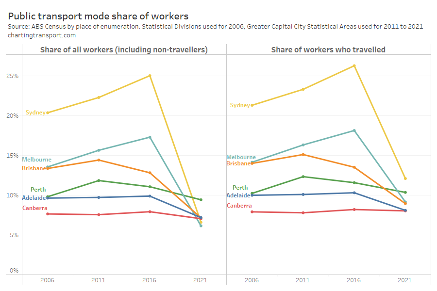
As a transport planner, I’m particularly interested in CBDs as there is a significant contest for market share between public and private transport. Before the pandemic, public transport dominated commuter mode share in the biggest CBDs, and CBDs make up a significant share of all public transport commuter trips.
Reminder: what was happening on Census day 2021
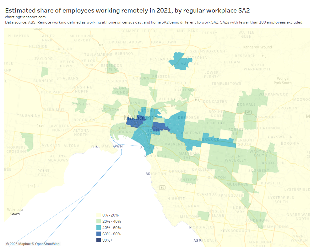
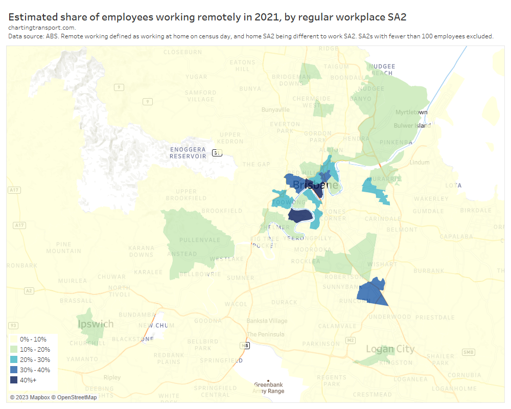
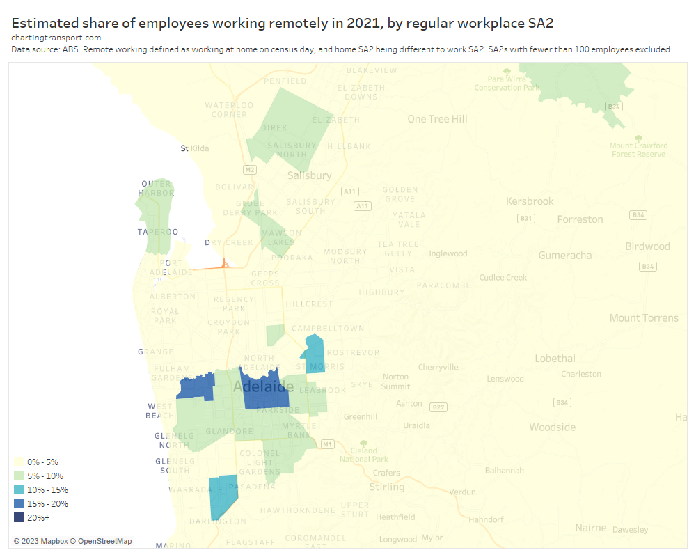
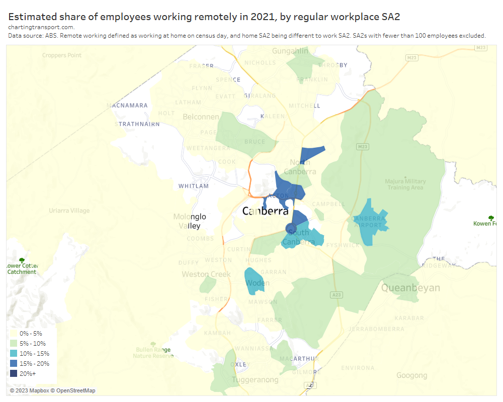
Melbourne and Sydney were in “lockdown” with workers required to work from home if possible. Brisbane was just out of lockdown, and the other cities were pretty much COVID-free, although Adelaide had experienced a short lockdown in July 2021. Here’s a summary of some key metrics (CBD office occupancy data sourced from the Property Council):
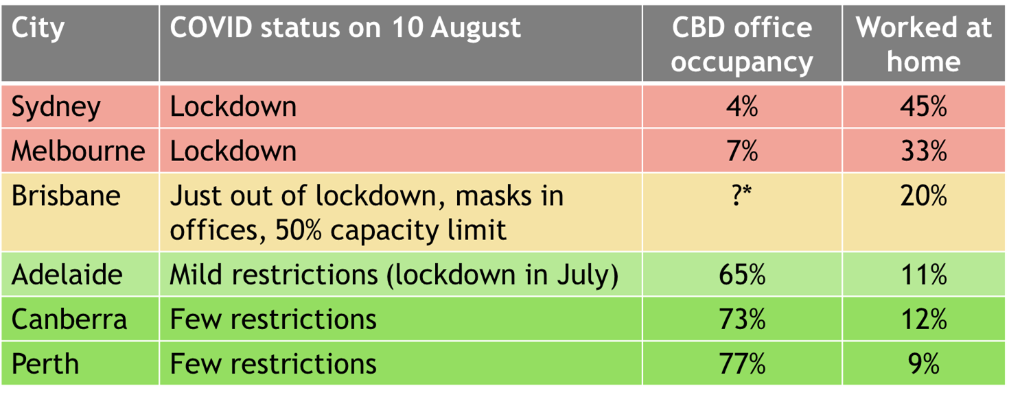
*The Property Council reported a figure of 60% for August 2021, but this would have been illegal on 10 August as there was a 50% capacity limit just after lockdown. We don’t know the exact dates when the office occupancy survey was conducted, I can only assume later in that month when restrictions were eased. 47% of CBD employees reported working remotely on census day.
What is a Central Business District?
I think of Central Business Districts as the civic, commercial, and business centre of a city, generally characterised by an area dense employment. Unfortunately the ABS’s SA2 boundaries don’t really align with these areas – especially Perth (pre 2021) and Adelaide where the SA2s covering the CBD also included areas of single-storey semi-detached housing.
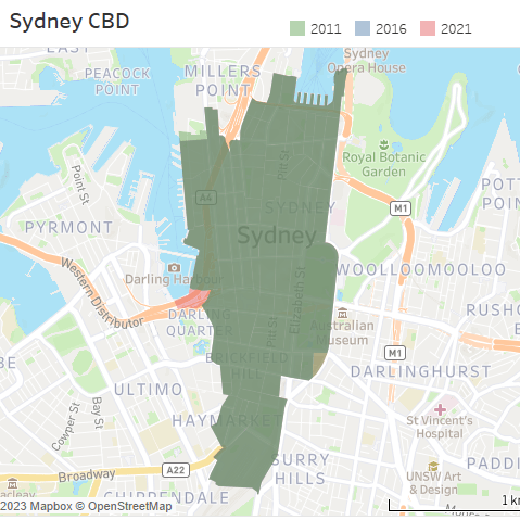
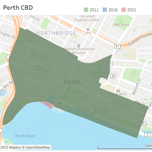
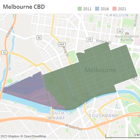
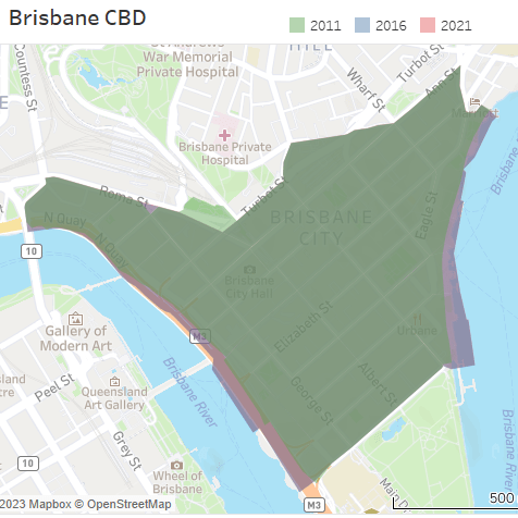
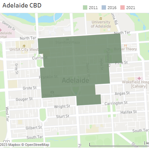
So for this analysis I’ve created my own CBD boundaries for Australia’s five largest cities. I’ve selected a set of destination zones that were relatively dense in 2021. I’ve tried for reasonably smooth boundaries, and have tried to avoid under-developed areas that might have cheaper car parking. I’ve then created equivalent sets of 2011 and 2016 destination zones – as similar as possible to the 2021 boundary – with the one exception of the Melbourne CBD from which I have excluded south-western parts of Docklands in 2011 due to low employment densities in that year (much of the land was yet to be developed and instead occupied by surface car parking).
Here are maps of these CBD areas. I’ve transparently shaded the CBD for each census year in a different colour which mostly overlap to show dark green. Purple areas are where boundaries are not identical for all years.
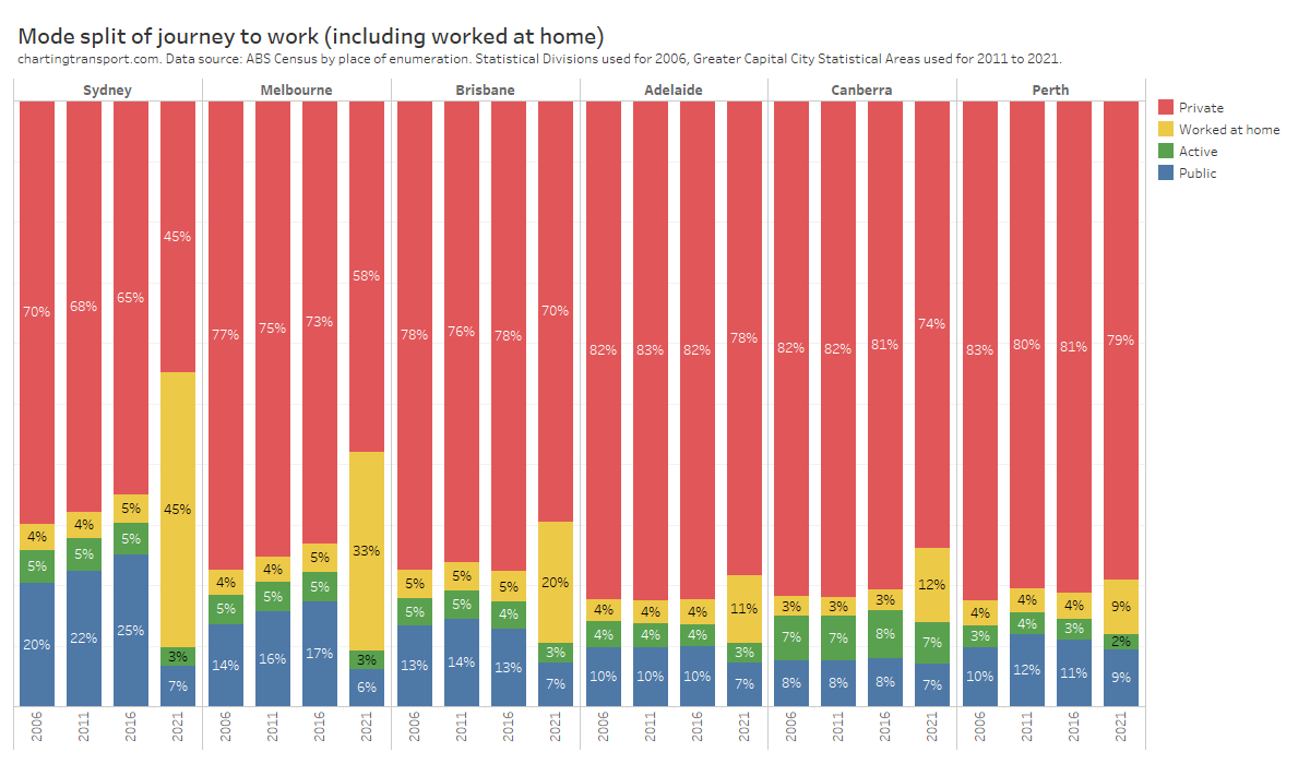
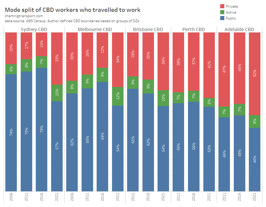
Here are the mode splits for those CBD areas, including those who worked at home:
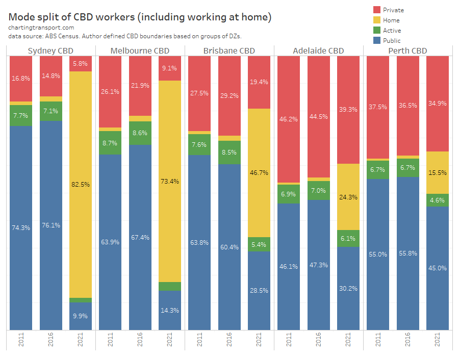
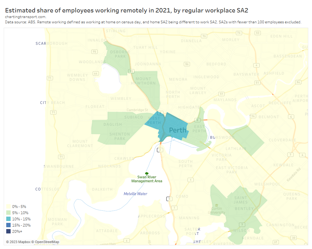
As you would expect, working at home dominated in locked-down Sydney and Melbourne in 2021, but was also quite common in Brisbane and Adelaide. In COVID-free Perth, working at home only accounted for 15.5% of CBD employees with the other 84.5% attending their workplaces on census day.
Public transport mode shares increased between 2011 and 2016 in all CBDs except Brisbane, but then in 2021 there was a significant shift away from all travelling modes to working at home in all cities.
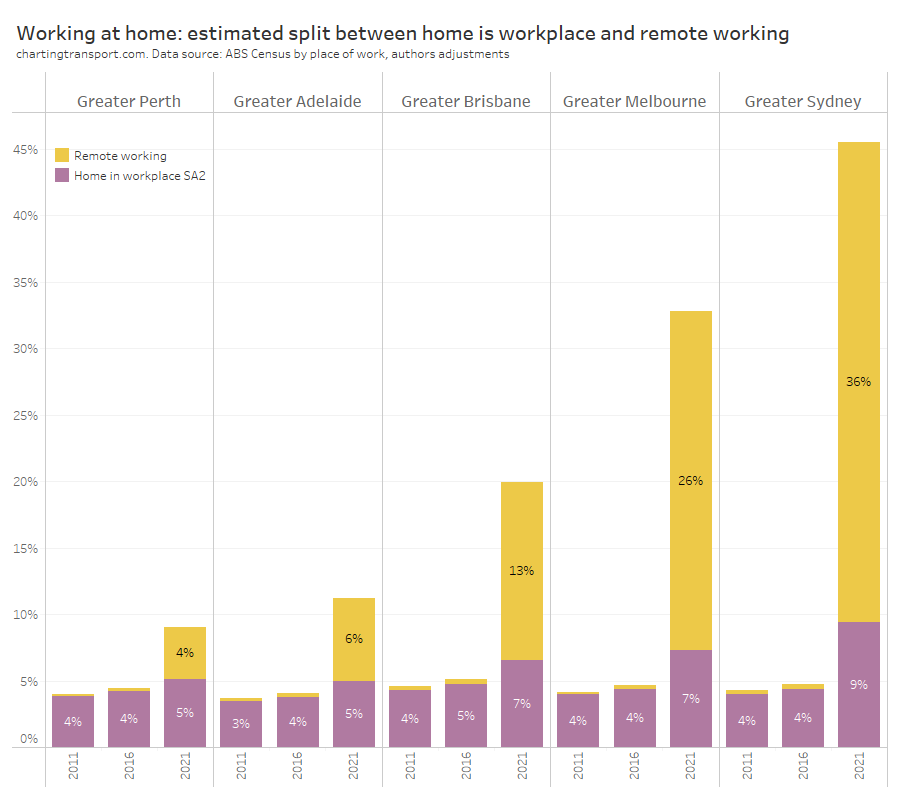
The working at home share may include people who routinely work from their home in a CBD area. To get some idea about these numbers, I’ve split the worked at home share for 2021 into those who lived inside and outside the CBD:
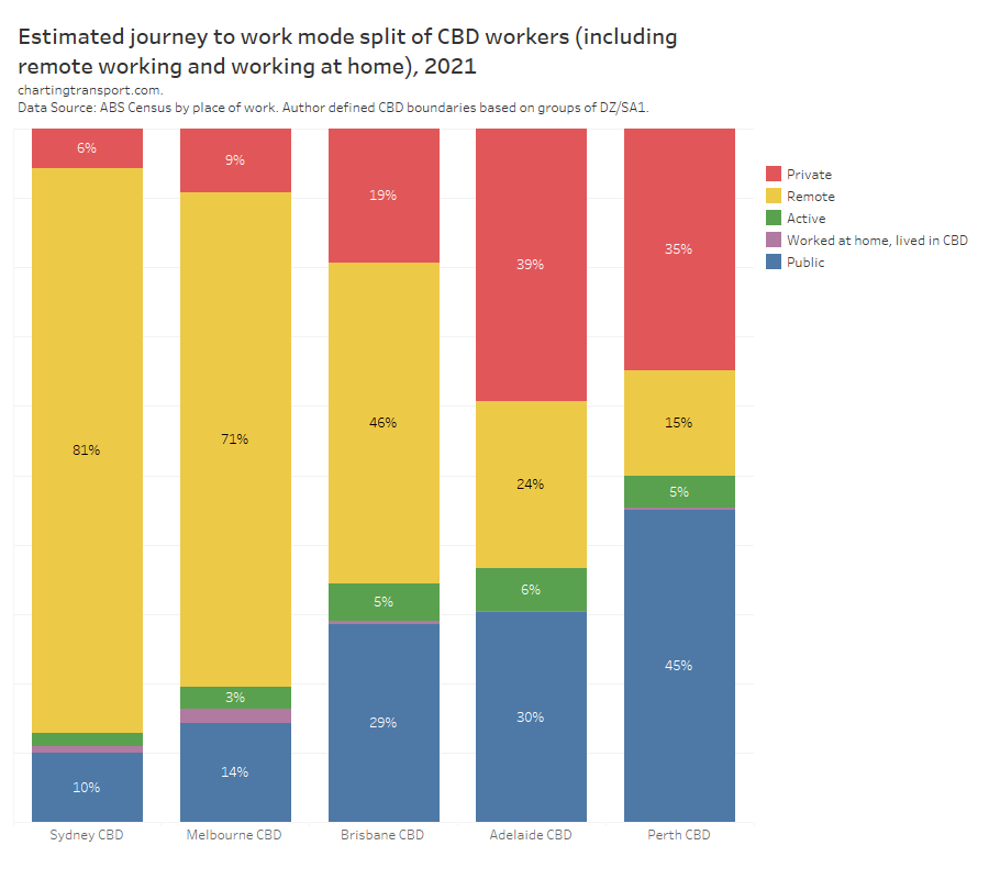
Only a tiny share of CBD workers worked at home and also lived within the CBD. Some of these will have been working remote from their regular workplace and others will have been routinely working at home (I could try to split these apart with deeper analysis but it doesn’t seem worthwhile with such small numbers).
How did working at home vary by age of CBD workers?
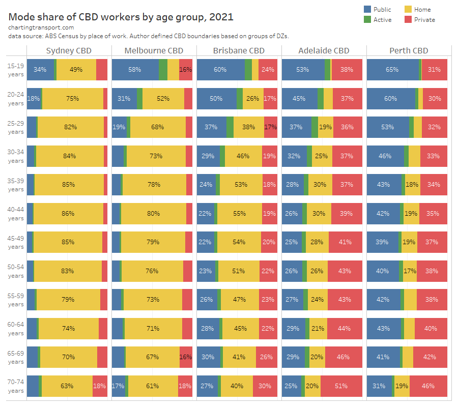
A really interesting finding here is that working at home peaked for those in their early 40s in almost all cities – an age with plenty of parents with child caring responsibilities. Teenagers and those in their early 20s were the least likely to work from home, probably because they were more likely to be in jobs not amenable to working at home (eg retail and hospitality). But perhaps also some younger white collar workers may have preferred to build professional networks by being present in the CBD.
In Adelaide and Perth there was a definite trend that younger commuters were more likely to use public transport, and older commuters more likely to use private transport. This was consistent with all cities in earlier censuses (although this was not the case in Brisbane in 2021).
This got me thinking. The COVID19 pandemic and ~18 month border closure surely had some impact on the age distribution of the CBD workforce.
Indeed, here’s a look at the age composition of CBD workers over time:

Between 2011 and 2016 all cities showed a shift in the age composition towards older employees, perhaps as the cohorts of more highly educated Australians got older, people stay in the workforce until later in life, and/or other changing demographics of our cities.
But in most cities (perhaps not Adelaide) there seemed to be a larger shift towards older workers between 2016 and 2021. I suspect this will reflect fewer recent skilled migrants and international students in 2021.
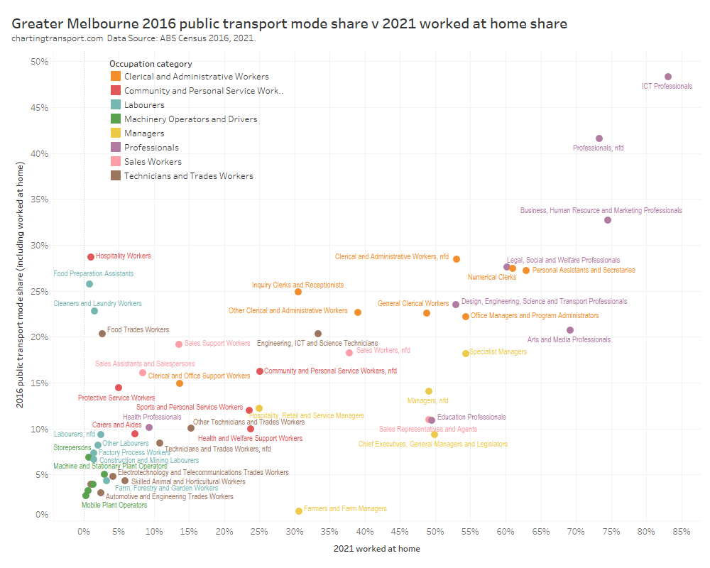
We know from other analysis (see: Why are younger adults more likely to use public transport? (an exploration of mode shares by age – part 1)) that younger adults generally have higher rates of public transport use, so the shift in demographics might be favouring a mode shift away from public transport – all other things being equal (which of course they are not). There was mostly a shift towards public transport for CBD workers between 2011 and 2016, so other factors must have had an overriding impact.
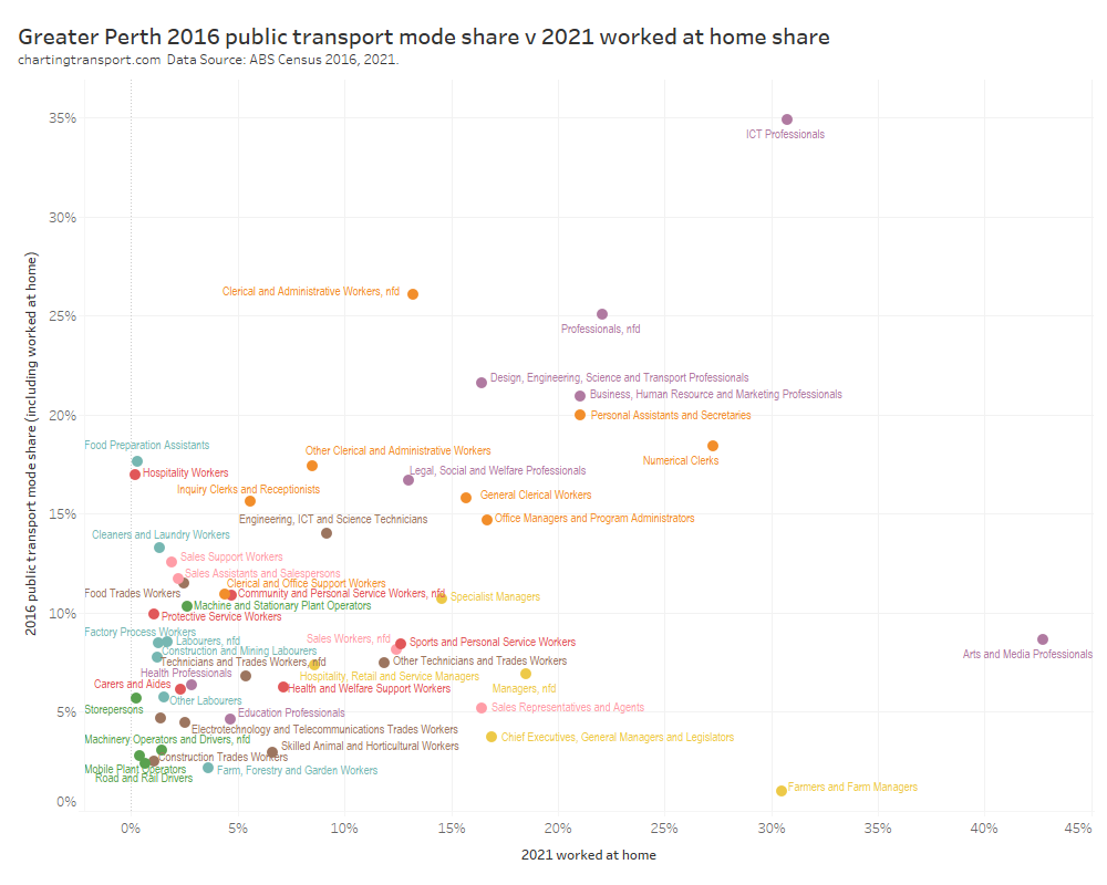
How did working at home vary by CBD worker occupation?
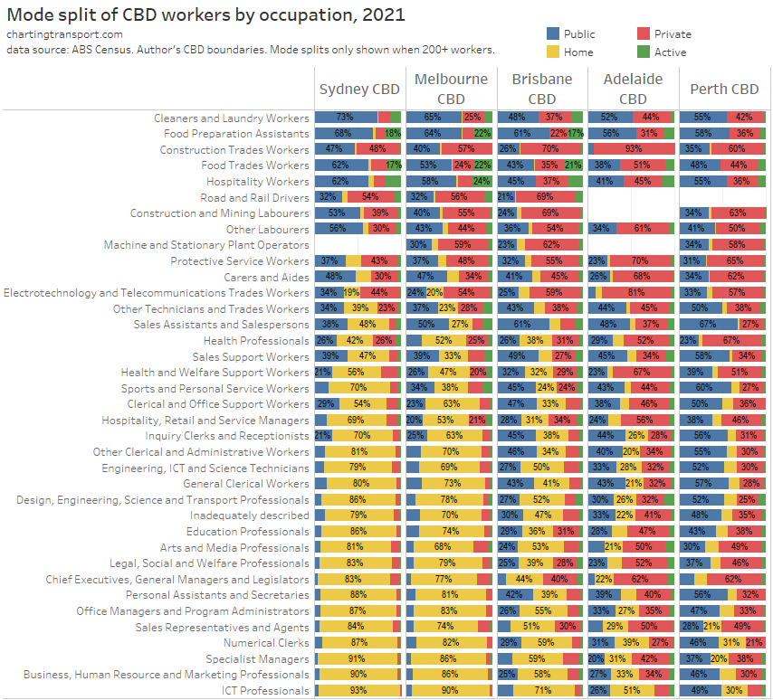
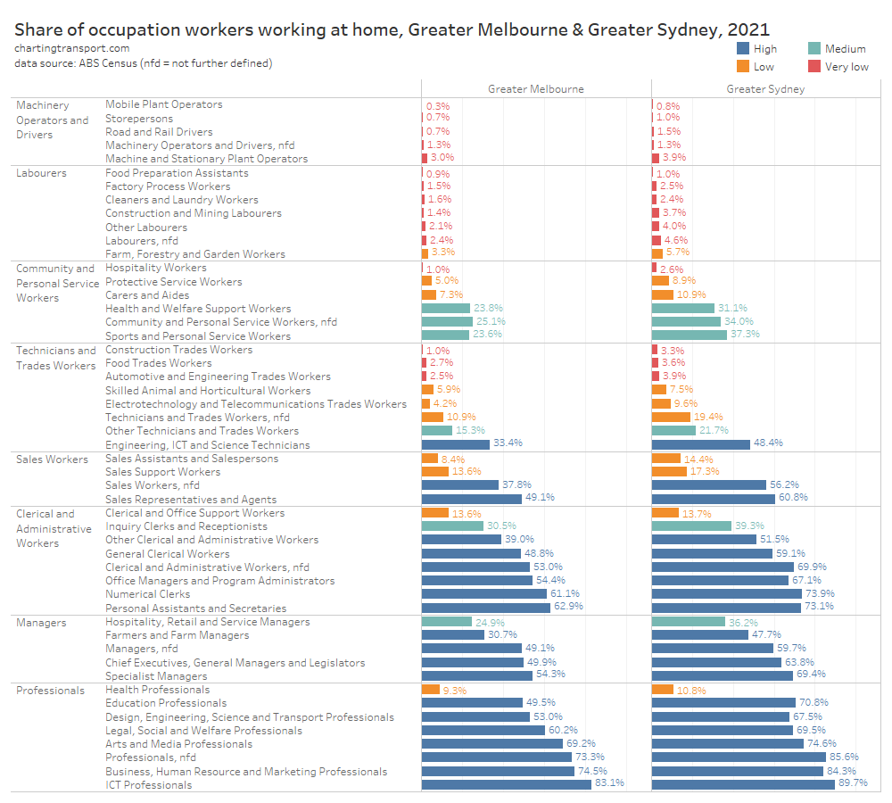
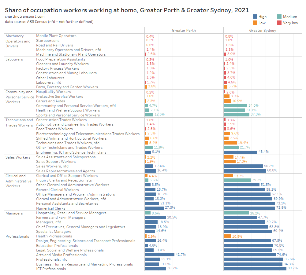
I’ve sorted the occupations by overall worked at home share, which was similar across the cities. This list roughly sorts from blue collar to white collar and I haven’t seen any surprises in this chart. I’ll come back to occupations shortly.
How did working at home vary by distance from work?
The following chart shows working at home rates by approximate distance from home to work, for central area workers.
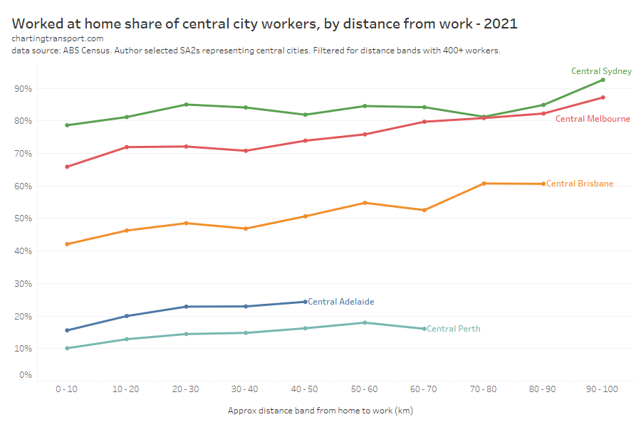
Technical note: For this analysis I’ve used journey to work data disaggregated by home SA2, work SA2, and whether or not workers worked at home. I’ve defined central city areas as collections of SA2s (so different boundaries to my CBD areas). Distances between home and work SA2s are calculated on SA2 centroids then aggregated to ranges.
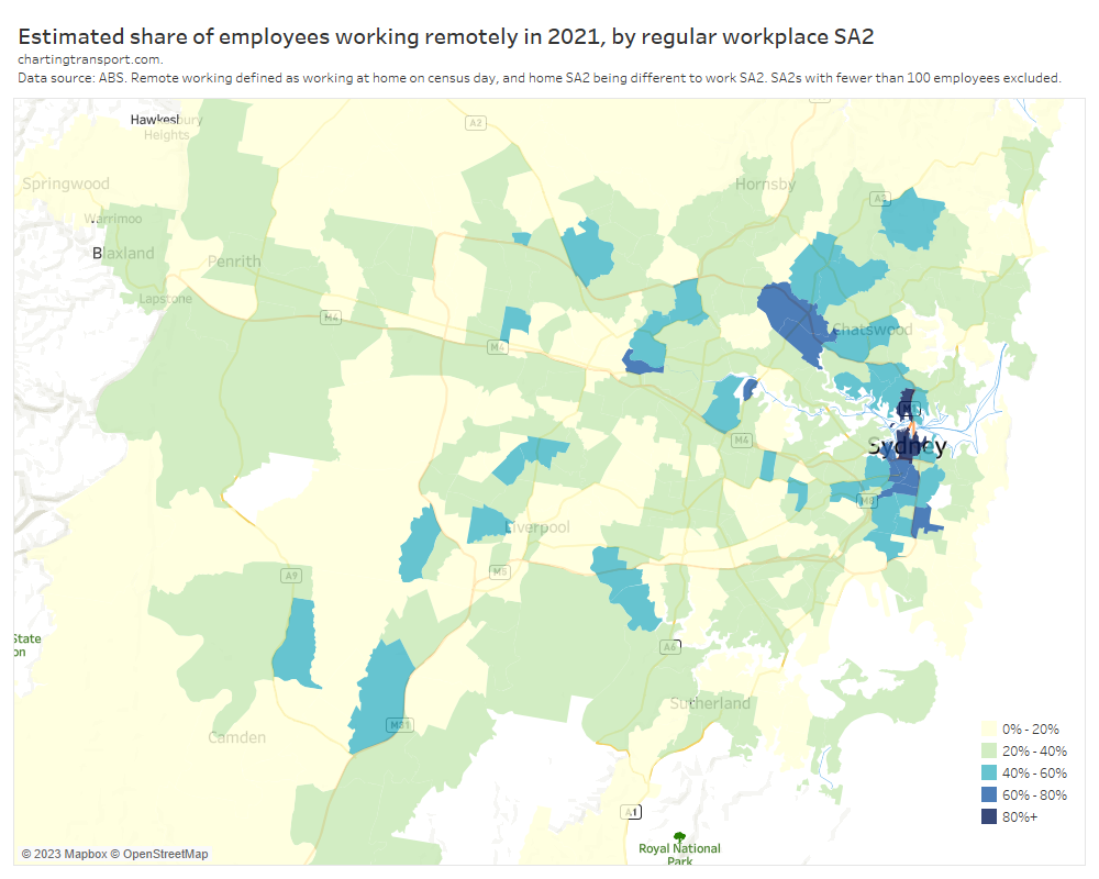
In all cities there was a general trend to higher rates of working at home for people living further from the central city, although Sydney rates of remote working were high at all distances (the strictness of lockdown probably overriding the impact of commuting distance). This pattern in other cities likely reflects the increased incentive to work from home when you have a longer commute to avoid.
Did COVID lead to a mode shift from public to private transport?
Some transport planners have been concerned that COVID19 might lead to a permanent mode shift from public transport to private transport, probably for two reasons:
- A reduction in total commuter demand might make private transport slightly more competitive (eg if parking costs reduce), resulting in a different mode split equilibrium. We can only really test this aspect in Perth and Adelaide as they were COVID-free but with a small but significant share of workers working remotely.
- People have a fear of becoming infected by COVID19 on public transport and therefore switch to private transport (although COVID can also spread in workplaces of course). It’s a bit harder to test this as Sydney and Melbourne were in lockdown (movement restrictions no doubt had much more impact than infection fear). Perth, Canberra, and Adelaide were COVID-free, although there might have been a some fear of undetected COVID circulating – and indeed that was probably happening in Canberra which went into lockdown a few days after the census. Brisbane was just out of lockdown with some restrictions remaining so infection fear may have been higher than in Perth and Adelaide. However the level of infection fear in these “COVID-free” cities in 2021 would certainly be less than that in 2022 and 2023 where COVID is known to be circulating in the community (although there’s since been plenty of opportunity to get vaccinated).
The hypothesis I want to test for COVID-free cities is that there was a mode shift from public transport to private transport, alongside the overall mode shift to working at home.
Okay, so what can census data tell us?
Unfortunately it’s almost impossible to know the behaviour change of individuals who had the same home and work locations in 2016 and 2021 without another data source. I don’t have access to the census longitudinal dataset and that might not even have a sufficient sample of CBD workers who didn’t change home or work location between the two censuses.
But I can explore this question by looking at the changes in overall volumes and mode shares, and then drilling down into different age and occupation cohorts.
How much mode shift was there between travelling modes?
Let’s first look at the overall change in mode split of people who did commute to CBDs in the last three-four censuses (I have 2006 data for Melbourne and Sydney, but only for those who travelled):
On this split, all cities saw a significant mode shift to private transport travel in 2021. The smallest was 4% in COVID-free Perth, while the largest was 18% in locked-down Sydney.
To explore further, here are the total volumes of commuters to CBDs for each mode, across the last three-four censuses:
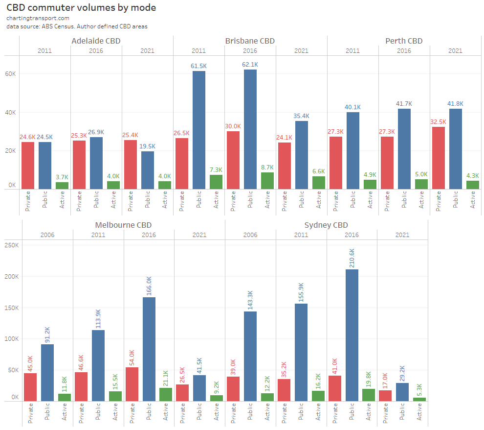
In the locked-down cities there was a substantial drop in both public and private transport commuters in 2021, although a larger proportional drop for public transport (in line with mode shifts seen above).
But I’m particularly interested in the then COVID-free cities of Adelaide and Perth, that exhibited COVID-free travel behaviour. Let’s start with a deep dive for Perth.
How did commuting behaviour change for Perth CBD commuters between 2016 and 2021?
The overall CBD workforce increased substantially from 83.0k to 105.7k, and this increase saw 5,164 more private transport trips, and about 85 more public transport trips. But the biggest net increase was for working at home.
If we include remote working, the overall mode share of private transport declined by 1.6% from 36.5% to 34.9%. Any mode shift from public transport to private transport was swamped by the overall shift to working remotely.
But does the overall pattern mask some mode shifts within age or occupation groups?
Did some age groups shift modes more than others? Initially for this analysis I started to look at the change in modal mix by five year age group, but of course the people within these 5 year age bands entirely change between censuses (that are held five years apart), so that wouldn’t be measuring behaviour change of a similar group of people.
Instead I’ve looked at the change in modal mix by approximate birth year cohorts (we only know people’s age in August, so the birth year groups are approximate – for example someone aged 25 at the 2021 census could have been born anytime between 11 August 1995 and 10 August 1996, but I’ve allocated them to the 1996 to 2000 cohort).
Here is the net change in volume of Perth CBD workers by birth year cohort and commuter mode (I’ve included the age of this cohort in 2021 at the bottom of the chart for reference).
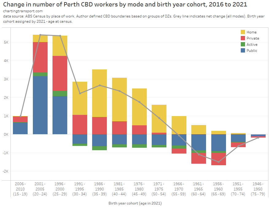
As you would expect, people aged in their 20s in 2021 made up a significant share of new CBD employees, and workers aged 60+ in 2021 (55+ in 2016) had a net reduction as many went into retirement.
Public transport had the largest share of net new trips for those aged 20-24 in 2021, although a substantial share also travelled by private transport. There was a more even split of net new trips for those aged 25-29 in 2021.
There was also substantial employee growth for people aged 30+ in 2021 (unlike in 2016), and for those aged 30-54 in 2021 the biggest change was a net increase in working at home.
There were increases in private transport use and decreases in public transport use for those aged 30 to 54 in 2021. This was a net 2270* commuters – about 2.1% of the overall CBD workforce (*summing the absolute values of the smaller of the public or private transport shift). But the overall private transport mode shift was -1.6% so changes in other age groups (particularly young adults) washed out all of this shift of middle-aged workers.
Was this mode shift for middle aged workers something to do with COVID, or was it something that was destined to happen anyway? On this blog I’ve explored the relationship between age and public transport mode share in great detail, and there’s certainly a pattern of decline with age, particularly as people become parents. See: Why are younger adults more likely to use public transport? (an exploration of mode shares by age) – part 1, part 2, and part 3.
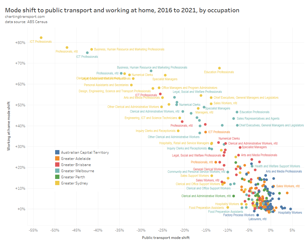
What about mode changes for different occupations? Here’s a look at commuter volume changes by mode and occupation for Perth’s CBD:
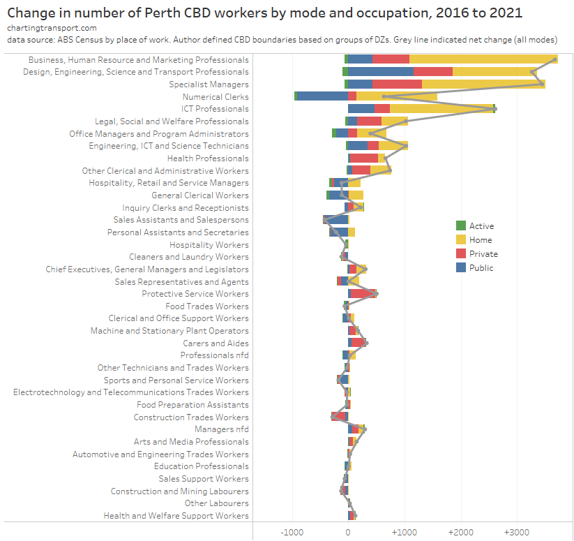
The Perth CBD put on a lot more professionals and specialist managers between 2016 and 2021, and working at home accounted for most of this net growth. The number of new public and private trips varied considerably by category but private transport growth outnumbered public transport growth for most professions.
In particular, almost all the growth in health professionals, protective service workers, and carers and aides was accounted for by private transport. These are occupations where working remotely from home is often difficult, and the high rates of private transport growth might also reflect significant rates of shift work where off-peak public transport service levels are often less competitive with private transport.
There are not many occupations that saw a net shift from public to private transport – these included office managers, program administrators, and clerical and office support workers. But again these numbers were tiny compared to the size of the Perth CBD workforce – suggesting there was very little net shift from public to private transport.
Overall there was a 1.6% shift away from private transport commuting to the Perth CBD, with most of the other mode shift being from public transport to remote working. The evidence from Perth does not support the hypothesis.
How did commuting behaviour change for Adelaide CBD commuters?
Adelaide saw only a tiny increase in the number of private transport commuters, but a significant decrease in the number of people who travelled on public transport. Overall there was a 5.3% shift away from private transport mode share (when you include remote working).
As per the analysis for Perth, here’s the change in volume of trips by mode and birth year:
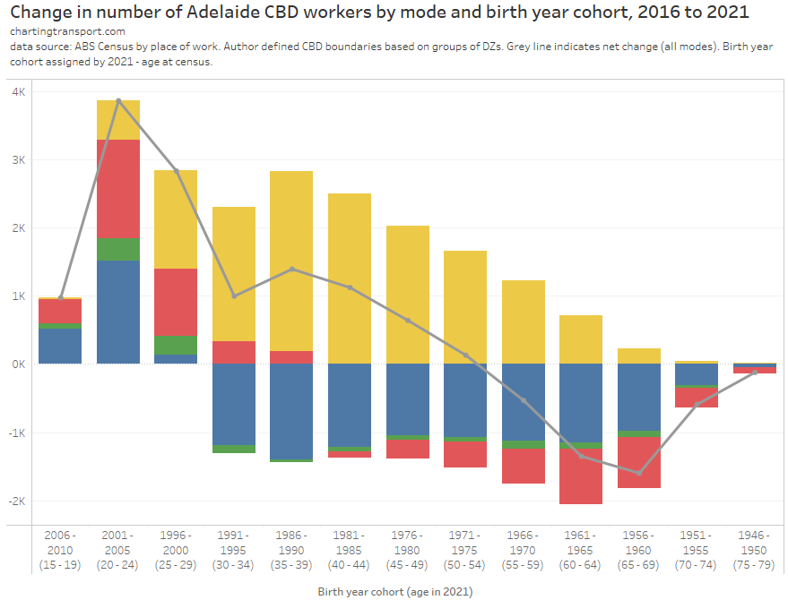
For Adelaide most of the net mode shift also appears to be from public transport to working remotely. There was a net increase in private transport commuting for people aged 15 to 34 in 2021, and a small decline in private transport trips for older age groups.
There was only a tiny net shift from public to private transport of 526 people within those aged 30-39 in 2021.
Like Perth, working at home accounted for a smaller share of the employment growth for younger adults.
Here’s a look at occupations for Adelaide:
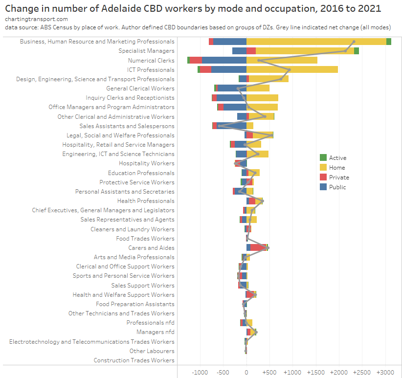
Again, the biggest mode shift here appears to have been from public transport to working at home, with the notable exception again of carers and aides, and health professionals (although small numbers). In most occupations there was also a mode shift away from private transport. Very few occupations show a net shift from public transport to private transport in Adelaide.
The evidence of Adelaide does not support the hypothesis of mode shift from public to private transport. The biggest change was a mode shift from public transport to remote working (plus some mode shift from private transport to remote working).
How did the mix of CBD car commuters change?
Yet another way of looking at potential mode shifts is whether the people driving to work in the CBD in 2021 were any different to previous censuses. For this analysis I’ve filtered for commuters to CBDs who did not use any public transport, but did travel as a vehicle driver or on motorbike/scooter (you might argue “Truck” should be included as well, but we don’t know whether there people were drivers or passengers and the numbers are tiny so I don’t think it is material).
Firstly here is the occupation split of vehicle drivers to work in the five CBDs over the last three censuses:
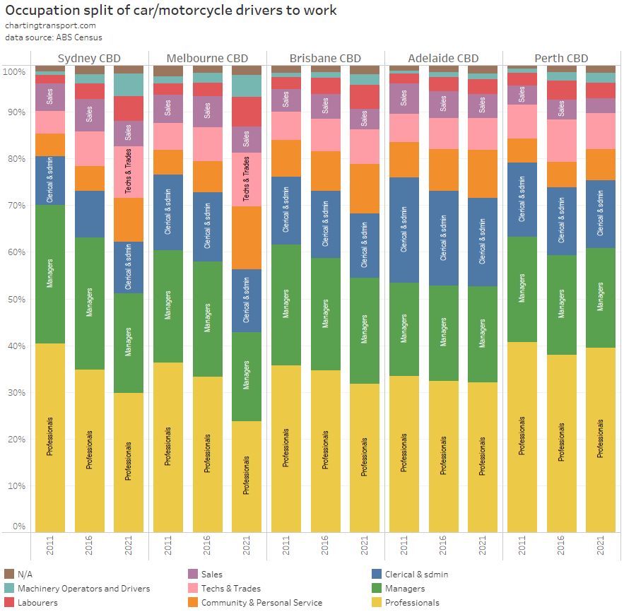
In most cities, there was a noticeable change in occupation share between 2016 and 2021 towards technicians and trade, labourers, machinery operators and drivers, and community and personal service workers, and away from professionals and managers. Basically a shift from white collar to blue/fluoro collar jobs, as many white collar workers shifted to working remotely. This shift was largest in the locked down cities of Melbourne and Sydney, but was also visible in Adelaide and Brisbane to a lesser extent.
It is also interesting to look at the change in volumes. Note the Y-axis on the following chart has an independent scale for each occupation group, with the biggest occupation groups at the top:
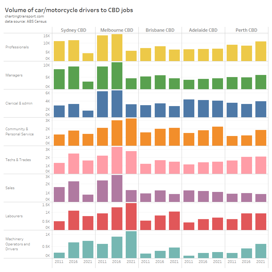
In locked-down Sydney and Melbourne, there was a massive decrease in white collar workers and an increase in machinery operators and drivers. Melbourne also saw an increase in labourers and community and personal service workers. This might reflect a reduction in car parking prices, although I cannot find evidence that prices were actually lower on census day (the City of Melbourne waived parking fees and restrictions from just after the census).
Diving deeper, there was a big increase in protective service workers in the Melbourne CBD, and about 2166 of them drove to work in 2021 (up from 1660 in 2016). This may reflect the opening of the new Victorian Police Centre in Spencer Street in 2020, complete with 600 car parks. Indeed the destination zone that includes this building (and Southern Cross Station) saw an increase of 769 private transport commuters between 2016 and 2021, the biggest increase of any CBD destination zone.
In COVID-free Perth there was an increase in professionals, clerical and administrative workers, managers, community and personal service workers, and machinery operators and drivers who drove to work, and there was only a decline in sales workers.
So what have I learnt from the latest census data?
I’ve covered a bit of ground, so here’s a summary of key findings and some discussion:
- Locked-down Sydney and Melbourne saw a significant shift to remote working of CBD employees in 2021. COVID-free CBDs saw much less shift to remote working (Adelaide 24% and Perth 15%).
- Remote working was most common for middle-aged CBD employees (peaking at 40-44 age bracket), and much lower for younger adults and a little less common for older employees.
- All CBDs saw a step change in the workforce age composition between 2016 and 2021, shifting to an older workforce, probably related to the halt to immigration during the pandemic.
- In most cities, remote working in 2021 was slightly more common for CBD employees who lived further from their CBD.
- In all cities, the main mode shift between 2016 and 2021 seems to be from public transport to remote working.
- No city saw a net mode shift from public transport to private transport (when you include remote working in the modal mix). The main mode shift in COVID-free cities appears to be from public transport to remote working. However it is entirely possible that some public transport commuters switched to private transport, but this was more than offset by other commuters who shifted from private transport to remote working. Few age or occupation cohorts saw a net shift from public to private transport.
- The only CBD to see a significant increase in private transport commuter trips was Perth (with +5164). However this was still a net mode shift away from private transport mode share due to massive growth in overall CBD employment between 2016 and 2021. I’m curious about how this happened, and I will explore it further in an upcoming post.
- Occupations likely to include many shift workers saw the biggest net private transport commuter growth in Adelaide and Perth – including health professionals, protective service workers (including police), carers, and aids.
So what can we expect in a “post-pandemic” world?
At the 2021 census all Australian cities were either in lockdown or were perceived to be COVID-free. No Australian cities were “living with COVID”, and in the cities with COVID circulating, few workers faced a choice between workplace attendance and remote working.
At the time of writing (March 2023), COVID is circulating across Australia and there are very few restrictions to restrict spread. There is an ongoing risk of COVID infection when using public transport and attending an indoor workplace (although you can choose to wear a mask of course).
Is this leading to a mode shift from public to private transport in this “post-pandemic” world? Have we even reached a new steady state? The best data to answer this will come from the 2026 census.
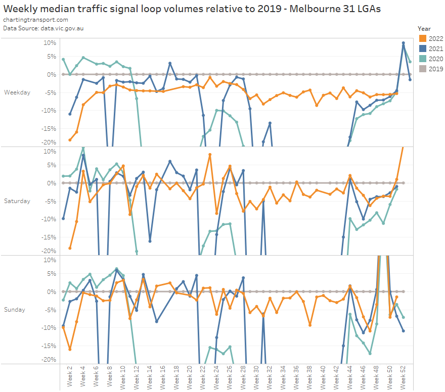
In the meantime I have had a quick look at some transport indicators for Melbourne.
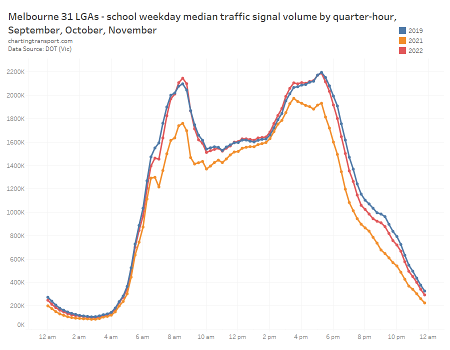
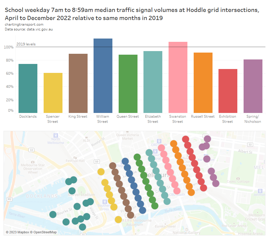
Vehicle traffic through CBD intersections in 2022 (excluding Q1) was consistently below 2019 levels in the AM peak in most parts of the CBD. However it’s only a rough indication as much of this traffic will be for purposes other than private transport commuting to the CBD (eg deliveries, through-traffic, buses, etc) (I’ve excluded signals on Wurundjeri Way which is likely to have much through-traffic).
The next chart shows average daily patronage for metropolitan trains, trams, and buses in Melbourne based on published total monthly patronage data but not taking into account the different day type compositions of months between years (I’d much prefer to use average school weekday patronage data to avoid calendar effects, but that data series only ran as far as June 2022 at the time of writing).
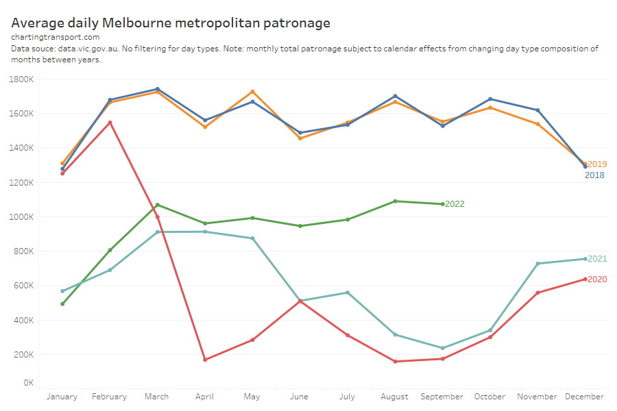
This data suggests CBD private transport commuter volumes in 2022 might be a bit below 2019 levels, while there has been a substantial reduction in public transport commuting. This is consistent with what was seen in Adelaide in the 2021 census – mostly a mode shift from public transport to remote working. Furthermore, if there has been a significant increase in Melbourne CBD employment, private transport mode share (when you include remote working) is more likely to have declined below 2019 levels.
Is infection fear still influencing mode choice?
The largest COVID wave in Victoria (so far at the time of writing) occurred in January 2022 peaking at 1229 people in hospital and there was significant public transport patronage suppression (well beyond the usual summer holiday lull) as many people choose to stay home (or were sick and had to stay home). Infection fear was probably having a big impact, as I recall there were few restrictions regarding workplace attendance.
There was also a fairly large COVID wave in winter 2022 peaking at 906 hospitalisations in July, but the above chart shows no significant associated reduction in public transport patronage. This suggests infection fear was probably having a very small impact on transport behaviour in mid-2022.
Certainly in my experience few people are wearing masks on Melbourne’s public transport at the time of writing, but maybe a cautious minority have still not returned to the network.
Emerging indications are that public transport patronage is returning even more strongly in February and March 2023, which might reflect even lower levels of infection fear (hospitalisation numbers have also reached the lowest numbers since September 2021), and/or it might reflect a surge in population growth and CBD employment/student numbers. Things to keep an eye on over time!


 Posted by chrisloader