Private and public transport journey to work mode shares vary considerably both between Australian cities and within them. Are these differences related to factors such as population density, motor vehicle ownership, employment density, proximity to train stations, proximity to busway stations, jobs within walking distance of homes, and distance from the city centre?
This posts sheds some light on those relationships for Australia’s six largest cities. I’m afraid it isn’t a short post (so get comfortable) but it’s fairly comprehensive (over 30 charts).
I should stress up front that a strong relationship between a certain factor and high or low mode shares does not imply causation. There are complex relationships between many of these factors, for example motor vehicle ownership rates are generally lower in areas of higher residential density (which I will also explore), and more factors beyond what I will explore here.
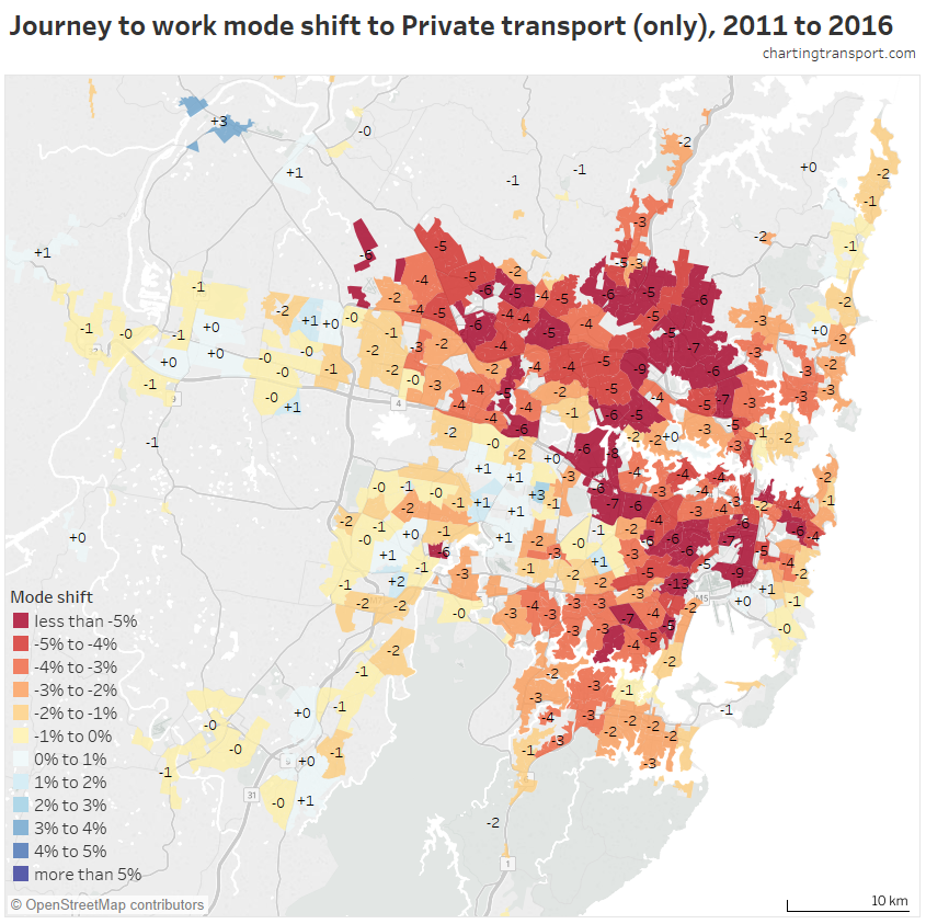
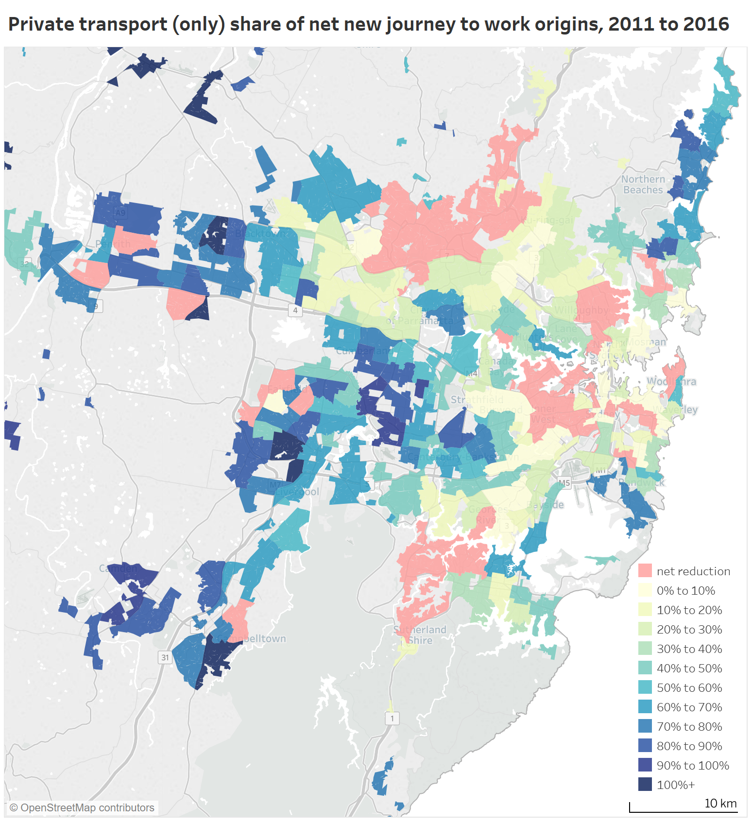
If you are interested in seeing spatial mode share patterns, see previous posts for Melbourne, Brisbane, and Sydney. You might also be interested in my analysis explaining the mode shifts between 2011 and 2016.
Population density
Higher population densities are commonly associated with higher public transport use. This stands to reason, as high density areas have more potential users per unit of area, but also higher density is likely to mean high land prices, which in turn increases the cost of residential parking. But higher public transport mode share can only happen if government’s invest in higher service levels, and this isn’t guaranteed to happen (although it often does, through pressures of overcrowding).
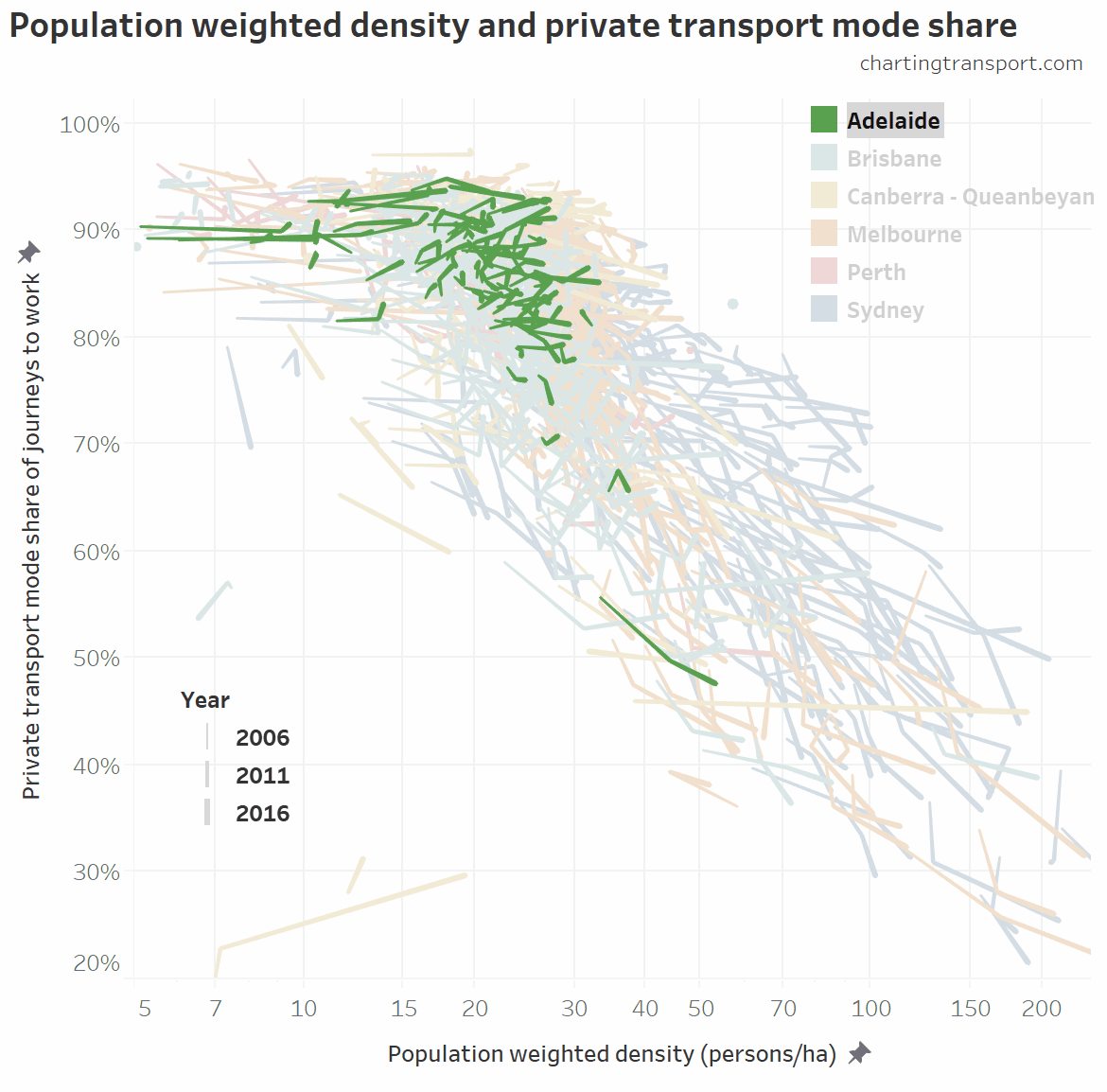
My preferred measure is population weighted density, which is the weighted average density of land parcels in a city, weighted by their population (this gets around problems of including sparsely populated urban land). I’ve measured it at census district (CD) geography for 2006 and Statistical Area Level 1 (SA1) geography for 2011 and 2016, using 2011 Significant Urban Area boundaries to define cities. The 2006 density figures are not perfectly comparable with 2011 and 2016 because CDs are slightly larger than SA1s, so the density values will be calculated as slightly smaller.
Here is the relationships at city level (the thin end of each worm is 2006 and the thick end 2016, with 2011 in the middle):

The relationship is very strong for Melbourne and Sydney over time. Between 2011 and 2016, Perth and Brisbane saw increased population density but reduced public transport mode share (mostly because of changes in the distribution of jobs between the centre and the suburbs).
Brisbane was a bit of an outlier in 2006 and 2011 with high public transport mode share relative to its lower population density.
Canberra is also perhaps a bit of an outlier, with much lower public transport mode share compared to similarly low density cities. This might be explained by the smaller total population, lower jobs density, and lack of rapid public transport services segregated from traffic.
But Canberra does have higher active transport mode share, so it’s worth doing the same analysis with private transport mode shares:

Brisbane was still an outlier in the relationship in 2006 and 2011, but Canberra is more in line with other data points.
Another interesting note is that Canberra went from being the least dense city in 2006 to the third most dense in 2016.
Drilling down to SA2 geography (SA2s are roughly the size of a suburb), here’s a chart showing all SA2s in all cities across the three census years (filtered for CDs and SA1s with at least 5 persons per hectare). I’ve animated it to highlight one city at a time so you can compare the cities, and I’ve used a log scale on the X-axis to spread out the data points (only the Sydney and Melbourne CBDs go off the chart to the right).
(if these animated GIF charts are not clear on your screen, you can click to enlarge the image, then use “back” to come back to this page).

You can see a fairly strong relationship, although it is very much a “cloud” rather than a tight relationship – there are other factors at play.
What I find interesting is that Sydney has had a lot of SA2s with population weighted densities around 50-100 but private mode shares over 55% (toward the upper-right part of the cloud of data points) – which are rare in all other cities. That’s a lot of traffic generation density, which cannot be great for road congestion. In a future post I might focus in on the outlier SA2s that are in the top right of these charts (can public transport do better in those places?).
In case you are wondering about the Brisbane SA2 with low density and low private transport mode share (middle left of chart) it is the Redland Islands where car-carrying ferries are essential to get off an island, and are counted as public transport in my methodology. The Canberra outlier in the bottom left is Acton (which is dominated by the Australian National University).
Employment density
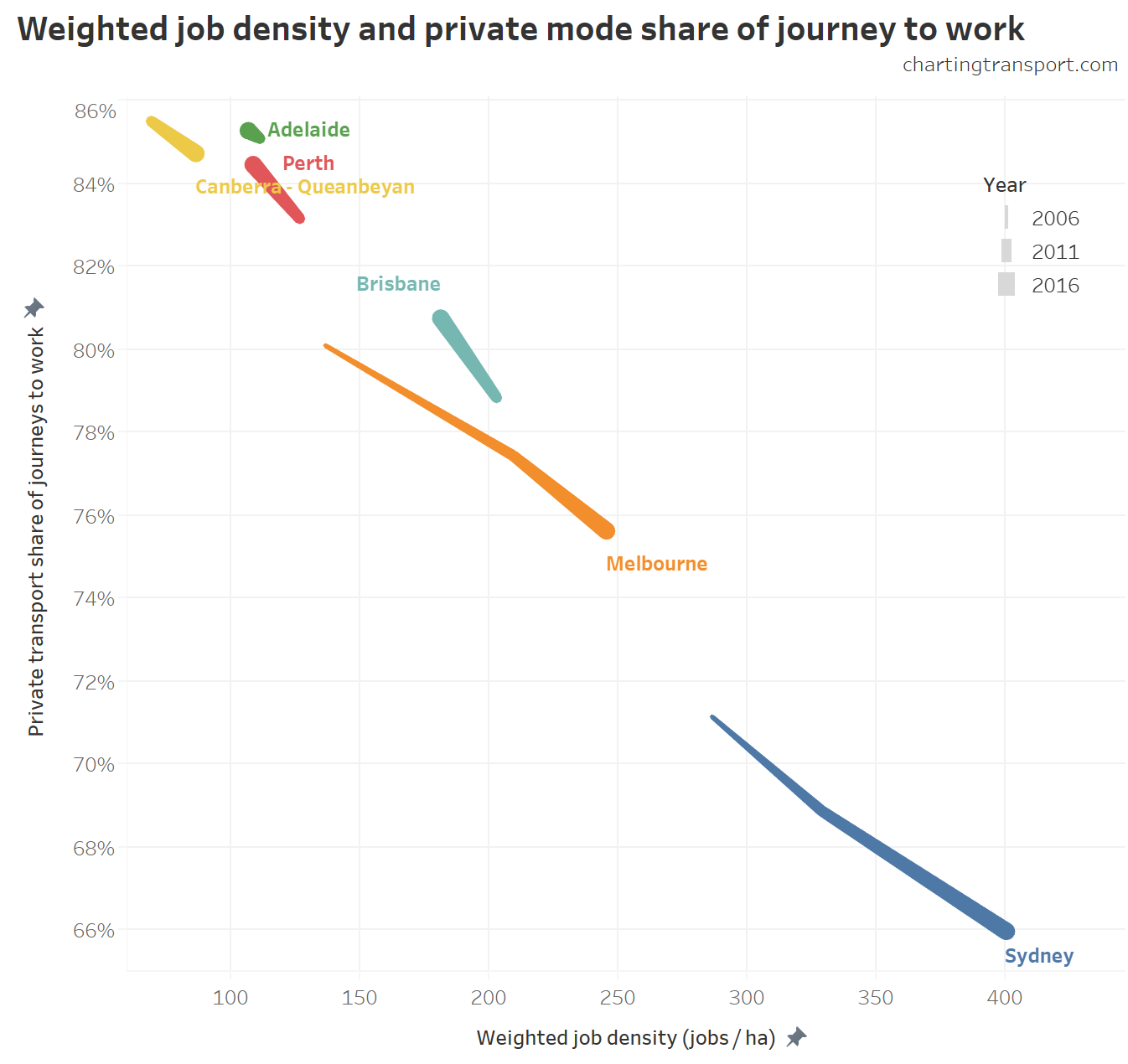
I’ve calculated a weighted job density in the same way I’ve calculated population weighted density, but using Destination Zones (which can actually be quite large so it certainly isn’t perfect). Weighted job density is a weighted average of job densities of all destination zones, weighted by the number of jobs in each zone. In a sense it is the density at which the average person works

(technical notes: I’ve actually only counted jobs as people who travelled on census day and reported their mode(s) of travel. Unfortunately I only have 2006 data for Sydney and Melbourne)
This chart suggests a very strong relationship at the city level, with all cities either moving up and left (Adelaide, Perth and Brisbane) or down and right (Sydney, Melbourne, Canberra).
So is the relationship as strong when you break it down to the Destination Zone level? The next chart shows jobs density and private mode share for all destination zones for 2016. Note that there is a log scale on the x-axis, and Adelaide dots are drawn on top of other cities in the top left which explains why that dense cloud of dots appears mostly green.

There’s clearly a strong relationship, although again the data points form a large cloud rather than tightly bunch around a line, so other factors will be at play.
It’s also interesting to see that the blue Sydney dots are generally lower than other cities at all job densities. That is, Sydney generally has lower private transport mode shares than other cities, regardless of employment density.
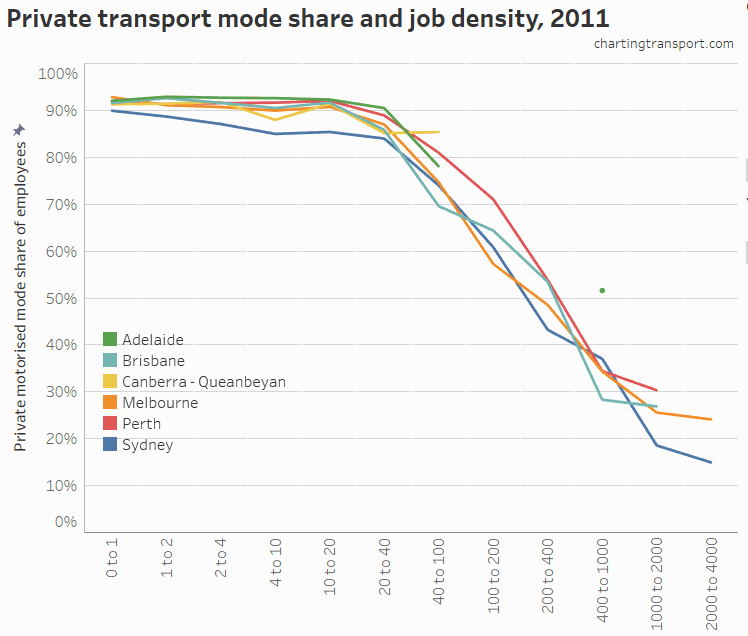
Which leads us to the next view: the private transport mode shares for jobs in different density ranges in each city for 2011 and 2016.

(click to enlarge if the chart appears blurry)
You can see a fairly consistent relationship between weighted job density and mode shares across all cities in both 2011 and 2016.
At almost all job density ranges, Sydney had the lowest average private transport mode share, while Adelaide and Perth were generally the highest (data points are not shown when there are fewer than 5 destination zones at a density range for a city). This shows that something other than jobs density is impacting private transport mode shares in Sydney. Is it walking catchment, public transport quality & quantity, or something else?
For more on the relationship between job density and mode share, see this previous post.
Proximity to public transport
Trains generally provide the fastest and most punctual public transport services (being largely separated from road traffic and having longer stop spacing), and are the most common form of rapid transit in Australian cities. So you would expect higher public transport mode shares around train stations.
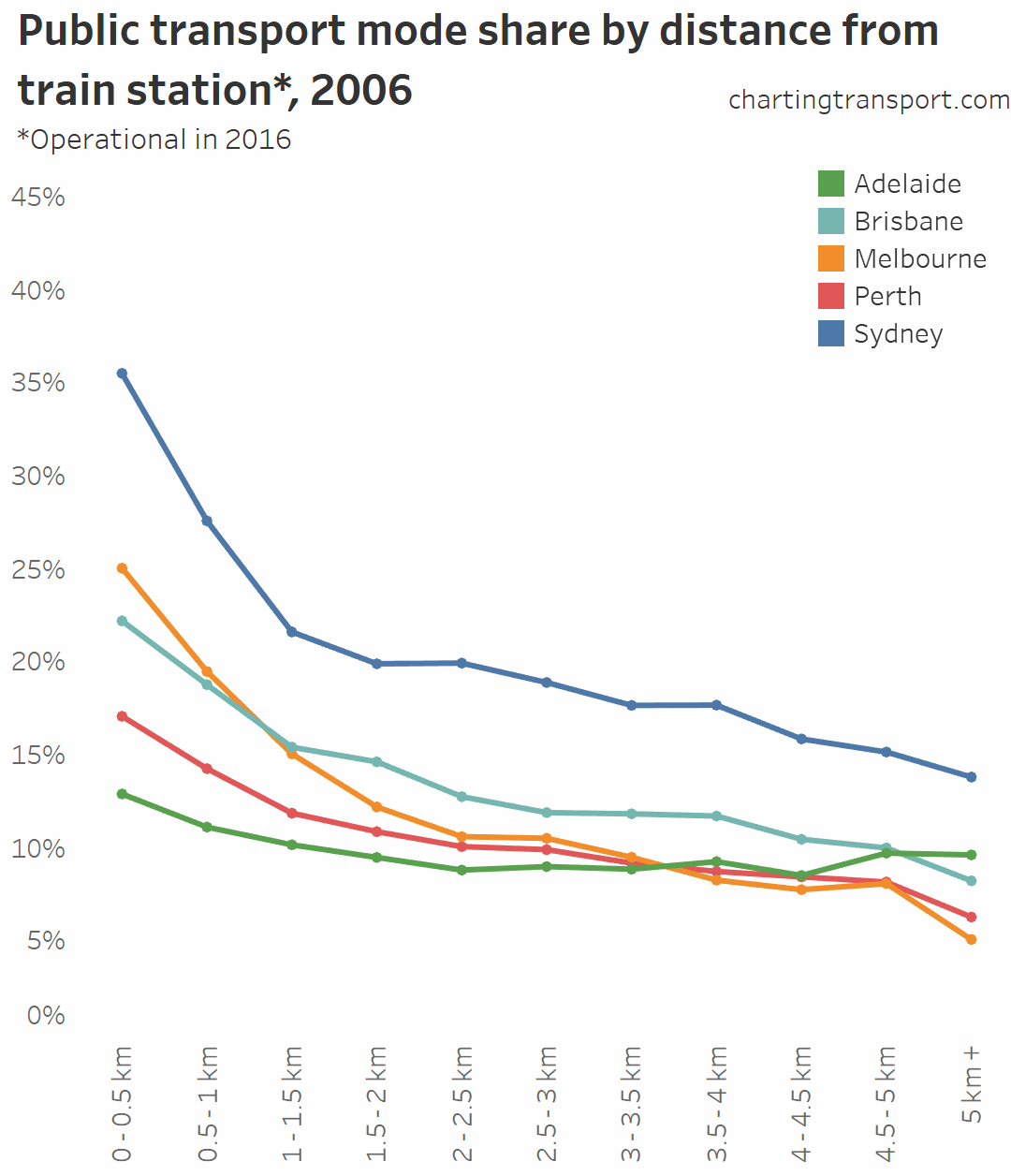
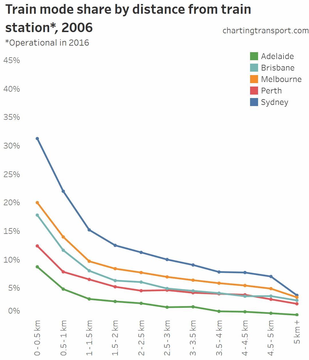
Here is a chart showing average journey to work public transport mode shares by home distance from train stations. It’s animated over the three census years, with a longer pause on 2016.

Technical note: A limitation here is that I’ve measured all census years against train stations that were operational in 2016 – so the 2006 and 2011 mode shares will be under-stated for the operational stations of those years. For example, in Melbourne the following stations opened between 2011 and 2016: Williams Landing, South Morang, Lynbrook, and Cardinia Road.
You can see that public transport shares went up between 2006 and 2011 in most cities at all distances from train stations. In both Perth and Brisbane there were new train lines opened between 2006 and 2011, which will explain some of that growth.
But if you watch carefully you will see public transport mode shares near train stations fell in both Brisbane and Perth between 2011 and 2016. That is, there was a mode shift away from public transport, even for people living close to train stations. As discussed previously, this is most likely related to there being only small jobs growth in the CBDs of those cities between 2011 and 2016, compared to suburban locations.
You can also see that public transport mode shares aren’t that much higher for areas near train stations in Adelaide (I’ll come back to that).
We can do the same for train mode shares (any journey involving train):

Again, Sydney’s train stations seem to have the biggest pulling power, while Adelaide’s have the least.
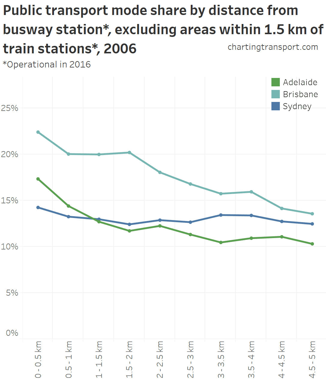
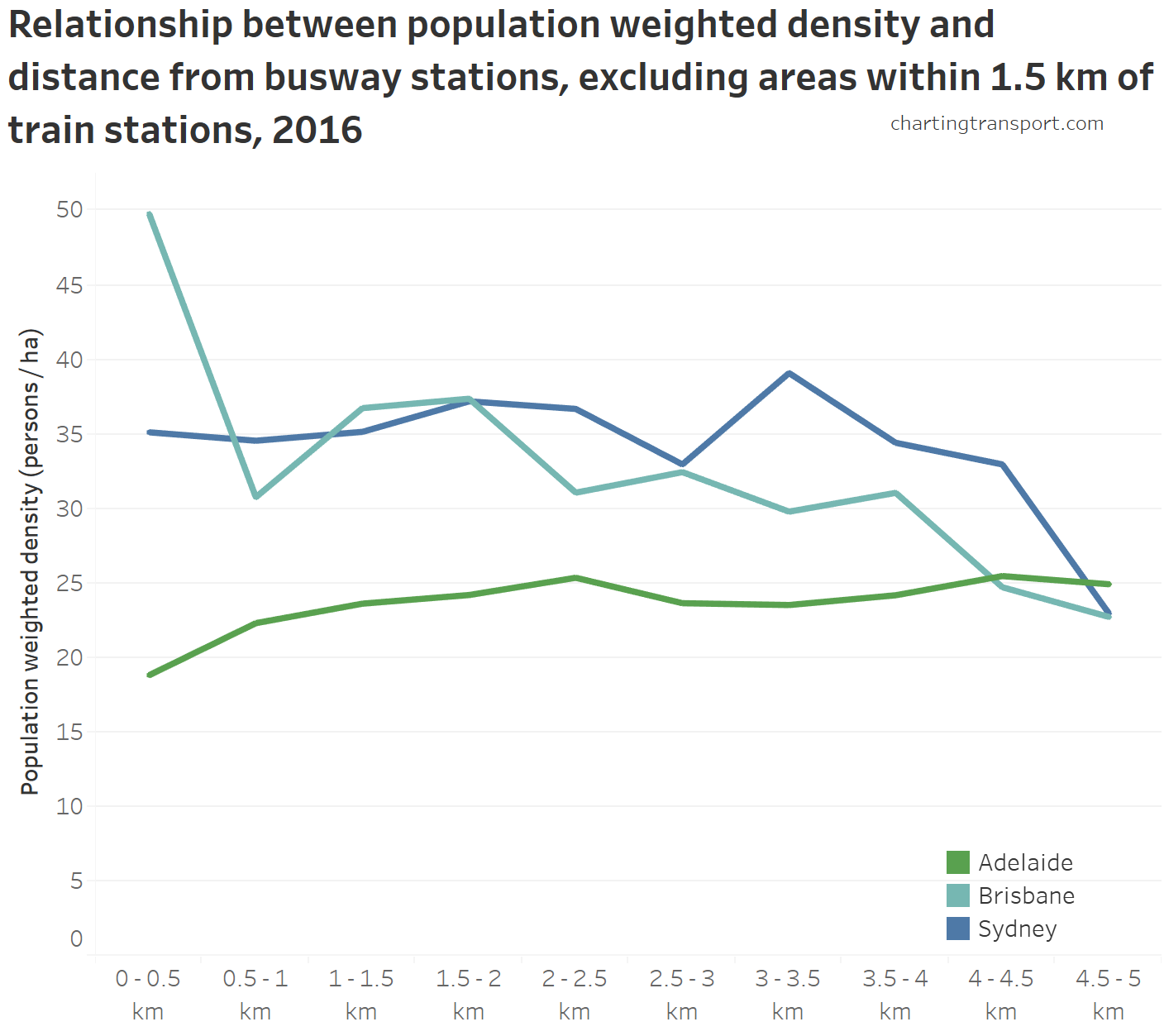
Busways are the other major form of rapid transit in Australian cities, with major lines in Brisbane, Sydney and Adelaide. Here is a chart of public transport mode share by distance from busway stations, excluding areas also within 1.5 km of a train station:

Note for Adelaide this data only considers suburban stations on the O-bahn, and not bus stops in the CBD. For Sydney all “T-Way” station are included, plus the four busway stations on the M2 motorway for which buses run into the CBD (but not the relatively short busway along Anzac Parade in Moore Park). Sydney’s north west T-Ways opened in 2007
Proximity to a busway station appears to influence public transport mode share strongly in Brisbane and Adelaide, where busways are mostly located in the inner and middle suburbs and cater for trips to the CBD. Sydney’s busway stations are in the “outer” western suburbs, feeding Blacktown, Parramatta, but also relatively long distance services to the Sydney CBD via the M2.
Curiously, public transport mode shares were higher in places between 3 and 5 km from busway stations in Sydney, compared to immediately adjacent areas. I’m not sure that I can explain that easily, but it suggests equally attractive public transport options exist away from busway and train stations.
The station proximity influence appears to extend around 1 km, which possibly reflects the fact that few busway stations have park and ride facilities, and are therefore more dependent on walking as an access mode (although cycling may be another station access mode).
Over time Sydney public transport mode share lifted at all distances from busway stations, while in Brisbane it rose in 2011 and then fell again in 2016, in line with other city mode shares.
So are busway stations similar to train stations in their impact on public transport mode share? To answer this I’ve segmented cities into areas near train stations, near busway stations, near both, and near neither. I’ve used 1.5 km as a proximity threshold that might represent an extended walking catchment.

In Sydney, train stations appear to have a much stronger influence on public transport mode shares than busway stations, but the opposite is true in Brisbane and Adelaide. This possibly reflects the much higher service frequencies on Adelaide and Brisbane busways compared to their trains, and the fact Sydney’s busway stations are so far from the CBD (and thus have fewer workers travelling to the CBD where public transport dominates mode share).
Also of note in this chart is that for areas more than 1.5 km from a train or busway station, Sydney had a much higher public transport mode share compared to the other cities. These areas will be served mostly by on-road buses, but also some ferries and one light rail line. Adelaide has the least difference between mode share for areas near and not-near train or busway stations.
We can do the a similar analysis for workplaces:

The most curious pattern here is Adelaide – where public transport mode share was highest for jobs between 1.5-2.5 kms from train stations. This distance band is dominated by the centre of the Adelaide CBD (the station being on the edge, arguably a “corner”), for which bus was the dominant public transport access mode. Also, there was no destination zone small enough near Adelaide central train station to register as 0 – 0.5 km away, and only one that is 0.5 – 1 km away (I use distances between station data points and destination zone centroids). So the results might look slightly different if smaller destination zones were drawn in the Adelaide CBD.
In all other cities there was a very strong relationship between train station proximity and public transport mode share, as you would expect. And Sydney again stands out with high public transport mode shares for workplaces more distant from train stations.
If you are wondering, the bump in Sydney at 2.5 to 3 km includes the Kensington / Randwick area which has high employment density and a strong bus connection to the central city (partly assisted by the Anzac Parade busway). And the relatively high figure for Melbourne at 1 – 1.5 km includes parts of Docklands, Parkville, Southbank, and St Kilda Road, which all have high tram service levels.
Unfortunately destination zones around busway stations are generally too large to provide meaningful insights so I’m not presenting such data.
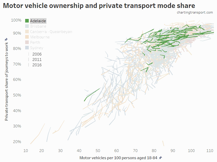
Motor vehicle ownership
It will come as little surprise that there is a relationship between household motor vehicle ownership and journey to work mode shares.
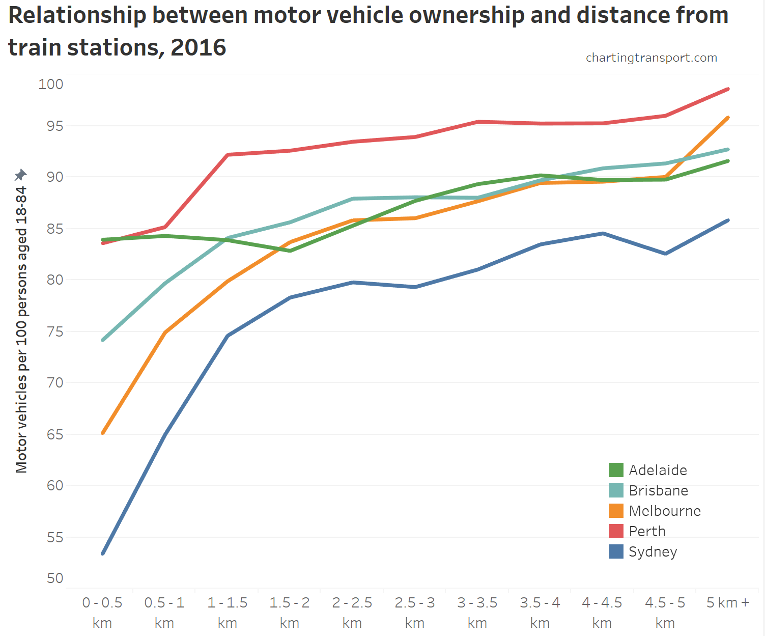
Here’s a summary chart for each city for the 2006, 2011 and 2016 censuses:

There appears to be a fairly strong relationship between the two factors at city level.
Sydney and Melbourne have seen the largest mode shift away from private transport, but only Melbourne has also seen declining motor vehicle ownership rates.
Canberra saw only weak growth in motor vehicle ownership between 2011 and 2016, and at the same time there was a shift away from private transport (and a large increase in population weighted density).
Perth and Brisbane saw increasing private transport mode share and increasing motor vehicle ownership between 2011 and 2016.
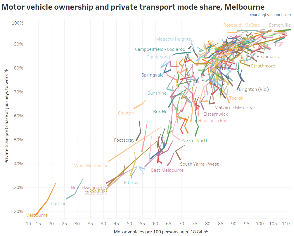
Here’s a more detailed look at the relationship over time for Melbourne at SA2 geography:

The outliers on the upper left are generally less-wealthy middle-outer suburban areas (lower motor vehicle ownership but high private mode share), while the outliers to the lower-right are wealthy inner suburbs where people can afford to own plenty of motor vehicles, but they didn’t use them all to get to work.
In the bottom left of the chart are inner city SA2s with declining private mode share and declining motor vehicle ownership. For motor vehicle ownership rates around 70-80 (motor vehicles per persons aged 18-84), there are many SA2s with private mode shares that declined 2006 to 2016, but not significantly lowering motor vehicle ownership rates. That suggests that just because people own many motor vehicles, they don’t necessarily use them to drive them to work.
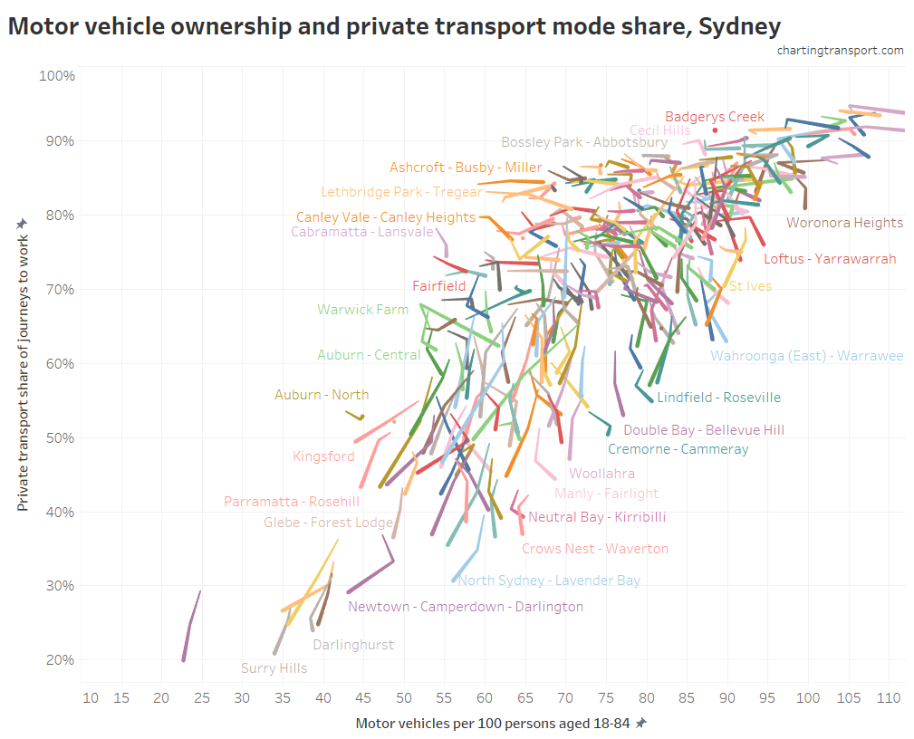
Here is the same data for Sydney:

There are many SA2s with motor vehicle ownership rates around 50 to 70 where the private mode shares are dropping faster than motor vehicle ownership. But there are also many areas with high private mode shares and increasing rates of motor vehicle ownership.
How do the other cities compare? Here are all the SA2s for all cities on the same chart, with alternating highlighted cities:

You can see big differences between the cities, but also that Brisbane and Perth have many SA2s with very high private mode share and rapidly increasing motor vehicle ownership (ie moving up and right, although it’s a little difficult to see with so many lines overlapping). Melbourne and Sydney have plenty of SA2s moving down and left – reducing motor vehicle ownership and declining private transport mode share (which may make some planners proud).
Of course there will be a relationship between motor vehicle ownership and where people choose to live and work. People working in the central city may prefer to live near train stations so they can avoid driving in congested traffic to expensive car parks. People who prefer not to drive might choose to live close to work and/or a frequent public transport line. People who are happy to drive to work in the suburbs might avoid higher priced real estate near train stations or the inner city.
As an aside, we can compare total household motor vehicles to the number of people driving to work, to estimate the proportion of household motor vehicles actually used in the journey to work. Here is Melbourne:

SA2s with a lower estimate are generally nearer the CBD, are wealthier areas, have reasonable public transport accessibility, and/or might be areas with a higher proportion of people not in the workforce (for whatever reason). The areas where the highest proportion of motor vehicles are required for the journey to work are relatively new outer suburbs on the fringe (perhaps suggesting forced car ownership), where adult workforce participation is probably high and public transport accessibility is lower.
The proportion of cars used in the journey to work declined on average in many parts of Melbourne. Given that motor vehicle ownership rates in Melbourne barely changed between 2011 and 2016, this probably represents people mode shifting, rather than people acquiring more motor vehicles even though they don’t need them to drive to work.
Jobs within walking distance of home
It stands to reason that people would be more likely to walk to work if there were more work opportunities within walking distance of their home.
For every SA1 I’ve measured how many jobs are approximately within 1 km as a notional walking catchment (measured as the sum of jobs in destination zones whose centroid are within 1 km of the centroid of each home SA1, so it is not perfect). Here’s the relationship with walking mode share:

(there are a lot of dots overlapping in the bottom left-corner and Adelaide dots have been drawn on top so try not to get thrown by that).
You don’t have to have a lot of nearby jobs to get a higher walking mode share, but if you do, you are very likely to get a high walking more share. The exceptions (many jobs, but low walking share) include many parts of Parramatta (Sydney), and areas separated from nearby jobs by water bodies or other topographical barriers (eg Kangaroo Point in Brisbane).
Workplace distance from the city centre
As was seen in a previous post, workplaces closer to city centres had much lower private transport mode shares, which is unsurprising as these are locations with generally the best public transport accessibility, high land values that can lead to higher car parking prices (which impact commuters who pay them), and often higher traffic congestion.
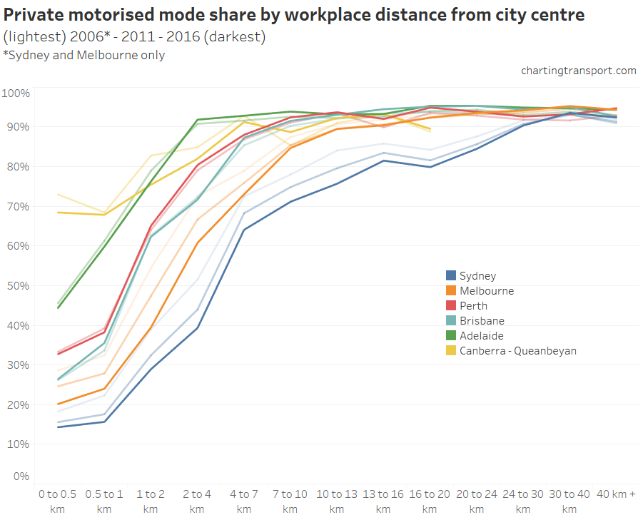
Here is a chart showing private transport mode share by workplace distance from the city centre. I’ve used faded lines to show 2011 and 2006 results (2006 only available for Sydney and Melbourne).

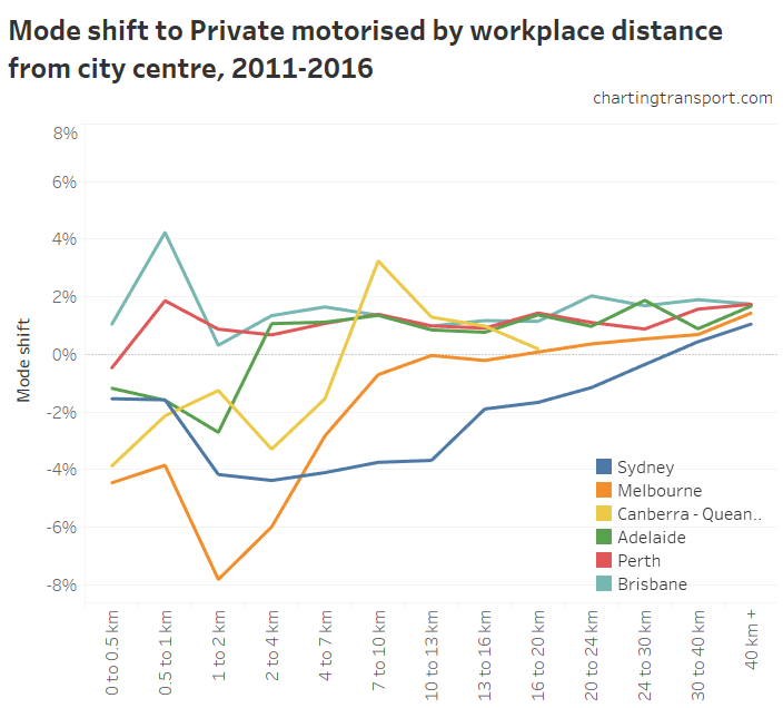
Here’s a chart that shows the mode shifts between 2011 and 2016:

Inner Melbourne had the biggest mode shifts away from private transport (particularly in Docklands that falls into the 1-2 km range, which saw significant employment and tram service growth), but Sydney had more consistent mode shifts across most distances from the city centre. Adelaide and Canberra saw mode shifts away from private transport in the inner city but towards private transport further out.
Brisbane and Perth saw – on average – a mode shift to private transport across almost all distances from the city centre, with the highest mode shift to private transport in Brisbane actually for the CBD itself(!).
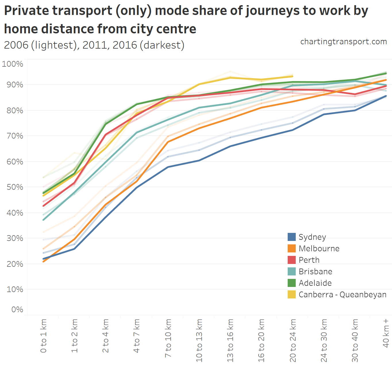
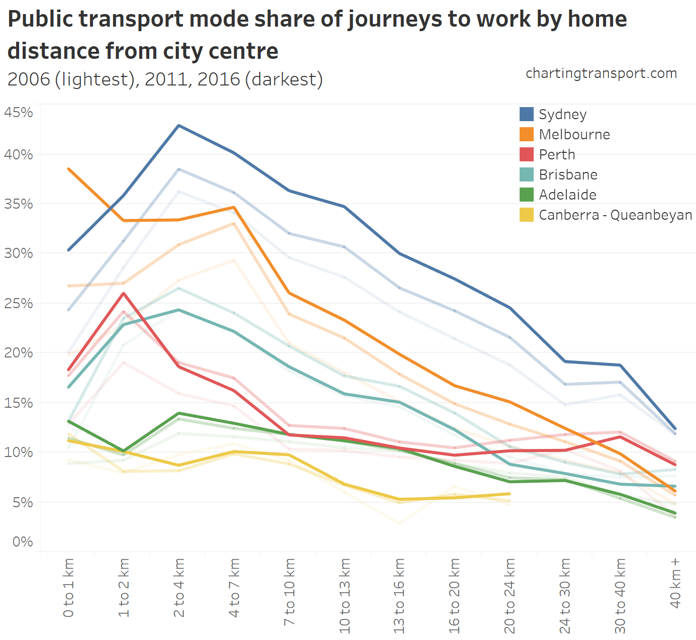
Home distance from the city centre
There’s unquestionably a relationship here too, and it’s probably mostly driven by public transport service levels being roughly proportional to distance from the CBD, but also the proportion of the population who work in the CBD being much higher for homes nearer the CBD.

Sydney had the lowest average private transport mode share at all distances up to 20 km from the CBD, followed by Melbourne and Brisbane, in line with overall mode shares.
The trends over time are also interesting. Brisbane saw mode shifts towards private transport at all distances more than 2 km from the city centre between 2011 and 2016. However there were not significant shifts for Perth outside the city centre – that is: modes shares by geography didn’t change very much. The mode shift away from public transport in Perth is best explained by the shift in jobs balance away from the city centre.
Here are public transport mode shares by home distance from city centres:

In most cities, public transport mode share peaked at a few kilometres from the city (as active transport has a higher mode in the central city).
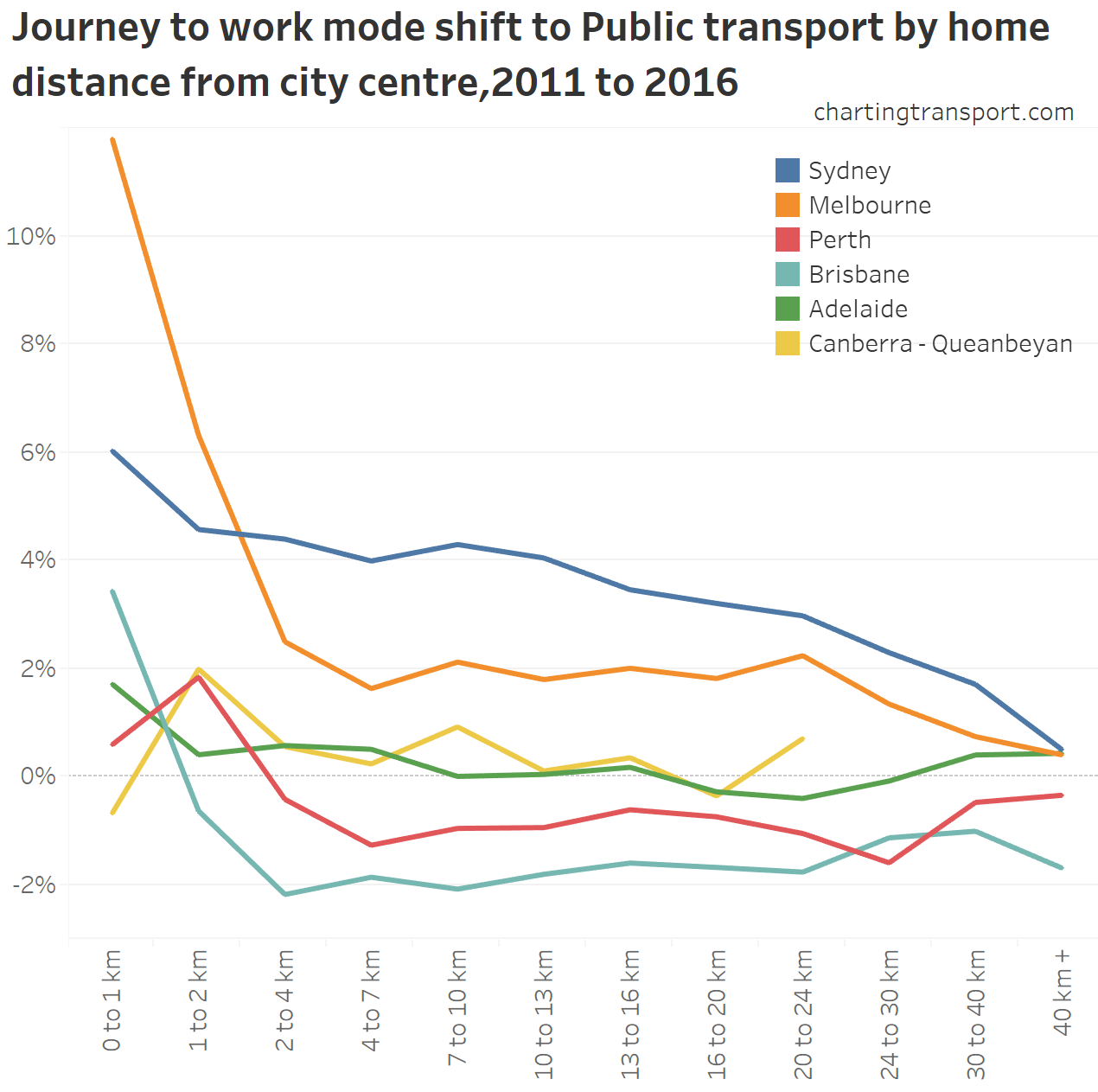
Here are public transport mode shifts by distance from the city centre between 2011 and 2016:

The significant shift in central Melbourne is likely to be largely explained by the Free Tram Zone introduced in 2015. Outside of the city centre the mode shifts are surprisingly uniform across each city.
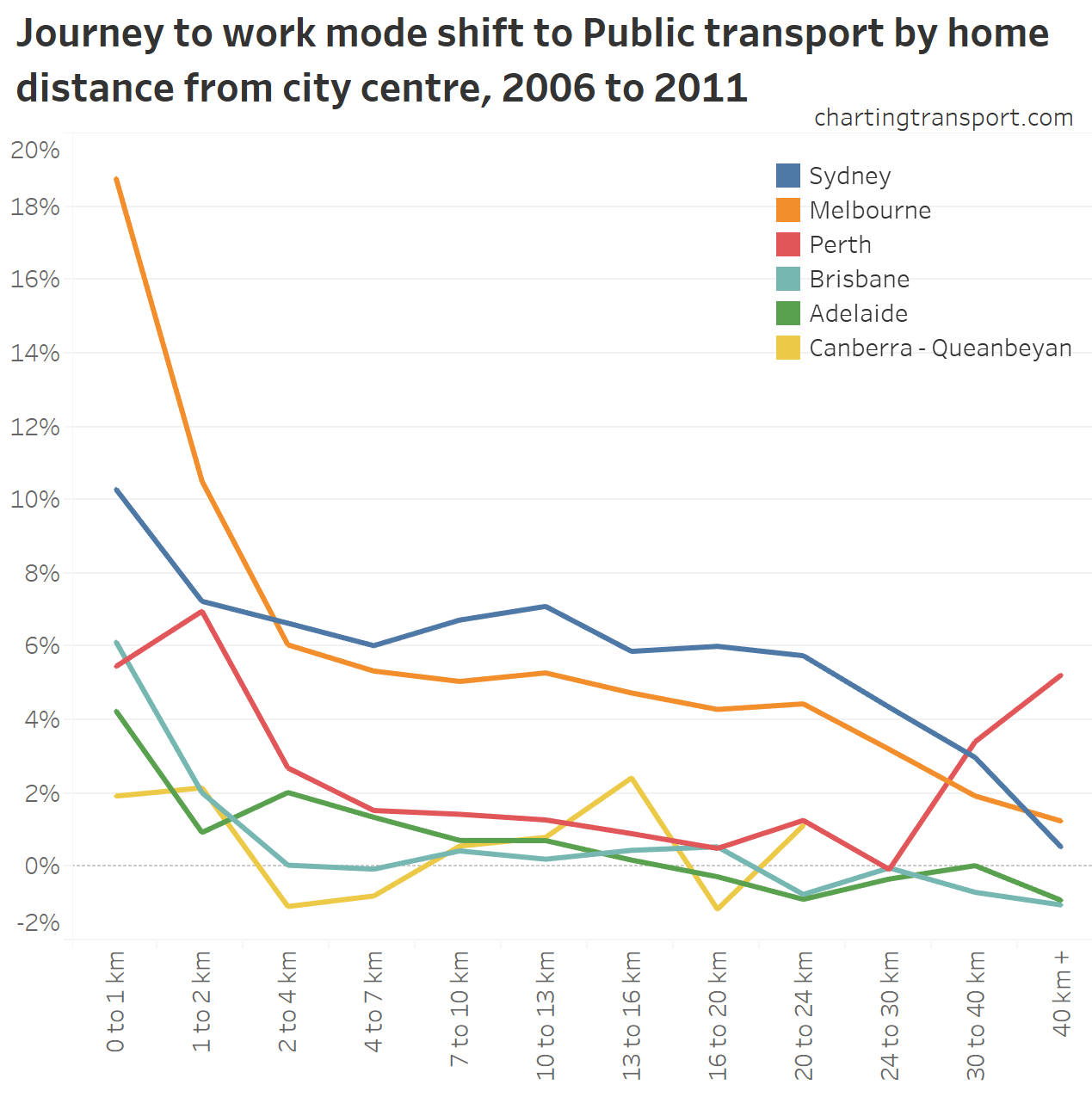
Here’s the same chart for 2006-2011, and you can clearly see the impact of the opening of the Mandurah railway line in Perth with significant mode shift beyond 30 km:

Curiously there was a massive shift to public transport for CBD residents in Melbourne (and this is before the free tram zone was introduced).
So which factors best explain the patterns in mode shares across cities?
What we’ve clearly seen is that higher public transport mode shares are seen for journeys to work…
- to higher density workplaces
- from areas of lower motor vehicle ownership
- to workplaces closer to train stations
- from higher density residential areas
- from areas around train and busway stations
- to and from areas closer to city centres (except from the central city where walking takes over)
- from less wealthy areas (while I haven’t tested this directly, wealth seems to explain a lot of the outliers in the scatter plots)
I’ve listed these roughly in order of the strength of the relationships seen in the data, but I haven’t put them all in a regression model (yet, sorry).
Of course most of these factors are inter-related, so we cannot isolate causation factors. I’m going to run through many of them, because they are often interesting: (note I have sometimes used log scales)
Population density is roughly related to distance from the city centre:

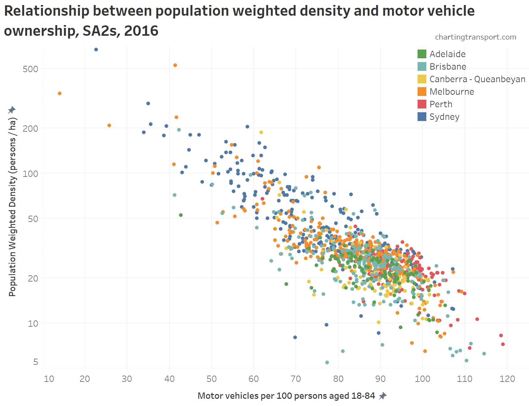
Motor vehicle ownership has a strong relationship with population density (see this post for more analysis):

Motor vehicle ownership has a weaker relationships with distance from the city centre:

Motor vehicle ownership is related to home distance from train stations, except in Adelaide:

Technical note: For this chart (and some below) I’ve calculated average quantities for the variable on the Y axis, as there would otherwise there are too many data points on the chart and it becomes very hard to see the relationship (I would need to show all SA1s because SA2s are too large in terms of distance from stations). The downside is that these style of charts don’t indicate the strength of relationships.
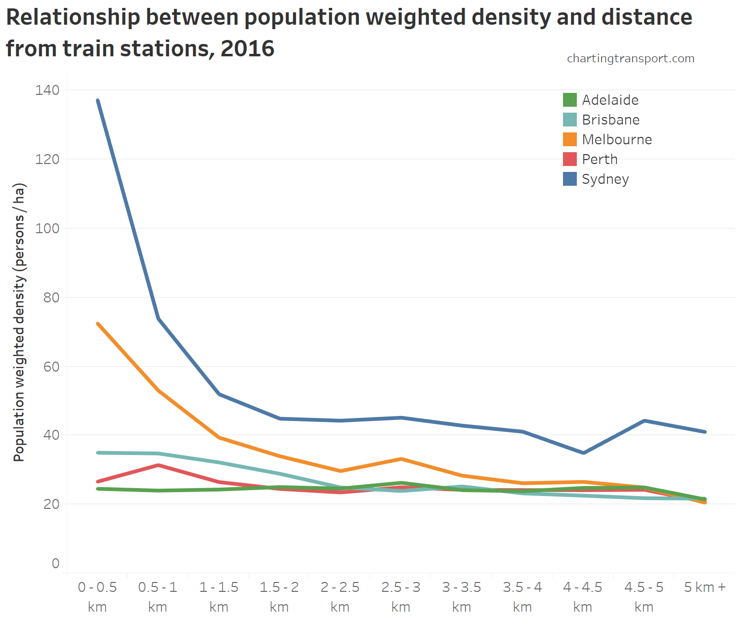
Population weighted density is related to distance from train stations, especially in Melbourne and Sydney, but not at all in Adelaide:

There is a relationship – although not strong – between weighted job density and distance from city centres:

There’s some relationship between average weighted jobs density and distance from train stations, except in Adelaide:

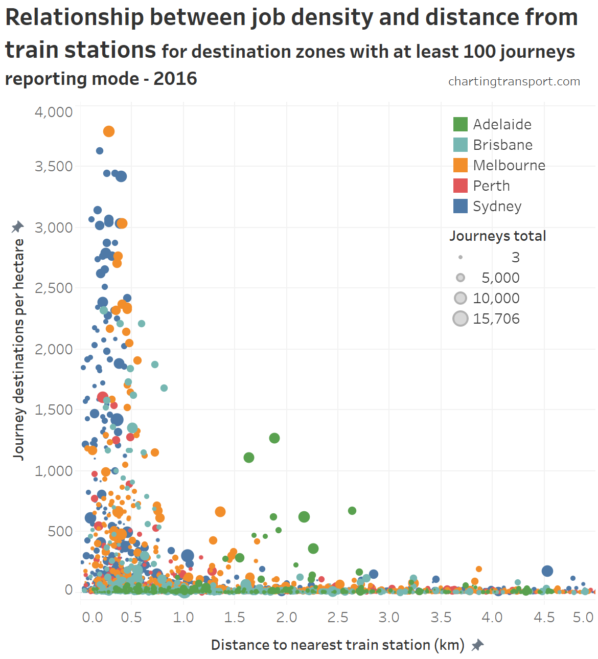
Here’s the same data, but as a scatter plot with a point for each destination zone, scaled by the number of journeys to each destination zone, and a linear Y-axis:

Technical note: the X-axis appears green mostly because Adelaide data points are drawn on top of other cities, but those data points aren’t of much interest.
In most cities, destination zones with high jobs density (over 700 jobs/ha) were only found within 1 km of a train station – with the notable major exception of Adelaide (again!).
(If you are curious, the large Melbourne zone at 1.4 km from a train station and 659 jobs/ha is the Parkville hospital precinct – where incidentally a train station is currently under construction).
There is a relationship between motor vehicle ownership and proximity to busway stations, but it varies between cities:

But there’s not much relationship between population density and proximity to busway stations (except in the immediate vicinity of busway stations in Brisbane):

Final remarks: there’s something about Adelaide’s train network
A few key observations come through clearly about the catchments around Adelaide’s train stations:
- In aggregate they do not have higher population density, unlike other cities.
- In aggregate they do not have particularly high public transport mode shares, unlike other cities.
- In aggregate they do not have lower rates of motor vehicle ownership, unlike other cities.
- They do not include the area of highest job density in the CBD (a longer walk or transfer to tram or bus is required), unlike other cities.
Few cities have spare land corridors available for new at-grade rapid public transport lines, and so transport planners generally want to make maximum use of the ones they’ve got, before opting for expensive and/or disruptive tunnelling or viaducts solutions. It looks like Adelaide’s rail corridors are not reaching their people-moving potential.
By contrast, Adelaide’s “O-Bahn” busway does go into the job dense heart of the CBD and the busway station catchments do have higher public transport mode share and lower motor vehicle ownership. However they do not have higher population density, possibly because the stations are surrounded by car parks, green space, and one large shopping centre (Tea Tree Plaza).
Mode shares, population densities, and motor vehicle ownership rates would quite probably change significantly if Adelaide could address the fourth issue by building a train station near the centre of the CBD.
In fact, Auckland had a very similar problem with its previous main city station being located away from the centre of the CBD. They fixed that with Britomart station opening in 2003 and train patronage soon rose quite dramatically (off a very low base, and also helped by service upgrades, subsequent electrification, and many other investments).
Should Adelaide do the same? It would certainly not be cheap and you would have to weigh up the costs and benefits.


 Posted by chrisloader